
Overview
The base color system is divided into the following clusters at the base level:
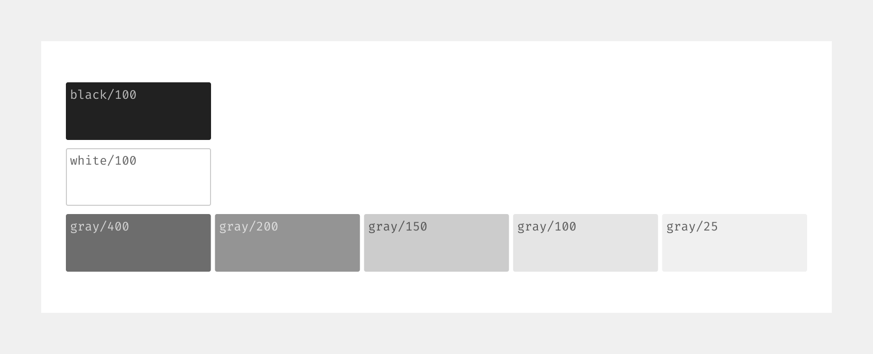
- Neutral = Neutral colors include black, gray, and white. These colors form the foundation of our design system.
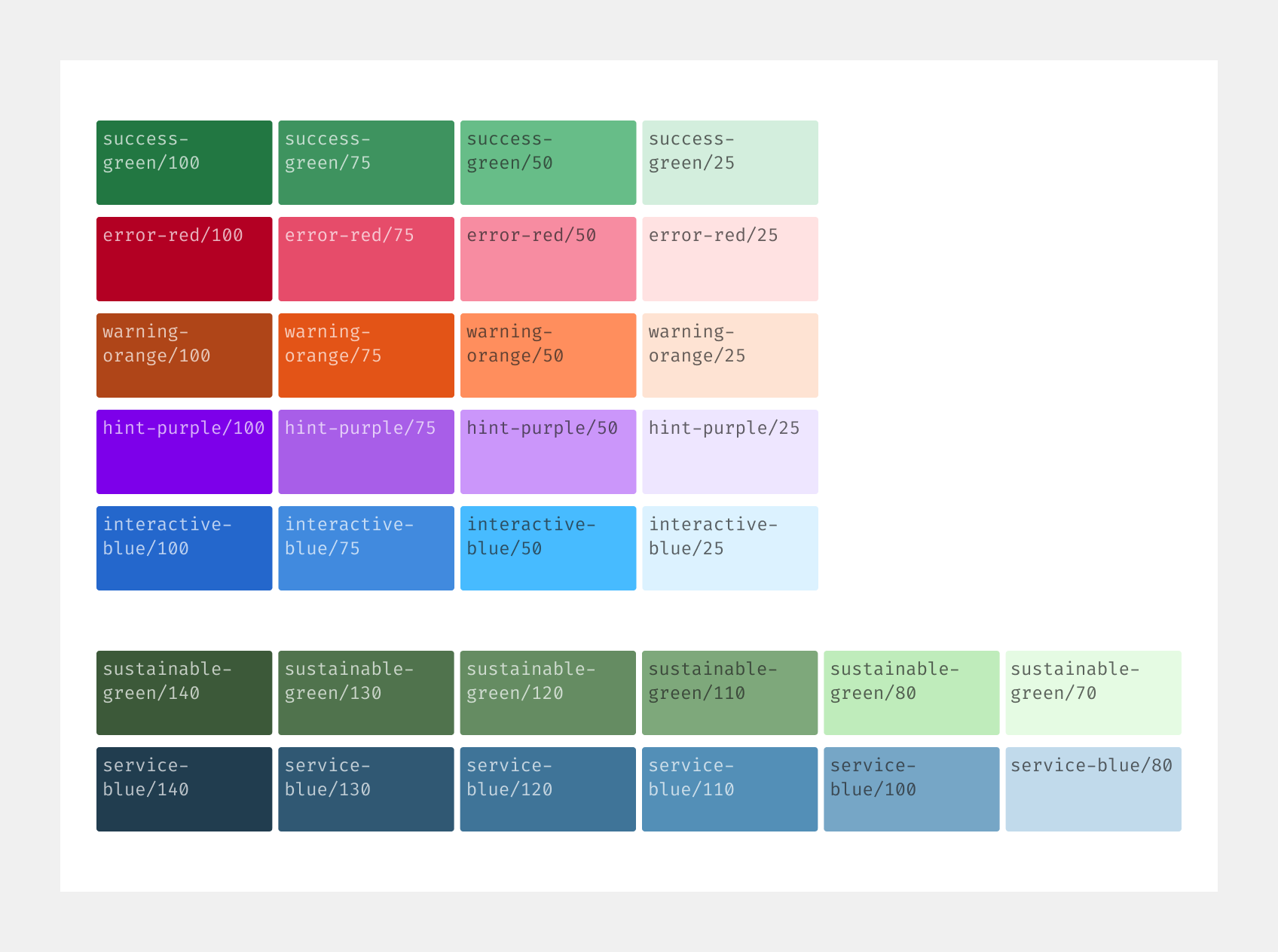
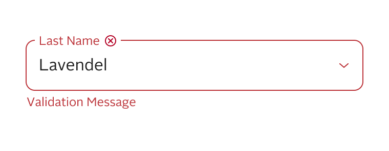
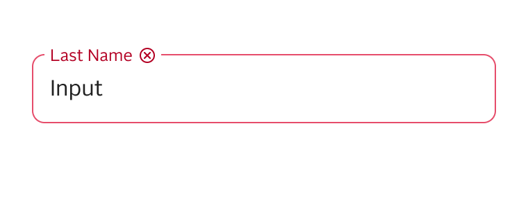
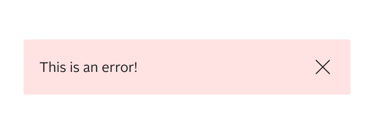
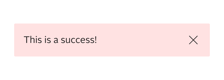
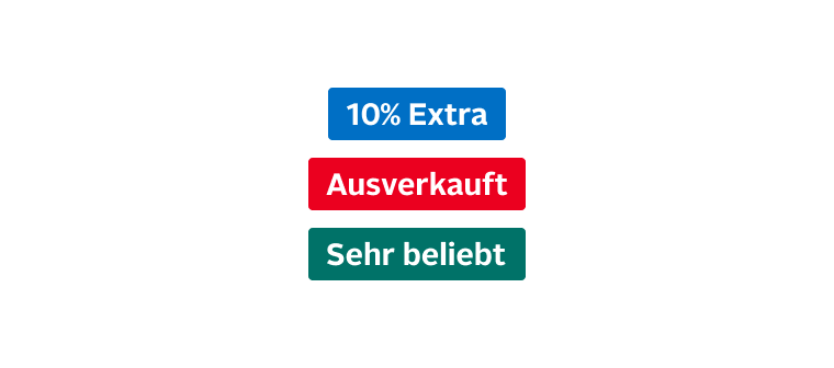
- Exclusive = The exclusive colors are success-green, error-red, warning-orange, hint-purple, interactive-blue, sustainable-green and service-blue. These colors are chosen specifically for their context and should not be used differently.
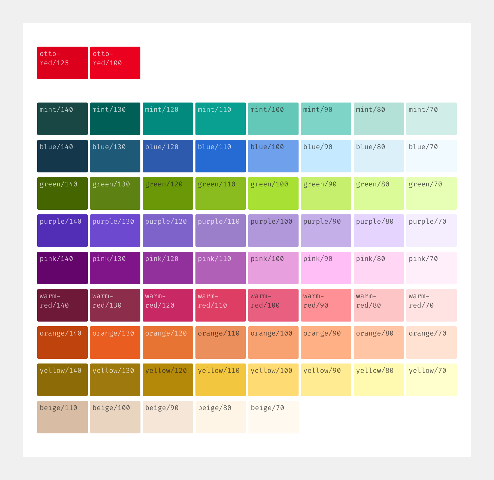
- Corporate = The corporate colors consists of all colors from our overarching corporate design and should be used to represent the OTTO brand.
Note: Mainly use semantic color design tokens for live! Base color design tokens are intended for drafts and special cases only.
Scale
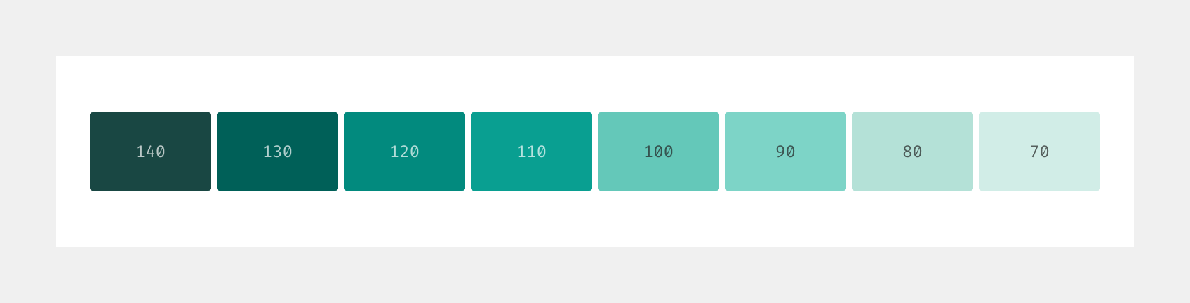
Most colors come in several shades, ranging from dark to light. The different shades are systematized using a numerical suffix. A higher number stands for a darker, whereas a lower number stands for a brighter shade.
Principles
- The beginning of the customer journey is inspirational. Selected corporate colors can be used at this stage. By the end, the interface becomes more focused with less color usage.
- Corporate and neutral colors are not exclusive and can be used for different contexts. Only exclusive colors are actually exclusive.
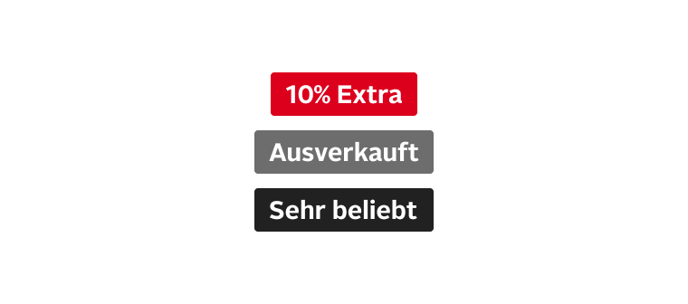
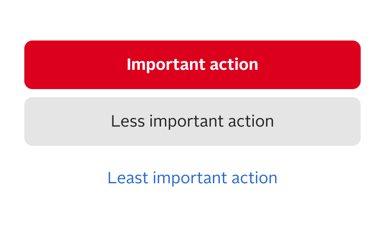
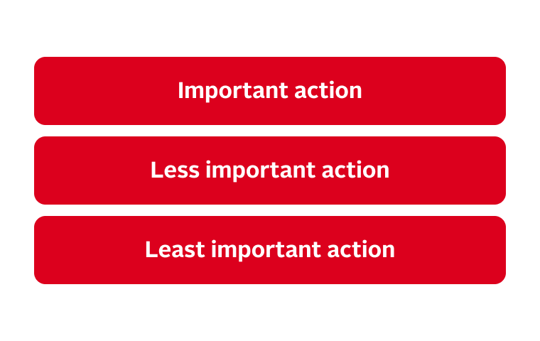
- You can use colors to highlight certain pages, features or components. When using colors always consider the overall context. Use eye-catching colors sparingly.
Best practices
Accessibility
All Otto components meet or exceed WCAG 2.1 AA contrast requirements. When using color outside of a component, ensure that the WCAG 2.1 requirements are always met.
Fragments
You can find an overview of all color tokens here.
Status
Implementation
Note: For full technical documentation of color visit Storybook/Color.