
Overview
Typefaces
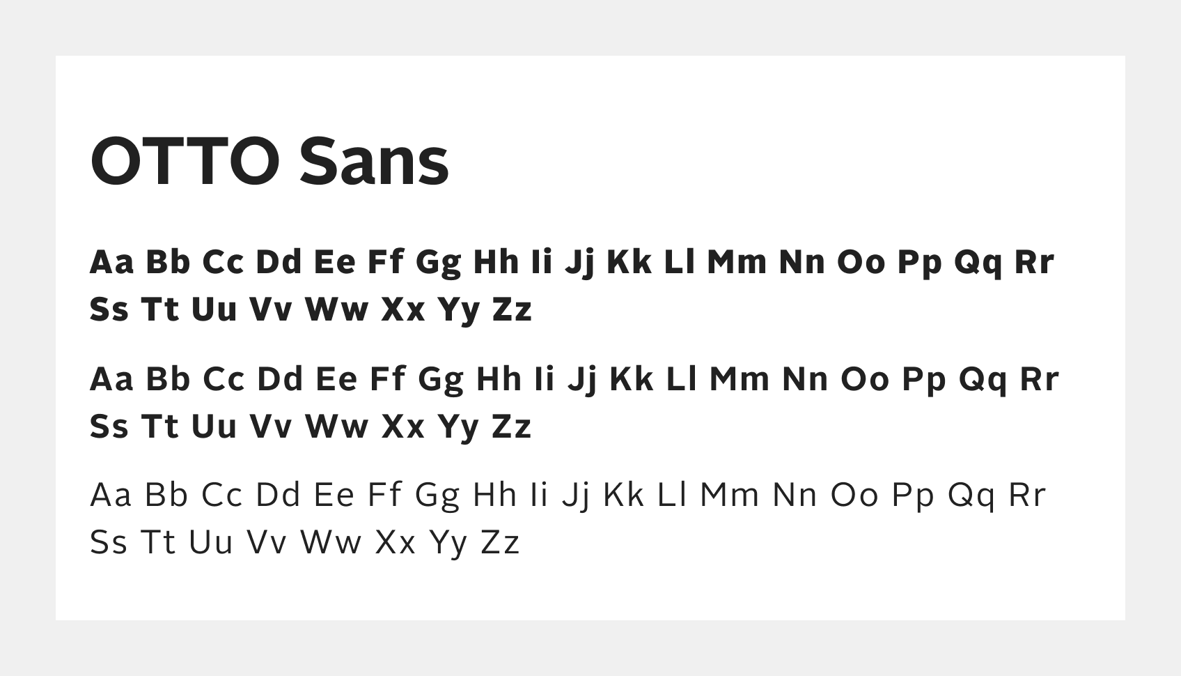
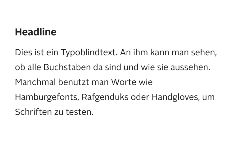
OTTO has its own typeface called OTTO Sans. The font includes different font weights. Only black, bold and regular are used in the design system. The OTTO sans is a sans serif font which is designed to be minimalistic and simple.
Styles
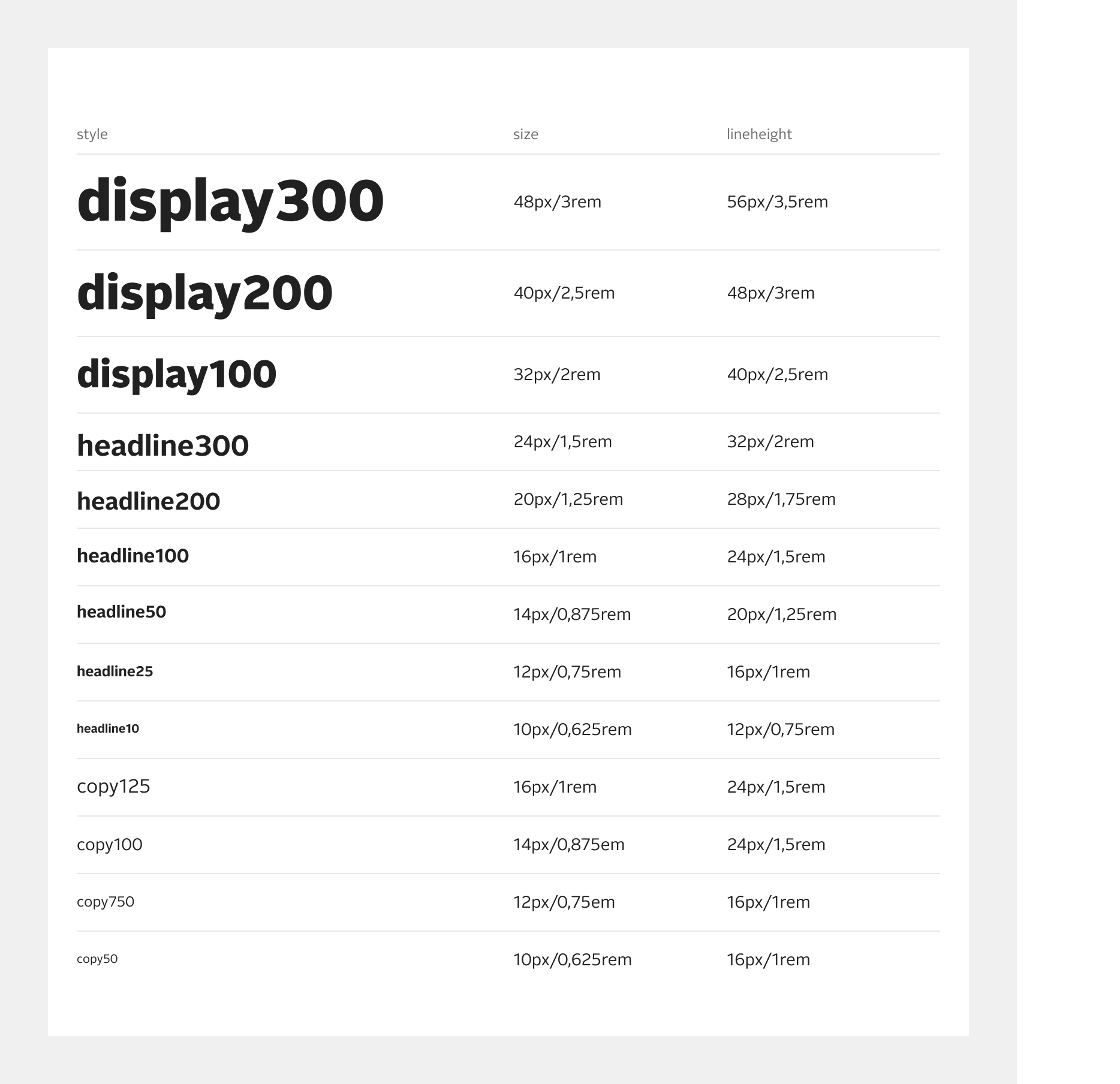
The typography is divided into the following styles:
- Display: Display300 is intended for desktop use. Meanwhile, display100 and display200 can be used for mobile. This display style is not intended for body text and should only appear once per page.
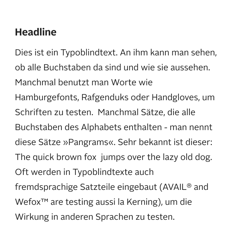
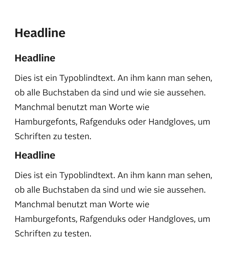
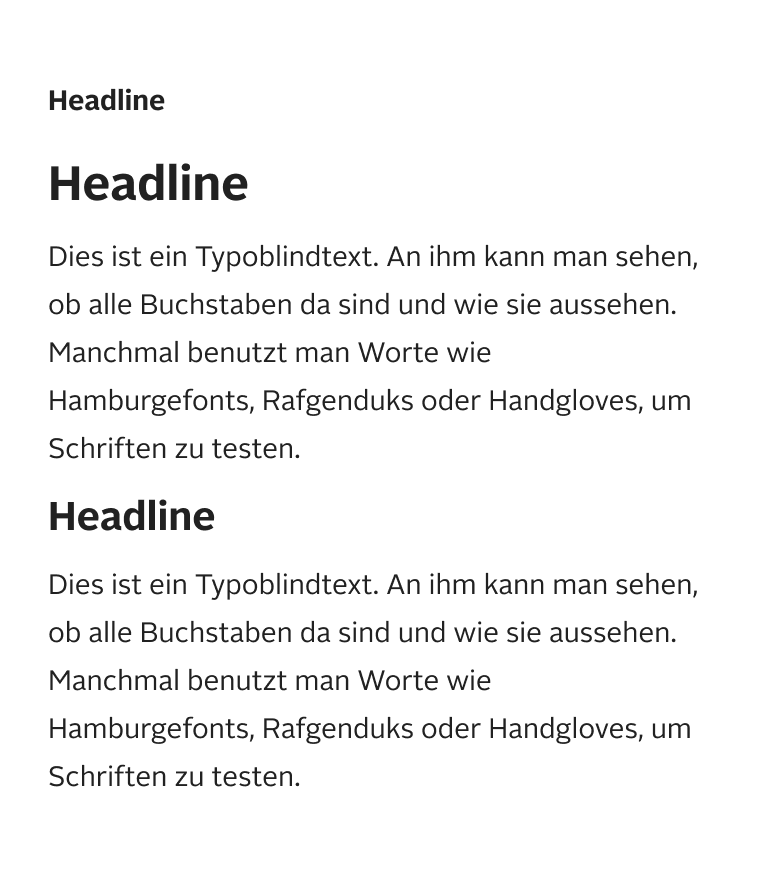
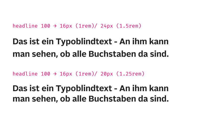
- Headline: Use the heading tags in the correct hierarchy (h1, h2, h3, etc.). The heading style is not directly connected with the heading tags, but rather represents their hierarchy. Headline100 is our default headline size.
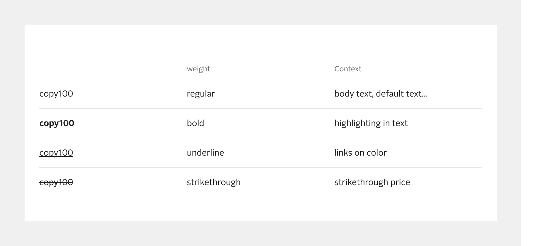
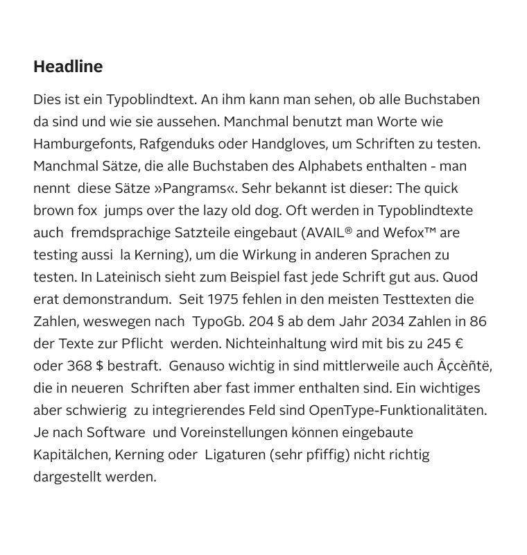
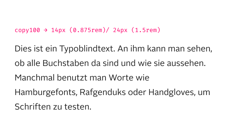
- Copy: Copy100 is intended for longer text. Smaller copy styles are acceptable for less important information but should be used sparingly.
Scale
The styles come in different sizes. The sizes are systematized by using a numerical suffix. The value 100 is used for the default size, for example headline100. A higher number stands for a bigger representation, whereas a lower number stands for a smaller font size.
List
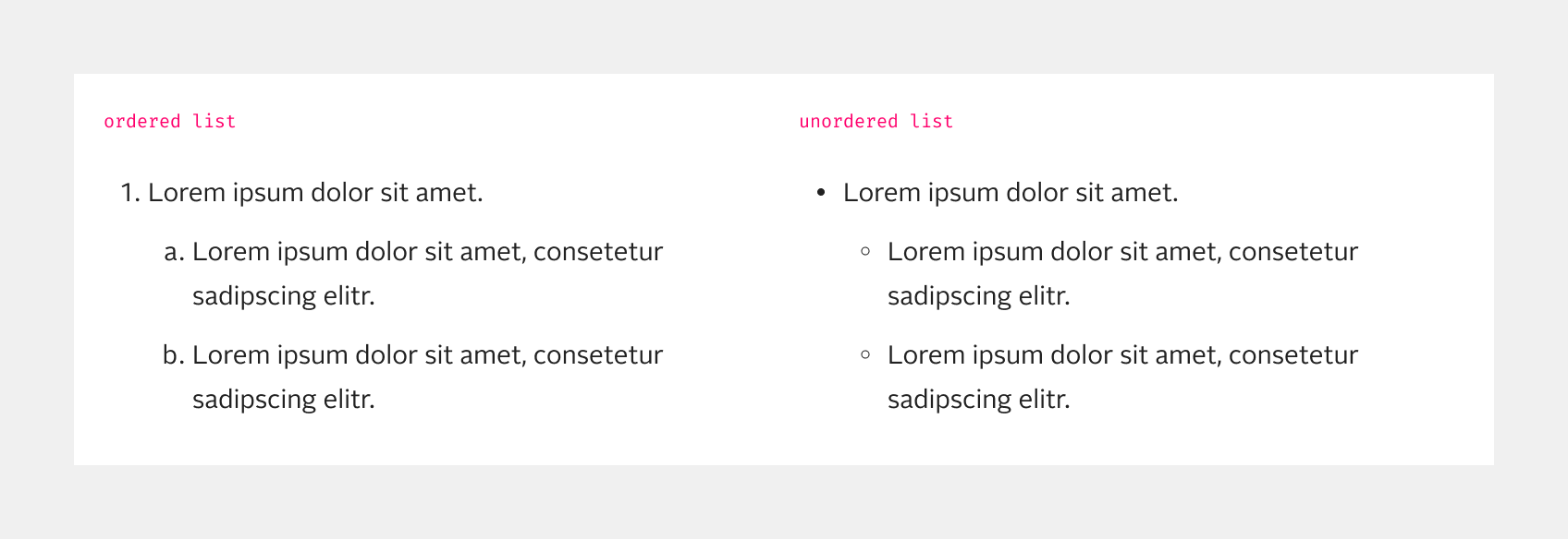
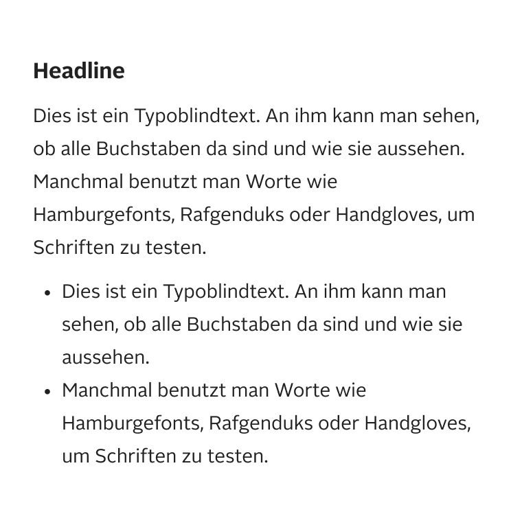
There are two types of list: ordered and unordered. Each type of list can have multiple levels. An ordered list can help to sort items in a logical way, such as alphabetically or numerically. Unordered lists can help to keep information short and easy to scan.
Note: For full technical documentation of naming, visit Storybook/List.
Best practices
Accessibility
For the correct use of typography in terms of accessibility, it is important to use a clean headline structure. The correct HTML tags (
, , etc.) should be used for the different headlines in the correct order. This ensures that the typographic hierarchy is also present in other formats, such as the screen reader.
etc.) should be used for the different headlines in the correct order. This ensures that the typographic hierarchy is also present in other formats, such as the screen reader.
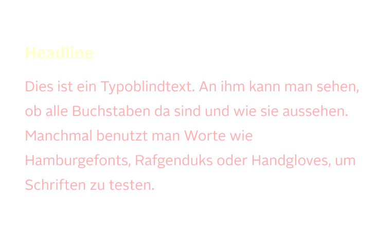
Another important aspect of accessible typography is to ensure a minimum color contrast of 4.5:1 to guarantee readability. The only exception in this regard is large-scale text, which only applies to headline300 and our display font styles - a minimum color contrast of 3:1 can be maintained here.
Furthermore, it must be ensured that text can be increased to a size of up to 200% or that the text spacing can be changed without losing information. Our typography no longer works with px, but with "rem". "rem" is a scalable and relative size unit for text. With a scaling of 100%, 1rem corresponds to 16px.
Status
Implementation
Note: For full technical documentation of typography, visit Storybook/Typography.