
Overview
Source: ./src/documentation/development/use-design-tokens.mdx
Use design tokens
Design tokens are a set of standardized, reusable variables that store design decisions about colors, typography, spacing, and more. They specify the actual values for the visual properties and serve as the single source of truth for them, ensuring consistency across different platforms and devices.
Info
See the Design tokens UX documentation for detailed design guidelines.
By using them instead of hardcoding values in your codebase, you ensure consistency, scalability, and easier maintenance of design styles across various apps, components, and features, ensuring a unified look and feel throughout the OTTO ecosystem.
Skip to:
Tiers of design tokens
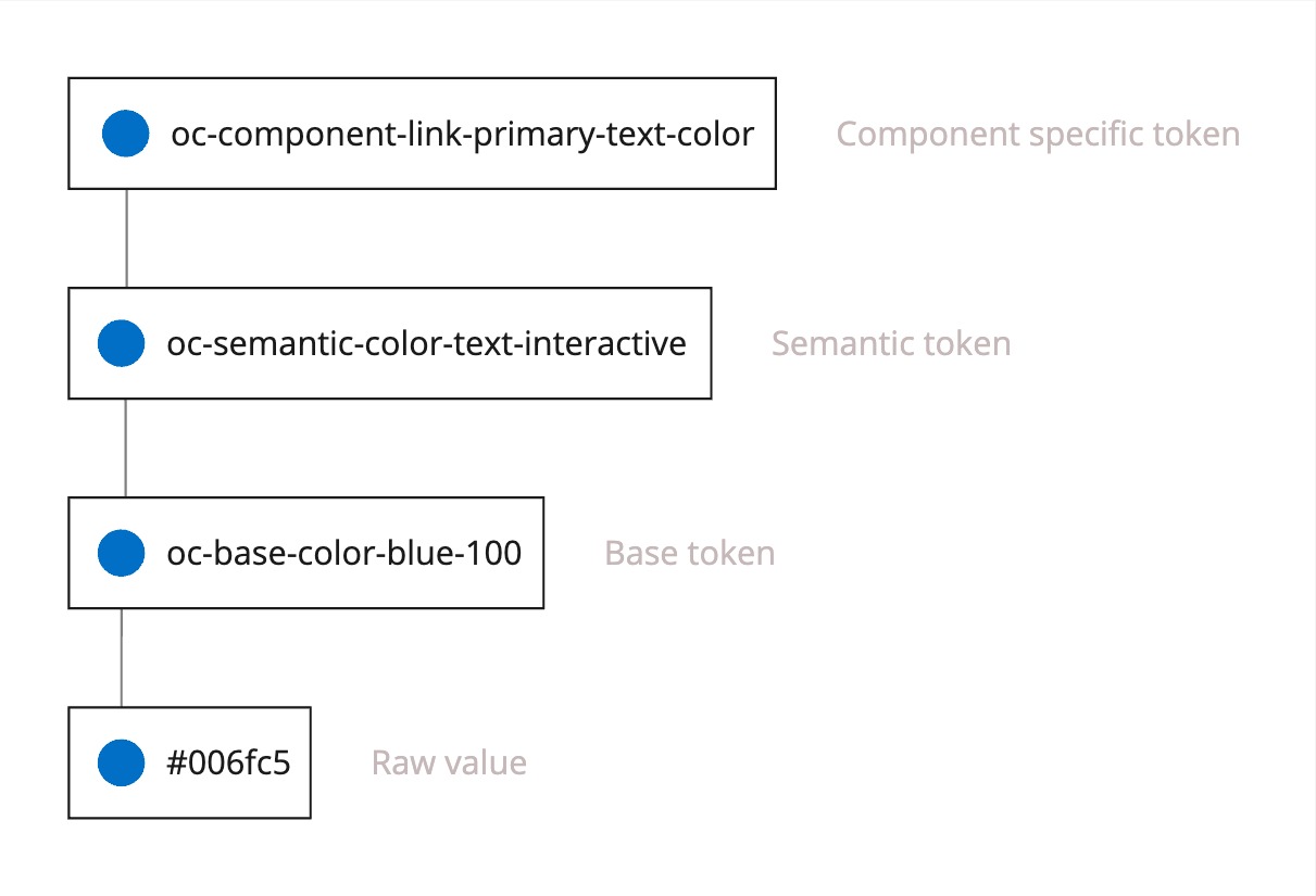
The design tokens are structured in three tiers: base tokens, semantic tokens, and component tokens.
The following image shows the relationship between these three tiers:
Base tokens
Base tokens are prefixed with oc-base- and point to raw values like colors, dimensions, or font families.
They are only used as a reference for semantic tokens.
Important: Do not use Base tokens in your production code. Base tokens are subject to change and can break. Instead, use semantic tokens.
Here are some examples of base tokens and the values they point to:
| Base token | Value |
|---|---|
| oc-base-color-interactive-blue-100 | #2366cb |
| oc-base-dimension-relative-16 | 1rem |
| oc-base-font-otto-sans | 'OTTOSans', Arial, Helvetica, sans-serif |
Semantic tokens
Semantic tokens are prefixed with oc-semantic- and point to base tokens only.
We recommend using semantic tokens in your codebase instead of using base tokens.
Here are some examples for semantic tokens and the base tokens they point to:
| Semantic token | Base token |
|---|---|
| oc-semantic-color-text-interactive | oc-base-color-interactive-blue-100 |
| oc-semantic-border-radius-200 | oc-base-dimension-relative-16 |
| oc-semantic-font-headline-font-family | oc-base-font-otto-sans |
Component tokens
Note: Component tokens are not exposed to the public API and are reserved for OTTO Components internal use only!
Use design tokens in your codebase
Design tokens are available in two formats: CSS variables or SCSS variables. The difference between the two is that the SCSS variables are pointing to the CSS variables and can be enabled with autocompletion in your IDE.
Design tokens as SCSS variables
We encourage you to use the design tokens as SCSS variables. By installing the design tokens package you benefit from the autocompletion in your IDE. Under the hood the SCSS variables point to the CSS variables.
Install the
design-tokenspackage:npm i -D @otto-ec/design-tokensUse design tokens in your code:
<script lang="ts">
  ...
</script>

<main>
  <p class="my-text">Some Text</p>
</main>

<style lang="scss">
  @use "@otto-ec/design-tokens/tokens";

  .my-text {
    color: tokens.$oc-semantic-color-text-success;
  }
</style>
Design tokens as CSS variables
All base and semantic design tokens are globally available on otto.de in form of CSS variables. Thus, they can also be used directly in your codebase without importing the design tokens package.
<script lang="ts">
  ...
</script>

<main>
  <p class="my-text">Some Text</p>
</main>

<style lang="css">
  .my-text {
    color: var(--oc-semantic-color-text-success);
  }
</style>
How to know which design tokens to use
- Design tokens are provided by our UX designers. Ideally you will find all relevant design tokens in the Figma design briefing of your feature.
- If you find that a design token is missing, please reach out to the UX team.
- Whenever possible, use the semantic tokens instead of the base tokens.