
Overview
Source: ./src/fragments/spacings/OCBreakpointsV1.mdx
Breakpoints
The breakpoint utilities provide mixins for responsive design, allowing you to apply styles at specific viewport or container widths.
Info
See the Responsiveness UX documentation for detailed design guidelines.
Skip to:
Available breakpoints
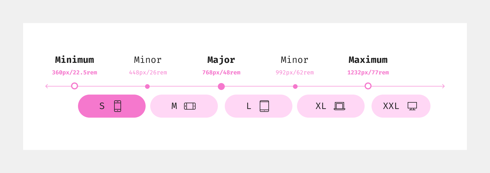
The following breakpoint identifiers are available:
| Identifier | Min-width | Description |
|---|---|---|
s |
22.5rem | Small screens |
m |
28rem | Medium screens |
l |
48rem | Large screens |
xl |
62rem | Extra large screens |
xxl |
77rem | XXL screens |
SCSS mixins
The following mixins are available:
| Mixin | Description |
|---|---|
breakpoint($from, $to, $containerFirst) |
Media/container query between two breakpoints |
breakpoint-from-s($to, $containerFirst) |
From small breakpoint (optionally to another) |
breakpoint-from-m($to, $containerFirst) |
From medium breakpoint (optionally to another). |
breakpoint-from-l($to, $containerFirst) |
From large breakpoint (optionally to another) |
breakpoint-from-xl($to, $containerFirst) |
From extra large breakpoint (optionally to another) |
breakpoint-from-xxl($containerFirst) |
From XXL breakpoint |
All mixins support container queries via the $containerFirst parameter.
These mixins are available in the @otto-ec/otto-components-utils package and can be imported as follows:
@use "@otto-ec/otto-components-utils/scss/mixins" as *;

.some-class {
  @include breakpoint-from-m() {
    // Styles for medium screens and up
  }
}
Usage guidelines
Use breakpoint mixins to create responsive layouts and components. You can target specific breakpoints or ranges.
Set responsive padding
// Add padding only from medium screens and up
@include breakpoint-from-m() {
  .my-component {
    padding: 16px;
  }
}
Set a range between breakpoints
// Apply styles between medium and large screens
@include breakpoint($breakpoint-m, $breakpoint-l) {
  .my-component {
    background: #f0f0f0;
  }
}
Find all usage examples in the breakpoints demo.
Info
See the Typography UX documentation for detailed user experience guidelines and best practices on responsiveness and breakpoints.
Accessibility
See the accessibility documentation for general guidelines on making your content accessible.
Layout and spacing/Breakpoints (OCBreakpointsV1.stories.ts)
Demo: Breakpoints
Story: fragments-layout-and-spacing-breakpoints--scss-mixin-demo · tags:
Story source (TypeScript, verbatim from Storybook)
{
  name: "Demo: Breakpoints",
  render: responsiveness
}