

Usage
In general, all icons can be used for different contexts and different meanings. A few icons are reserved for a specific context, e.g., the heart icon should only be used for the wishlist. All reserved icons are marked with an asterisk (*). In the figma library file you can also find the icon library sorted by categories, e.g., services, brand, user interaction etc. The naming of the icons are mainly descriptive but also semantic.
HTML
<div style="display:grid;grid-template-columns:auto auto auto;align-items:center;justify-content:center;gap:32px 40px;padding:24px 0">
<oc-icon-v1 type="basket" style="width:2rem;height:2rem"></oc-icon-v1>
<oc-icon-v1 type="arrow-long-right" style="color:#f06"></oc-icon-v1>
<oc-button-v1 variant="primary" fit-content icon-type-left="basket">In den Warenkorb</oc-button-v1>
<oc-icon-v1 type="wishlist" style="width:2rem;height:2rem"></oc-icon-v1>
<oc-icon-v1 type="arrow-long-right" style="color:#f06"></oc-icon-v1>
<oc-button-v1 variant="secondary" fit-content icon-type-left="wishlist">Artikel merken</oc-button-v1>
Variants
Icons are available in sizes 100 and 50.
- The default size of icon 100 is 1.5×1.5 rem, but it can be scaled in 0.5 rem steps, and in special cases, in 0.25 rem steps, as described in our grid system. It cannot be scaled smaller than the default size.
- Icon 50 is only allowed to be used in 0.75×0.75 rem and cannot be scaled at all.
16px
24pxdefault size
32px
40px
48px
HTML
<div style="display:flex;flex-wrap:wrap;justify-content:space-around;align-items:flex-end;gap:24px 16px;padding:16px 0;font:0.8125rem/1.25rem ui-monospace,SFMono-Regular,Menlo,monospace;text-align:center">
<div style="display:flex;flex-direction:column;align-items:center;gap:12px;color:var(--oc-semantic-color-text-secondary)"><oc-icon-v1 type="inplace-zoom" style="width:1rem;height:1rem;color:var(--oc-semantic-color-text-disabled)"></oc-icon-v1><span>Icon100<br>16px</span><span style="width:18px;height:18px;border:1.5px solid currentColor;border-radius:50%;background:linear-gradient(45deg,transparent calc(50% - .75px),currentColor calc(50% - .75px) calc(50% + .75px),transparent calc(50% + .75px))"></span></div>
<div style="display:flex;flex-direction:column;align-items:center;gap:12px;color:#f06"><oc-icon-v1 type="inplace-zoom" style="width:1.5rem;height:1.5rem;color:var(--oc-semantic-color-text-default)"></oc-icon-v1><span>Icon100<br>24px</span><span style="height:18px;line-height:18px">default size</span></div>
<div style="display:flex;flex-direction:column;align-items:center;gap:12px;color:var(--oc-semantic-color-text-success)"><oc-icon-v1 type="inplace-zoom" style="width:2rem;height:2rem;color:var(--oc-semantic-color-text-default)"></oc-icon-v1><span>Icon100<br>32px</span><oc-icon-v1 type="success-hint" style="color:currentColor;width:18px;height:18px"></oc-icon-v1></div>
<div style="display:flex;flex-direction:column;align-items:center;gap:12px;color:var(--oc-semantic-color-text-success)"><oc-icon-v1 type="inplace-zoom" style="width:2.5rem;height:2.5rem;color:var(--oc-semantic-color-text-default)"></oc-icon-v1><span>Icon100<br>40px</span><oc-icon-v1 type="success-hint" style="color:currentColor;width:18px;height:18px"></oc-icon-v1></div>
<div style="display:flex;flex-direction:column;align-items:center;gap:12px;color:var(--oc-semantic-color-text-success)"><oc-icon-v1 type="inplace-zoom" style="width:3rem;height:3rem;color:var(--oc-semantic-color-text-default)"></oc-icon-v1><span>Icon100<br>48px</span><oc-icon-v1 type="success-hint" style="color:currentColor;width:18px;height:18px"></oc-icon-v1></div>
8px
12pxdefault size
16px
24px
HTML
<div style="display:flex;flex-wrap:wrap;justify-content:space-around;align-items:flex-end;gap:24px 16px;padding:16px 0;font:0.8125rem/1.25rem ui-monospace,SFMono-Regular,Menlo,monospace;text-align:center">
<div style="display:flex;flex-direction:column;align-items:center;gap:12px;color:var(--oc-semantic-color-text-secondary)"><oc-icon-v1 type="inplace-zoom" size="50" style="width:0.5rem;height:0.5rem;color:var(--oc-semantic-color-text-disabled)"></oc-icon-v1><span>Icon50<br>8px</span><span style="width:18px;height:18px;border:1.5px solid currentColor;border-radius:50%;background:linear-gradient(45deg,transparent calc(50% - .75px),currentColor calc(50% - .75px) calc(50% + .75px),transparent calc(50% + .75px))"></span></div>
<div style="display:flex;flex-direction:column;align-items:center;gap:12px;color:#f06"><oc-icon-v1 type="inplace-zoom" size="50" style="color:var(--oc-semantic-color-text-default)"></oc-icon-v1><span>Icon50<br>12px</span><span style="height:18px;line-height:18px">default size</span></div>
<div style="display:flex;flex-direction:column;align-items:center;gap:12px;color:var(--oc-semantic-color-text-secondary)"><oc-icon-v1 type="inplace-zoom" size="50" style="width:1rem;height:1rem;color:var(--oc-semantic-color-text-disabled)"></oc-icon-v1><span>Icon50<br>16px</span><span style="width:18px;height:18px;border:1.5px solid currentColor;border-radius:50%;background:linear-gradient(45deg,transparent calc(50% - .75px),currentColor calc(50% - .75px) calc(50% + .75px),transparent calc(50% + .75px))"></span></div>
<div style="display:flex;flex-direction:column;align-items:center;gap:12px;color:var(--oc-semantic-color-text-secondary)"><oc-icon-v1 type="inplace-zoom" size="50" style="width:1.5rem;height:1.5rem;color:var(--oc-semantic-color-text-disabled)"></oc-icon-v1><span>Icon50<br>24px</span><span style="width:18px;height:18px;border:1.5px solid currentColor;border-radius:50%;background:linear-gradient(45deg,transparent calc(50% - .75px),currentColor calc(50% - .75px) calc(50% + .75px),transparent calc(50% + .75px))"></span></div>
To be able to scale icons, they are provided in SVG vector format. This way they don't get pixelated when scaled up. All icons use the text-default token by default, but you can also use different colors from our color palette. Be sure to meet contrast requirements.
HTML
<div style="display:grid;grid-template-columns:repeat(4,1fr);align-items:stretch">
<div style="display:flex;justify-content:center;align-items:center;padding:40px 16px"><oc-icon-v1 type="inplace-zoom" style="width:3rem;height:3rem;color:var(--oc-semantic-color-text-default)"></oc-icon-v1></div>
<div style="display:flex;justify-content:center;align-items:center;padding:40px 16px"><oc-icon-v1 type="inplace-zoom" style="width:3rem;height:3rem;color:var(--oc-semantic-color-text-brand)"></oc-icon-v1></div>
<div style="display:flex;justify-content:center;align-items:center;padding:40px 16px"><oc-icon-v1 type="inplace-zoom" style="width:3rem;height:3rem;color:var(--oc-semantic-color-text-success)"></oc-icon-v1></div>
<div style="display:flex;justify-content:center;align-items:center;padding:40px 16px;background:var(--oc-semantic-color-background-inverted)"><oc-icon-v1 type="inplace-zoom" style="width:3rem;height:3rem;color:var(--oc-semantic-color-text-inverted)"></oc-icon-v1></div>
Characteristics
All icons are designed as outlined icons. In rare cases, there is also a filled variant. They are used for actions that have been performed, such as rating a product on a scale of one to five stars.
HTML
<div style="display:grid;grid-template-columns:repeat(4,auto);justify-content:center;gap:24px 56px;padding:8px 0">
<oc-icon-v1 type="wishlist" style="width:2.5rem;height:2.5rem"></oc-icon-v1>
<oc-icon-v1 type="success-hint" style="width:2.5rem;height:2.5rem"></oc-icon-v1>
<oc-icon-v1 type="rating-empty" style="width:2.5rem;height:2.5rem"></oc-icon-v1>
<oc-icon-v1 type="play-outline" style="width:2.5rem;height:2.5rem"></oc-icon-v1>
<oc-icon-v1 type="wishlist-active" style="width:2.5rem;height:2.5rem;color:var(--oc-semantic-color-text-default)"></oc-icon-v1>
<oc-icon-v1 type="success-hint-filled" style="width:2.5rem;height:2.5rem"></oc-icon-v1>
<oc-icon-v1 type="rating-filled" style="width:2.5rem;height:2.5rem"></oc-icon-v1>
<oc-icon-v1 type="play" style="width:2.5rem;height:2.5rem"></oc-icon-v1>
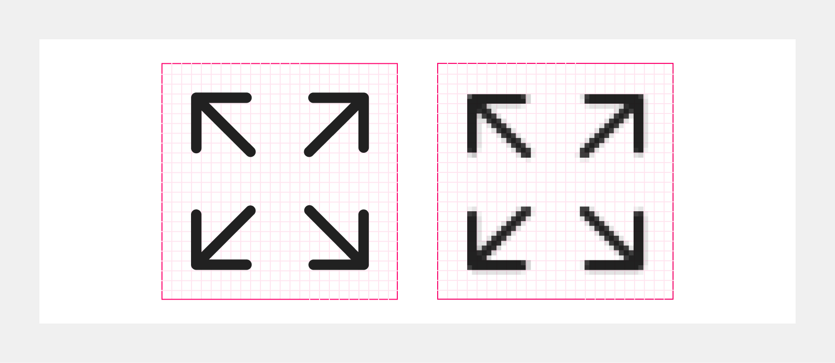
The icons are characterized by the fact that they have rounded corners but sharp corners on the inside. They are always positioned on a half-pixel grid to ensure they work at a minimum of @2x resolution. To ensure visual consistency between the icon 100 and the icon 50, the icon 100 has a line thickness of 1px at a size of 24×24px, and the icon 50 has a line thickness of 1px at a size of 12×12px. Most icons are designed within a square canvas and with protective padding around the edges to ensure safe spacing within the canvas.
HTML
<div style="display:flex;justify-content:center;padding:16px 0">
<oc-icon-v1 type="inplace-zoom" style="width:12rem;height:12rem"></oc-icon-v1>
HTML
<div style="display:flex;flex-wrap:wrap;justify-content:center;align-items:flex-end;gap:40px 72px;padding:8px 0;color:#f06;font:0.875rem/1.25rem ui-monospace,SFMono-Regular,Menlo,monospace">
<div style="display:grid;grid-template-columns:auto auto;gap:8px 12px;align-items:center">
  <span style="grid-column:1;justify-self:center;margin-bottom:16px">icon50</span><span></span>
  <span style="grid-column:1;display:flex;flex-direction:column;gap:2px;width:10px;align-items:flex-start;font-size:0.75rem">1px<span style="width:10px;height:6px;border:1px solid #f06;border-top:0;border-bottom:0;background:linear-gradient(#f06,#f06) center/100% 1px no-repeat"></span></span><span></span>
  <div style="position:relative;width:120px;height:120px;box-sizing:border-box;border:1px solid #f06;background:linear-gradient(var(--oc-semantic-color-background-canvas,#fff),var(--oc-semantic-color-background-canvas,#fff)) center/100px 100px no-repeat,rgba(255,0,102,.12)"><div style="position:absolute;inset:0;background-image:linear-gradient(to right,rgba(255,0,102,.28) 1px,transparent 1px),linear-gradient(to bottom,rgba(255,0,102,.28) 1px,transparent 1px);background-size:10px 10px"></div><oc-icon-v1 type="inplace-zoom" size="50" style="position:absolute;inset:-1px;width:120px;height:120px;color:var(--oc-semantic-color-text-default)"></oc-icon-v1></div>
  <div style="height:120px;display:flex;align-items:center;gap:6px"><span style="width:7px;height:100%;border:1px solid #f06;border-left:0;border-right:0;background:linear-gradient(#f06,#f06) center/1px 100% no-repeat"></span><span style="writing-mode:vertical-rl;transform:rotate(180deg)">12px</span></div>
  <div style="display:flex;flex-direction:column;align-items:center;gap:4px"><span style="width:120px;height:7px;border:1px solid #f06;border-top:0;border-bottom:0;background:linear-gradient(#f06,#f06) center/100% 1px no-repeat"></span>12px</div><span></span>
<div style="display:grid;grid-template-columns:auto auto;gap:8px 12px;align-items:center">
  <span style="grid-column:1;justify-self:center;margin-bottom:16px">icon100</span><span></span>
  <span style="grid-column:1;display:flex;flex-direction:column;gap:2px;width:30px;align-items:flex-start;font-size:0.75rem">3px<span style="width:30px;height:6px;border:1px solid #f06;border-top:0;border-bottom:0;background:linear-gradient(#f06,#f06) center/100% 1px no-repeat"></span></span><span></span>
  <div style="position:relative;width:240px;height:240px;box-sizing:border-box;border:1px solid #f06;background:linear-gradient(var(--oc-semantic-color-background-canvas,#fff),var(--oc-semantic-color-background-canvas,#fff)) center/180px 180px no-repeat,rgba(255,0,102,.12)"><div style="position:absolute;inset:0;background-image:linear-gradient(to right,rgba(255,0,102,.28) 1px,transparent 1px),linear-gradient(to bottom,rgba(255,0,102,.28) 1px,transparent 1px);background-size:10px 10px"></div><oc-icon-v1 type="inplace-zoom" style="position:absolute;inset:-1px;width:240px;height:240px;color:var(--oc-semantic-color-text-default)"></oc-icon-v1></div>
  <div style="height:240px;display:flex;align-items:center;gap:6px"><span style="width:7px;height:100%;border:1px solid #f06;border-left:0;border-right:0;background:linear-gradient(#f06,#f06) center/1px 100% no-repeat"></span><span style="writing-mode:vertical-rl;transform:rotate(180deg)">24px</span></div>
  <div style="display:flex;flex-direction:column;align-items:center;gap:4px"><span style="width:240px;height:7px;border:1px solid #f06;border-top:0;border-bottom:0;background:linear-gradient(#f06,#f06) center/100% 1px no-repeat"></span>24px</div><span></span>
Best practices
- Über uns
Nachhaltigkeit Unternehmen Compliance Presse Jobs
Über uns Nachhaltigkeit Unternehmen Compliance Presse Jobs
Accessibility
To ensure that icons scale properly when text size is increased, icons are implemented using rem instead of px. Rem is a scalable and relative size unit for text. When scaled to 100%, 1rem is equal to 16px.
HTML
<div style="display:flex;flex-wrap:wrap;justify-content:center;align-items:flex-end;gap:40px 72px;padding:8px 0;color:#f06;font:0.875rem/1.25rem ui-monospace,SFMono-Regular,Menlo,monospace">
<div style="display:grid;grid-template-columns:auto auto;gap:8px 12px;align-items:center">
  <span style="grid-column:1;justify-self:center;margin-bottom:16px">icon50</span><span></span>
  <div style="position:relative;width:120px;height:120px;background:linear-gradient(var(--oc-semantic-color-background-canvas,#fff),var(--oc-semantic-color-background-canvas,#fff)) center/100px 100px no-repeat,rgba(255,0,102,.12)"><oc-icon-v1 type="inplace-zoom" size="50" style="position:absolute;inset:0;width:120px;height:120px;color:var(--oc-semantic-color-text-default)"></oc-icon-v1></div>
  <div style="height:120px;display:flex;align-items:center;gap:6px"><span style="width:7px;height:100%;border:1px solid #f06;border-left:0;border-right:0;background:linear-gradient(#f06,#f06) center/1px 100% no-repeat"></span><span style="writing-mode:vertical-rl;transform:rotate(180deg)">0.75rem</span></div>
  <div style="display:flex;flex-direction:column;align-items:center;gap:4px"><span style="width:120px;height:7px;border:1px solid #f06;border-top:0;border-bottom:0;background:linear-gradient(#f06,#f06) center/100% 1px no-repeat"></span>0.75rem</div><span></span>
<div style="display:grid;grid-template-columns:auto auto;gap:8px 12px;align-items:center">
  <span style="grid-column:1;justify-self:center;margin-bottom:16px">icon100</span><span></span>
  <div style="position:relative;width:240px;height:240px;background:linear-gradient(var(--oc-semantic-color-background-canvas,#fff),var(--oc-semantic-color-background-canvas,#fff)) center/180px 180px no-repeat,rgba(255,0,102,.12)"><oc-icon-v1 type="inplace-zoom" style="position:absolute;inset:0;width:240px;height:240px;color:var(--oc-semantic-color-text-default)"></oc-icon-v1></div>
  <div style="height:240px;display:flex;align-items:center;gap:6px"><span style="width:7px;height:100%;border:1px solid #f06;border-left:0;border-right:0;background:linear-gradient(#f06,#f06) center/1px 100% no-repeat"></span><span style="writing-mode:vertical-rl;transform:rotate(180deg)">1.5rem</span></div>
  <div style="display:flex;flex-direction:column;align-items:center;gap:4px"><span style="width:240px;height:7px;border:1px solid #f06;border-top:0;border-bottom:0;background:linear-gradient(#f06,#f06) center/100% 1px no-repeat"></span>1.5rem</div><span></span>
In order to improve accessibility, it is also important to use a label with an icon. Icons with a label should not have an aria label to avoid duplication when read aloud by a screen reader.
If the icon does not have a label, you must use an aria label, e.g., icon button.
When writing an aria label for an icon, keep the following in mind:
- Keep it descriptive and concise.
- For purely decorative icons, it is often best to have an empty aria label so that screen readers ignore it.
- Avoid redundancies such as “icon”, since the screen reader typically already declares the type of element.
How to use icons
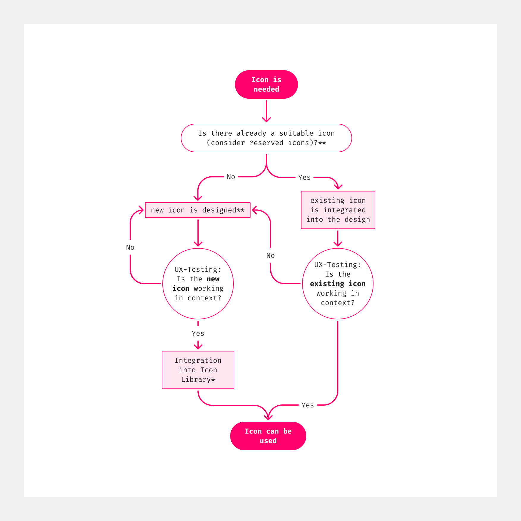
For help during this step, get in touch with a UXDFor help during this step, get in touch with our icon designer*
For using icons, designers can utilize the icon library in Figma and developers can implement icons from Storybook.
- Figma Icon Library: for designers
- Storybook Icon Overview: for developers
Status
Implementation
Note: For full technical documentation of icons, visit Storybook/Icons.