
Overview
Adaptive Breakpoints
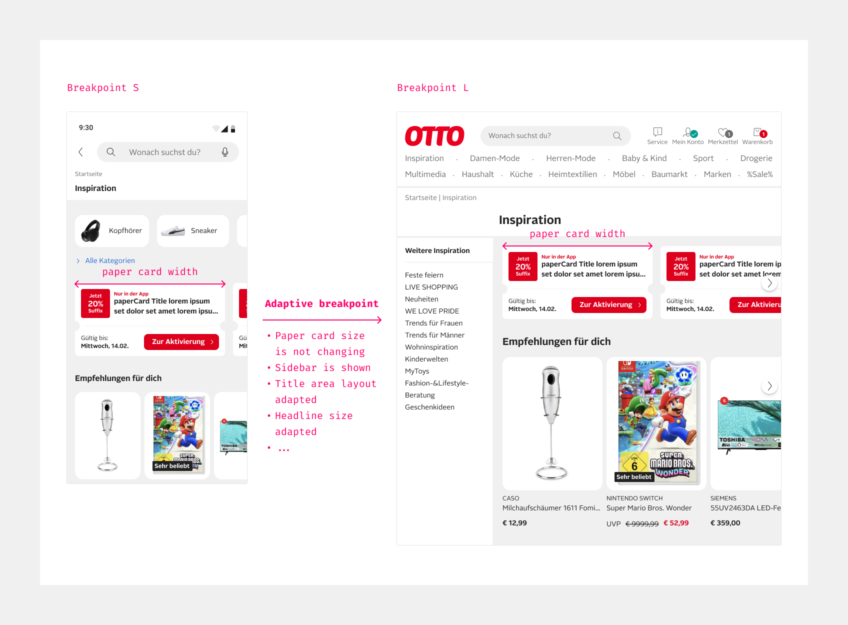
A breakpoint at OTTO is a specific screen width at which the layout or styling of a page changes adaptively to better fit the width of the viewport. The following breakpoint system is designed to ensure adaptive behavior at OTTO.
The breakpoint system is pixel-based and implemented using rem. In the default size, 1rem is equal to 16px. The breakpoint system consists of the following steps.
Adjustments based on the breakpoints should react dynamically to changes in the viewport throughout runtime. This means that layout decisions are not only made when the page loads, but the view also reacts to browser resizing or orientation changes.
Minimum
360px/22.5rem
Minor
448px/28rem
Major
768px/48rem
Minor
992px/62rem
Maximum
1232px/77rem
HTML
<div style="padding:16px 0;font-family:ui-monospace,SFMono-Regular,Menlo,monospace">
<div style="display:grid;grid-template-columns:0.45fr repeat(5,minmax(0,1fr));row-gap:12px;align-items:center">
  <span></span>
  <div><div style="display:inline-block;transform:translateX(-50%);text-align:center;white-space:nowrap"><p style="font-size:1.0625rem;line-height:1.5rem;font-weight:700">Minimum</p><p style="font-size:0.75rem;line-height:1rem;font-weight:700;color:var(--oc-semantic-color-text-brand)">360px/22.5rem</p></div></div>
  <div><div style="display:inline-block;transform:translateX(-50%);text-align:center;white-space:nowrap"><p style="font-size:1.0625rem;line-height:1.5rem">Minor</p><p style="font-size:0.75rem;line-height:1rem;color:var(--oc-semantic-color-text-brand)">448px/28rem</p></div></div>
  <div><div style="display:inline-block;transform:translateX(-50%);text-align:center;white-space:nowrap"><p style="font-size:1.0625rem;line-height:1.5rem;font-weight:700">Major</p><p style="font-size:0.75rem;line-height:1rem;font-weight:700;color:var(--oc-semantic-color-text-brand)">768px/48rem</p></div></div>
  <div><div style="display:inline-block;transform:translateX(-50%);text-align:center;white-space:nowrap"><p style="font-size:1.0625rem;line-height:1.5rem">Minor</p><p style="font-size:0.75rem;line-height:1rem;color:var(--oc-semantic-color-text-brand)">992px/62rem</p></div></div>
  <div><div style="display:inline-block;transform:translateX(-50%);text-align:center;white-space:nowrap"><p style="font-size:1.0625rem;line-height:1.5rem;font-weight:700">Maximum</p><p style="font-size:0.75rem;line-height:1rem;font-weight:700;color:var(--oc-semantic-color-text-brand)">1232px/77rem</p></div></div>
  <div style="grid-column:1/-1;position:relative;height:22px;display:grid;grid-template-columns:subgrid;align-items:center">
    <span style="position:absolute;left:0;right:0;top:10px;height:2px;background:var(--oc-semantic-color-background-brand)"></span>
    <span style="position:absolute;left:0;top:6px;width:8px;height:8px;border-left:2px solid var(--oc-semantic-color-background-brand);border-bottom:2px solid var(--oc-semantic-color-background-brand);transform:rotate(45deg)"></span>
    <span style="position:absolute;right:0;top:6px;width:8px;height:8px;border-right:2px solid var(--oc-semantic-color-background-brand);border-top:2px solid var(--oc-semantic-color-background-brand);transform:rotate(45deg)"></span>
    <span></span>
    <span style="position:relative;justify-self:start;width:18px;height:18px;margin-left:-9px;box-sizing:border-box;border-radius:50%;border:3px solid var(--oc-semantic-color-background-brand);background:var(--oc-semantic-color-background-canvas)"></span>
    <span style="position:relative;justify-self:start;width:12px;height:12px;margin-left:-6px;border-radius:50%;background:var(--oc-semantic-color-background-brand)"></span>
    <span style="position:relative;justify-self:start;width:20px;height:20px;margin-left:-10px;border-radius:50%;background:var(--oc-semantic-color-background-brand)"></span>
    <span style="position:relative;justify-self:start;width:12px;height:12px;margin-left:-6px;border-radius:50%;background:var(--oc-semantic-color-background-brand)"></span>
    <span style="position:relative;justify-self:start;width:18px;height:18px;margin-left:-9px;box-sizing:border-box;border-radius:50%;border:3px solid var(--oc-semantic-color-background-brand);background:var(--oc-semantic-color-background-canvas)"></span>
  <span></span>
  <span style="display:flex;align-items:center;justify-content:center;gap:10px;height:52px;margin:0 4px 0 8px;border-radius:26px;font-size:1.25rem;color:var(--oc-base-color-white-100);background:var(--oc-semantic-color-background-brand)">S <oc-icon-v1 type="phone"></oc-icon-v1></span>
  <span style="display:flex;align-items:center;justify-content:center;gap:10px;height:52px;margin:0 4px;border-radius:26px;font-size:1.25rem;background:var(--oc-semantic-color-background-soft-warm-red)">M <oc-icon-v1 type="phone" style="transform:rotate(90deg)"></oc-icon-v1></span>
  <span style="display:flex;align-items:center;justify-content:center;gap:10px;height:52px;margin:0 4px;border-radius:26px;font-size:1.25rem;background:var(--oc-semantic-color-background-soft-warm-red)">L <oc-icon-v1 type="tablet"></oc-icon-v1></span>
  <span style="display:flex;align-items:center;justify-content:center;gap:10px;height:52px;margin:0 4px;border-radius:26px;font-size:1.25rem;background:var(--oc-semantic-color-background-soft-warm-red)">XL <oc-icon-v1 type="laptop"></oc-icon-v1></span>
  <span style="display:flex;align-items:center;justify-content:center;gap:10px;height:52px;margin:0 16px 0 4px;border-radius:26px;font-size:1.25rem;background:var(--oc-semantic-color-background-soft-warm-red)">XXL <oc-icon-v1 type="desktop"></oc-icon-v1></span>
Each breakpoint has different impacts on the layout of the page:
- Minimum (360px/22.5rem): The page does not have to function below this limit.
- Maximum (1232px/77rem): Above this limit, the layout will no longer adjust proportionally, but the left and right margins will increase.
- Major breakpoint (768px/48rem): Fundamental changes to the layout and behavior of the page will be applied.
- Minor breakpoints (448px/28rem and 992px/62rem): Makes minor changes, such as adjusting the layout or displaying advertising.
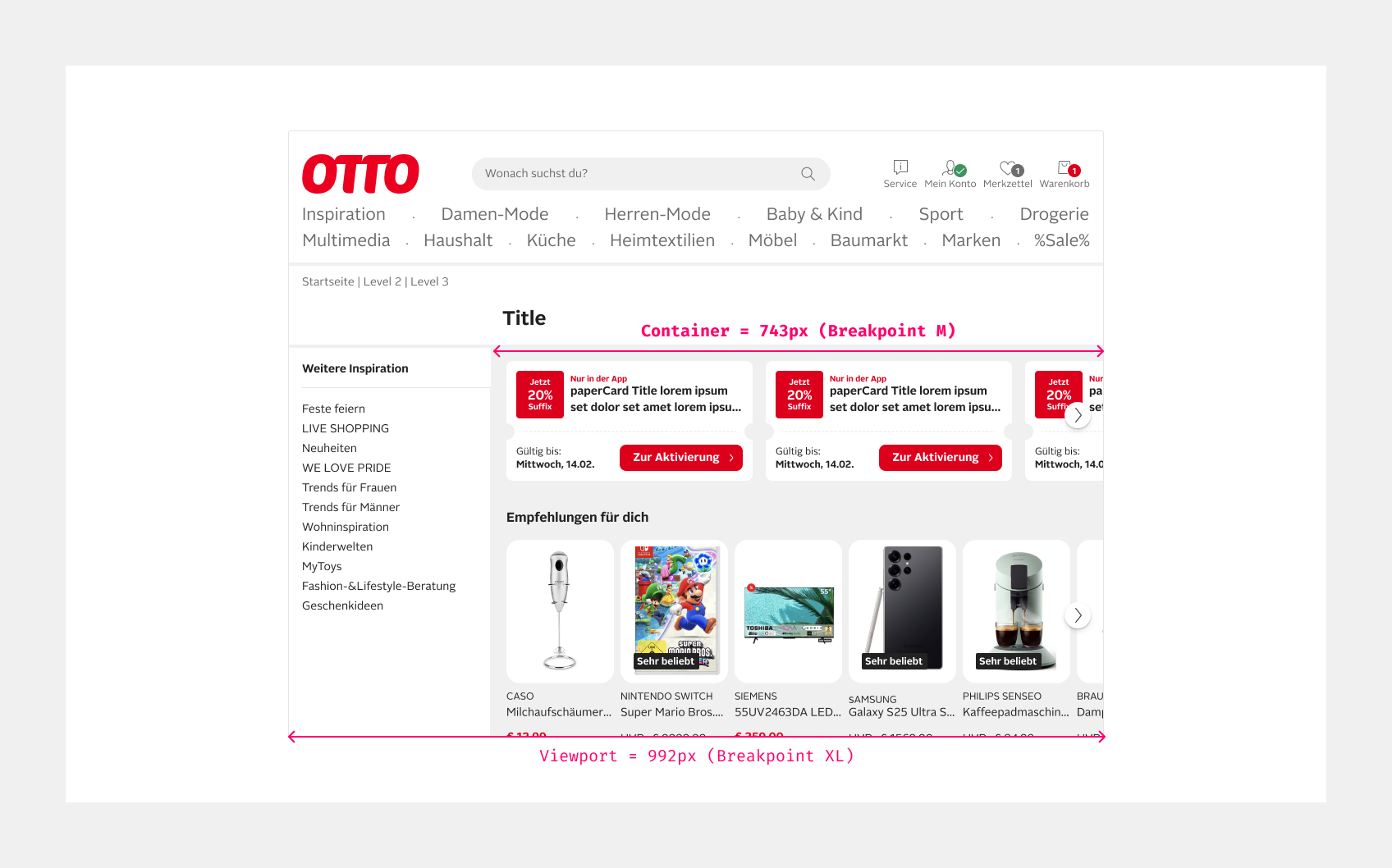
Note, that breakpoint classes provided by the Design System are container-based rather than viewport-based. This is unusual and a rather modern approach. It provides the opportunity to react on the actual width of a container, e.g. the main content container. If a sidebar narrows the width of the main content, this content will still be optimized for the smaller main container, respecting its actual size.
Responsive Behavior
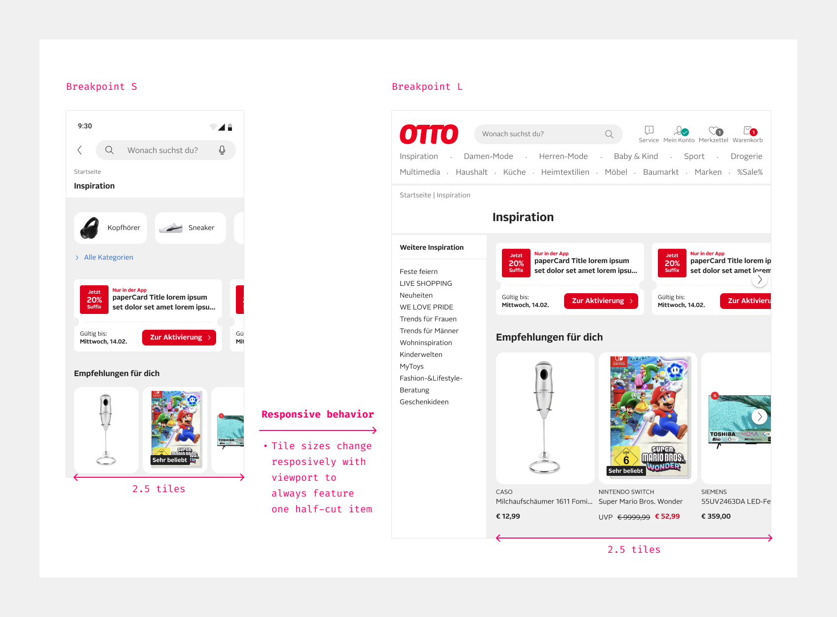
Apart from adaptive breakpoint adjustments, content adjusts dynamically to the respective available space. This may apply when using the grid system to place items next to each other or when the widths of items in a cinema is calculated to always cut the last visible item.
Again, responsive layouts should react dynamically to changes in the viewport throughout runtime, not just initially on pageload.
Mobile first and default resolutions
The OTTO Design System is based on the Mobile First approach due to the fact that the growing majority of OTTO users access the website via mobile devices. Therefore, the conception for the mobile touchpoints (Mobile Web, Android App and iOS App) should be based on the following resolutions:
HTML
<div style="display:flex;justify-content:center;align-items:center;gap:40px;padding:16px 0;font:400 0.875rem/1.25rem ui-monospace,SFMono-Regular,Menlo,monospace">
<div style="width:180px;height:400px;box-sizing:border-box;border:3px solid var(--oc-semantic-color-background-brand);border-radius:28px;display:flex;flex-direction:column;align-items:center;padding:16px">
  <div style="flex:1;display:flex;flex-direction:column;justify-content:center;align-items:center;gap:28px;text-align:center">
<oc-icon-v1 type="globe" style="color:var(--oc-semantic-color-text-brand)"></oc-icon-v1><span>Mobile Web</span></div>
<oc-icon-v1 type="phone" style="color:var(--oc-semantic-color-text-brand)"></oc-icon-v1><span>Android App</span></div>
  <b style="color:var(--oc-semantic-color-text-brand)">360×800px/dp</b>
<div style="width:197px;height:426px;box-sizing:border-box;border:3px solid var(--oc-semantic-color-background-brand);border-radius:28px;display:flex;flex-direction:column;align-items:center;padding:16px">
  <div style="flex:1;display:flex;flex-direction:column;justify-content:center;align-items:center;text-align:center">
<oc-icon-v1 type="phone" style="color:var(--oc-semantic-color-text-brand)"></oc-icon-v1><span>iOS App</span></div>
  <b style="color:var(--oc-semantic-color-text-brand)">393×852pt</b>
Device Pixel Ratio
When we refer to "px" we mean logical pixels. It’s practical to understand that different devices come with various Device Pixel Ratios (DPR). The Device Pixel Ratio indicates how many physical (device) pixels are used to display one logical (CSS) pixels on the screen. For example, if a device has a DPR of 2, it means that each CSS pixel is made up of four physical pixels (2 pixels wide and 2 pixels high). Similar concepts exist in Android with density-independent pixels (dp) and in iOS with point (pt). They all are abstract concepts to provide consistent visual sizes of UI elements across different screen densities.
Since most of our users' displays (>80%) have a DPR of at least 2, we optimize visuals, e.g. icons, to be pixel-perfect down to half pixels.
HTML
<div style="display:flex;justify-content:center;align-items:flex-start;gap:24px;padding:16px 0;font-family:ui-monospace,SFMono-Regular,Menlo,monospace">
<span style="width:120px;height:120px;background:var(--oc-semantic-color-background-brand)"></span><b style="font-size:1.125rem">1:1</b></div>
<span style="width:120px;height:120px;display:grid;grid-template-columns:1fr 1fr;gap:3px"><span style="background:var(--oc-semantic-color-background-brand)"></span><span style="background:var(--oc-semantic-color-background-soft-warm-red)"></span><span style="background:var(--oc-semantic-color-background-soft-warm-red)"></span><span style="background:var(--oc-semantic-color-background-soft-warm-red)"></span></span><b style="font-size:1.125rem">2:1</b></div>
<span style="width:120px;height:120px;display:grid;grid-template-columns:repeat(3,1fr);gap:3px"><span style="background:var(--oc-semantic-color-background-soft-warm-red)"></span><span style="background:var(--oc-semantic-color-background-soft-warm-red)"></span><span style="background:var(--oc-semantic-color-background-brand)"></span><span style="background:var(--oc-semantic-color-background-soft-warm-red)"></span><span style="background:var(--oc-semantic-color-background-soft-warm-red)"></span><span style="background:var(--oc-semantic-color-background-soft-warm-red)"></span><span style="background:var(--oc-semantic-color-background-soft-warm-red)"></span><span style="background:var(--oc-semantic-color-background-soft-warm-red)"></span><span style="background:var(--oc-semantic-color-background-soft-warm-red)"></span></span><b style="font-size:1.125rem">3:1</b></div>
<div style="position:relative;width:170px;height:120px;font-size:0.8125rem;line-height:1rem;color:var(--oc-semantic-color-text-brand)">
  <span style="position:absolute;left:0;top:0;bottom:0;width:2px;background:var(--oc-semantic-color-background-brand)"></span>
  <span style="position:absolute;left:12px;top:0;height:38px;width:2px;background:var(--oc-semantic-color-background-brand)"></span>
  <b style="position:absolute;left:26px;top:11px;white-space:nowrap">1 physical pixel</b>
  <span style="position:absolute;left:26px;top:72px;white-space:nowrap">1 logical pixel</span>
Status
Implementation
Note: For full technical documentation of breakpoints, visit Storybook/Breakpoints.