

How OTTO and the Otto Group design their documents, read from the official annual reports and PDFs: embedded fonts, type sizes, text and area colours, grids and page layouts. Colour values are the values stored in the files; measurements come from the page coordinates (1 pt = 0.353 mm).
Two brands, two systems:
- Otto Group (holding): typeface Optimist (Newglyph), lowercase wordmark „otto group", red
#F00020, pastel panels, outline and solid headline pairs, thin red rules, red line illustrations. Landscape A4 reports. - OTTO (retailer): typeface OTTO Sans / OTTO Sans KO Black (Okay Type), the bold italic OTTO wordmark,
OTTO red
#EB001F(older files#F00020), service blue and petrol panels, heavy black headlines. Portrait A4 one-pagers.
Otto Group documents
Annual Report 2025/26 „Our future: powered by people and tech" (English and German, 233 pages)
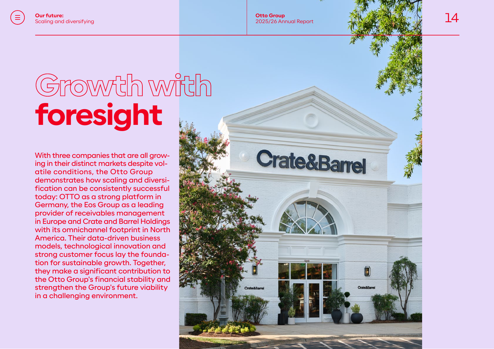
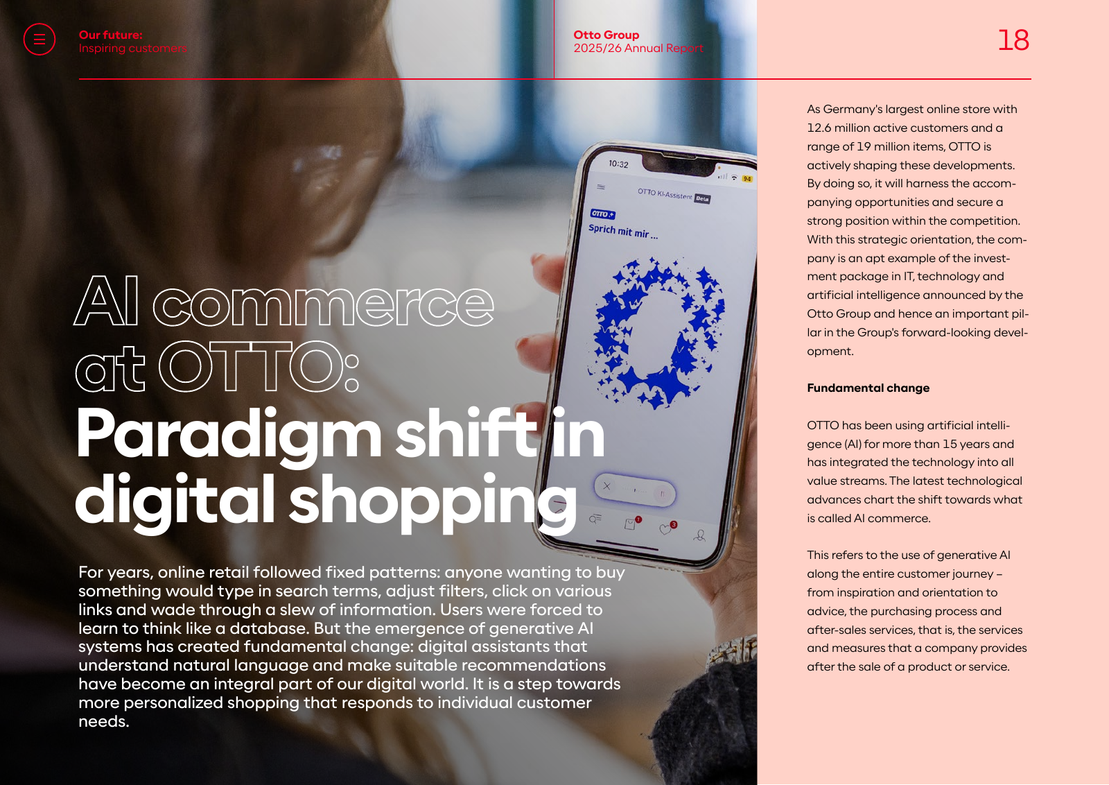
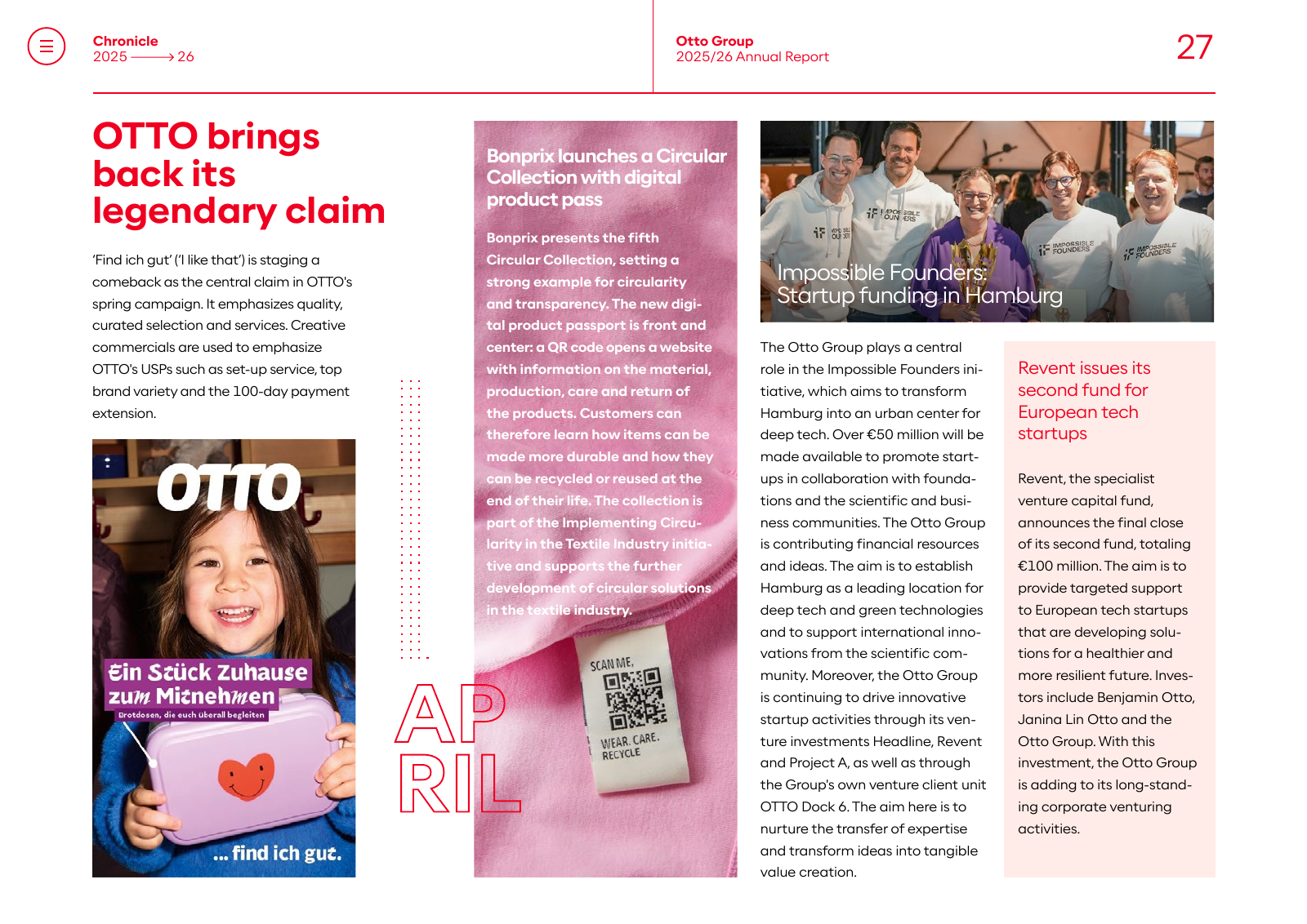
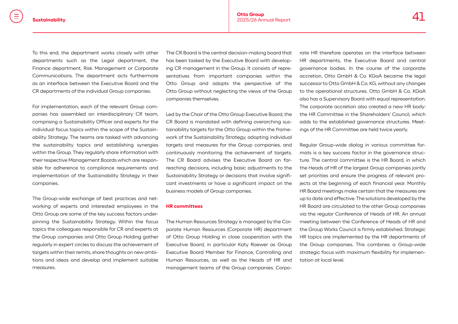
Sample pages: cover · key figures · contents · CEO letter · corporate overview · chapter opener · image opener · chronicle · text page · table in text · section opener „Figures" · financial table · notes opener

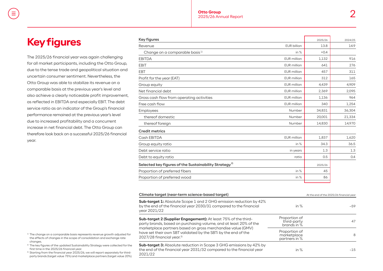
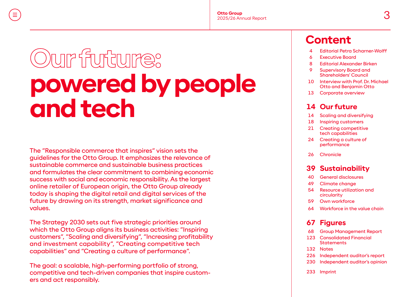
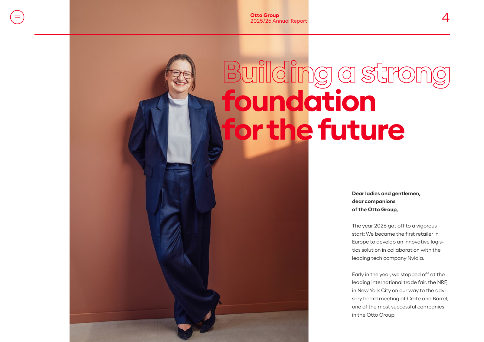
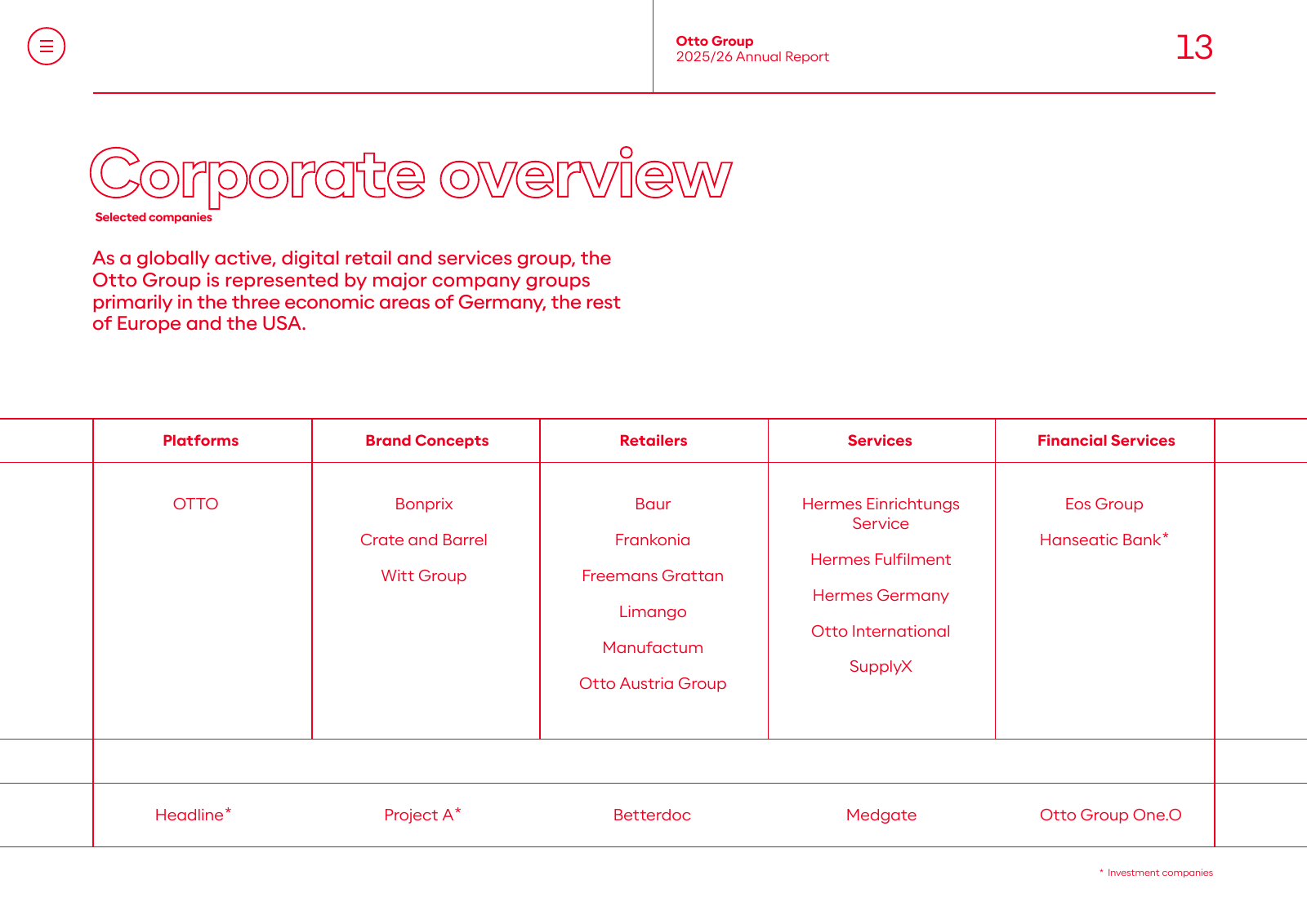
| Aspect | Observation |
|---|---|
| Format | A4 landscape, 297 × 210 mm (841.9 × 595.3 pt), laid out for screens first (clickable menu icon top left) |
| Typefaces (embedded) | OptimistPPT-Light (body, ~88 % of all characters), -Regular (12 pt intros), -Medium (table row labels), -Bold (headlines, subheads, emphasis). One Otto-brand exception: OTTOSans-Light in an OTTO section. No second family |
| Type sizes | body 8.5 pt Light, leading ≈ 14 pt; table text 8 pt, table figures 7 pt, footnotes 5.5–7 pt; intro/standfirst 12 pt Regular; page title 21 pt Bold; chapter headline 50 pt Bold; section opener 70 pt Bold; page number 21 pt Light |
| Colours (text) | body #191919, secondary #30302F, every headline, subhead, running head, page number and rule in red #F00020; white on photos; one purple accent #522EB8 |
| Colours (areas) | pastel full-bleed page panels: lilac #E7DAF9, salmon #FFD2C8, yellow #FFF59B, beige #F7F1E0 / #F5F0E1, peach #FFE0CE, pale yellow #FFFBD5; dark tones #444E57, #4B3666; black only behind photos |
| Grid and margins | outer margins 21 mm left and right (text from x = 59.5 pt), header rule at 21 mm from top; 3 text columns of ≈ 82 mm with 5 mm gutter; running head in two parts: section name left (Bold + Light, red), „Otto Group / 2025/26 Annual Report" from the page centre (x = 435.5 pt) with a thin vertical red rule, page number flush right; a full-width thin red rule under the head |
| Cover | full-bleed photo (Crate & Barrel store, New York, woman walking, yellow cab) under a magenta-to-orange gradient with a light network-line motif; white „otto group" wordmark top left; year and „Annual Report" small in Light; title in two voices: „Our future:" as white outline text, „powered by people and tech" in white Bold |
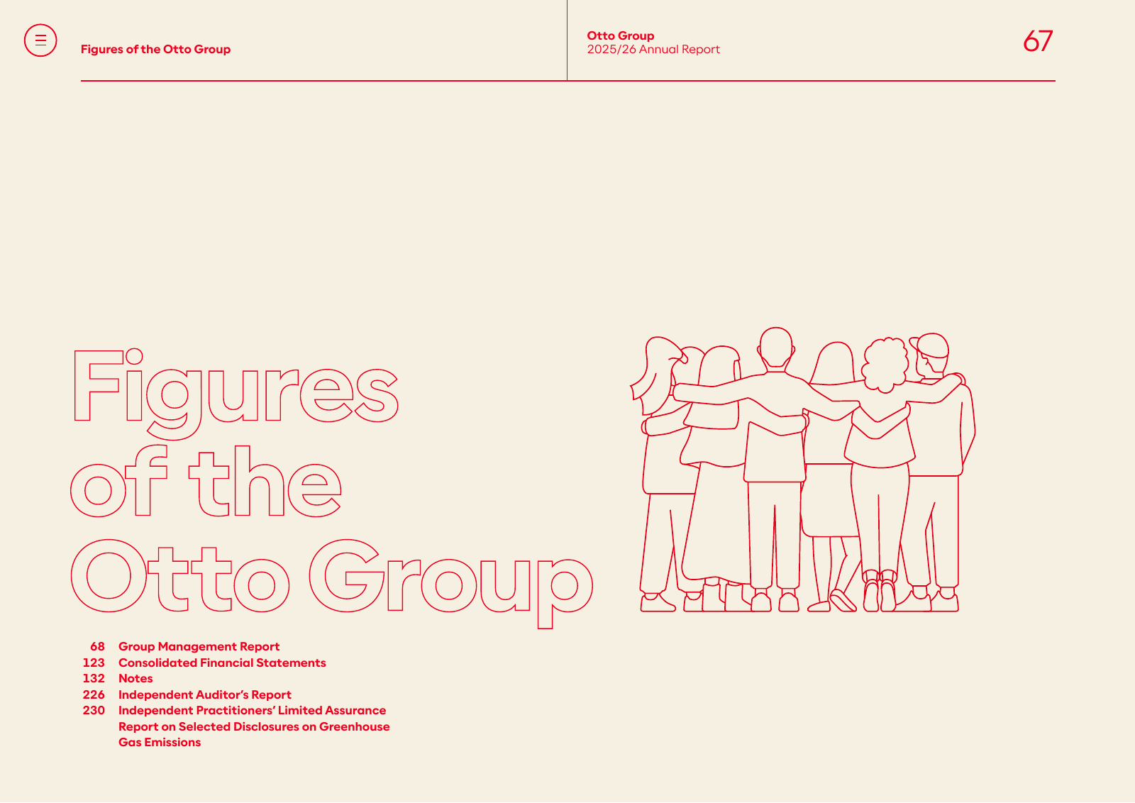
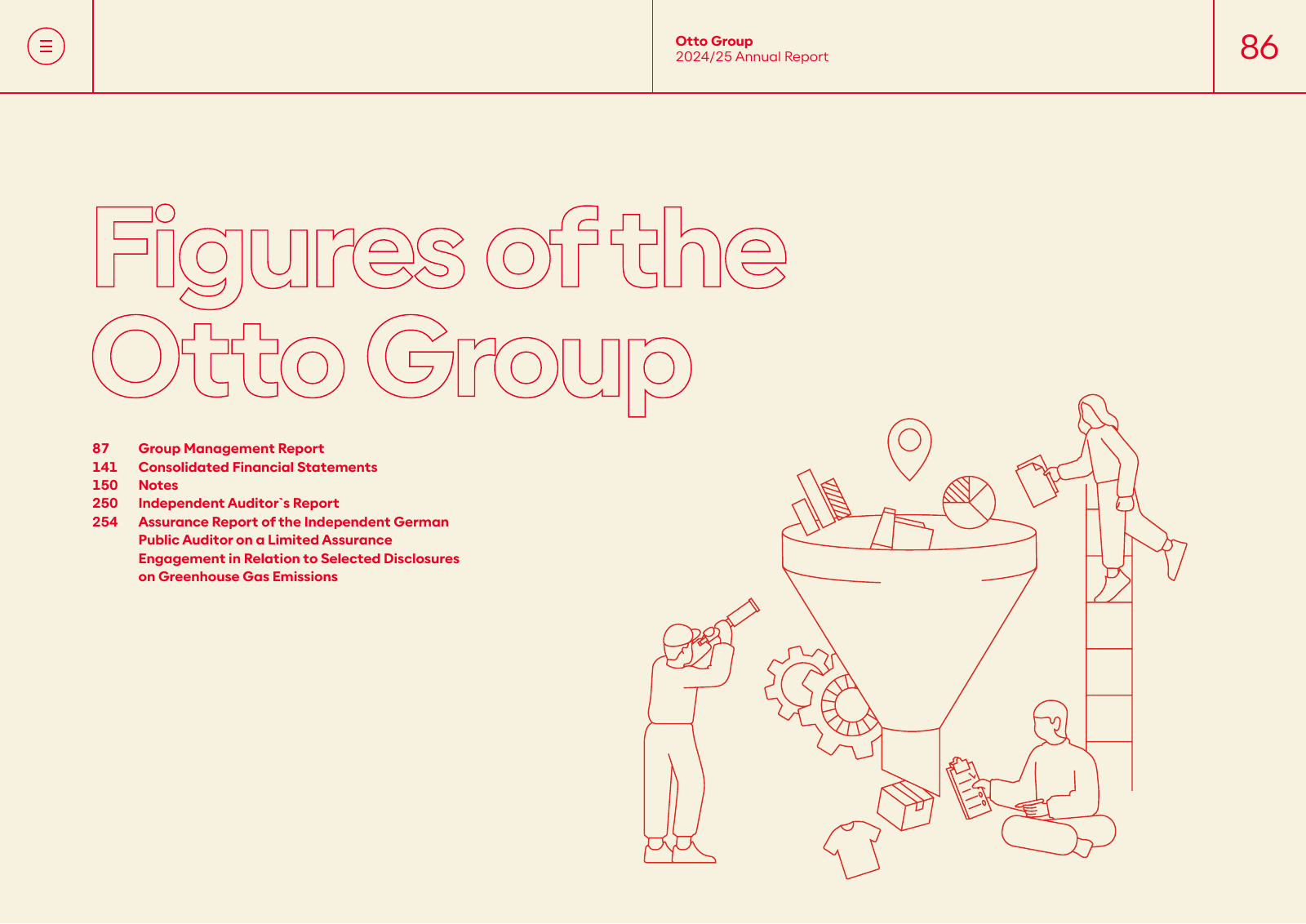
| Headline style | the signature device: first line as red outline (stroke only), second line solid red Bold, both in Optimist, sentence case, tight leading, left-aligned (e.g. „Growth with / foresight", „Figures of the Otto Group" fully outlined) |
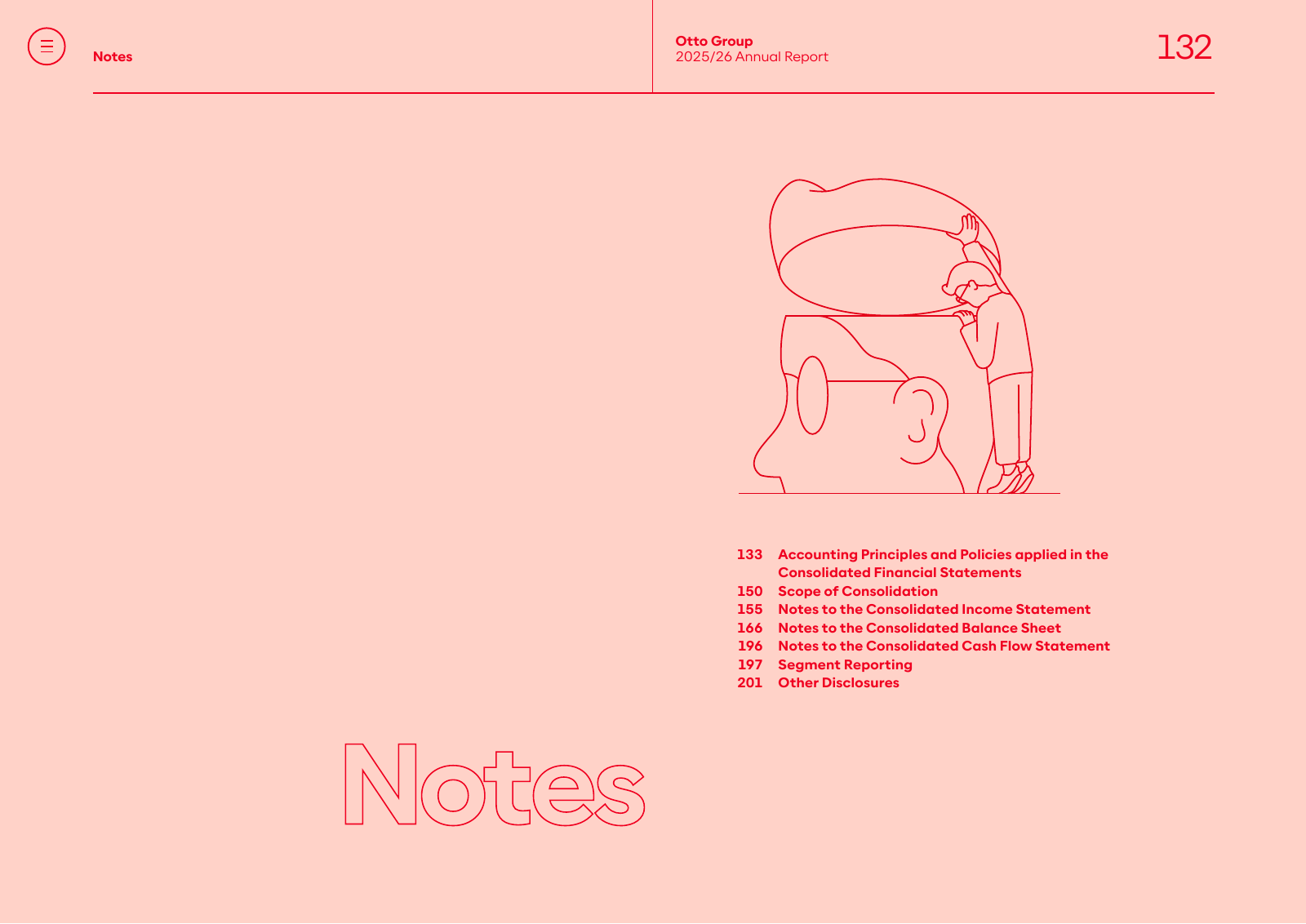
| Chapter openers | pastel full-page colour, outline and solid headline, 12 pt red intro, and either a large photo on half the spread or a thin red line illustration of people (continuous stroke, no fill) |
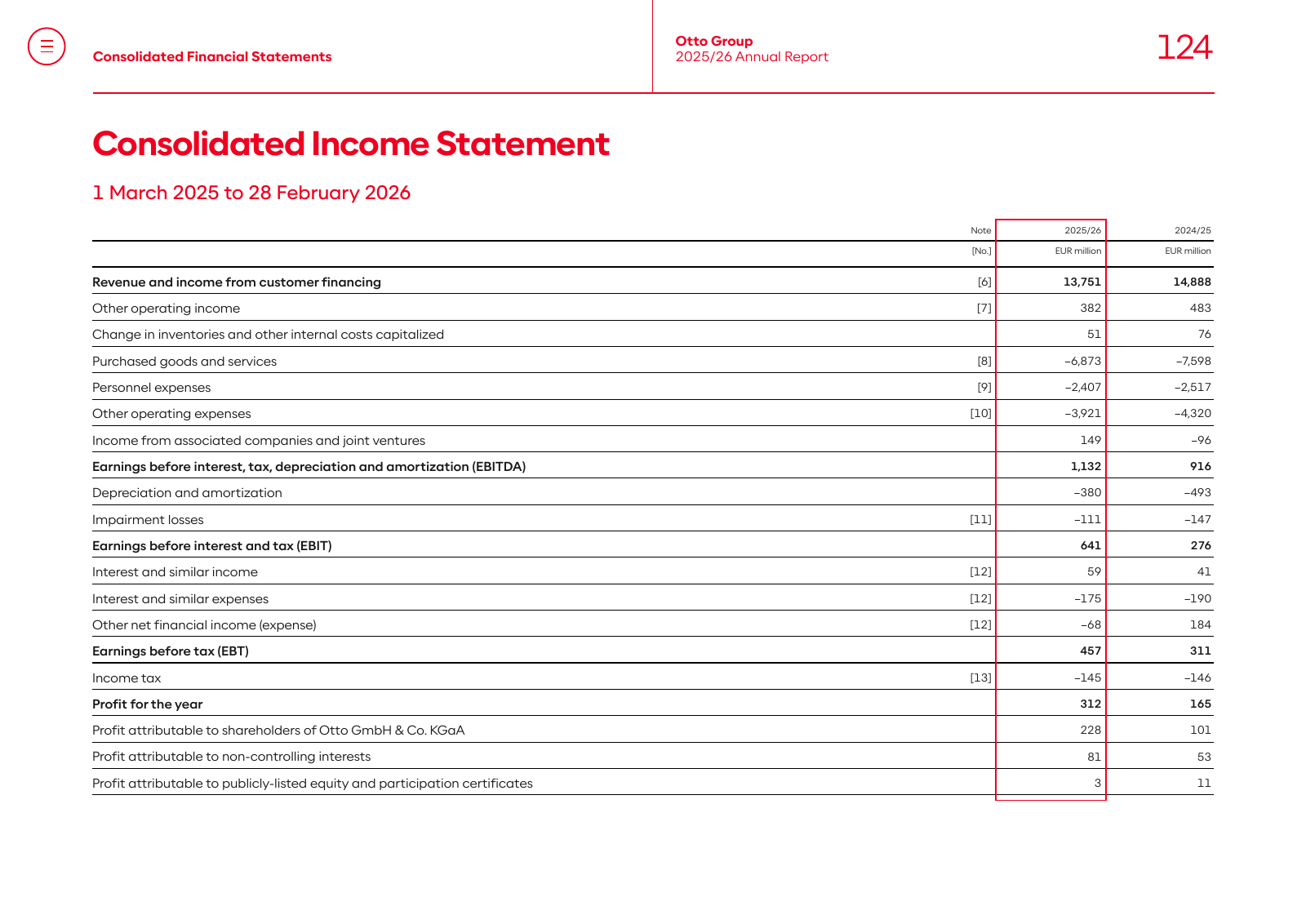
| Tables | no fills or zebra; thin black horizontal rules per row, heavier rule under the header; current year column framed by a red rectangle; labels in Medium 8 pt, figures right-aligned 7–8 pt, units „EUR million" in 5.5 pt above the columns; bold rows for subtotals |
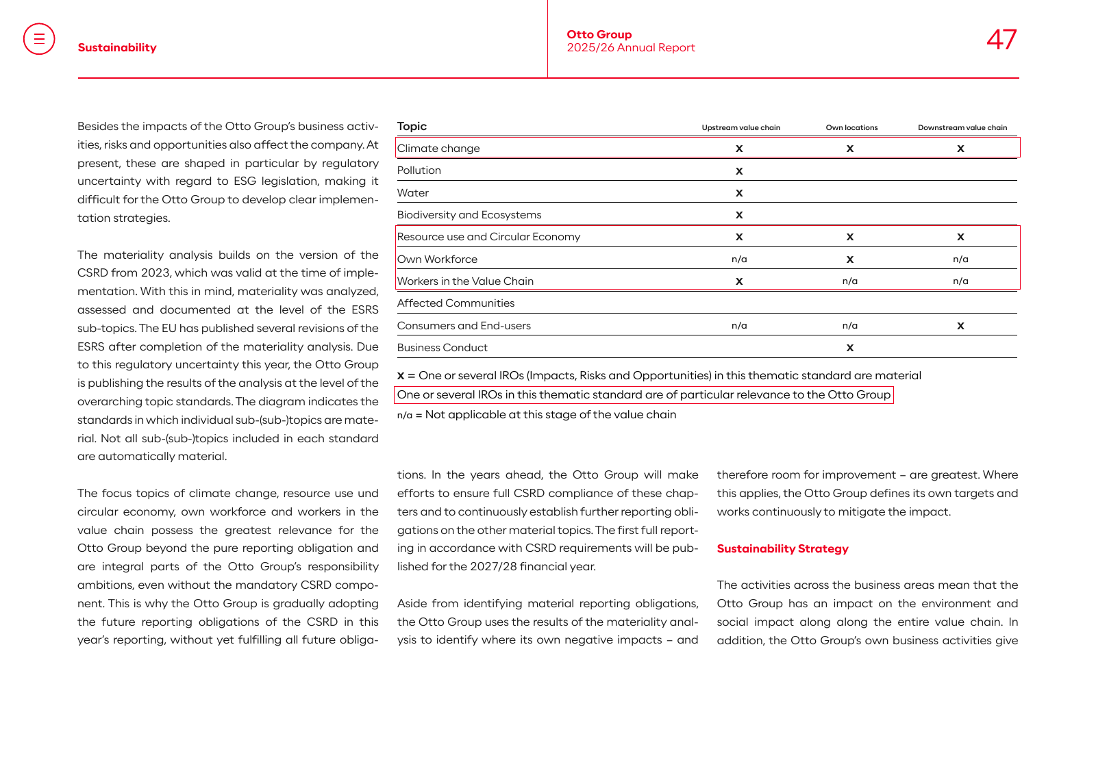
| Charts | few; key figures are tables. Where highlighted, a red outline box marks the relevant rows (materiality table p. 47) |
| Photography | documentary-editorial: real executives in offices and stores, warm light, shallow depth of field, full-bleed or half-page, no cut-outs; portraits of board members in dark business casual against warm walls |
| Logo | only on the cover (white, top left, ≈ 60 mm wide). Inside pages carry the name as text in the running head, never the logo |
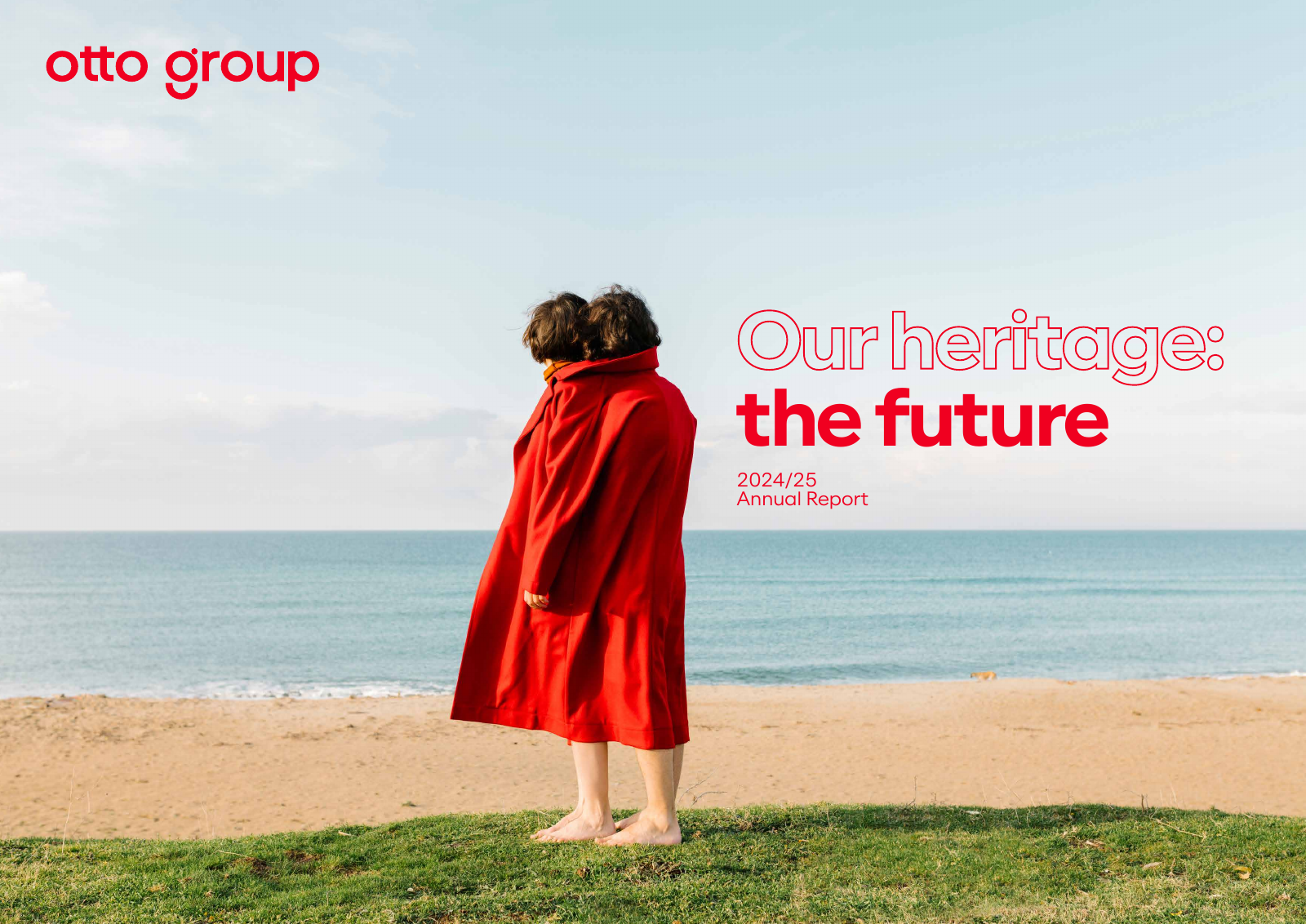
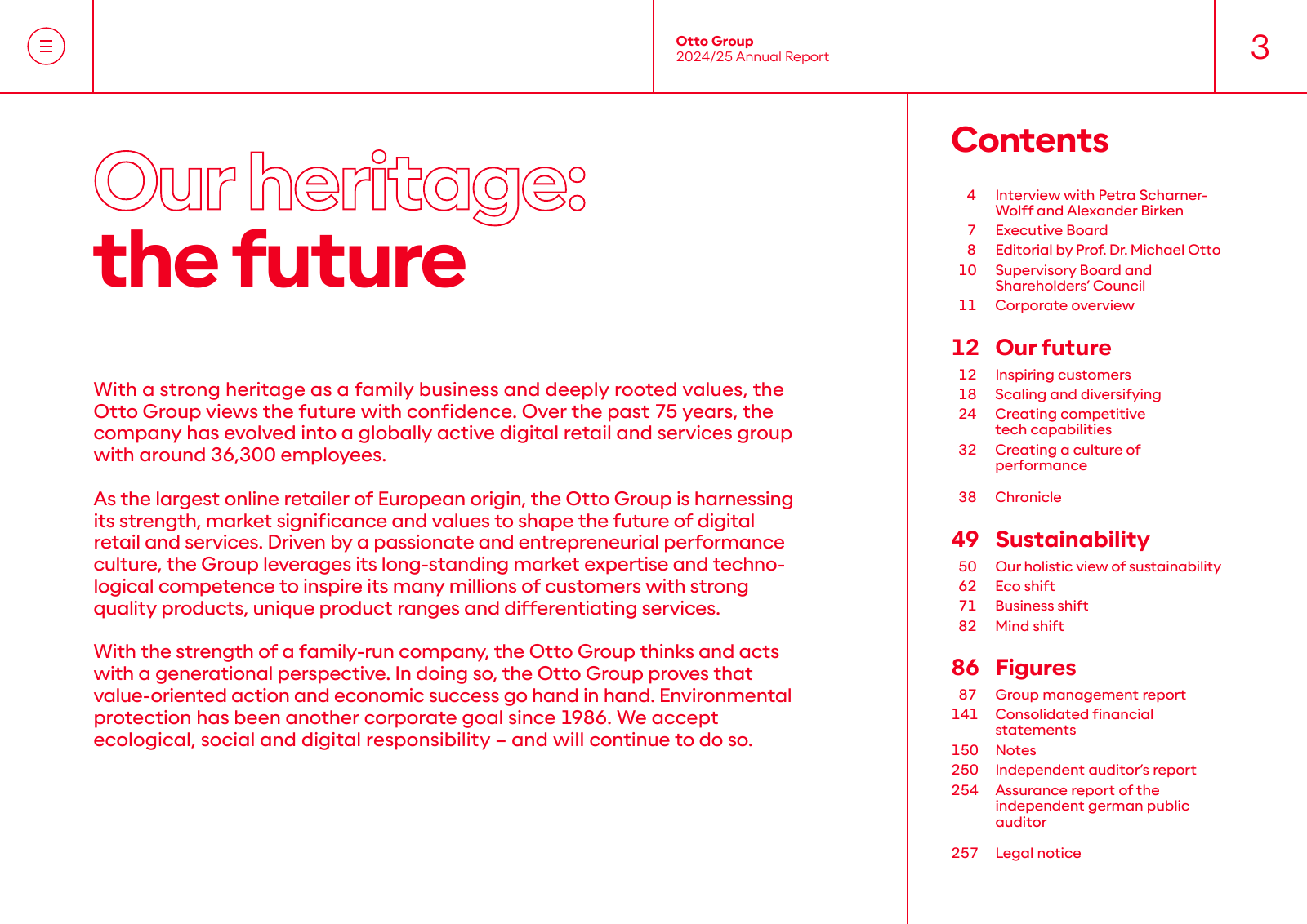
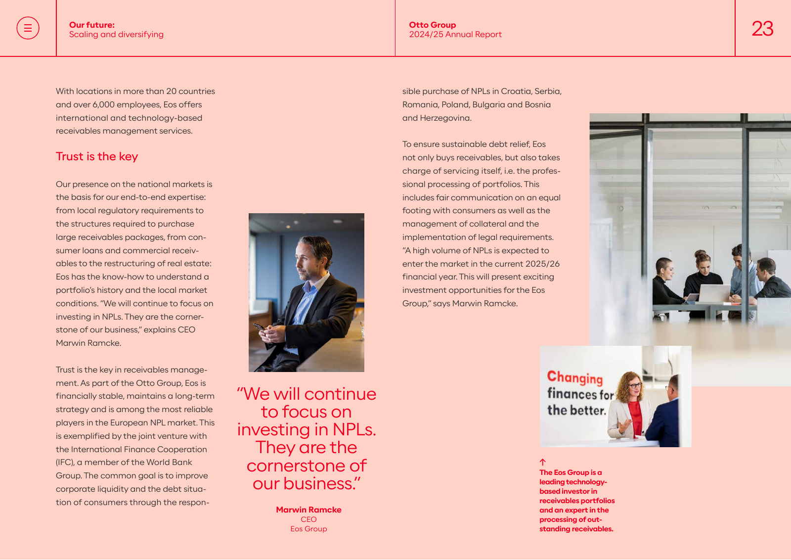
Annual Report 2024/25 „Our heritage: the future" (257 pages)
Same system as 2025/26 (Optimist Light/Regular/Medium/Bold, #F00020, #191919, same pastel panels, same grid,
running head and outline and solid headline pair). Cover: woman in a red coat on a beach, photo full-bleed without
gradient. More red line illustrations (robots, people, hands) than in 2025/26. Pages:
cover,
contents,
opener,
figures opener.
The German edition also embeds an Arial Black glyph set, a stray rather than a design choice.
ESG Fact Sheet 2026 (10 pages) and Sustainability part 2025/26 (29 pages)
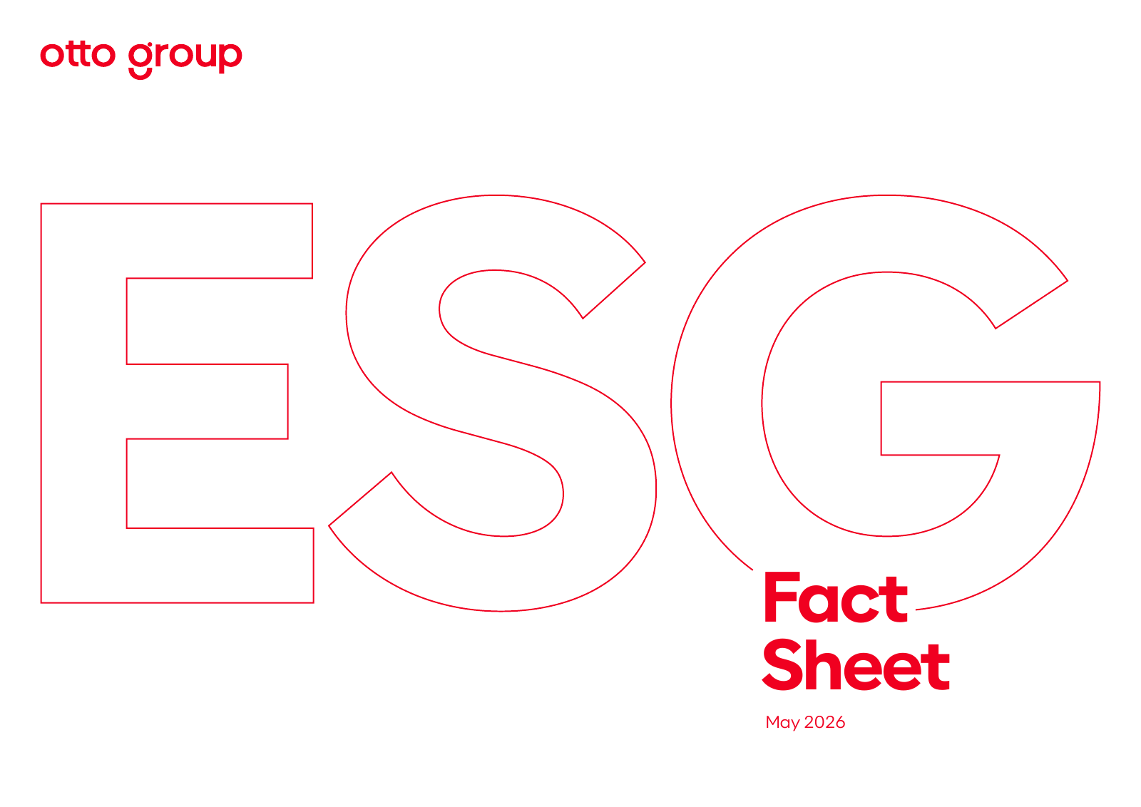
Same fonts and grid. ESG cover: white page, „otto group"
wordmark in red top left, giant red outline letters „ESG" as background, „Fact Sheet" in solid red Bold. Inner pages
are dense tables on white, red outline boxes for highlights. Sustainability part uses yellow #FFF59B for its opener.
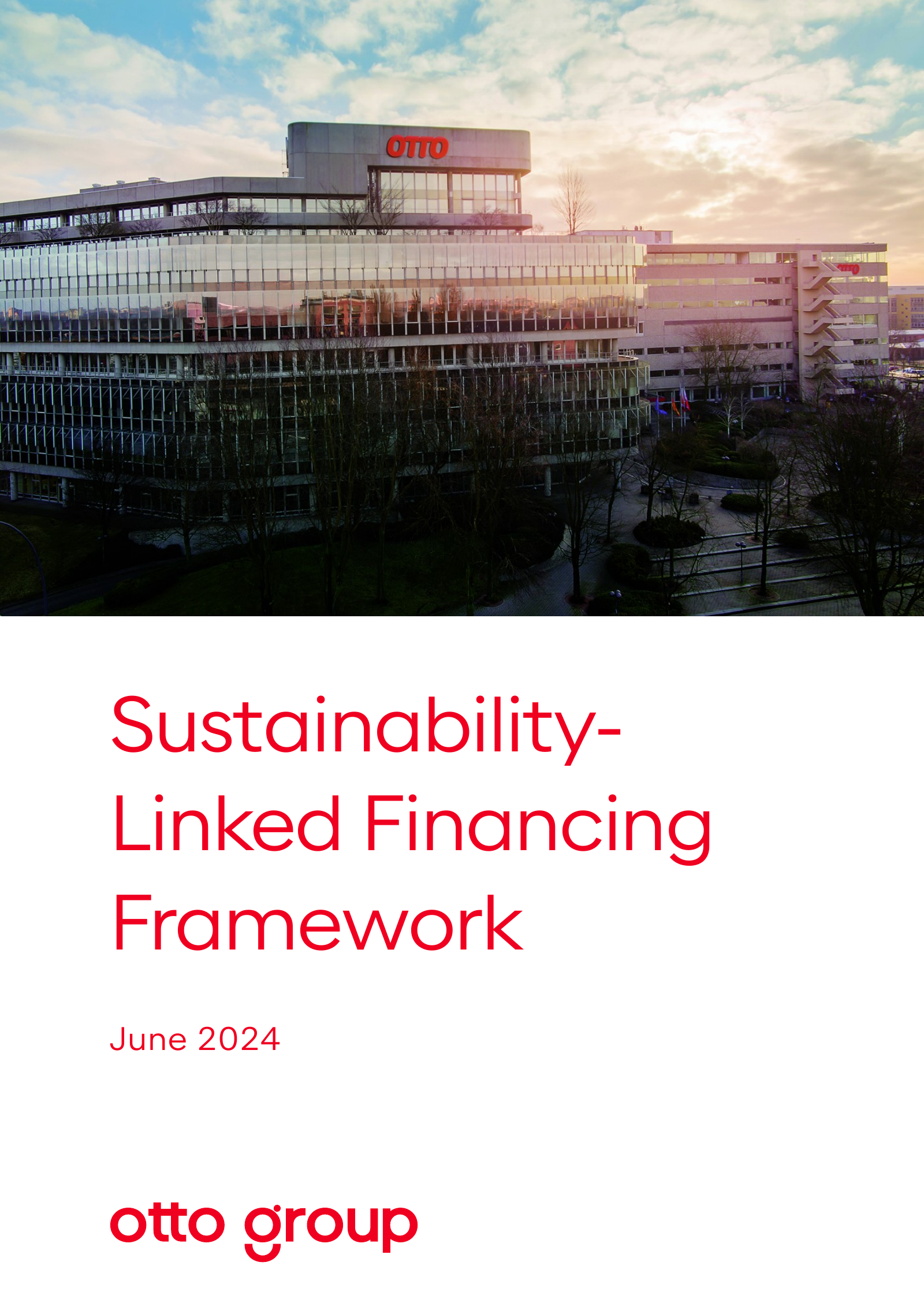
Sustainability-Linked Financing Framework 2024 (28 pages)
Word document using the corporate font as OptimistPPT (the Office version of Optimist) at 10 pt Light, red
#F00020 headings, #191919 body. Shows how an Office-produced document stays on brand:
p1.
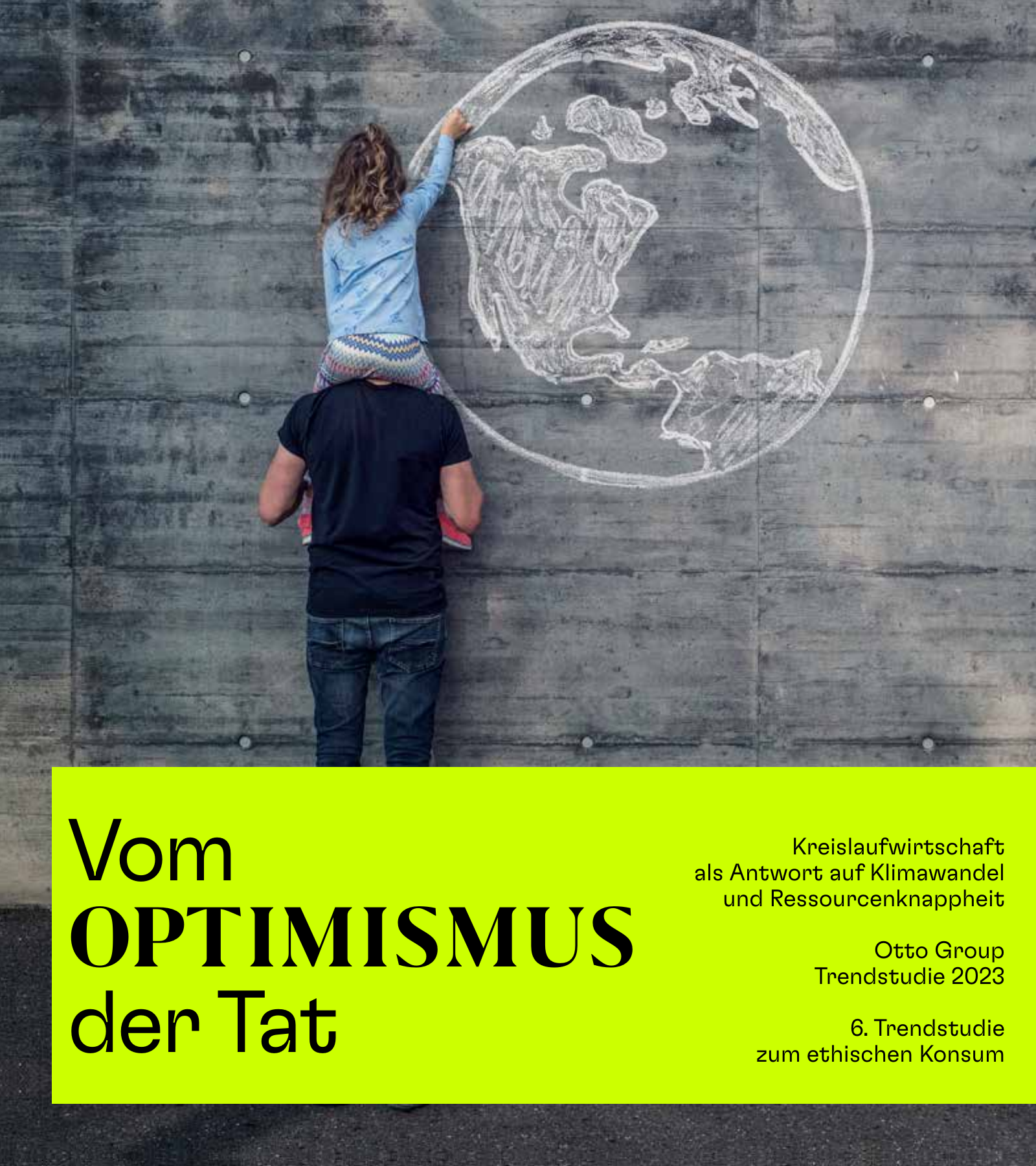
Trendstudie 2023 „Vom Optimismus der Tat" (57 pages)
A campaign exception, not the corporate system: GT Flexa, GT Planar, Grifo M and Source Serif Pro, neon colours
(#CCFF00, #00FFFF, #9552E8) on black and white, 200 × 225 mm format. Use only as an example of how the group
treats a study as a separate editorial product. cover.
Commercial Paper Information Memorandum 2025 (30 pages)
Legal text printed to PDF from Word; no brand design.
OTTO documents
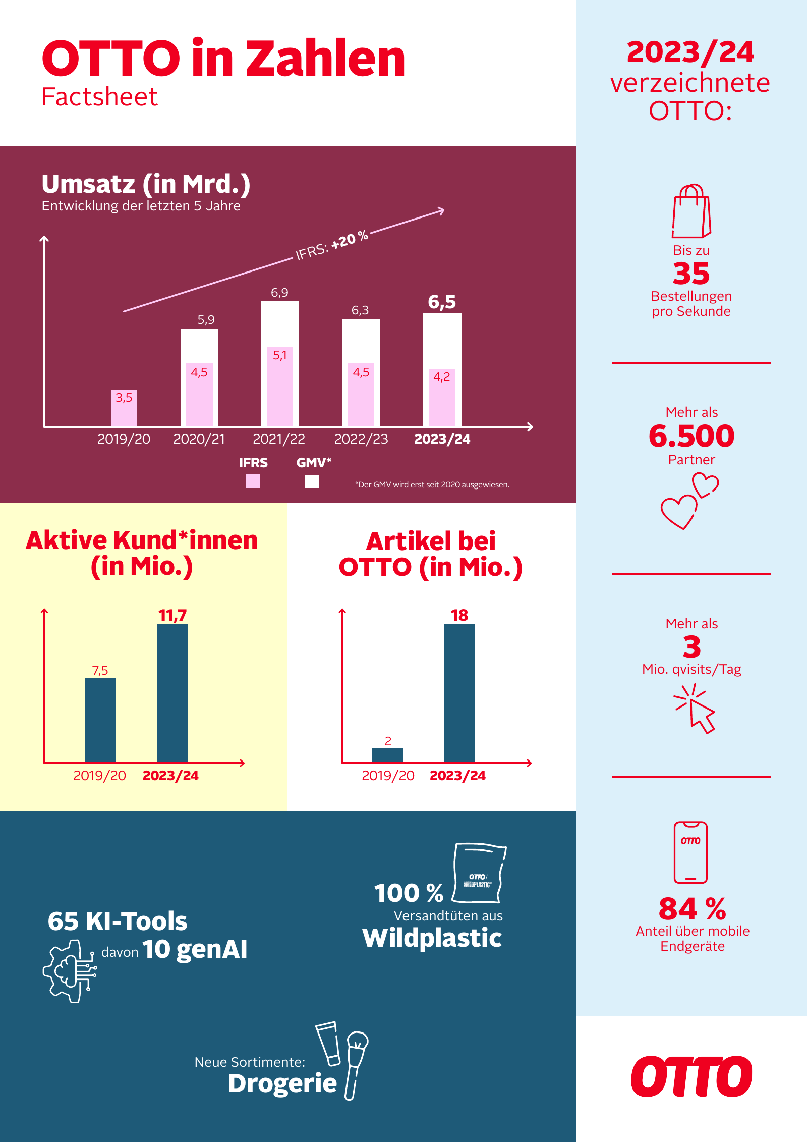
„OTTO in Zahlen – Factsheet 2023/24" (1 page, A4 portrait, Illustrator)
| Aspect | Observation |
|---|---|
| Typefaces | OTTOSansKO-Black for headlines and key numbers (19–37 pt), OTTOSans-Regular for labels and text (10 pt, footnote 6 pt) |
| Colours | text red #F00020 and white; panels burgundy #8C2D4B, petrol #1E5A78, light blue #DCF0FA, pale yellow #FFFFCD, pink bars #FDCAF5, white |
| Layout | modular colour blocks filling the page edge to edge, a right-hand sidebar (light blue) with stacked KPIs separated by thin red rules, OTTO wordmark in red bottom right |
| Headline | „OTTO in Zahlen" in KO Black red, sentence case, „Factsheet" in Regular below |
| Charts | simple bar charts: white and pink bars on burgundy, petrol bars on yellow/white, thin arrow axes, values above bars, current year bold |
| Icons | thin line icons (bag, hearts, cursor, phone, gear) in red or white |
Campus fact sheet (2024) and directions sheet (2025)
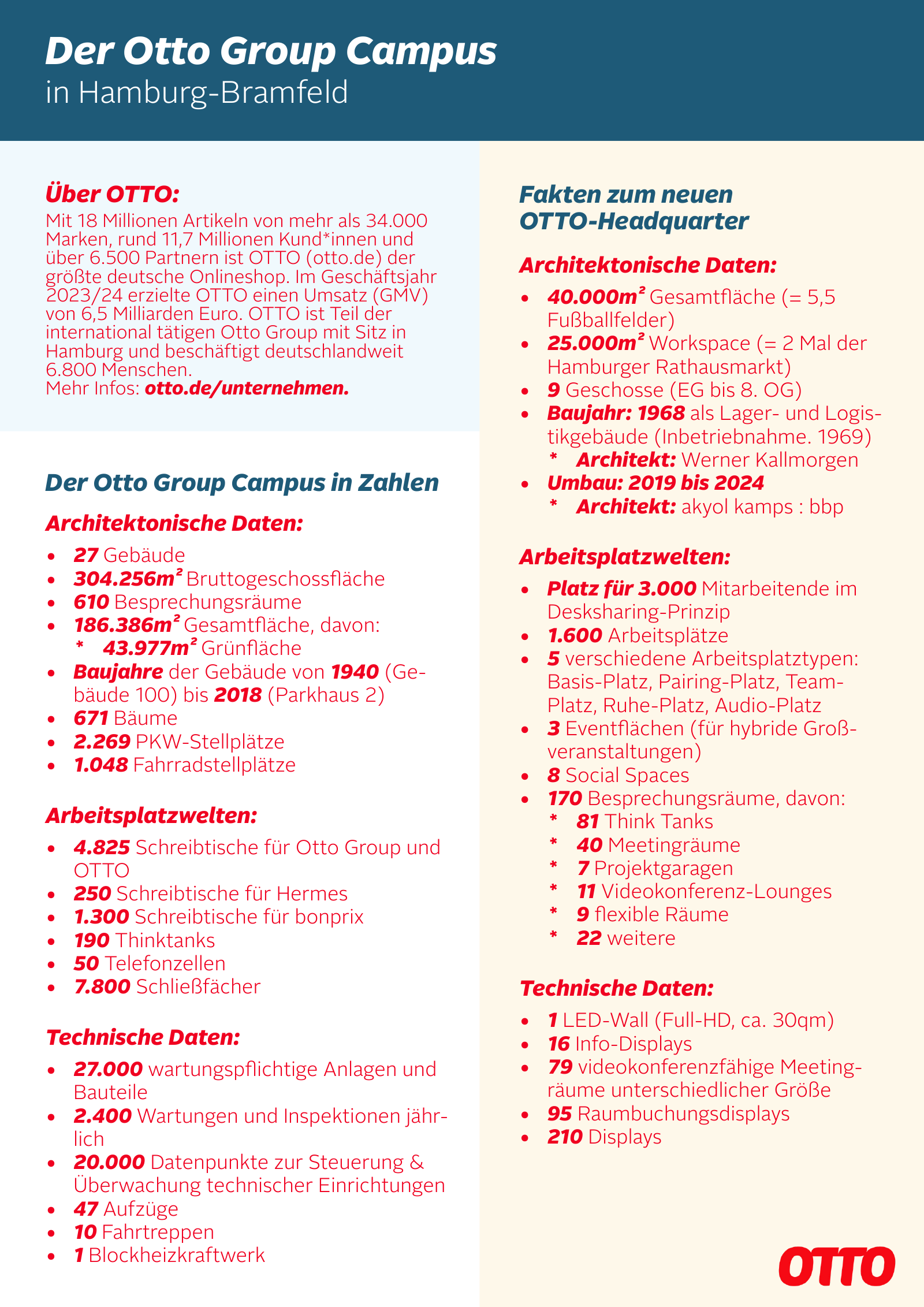
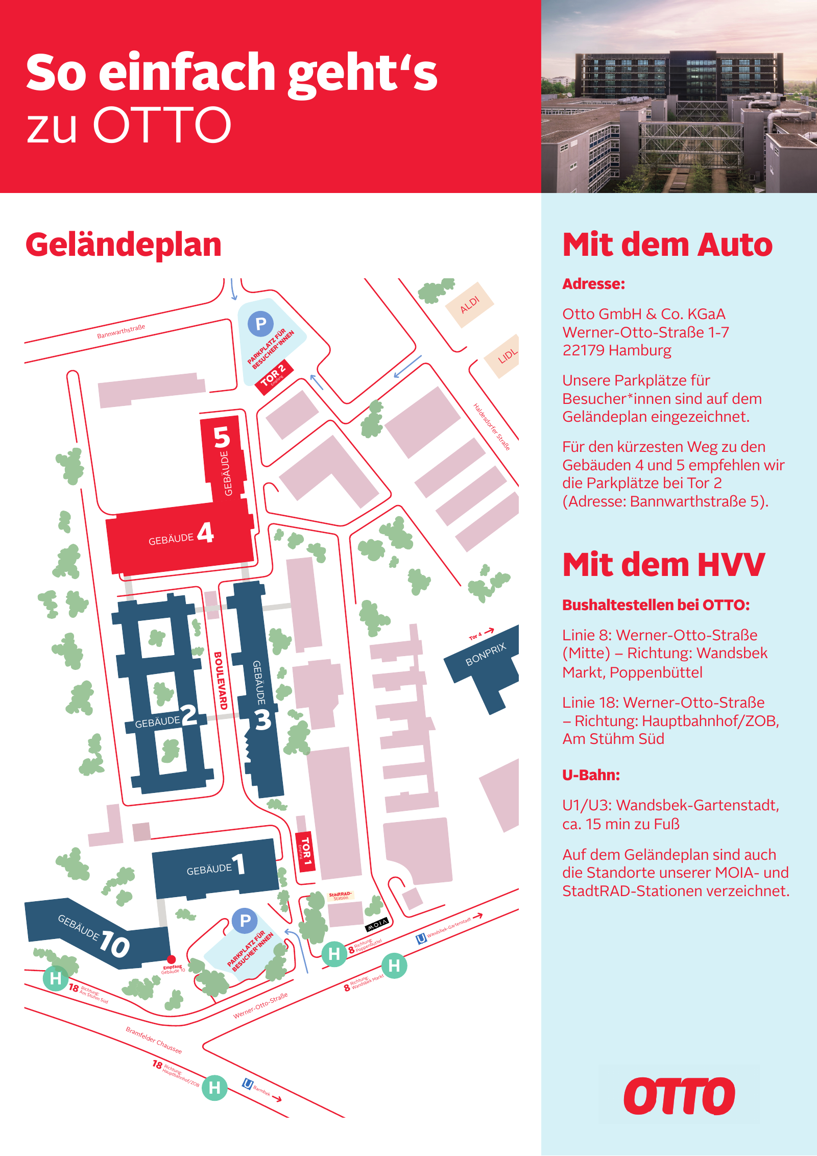
- Campus:
OTTOSans-Light12–13 pt text withOTTOSansKO-BlackItalicfor headlines and figures, red#F00020text, petrol#1E5A78header band with white italic headline, light blue#DCF0FAand cream#FFF3E0panels, red wordmark bottom right, bullets with bold-italic numbers. - Directions:
OTTOSans-Regular/BoldandOTTOSansKO-Black, red header block#E41729with white headline „So einfach geht's zu OTTO", photo top right, light blue sidebar, site plan in red lines with petrol buildings, wordmark bottom right.
Other OTTO PDFs
The 2015 logo press release is a Word document in Arial; the LkSG report is the federal template. Neither is an OTTO design sample.
How to build an Otto Group style PDF
Use for anything signed by the holding: annual report, group-level report, investor or bond material, corporate responsibility, group-wide HR or strategy papers.
- Format: A4 landscape 297 × 210 mm for reports and decks; A4 portrait only for Word/Office documents.
- Type: Optimist only (Light for body, Regular for intros, Medium for table labels, Bold for headlines). Optimist
is a licensed Newglyph face and not included here. Office fallback used by the group itself:
OptimistPPT. Web fallback on ottogroup.com: Arial, Helvetica. - Sizes: body 8.5/14 pt, intro 12 pt Regular, page title 21 pt Bold, chapter headline 50 pt Bold (outline line and solid line), section opener 70 pt outline, footnotes 5.5–7 pt, page number 21 pt Light.
- Colours: red
#F00020for all headings, running heads, rules and page numbers; text#191919; pastel panels lilac#E7DAF9, salmon#FFD2C8, yellow#FFF59B, beige#F5F0E1, peach#FFE0CEas full-page backgrounds for openers and feature pages; white for text and table pages. The wordmark SVG is#EE0020, ottogroup.com usesrgb(240, 0, 32)=#F00020. - Grid: 21 mm outer margins, 3 columns of ≈ 82 mm with 5 mm gutter; header zone 21 mm with a thin red rule
across the text width; running head split at the page centre („Otto Group /
Annual Report"). - Headlines: sentence case, two voices: line one red outline, line two solid red Bold. Never all caps.
- Tables: hairline rules only, current period framed in a red rectangle, units in small type above columns.
- Imagery: real people and real places of the group companies, warm natural light, editorial crops; red single-line illustrations of people for abstract topics. The cover may carry a magenta-to-orange gradient over the photo.
- Logo: „otto group" wordmark once, on the cover, top left, red on white or white on image. Never the OTTO wordmark as the sender of a group document.
How to build an OTTO style PDF
Use for anything signed by the retailer OTTO (otto.de): customer-facing material, OTTO press fact sheets, OTTO employer and partner material. All values come from the design tokens and the rules of the OTTO Brand Hub.
- Format: A4 portrait for fact sheets and one-pagers (all OTTO PDFs found are portrait).
- Type: OTTO Sans (Regular/Light for text, Bold for emphasis) and OTTO Sans KO Black (or Black Italic) for headlines and key numbers; OTTO Play only for campaign headlines. The font files are included. Mixed case, never all caps. Red text at least 18 pt Regular or 14 pt Black.
- Colours: OTTO red
#EB001F(Brand Hub, since 2022; older PDFs use#F00020) for headlines and the logo; body dark grey (#212121on otto.de); service blue scale#213D4F–#C1DAEBand petrol#1E5A78for service and fact panels; light blue#DCF0FA, cream#FFF3E0, pale yellow#FFFFCDas light panels; Sustainable Green#7EA87Bonly for sustainability. Keep red below about 30 % of the area (Brand Hub rule). - Layout: modular edge-to-edge colour blocks, a KPI sidebar, thin red rules between stacked facts, simple bar charts with thin arrow axes, thin line icons.
- Headlines: red on light, white on dark only; KO Black, sentence case, short („OTTO in Zahlen", „So einfach geht's zu OTTO").
- Logo: the red OTTO wordmark as sender, typically bottom right, inside the type area with its protective space, red on light, white only on OTTO red; never black, never inside a headline.
- Imagery: bright, warm, real people, product in use; see photography.
Not public: an official OTTO multi-page report template or grid specification; the margins above are derived from the one-pagers. Optimist, the Otto Group typeface, is not included.