
The four letters of the OTTO wordmark as solid objects, stacked, leaned and balanced like a sculpture. For brand heroes, chapter openers and statement sections. The sculpture never replaces the logo: wherever the logo appears, it is the original file, set in the layout.
The letter shapes, the bold italic O and the T with its cuts, come from the original wordmark, never from a redrawing.
The brief
style: professional product and industrial-design photography of a sculpture, editorial, calm, precise; the letters O, T, T, O of the reference wordmark as thick solid objects (depth about a third of the letter height), exact letter shapes and italic slant from the reference, crisp edges, real materials (matte powder-coated metal, soft-touch plastic, polished lacquer), no toy or clay look
palette: OTTO red exactly #eb001f for the letters unless the motif says otherwise; white #ffffff, light grey #f0f0f0, mid grey #d6d6d6 and near-black #212121 as neutrals; no other hues
ground: seamless flat light grey #f0f0f0 studio sweep, no vignette; only when the motif names OTTO red #eb001f as the ground: a seamless flat red sweep, the letters then white or light grey
composition: the motif sets the placement; generous negative space for type
light: large soft window light from the top left, one soft natural contact shadow per object
never: any other letters, words or numbers, extra logos, printed text on objects, watermarks, confetti, glitter, neon, characters, faces, hands, pastel colours, clay, plasticine
Checks
- Letter by letter against the wordmark: exactly O, T, T, O, the italic slant and the T crossbars as in the logo, no extra or mirrored letters.
- The red within a colour difference of 8 (delta E) of OTTO red #EB001F, as for the red material style.
Pictures in this style
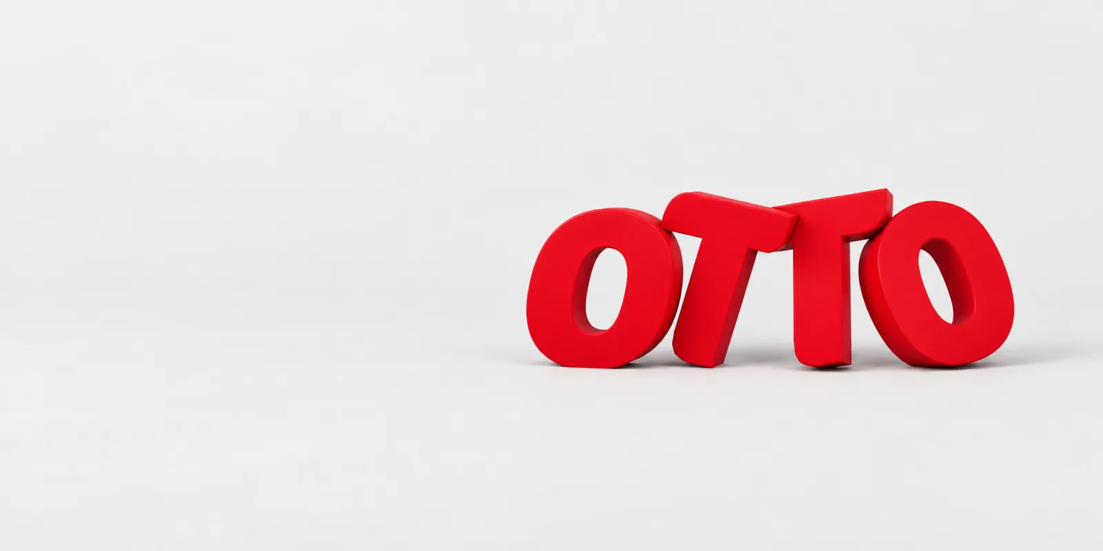 The letters leaning against each other, a loose row
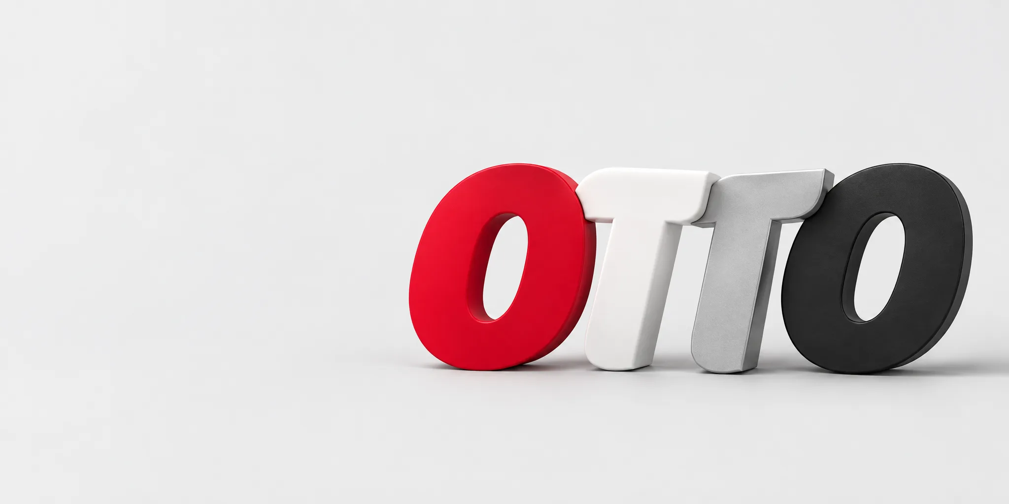 Letters in red, white, grey and black: sculpture art, not the logo
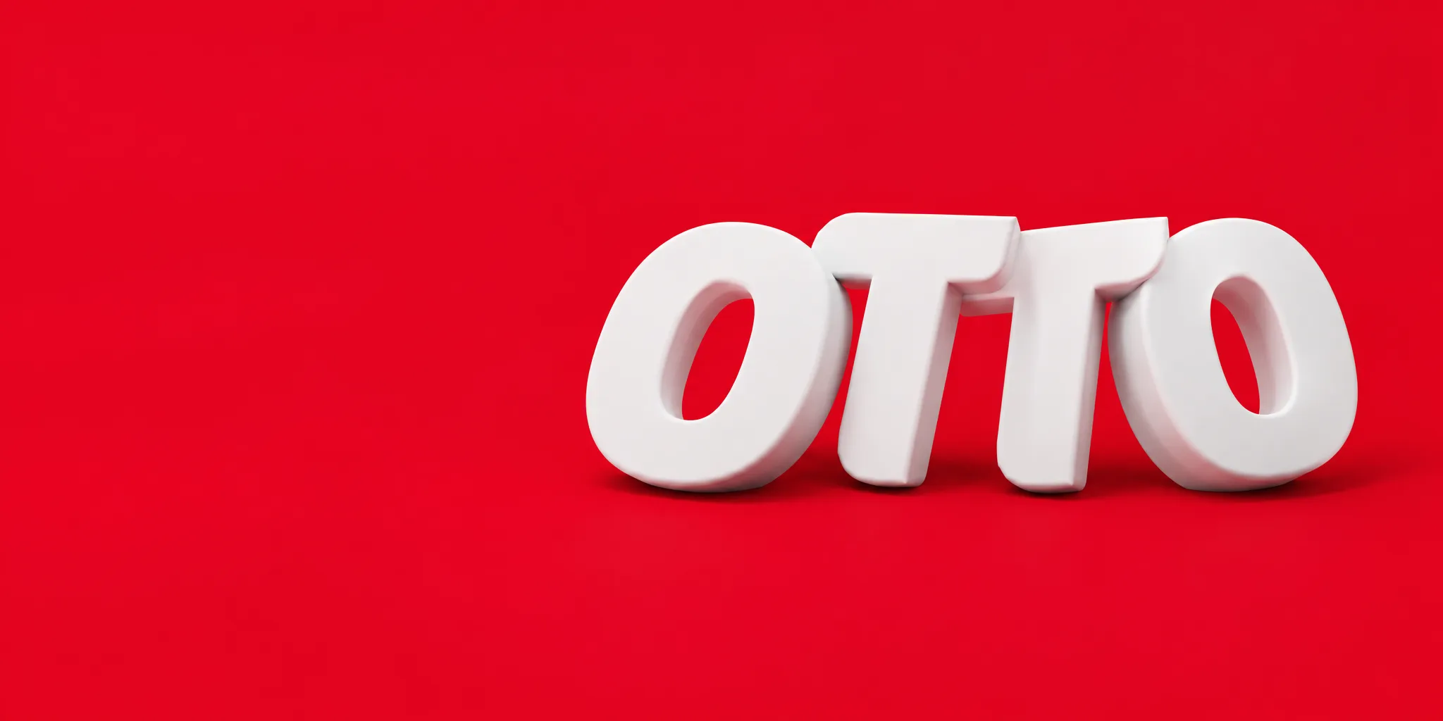 White letters on an OTTO red ground
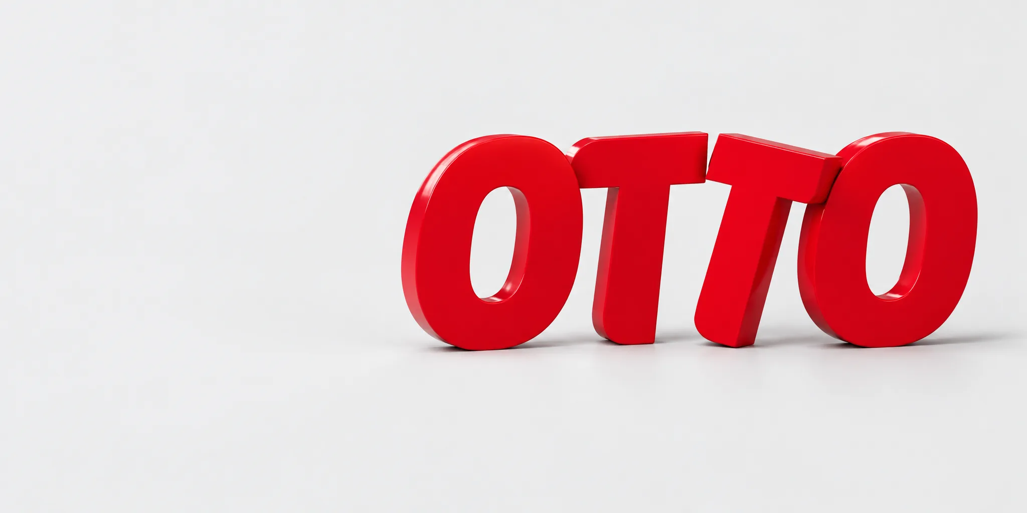 The four letters in a row, OTTO red on light grey
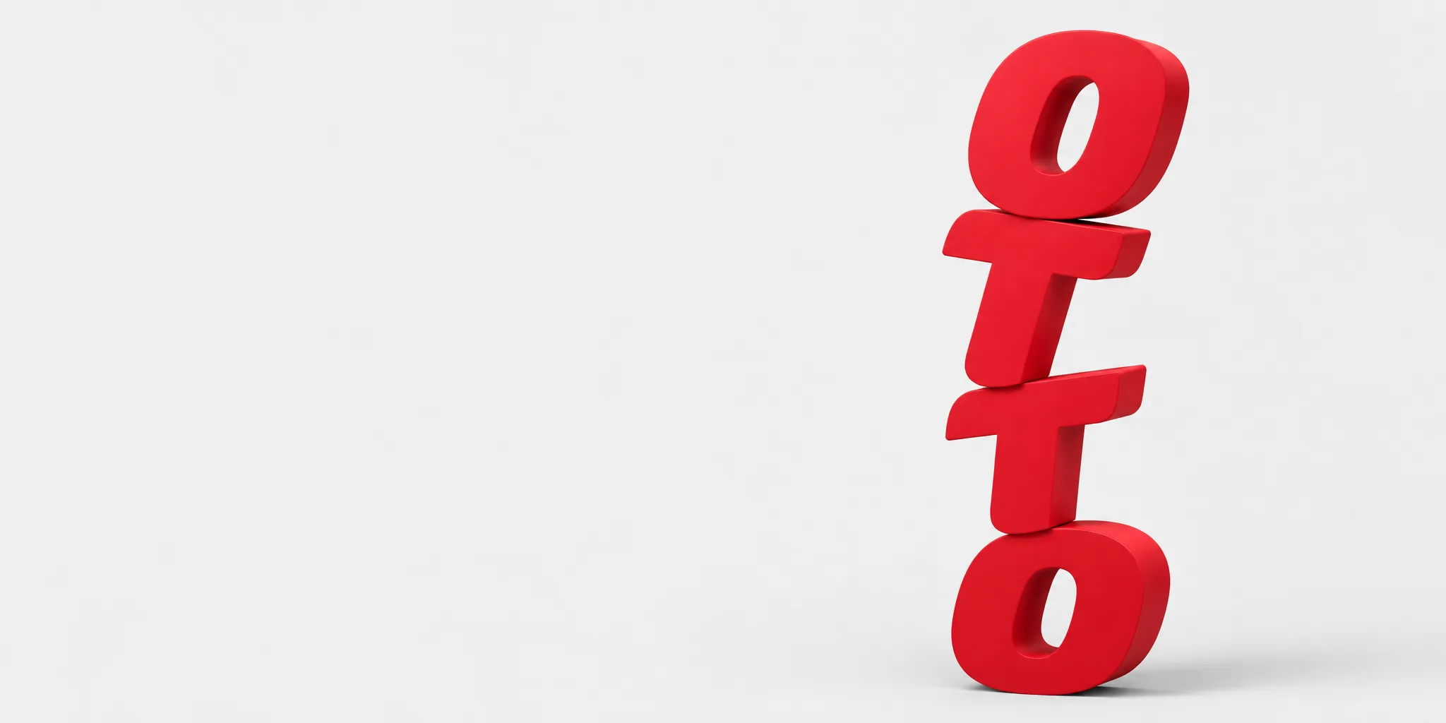 The letters stacked into a tower
 The „otto group“ wordmark as a sculpture on sand