
Overview
Border radius
The border radius is an indicator of interactivity. Therefore, most interactive components in the design system have a border radius of at least 4 pixels. The default border radius is 8px and is used, for example, inside buttons or text fields. Larger components, such as media object cards or promo cards, use a larger border radius of 16px. However, there are also cases in which rounded elements, such as cards, are static themselves but act as containers for interactive elements.
Static components, such as blocks, banners, and tags, have a maximum border radius of 2 px. The 2px is only used for decorative purposes.
These different border radii make it easier to distinguish between static and interactive components.
Interactive ≥4px border radius
Static ≤2px border radius
HTML
<div style="display:flex;flex-direction:column;align-items:center;gap:56px">
  <p><b>Interactive</b> ≥4px border radius</p>
  <span style="position:relative;display:inline-block">
    <oc-button-v1 variant="secondary" fit-content>Button</oc-button-v1>
    <span aria-hidden="true" style="position:absolute;right:-18px;top:-18px;width:32px;height:32px;border-top:2px solid #f06;border-right:2px solid #f06;border-top-right-radius:8px"></span>
    <span aria-hidden="true" style="position:absolute;left:calc(100% + 22px);top:-24px">8px</span>
    <span aria-hidden="true" style="position:absolute;left:-18px;bottom:-18px;width:32px;height:32px;border-bottom:2px solid #f06;border-left:2px solid #f06;border-bottom-left-radius:8px"></span>
    <span aria-hidden="true" style="position:absolute;right:calc(100% + 22px);bottom:-18px">8px</span>
  </span>
<div style="display:flex;flex-direction:column;align-items:center;gap:56px">
  <p><b>Static</b> ≤2px border radius</p>
  <span style="position:relative;display:inline-block">
    <oc-tag-v1 variant="info-primary">Tag</oc-tag-v1>
    <span aria-hidden="true" style="position:absolute;right:-16px;top:-16px;width:32px;height:32px;border-top:2px solid #f06;border-right:2px solid #f06;border-top-right-radius:2px"></span>
    <span aria-hidden="true" style="position:absolute;left:calc(100% + 22px);top:-24px">2px</span>
    <span aria-hidden="true" style="position:absolute;left:-16px;bottom:-16px;width:32px;height:32px;border-bottom:2px solid #f06;border-left:2px solid #f06;border-bottom-left-radius:2px"></span>
    <span aria-hidden="true" style="position:absolute;right:calc(100% + 22px);bottom:-16px">2px</span>
  </span>
Border radius nesting
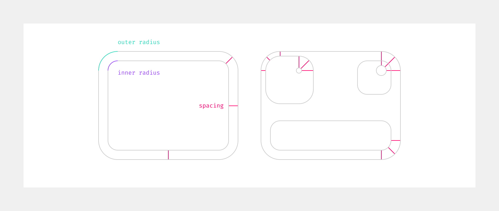
Elements with border radiuses should be nested in such a way that the curves fit into each other when nested within each other. This can be achieved by adjusting either the spacing or the radius values, depending on what is possible. As Design System components, like buttons or cards, usually use a specific border radius, most of the time the spacing will be adjusted.
The calculation is as follows:
spacing = outer radius - inner radius
Border vs. outline
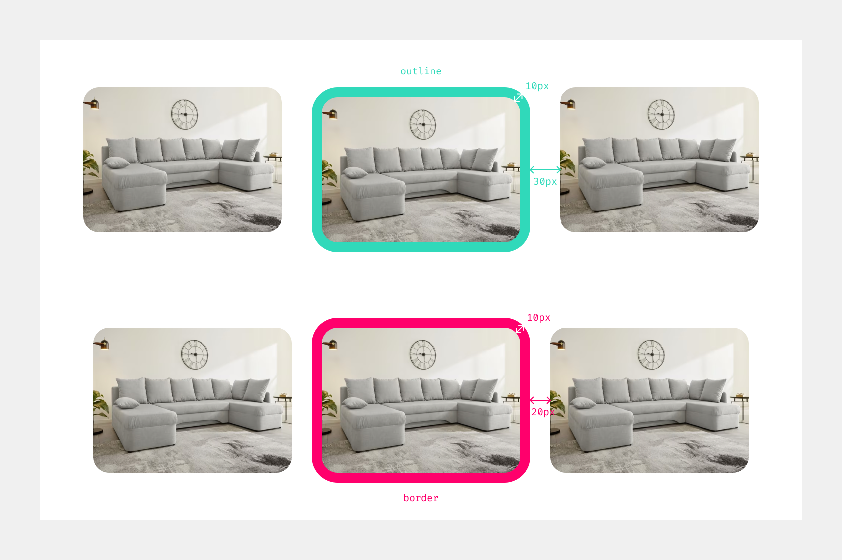
The main difference border and outline is that border takes up space in the layout and changes the size of an element, while outline is drawn outside the frame without affecting the layout or neighboring elements.
Fragments
You can find an overview of all border radius tokens here.
Status
Implementation
Note: For full technical documentation of the border, visit Storybook/Border.