
Configurator
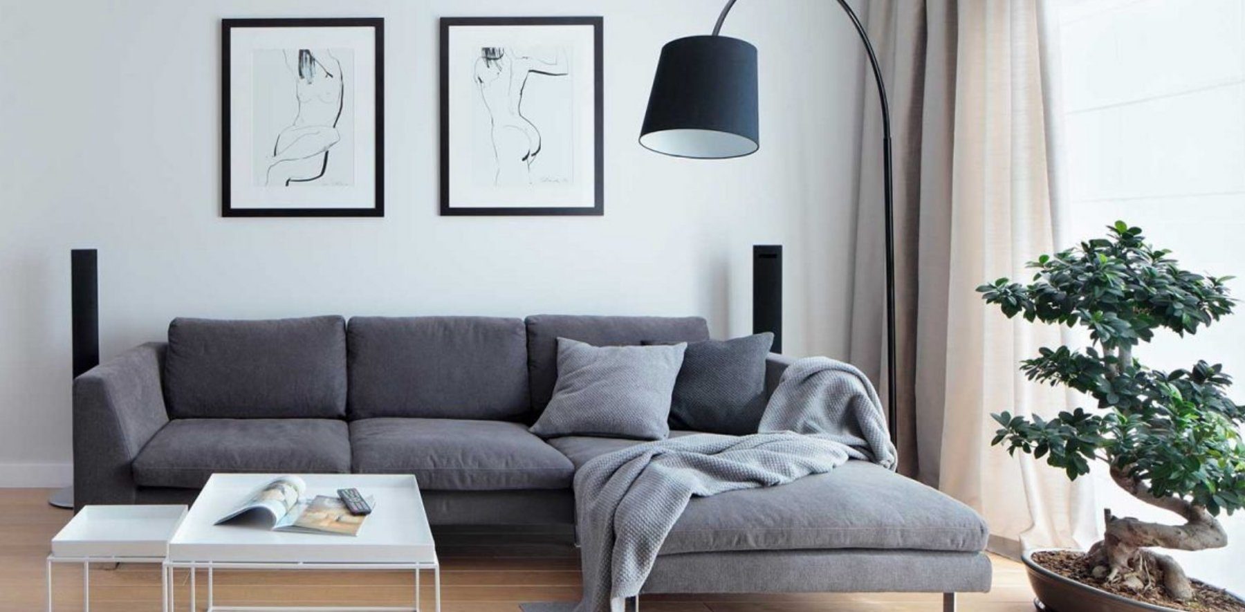
<oc-media-object-card-v2 elevation-level="stacked" icon="order-return" style="width:min(100%,480px)"><a href="#" aria-label="oc-auto"></a><picture slot="img"><img alt="" style="margin:0;height:100%" src="/references/images/otto/otto-shop-teaser-wohnzimmer.jpg"></picture><span slot="headline">Wohnzimmer</span><span slot="subline">Sofas, Tische und Leuchten</span><oc-action-signifier-v1 slot="action-signifier" label="Ansehen" variant="icon" hidden="hidden"></oc-action-signifier-v1></oc-media-object-card-v2>Usage
Anatomy
HTML
<div class="on-frame"><div style="max-width:400px;margin:0 auto">
<oc-media-object-card-v2><a href="#" aria-label="oc-auto"></a><img slot="img" src="/references/images/otto/otto-shop-teaser-wohnzimmer.jpg" alt=""><span slot="headline">Wohnzimmer</span><span slot="subline">Neu im Shop</span></oc-media-object-card-v2>
</div>
Variants
The media object card is available in the following sizes:
- 100
- 75
- 50
- 25
You can use the media object card with text only, an icon or an image . For the image you can place either an ambient or a cutout image.
You can also choose between the default and inverted variant of the media object card. The default variant has black text and a black icon. Meanwhile the inverted variant features white text and a white icon. The default and inverted background color can be freely overwritten. But make sure to meet sufficient contrast due to the accessibility standards.
You can optionally add an action signifier as text or icon to increase the affordability of the media object card.
HTML
<div class="on-frame" style="display:grid;grid-template-columns:1fr 1fr;gap:32px 24px;align-items:center">
<p class="demo-label">Size 100</p><oc-media-object-card-v2 size="100"><a href="#" aria-label="oc-auto"></a><img slot="img" src="/references/images/otto/otto-shop-teaser-wohnzimmer.jpg" alt=""><span slot="headline">Wohnzimmer</span><span slot="subline">Neu im Shop</span></oc-media-object-card-v2></div>
<p class="demo-label">Size 75</p><oc-media-object-card-v2 size="75"><a href="#" aria-label="oc-auto"></a><img slot="img" src="/references/images/otto/otto-shop-teaser-wohnzimmer.jpg" alt=""><span slot="headline">Wohnzimmer</span><span slot="subline">Neu im Shop</span></oc-media-object-card-v2></div>
<p class="demo-label">Size 50</p><oc-media-object-card-v2 size="50"><a href="#" aria-label="oc-auto"></a><img slot="img" src="/references/images/otto/otto-shop-teaser-wohnzimmer.jpg" alt=""><span slot="headline">Wohnzimmer</span><span slot="subline">Neu im Shop</span></oc-media-object-card-v2></div>
<p class="demo-label">Size 25</p><oc-media-object-card-v2 size="25"><a href="#" aria-label="oc-auto"></a><img slot="img" src="/references/images/otto/otto-shop-teaser-wohnzimmer.jpg" alt=""><span slot="headline">Wohnzimmer</span><span slot="subline">Neu im Shop</span></oc-media-object-card-v2></div>
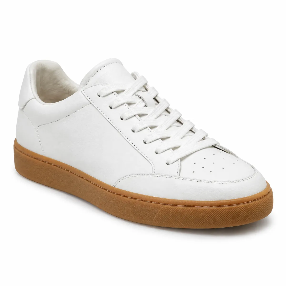
HTML
<div class="on-frame" style="display:grid;grid-template-columns:1fr 1fr;gap:24px">
<p class="demo-label">Text only</p><oc-media-object-card-v2 variant="text-only"><a href="#" aria-label="oc-auto"></a><span slot="headline">Versand</span><span slot="subline">Kostenlos ab 29 €</span></oc-media-object-card-v2></div>
<p class="demo-label">Image ambient</p><oc-media-object-card-v2 variant="ambient-image" inverted><a href="#" aria-label="oc-auto"></a><img slot="img" src="/references/images/otto/otto-shop-teaser-wohnzimmer.jpg" alt=""><span slot="headline">Wohnzimmer</span><span slot="subline">Bis zu -30 %</span></oc-media-object-card-v2></div>
<p class="demo-label">Icon</p><oc-media-object-card-v2 variant="icon" icon="smiley-happy"><a href="#" aria-label="oc-auto"></a><span slot="headline">Kundenservice</span><span slot="subline">Wir helfen dir gern</span></oc-media-object-card-v2></div>
<p class="demo-label">Image cutout</p><oc-media-object-card-v2 variant="cut-out-image" inverted><a href="#" aria-label="oc-auto"></a><picture slot="img"><img src="/previews/imagery/samples/otto-product-still/product-sneaker.webp" alt="" style="margin:0;height:100%"></picture><span slot="headline">Sneaker</span><span slot="subline">Bis zu -30 %</span></oc-media-object-card-v2></div>
HTML
<div class="on-frame" style="display:grid;grid-template-columns:1fr 1fr;gap:24px">
<oc-media-object-card-v2><a href="#" aria-label="oc-auto"></a><img slot="img" src="/references/images/otto/otto-shop-teaser-wohnzimmer.jpg" alt=""><span slot="headline">Wohnzimmer</span><span slot="subline">Neu im Shop</span></oc-media-object-card-v2>
<oc-media-object-card-v2 inverted><a href="#" aria-label="oc-auto"></a><img slot="img" src="/references/images/otto/otto-shop-teaser-wohnzimmer.jpg" alt=""><span slot="headline">Wohnzimmer</span><span slot="subline">Bis zu -30 %</span></oc-media-object-card-v2>
HTML
<div class="on-frame" style="display:grid;grid-template-columns:1fr 1fr;gap:16px 24px">
<oc-media-object-card-v2><a href="#" aria-label="oc-auto"></a><img slot="img" src="/references/images/otto/otto-shop-teaser-wohnzimmer.jpg" alt=""><span slot="headline">Wohnzimmer</span><span slot="subline">Neu im Shop</span><oc-action-signifier-v1 slot="action-signifier" variant="icon"></oc-action-signifier-v1></oc-media-object-card-v2>
<oc-media-object-card-v2 inverted><a href="#" aria-label="oc-auto"></a><img slot="img" src="/references/images/otto/otto-shop-teaser-wohnzimmer.jpg" alt=""><span slot="headline">Wohnzimmer</span><span slot="subline">Bis zu -30 %</span><oc-action-signifier-v1 slot="action-signifier" variant="icon" inverted></oc-action-signifier-v1></oc-media-object-card-v2>
<oc-media-object-card-v2><a href="#" aria-label="oc-auto"></a><img slot="img" src="/references/images/otto/otto-shop-teaser-wohnzimmer.jpg" alt=""><span slot="headline">Wohnzimmer</span><span slot="subline">Neu im Shop</span><oc-action-signifier-v1 slot="action-signifier" variant="text" label="Ansehen"></oc-action-signifier-v1></oc-media-object-card-v2>
<oc-media-object-card-v2 inverted><a href="#" aria-label="oc-auto"></a><img slot="img" src="/references/images/otto/otto-shop-teaser-wohnzimmer.jpg" alt=""><span slot="headline">Wohnzimmer</span><span slot="subline">Bis zu -30 %</span><oc-action-signifier-v1 slot="action-signifier" variant="text" label="Ansehen" inverted></oc-action-signifier-v1></oc-media-object-card-v2>
Behavior
States
HTML
<div class="on-frame" style="display:grid;grid-template-columns:1fr 1fr;gap:24px">
<p class="demo-label">Enabled</p><oc-media-object-card-v2><a href="#" aria-label="oc-auto"></a><img slot="img" src="/references/images/otto/otto-shop-teaser-wohnzimmer.jpg" alt=""><span slot="headline">Wohnzimmer</span><span slot="subline">Neu im Shop</span></oc-media-object-card-v2></div>
<p class="demo-label">Hover (shown)</p><oc-media-object-card-v2 style="background-image:linear-gradient(var(--oc-semantic-color-overlay-hover),var(--oc-semantic-color-overlay-hover))"><a href="#" aria-label="oc-auto"></a><img slot="img" src="/references/images/otto/otto-shop-teaser-wohnzimmer.jpg" alt=""><span slot="headline">Wohnzimmer</span><span slot="subline">Neu im Shop</span></oc-media-object-card-v2></div>
<p class="demo-label">Pressed (shown)</p><oc-media-object-card-v2 has-action-child-active><a href="#" aria-label="oc-auto"></a><img slot="img" src="/references/images/otto/otto-shop-teaser-wohnzimmer.jpg" alt=""><span slot="headline">Wohnzimmer</span><span slot="subline">Neu im Shop</span></oc-media-object-card-v2></div>
<p class="demo-label">Selected</p><oc-media-object-card-v2><a href="#" aria-current="page" aria-label="oc-auto"></a><img slot="img" src="/references/images/otto/otto-shop-teaser-wohnzimmer.jpg" alt=""><span slot="headline">Wohnzimmer</span><span slot="subline">Neu im Shop</span></oc-media-object-card-v2></div>
<p class="demo-label">Focus (shown)</p><oc-media-object-card-v2 style="outline:2px solid var(--oc-semantic-focus-outline-color);outline-offset:2px"><a href="#" aria-label="oc-auto"></a><img slot="img" src="/references/images/otto/otto-shop-teaser-wohnzimmer.jpg" alt=""><span slot="headline">Wohnzimmer</span><span slot="subline">Neu im Shop</span></oc-media-object-card-v2></div>
For information on states, refer to foundations.
Typography
Each size of the media object cards has different limitation of lines for the headline and subline. It follows the logic that the lines always start with the headline and that the remaining lines are filled with the subline.
HTML
<div class="on-frame" style="display:grid;grid-template-columns:repeat(2,minmax(0,300px));gap:32px 24px;justify-content:center;align-items:start">
<p class="demo-label">Size 100</p><oc-media-object-card-v2 size="100"><a href="#" aria-label="oc-auto"></a><img slot="img" src="/references/images/otto/otto-shop-teaser-wohnzimmer.jpg" alt=""><span slot="headline">Wohnzimmer, Esszimmer und Arbeitszimmer</span><span slot="subline">Sofas, Tische, Stühle und Leuchten für dein Zuhause</span></oc-media-object-card-v2></div>
<p class="demo-label">Size 75</p><oc-media-object-card-v2 size="75"><a href="#" aria-label="oc-auto"></a><img slot="img" src="/references/images/otto/otto-shop-teaser-wohnzimmer.jpg" alt=""><span slot="headline">Wohnzimmer, Esszimmer und Arbeitszimmer</span><span slot="subline">Sofas, Tische, Stühle und Leuchten für dein Zuhause</span></oc-media-object-card-v2></div>
<p class="demo-label">Size 50</p><oc-media-object-card-v2 size="50"><a href="#" aria-label="oc-auto"></a><img slot="img" src="/references/images/otto/otto-shop-teaser-wohnzimmer.jpg" alt=""><span slot="headline">Wohnzimmer, Esszimmer und Arbeitszimmer</span><span slot="subline">Sofas, Tische, Stühle und Leuchten für dein Zuhause</span></oc-media-object-card-v2></div>
<p class="demo-label">Size 25</p><oc-media-object-card-v2 size="25"><a href="#" aria-label="oc-auto"></a><img slot="img" src="/references/images/otto/otto-shop-teaser-wohnzimmer.jpg" alt=""><span slot="headline">Wohnzimmer, Esszimmer und Arbeitszimmer</span><span slot="subline">Sofas, Tische, Stühle und Leuchten für dein Zuhause</span></oc-media-object-card-v2></div>
In general, the media object card prefers that the text (headline and subline) is placed next to each other. When this is no longer possible, they are placed one below the other. You can also use the "prefer vertical alignment" option. This will always place the text below each other.
HTML
<div class="on-frame" style="display:grid;grid-template-columns:1fr 1.3fr;gap:16px;align-items:end">
<p class="demo-label">Default</p><oc-media-object-card-v2><a href="#" aria-label="oc-auto"></a><img slot="img" src="/references/images/otto/otto-shop-teaser-wohnzimmer.jpg" alt=""><span slot="headline">Wohnzimmer</span><span slot="subline">Neu im Shop</span></oc-media-object-card-v2></div>
<p class="demo-label">Prefer vertical alignment</p><oc-media-object-card-v2 prefer-vertical-alignment><a href="#" aria-label="oc-auto"></a><img slot="img" src="/references/images/otto/otto-shop-teaser-wohnzimmer.jpg" alt=""><span slot="headline">Wohnzimmer</span><span slot="subline">Neu im Shop</span></oc-media-object-card-v2></div>
Fitting
For the width of the media object card you can either choose fit-content or fill-parent. The height of the media object card depends on the size and is always fixed.
HTML
<div class="on-frame" style="display:grid;grid-template-columns:1fr 1fr;gap:32px;align-items:end">
<p class="demo-label">fit-content</p><div><oc-media-object-card-v2 width-behavior="fit"><a href="#" aria-label="oc-auto"></a><img slot="img" src="/references/images/otto/otto-shop-teaser-wohnzimmer.jpg" alt=""><span slot="headline">Wohnzimmer</span><span slot="subline">Neu im Shop</span></oc-media-object-card-v2></div></div>
<p class="demo-label">fill-parent</p><oc-media-object-card-v2 width-behavior="fill"><a href="#" aria-label="oc-auto"></a><img slot="img" src="/references/images/otto/otto-shop-teaser-wohnzimmer.jpg" alt=""><span slot="headline">Wohnzimmer</span><span slot="subline">Neu im Shop</span></oc-media-object-card-v2></div>
Placement
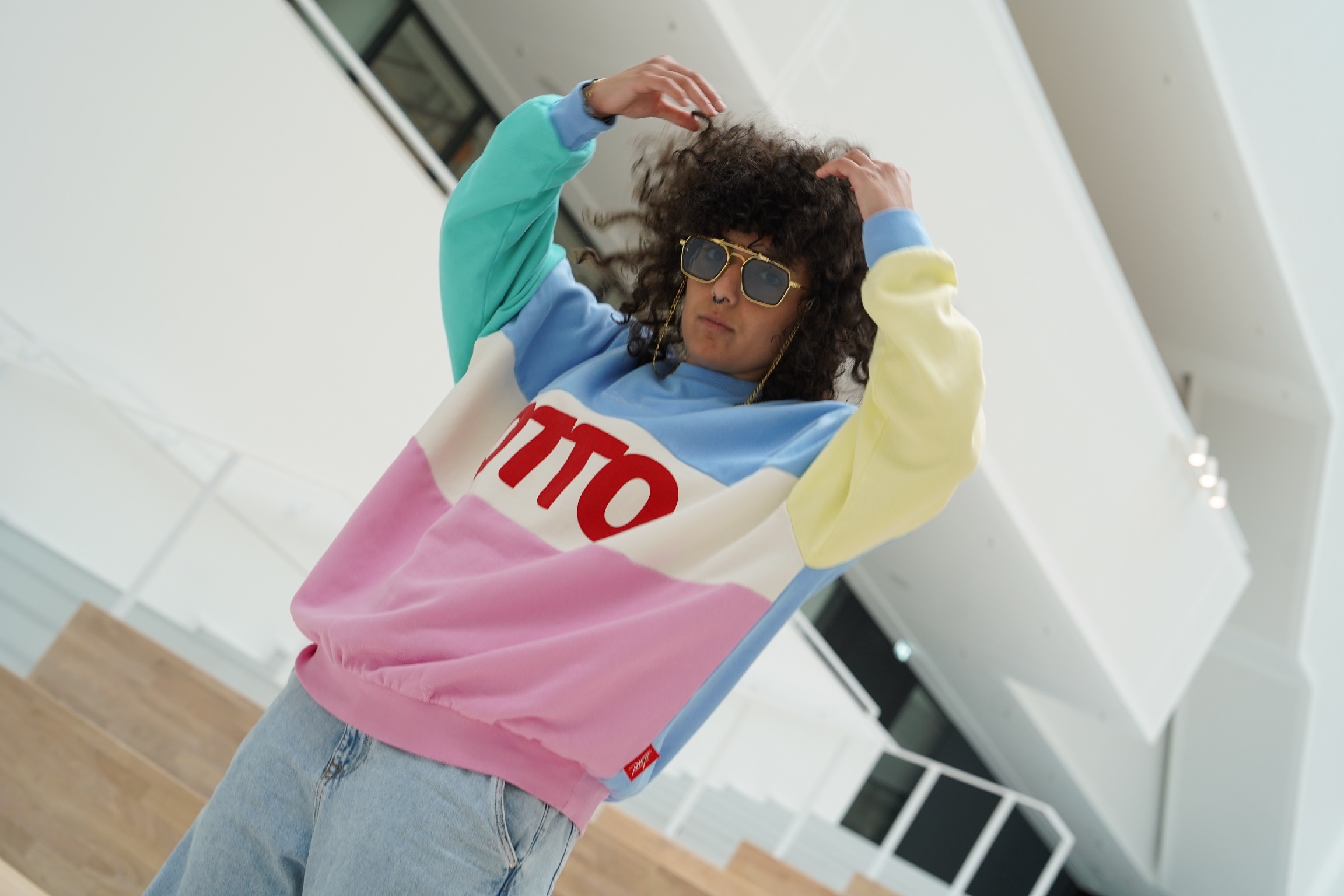
Media object card are mostly used within a cinema or with multiple instances next to each other. When placing multiple media object cards side by side you should use the same size. You can also use the media object card standalone but consider that the width on desktop gets pretty big.
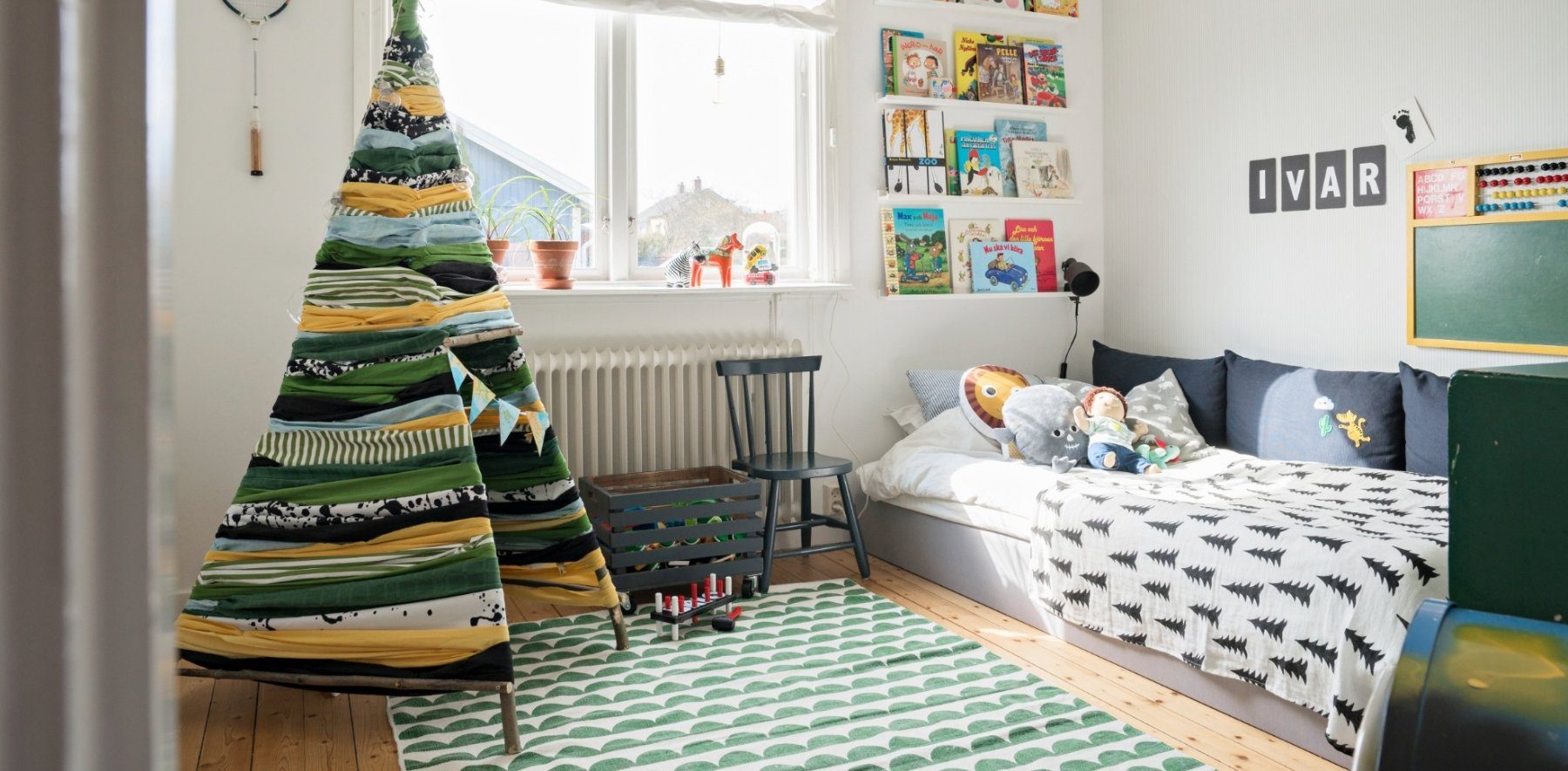
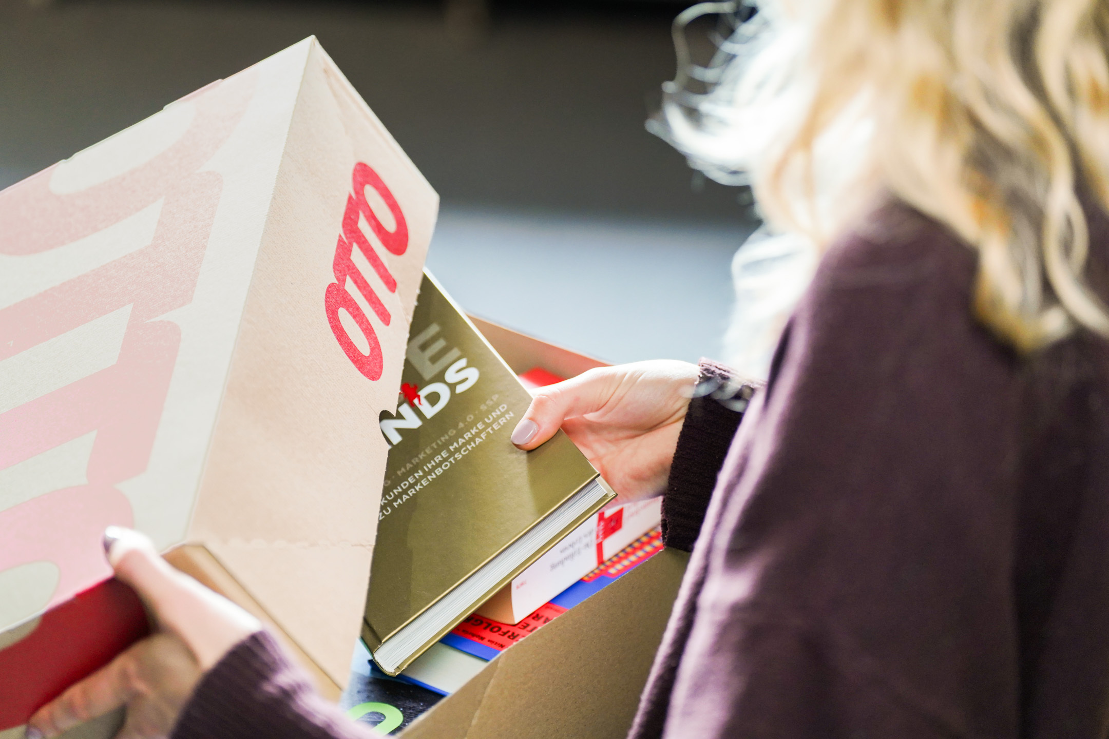
HTML
<div class="on-frame" style="display:grid;grid-template-columns:minmax(0,1fr);gap:24px">
<oc-cinema-v1 oc-aria-label="Kategorien" items-per-page="2">
  <oc-media-object-card-v2><a href="#" aria-label="oc-auto"></a><img slot="img" src="/references/images/otto/otto-shop-teaser-wohnzimmer.jpg" alt=""><span slot="headline">Wohnzimmer</span><span slot="subline">Neu im Shop</span></oc-media-object-card-v2>
  <oc-media-object-card-v2><a href="#" aria-label="oc-auto"></a><img slot="img" src="/references/images/otto/otto-shop-teaser-kinderzimmer.jpg" alt=""><span slot="headline">Kinderzimmer</span><span slot="subline">Neu im Shop</span></oc-media-object-card-v2>
  <oc-media-object-card-v2><a href="#" aria-label="oc-auto"></a><img slot="img" src="/references/images/otto/otto-buecher-sortiment.jpg" alt=""><span slot="headline">Bücher</span><span slot="subline">Neu im Shop</span></oc-media-object-card-v2>
  <oc-media-object-card-v2><a href="#" aria-label="oc-auto"></a><img slot="img" src="/references/images/otto/otto-fashion-drop-mojo-06.jpg" alt=""><span slot="headline">Mode</span><span slot="subline">Neu im Shop</span></oc-media-object-card-v2>
</oc-cinema-v1>
<div style="display:grid;grid-template-columns:repeat(3,minmax(0,1fr));gap:16px">
  <oc-media-object-card-v2 prefer-vertical-alignment><a href="#" aria-label="oc-auto"></a><img slot="img" src="/references/images/otto/otto-shop-teaser-wohnzimmer.jpg" alt=""><span slot="headline">Wohnzimmer</span><span slot="subline">Neu im Shop</span></oc-media-object-card-v2>
  <oc-media-object-card-v2 prefer-vertical-alignment><a href="#" aria-label="oc-auto"></a><img slot="img" src="/references/images/otto/otto-shop-teaser-kinderzimmer.jpg" alt=""><span slot="headline">Kinderzimmer</span><span slot="subline">Neu im Shop</span></oc-media-object-card-v2>
  <oc-media-object-card-v2 prefer-vertical-alignment><a href="#" aria-label="oc-auto"></a><img slot="img" src="/references/images/otto/otto-buecher-sortiment.jpg" alt=""><span slot="headline">Bücher</span><span slot="subline">Neu im Shop</span></oc-media-object-card-v2>
<oc-media-object-card-v2><a href="#" aria-label="oc-auto"></a><img slot="img" src="/references/images/otto/otto-shop-teaser-wohnzimmer.jpg" alt=""><span slot="headline">Wohnzimmer</span><span slot="subline">Neu im Shop</span></oc-media-object-card-v2>
Elevation
Media object cards are placed on top of the frame (level 0) inside the canvas (level 1). Media object cards can also be placed on top of the canvas (level 1.5) as stacked media object card. You can use stacked media object cards when you want to place a card inside a block. Therefore, stacked media object cards have a different background color (stacked background).
HTML
<div class="on-frame" style="display:grid;grid-template-columns:1fr 1fr;gap:32px;align-items:center">
<p class="demo-label">Default, on frame</p><oc-media-object-card-v2><a href="#" aria-label="oc-auto"></a><img slot="img" src="/references/images/otto/otto-shop-teaser-wohnzimmer.jpg" alt=""><span slot="headline">Wohnzimmer</span><span slot="subline">Neu im Shop</span></oc-media-object-card-v2></div>
<oc-block-v2><div class="group"><p class="demo-label">Stacked, inside a block</p><oc-media-object-card-v2 elevation-level="stacked"><a href="#" aria-label="oc-auto"></a><img slot="img" src="/references/images/otto/otto-shop-teaser-wohnzimmer.jpg" alt=""><span slot="headline">Wohnzimmer</span><span slot="subline">Neu im Shop</span></oc-media-object-card-v2></div></oc-block-v2>
Responsiveness
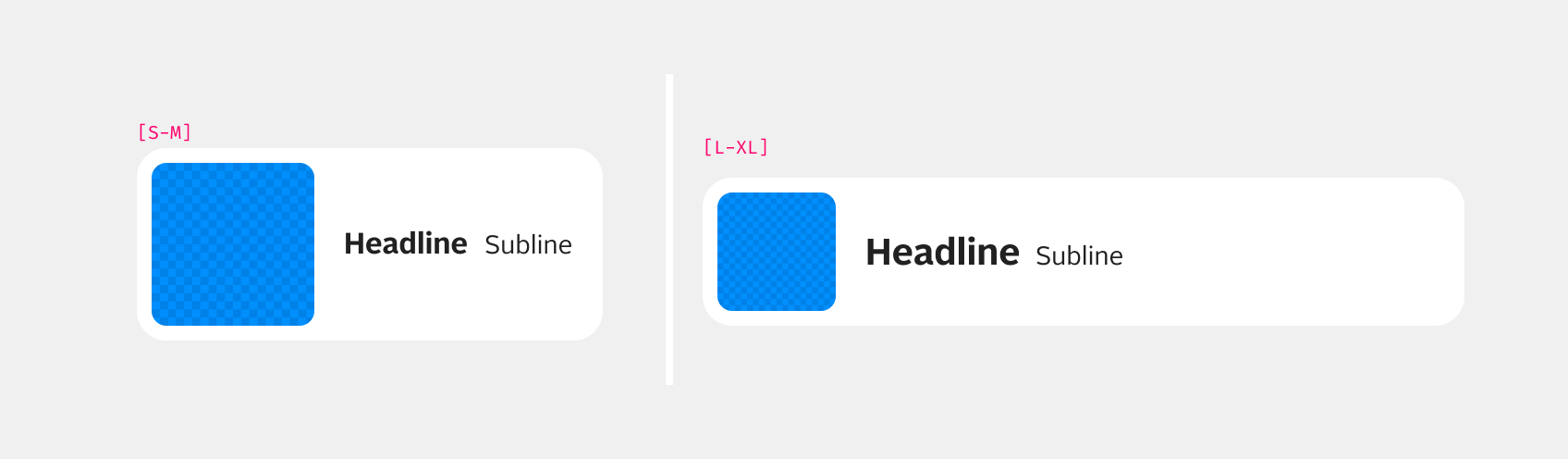
In principle, the media object card behaves in the same way across all breakpoints. The only exception is size 100, where the headline in breakpoint S is set as headline 100 and from breakpoint L it becomes headline200.
Best practices
Accessibility
For information on accessibility, refer to thetechnical documentation.
Status
Related components
Implementation
Live demo
Wie können wir dir helfen?
Zuletzt angesehen
HTML
<div class="on-frame demo-stack" style="gap:32px">
<p class="oc-headline-200" style="margin:0">Wie können wir dir helfen?</p>
<div style="display:grid;grid-template-columns:repeat(auto-fit,minmax(15rem,1fr));gap:16px">
  <oc-media-object-card-v2 size="75" prefer-vertical-alignment variant="icon" icon="order"><a href="#" aria-label="oc-auto"></a><span slot="headline">Bestellung verfolgen</span><span slot="subline">Wo ist mein Paket?</span><oc-action-signifier-v1 slot="action-signifier" variant="icon"></oc-action-signifier-v1></oc-media-object-card-v2>
  <oc-media-object-card-v2 size="75" prefer-vertical-alignment variant="icon" icon="order-return"><a href="#" aria-label="oc-auto"></a><span slot="headline">Artikel zurücksenden</span><span slot="subline">30 Tage kostenlos</span><oc-action-signifier-v1 slot="action-signifier" variant="icon"></oc-action-signifier-v1></oc-media-object-card-v2>
  <oc-media-object-card-v2 size="75" prefer-vertical-alignment variant="icon" icon="payment-invoice"><a href="#" aria-label="oc-auto"></a><span slot="headline">Rechnung und Zahlung</span><span slot="subline">Rechnung oder Raten</span><oc-action-signifier-v1 slot="action-signifier" variant="icon"></oc-action-signifier-v1></oc-media-object-card-v2>
  <oc-media-object-card-v2 size="75" prefer-vertical-alignment variant="icon" icon="person-callcenter"><a href="#" aria-label="oc-auto"></a><span slot="headline">Kundenservice</span><span slot="subline">Mo bis Sa, 8 bis 20 Uhr</span><oc-action-signifier-v1 slot="action-signifier" variant="icon"></oc-action-signifier-v1></oc-media-object-card-v2>
<div style="display:flex;justify-content:space-between;align-items:baseline;gap:12px"><p class="oc-headline-200" style="margin:0">Zuletzt angesehen</p><oc-link-v2><a href="#">Verlauf löschen</a></oc-link-v2></div>
<div style="display:grid;grid-template-columns:repeat(auto-fit,minmax(11rem,1fr));gap:16px">
  <oc-media-object-card-v2 size="75" prefer-vertical-alignment variant="cut-out-image"><a href="#" aria-label="oc-auto"></a><picture slot="img"><img src="/previews/imagery/samples/otto-product-still/product-sneaker.webp" alt="" style="margin:0;height:100%"></picture><span slot="headline">Sneaker »Court«</span><span slot="subline">79,99 €</span><oc-action-signifier-v1 slot="action-signifier" variant="icon"></oc-action-signifier-v1></oc-media-object-card-v2>
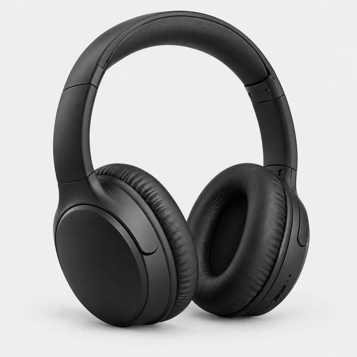
  <oc-media-object-card-v2 size="75" prefer-vertical-alignment variant="cut-out-image"><a href="#" aria-label="oc-auto"></a><picture slot="img"><img src="/previews/imagery/samples/otto-product-still/product-headphones.webp" alt="" style="margin:0;height:100%"></picture><span slot="headline">Kopfhörer »Studio«</span><span slot="subline">98,99 €</span><oc-action-signifier-v1 slot="action-signifier" variant="icon"></oc-action-signifier-v1></oc-media-object-card-v2>
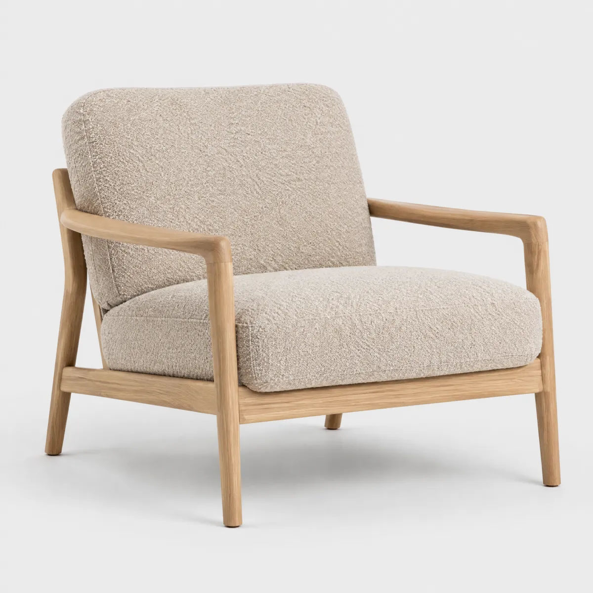
  <oc-media-object-card-v2 size="75" prefer-vertical-alignment variant="cut-out-image"><a href="#" aria-label="oc-auto"></a><picture slot="img"><img src="/previews/imagery/samples/otto-product-still/product-armchair.webp" alt="" style="margin:0;height:100%"></picture><span slot="headline">Sessel »Lounge«</span><span slot="subline">449,99 €</span><oc-action-signifier-v1 slot="action-signifier" variant="icon"></oc-action-signifier-v1></oc-media-object-card-v2>
Code
| Version | Tag | Status | API |
|---|---|---|---|
| v2 | <oc-media-object-card-v2> |
Stable, allowed for generation | MediaObjectCardV2 |
| v1 | <oc-media-object-card-v1> |
Deprecated, NOT allowed for generation | MediaObjectCardV1 |
Only the latest version (v2) is allowed for generation. Older versions are kept for reference and are deprecated.
Overview (v2)
MediaObjectCard
The mediaobjectcard component is an interactive container with customizable content areas for media and text. It has configurable elevation levels and sizes, and handles both link and button interactions.
Note
The component truncates overflowing content.
Common use cases include benefit cards, wishlist reminders, or anywhere media needs to be displayed with supporting text.
Default variation
<div style="width: 328px;">
  <oc-media-object-card-v2 class="${className}" variant="ambient-image" single-line size="100"
    >${unsafeHTML(defaultSlot)}${unsafeHTML(imgSlot)}${unsafeHTML(headlineSlot)}${unsafeHTML(sublineSlot)}${unsafeHTML(actionSignifierSlot)}
  </oc-media-object-card-v2>
</div>
${css}
Configuration
The mediaobjectcard component is available in the main styling variants ambient-image cut-out-image and icon as well as 4 different sizes: 25, 50, 75 and 100. The default size is 100.
This component is configurable, allowing you to tailor its features and appearance to your specific needs.
To explore all the available options and adjust the component, use the component configurator and see the changes affect the component in real-time.
Usage guidelines
Before integrating the mediaobjectcard component into your project, make sure you have correctly installed the OTTO components package. Look through the variations page for examples of possible component variations. Here, you can discover both common and specific variations that address different use cases.
Info
See the MediaObjectCard UX documentation for detailed user experience guidelines.
Accessibility
The mediaobjectcard component comes with a set of built-in accessibility features to ensure a seamless experience for all users.
Keyboard navigation
The media object card component supports keyboard navigation for accessibility purposes. The following table lists the keyboard shortcuts available for this component:
| Shortcut | Description |
|---|---|
| Tab | Moves focus to the card when it's interactive. |
| Enter/Space | Activates the card's primary action when focused. |
Use oc-aria-label
To make the mediaobjectcard recognizable for screen readers, use the oc-aria-label attribute to provide clear and descriptive context information.
See the general accessibility documentation for guidance on using oc-aria-label, including how it works with link and masked link behavior.
Test screen reader support
You can test the screen reader behavior of the mediaobjectcardin the Variation "As Link".
Configuration (v2)
MediaObjectCard configuration
Configure the mediaobjectcard component with the controls below and see the changes live in the preview canvas. Click the Show code button within the preview canvas to see the source code for the current component configuration.
<div style="width: 328px;">
  <oc-media-object-card-v2 class="${className}" variant="ambient-image" single-line size="100"
    >${unsafeHTML(defaultSlot)}${unsafeHTML(imgSlot)}${unsafeHTML(headlineSlot)}${unsafeHTML(sublineSlot)}${unsafeHTML(actionSignifierSlot)}
  </oc-media-object-card-v2>
</div>
${css}
Interactive configurator (Storybook controls); every option is listed in the API section of this file.
Migration (v2)
Migration from Media Object Card v1 to v2
The oc-media-object-card component has been updated from oc-media-object-card-v1 to oc-media-object-card-v2.
This migration guide provides step-by-step instructions to update your project to the latest version.
Skip to:
What's new
Simplified API with native elements
The component now uses native HTML elements (<a>, <button>) in the default slot instead of the primary-action slot, providing:
- Improved accessibility with native semantics
- Simpler API with fewer custom attributes
- Better form integration
Automatic accessibility labeling
The new aria-label="oc-auto" pattern automatically derives accessible names from the headline and subline slots:
<oc-media-object-card-v2 variant="ambient-image">
  <a href="/product" aria-label="oc-auto"></a>
  <img slot="img" src="image.jpg" alt="Product image" />
  <div slot="headline">Premium Widget</div>
  <div slot="subline">$49.99</div>
</oc-media-object-card-v2>
Width behavior attribute
The fit-content boolean attribute has been replaced with the more semantic width-behavior attribute that accepts "fill" (default) or "fit" values:
<oc-media-object-card-v2 width-behavior="fit">
  <!-- content -->
</oc-media-object-card-v2>
Icon color as CSS variable
The icon-color attribute has been converted to a CSS variable for better customization:
<oc-media-object-card-v2 variant="icon" icon="heart" style="--icon-color: #ff0000">
  <!-- content -->
</oc-media-object-card-v2>
Explicit interaction patterns
Instead of using attributes like as-button or base64-href, v2 makes the interaction pattern explicit through the HTML structure:
- Link:
<oc-media-object-card-v2><a href="...">...</a></oc-media-object-card-v2> - Button:
<oc-media-object-card-v2><button>...</button></oc-media-object-card-v2> - Masked link:
<oc-media-object-card-v2><div role="link" tabindex="0" data-masked-ref="...">...</div></oc-media-object-card-v2> - Link switching:
<oc-media-object-card-v2><a href="..." data-masked-ref="...">...</a></oc-media-object-card-v2>
This makes the component's behavior clearer and more maintainable.
API changes
Removed attributes
The following attributes have been removed and their functionality moved to the slotted element or renamed:
| v1 Attribute | v2 Equivalent | Notes |
|---|---|---|
align-headline |
Use --align-headline CSS variable |
Moved to CSS variable |
align-subline |
Use --align-subline CSS variable |
Moved to CSS variable |
as-button |
Use a <button> tag in the default slot |
Button behavior now explicit via native button |
background-color |
Use --background-color CSS variable |
Moved to CSS variable |
base64-href |
Use data-masked-ref attribute on <a> element in default slot |
Moved to slotted element |
fit-content |
width-behavior="fit" |
Renamed for clarity |
icon-color |
Use --icon-color CSS variable |
Moved to CSS variable |
oc-aria-label |
Use aria-label on the slotted element (or aria-label="oc-auto") |
Renamed to standard attribute |
rel |
Set rel attribute on the slotted <a> element |
Moved to native anchor element |
target |
Set target attribute on the slotted <a> element |
Moved to native anchor element |
Changed slots
| v1 Slot | v2 Slot | Notes |
|---|---|---|
primary-action |
default |
Interactive element (<a> or <button>) now goes in the default slot |
New slots
| Slot | Description |
|---|---|
default |
Contains the interactive element (<a>, <button>, or <div> for masked links). Supports oc-auto for accessibility. |
Unchanged attributes
| Attribute | Notes |
|---|---|
elevation-level |
Works the same in v2 |
icon |
Works the same in v2 |
inverted |
Works the same in v2 |
prefer-vertical-alignment |
Works the same in v2 |
single-line |
Works the same in v2 |
size |
Works the same in v2 |
variant |
Works the same in v2 |
Unchanged slots
| Slot | Notes |
|---|---|
action-signifier |
Works the same in v2 |
headline |
Works the same in v2 |
img |
Works the same in v2 |
subline |
Works the same in v2 |
CSS Variables
| v1 Property | v2 Property | Notes |
|---|---|---|
align-headline attribute |
--align-headline |
Moved from HTML attribute to CSS variable |
align-subline attribute |
--align-subline |
Moved from HTML attribute to CSS variable |
--background-color |
--background-color |
Works the same in v2 |
--cutout-overlay |
--cutout-overlay |
Works the same in v2 |
--icon-color |
--icon-color |
Works the same in v2 (see icon-color attribute removed above) |
How to migrate
The main change in v2 is the simplified API that uses the default slot for the interactive element (link or button) instead of managing it through attributes or the primary-action slot.
Migrate a basic media object card with link behavior
<!-- From: -->
<oc-media-object-card-v1 variant="ambient-image">
  <a slot="primary-action" href="/product" aria-labelledby="headline1 subline1"></a>
  <img slot="img" src="image.jpg" alt="Product image" />
  <div slot="headline" id="headline1">Headline</div>
  <div slot="subline" id="subline1">Subline</div>
</oc-media-object-card-v1>
<!-- To: -->
<oc-media-object-card-v2 variant="ambient-image">
  <a href="/product" aria-label="oc-auto"></a>
  <img slot="img" src="image.jpg" alt="Product image" />
  <div slot="headline">Headline</div>
  <div slot="subline">Subline</div>
</oc-media-object-card-v2>
Note: The aria-label="oc-auto" attribute enables automatic accessibility labeling from the headline and subline slots.
Migrate a media object card with button behavior
<!-- From: -->
<oc-media-object-card-v1 variant="icon" icon="wishlist" as-button oc-aria-label="Add to wishlist">
  <div slot="headline">Add to wishlist</div>
  <div slot="subline">Save for later</div>
</oc-media-object-card-v1>
<!-- To: -->
<oc-media-object-card-v2 variant="icon" icon="wishlist">
  <button aria-label="oc-auto"></button>
  <div slot="headline">Add to wishlist</div>
  <div slot="subline">Save for later</div>
</oc-media-object-card-v2>
Migrate a media object card with masked link (base64-href)
<!-- From: -->
<oc-media-object-card-v1 variant="ambient-image" base64-href="L3Byb2R1Y3Q=" oc-aria-label="View product">
  <img slot="img" src="image.jpg" alt="Product image" />
  <div slot="headline">Headline</div>
  <div slot="subline">Subline</div>
</oc-media-object-card-v1>
<!-- To: -->
<oc-media-object-card-v2 variant="ambient-image">
  <div role="link" tabindex="0" data-masked-ref="L3Byb2R1Y3Q=" aria-label="oc-auto"></div>
  <img slot="img" src="image.jpg" alt="Product image" />
  <div slot="headline">Headline</div>
  <div slot="subline">Subline</div>
</oc-media-object-card-v2>
Migrate a media object card with link switch behavior
<!-- From: -->
<oc-media-object-card-v1 variant="ambient-image" base64-href="L3VzZXI=">
  <a slot="primary-action" href="/seo-url" aria-label="View profile"></a>
  <img slot="img" src="image.jpg" alt="Profile picture" />
  <div slot="headline">Headline</div>
  <div slot="subline">Subline</div>
</oc-media-object-card-v1>
<!-- To: -->
<oc-media-object-card-v2 variant="ambient-image">
  <a href="/seo-url" data-masked-ref="L3VzZXI=" aria-label="oc-auto"></a>
  <img slot="img" src="image.jpg" alt="Profile picture" />
  <div slot="headline">Headline</div>
  <div slot="subline">Subline</div>
</oc-media-object-card-v2>
Migrate a text-only variant
<!-- From: -->
<oc-media-object-card-v1 variant="text-only" as-button oc-aria-label="Select option">
  <div slot="headline">Option Title</div>
  <div slot="subline">Option description</div>
</oc-media-object-card-v1>
<!-- To: -->
<oc-media-object-card-v2 variant="text-only">
  <button aria-label="oc-auto"></button>
  <div slot="headline">Option Title</div>
  <div slot="subline">Option description</div>
</oc-media-object-card-v2>
Migrate a card with custom background color
<!-- From: -->
<oc-media-object-card-v1 variant="ambient-image" background-color="#f0f0f0">
  <a slot="primary-action" href="/product" aria-label="View product"></a>
  <img slot="img" src="image.jpg" alt="Product image" />
  <div slot="headline">Product Name</div>
  <div slot="subline">$99.99</div>
</oc-media-object-card-v1>
<!-- To: -->
<oc-media-object-card-v2 variant="ambient-image" style="--background-color: #f0f0f0">
  <a href="/product" aria-label="oc-auto"></a>
  <img slot="img" src="image.jpg" alt="Product image" />
  <div slot="headline">Product Name</div>
  <div slot="subline">$99.99</div>
</oc-media-object-card-v2>
Migrate a card with cut-out image variant
<!-- From: -->
<oc-media-object-card-v1 variant="cut-out-image" style="--cutout-overlay: #f0f0f0">
  <a slot="primary-action" href="/product" aria-label="View product"></a>
  <img slot="img" src="image.jpg" alt="Product image" />
  <div slot="headline">Product Name</div>
  <div slot="subline">$99.99</div>
</oc-media-object-card-v1>
<!-- To: -->
<oc-media-object-card-v2 variant="cut-out-image" style="--cutout-overlay: #f0f0f0">
  <a href="/product" aria-label="oc-auto"></a>
  <img slot="img" src="image.jpg" alt="Product image" />
  <div slot="headline">Product Name</div>
  <div slot="subline">$99.99</div>
</oc-media-object-card-v2>
Migrate alignment attributes (align-headline / align-subline)
In v1, headline and subline alignment were controlled via HTML attributes. In v2, they are CSS custom properties.
<!-- From: -->
<oc-media-object-card-v1 variant="ambient-image" align-headline="center" align-subline="end">
  <div slot="headline">Headline</div>
  <div slot="subline">Subline</div>
</oc-media-object-card-v1>
<!-- To: -->
<oc-media-object-card-v2 variant="ambient-image" style="--align-headline: center; --align-subline: end">
  <div slot="headline">Headline</div>
  <div slot="subline">Subline</div>
</oc-media-object-card-v2>
Migrate width behavior (fit-content)
<!-- From: -->
<oc-media-object-card-v1 variant="icon" icon="info" fit-content>
  <div slot="headline">Info</div>
</oc-media-object-card-v1>
<!-- To: -->
<oc-media-object-card-v2 variant="icon" icon="info" width-behavior="fit">
  <div slot="headline">Info</div>
</oc-media-object-card-v2>
Migrate with action signifier
<!-- From: -->
<oc-media-object-card-v1 variant="ambient-image" as-button oc-aria-label="Card action">
  <img slot="img" src="image.jpg" alt="Product image" />
  <div slot="headline">Headline</div>
  <div slot="subline">Subline</div>
  <oc-action-signifier-v1 slot="action-signifier" variant="text" label="Action"></oc-action-signifier-v1>
</oc-media-object-card-v1>
<!-- To: -->
<oc-media-object-card-v2 variant="ambient-image">
  <button aria-label="oc-auto"></button>
  <img slot="img" src="image.jpg" alt="Product image" />
  <div slot="headline">Headline</div>
  <div slot="subline">Subline</div>
  <oc-action-signifier-v1 slot="action-signifier" variant="text" label="Action"></oc-action-signifier-v1>
</oc-media-object-card-v2>
Migrate with custom icon color
<!-- From: -->
<oc-media-object-card-v1 variant="icon" icon="heart" icon-color="#ff0000">
  <div slot="headline">Favorites</div>
</oc-media-object-card-v1>
<!-- To: -->
<oc-media-object-card-v2 variant="icon" icon="heart" style="--icon-color: #ff0000">
  <div slot="headline">Favorites</div>
</oc-media-object-card-v2>
API v1 (v1, deprecated, not for generation)
Media Object Card v1 API
API: <oc-media-object-card-v1> (MediaObjectCardV1)
The media object card component is a versatile UI element that combines media (like images or icons) with textual content (headline and subline) to create an engaging and informative card layout. It can be used in various contexts, such as displaying product information, user profiles, or any content that benefits from a visual representation alongside text.
Attributes / properties
| Attribute | Type | Default | Required | Description |
|---|---|---|---|---|
variant |
"icon" | "ambient-image" | "cut-out-image" | "text-only" |
"ambient-image" |
no | The variant of the media object card |
size |
"50" | "100" | "25" | "75" |
"100" |
no | Sets the size of the media object card |
icon |
icon name (427 values; see Icon list in `storybook/components/icon/README.md`) |
undefined |
no | Sets the icon of the media object card. |
inverted |
boolean |
undefined |
no | Sets the media-object-card styles to be inverted. |
fit-content |
boolean |
false |
no | Determines if the element should be as wide as the content. Only works if there is no custom width set. Set to true to make the media object card fit the content width. |
prefer-vertical-alignment |
boolean |
undefined |
no | Prefers vertical alignment of text whenever possible. |
single-line |
boolean |
undefined |
no | Whether the content should be shown in a single line |
align-headline |
"stretch" | "auto" | "normal" | "baseline" | "center" | "end" | "start" | "self-start" | "self-end" | "flex-start" | "flex-end" |
"baseline" |
no | Sets the alignment of the headline. Note: The alignment of the headline is only applied when slots are aligned horizontally. |
align-subline |
"stretch" | "auto" | "normal" | "baseline" | "center" | "end" | "start" | "self-start" | "self-end" | "flex-start" | "flex-end" |
"baseline" |
no | Sets the alignment of the subline. Note: The alignment of the headline is only applied when slots are aligned horizontally. |
elevation-level |
"canvas" | "stacked" | "above" | "sticky" |
"canvas" |
no | Sets the elevation level of the card. The elevation level determines the shadow and depth of the card. - canvas: no shadow, media-object-card appears flat, to be used on frame.Note: Has no effect, when background-color or inverted has been set. - stacked: shadow, media-object-card appears stacked, to be used on canvas.Note: Has no effect, when background-color or inverted has been set. - above: shadow, media-object-card appears above other levels. - sticky: shadow, media-object-card appears above all other levels and is sticky. |
background-color |
string |
undefined |
no | Sets a custom background color. |
icon-color |
string |
undefined |
no | Custom icon color |
base64-href |
string |
undefined |
no | Sets the base64-encoded link target of the media object card. Use this attribute to prevent search engines from indexing the link target. |
target |
"_blank" | "_self" | "_parent" | "_top" |
undefined |
no | Sets the target attribute of the media object card. Note Only applies when base64Href is set. |
rel |
string |
undefined |
no | Sets the rel attribute of the media object card. Note Only applies when base64Href is set. |
as-button |
boolean |
false |
no | Determines if the media object card behaves as a button or as a link when clicked. Set to true to make the media object card behave as a button and trigger an action instead of navigating to a new page. |
oc-aria-label |
string |
undefined |
no | Sets the ARIA label of the media object card. |
Slots
| Slot | Required | Description |
|---|---|---|
headline |
no | Sets the main headline. |
subline |
no | Sets the subline of the media object card. Use this slot to display additional information or context about the media object card. |
img |
no | Sets an image. |
action-signifier |
no | Action signifier slot For more information, see the action signifier documentation. |
primary-action |
no | Add an empty tag to change the default behavior of the card component. - empty a tag: the card component behaves as a link (SEO relevant) - empty button tag: the card component behaves as a button - empty div tag: for link masking when there are multiple interactive elements |
Events
| Event | Detail type | Description |
|---|---|---|
oc-property-change |
OcMediaObjectCardV1Events["oc-property-change"] |
Whenever a property value changes, this event triggers. Use this event to track all property changes within the component. Refer to the Events documentation for more information. |
oc-mount |
{ component: string; } |
Fired when the component is mounted to the DOM. The event is fired when the onMount hook of the component is called by the runtime. |
oc-unmount |
{ component: string; } |
Fired when the component is unmounted from the DOM. The event is fired when the function returned by the onMount hook of the component is called by the runtime. |
CSS custom properties
| Custom property | Default | Description |
|---|---|---|
--background-color |
undefined |
Sets a custom background color through a CSS variable. Note: The preferred way of using colors is via design tokens instead of hex values. |
--cutout-overlay |
undefined |
Sets the background color of the cutout area Note: Only applies when variant is set to "cut-out-image" |
--icon-color |
undefined |
Sets a custom icon color through a CSS variable. Note: The preferred way of using colors is via design tokens instead of hex values. |
API v2
Media Object Card v2 API
API: <oc-media-object-card-v2> (MediaObjectCardV2)
The media object card component is a versatile UI element that combines media (like images or icons) with textual content (headline and subline) to create an engaging and informative card layout. It can be used in various contexts, such as displaying product information, user profiles, or any content that benefits from a visual representation alongside text.
Attributes / properties
| Attribute | Type | Default | Required | Description |
|---|---|---|---|---|
variant |
"icon" | "ambient-image" | "cut-out-image" | "text-only" |
"ambient-image" |
no | The variant of the media object card |
size |
"50" | "100" | "25" | "75" |
"100" |
no | Sets the size of the media object card |
icon |
icon name (427 values; see Icon list in `storybook/components/icon/README.md`) |
undefined |
no | Sets the icon of the media object card. |
inverted |
boolean |
false |
no | Sets the media-object-card styles to be inverted. |
width-behavior |
"fill" | "fit" |
"fill" |
no | Defines the width behavior of the media card component. - "fill": The component expands to fill the available width. - "fit": The component width fits its content. |
prefer-vertical-alignment |
boolean |
false |
no | Prefers vertical alignment of text whenever possible. |
single-line |
boolean |
false |
no | Whether the content should be shown in a single line |
elevation-level |
"canvas" | "stacked" | "above" | "sticky" |
"canvas" |
no | Sets the elevation level of the card. The elevation level determines the shadow and depth of the card. - canvas: no shadow, media-object-card appears flat, to be used on frame.Note: Has no effect, when background-color or inverted has been set. - stacked: shadow, media-object-card appears stacked, to be used on canvas.Note: Has no effect, when background-color or inverted has been set. - above: shadow, media-object-card appears above other levels. - sticky: shadow, media-object-card appears above all other levels and is sticky. |
Slots
| Slot | Required | Description |
|---|---|---|
headline |
no | Sets the main headline. |
subline |
no | Sets the subline of the media object card. Use this slot to display additional information or context about the media object card. |
default |
no | Accepts one of the following elements: - <input type="checkbox"> for multi-selection - <input type="radio"> for single-selection - <button role="switch"> for switch behavior - <button> for button behavior - <a href="#"> for link behavior - <div data-masked-ref="..."> for masked link behavior - <a data-masked-ref="..."> for link switching - aria-current on <button> or <a> for current-marked behaviorFor more information on interactive components, refer to the interactive component slots documentation. |
img |
no | Sets an image. Note: When variant is set to "cut-out-image", pass a <picture> element, not a bare <img>. The --cutout-overlay is rendered via a pseudo-element, which is not supported on replaced elements like <img> and will not appear. |
action-signifier |
no | Action signifier slot For more information, see the action signifier documentation |
Events
| Event | Detail type | Description |
|---|---|---|
oc-property-change |
OcMediaObjectCardV2Events["oc-property-change"] |
Whenever a property value changes, this event triggers. Use this event to track all property changes within the component. Refer to the Events documentation for more information. |
oc-mount |
{ component: string; } |
Fired when the component is mounted to the DOM. The event is fired when the onMount hook of the component is called by the runtime. |
oc-unmount |
{ component: string; } |
Fired when the component is unmounted from the DOM. The event is fired when the function returned by the onMount hook of the component is called by the runtime. |
CSS custom properties
| Custom property | Default | Description |
|---|---|---|
--background-color |
undefined |
Sets the custom background color |
--cutout-overlay |
undefined |
Sets the background color of the cutout area Note: Only applies when variant is set to "cut-out-image" and the img slot is a <picture> element. Not supported on a bare <img>. |
--icon-color |
undefined |
Sets the custom icon color |
--align-headline |
"baseline" |
Sets the alignment of the headline. Note: The alignment of the headline is only applied when slots are aligned horizontally. |
--align-subline |
"baseline" |
Sets the alignment of the subline. Note: The alignment of the headline is only applied when slots are aligned horizontally. |
Variations (v2)
Variations
Listed below are the most common variations of the mediaobjectcard component as well as specific component variations for different use cases.
You can explore all available options using the component configurator, adjust the component to your needs, and see the changes live in a preview canvas.
Default
Story: components-media-object-card-variations--default · tags: components, media-object-card, 2, variations
Default Component
Args: variant=ambient-image, single-line=true, size=100
<div style="width: 328px;">
  <oc-media-object-card-v2 class="${className}" variant="ambient-image" single-line size="100"
    >${unsafeHTML(defaultSlot)}${unsafeHTML(imgSlot)}${unsafeHTML(headlineSlot)}${unsafeHTML(sublineSlot)}${unsafeHTML(actionSignifierSlot)}
  </oc-media-object-card-v2>
</div>
${css}
Story source (TypeScript, verbatim from Storybook)
{
  args: {
    variant: "ambient-image",
    "single-line": true,
    size: "100"
  },
  render({
    headlineSlot,
    sublineSlot,
    actionSignifierSlot,
    defaultSlot,
    imgSlot,
    ...props
  }) {
    const {
      css,
      className
    } = cssVariablesExample(props);
    return html`
      <div style="width: 328px;">
        <oc-media-object-card-v2 class="${className}" ${spread(props)}
          >${unsafeHTML(defaultSlot)}${unsafeHTML(imgSlot)}${unsafeHTML(headlineSlot)}${unsafeHTML(sublineSlot)}${unsafeHTML(actionSignifierSlot)}
        </oc-media-object-card-v2>
      </div>
      ${css}
    `;
  }
}
Action Signifier
Story: components-media-object-card-variations--action-signifier · tags: components, media-object-card, 2, variations
Variation using the action-signifier slot.
Args: variant=ambient-image, imgSlot=(see snippet), headlineSlot=<div slot='headline'>Headline</div>, sublineSlot=<div slot='subline'>Subline</div>, actionSignifierSlot=<oc-action-signifier-v1 slot='action-signifier' variant='text' label='Action'></oc-action-signifier-v1>

HTML
<oc-media-object-card-v2 variant="ambient-image">
<img slot="img" src="https://www.otto.de/assets-storybook/assets/img-placeholder-100.DVwSxVZf.png" alt="blue checkered background">
<div slot='headline'>Headline</div>
<div slot='subline'>Subline</div>
<oc-action-signifier-v1 slot='action-signifier' variant='text' label='Action'></oc-action-signifier-v1>
</oc-media-object-card-v2>
With checked behavior
Story: components-media-object-card-variations--with-checked-behavior · tags: components, media-object-card, 2, variations
The media object card can be marked as checked using a checkbox, a radio button, a switch button, or a current-marked link in the default slot. See marking content as checked for guidance on choosing the right pattern.
Args: variant=ambient-image, imgSlot=(see snippet), headlineSlot=<div slot='headline'>Headline</div>, sublineSlot=<div slot='subline'>Subline</div>
Checkbox
Radio button
Switch button
Current-marked link
HTML
<h2>Checkbox</h2>
<div class="row">
<oc-media-object-card-v2 variant="ambient-image">
  <input type="checkbox" aria-label="oc-auto" />
  <img slot="img" src="https://www.otto.de/assets-storybook/assets/img-placeholder-100.DVwSxVZf.png" alt="blue checkered background"><div slot='headline'>Headline</div><div slot='subline'>Subline</div>
</oc-media-object-card-v2>
<oc-media-object-card-v2 variant="ambient-image">
  <input type="checkbox" aria-label="oc-auto" checked />
  <img slot="img" src="https://www.otto.de/assets-storybook/assets/img-placeholder-100.DVwSxVZf.png" alt="blue checkered background"><div slot='headline'>Headline</div><div slot='subline'>Subline</div>
</oc-media-object-card-v2>
<oc-media-object-card-v2 variant="ambient-image">
  <input type="checkbox" aria-label="oc-auto" />
  <img slot="img" src="https://www.otto.de/assets-storybook/assets/img-placeholder-100.DVwSxVZf.png" alt="blue checkered background"><div slot='headline'>Headline</div><div slot='subline'>Subline</div>
</oc-media-object-card-v2>
<h2>Radio button</h2>
<div class="row">
<oc-media-object-card-v2 variant="ambient-image">
  <input type="radio" name="media-object-card-selection-demo" aria-label="oc-auto" />
  <img slot="img" src="https://www.otto.de/assets-storybook/assets/img-placeholder-100.DVwSxVZf.png" alt="blue checkered background"><div slot='headline'>Headline</div><div slot='subline'>Subline</div>
</oc-media-object-card-v2>
<oc-media-object-card-v2 variant="ambient-image">
  <input
    type="radio"
    name="media-object-card-selection-demo"
    aria-label="oc-auto"
    checked
  />
  <img slot="img" src="https://www.otto.de/assets-storybook/assets/img-placeholder-100.DVwSxVZf.png" alt="blue checkered background"><div slot='headline'>Headline</div><div slot='subline'>Subline</div>
</oc-media-object-card-v2>
<oc-media-object-card-v2 variant="ambient-image">
  <input type="radio" name="media-object-card-selection-demo" aria-label="oc-auto" />
  <img slot="img" src="https://www.otto.de/assets-storybook/assets/img-placeholder-100.DVwSxVZf.png" alt="blue checkered background"><div slot='headline'>Headline</div><div slot='subline'>Subline</div>
</oc-media-object-card-v2>
<h2>Switch button</h2>
<div class="row">
<oc-media-object-card-v2 variant="ambient-image">
  <button role="switch" aria-checked="false" aria-label="oc-auto"></button>
  <img slot="img" src="https://www.otto.de/assets-storybook/assets/img-placeholder-100.DVwSxVZf.png" alt="blue checkered background"><div slot='headline'>Headline</div><div slot='subline'>Subline</div>
</oc-media-object-card-v2>
<oc-media-object-card-v2 variant="ambient-image">
  <button role="switch" aria-checked="true" aria-label="oc-auto"></button>
  <img slot="img" src="https://www.otto.de/assets-storybook/assets/img-placeholder-100.DVwSxVZf.png" alt="blue checkered background"><div slot='headline'>Headline</div><div slot='subline'>Subline</div>
</oc-media-object-card-v2>
<oc-media-object-card-v2 variant="ambient-image">
  <button role="switch" aria-checked="false" aria-label="oc-auto"></button>
  <img slot="img" src="https://www.otto.de/assets-storybook/assets/img-placeholder-100.DVwSxVZf.png" alt="blue checkered background"><div slot='headline'>Headline</div><div slot='subline'>Subline</div>
</oc-media-object-card-v2>
<h2>Current-marked link</h2>
<div class="row">
<oc-media-object-card-v2 variant="ambient-image">
  <a href="#" aria-label="oc-auto"></a>
  <img slot="img" src="https://www.otto.de/assets-storybook/assets/img-placeholder-100.DVwSxVZf.png" alt="blue checkered background"><div slot='headline'>Headline</div><div slot='subline'>Subline</div>
</oc-media-object-card-v2>
<oc-media-object-card-v2 variant="ambient-image">
  <a href="#" aria-current="page" aria-label="oc-auto"></a>
  <img slot="img" src="https://www.otto.de/assets-storybook/assets/img-placeholder-100.DVwSxVZf.png" alt="blue checkered background"><div slot='headline'>Headline</div><div slot='subline'>Subline</div>
</oc-media-object-card-v2>
<oc-media-object-card-v2 variant="ambient-image">
  <a href="#" aria-label="oc-auto"></a>
  <img slot="img" src="https://www.otto.de/assets-storybook/assets/img-placeholder-100.DVwSxVZf.png" alt="blue checkered background"><div slot='headline'>Headline</div><div slot='subline'>Subline</div>
</oc-media-object-card-v2>
<style>
.row {
  display: flex;
  gap: 16px;
  flex-wrap: wrap;
  margin-bottom: 24px;
}
.row > oc-media-object-card-v2 {
  width: 200px;
}
h2 {
  margin-top: 16px;
}
</style>
Story source (TypeScript, verbatim from Storybook)
{
  name: "With checked behavior",
  args: {
    variant: "ambient-image",
    imgSlot: `<img slot="img" src="${placeholderImg}" alt="blue checkered background">`,
    headlineSlot: "<div slot='headline'>Headline</div>",
    sublineSlot: "<div slot='subline'>Subline</div>"
  },
  // eslint-disable-next-line @typescript-eslint/no-unused-vars -- actionSignifierSlot/defaultSlot are not used, this story renders fixed content
  render({
    headlineSlot,
    sublineSlot,
    actionSignifierSlot,
    defaultSlot,
    imgSlot,
    ...props
  }) {
    return html`
      <h2>Checkbox</h2>
      <div class="row">
        <oc-media-object-card-v2 ${spread(props)}>
          <input type="checkbox" aria-label="oc-auto" />
          ${unsafeHTML(imgSlot)}${unsafeHTML(headlineSlot)}${unsafeHTML(sublineSlot)}
        </oc-media-object-card-v2>
        <oc-media-object-card-v2 ${spread(props)}>
          <input type="checkbox" aria-label="oc-auto" checked />
          ${unsafeHTML(imgSlot)}${unsafeHTML(headlineSlot)}${unsafeHTML(sublineSlot)}
        </oc-media-object-card-v2>
        <oc-media-object-card-v2 ${spread(props)}>
          <input type="checkbox" aria-label="oc-auto" />
          ${unsafeHTML(imgSlot)}${unsafeHTML(headlineSlot)}${unsafeHTML(sublineSlot)}
        </oc-media-object-card-v2>
      </div>

      <h2>Radio button</h2>
      <div class="row">
        <oc-media-object-card-v2 ${spread(props)}>
          <input type="radio" name="media-object-card-selection-demo" aria-label="oc-auto" />
          ${unsafeHTML(imgSlot)}${unsafeHTML(headlineSlot)}${unsafeHTML(sublineSlot)}
        </oc-media-object-card-v2>
        <oc-media-object-card-v2 ${spread(props)}>
          <input
            type="radio"
            name="media-object-card-selection-demo"
            aria-label="oc-auto"
            checked
          />
          ${unsafeHTML(imgSlot)}${unsafeHTML(headlineSlot)}${unsafeHTML(sublineSlot)}
        </oc-media-object-card-v2>
        <oc-media-object-card-v2 ${spread(props)}>
          <input type="radio" name="media-object-card-selection-demo" aria-label="oc-auto" />
          ${unsafeHTML(imgSlot)}${unsafeHTML(headlineSlot)}${unsafeHTML(sublineSlot)}
        </oc-media-object-card-v2>
      </div>

      <h2>Switch button</h2>
      <div class="row">
        <oc-media-object-card-v2 ${spread(props)}>
          <button role="switch" aria-checked="false" aria-label="oc-auto"></button>
          ${unsafeHTML(imgSlot)}${unsafeHTML(headlineSlot)}${unsafeHTML(sublineSlot)}
        </oc-media-object-card-v2>
        <oc-media-object-card-v2 ${spread(props)}>
          <button role="switch" aria-checked="true" aria-label="oc-auto"></button>
          ${unsafeHTML(imgSlot)}${unsafeHTML(headlineSlot)}${unsafeHTML(sublineSlot)}
        </oc-media-object-card-v2>
        <oc-media-object-card-v2 ${spread(props)}>
          <button role="switch" aria-checked="false" aria-label="oc-auto"></button>
          ${unsafeHTML(imgSlot)}${unsafeHTML(headlineSlot)}${unsafeHTML(sublineSlot)}
        </oc-media-object-card-v2>
      </div>

      <h2>Current-marked link</h2>
      <div class="row">
        <oc-media-object-card-v2 ${spread(props)}>
          <a href="#" aria-label="oc-auto"></a>
          ${unsafeHTML(imgSlot)}${unsafeHTML(headlineSlot)}${unsafeHTML(sublineSlot)}
        </oc-media-object-card-v2>
        <oc-media-object-card-v2 ${spread(props)}>
          <a href="#" aria-current="page" aria-label="oc-auto"></a>
          ${unsafeHTML(imgSlot)}${unsafeHTML(headlineSlot)}${unsafeHTML(sublineSlot)}
        </oc-media-object-card-v2>
        <oc-media-object-card-v2 ${spread(props)}>
          <a href="#" aria-label="oc-auto"></a>
          ${unsafeHTML(imgSlot)}${unsafeHTML(headlineSlot)}${unsafeHTML(sublineSlot)}
        </oc-media-object-card-v2>
      </div>

      <style>
        .row {
          display: flex;
          gap: 16px;
          flex-wrap: wrap;
          margin-bottom: 24px;
        }

        .row > oc-media-object-card-v2 {
          width: 200px;
        }

        h2 {
          margin-top: 16px;
        }
      </style>
    `;
  }
}
With button behavior
Story: components-media-object-card-variations--with-button-behavior · tags: components, media-object-card, 2, variations
The media object card can also be used with button behavior by placing a button element in the default slot.
Args: variant=ambient-image, imgSlot=(see snippet), headlineSlot=<div slot='headline'>Headline</div>, sublineSlot=<div slot='subline'>Subline</div>, defaultSlot=<button aria-label='oc-auto'></button>
HTML
<oc-media-object-card-v2 variant="ambient-image">
<img slot="img" src="https://www.otto.de/assets-storybook/assets/img-placeholder-100.DVwSxVZf.png" alt="blue checkered background">
<div slot='headline'>Headline</div>
<div slot='subline'>Subline</div>
<button aria-label='oc-auto'></button>
</oc-media-object-card-v2>
With link behavior
Story: components-media-object-card-variations--with-link-behavior · tags: components, media-object-card, 2, variations
The media object card component with a link as action. Search engines will detect the href.
Args: variant=ambient-image, imgSlot=(see snippet), headlineSlot=<div slot='headline' >Headline</div>, sublineSlot=<div slot='subline' >Subline</div>, defaultSlot=<a href='#' aria-label='oc-auto'></a>
HTML
<oc-media-object-card-v2 variant="ambient-image">
<img slot="img" src="https://www.otto.de/assets-storybook/assets/img-placeholder-100.DVwSxVZf.png" alt="blue checkered background">
<div slot='headline' >Headline</div>
<div slot='subline' >Subline</div>
<a href='#' aria-label='oc-auto'></a>
</oc-media-object-card-v2>
With masked link behavior
Story: components-media-object-card-variations--with-masked-link-behavior · tags: components, media-object-card, 2, variations
The media object card component with a masked link. Search engines will not detect the href.
Args: variant=ambient-image, imgSlot=(see snippet), headlineSlot=<div slot='headline'>Headline</div>, sublineSlot=<div slot='subline'>Subline</div>, defaultSlot=<div role="link" tabindex="0" data-masked-ref="Iw==" aria-label='oc-auto'></div>
HTML
<oc-media-object-card-v2 variant="ambient-image">
<img slot="img" src="https://www.otto.de/assets-storybook/assets/img-placeholder-100.DVwSxVZf.png" alt="blue checkered background">
<div slot='headline'>Headline</div>
<div slot='subline'>Subline</div>
<div role="link" tabindex="0" data-masked-ref="Iw==" aria-label='oc-auto'></div>
</oc-media-object-card-v2>
With link switch behavior
Story: components-media-object-card-variations--with-link-switch-behavior · tags: components, media-object-card, 2, variations
The media object card component with a link with switch behavior. Search engines will detect the href, while users receive the Base64-encoded version.
Args: variant=ambient-image, imgSlot=(see snippet), headlineSlot=<div slot='headline'>Headline</div>, sublineSlot=<div slot='subline'>Subline</div>, defaultSlot=<a href='#' data-masked-ref="Iw==" aria-label='oc-auto'></a>
HTML
<oc-media-object-card-v2 variant="ambient-image">
<img slot="img" src="https://www.otto.de/assets-storybook/assets/img-placeholder-100.DVwSxVZf.png" alt="blue checkered background">
<div slot='headline'>Headline</div>
<div slot='subline'>Subline</div>
<a href='#' data-masked-ref="Iw==" aria-label='oc-auto'></a>
</oc-media-object-card-v2>
Ambient Image
Story: components-media-object-card-variations--ambient-image · tags: components, media-object-card, 2, variations
Ambient Image variant
Args: variant=ambient-image, imgSlot=(see snippet), headlineSlot=<div slot='headline'>Headline</div>, sublineSlot=<div slot='subline'>Subline</div>, size=100
HTML
<oc-media-object-card-v2 variant="ambient-image" size="100">
<picture slot="img">
                <img loading="eager" src="https://www.otto.de/assets-storybook/assets/img-placeholder-100.DVwSxVZf.png" alt="blue checkered background">
              </picture>
<div slot='headline'>Headline</div>
<div slot='subline'>Subline</div>
</oc-media-object-card-v2>
Cut Out Image
Story: components-media-object-card-variations--cut-out-image · tags: components, media-object-card, 2, variations
Cutout Image variant
Args: variant=cut-out-image, imgSlot=(see snippet), headlineSlot=<div slot='headline'>Headline</div>, sublineSlot=<div slot='subline'>Subline</div>, size=100
HTML
<oc-media-object-card-v2 variant="cut-out-image" size="100">
<picture slot="img">
                <img loading="eager" src="https://www.otto.de/assets-storybook/assets/img-placeholder-100.DVwSxVZf.png" alt="blue checkered background">
              </picture>
<div slot='headline'>Headline</div>
<div slot='subline'>Subline</div>
</oc-media-object-card-v2>
Icon
Story: components-media-object-card-variations--icon · tags: components, media-object-card, 2, variations
Icon variant
Args: variant=icon, icon=duration, headlineSlot=<div slot='headline'>Headline</div>, sublineSlot=<div slot='subline'>Subline</div>, size=100
HTML
<oc-media-object-card-v2 variant="icon" icon="duration" size="100">
<div slot='headline'>Headline</div>
<div slot='subline'>Subline</div>
</oc-media-object-card-v2>
Text Only
Story: components-media-object-card-variations--text-only · tags: components, media-object-card, 2, variations
Text-Only variant
Args: variant=text-only, headlineSlot=<div slot='headline'>Headline</div>, sublineSlot=<div slot='subline'>Subline</div>, size=100
HTML
<oc-media-object-card-v2 variant="text-only" size="100">
<div slot='headline'>Headline</div>
<div slot='subline'>Subline</div>
</oc-media-object-card-v2>
Inverted
Story: components-media-object-card-variations--inverted · tags: components, media-object-card, 2, variations
Inverted variant
Args: variant=ambient-image, imgSlot=(see snippet), headlineSlot=<div slot='headline'>Headline</div>, sublineSlot=<div slot='subline'>Subline</div>, size=100, inverted=true
HTML
<oc-media-object-card-v2 variant="ambient-image" size="100" inverted>
<img slot="img" src="https://www.otto.de/assets-storybook/assets/img-placeholder-100.DVwSxVZf.png" alt="blue checkered background">
<div slot='headline'>Headline</div>
<div slot='subline'>Subline</div>
</oc-media-object-card-v2>
Prefer Vertical Alignment
Story: components-media-object-card-variations--prefer-vertical-alignment · tags: components, media-object-card, 2, variations
Prefer vertical alignment variant
Args: variant=ambient-image, imgSlot=(see snippet), headlineSlot=<div slot='headline'>Lorem ipsum dolor sit amet, consetetur sadipscing elitr</div>, sublineSlot=<div slot='subline'>Subline foo bar baz</div>, prefer-vertical-alignment=true, size=100, inverted=true
HTML
<oc-media-object-card-v2 variant="ambient-image" prefer-vertical-alignment size="100" inverted>
<img slot="img" src="https://www.otto.de/assets-storybook/assets/img-placeholder-100.DVwSxVZf.png" alt="blue checkered background">
<div slot='headline'>Lorem ipsum dolor sit amet, consetetur sadipscing elitr</div>
<div slot='subline'>Subline foo bar baz</div>
</oc-media-object-card-v2>
Demo: Text Resizing
Story: components-media-object-card-variations--demo-text-resizing · tags: components, media-object-card, 2, variations
Demo: Text Resizing
Args: imgSlot=(see snippet), headlineSlot=<div slot='headline'>Lorem ipsum dolor sit amet, consetetur sadipscing elitr</div>, sublineSlot=<div slot='subline'>Subline foo bar baz</div>, size=100
<p id="current-font-size-text">Current Font-Size: 16px</p>

<br />
<br />

<h1>Restricted Width</h1>
<div style="width: 80%; display: flex; flex-direction: column; gap: 16px; ">
  <oc-media-object-card-v2 style="width: 320px" size="100"
    >${unsafeHTML(defaultSlot)}<img slot="img" src="https://www.otto.de/assets-storybook/assets/img-placeholder-100.DVwSxVZf.png" alt="blue checkered background"><div slot='headline'>Lorem ipsum dolor sit amet, consetetur sadipscing elitr</div><div slot='subline'>Subline foo bar baz</div>
  </oc-media-object-card-v2>

  <oc-media-object-card-v2 style="width: 320px" size="100"
    >${unsafeHTML(defaultSlot)}<img slot="img" src="https://www.otto.de/assets-storybook/assets/img-placeholder-100.DVwSxVZf.png" alt="blue checkered background"><div slot='headline'>Lorem ipsum dolor sit amet, consetetur sadipscing elitr</div><div slot='subline'>Subline foo bar baz</div>
  </oc-media-object-card-v2>

  <oc-media-object-card-v2
    style="width: 320px"
    size="100"
    variant="icon"
    icon="duration"
    >${unsafeHTML(defaultSlot)}<img slot="img" src="https://www.otto.de/assets-storybook/assets/img-placeholder-100.DVwSxVZf.png" alt="blue checkered background"><div slot='headline'>Lorem ipsum dolor sit amet, consetetur sadipscing elitr</div><div slot='subline'>Subline foo bar baz</div>
  </oc-media-object-card-v2>
</div>

<br />
<br />

<h1>Fit Content</h1>

<div style="width: 80%; display: flex; flex-direction: column; gap: 16px; ">
  <oc-media-object-card-v2 width-behavior="fit" size="100"
    >${unsafeHTML(defaultSlot)}<img slot="img" src="https://www.otto.de/assets-storybook/assets/img-placeholder-100.DVwSxVZf.png" alt="blue checkered background"><div slot='headline'>Lorem ipsum dolor sit amet, consetetur sadipscing elitr</div><div slot='subline'>Subline foo bar baz</div>
  </oc-media-object-card-v2>

  <oc-media-object-card-v2 size="100" width-behavior="fit"
    >${unsafeHTML(defaultSlot)}<img slot="img" src="https://www.otto.de/assets-storybook/assets/img-placeholder-100.DVwSxVZf.png" alt="blue checkered background"><div slot='headline'>Lorem ipsum dolor sit amet, consetetur sadipscing elitr</div><div slot='subline'>Subline foo bar baz</div>
  </oc-media-object-card-v2>

  <oc-media-object-card-v2
    size="100"
    variant="icon"
    icon="duration"
    width-behavior="fit"
    >${unsafeHTML(defaultSlot)}<img slot="img" src="https://www.otto.de/assets-storybook/assets/img-placeholder-100.DVwSxVZf.png" alt="blue checkered background"><div slot='headline'>Lorem ipsum dolor sit amet, consetetur sadipscing elitr</div><div slot='subline'>Subline foo bar baz</div>
  </oc-media-object-card-v2>
</div>

<br />
<br />

<h1>Fill Parent</h1>

<div style="width: 80%; display: flex; flex-direction: column; gap: 16px; ">
  <oc-media-object-card-v2 size="100"
    >${unsafeHTML(defaultSlot)}<img slot="img" src="https://www.otto.de/assets-storybook/assets/img-placeholder-100.DVwSxVZf.png" alt="blue checkered background"><div slot='headline'>Lorem ipsum dolor sit amet, consetetur sadipscing elitr</div><div slot='subline'>Subline foo bar baz</div>
  </oc-media-object-card-v2>

  <oc-media-object-card-v2 size="100"
    >${unsafeHTML(defaultSlot)}<img slot="img" src="https://www.otto.de/assets-storybook/assets/img-placeholder-100.DVwSxVZf.png" alt="blue checkered background"><div slot='headline'>Lorem ipsum dolor sit amet, consetetur sadipscing elitr</div><div slot='subline'>Subline foo bar baz</div>
  </oc-media-object-card-v2>

  <oc-media-object-card-v2 size="100" variant="icon" icon="duration"
    >${unsafeHTML(defaultSlot)}<img slot="img" src="https://www.otto.de/assets-storybook/assets/img-placeholder-100.DVwSxVZf.png" alt="blue checkered background"><div slot='headline'>Lorem ipsum dolor sit amet, consetetur sadipscing elitr</div><div slot='subline'>Subline foo bar baz</div>
  </oc-media-object-card-v2>
</div>

<div style="display: flex; flex-direction: column; gap: 16px; margin-top: 32px">
  <oc-button-v1 id="increase-font-size-button" width-behavior="fit"
    >Increase font-size</oc-button-v1
  >
  <oc-button-v1 id="decrease-font-size-button" width-behavior="fit"
    >Decrease font-size</oc-button-v1
  >
  <oc-button-v1 id="reset-font-size-button" width-behavior="fit"
    >Reset font-size</oc-button-v1
  >
</div>

<script>
  (() => {
    let currentFontSize = 16;
    const currentFontSizeText = document.getElementById("current-font-size-text");

    const increaseFontSizeButton = document.getElementById("increase-font-size-button");
    const decreaseFontSizeButton = document.getElementById("decrease-font-size-button");
    const resetFontSizeButton = document.getElementById("reset-font-size-button");

    increaseFontSizeButton.addEventListener("click", increaseFontSize);
    decreaseFontSizeButton.addEventListener("click", decreaseFontSize);
    resetFontSizeButton.addEventListener("click", resetFontSize);

    function increaseFontSize() {
      if (!document.querySelector("#custom-font-size")) {
        const style = document.createElement("style");

        style.id = "custom-font-size";
        currentFontSize += 1;
        style.innerText = "html { font-size: " + currentFontSize + "px }";

        document.head.append(style);
      } else {
        currentFontSize += 1;
        currentFontSizeText.innerText = "Current Font-Size: " + currentFontSize + " px";
        document.querySelector("#custom-font-size").innerText =
          "html { font-size: " + currentFontSize + "px }";
      }
    }

    function decreaseFontSize() {
      if (!document.querySelector("#custom-font-size")) {
        const style = document.createElement("style");

        style.id = "custom-font-size";

        style.innerText = "html { font-size: " + currentFontSize + "px }";

        document.head.append(style);
      } else {
        currentFontSize -= 1;
        currentFontSizeText.innerText = "Current Font-Size: " + currentFontSize + " px";
        document.querySelector("#custom-font-size").innerText =
          "html { font-size: " + currentFontSize + "px }";
      }
    }

    function resetFontSize() {
      if (!document.querySelector("#custom-font-size")) {
        const style = document.createElement("style");

        style.id = "custom-font-size";

        style.innerText = "html { font-size: 16px }";

        document.head.append(style);
      } else {
        currentFontSize = 16;
        currentFontSizeText.innerText = "Current Font-Size: " + currentFontSize + " px";
        document.querySelector("#custom-font-size").innerText =
          "html { font-size: " + currentFontSize + "px }";
      }
    }
  })();
</script>
Story source (TypeScript, verbatim from Storybook)
{
  name: "Demo: Text Resizing",
  parameters: {
    chromatic: {
      hideInChromatic: true
    }
  },
  args: {
    imgSlot: `<img slot="img" src="${placeholderImg}" alt="blue checkered background">`,
    headlineSlot: "<div slot='headline'>Lorem ipsum dolor sit amet, consetetur sadipscing elitr</div>",
    sublineSlot: "<div slot='subline'>Subline foo bar baz</div>",
    size: "100"
  },
  render(args) {
    const {
      headlineSlot,
      imgSlot,
      sublineSlot,
      defaultSlot,
      ...props
    } = args;
    return html`
      <p id="current-font-size-text">Current Font-Size: 16px</p>

      <br />
      <br />

      <h1>Restricted Width</h1>
      <div style="width: 80%; display: flex; flex-direction: column; gap: 16px; ">
        <oc-media-object-card-v2 style="width: 320px" ${spread(props)}
          >${unsafeHTML(defaultSlot)}${unsafeHTML(imgSlot)}${unsafeHTML(headlineSlot)}${unsafeHTML(sublineSlot)}
        </oc-media-object-card-v2>

        <oc-media-object-card-v2 style="width: 320px" ${spread(props)}
          >${unsafeHTML(defaultSlot)}${unsafeHTML(imgSlot)}${unsafeHTML(headlineSlot)}${unsafeHTML(sublineSlot)}
        </oc-media-object-card-v2>

        <oc-media-object-card-v2
          style="width: 320px"
          ${spread(props)}
          variant="icon"
          icon="duration"
          >${unsafeHTML(defaultSlot)}${unsafeHTML(imgSlot)}${unsafeHTML(headlineSlot)}${unsafeHTML(sublineSlot)}
        </oc-media-object-card-v2>
      </div>

      <br />
      <br />

      <h1>Fit Content</h1>

      <div style="width: 80%; display: flex; flex-direction: column; gap: 16px; ">
        <oc-media-object-card-v2 width-behavior="fit" ${spread(props)}
          >${unsafeHTML(defaultSlot)}${unsafeHTML(imgSlot)}${unsafeHTML(headlineSlot)}${unsafeHTML(sublineSlot)}
        </oc-media-object-card-v2>

        <oc-media-object-card-v2 ${spread(props)} width-behavior="fit"
          >${unsafeHTML(defaultSlot)}${unsafeHTML(imgSlot)}${unsafeHTML(headlineSlot)}${unsafeHTML(sublineSlot)}
        </oc-media-object-card-v2>

        <oc-media-object-card-v2
          ${spread(props)}
          variant="icon"
          icon="duration"
          width-behavior="fit"
          >${unsafeHTML(defaultSlot)}${unsafeHTML(imgSlot)}${unsafeHTML(headlineSlot)}${unsafeHTML(sublineSlot)}
        </oc-media-object-card-v2>
      </div>

      <br />
      <br />

      <h1>Fill Parent</h1>

      <div style="width: 80%; display: flex; flex-direction: column; gap: 16px; ">
        <oc-media-object-card-v2 ${spread(props)}
          >${unsafeHTML(defaultSlot)}${unsafeHTML(imgSlot)}${unsafeHTML(headlineSlot)}${unsafeHTML(sublineSlot)}
        </oc-media-object-card-v2>

        <oc-media-object-card-v2 ${spread(props)}
          >${unsafeHTML(defaultSlot)}${unsafeHTML(imgSlot)}${unsafeHTML(headlineSlot)}${unsafeHTML(sublineSlot)}
        </oc-media-object-card-v2>

        <oc-media-object-card-v2 ${spread(props)} variant="icon" icon="duration"
          >${unsafeHTML(defaultSlot)}${unsafeHTML(imgSlot)}${unsafeHTML(headlineSlot)}${unsafeHTML(sublineSlot)}
        </oc-media-object-card-v2>
      </div>

      <div style="display: flex; flex-direction: column; gap: 16px; margin-top: 32px">
        <oc-button-v1 id="increase-font-size-button" width-behavior="fit"
          >Increase font-size</oc-button-v1
        >
        <oc-button-v1 id="decrease-font-size-button" width-behavior="fit"
          >Decrease font-size</oc-button-v1
        >
        <oc-button-v1 id="reset-font-size-button" width-behavior="fit"
          >Reset font-size</oc-button-v1
        >
      </div>

      <script>
        (() => {
          let currentFontSize = 16;
          const currentFontSizeText = document.getElementById("current-font-size-text");

          const increaseFontSizeButton = document.getElementById("increase-font-size-button");
          const decreaseFontSizeButton = document.getElementById("decrease-font-size-button");
          const resetFontSizeButton = document.getElementById("reset-font-size-button");

          increaseFontSizeButton.addEventListener("click", increaseFontSize);
          decreaseFontSizeButton.addEventListener("click", decreaseFontSize);
          resetFontSizeButton.addEventListener("click", resetFontSize);

          function increaseFontSize() {
            if (!document.querySelector("#custom-font-size")) {
              const style = document.createElement("style");

              style.id = "custom-font-size";
              currentFontSize += 1;
              style.innerText = "html { font-size: " + currentFontSize + "px }";

              document.head.append(style);
            } else {
              currentFontSize += 1;
              currentFontSizeText.innerText = "Current Font-Size: " + currentFontSize + " px";
              document.querySelector("#custom-font-size").innerText =
                "html { font-size: " + currentFontSize + "px }";
            }
          }

          function decreaseFontSize() {
            if (!document.querySelector("#custom-font-size")) {
              const style = document.createElement("style");

              style.id = "custom-font-size";

              style.innerText = "html { font-size: " + currentFontSize + "px }";

              document.head.append(style);
            } else {
              currentFontSize -= 1;
              currentFontSizeText.innerText = "Current Font-Size: " + currentFontSize + " px";
              document.querySelector("#custom-font-size").innerText =
                "html { font-size: " + currentFontSize + "px }";
            }
          }

          function resetFontSize() {
            if (!document.querySelector("#custom-font-size")) {
              const style = document.createElement("style");

              style.id = "custom-font-size";

              style.innerText = "html { font-size: 16px }";

              document.head.append(style);
            } else {
              currentFontSize = 16;
              currentFontSizeText.innerText = "Current Font-Size: " + currentFontSize + " px";
              document.querySelector("#custom-font-size").innerText =
                "html { font-size: " + currentFontSize + "px }";
            }
          }
        })();
      </script>
    `;
  }
}
Demo: Icon color
Story: components-media-object-card-variations--demo-icon-color · tags: components, media-object-card, 2, variations
Demo: Icon Color
Args: variant=icon, icon=duration, headlineSlot=<div slot='headline'>Headline</div>, sublineSlot=<div slot='subline'>Subline</div>, size=100
<div style="width: 80%; display: flex; gap: 16px; flex-wrap: wrap">
  <oc-media-object-card-v2 style="width: 350px;" variant="icon" icon="duration" size="100"
    >${unsafeHTML(defaultSlot)}${unsafeHTML(imgSlot)}<div slot='headline'>Headline</div><div slot='subline'>Subline</div>
  </oc-media-object-card-v2>

  <oc-media-object-card-v2 style="width: 350px; --icon-color: #F00020" variant="icon" icon="duration" size="100"
    >${unsafeHTML(defaultSlot)}${unsafeHTML(imgSlot)}<div slot='headline'>Headline</div><div slot='subline'>Subline</div>
  </oc-media-object-card-v2>

  <oc-media-object-card-v2
    style="width: 350px; --icon-color: #007268"
    variant="icon" icon="duration" size="100"
    icon-color="#007268"
    >${unsafeHTML(defaultSlot)}${unsafeHTML(imgSlot)}<div slot='headline'>Headline</div><div slot='subline'>Subline</div>
  </oc-media-object-card-v2>

  <oc-media-object-card-v2 style="width: 350px;" variant="icon" icon="duration" size="100" inverted
    >${unsafeHTML(defaultSlot)}${unsafeHTML(imgSlot)}<div slot='headline'>Headline</div><div slot='subline'>Subline</div>
  </oc-media-object-card-v2>

  <oc-media-object-card-v2
    style="width: 350px; --background-color: #212121; --icon-color: #008CF8"
    variant="icon" icon="duration" size="100"
    inverted
    >${unsafeHTML(defaultSlot)}${unsafeHTML(imgSlot)}<div slot='headline'>Headline</div><div slot='subline'>Subline</div>
  </oc-media-object-card-v2>
</div>
Story source (TypeScript, verbatim from Storybook)
{
  name: "Demo: Icon color",
  parameters: {
    chromatic: {
      hideInChromatic: true
    }
  },
  args: {
    variant: "icon",
    icon: "duration",
    headlineSlot: "<div slot='headline'>Headline</div>",
    sublineSlot: "<div slot='subline'>Subline</div>",
    size: "100"
  },
  render(args) {
    const {
      headlineSlot,
      imgSlot,
      sublineSlot,
      defaultSlot,
      ...props
    } = args;
    return html`
      <div style="width: 80%; display: flex; gap: 16px; flex-wrap: wrap">
        <oc-media-object-card-v2 style="width: 350px;" ${spread(props)}
          >${unsafeHTML(defaultSlot)}${unsafeHTML(imgSlot)}${unsafeHTML(headlineSlot)}${unsafeHTML(sublineSlot)}
        </oc-media-object-card-v2>

        <oc-media-object-card-v2 style="width: 350px; --icon-color: #F00020" ${spread(props)}
          >${unsafeHTML(defaultSlot)}${unsafeHTML(imgSlot)}${unsafeHTML(headlineSlot)}${unsafeHTML(sublineSlot)}
        </oc-media-object-card-v2>

        <oc-media-object-card-v2
          style="width: 350px; --icon-color: #007268"
          ${spread(props)}
          icon-color="#007268"
          >${unsafeHTML(defaultSlot)}${unsafeHTML(imgSlot)}${unsafeHTML(headlineSlot)}${unsafeHTML(sublineSlot)}
        </oc-media-object-card-v2>

        <oc-media-object-card-v2 style="width: 350px;" ${spread(props)} inverted
          >${unsafeHTML(defaultSlot)}${unsafeHTML(imgSlot)}${unsafeHTML(headlineSlot)}${unsafeHTML(sublineSlot)}
        </oc-media-object-card-v2>

        <oc-media-object-card-v2
          style="width: 350px; --background-color: #212121; --icon-color: #008CF8"
          ${spread(props)}
          inverted
          >${unsafeHTML(defaultSlot)}${unsafeHTML(imgSlot)}${unsafeHTML(headlineSlot)}${unsafeHTML(sublineSlot)}
        </oc-media-object-card-v2>
      </div>
    `;
  }
}
Demo: Background color
Story: components-media-object-card-variations--demo-background-color · tags: components, media-object-card, 2, variations
Demo: Background Color
Args: variant=icon, icon=duration, headlineSlot=<div slot='headline'>Headline</div>, sublineSlot=<div slot='subline'>Subline</div>, size=100
<div style="width: 80%; display: flex; gap: 16px; flex-wrap: wrap">
  <oc-media-object-card-v2 style="width: 350px;" variant="icon" icon="duration" size="100" inverted
    >${unsafeHTML(imgSlot)}<div slot='headline'>Headline</div><div slot='subline'>Subline</div>
  </oc-media-object-card-v2>

  <oc-media-object-card-v2
    style="width: 350px; --background-color: #006058"
    variant="icon" icon="duration" size="100"
    inverted
    >${unsafeHTML(imgSlot)}<div slot='headline'>Headline</div><div slot='subline'>Subline</div>
  </oc-media-object-card-v2>

  <oc-media-object-card-v2
    style="width: 350px; --background-color: #1E5A78"
    variant="icon" icon="duration" size="100"
    inverted
    >${unsafeHTML(imgSlot)}<div slot='headline'>Headline</div><div slot='subline'>Subline</div>
  </oc-media-object-card-v2>

  <oc-media-object-card-v2
    style="width: 350px; --background-color: #5E8114"
    variant="icon" icon="duration" size="100"
    inverted
    >${unsafeHTML(imgSlot)}<div slot='headline'>Headline</div><div slot='subline'>Subline</div>
  </oc-media-object-card-v2>

  <oc-media-object-card-v2
    style="width: 350px; --background-color: #6C49CF"
    variant="icon" icon="duration" size="100"
    inverted
    >${unsafeHTML(imgSlot)}<div slot='headline'>Headline</div><div slot='subline'>Subline</div>
  </oc-media-object-card-v2>

  <oc-media-object-card-v2
    style="width: 350px; --background-color: #801489"
    variant="icon" icon="duration" size="100"
    inverted
    >${unsafeHTML(imgSlot)}<div slot='headline'>Headline</div><div slot='subline'>Subline</div>
  </oc-media-object-card-v2>

  <oc-media-object-card-v2
    style="width: 350px; --background-color: #8C2D4B"
    variant="icon" icon="duration" size="100"
    inverted
    >${unsafeHTML(imgSlot)}<div slot='headline'>Headline</div><div slot='subline'>Subline</div>
  </oc-media-object-card-v2>

  <oc-media-object-card-v2
    style="width: 350px; --background-color: #E95D21"
    variant="icon" icon="duration" size="100"
    inverted
    >${unsafeHTML(imgSlot)}<div slot='headline'>Headline</div><div slot='subline'>Subline</div>
  </oc-media-object-card-v2>

  <oc-media-object-card-v2
    style="width: 350px; --background-color: #9E790D"
    variant="icon" icon="duration" size="100"
    inverted
    >${unsafeHTML(imgSlot)}<div slot='headline'>Headline</div><div slot='subline'>Subline</div>
  </oc-media-object-card-v2>
</div>
Story source (TypeScript, verbatim from Storybook)
{
  name: "Demo: Background color",
  parameters: {
    chromatic: {
      hideInChromatic: true
    }
  },
  args: {
    variant: "icon",
    icon: "duration",
    headlineSlot: "<div slot='headline'>Headline</div>",
    sublineSlot: "<div slot='subline'>Subline</div>",
    size: "100"
  },
  render(args) {
    const {
      headlineSlot,
      imgSlot,
      sublineSlot,
      ...props
    } = args;
    return html`
      <div style="width: 80%; display: flex; gap: 16px; flex-wrap: wrap">
        <oc-media-object-card-v2 style="width: 350px;" ${spread(props)} inverted
          >${unsafeHTML(imgSlot)}${unsafeHTML(headlineSlot)}${unsafeHTML(sublineSlot)}
        </oc-media-object-card-v2>

        <oc-media-object-card-v2
          style="width: 350px; --background-color: #006058"
          ${spread(props)}
          inverted
          >${unsafeHTML(imgSlot)}${unsafeHTML(headlineSlot)}${unsafeHTML(sublineSlot)}
        </oc-media-object-card-v2>

        <oc-media-object-card-v2
          style="width: 350px; --background-color: #1E5A78"
          ${spread(props)}
          inverted
          >${unsafeHTML(imgSlot)}${unsafeHTML(headlineSlot)}${unsafeHTML(sublineSlot)}
        </oc-media-object-card-v2>

        <oc-media-object-card-v2
          style="width: 350px; --background-color: #5E8114"
          ${spread(props)}
          inverted
          >${unsafeHTML(imgSlot)}${unsafeHTML(headlineSlot)}${unsafeHTML(sublineSlot)}
        </oc-media-object-card-v2>

        <oc-media-object-card-v2
          style="width: 350px; --background-color: #6C49CF"
          ${spread(props)}
          inverted
          >${unsafeHTML(imgSlot)}${unsafeHTML(headlineSlot)}${unsafeHTML(sublineSlot)}
        </oc-media-object-card-v2>

        <oc-media-object-card-v2
          style="width: 350px; --background-color: #801489"
          ${spread(props)}
          inverted
          >${unsafeHTML(imgSlot)}${unsafeHTML(headlineSlot)}${unsafeHTML(sublineSlot)}
        </oc-media-object-card-v2>

        <oc-media-object-card-v2
          style="width: 350px; --background-color: #8C2D4B"
          ${spread(props)}
          inverted
          >${unsafeHTML(imgSlot)}${unsafeHTML(headlineSlot)}${unsafeHTML(sublineSlot)}
        </oc-media-object-card-v2>

        <oc-media-object-card-v2
          style="width: 350px; --background-color: #E95D21"
          ${spread(props)}
          inverted
          >${unsafeHTML(imgSlot)}${unsafeHTML(headlineSlot)}${unsafeHTML(sublineSlot)}
        </oc-media-object-card-v2>

        <oc-media-object-card-v2
          style="width: 350px; --background-color: #9E790D"
          ${spread(props)}
          inverted
          >${unsafeHTML(imgSlot)}${unsafeHTML(headlineSlot)}${unsafeHTML(sublineSlot)}
        </oc-media-object-card-v2>
      </div>
    `;
  }
}
Demo: Different sizes
Story: components-media-object-card-variations--demo-different-sizes · tags: components, media-object-card, 2, variations
Demo: Different Sizes
Args: variant=icon, icon=duration, headlineSlot=(see snippet), sublineSlot=(see snippet), width-behavior=fit
<p>Size 100</p>
<oc-media-object-card-v2 variant="icon" icon="duration" width-behavior="fit" size="100"
  >${unsafeHTML(imgSlot)}<div slot='headline'>Headline Lorem ipsum dolor sit amet consectetur adipisicing elit. Dolores saepe, vel nesciunt amet necessitatibus porro vero quas asperiores quasi voluptate?</div><div slot='subline'>Subline Lorem ipsum dolor sit amet consectetur adipisicing elit. Dolores saepe, vel nesciunt amet necessitatibus porro vero quas asperiores quasi voluptate?</div>
</oc-media-object-card-v2>
<br />

<p>Size 75</p>
<oc-media-object-card-v2 variant="icon" icon="duration" width-behavior="fit" size="75"
  >${unsafeHTML(imgSlot)}<div slot='headline'>Headline Lorem ipsum dolor sit amet consectetur adipisicing elit. Dolores saepe, vel nesciunt amet necessitatibus porro vero quas asperiores quasi voluptate?</div><div slot='subline'>Subline Lorem ipsum dolor sit amet consectetur adipisicing elit. Dolores saepe, vel nesciunt amet necessitatibus porro vero quas asperiores quasi voluptate?</div>
</oc-media-object-card-v2>
<br />

<p>Size 50</p>
<oc-media-object-card-v2 variant="icon" icon="duration" width-behavior="fit" size="50"
  >${unsafeHTML(imgSlot)}<div slot='headline'>Headline Lorem ipsum dolor sit amet consectetur adipisicing elit. Dolores saepe, vel nesciunt amet necessitatibus porro vero quas asperiores quasi voluptate?</div><div slot='subline'>Subline Lorem ipsum dolor sit amet consectetur adipisicing elit. Dolores saepe, vel nesciunt amet necessitatibus porro vero quas asperiores quasi voluptate?</div>
</oc-media-object-card-v2>
<br />

<p>Size 25</p>
<oc-media-object-card-v2 variant="icon" icon="duration" width-behavior="fit" size="25"
  >${unsafeHTML(imgSlot)}<div slot='headline'>Headline Lorem ipsum dolor sit amet consectetur adipisicing elit. Dolores saepe, vel nesciunt amet necessitatibus porro vero quas asperiores quasi voluptate?</div><div slot='subline'>Subline Lorem ipsum dolor sit amet consectetur adipisicing elit. Dolores saepe, vel nesciunt amet necessitatibus porro vero quas asperiores quasi voluptate?</div>
</oc-media-object-card-v2>
Story source (TypeScript, verbatim from Storybook)
{
  name: "Demo: Different sizes",
  parameters: {
    chromatic: {
      hideInChromatic: true
    }
  },
  args: {
    variant: "icon",
    icon: "duration",
    headlineSlot: "<div slot='headline'>Headline Lorem ipsum dolor sit amet consectetur adipisicing elit. Dolores saepe, vel nesciunt amet necessitatibus porro vero quas asperiores quasi voluptate?</div>",
    sublineSlot: "<div slot='subline'>Subline Lorem ipsum dolor sit amet consectetur adipisicing elit. Dolores saepe, vel nesciunt amet necessitatibus porro vero quas asperiores quasi voluptate?</div>",
    "width-behavior": "fit"
  },
  render(args) {
    const {
      headlineSlot,
      imgSlot,
      sublineSlot,
      ...props
    } = args;
    return html`
      <p>Size 100</p>
      <oc-media-object-card-v2 ${spread(props)} size="100"
        >${unsafeHTML(imgSlot)}${unsafeHTML(headlineSlot)}${unsafeHTML(sublineSlot)}
      </oc-media-object-card-v2>
      <br />

      <p>Size 75</p>
      <oc-media-object-card-v2 ${spread(props)} size="75"
        >${unsafeHTML(imgSlot)}${unsafeHTML(headlineSlot)}${unsafeHTML(sublineSlot)}
      </oc-media-object-card-v2>
      <br />

      <p>Size 50</p>
      <oc-media-object-card-v2 ${spread(props)} size="50"
        >${unsafeHTML(imgSlot)}${unsafeHTML(headlineSlot)}${unsafeHTML(sublineSlot)}
      </oc-media-object-card-v2>
      <br />

      <p>Size 25</p>
      <oc-media-object-card-v2 ${spread(props)} size="25"
        >${unsafeHTML(imgSlot)}${unsafeHTML(headlineSlot)}${unsafeHTML(sublineSlot)}
      </oc-media-object-card-v2>
    `;
  }
}
Demo: Different sizes - Text-Only
Story: components-media-object-card-variations--demo-different-sizes-text-only · tags: components, media-object-card, 2, variations
Demo: Different Sizes - Text-Only
Args: variant=text-only, headlineSlot=<div slot='headline'>Headline</div>, sublineSlot=<div slot='subline'>Subline</div>
<p>Size 100</p>
<oc-media-object-card-v2 variant="text-only" size="100"
  >${unsafeHTML(imgSlot)}<div slot='headline'>Headline</div><div slot='subline'>Subline</div>
</oc-media-object-card-v2>
<br />

<p>Size 75</p>
<oc-media-object-card-v2 variant="text-only" size="75"
  >${unsafeHTML(imgSlot)}<div slot='headline'>Headline</div><div slot='subline'>Subline</div>
</oc-media-object-card-v2>
<br />

<p>Size 50</p>
<oc-media-object-card-v2 variant="text-only" size="50"
  >${unsafeHTML(imgSlot)}<div slot='headline'>Headline</div><div slot='subline'>Subline</div>
</oc-media-object-card-v2>
<br />

<p>Size 25</p>
<oc-media-object-card-v2 variant="text-only" size="25"
  >${unsafeHTML(imgSlot)}<div slot='headline'>Headline</div><div slot='subline'>Subline</div>
</oc-media-object-card-v2>

<br />
<oc-switch-v2 width-behavior="fit">Inverted</oc-switch-v2>

<script>
  (() => {
    const switchElement = document.querySelector("oc-switch-v2");
    const mediaObjectCards = document.querySelectorAll("oc-media-object-card-v2");

    const setInverted = () => {
      mediaObjectCards.forEach((card) => {
        if (switchElement.checked) {
          card.setAttribute("inverted", "true");
        } else {
          card.removeAttribute("inverted");
        }
      });
    };

    switchElement.addEventListener("change", setInverted);
  })();
</script>
Story source (TypeScript, verbatim from Storybook)
{
  name: "Demo: Different sizes - Text-Only",
  parameters: {
    chromatic: {
      hideInChromatic: true
    }
  },
  args: {
    variant: "text-only",
    headlineSlot: "<div slot='headline'>Headline</div>",
    sublineSlot: "<div slot='subline'>Subline</div>"
  },
  render(args) {
    const {
      headlineSlot,
      imgSlot,
      sublineSlot,
      ...props
    } = args;
    return html`
      <p>Size 100</p>
      <oc-media-object-card-v2 ${spread(props)} size="100"
        >${unsafeHTML(imgSlot)}${unsafeHTML(headlineSlot)}${unsafeHTML(sublineSlot)}
      </oc-media-object-card-v2>
      <br />

      <p>Size 75</p>
      <oc-media-object-card-v2 ${spread(props)} size="75"
        >${unsafeHTML(imgSlot)}${unsafeHTML(headlineSlot)}${unsafeHTML(sublineSlot)}
      </oc-media-object-card-v2>
      <br />

      <p>Size 50</p>
      <oc-media-object-card-v2 ${spread(props)} size="50"
        >${unsafeHTML(imgSlot)}${unsafeHTML(headlineSlot)}${unsafeHTML(sublineSlot)}
      </oc-media-object-card-v2>
      <br />

      <p>Size 25</p>
      <oc-media-object-card-v2 ${spread(props)} size="25"
        >${unsafeHTML(imgSlot)}${unsafeHTML(headlineSlot)}${unsafeHTML(sublineSlot)}
      </oc-media-object-card-v2>

      <br />
      <oc-switch-v2 width-behavior="fit">Inverted</oc-switch-v2>

      <script>
        (() => {
          const switchElement = document.querySelector("oc-switch-v2");
          const mediaObjectCards = document.querySelectorAll("oc-media-object-card-v2");

          const setInverted = () => {
            mediaObjectCards.forEach((card) => {
              if (switchElement.checked) {
                card.setAttribute("inverted", "true");
              } else {
                card.removeAttribute("inverted");
              }
            });
          };

          switchElement.addEventListener("change", setInverted);
        })();
      </script>
    `;
  }
}
Demo: Different Elevations
Story: components-media-object-card-variations--demo-different-elevations · tags: components, media-object-card, 2, variations
Demo: Different Elevations
Args: variant=icon, icon=duration, headlineSlot=(see snippet), sublineSlot=(see snippet), width-behavior=fit
<p>canvas</p>
<oc-media-object-card-v2 variant="icon" icon="duration" width-behavior="fit" size="100" elevation-level="canvas"
  >${unsafeHTML(imgSlot)}<div slot='headline'>Headline Lorem ipsum dolor sit amet consectetur adipisicing elit. Dolores saepe, vel nesciunt amet necessitatibus porro vero quas asperiores quasi voluptate?</div><div slot='subline'>Subline Lorem ipsum dolor sit amet consectetur adipisicing elit. Dolores saepe, vel nesciunt amet necessitatibus porro vero quas asperiores quasi voluptate?</div>
</oc-media-object-card-v2>
<br />

<p>stacked</p>
<div style="padding: 16px; background-color: #fff">
  <oc-media-object-card-v2 variant="icon" icon="duration" width-behavior="fit" size="100" elevation-level="stacked"
    >${unsafeHTML(imgSlot)}<div slot='headline'>Headline Lorem ipsum dolor sit amet consectetur adipisicing elit. Dolores saepe, vel nesciunt amet necessitatibus porro vero quas asperiores quasi voluptate?</div><div slot='subline'>Subline Lorem ipsum dolor sit amet consectetur adipisicing elit. Dolores saepe, vel nesciunt amet necessitatibus porro vero quas asperiores quasi voluptate?</div>
  </oc-media-object-card-v2>
</div>
<br />

<p>above</p>
<oc-media-object-card-v2 variant="icon" icon="duration" width-behavior="fit" size="100" elevation-level="above"
  >${unsafeHTML(imgSlot)}<div slot='headline'>Headline Lorem ipsum dolor sit amet consectetur adipisicing elit. Dolores saepe, vel nesciunt amet necessitatibus porro vero quas asperiores quasi voluptate?</div><div slot='subline'>Subline Lorem ipsum dolor sit amet consectetur adipisicing elit. Dolores saepe, vel nesciunt amet necessitatibus porro vero quas asperiores quasi voluptate?</div>
</oc-media-object-card-v2>
<br />

<p>sticky</p>
<oc-media-object-card-v2 variant="icon" icon="duration" width-behavior="fit" size="100" elevation-level="sticky"
  >${unsafeHTML(imgSlot)}<div slot='headline'>Headline Lorem ipsum dolor sit amet consectetur adipisicing elit. Dolores saepe, vel nesciunt amet necessitatibus porro vero quas asperiores quasi voluptate?</div><div slot='subline'>Subline Lorem ipsum dolor sit amet consectetur adipisicing elit. Dolores saepe, vel nesciunt amet necessitatibus porro vero quas asperiores quasi voluptate?</div>
</oc-media-object-card-v2>
Story source (TypeScript, verbatim from Storybook)
{
  name: "Demo: Different Elevations",
  args: {
    variant: "icon",
    icon: "duration",
    headlineSlot: "<div slot='headline'>Headline Lorem ipsum dolor sit amet consectetur adipisicing elit. Dolores saepe, vel nesciunt amet necessitatibus porro vero quas asperiores quasi voluptate?</div>",
    sublineSlot: "<div slot='subline'>Subline Lorem ipsum dolor sit amet consectetur adipisicing elit. Dolores saepe, vel nesciunt amet necessitatibus porro vero quas asperiores quasi voluptate?</div>",
    "width-behavior": "fit"
  },
  render(args) {
    const {
      headlineSlot,
      imgSlot,
      sublineSlot,
      ...props
    } = args;
    return html`
      <p>canvas</p>
      <oc-media-object-card-v2 ${spread(props)} size="100" elevation-level="canvas"
        >${unsafeHTML(imgSlot)}${unsafeHTML(headlineSlot)}${unsafeHTML(sublineSlot)}
      </oc-media-object-card-v2>
      <br />

      <p>stacked</p>
      <div style="padding: 16px; background-color: #fff">
        <oc-media-object-card-v2 ${spread(props)} size="100" elevation-level="stacked"
          >${unsafeHTML(imgSlot)}${unsafeHTML(headlineSlot)}${unsafeHTML(sublineSlot)}
        </oc-media-object-card-v2>
      </div>
      <br />

      <p>above</p>
      <oc-media-object-card-v2 ${spread(props)} size="100" elevation-level="above"
        >${unsafeHTML(imgSlot)}${unsafeHTML(headlineSlot)}${unsafeHTML(sublineSlot)}
      </oc-media-object-card-v2>
      <br />

      <p>sticky</p>
      <oc-media-object-card-v2 ${spread(props)} size="100" elevation-level="sticky"
        >${unsafeHTML(imgSlot)}${unsafeHTML(headlineSlot)}${unsafeHTML(sublineSlot)}
      </oc-media-object-card-v2>
    `;
  }
}
Demo: Multiple Action Signifier
Story: components-media-object-card-variations--demo-multiple-action-signifier · tags: components, media-object-card, 2, variations
Demo: Background Color
Args: variant=ambient-image, imgSlot=(see snippet), headlineSlot=<div slot='headline'>Headline</div>, sublineSlot=<div slot='subline'>Subline</div>, width-behavior=fit, size=100
HTML
<div style="display: flex; gap: 16px; flex-wrap: wrap">
<oc-media-object-card-v2 variant="ambient-image" width-behavior="fit" size="100"
  ><img slot='img' src="https://www.otto.de/assets-storybook/assets/img-placeholder-100.DVwSxVZf.png" alt='blue checkered background'><div slot='headline'>Headline</div><div slot='subline'>Subline</div>
  <oc-action-signifier-v1
    slot="action-signifier"
    variant="text"
    label="Action"
  ></oc-action-signifier-v1>
</oc-media-object-card-v2>
<oc-media-object-card-v2 variant="ambient-image" width-behavior="fit" size="100"
  ><img slot='img' src="https://www.otto.de/assets-storybook/assets/img-placeholder-100.DVwSxVZf.png" alt='blue checkered background'><div slot='headline'>Headline</div><div slot='subline'>Subline</div>
  <oc-action-signifier-v1 slot="action-signifier" variant="icon"></oc-action-signifier-v1>
</oc-media-object-card-v2>
<oc-media-object-card-v2 variant="ambient-image" width-behavior="fit" size="100" inverted
  ><img slot='img' src="https://www.otto.de/assets-storybook/assets/img-placeholder-100.DVwSxVZf.png" alt='blue checkered background'><div slot='headline'>Headline</div><div slot='subline'>Subline</div>
  <oc-action-signifier-v1
    slot="action-signifier"
    variant="text"
    label="Action"
    inverted
  ></oc-action-signifier-v1>
</oc-media-object-card-v2>
<oc-media-object-card-v2 variant="ambient-image" width-behavior="fit" size="100" inverted
  ><img slot='img' src="https://www.otto.de/assets-storybook/assets/img-placeholder-100.DVwSxVZf.png" alt='blue checkered background'><div slot='headline'>Headline</div><div slot='subline'>Subline</div>
  <oc-action-signifier-v1
    slot="action-signifier"
    variant="icon"
    inverted
  ></oc-action-signifier-v1>
</oc-media-object-card-v2>
Story source (TypeScript, verbatim from Storybook)
{
  name: "Demo: Multiple Action Signifier",
  parameters: {
    chromatic: {
      hideInChromatic: true
    }
  },
  args: {
    variant: "ambient-image",
    imgSlot: `<img slot='img' src="${placeholderImg}" alt='blue checkered background'>`,
    headlineSlot: "<div slot='headline'>Headline</div>",
    sublineSlot: "<div slot='subline'>Subline</div>",
    "width-behavior": "fit",
    size: "100"
  },
  render(args) {
    const {
      headlineSlot,
      imgSlot,
      sublineSlot,
      ...props
    } = args;
    return html`
      <div style="display: flex; gap: 16px; flex-wrap: wrap">
        <oc-media-object-card-v2 ${spread(props)}
          >${unsafeHTML(imgSlot)}${unsafeHTML(headlineSlot)}${unsafeHTML(sublineSlot)}
          <oc-action-signifier-v1
            slot="action-signifier"
            variant="text"
            label="Action"
          ></oc-action-signifier-v1>
        </oc-media-object-card-v2>

        <oc-media-object-card-v2 ${spread(props)}
          >${unsafeHTML(imgSlot)}${unsafeHTML(headlineSlot)}${unsafeHTML(sublineSlot)}
          <oc-action-signifier-v1 slot="action-signifier" variant="icon"></oc-action-signifier-v1>
        </oc-media-object-card-v2>

        <oc-media-object-card-v2 ${spread(props)} inverted
          >${unsafeHTML(imgSlot)}${unsafeHTML(headlineSlot)}${unsafeHTML(sublineSlot)}
          <oc-action-signifier-v1
            slot="action-signifier"
            variant="text"
            label="Action"
            inverted
          ></oc-action-signifier-v1>
        </oc-media-object-card-v2>

        <oc-media-object-card-v2 ${spread(props)} inverted
          >${unsafeHTML(imgSlot)}${unsafeHTML(headlineSlot)}${unsafeHTML(sublineSlot)}
          <oc-action-signifier-v1
            slot="action-signifier"
            variant="icon"
            inverted
          ></oc-action-signifier-v1>
        </oc-media-object-card-v2>
      </div>
    `;
  }
}
Demo: Different Sizes - Cut-Out-Image
Story: components-media-object-card-variations--demo-multiple-cut-out · tags: components, media-object-card, 2, variations
Demo: Different Sizes - Cut-Out-Image
Args: variant=cut-out-image, inverted=true, imgSlot=(see snippet), headlineSlot=<div slot='headline'>Headline</div>, sublineSlot=<div slot='subline'>Subline</div>
100
75
50
25
HTML
<div style="display: flex; flex-direction: column; gap: 16px; ">
<p>100</p>
<oc-media-object-card-v2 size="100" variant="cut-out-image" inverted
  ><picture slot="img">
             <img alt="bluse" srcset="https://i.otto.de/i/otto/d8aa53fe-a218-5a24-937f-cd5d9126e61b?$responsive_ft2_webp$">
            </picture><div slot='headline'>Headline</div><div slot='subline'>Subline</div></oc-media-object-card-v2
>
<p>75</p>
<oc-media-object-card-v2 size="75" variant="cut-out-image" inverted
  ><picture slot="img">
             <img alt="bluse" srcset="https://i.otto.de/i/otto/d8aa53fe-a218-5a24-937f-cd5d9126e61b?$responsive_ft2_webp$">
            </picture><div slot='headline'>Headline</div><div slot='subline'>Subline</div></oc-media-object-card-v2
>
<p>50</p>
<oc-media-object-card-v2 size="50" variant="cut-out-image" inverted
  ><picture slot="img">
             <img alt="bluse" srcset="https://i.otto.de/i/otto/d8aa53fe-a218-5a24-937f-cd5d9126e61b?$responsive_ft2_webp$">
            </picture><div slot='headline'>Headline</div><div slot='subline'>Subline</div></oc-media-object-card-v2
>
<p>25</p>
<oc-media-object-card-v2 size="25" variant="cut-out-image" inverted
  ><picture slot="img">
             <img alt="bluse" srcset="https://i.otto.de/i/otto/d8aa53fe-a218-5a24-937f-cd5d9126e61b?$responsive_ft2_webp$">
            </picture><div slot='headline'>Headline</div><div slot='subline'>Subline</div></oc-media-object-card-v2
>
Story source (TypeScript, verbatim from Storybook)
{
  name: "Demo: Different Sizes - Cut-Out-Image",
  parameters: {
    chromatic: {
      hideInChromatic: true
    }
  },
  args: {
    variant: "cut-out-image",
    inverted: true,
    imgSlot: `<picture slot="img">
               <img alt="bluse" srcset="https://i.otto.de/i/otto/d8aa53fe-a218-5a24-937f-cd5d9126e61b?$responsive_ft2_webp$">
              </picture>`,
    headlineSlot: "<div slot='headline'>Headline</div>",
    sublineSlot: "<div slot='subline'>Subline</div>"
  },
  render(args) {
    const {
      headlineSlot,
      imgSlot,
      sublineSlot,
      ...props
    } = args;
    return html`
      <div style="display: flex; flex-direction: column; gap: 16px; ">
        <p>100</p>
        <oc-media-object-card-v2 size="100" ${spread(props)}
          >${unsafeHTML(imgSlot)}${unsafeHTML(headlineSlot)}${unsafeHTML(sublineSlot)}</oc-media-object-card-v2
        >
        <p>75</p>
        <oc-media-object-card-v2 size="75" ${spread(props)}
          >${unsafeHTML(imgSlot)}${unsafeHTML(headlineSlot)}${unsafeHTML(sublineSlot)}</oc-media-object-card-v2
        >
        <p>50</p>
        <oc-media-object-card-v2 size="50" ${spread(props)}
          >${unsafeHTML(imgSlot)}${unsafeHTML(headlineSlot)}${unsafeHTML(sublineSlot)}</oc-media-object-card-v2
        >
        <p>25</p>
        <oc-media-object-card-v2 size="25" ${spread(props)}
          >${unsafeHTML(imgSlot)}${unsafeHTML(headlineSlot)}${unsafeHTML(sublineSlot)}</oc-media-object-card-v2
        >
      </div>
    `;
  }
}
Demo: Different Sizes - Ambient Image
Story: components-media-object-card-variations--demo-multiple-ambient · tags: components, media-object-card, 2, variations
Demo: Different Sizes - Ambient
Args: inverted=true, variant=ambient-image, imgSlot=(see snippet), headlineSlot=<div slot='headline'>Headline</div>, sublineSlot=<div slot='subline'>Subline</div>
100
75
50
25
HTML
<div style="display: flex; flex-direction: column; gap: 16px; ">
<p>100</p>
<oc-media-object-card-v2 size="100" inverted variant="ambient-image"
  ><img slot="img" src="https://www.otto.de/assets-storybook/assets/img-placeholder-100.DVwSxVZf.png"
         alt="blue checkered background"><div slot='headline'>Headline</div><div slot='subline'>Subline</div></oc-media-object-card-v2
>
<p>75</p>
<oc-media-object-card-v2 size="75" inverted variant="ambient-image"
  ><img slot="img" src="https://www.otto.de/assets-storybook/assets/img-placeholder-100.DVwSxVZf.png"
         alt="blue checkered background"><div slot='headline'>Headline</div><div slot='subline'>Subline</div></oc-media-object-card-v2
>
<p>50</p>
<oc-media-object-card-v2 size="50" inverted variant="ambient-image"
  ><img slot="img" src="https://www.otto.de/assets-storybook/assets/img-placeholder-100.DVwSxVZf.png"
         alt="blue checkered background"><div slot='headline'>Headline</div><div slot='subline'>Subline</div></oc-media-object-card-v2
>
<p>25</p>
<oc-media-object-card-v2 size="25" inverted variant="ambient-image"
  ><img slot="img" src="https://www.otto.de/assets-storybook/assets/img-placeholder-100.DVwSxVZf.png"
         alt="blue checkered background"><div slot='headline'>Headline</div><div slot='subline'>Subline</div></oc-media-object-card-v2
>
Story source (TypeScript, verbatim from Storybook)
{
  name: "Demo: Different Sizes - Ambient Image",
  parameters: {
    chromatic: {
      hideInChromatic: true
    }
  },
  args: {
    inverted: true,
    variant: "ambient-image",
    imgSlot: `<img slot="img" src="${placeholderImg}"
           alt="blue checkered background">`,
    headlineSlot: "<div slot='headline'>Headline</div>",
    sublineSlot: "<div slot='subline'>Subline</div>"
  },
  render(args) {
    const {
      headlineSlot,
      imgSlot,
      sublineSlot,
      ...props
    } = args;
    return html`
      <div style="display: flex; flex-direction: column; gap: 16px; ">
        <p>100</p>
        <oc-media-object-card-v2 size="100" ${spread(props)}
          >${unsafeHTML(imgSlot)}${unsafeHTML(headlineSlot)}${unsafeHTML(sublineSlot)}</oc-media-object-card-v2
        >
        <p>75</p>
        <oc-media-object-card-v2 size="75" ${spread(props)}
          >${unsafeHTML(imgSlot)}${unsafeHTML(headlineSlot)}${unsafeHTML(sublineSlot)}</oc-media-object-card-v2
        >
        <p>50</p>
        <oc-media-object-card-v2 size="50" ${spread(props)}
          >${unsafeHTML(imgSlot)}${unsafeHTML(headlineSlot)}${unsafeHTML(sublineSlot)}</oc-media-object-card-v2
        >
        <p>25</p>
        <oc-media-object-card-v2 size="25" ${spread(props)}
          >${unsafeHTML(imgSlot)}${unsafeHTML(headlineSlot)}${unsafeHTML(sublineSlot)}</oc-media-object-card-v2
        >
      </div>
    `;
  }
}
Demo: Custom Action Signifier
Story: components-media-object-card-variations--demo-custom-action-signifier · tags: components, media-object-card, 2, variations
Demo: Custom Action Signifier
Args: size=50, inverted=true, prefer-vertical-alignment=true, variant=icon, icon=new, headlineSlot=<div slot='headline'>Noch mehr Punkte verdienen?</div>, sublineSlot=<div slot='subline'>Jetzt UP Challenges entdecken</div>, --background-color=#374BC8, actionSignifierSlot=(see snippet), defaultSlot=<a href="#" aria-label="Jetzt UP Challenges entdecken"></a>, elevation-level=sticky
HTML
<oc-media-object-card-v2 size="50" inverted prefer-vertical-alignment variant="icon" icon="new" elevation-level="sticky" style="--background-color: #374BC8">
<div slot='headline'>Noch mehr Punkte verdienen?</div>
<div slot='subline'>Jetzt UP Challenges entdecken</div>
<div slot="action-signifier" style="display: flex; align-items: center;">
      <oc-icon-button-v3 class="oc-secondary-action" variant="inverted-transparent" icon="close" oc-aria-label="close"></oc-icon-button-v3>
<a href="#" aria-label="Jetzt UP Challenges entdecken"></a>
</oc-media-object-card-v2>
Story source (TypeScript, verbatim from Storybook)
{
  name: "Demo: Custom Action Signifier",
  parameters: {
    chromatic: {
      hideInChromatic: true
    }
  },
  args: {
    size: "50",
    inverted: true,
    "prefer-vertical-alignment": true,
    variant: "icon",
    icon: "new",
    headlineSlot: "<div slot='headline'>Noch mehr Punkte verdienen?</div>",
    sublineSlot: "<div slot='subline'>Jetzt UP Challenges entdecken</div>",
    "--background-color": "#374BC8",
    actionSignifierSlot: `
    <div slot="action-signifier" style="display: flex; align-items: center;">
      <oc-icon-button-v3 class="oc-secondary-action" variant="inverted-transparent" icon="close" oc-aria-label="close"></oc-icon-button-v3>
    </div>
    `,
    defaultSlot: `<a href="#" aria-label="Jetzt UP Challenges entdecken"></a>`,
    "elevation-level": "sticky"
  }
}
Demo: Pricing
Story: components-media-object-card-variations--demo-pricing · tags: components, media-object-card, 2, variations
<oc-media-object-card-v2 variant="cut-out-image" style="--align-headline=center">
  <a href="/order/basket" aria-label="In deinem Warenkorb liegt noch..."></a>
  <picture slot="img">
    <img src="${placeholderImg}" alt="blue checkered background" />
  </picture>

  <div slot="headline" id="headline1" aria-hidden="true">In deinem Warenkorb</div>

  <div slot="subline" id="subline2" aria-hidden="true" class="subline">
    <div>
      <span>UVP</span>
      <span class="oc-line-through">€ 44,99</span>
    </div>

    <div class="oc-copy--bold oc-text-color-sale">€ 19,99</div>

    <div class="oc-copy-75 oc-text-color-secondary">(€ 66,63 / 100 ml)</div>
  </div>
</oc-media-object-card-v2>

<style>
  .subline {
    display: grid;
    grid-template-columns: 1fr 1fr;
    column-gap: 16px;
  }
</style>
Story source (TypeScript, verbatim from Storybook)
{
  name: "Demo: Pricing",
  parameters: {
    controls: {
      disabled: true
    }
  },
  render() {
    return html`
      <oc-media-object-card-v2 variant="cut-out-image" style="--align-headline=center">
        <a href="/order/basket" aria-label="In deinem Warenkorb liegt noch..."></a>
        <picture slot="img">
          <img src="${placeholderImg}" alt="blue checkered background" />
        </picture>

        <div slot="headline" id="headline1" aria-hidden="true">In deinem Warenkorb</div>

        <div slot="subline" id="subline2" aria-hidden="true" class="subline">
          <div>
            <span>UVP</span>
            <span class="oc-line-through">€ 44,99</span>
          </div>

          <div class="oc-copy--bold oc-text-color-sale">€ 19,99</div>

          <div class="oc-copy-75 oc-text-color-secondary">(€ 66,63 / 100 ml)</div>
        </div>
      </oc-media-object-card-v2>

      <style>
        .subline {
          display: grid;
          grid-template-columns: 1fr 1fr;
          column-gap: 16px;
        }
      </style>
    `;
  }
}
Demo: Different Cut-Out Image Overlays
Story: components-media-object-card-variations--demo-different-cut-out-image-overlays · tags: components, media-object-card, 2, variations
Args: variant=cut-out-image, headlineSlot=<div slot='headline'>Headline</div>, sublineSlot=<div slot='subline'>Subline</div>, size=100
<div style="display: flex; gap: 16px; flex-wrap: wrap">
<oc-media-object-card-v2
variant="cut-out-image" size="100"
style="--cutout-overlay: var(--oc-semantic-color-overlay-stacked)"
>${unsafeHTML(defaultSlot)}${unsafeHTML(imgSlot)}<div slot='headline'>Headline</div><div slot='subline'>Subline</div>${unsafeHTML(actionSignifierSlot)}
<picture slot="img">
<img
loading="eager"
src="https://i.otto.de/i/otto/2c0685a0-8d01-55dc-9bd3-00396f2a430f/?h=200&upscale=true&w=200"
alt="grey shoe"
/>
</picture>
</oc-media-object-card-v2>
<oc-media-object-card-v2 variant="cut-out-image" size="100" style="--cutout-overlay: #19d3d31e">
${unsafeHTML(defaultSlot)}${unsafeHTML(imgSlot)}<div slot='headline'>Headline</div><div slot='subline'>Subline</div>${unsafeHTML(actionSignifierSlot)}
<picture slot="img">
<img
loading="eager"
src="https://i.otto.de/i/otto/2c0685a0-8d01-55dc-9bd3-00396f2a430f/?h=200&upscale=true&w=200"
alt="grey shoe"
/>
</picture>
</oc-media-object-card-v2>
<oc-media-object-card-v2
variant="cut-out-image" size="100"
style="--cutout-overlay: linear-gradient(145deg,rgba(2, 0, 36, 0.181) 0%, rgba(9, 9, 121, 0.262) 35%, rgba(0, 213, 255, 0.293) 100%)"
>
${unsafeHTML(defaultSlot)}${unsafeHTML(imgSlot)}<div slot='headline'>Headline</div><div slot='subline'>Subline</div>${unsafeHTML(actionSignifierSlot)}
<picture slot="img">
<img
loading="eager"
src="https://i.otto.de/i/otto/2c0685a0-8d01-55dc-9bd3-00396f2a430f/?h=200&upscale=true&w=200"
alt="grey shoe"
/>
</picture>
</oc-media-object-card-v2>
</div>
Story source (TypeScript, verbatim from Storybook)
{
name: "Demo: Different Cut-Out Image Overlays",
parameters: {
chromatic: {
hideInChromatic: true
},
controls: {
disabled: true
}
},
argTypes: hideControlsBadge(Metadata),
args: {
variant: "cut-out-image",
headlineSlot: "<div slot='headline'>Headline</div>",
sublineSlot: "<div slot='subline'>Subline</div>",
size: "100"
},
render(args) {
const {
headlineSlot,
imgSlot,
sublineSlot,
actionSignifierSlot,
defaultSlot,
...props
} = args;
return html`
<div style="display: flex; gap: 16px; flex-wrap: wrap">
<oc-media-object-card-v2
${spread(props)}
style="--cutout-overlay: var(--oc-semantic-color-overlay-stacked)"
>${unsafeHTML(defaultSlot)}${unsafeHTML(imgSlot)}${unsafeHTML(headlineSlot)}${unsafeHTML(sublineSlot)}${unsafeHTML(actionSignifierSlot)}
<picture slot="img">
<img
loading="eager"
src="https://i.otto.de/i/otto/2c0685a0-8d01-55dc-9bd3-00396f2a430f/?h=200&upscale=true&w=200"
alt="grey shoe"
/>
</picture>
</oc-media-object-card-v2>
<oc-media-object-card-v2 ${spread(props)} style="--cutout-overlay: #19d3d31e">
${unsafeHTML(defaultSlot)}${unsafeHTML(imgSlot)}${unsafeHTML(headlineSlot)}${unsafeHTML(sublineSlot)}${unsafeHTML(actionSignifierSlot)}
<picture slot="img">
<img
loading="eager"
src="https://i.otto.de/i/otto/2c0685a0-8d01-55dc-9bd3-00396f2a430f/?h=200&upscale=true&w=200"
alt="grey shoe"
/>
</picture>
</oc-media-object-card-v2>
<oc-media-object-card-v2
${spread(props)}
style="--cutout-overlay: linear-gradient(145deg,rgba(2, 0, 36, 0.181) 0%, rgba(9, 9, 121, 0.262) 35%, rgba(0, 213, 255, 0.293) 100%)"
>
${unsafeHTML(defaultSlot)}${unsafeHTML(imgSlot)}${unsafeHTML(headlineSlot)}${unsafeHTML(sublineSlot)}${unsafeHTML(actionSignifierSlot)}
<picture slot="img">
<img
loading="eager"
src="https://i.otto.de/i/otto/2c0685a0-8d01-55dc-9bd3-00396f2a430f/?h=200&upscale=true&w=200"
alt="grey shoe"
/>
</picture>
</oc-media-object-card-v2>
</div>
`;
}
}
Interaction tests (MediaObjectCardV2.interactions.stories.ts)
Interaction test stories (automated tests, not usage patterns).
Should Have Pointer Events Set
Story: components-media-object-card-interaction-tests--should-have-pointer-events-set · tags:
Should Have No Pointer Events Set
Story: components-media-object-card-interaction-tests--should-have-no-pointer-events-set · tags:
V1 (v1, deprecated, not for generation)
Media object card
The media object card component is an interactive container with customizable content areas for media and text. It has configurable elevation levels and sizes, and handles both link and button interactions.
Note
The component truncates overflowing content.
Common use cases include benefit cards, wishlist reminders, or anywhere media needs to be displayed with supporting text.
Default variation
<div style="width: 328px;">
  <oc-media-object-card-v1 class="${className}" variant="ambient-image" single-line size="100"
    >${unsafeHTML(primaryActionSlot)}${unsafeHTML(imgSlot)}${unsafeHTML(headlineSlot)}${unsafeHTML(sublineSlot)}${unsafeHTML(actionSignifierSlot)}
  </oc-media-object-card-v1>
</div>
${css}
Configuration
The media object card component is available in the main styling variants ambient-image cut-out-image and icon as well as 4 different sizes: 25, 50, 75 and 100. The default size is 100.
This component is configurable, allowing you to tailor its features and appearance to your specific needs.
To explore all the available options and adjust the component, use the component configurator and see the changes affect the component in real-time.
Usage guidelines
Before integrating the media object card component into your project, make sure you have correctly installed the OTTO components package. Look through the variations page for examples of possible component variations. Here, you can discover both common and specific variations that address different use cases.
Info
See the Media object card UX documentation for detailed user experience guidelines.
Accessibility
The media object card component comes with a set of built-in accessibility features to ensure a seamless experience for all users.
Keyboard navigation
The media object card component supports keyboard navigation for accessibility purposes. The following table lists the keyboard shortcuts available for this component:
| Shortcut | Description |
|---|---|
| Tab | Moves focus to the card when it's interactive. |
| Enter/Space | Activates the card's primary action when focused. |
Use oc-aria-label
To make the media object card recognizable for screen readers, use the oc-aria-label attribute to provide clear and descriptive context information.
See the general accessibility documentation for guidance on using oc-aria-label, including how it works with link and masked link behavior.
Test screen reader support
You can test the screen reader behavior of the media object cardin the Variation "As Link".
V1/Configuration (v1, deprecated, not for generation)
Media object card configuration
Configure the media object card component with the controls below and see the changes live in the preview canvas. Click the Show code button within the preview canvas to see the source code for the current component configuration.
<div style="width: 328px;">
  <oc-media-object-card-v1 class="${className}" variant="ambient-image" single-line size="100"
    >${unsafeHTML(primaryActionSlot)}${unsafeHTML(imgSlot)}${unsafeHTML(headlineSlot)}${unsafeHTML(sublineSlot)}${unsafeHTML(actionSignifierSlot)}
  </oc-media-object-card-v1>
</div>
${css}
Interactive configurator (Storybook controls); every option is listed in the API section of this file.
V1/Variations (v1, deprecated, not for generation)
Variations
Listed below are the most common variations of the media object card component as well as specific component variations for different use cases.
You can explore all available options using the component configurator, adjust the component to your needs, and see the changes live in a preview canvas.
Default
Story: components-media-object-card-v1-variations--default · tags: components, media-object-card, v1, variations
Default Component
Args: variant=ambient-image, single-line=true, size=100
<div style="width: 328px;">
  <oc-media-object-card-v1 class="${className}" variant="ambient-image" single-line size="100"
    >${unsafeHTML(primaryActionSlot)}${unsafeHTML(imgSlot)}${unsafeHTML(headlineSlot)}${unsafeHTML(sublineSlot)}${unsafeHTML(actionSignifierSlot)}
  </oc-media-object-card-v1>
</div>
${css}
Story source (TypeScript, verbatim from Storybook)
{
  args: {
    variant: "ambient-image",
    "single-line": true,
    size: "100"
  },
  render({
    headlineSlot,
    sublineSlot,
    actionSignifierSlot,
    primaryActionSlot,
    imgSlot,
    ...props
  }) {
    const {
      css,
      className
    } = cssVariablesExample(props);
    return html`
      <div style="width: 328px;">
        <oc-media-object-card-v1 class="${className}" ${spread(props)}
          >${unsafeHTML(primaryActionSlot)}${unsafeHTML(imgSlot)}${unsafeHTML(headlineSlot)}${unsafeHTML(sublineSlot)}${unsafeHTML(actionSignifierSlot)}
        </oc-media-object-card-v1>
      </div>
      ${css}
    `;
  }
}
Action Signifier
Story: components-media-object-card-v1-variations--action-signifier · tags: components, media-object-card, v1, variations
Variation using the action-signifier slot.
Args: variant=ambient-image, imgSlot=(see snippet), headlineSlot=<div slot='headline'>Headline</div>, sublineSlot=<div slot='subline'>Subline</div>, actionSignifierSlot=<oc-action-signifier-v1 slot='action-signifier' variant='text' label='Action'></oc-action-signifier-v1>, oc-aria-label=Media Object Card
<oc-media-object-card-v1 variant="ambient-image" oc-aria-label="Media Object Card">
  <img slot="img" src="https://www.otto.de/assets-storybook/assets/img-placeholder-100.DVwSxVZf.png"
             alt="blue checkered background">
  <div slot='headline'>Headline</div>
  <div slot='subline'>Subline</div>
  <oc-action-signifier-v1 slot='action-signifier' variant='text' label='Action'></oc-action-signifier-v1>
</oc-media-object-card-v1>
As button
Story: components-media-object-card-v1-variations--as-button · tags: components, media-object-card, v1, variations
Variation using the as-button attribute to provide button functionality and trigger an action instead of navigating to a new page.
Args: variant=ambient-image, imgSlot=(see snippet), headlineSlot=<div slot='headline'>Headline</div>, sublineSlot=<div slot='subline'>Subline</div>, as-button=true, oc-aria-label=Media Object Card
<oc-media-object-card-v1 variant="ambient-image" as-button oc-aria-label="Media Object Card">
  <img slot="img" src="https://www.otto.de/assets-storybook/assets/img-placeholder-100.DVwSxVZf.png"
             alt="blue checkered background">
  <div slot='headline'>Headline</div>
  <div slot='subline'>Subline</div>
</oc-media-object-card-v1>
As link
Story: components-media-object-card-v1-variations--as-link · tags: components, media-object-card, v1, variations
Variation using the primary-action slot to provide navigation functionality.
Args: variant=ambient-image, imgSlot=(see snippet), headlineSlot=<div slot='headline' id='headline1' aria-hidden='true'>Headline</div>, sublineSlot=<div slot='subline' id='subline2' aria-hidden='true'>Subline</div>, primaryActionSlot=<a slot="primary-action" href='#' aria-labelledby='headline1 subline2 img3' ></a>
<oc-media-object-card-v1 variant="ambient-image">
  <img slot="img" src="https://www.otto.de/assets-storybook/assets/img-placeholder-100.DVwSxVZf.png" id="img3" aria-hidden='true'
             alt="blue checkered background">
  <div slot='headline' id='headline1' aria-hidden='true'>Headline</div>
  <div slot='subline' id='subline2' aria-hidden='true'>Subline</div>
  <a slot="primary-action" href='#' aria-labelledby='headline1 subline2 img3' ></a>
</oc-media-object-card-v1>
As masked link
Story: components-media-object-card-v1-variations--as-masked-link · tags: components, media-object-card, v1, variations
Variation using the base64-href attribute to provide navigation functionality and hide the link from search engines.
Args: variant=ambient-image, imgSlot=(see snippet), headlineSlot=<div slot='headline'>Headline</div>, sublineSlot=<div slot='subline'>Subline</div>, base64-href=Iw==
<oc-media-object-card-v1 variant="ambient-image" base64-href="Iw==">
  <img slot="img" src="https://www.otto.de/assets-storybook/assets/img-placeholder-100.DVwSxVZf.png"
             alt="blue checkered background">
  <div slot='headline'>Headline</div>
  <div slot='subline'>Subline</div>
</oc-media-object-card-v1>
Ambient Image
Story: components-media-object-card-v1-variations--ambient-image · tags: components, media-object-card, v1, variations
Ambient Image variant
Args: variant=ambient-image, imgSlot=(see snippet), headlineSlot=<div slot='headline'>Headline</div>, sublineSlot=<div slot='subline'>Subline</div>, size=100
<oc-media-object-card-v1 variant="ambient-image" size="100">
  <picture slot="img">
                  <img loading="eager" src="https://www.otto.de/assets-storybook/assets/img-placeholder-100.DVwSxVZf.png" alt="blue checkered background">
                </picture>
  <div slot='headline'>Headline</div>
  <div slot='subline'>Subline</div>
</oc-media-object-card-v1>
Cut Out Image
Story: components-media-object-card-v1-variations--cut-out-image · tags: components, media-object-card, v1, variations
Cutout Image variant
Args: variant=cut-out-image, imgSlot=(see snippet), headlineSlot=<div slot='headline'>Headline</div>, sublineSlot=<div slot='subline'>Subline</div>, size=100
<oc-media-object-card-v1 variant="cut-out-image" size="100">
  <picture slot="img">
                  <img loading="eager" src="https://www.otto.de/assets-storybook/assets/img-placeholder-100.DVwSxVZf.png" alt="blue checkered background">
                </picture>
  <div slot='headline'>Headline</div>
  <div slot='subline'>Subline</div>
</oc-media-object-card-v1>
Icon
Story: components-media-object-card-v1-variations--icon · tags: components, media-object-card, v1, variations
Icon variant
Args: variant=icon, icon=duration, headlineSlot=<div slot='headline'>Headline</div>, sublineSlot=<div slot='subline'>Subline</div>, size=100
<oc-media-object-card-v1 variant="icon" icon="duration" size="100">
  <div slot='headline'>Headline</div>
  <div slot='subline'>Subline</div>
</oc-media-object-card-v1>
Text Only
Story: components-media-object-card-v1-variations--text-only · tags: components, media-object-card, v1, variations
Text-Only variant
Args: variant=text-only, headlineSlot=<div slot='headline'>Headline</div>, sublineSlot=<div slot='subline'>Subline</div>, size=100
<oc-media-object-card-v1 variant="text-only" size="100">
  <div slot='headline'>Headline</div>
  <div slot='subline'>Subline</div>
</oc-media-object-card-v1>
Inverted
Story: components-media-object-card-v1-variations--inverted · tags: components, media-object-card, v1, variations
Inverted variant
Args: variant=ambient-image, imgSlot=(see snippet), headlineSlot=<div slot='headline'>Headline</div>, sublineSlot=<div slot='subline'>Subline</div>, size=100, inverted=true
<oc-media-object-card-v1 variant="ambient-image" size="100" inverted>
  <img slot="img" src="https://www.otto.de/assets-storybook/assets/img-placeholder-100.DVwSxVZf.png"
             alt="blue checkered background">
  <div slot='headline'>Headline</div>
  <div slot='subline'>Subline</div>
</oc-media-object-card-v1>
Prefer Vertical Alignment
Story: components-media-object-card-v1-variations--prefer-vertical-alignment · tags: components, media-object-card, v1, variations
Prefer vertical alignment variant
Args: variant=ambient-image, imgSlot=(see snippet), headlineSlot=<div slot='headline'>Lorem ipsum dolor sit amet, consetetur sadipscing elitr</div>, sublineSlot=<div slot='subline'>Subline foo bar baz</div>, prefer-vertical-alignment=true, size=100, inverted=true
<oc-media-object-card-v1 variant="ambient-image" prefer-vertical-alignment size="100" inverted>
  <img slot="img" src="https://www.otto.de/assets-storybook/assets/img-placeholder-100.DVwSxVZf.png"
             alt="blue checkered background">
  <div slot='headline'>Lorem ipsum dolor sit amet, consetetur sadipscing elitr</div>
  <div slot='subline'>Subline foo bar baz</div>
</oc-media-object-card-v1>
Demo: Text Resizing
Story: components-media-object-card-v1-variations--demo-text-resizing · tags: components, media-object-card, v1, variations
Demo: Text Resizing
Args: imgSlot=(see snippet), headlineSlot=<div slot='headline'>Lorem ipsum dolor sit amet, consetetur sadipscing elitr</div>, sublineSlot=<div slot='subline'>Subline foo bar baz</div>, size=100
<p id="current-font-size-text">Current Font-Size: 16px</p>

<br />
<br />

<h1>Restricted Width</h1>
<div style="width: 80%; display: flex; flex-direction: column; gap: 16px; ">
  <oc-media-object-card-v1 style="width: 320px" size="100"
    >${unsafeHTML(primaryActionSlot)}<img slot="img" src="https://www.otto.de/assets-storybook/assets/img-placeholder-100.DVwSxVZf.png"
           alt="blue checkered background"><div slot='headline'>Lorem ipsum dolor sit amet, consetetur sadipscing elitr</div><div slot='subline'>Subline foo bar baz</div>
  </oc-media-object-card-v1>

  <oc-media-object-card-v1 style="width: 320px" size="100"
    >${unsafeHTML(primaryActionSlot)}<img slot="img" src="https://www.otto.de/assets-storybook/assets/img-placeholder-100.DVwSxVZf.png"
           alt="blue checkered background"><div slot='headline'>Lorem ipsum dolor sit amet, consetetur sadipscing elitr</div><div slot='subline'>Subline foo bar baz</div>
  </oc-media-object-card-v1>

  <oc-media-object-card-v1
    style="width: 320px"
    size="100"
    variant="icon"
    icon="duration"
    >${unsafeHTML(primaryActionSlot)}<img slot="img" src="https://www.otto.de/assets-storybook/assets/img-placeholder-100.DVwSxVZf.png"
           alt="blue checkered background"><div slot='headline'>Lorem ipsum dolor sit amet, consetetur sadipscing elitr</div><div slot='subline'>Subline foo bar baz</div>
  </oc-media-object-card-v1>
</div>

<br />
<br />

<h1>Fit Content</h1>

<div style="width: 80%; display: flex; flex-direction: column; gap: 16px; ">
  <oc-media-object-card-v1 fit-content size="100"
    >${unsafeHTML(primaryActionSlot)}<img slot="img" src="https://www.otto.de/assets-storybook/assets/img-placeholder-100.DVwSxVZf.png"
           alt="blue checkered background"><div slot='headline'>Lorem ipsum dolor sit amet, consetetur sadipscing elitr</div><div slot='subline'>Subline foo bar baz</div>
  </oc-media-object-card-v1>

  <oc-media-object-card-v1 size="100" fit-content
    >${unsafeHTML(primaryActionSlot)}<img slot="img" src="https://www.otto.de/assets-storybook/assets/img-placeholder-100.DVwSxVZf.png"
           alt="blue checkered background"><div slot='headline'>Lorem ipsum dolor sit amet, consetetur sadipscing elitr</div><div slot='subline'>Subline foo bar baz</div>
  </oc-media-object-card-v1>

  <oc-media-object-card-v1 size="100" variant="icon" icon="duration" fit-content
    >${unsafeHTML(primaryActionSlot)}<img slot="img" src="https://www.otto.de/assets-storybook/assets/img-placeholder-100.DVwSxVZf.png"
           alt="blue checkered background"><div slot='headline'>Lorem ipsum dolor sit amet, consetetur sadipscing elitr</div><div slot='subline'>Subline foo bar baz</div>
  </oc-media-object-card-v1>
</div>

<br />
<br />

<h1>Fill Parent</h1>

<div style="width: 80%; display: flex; flex-direction: column; gap: 16px; ">
  <oc-media-object-card-v1 size="100"
    >${unsafeHTML(primaryActionSlot)}<img slot="img" src="https://www.otto.de/assets-storybook/assets/img-placeholder-100.DVwSxVZf.png"
           alt="blue checkered background"><div slot='headline'>Lorem ipsum dolor sit amet, consetetur sadipscing elitr</div><div slot='subline'>Subline foo bar baz</div>
  </oc-media-object-card-v1>

  <oc-media-object-card-v1 size="100"
    >${unsafeHTML(primaryActionSlot)}<img slot="img" src="https://www.otto.de/assets-storybook/assets/img-placeholder-100.DVwSxVZf.png"
           alt="blue checkered background"><div slot='headline'>Lorem ipsum dolor sit amet, consetetur sadipscing elitr</div><div slot='subline'>Subline foo bar baz</div>
  </oc-media-object-card-v1>

  <oc-media-object-card-v1 size="100" variant="icon" icon="duration"
    >${unsafeHTML(primaryActionSlot)}<img slot="img" src="https://www.otto.de/assets-storybook/assets/img-placeholder-100.DVwSxVZf.png"
           alt="blue checkered background"><div slot='headline'>Lorem ipsum dolor sit amet, consetetur sadipscing elitr</div><div slot='subline'>Subline foo bar baz</div>
  </oc-media-object-card-v1>
</div>

<div style="display: flex; flex-direction: column; gap: 16px; margin-top: 32px">
  <oc-button-v1 id="increase-font-size-button" fit-content>Increase font-size</oc-button-v1>
  <oc-button-v1 id="decrease-font-size-button" fit-content>Decrease font-size</oc-button-v1>
  <oc-button-v1 id="reset-font-size-button" fit-content>Reset font-size</oc-button-v1>
</div>

<script>
  (() => {
    let currentFontSize = 16;
    const currentFontSizeText = document.getElementById("current-font-size-text");

    const increaseFontSizeButton = document.getElementById("increase-font-size-button");
    const decreaseFontSizeButton = document.getElementById("decrease-font-size-button");
    const resetFontSizeButton = document.getElementById("reset-font-size-button");

    increaseFontSizeButton.addEventListener("click", increaseFontSize);
    decreaseFontSizeButton.addEventListener("click", decreaseFontSize);
    resetFontSizeButton.addEventListener("click", resetFontSize);

    function increaseFontSize() {
      if (!document.querySelector("#custom-font-size")) {
        const style = document.createElement("style");

        style.id = "custom-font-size";
        currentFontSize += 1;
        style.innerText = "html { font-size: " + currentFontSize + "px }";

        document.head.append(style);
      } else {
        currentFontSize += 1;
        currentFontSizeText.innerText = "Current Font-Size: " + currentFontSize + " px";
        document.querySelector("#custom-font-size").innerText =
          "html { font-size: " + currentFontSize + "px }";
      }
    }

    function decreaseFontSize() {
      if (!document.querySelector("#custom-font-size")) {
        const style = document.createElement("style");

        style.id = "custom-font-size";

        style.innerText = "html { font-size: " + currentFontSize + "px }";

        document.head.append(style);
      } else {
        currentFontSize -= 1;
        currentFontSizeText.innerText = "Current Font-Size: " + currentFontSize + " px";
        document.querySelector("#custom-font-size").innerText =
          "html { font-size: " + currentFontSize + "px }";
      }
    }

    function resetFontSize() {
      if (!document.querySelector("#custom-font-size")) {
        const style = document.createElement("style");

        style.id = "custom-font-size";

        style.innerText = "html { font-size: 16px }";

        document.head.append(style);
      } else {
        currentFontSize = 16;
        currentFontSizeText.innerText = "Current Font-Size: " + currentFontSize + " px";
        document.querySelector("#custom-font-size").innerText =
          "html { font-size: " + currentFontSize + "px }";
      }
    }
  })();
</script>
Story source (TypeScript, verbatim from Storybook)
{
  name: "Demo: Text Resizing",
  parameters: {
    chromatic: {
      hideInChromatic: true
    }
  },
  args: {
    imgSlot: `<img slot="img" src="${placeholderImg}"
           alt="blue checkered background">`,
    headlineSlot: "<div slot='headline'>Lorem ipsum dolor sit amet, consetetur sadipscing elitr</div>",
    sublineSlot: "<div slot='subline'>Subline foo bar baz</div>",
    size: "100"
  },
  render(args) {
    const {
      headlineSlot,
      imgSlot,
      sublineSlot,
      primaryActionSlot,
      ...props
    } = args;
    return html`
      <p id="current-font-size-text">Current Font-Size: 16px</p>

      <br />
      <br />

      <h1>Restricted Width</h1>
      <div style="width: 80%; display: flex; flex-direction: column; gap: 16px; ">
        <oc-media-object-card-v1 style="width: 320px" ${spread(props)}
          >${unsafeHTML(primaryActionSlot)}${unsafeHTML(imgSlot)}${unsafeHTML(headlineSlot)}${unsafeHTML(sublineSlot)}
        </oc-media-object-card-v1>

        <oc-media-object-card-v1 style="width: 320px" ${spread(props)}
          >${unsafeHTML(primaryActionSlot)}${unsafeHTML(imgSlot)}${unsafeHTML(headlineSlot)}${unsafeHTML(sublineSlot)}
        </oc-media-object-card-v1>

        <oc-media-object-card-v1
          style="width: 320px"
          ${spread(props)}
          variant="icon"
          icon="duration"
          >${unsafeHTML(primaryActionSlot)}${unsafeHTML(imgSlot)}${unsafeHTML(headlineSlot)}${unsafeHTML(sublineSlot)}
        </oc-media-object-card-v1>
      </div>

      <br />
      <br />

      <h1>Fit Content</h1>

      <div style="width: 80%; display: flex; flex-direction: column; gap: 16px; ">
        <oc-media-object-card-v1 fit-content ${spread(props)}
          >${unsafeHTML(primaryActionSlot)}${unsafeHTML(imgSlot)}${unsafeHTML(headlineSlot)}${unsafeHTML(sublineSlot)}
        </oc-media-object-card-v1>

        <oc-media-object-card-v1 ${spread(props)} fit-content
          >${unsafeHTML(primaryActionSlot)}${unsafeHTML(imgSlot)}${unsafeHTML(headlineSlot)}${unsafeHTML(sublineSlot)}
        </oc-media-object-card-v1>

        <oc-media-object-card-v1 ${spread(props)} variant="icon" icon="duration" fit-content
          >${unsafeHTML(primaryActionSlot)}${unsafeHTML(imgSlot)}${unsafeHTML(headlineSlot)}${unsafeHTML(sublineSlot)}
        </oc-media-object-card-v1>
      </div>

      <br />
      <br />

      <h1>Fill Parent</h1>

      <div style="width: 80%; display: flex; flex-direction: column; gap: 16px; ">
        <oc-media-object-card-v1 ${spread(props)}
          >${unsafeHTML(primaryActionSlot)}${unsafeHTML(imgSlot)}${unsafeHTML(headlineSlot)}${unsafeHTML(sublineSlot)}
        </oc-media-object-card-v1>

        <oc-media-object-card-v1 ${spread(props)}
          >${unsafeHTML(primaryActionSlot)}${unsafeHTML(imgSlot)}${unsafeHTML(headlineSlot)}${unsafeHTML(sublineSlot)}
        </oc-media-object-card-v1>

        <oc-media-object-card-v1 ${spread(props)} variant="icon" icon="duration"
          >${unsafeHTML(primaryActionSlot)}${unsafeHTML(imgSlot)}${unsafeHTML(headlineSlot)}${unsafeHTML(sublineSlot)}
        </oc-media-object-card-v1>
      </div>

      <div style="display: flex; flex-direction: column; gap: 16px; margin-top: 32px">
        <oc-button-v1 id="increase-font-size-button" fit-content>Increase font-size</oc-button-v1>
        <oc-button-v1 id="decrease-font-size-button" fit-content>Decrease font-size</oc-button-v1>
        <oc-button-v1 id="reset-font-size-button" fit-content>Reset font-size</oc-button-v1>
      </div>

      <script>
        (() => {
          let currentFontSize = 16;
          const currentFontSizeText = document.getElementById("current-font-size-text");

          const increaseFontSizeButton = document.getElementById("increase-font-size-button");
          const decreaseFontSizeButton = document.getElementById("decrease-font-size-button");
          const resetFontSizeButton = document.getElementById("reset-font-size-button");

          increaseFontSizeButton.addEventListener("click", increaseFontSize);
          decreaseFontSizeButton.addEventListener("click", decreaseFontSize);
          resetFontSizeButton.addEventListener("click", resetFontSize);

          function increaseFontSize() {
            if (!document.querySelector("#custom-font-size")) {
              const style = document.createElement("style");

              style.id = "custom-font-size";
              currentFontSize += 1;
              style.innerText = "html { font-size: " + currentFontSize + "px }";

              document.head.append(style);
            } else {
              currentFontSize += 1;
              currentFontSizeText.innerText = "Current Font-Size: " + currentFontSize + " px";
              document.querySelector("#custom-font-size").innerText =
                "html { font-size: " + currentFontSize + "px }";
            }
          }

          function decreaseFontSize() {
            if (!document.querySelector("#custom-font-size")) {
              const style = document.createElement("style");

              style.id = "custom-font-size";

              style.innerText = "html { font-size: " + currentFontSize + "px }";

              document.head.append(style);
            } else {
              currentFontSize -= 1;
              currentFontSizeText.innerText = "Current Font-Size: " + currentFontSize + " px";
              document.querySelector("#custom-font-size").innerText =
                "html { font-size: " + currentFontSize + "px }";
            }
          }

          function resetFontSize() {
            if (!document.querySelector("#custom-font-size")) {
              const style = document.createElement("style");

              style.id = "custom-font-size";

              style.innerText = "html { font-size: 16px }";

              document.head.append(style);
            } else {
              currentFontSize = 16;
              currentFontSizeText.innerText = "Current Font-Size: " + currentFontSize + " px";
              document.querySelector("#custom-font-size").innerText =
                "html { font-size: " + currentFontSize + "px }";
            }
          }
        })();
      </script>
    `;
  }
}
Demo: Icon color
Story: components-media-object-card-v1-variations--demo-icon-color · tags: components, media-object-card, v1, variations
Demo: Icon Color
Args: variant=icon, icon=duration, headlineSlot=<div slot='headline'>Headline</div>, sublineSlot=<div slot='subline'>Subline</div>, size=100
<div style="width: 80%; display: flex; gap: 16px; flex-wrap: wrap">
  <oc-media-object-card-v1 style="width: 350px;" variant="icon" icon="duration" size="100"
    >${unsafeHTML(primaryActionSlot)}${unsafeHTML(imgSlot)}<div slot='headline'>Headline</div><div slot='subline'>Subline</div>
  </oc-media-object-card-v1>

  <oc-media-object-card-v1 style="width: 350px;" variant="icon" icon="duration" size="100" icon-color="#F00020"
    >${unsafeHTML(primaryActionSlot)}${unsafeHTML(imgSlot)}<div slot='headline'>Headline</div><div slot='subline'>Subline</div>
  </oc-media-object-card-v1>

  <oc-media-object-card-v1 style="width: 350px;" variant="icon" icon="duration" size="100" icon-color="#007268"
    >${unsafeHTML(primaryActionSlot)}${unsafeHTML(imgSlot)}<div slot='headline'>Headline</div><div slot='subline'>Subline</div>
  </oc-media-object-card-v1>

  <oc-media-object-card-v1 style="width: 350px;" variant="icon" icon="duration" size="100" inverted="true"
    >${unsafeHTML(primaryActionSlot)}${unsafeHTML(imgSlot)}<div slot='headline'>Headline</div><div slot='subline'>Subline</div>
  </oc-media-object-card-v1>

  <oc-media-object-card-v1
    style="width: 350px;"
    variant="icon" icon="duration" size="100"
    inverted="true"
    icon-color="#008CF8"
    background-color="#212121"
    >${unsafeHTML(primaryActionSlot)}${unsafeHTML(imgSlot)}<div slot='headline'>Headline</div><div slot='subline'>Subline</div>
  </oc-media-object-card-v1>
</div>
Story source (TypeScript, verbatim from Storybook)
{
  name: "Demo: Icon color",
  parameters: {
    chromatic: {
      hideInChromatic: true
    }
  },
  args: {
    variant: "icon",
    icon: "duration",
    headlineSlot: "<div slot='headline'>Headline</div>",
    sublineSlot: "<div slot='subline'>Subline</div>",
    size: "100"
  },
  render(args) {
    const {
      headlineSlot,
      imgSlot,
      sublineSlot,
      primaryActionSlot,
      ...props
    } = args;
    return html`
      <div style="width: 80%; display: flex; gap: 16px; flex-wrap: wrap">
        <oc-media-object-card-v1 style="width: 350px;" ${spread(props)}
          >${unsafeHTML(primaryActionSlot)}${unsafeHTML(imgSlot)}${unsafeHTML(headlineSlot)}${unsafeHTML(sublineSlot)}
        </oc-media-object-card-v1>

        <oc-media-object-card-v1 style="width: 350px;" ${spread(props)} icon-color="#F00020"
          >${unsafeHTML(primaryActionSlot)}${unsafeHTML(imgSlot)}${unsafeHTML(headlineSlot)}${unsafeHTML(sublineSlot)}
        </oc-media-object-card-v1>

        <oc-media-object-card-v1 style="width: 350px;" ${spread(props)} icon-color="#007268"
          >${unsafeHTML(primaryActionSlot)}${unsafeHTML(imgSlot)}${unsafeHTML(headlineSlot)}${unsafeHTML(sublineSlot)}
        </oc-media-object-card-v1>

        <oc-media-object-card-v1 style="width: 350px;" ${spread(props)} inverted="true"
          >${unsafeHTML(primaryActionSlot)}${unsafeHTML(imgSlot)}${unsafeHTML(headlineSlot)}${unsafeHTML(sublineSlot)}
        </oc-media-object-card-v1>

        <oc-media-object-card-v1
          style="width: 350px;"
          ${spread(props)}
          inverted="true"
          icon-color="#008CF8"
          background-color="#212121"
          >${unsafeHTML(primaryActionSlot)}${unsafeHTML(imgSlot)}${unsafeHTML(headlineSlot)}${unsafeHTML(sublineSlot)}
        </oc-media-object-card-v1>
      </div>
    `;
  }
}
Demo: Background color
Story: components-media-object-card-v1-variations--demo-background-color · tags: components, media-object-card, v1, variations
Demo: Background Color
Args: variant=icon, icon=duration, headlineSlot=<div slot='headline'>Headline</div>, sublineSlot=<div slot='subline'>Subline</div>, size=100
<div style="width: 80%; display: flex; gap: 16px; flex-wrap: wrap">
  <oc-media-object-card-v1 style="width: 350px;" variant="icon" icon="duration" size="100" inverted="true"
    >${unsafeHTML(imgSlot)}<div slot='headline'>Headline</div><div slot='subline'>Subline</div>
  </oc-media-object-card-v1>

  <oc-media-object-card-v1
    style="width: 350px;"
    variant="icon" icon="duration" size="100"
    inverted="true"
    background-color="#006058"
    >${unsafeHTML(imgSlot)}<div slot='headline'>Headline</div><div slot='subline'>Subline</div>
  </oc-media-object-card-v1>

  <oc-media-object-card-v1
    style="width: 350px;"
    variant="icon" icon="duration" size="100"
    inverted="true"
    background-color="#1E5A78"
    >${unsafeHTML(imgSlot)}<div slot='headline'>Headline</div><div slot='subline'>Subline</div>
  </oc-media-object-card-v1>

  <oc-media-object-card-v1
    style="width: 350px;"
    variant="icon" icon="duration" size="100"
    inverted="true"
    background-color="#5E8114"
    >${unsafeHTML(imgSlot)}<div slot='headline'>Headline</div><div slot='subline'>Subline</div>
  </oc-media-object-card-v1>

  <oc-media-object-card-v1
    style="width: 350px;"
    variant="icon" icon="duration" size="100"
    inverted="true"
    background-color="#6C49CF"
    >${unsafeHTML(imgSlot)}<div slot='headline'>Headline</div><div slot='subline'>Subline</div>
  </oc-media-object-card-v1>

  <oc-media-object-card-v1
    style="width: 350px;"
    variant="icon" icon="duration" size="100"
    inverted="true"
    background-color="#801489"
    >${unsafeHTML(imgSlot)}<div slot='headline'>Headline</div><div slot='subline'>Subline</div>
  </oc-media-object-card-v1>

  <oc-media-object-card-v1
    style="width: 350px;"
    variant="icon" icon="duration" size="100"
    inverted="true"
    background-color="#8C2D4B"
    >${unsafeHTML(imgSlot)}<div slot='headline'>Headline</div><div slot='subline'>Subline</div>
  </oc-media-object-card-v1>

  <oc-media-object-card-v1
    style="width: 350px;"
    variant="icon" icon="duration" size="100"
    inverted="true"
    background-color="#E95D21"
    >${unsafeHTML(imgSlot)}<div slot='headline'>Headline</div><div slot='subline'>Subline</div>
  </oc-media-object-card-v1>

  <oc-media-object-card-v1
    style="width: 350px;"
    variant="icon" icon="duration" size="100"
    inverted="true"
    background-color="#9E790D"
    >${unsafeHTML(imgSlot)}<div slot='headline'>Headline</div><div slot='subline'>Subline</div>
  </oc-media-object-card-v1>
</div>
Story source (TypeScript, verbatim from Storybook)
{
  name: "Demo: Background color",
  parameters: {
    chromatic: {
      hideInChromatic: true
    }
  },
  args: {
    variant: "icon",
    icon: "duration",
    headlineSlot: "<div slot='headline'>Headline</div>",
    sublineSlot: "<div slot='subline'>Subline</div>",
    size: "100"
  },
  render(args) {
    const {
      headlineSlot,
      imgSlot,
      sublineSlot,
      ...props
    } = args;
    return html`
      <div style="width: 80%; display: flex; gap: 16px; flex-wrap: wrap">
        <oc-media-object-card-v1 style="width: 350px;" ${spread(props)} inverted="true"
          >${unsafeHTML(imgSlot)}${unsafeHTML(headlineSlot)}${unsafeHTML(sublineSlot)}
        </oc-media-object-card-v1>

        <oc-media-object-card-v1
          style="width: 350px;"
          ${spread(props)}
          inverted="true"
          background-color="#006058"
          >${unsafeHTML(imgSlot)}${unsafeHTML(headlineSlot)}${unsafeHTML(sublineSlot)}
        </oc-media-object-card-v1>

        <oc-media-object-card-v1
          style="width: 350px;"
          ${spread(props)}
          inverted="true"
          background-color="#1E5A78"
          >${unsafeHTML(imgSlot)}${unsafeHTML(headlineSlot)}${unsafeHTML(sublineSlot)}
        </oc-media-object-card-v1>

        <oc-media-object-card-v1
          style="width: 350px;"
          ${spread(props)}
          inverted="true"
          background-color="#5E8114"
          >${unsafeHTML(imgSlot)}${unsafeHTML(headlineSlot)}${unsafeHTML(sublineSlot)}
        </oc-media-object-card-v1>

        <oc-media-object-card-v1
          style="width: 350px;"
          ${spread(props)}
          inverted="true"
          background-color="#6C49CF"
          >${unsafeHTML(imgSlot)}${unsafeHTML(headlineSlot)}${unsafeHTML(sublineSlot)}
        </oc-media-object-card-v1>

        <oc-media-object-card-v1
          style="width: 350px;"
          ${spread(props)}
          inverted="true"
          background-color="#801489"
          >${unsafeHTML(imgSlot)}${unsafeHTML(headlineSlot)}${unsafeHTML(sublineSlot)}
        </oc-media-object-card-v1>

        <oc-media-object-card-v1
          style="width: 350px;"
          ${spread(props)}
          inverted="true"
          background-color="#8C2D4B"
          >${unsafeHTML(imgSlot)}${unsafeHTML(headlineSlot)}${unsafeHTML(sublineSlot)}
        </oc-media-object-card-v1>

        <oc-media-object-card-v1
          style="width: 350px;"
          ${spread(props)}
          inverted="true"
          background-color="#E95D21"
          >${unsafeHTML(imgSlot)}${unsafeHTML(headlineSlot)}${unsafeHTML(sublineSlot)}
        </oc-media-object-card-v1>

        <oc-media-object-card-v1
          style="width: 350px;"
          ${spread(props)}
          inverted="true"
          background-color="#9E790D"
          >${unsafeHTML(imgSlot)}${unsafeHTML(headlineSlot)}${unsafeHTML(sublineSlot)}
        </oc-media-object-card-v1>
      </div>
    `;
  }
}
Demo: Different sizes
Story: components-media-object-card-v1-variations--demo-different-sizes · tags: components, media-object-card, v1, variations
Demo: Different Sizes
Args: variant=icon, icon=duration, headlineSlot=(see snippet), sublineSlot=(see snippet), fit-content=true
<p>Size 100</p>
<oc-media-object-card-v1 variant="icon" icon="duration" fit-content size="100"
  >${unsafeHTML(imgSlot)}<div slot='headline'>Headline Lorem ipsum dolor sit amet consectetur adipisicing elit. Dolores saepe, vel nesciunt amet necessitatibus porro vero quas asperiores quasi voluptate?</div><div slot='subline'>Subline Lorem ipsum dolor sit amet consectetur adipisicing elit. Dolores saepe, vel nesciunt amet necessitatibus porro vero quas asperiores quasi voluptate?</div>
</oc-media-object-card-v1>
<br />

<p>Size 75</p>
<oc-media-object-card-v1 variant="icon" icon="duration" fit-content size="75"
  >${unsafeHTML(imgSlot)}<div slot='headline'>Headline Lorem ipsum dolor sit amet consectetur adipisicing elit. Dolores saepe, vel nesciunt amet necessitatibus porro vero quas asperiores quasi voluptate?</div><div slot='subline'>Subline Lorem ipsum dolor sit amet consectetur adipisicing elit. Dolores saepe, vel nesciunt amet necessitatibus porro vero quas asperiores quasi voluptate?</div>
</oc-media-object-card-v1>
<br />

<p>Size 50</p>
<oc-media-object-card-v1 variant="icon" icon="duration" fit-content size="50"
  >${unsafeHTML(imgSlot)}<div slot='headline'>Headline Lorem ipsum dolor sit amet consectetur adipisicing elit. Dolores saepe, vel nesciunt amet necessitatibus porro vero quas asperiores quasi voluptate?</div><div slot='subline'>Subline Lorem ipsum dolor sit amet consectetur adipisicing elit. Dolores saepe, vel nesciunt amet necessitatibus porro vero quas asperiores quasi voluptate?</div>
</oc-media-object-card-v1>
<br />

<p>Size 25</p>
<oc-media-object-card-v1 variant="icon" icon="duration" fit-content size="25"
  >${unsafeHTML(imgSlot)}<div slot='headline'>Headline Lorem ipsum dolor sit amet consectetur adipisicing elit. Dolores saepe, vel nesciunt amet necessitatibus porro vero quas asperiores quasi voluptate?</div><div slot='subline'>Subline Lorem ipsum dolor sit amet consectetur adipisicing elit. Dolores saepe, vel nesciunt amet necessitatibus porro vero quas asperiores quasi voluptate?</div>
</oc-media-object-card-v1>
Story source (TypeScript, verbatim from Storybook)
{
  name: "Demo: Different sizes",
  parameters: {
    chromatic: {
      hideInChromatic: true
    }
  },
  args: {
    variant: "icon",
    icon: "duration",
    headlineSlot: "<div slot='headline'>Headline Lorem ipsum dolor sit amet consectetur adipisicing elit. Dolores saepe, vel nesciunt amet necessitatibus porro vero quas asperiores quasi voluptate?</div>",
    sublineSlot: "<div slot='subline'>Subline Lorem ipsum dolor sit amet consectetur adipisicing elit. Dolores saepe, vel nesciunt amet necessitatibus porro vero quas asperiores quasi voluptate?</div>",
    "fit-content": true
  },
  render(args) {
    const {
      headlineSlot,
      imgSlot,
      sublineSlot,
      ...props
    } = args;
    return html`
      <p>Size 100</p>
      <oc-media-object-card-v1 ${spread(props)} size="100"
        >${unsafeHTML(imgSlot)}${unsafeHTML(headlineSlot)}${unsafeHTML(sublineSlot)}
      </oc-media-object-card-v1>
      <br />

      <p>Size 75</p>
      <oc-media-object-card-v1 ${spread(props)} size="75"
        >${unsafeHTML(imgSlot)}${unsafeHTML(headlineSlot)}${unsafeHTML(sublineSlot)}
      </oc-media-object-card-v1>
      <br />

      <p>Size 50</p>
      <oc-media-object-card-v1 ${spread(props)} size="50"
        >${unsafeHTML(imgSlot)}${unsafeHTML(headlineSlot)}${unsafeHTML(sublineSlot)}
      </oc-media-object-card-v1>
      <br />

      <p>Size 25</p>
      <oc-media-object-card-v1 ${spread(props)} size="25"
        >${unsafeHTML(imgSlot)}${unsafeHTML(headlineSlot)}${unsafeHTML(sublineSlot)}
      </oc-media-object-card-v1>
    `;
  }
}
Demo: Different sizes - Text-Only
Story: components-media-object-card-v1-variations--demo-different-sizes-text-only · tags: components, media-object-card, v1, variations
Demo: Different Sizes - Text-Only
Args: variant=text-only, headlineSlot=<div slot='headline'>Headline</div>, sublineSlot=<div slot='subline'>Subline</div>
<p>Size 100</p>
<oc-media-object-card-v1 variant="text-only" size="100"
  >${unsafeHTML(imgSlot)}<div slot='headline'>Headline</div><div slot='subline'>Subline</div>
</oc-media-object-card-v1>
<br />

<p>Size 75</p>
<oc-media-object-card-v1 variant="text-only" size="75"
  >${unsafeHTML(imgSlot)}<div slot='headline'>Headline</div><div slot='subline'>Subline</div>
</oc-media-object-card-v1>
<br />

<p>Size 50</p>
<oc-media-object-card-v1 variant="text-only" size="50"
  >${unsafeHTML(imgSlot)}<div slot='headline'>Headline</div><div slot='subline'>Subline</div>
</oc-media-object-card-v1>
<br />

<p>Size 25</p>
<oc-media-object-card-v1 variant="text-only" size="25"
  >${unsafeHTML(imgSlot)}<div slot='headline'>Headline</div><div slot='subline'>Subline</div>
</oc-media-object-card-v1>

<br />
<oc-switch-v3 width-behavior="fit">
  <input type="checkbox" aria-label="oc-auto" />
  <label slot="label">Inverted</label>
</oc-switch-v3>

<script>
  (() => {
    const switchElement = document.querySelector("oc-switch-v3 input");
    const mediaObjectCards = document.querySelectorAll("oc-media-object-card-v1");

    const setInverted = () => {
      mediaObjectCards.forEach((card) => {
        if (switchElement.checked) {
          card.setAttribute("inverted", "true");
        } else {
          card.removeAttribute("inverted");
        }
      });
    };

    switchElement.addEventListener("change", setInverted);
  })();
</script>
Story source (TypeScript, verbatim from Storybook)
{
  name: "Demo: Different sizes - Text-Only",
  parameters: {
    chromatic: {
      hideInChromatic: true
    }
  },
  args: {
    variant: "text-only",
    headlineSlot: "<div slot='headline'>Headline</div>",
    sublineSlot: "<div slot='subline'>Subline</div>"
  },
  render(args) {
    const {
      headlineSlot,
      imgSlot,
      sublineSlot,
      ...props
    } = args;
    return html`
      <p>Size 100</p>
      <oc-media-object-card-v1 ${spread(props)} size="100"
        >${unsafeHTML(imgSlot)}${unsafeHTML(headlineSlot)}${unsafeHTML(sublineSlot)}
      </oc-media-object-card-v1>
      <br />

      <p>Size 75</p>
      <oc-media-object-card-v1 ${spread(props)} size="75"
        >${unsafeHTML(imgSlot)}${unsafeHTML(headlineSlot)}${unsafeHTML(sublineSlot)}
      </oc-media-object-card-v1>
      <br />

      <p>Size 50</p>
      <oc-media-object-card-v1 ${spread(props)} size="50"
        >${unsafeHTML(imgSlot)}${unsafeHTML(headlineSlot)}${unsafeHTML(sublineSlot)}
      </oc-media-object-card-v1>
      <br />

      <p>Size 25</p>
      <oc-media-object-card-v1 ${spread(props)} size="25"
        >${unsafeHTML(imgSlot)}${unsafeHTML(headlineSlot)}${unsafeHTML(sublineSlot)}
      </oc-media-object-card-v1>

      <br />
      <oc-switch-v3 width-behavior="fit">
        <input type="checkbox" aria-label="oc-auto" />
        <label slot="label">Inverted</label>
      </oc-switch-v3>

      <script>
        (() => {
          const switchElement = document.querySelector("oc-switch-v3 input");
          const mediaObjectCards = document.querySelectorAll("oc-media-object-card-v1");

          const setInverted = () => {
            mediaObjectCards.forEach((card) => {
              if (switchElement.checked) {
                card.setAttribute("inverted", "true");
              } else {
                card.removeAttribute("inverted");
              }
            });
          };

          switchElement.addEventListener("change", setInverted);
        })();
      </script>
    `;
  }
}
Demo: Different Elevations
Story: components-media-object-card-v1-variations--demo-different-elevations · tags: components, media-object-card, v1, variations
Demo: Different Elevations
Args: variant=icon, icon=duration, headlineSlot=(see snippet), sublineSlot=(see snippet), fit-content=true
<p>canvas</p>
<oc-media-object-card-v1 variant="icon" icon="duration" fit-content size="100" elevation-level="canvas"
  >${unsafeHTML(imgSlot)}<div slot='headline'>Headline Lorem ipsum dolor sit amet consectetur adipisicing elit. Dolores saepe, vel nesciunt amet necessitatibus porro vero quas asperiores quasi voluptate?</div><div slot='subline'>Subline Lorem ipsum dolor sit amet consectetur adipisicing elit. Dolores saepe, vel nesciunt amet necessitatibus porro vero quas asperiores quasi voluptate?</div>
</oc-media-object-card-v1>
<br />

<p>stacked</p>
<div style="padding: 16px; background-color: #fff">
  <oc-media-object-card-v1 variant="icon" icon="duration" fit-content size="100" elevation-level="stacked"
    >${unsafeHTML(imgSlot)}<div slot='headline'>Headline Lorem ipsum dolor sit amet consectetur adipisicing elit. Dolores saepe, vel nesciunt amet necessitatibus porro vero quas asperiores quasi voluptate?</div><div slot='subline'>Subline Lorem ipsum dolor sit amet consectetur adipisicing elit. Dolores saepe, vel nesciunt amet necessitatibus porro vero quas asperiores quasi voluptate?</div>
  </oc-media-object-card-v1>
</div>
<br />

<p>above</p>
<oc-media-object-card-v1 variant="icon" icon="duration" fit-content size="100" elevation-level="above"
  >${unsafeHTML(imgSlot)}<div slot='headline'>Headline Lorem ipsum dolor sit amet consectetur adipisicing elit. Dolores saepe, vel nesciunt amet necessitatibus porro vero quas asperiores quasi voluptate?</div><div slot='subline'>Subline Lorem ipsum dolor sit amet consectetur adipisicing elit. Dolores saepe, vel nesciunt amet necessitatibus porro vero quas asperiores quasi voluptate?</div>
</oc-media-object-card-v1>
<br />

<p>sticky</p>
<oc-media-object-card-v1 variant="icon" icon="duration" fit-content size="100" elevation-level="sticky"
  >${unsafeHTML(imgSlot)}<div slot='headline'>Headline Lorem ipsum dolor sit amet consectetur adipisicing elit. Dolores saepe, vel nesciunt amet necessitatibus porro vero quas asperiores quasi voluptate?</div><div slot='subline'>Subline Lorem ipsum dolor sit amet consectetur adipisicing elit. Dolores saepe, vel nesciunt amet necessitatibus porro vero quas asperiores quasi voluptate?</div>
</oc-media-object-card-v1>
Story source (TypeScript, verbatim from Storybook)
{
  name: "Demo: Different Elevations",
  args: {
    variant: "icon",
    icon: "duration",
    headlineSlot: "<div slot='headline'>Headline Lorem ipsum dolor sit amet consectetur adipisicing elit. Dolores saepe, vel nesciunt amet necessitatibus porro vero quas asperiores quasi voluptate?</div>",
    sublineSlot: "<div slot='subline'>Subline Lorem ipsum dolor sit amet consectetur adipisicing elit. Dolores saepe, vel nesciunt amet necessitatibus porro vero quas asperiores quasi voluptate?</div>",
    "fit-content": true
  },
  render(args) {
    const {
      headlineSlot,
      imgSlot,
      sublineSlot,
      ...props
    } = args;
    return html`
      <p>canvas</p>
      <oc-media-object-card-v1 ${spread(props)} size="100" elevation-level="canvas"
        >${unsafeHTML(imgSlot)}${unsafeHTML(headlineSlot)}${unsafeHTML(sublineSlot)}
      </oc-media-object-card-v1>
      <br />

      <p>stacked</p>
      <div style="padding: 16px; background-color: #fff">
        <oc-media-object-card-v1 ${spread(props)} size="100" elevation-level="stacked"
          >${unsafeHTML(imgSlot)}${unsafeHTML(headlineSlot)}${unsafeHTML(sublineSlot)}
        </oc-media-object-card-v1>
      </div>
      <br />

      <p>above</p>
      <oc-media-object-card-v1 ${spread(props)} size="100" elevation-level="above"
        >${unsafeHTML(imgSlot)}${unsafeHTML(headlineSlot)}${unsafeHTML(sublineSlot)}
      </oc-media-object-card-v1>
      <br />

      <p>sticky</p>
      <oc-media-object-card-v1 ${spread(props)} size="100" elevation-level="sticky"
        >${unsafeHTML(imgSlot)}${unsafeHTML(headlineSlot)}${unsafeHTML(sublineSlot)}
      </oc-media-object-card-v1>
    `;
  }
}
Demo: Multiple Action Signifier
Story: components-media-object-card-v1-variations--demo-multiple-action-signifier · tags: components, media-object-card, v1, variations
Demo: Background Color
Args: variant=ambient-image, imgSlot=(see snippet), headlineSlot=<div slot='headline'>Headline</div>, sublineSlot=<div slot='subline'>Subline</div>, fit-content=true, size=100
<div style="display: flex; gap: 16px; flex-wrap: wrap">
  <oc-media-object-card-v1 variant="ambient-image" fit-content size="100"
    ><img slot='img' src="https://www.otto.de/assets-storybook/assets/img-placeholder-100.DVwSxVZf.png" alt='blue checkered background'><div slot='headline'>Headline</div><div slot='subline'>Subline</div>
    "<oc-action-signifier-v1
      slot="action-signifier"
      variant="text"
      label="Action"
    ></oc-action-signifier-v1
    >",
  </oc-media-object-card-v1>

  <oc-media-object-card-v1 variant="ambient-image" fit-content size="100"
    ><img slot='img' src="https://www.otto.de/assets-storybook/assets/img-placeholder-100.DVwSxVZf.png" alt='blue checkered background'><div slot='headline'>Headline</div><div slot='subline'>Subline</div>
    "<oc-action-signifier-v1 slot="action-signifier" variant="icon"></oc-action-signifier-v1
    >",
  </oc-media-object-card-v1>

  <oc-media-object-card-v1 variant="ambient-image" fit-content size="100" inverted="true"
    ><img slot='img' src="https://www.otto.de/assets-storybook/assets/img-placeholder-100.DVwSxVZf.png" alt='blue checkered background'><div slot='headline'>Headline</div><div slot='subline'>Subline</div>
    "<oc-action-signifier-v1
      slot="action-signifier"
      variant="text"
      label="Action"
      inverted
    ></oc-action-signifier-v1
    >",
  </oc-media-object-card-v1>

  <oc-media-object-card-v1 variant="ambient-image" fit-content size="100" inverted="true"
    ><img slot='img' src="https://www.otto.de/assets-storybook/assets/img-placeholder-100.DVwSxVZf.png" alt='blue checkered background'><div slot='headline'>Headline</div><div slot='subline'>Subline</div>
    "<oc-action-signifier-v1
      slot="action-signifier"
      variant="icon"
      inverted
    ></oc-action-signifier-v1
    >",
  </oc-media-object-card-v1>
</div>
Story source (TypeScript, verbatim from Storybook)
{
  name: "Demo: Multiple Action Signifier",
  parameters: {
    chromatic: {
      hideInChromatic: true
    }
  },
  args: {
    variant: "ambient-image",
    imgSlot: `<img slot='img' src="${placeholderImg}" alt='blue checkered background'>`,
    headlineSlot: "<div slot='headline'>Headline</div>",
    sublineSlot: "<div slot='subline'>Subline</div>",
    "fit-content": true,
    size: "100"
  },
  render(args) {
    const {
      headlineSlot,
      imgSlot,
      sublineSlot,
      ...props
    } = args;
    return html`
      <div style="display: flex; gap: 16px; flex-wrap: wrap">
        <oc-media-object-card-v1 ${spread(props)}
          >${unsafeHTML(imgSlot)}${unsafeHTML(headlineSlot)}${unsafeHTML(sublineSlot)}
          "<oc-action-signifier-v1
            slot="action-signifier"
            variant="text"
            label="Action"
          ></oc-action-signifier-v1
          >",
        </oc-media-object-card-v1>

        <oc-media-object-card-v1 ${spread(props)}
          >${unsafeHTML(imgSlot)}${unsafeHTML(headlineSlot)}${unsafeHTML(sublineSlot)}
          "<oc-action-signifier-v1 slot="action-signifier" variant="icon"></oc-action-signifier-v1
          >",
        </oc-media-object-card-v1>

        <oc-media-object-card-v1 ${spread(props)} inverted="true"
          >${unsafeHTML(imgSlot)}${unsafeHTML(headlineSlot)}${unsafeHTML(sublineSlot)}
          "<oc-action-signifier-v1
            slot="action-signifier"
            variant="text"
            label="Action"
            inverted
          ></oc-action-signifier-v1
          >",
        </oc-media-object-card-v1>

        <oc-media-object-card-v1 ${spread(props)} inverted="true"
          >${unsafeHTML(imgSlot)}${unsafeHTML(headlineSlot)}${unsafeHTML(sublineSlot)}
          "<oc-action-signifier-v1
            slot="action-signifier"
            variant="icon"
            inverted
          ></oc-action-signifier-v1
          >",
        </oc-media-object-card-v1>
      </div>
    `;
  }
}
Demo: Different Sizes - Cut-Out-Image
Story: components-media-object-card-v1-variations--demo-multiple-cut-out · tags: components, media-object-card, v1, variations
Demo: Different Sizes - Cut-Out-Image
Args: variant=cut-out-image, inverted=true, imgSlot=(see snippet), headlineSlot=<div slot='headline'>Headline</div>, sublineSlot=<div slot='subline'>Subline</div>
<div style="display: flex; flex-direction: column; gap: 16px; ">
  <p>100</p>
  <oc-media-object-card-v1 size="100" variant="cut-out-image" inverted
    ><picture slot="img">
               <img alt="bluse" srcset="https://i.otto.de/i/otto/d8aa53fe-a218-5a24-937f-cd5d9126e61b?$responsive_ft2_webp$">
              </picture><div slot='headline'>Headline</div><div slot='subline'>Subline</div></oc-media-object-card-v1
  >
  <p>75</p>
  <oc-media-object-card-v1 size="75" variant="cut-out-image" inverted
    ><picture slot="img">
               <img alt="bluse" srcset="https://i.otto.de/i/otto/d8aa53fe-a218-5a24-937f-cd5d9126e61b?$responsive_ft2_webp$">
              </picture><div slot='headline'>Headline</div><div slot='subline'>Subline</div></oc-media-object-card-v1
  >
  <p>50</p>
  <oc-media-object-card-v1 size="50" variant="cut-out-image" inverted
    ><picture slot="img">
               <img alt="bluse" srcset="https://i.otto.de/i/otto/d8aa53fe-a218-5a24-937f-cd5d9126e61b?$responsive_ft2_webp$">
              </picture><div slot='headline'>Headline</div><div slot='subline'>Subline</div></oc-media-object-card-v1
  >
  <p>25</p>
  <oc-media-object-card-v1 size="25" variant="cut-out-image" inverted
    ><picture slot="img">
               <img alt="bluse" srcset="https://i.otto.de/i/otto/d8aa53fe-a218-5a24-937f-cd5d9126e61b?$responsive_ft2_webp$">
              </picture><div slot='headline'>Headline</div><div slot='subline'>Subline</div></oc-media-object-card-v1
  >
</div>
Story source (TypeScript, verbatim from Storybook)
{
  name: "Demo: Different Sizes - Cut-Out-Image",
  parameters: {
    chromatic: {
      hideInChromatic: true
    }
  },
  args: {
    variant: "cut-out-image",
    inverted: true,
    imgSlot: `<picture slot="img">
               <img alt="bluse" srcset="https://i.otto.de/i/otto/d8aa53fe-a218-5a24-937f-cd5d9126e61b?$responsive_ft2_webp$">
              </picture>`,
    headlineSlot: "<div slot='headline'>Headline</div>",
    sublineSlot: "<div slot='subline'>Subline</div>"
  },
  render(args) {
    const {
      headlineSlot,
      imgSlot,
      sublineSlot,
      ...props
    } = args;
    return html`
      <div style="display: flex; flex-direction: column; gap: 16px; ">
        <p>100</p>
        <oc-media-object-card-v1 size="100" ${spread(props)}
          >${unsafeHTML(imgSlot)}${unsafeHTML(headlineSlot)}${unsafeHTML(sublineSlot)}</oc-media-object-card-v1
        >
        <p>75</p>
        <oc-media-object-card-v1 size="75" ${spread(props)}
          >${unsafeHTML(imgSlot)}${unsafeHTML(headlineSlot)}${unsafeHTML(sublineSlot)}</oc-media-object-card-v1
        >
        <p>50</p>
        <oc-media-object-card-v1 size="50" ${spread(props)}
          >${unsafeHTML(imgSlot)}${unsafeHTML(headlineSlot)}${unsafeHTML(sublineSlot)}</oc-media-object-card-v1
        >
        <p>25</p>
        <oc-media-object-card-v1 size="25" ${spread(props)}
          >${unsafeHTML(imgSlot)}${unsafeHTML(headlineSlot)}${unsafeHTML(sublineSlot)}</oc-media-object-card-v1
        >
      </div>
    `;
  }
}
Demo: Different Sizes - Ambient Image
Story: components-media-object-card-v1-variations--demo-multiple-ambient · tags: components, media-object-card, v1, variations
Demo: Different Sizes - Ambient
Args: inverted=true, variant=ambient-image, imgSlot=(see snippet), headlineSlot=<div slot='headline'>Headline</div>, sublineSlot=<div slot='subline'>Subline</div>
<div style="display: flex; flex-direction: column; gap: 16px; ">
  <p>100</p>
  <oc-media-object-card-v1 size="100" inverted variant="ambient-image"
    ><img slot="img" src="https://www.otto.de/assets-storybook/assets/img-placeholder-100.DVwSxVZf.png"
           alt="blue checkered background"><div slot='headline'>Headline</div><div slot='subline'>Subline</div></oc-media-object-card-v1
  >
  <p>75</p>
  <oc-media-object-card-v1 size="75" inverted variant="ambient-image"
    ><img slot="img" src="https://www.otto.de/assets-storybook/assets/img-placeholder-100.DVwSxVZf.png"
           alt="blue checkered background"><div slot='headline'>Headline</div><div slot='subline'>Subline</div></oc-media-object-card-v1
  >
  <p>50</p>
  <oc-media-object-card-v1 size="50" inverted variant="ambient-image"
    ><img slot="img" src="https://www.otto.de/assets-storybook/assets/img-placeholder-100.DVwSxVZf.png"
           alt="blue checkered background"><div slot='headline'>Headline</div><div slot='subline'>Subline</div></oc-media-object-card-v1
  >
  <p>25</p>
  <oc-media-object-card-v1 size="25" inverted variant="ambient-image"
    ><img slot="img" src="https://www.otto.de/assets-storybook/assets/img-placeholder-100.DVwSxVZf.png"
           alt="blue checkered background"><div slot='headline'>Headline</div><div slot='subline'>Subline</div></oc-media-object-card-v1
  >
</div>
Story source (TypeScript, verbatim from Storybook)
{
  name: "Demo: Different Sizes - Ambient Image",
  parameters: {
    chromatic: {
      hideInChromatic: true
    }
  },
  args: {
    inverted: true,
    variant: "ambient-image",
    imgSlot: `<img slot="img" src="${placeholderImg}"
           alt="blue checkered background">`,
    headlineSlot: "<div slot='headline'>Headline</div>",
    sublineSlot: "<div slot='subline'>Subline</div>"
  },
  render(args) {
    const {
      headlineSlot,
      imgSlot,
      sublineSlot,
      ...props
    } = args;
    return html`
      <div style="display: flex; flex-direction: column; gap: 16px; ">
        <p>100</p>
        <oc-media-object-card-v1 size="100" ${spread(props)}
          >${unsafeHTML(imgSlot)}${unsafeHTML(headlineSlot)}${unsafeHTML(sublineSlot)}</oc-media-object-card-v1
        >
        <p>75</p>
        <oc-media-object-card-v1 size="75" ${spread(props)}
          >${unsafeHTML(imgSlot)}${unsafeHTML(headlineSlot)}${unsafeHTML(sublineSlot)}</oc-media-object-card-v1
        >
        <p>50</p>
        <oc-media-object-card-v1 size="50" ${spread(props)}
          >${unsafeHTML(imgSlot)}${unsafeHTML(headlineSlot)}${unsafeHTML(sublineSlot)}</oc-media-object-card-v1
        >
        <p>25</p>
        <oc-media-object-card-v1 size="25" ${spread(props)}
          >${unsafeHTML(imgSlot)}${unsafeHTML(headlineSlot)}${unsafeHTML(sublineSlot)}</oc-media-object-card-v1
        >
      </div>
    `;
  }
}
Demo: Custom Action Signifier
Story: components-media-object-card-v1-variations--demo-custom-action-signifier · tags: components, media-object-card, v1, variations
Demo: Custom Action Signifier
Args: size=50, inverted=true, prefer-vertical-alignment=true, variant=icon, icon=new, headlineSlot=<div slot='headline'>Noch mehr Punkte verdienen?</div>, sublineSlot=<div slot='subline'>Jetzt UP Challenges entdecken</div>, background-color=#374BC8, actionSignifierSlot=(see snippet), primaryActionSlot=<a slot="primary-action" href="#" aria-label="Jetzt UP Challenges entdecken"></a>, elevation-level=sticky
<oc-media-object-card-v1 size="50" inverted prefer-vertical-alignment variant="icon" icon="new" background-color="#374BC8" elevation-level="sticky"
  >${unsafeHTML(imgSlot)}<div slot='headline'>Noch mehr Punkte verdienen?</div><div slot='subline'>Jetzt UP Challenges entdecken</div>
    <div slot="action-signifier" style="display: flex; align-items: center;">
      <oc-icon-button-v3 class="oc-secondary-action" variant="inverted-transparent" icon="close" oc-aria-label="close"></oc-icon-button-v3>
    </div>
    <a slot="primary-action" href="#" aria-label="Jetzt UP Challenges entdecken"></a></oc-media-object-card-v1
>
Story source (TypeScript, verbatim from Storybook)
{
  name: "Demo: Custom Action Signifier",
  parameters: {
    chromatic: {
      hideInChromatic: true
    },
    controls: {
      disabled: true
    }
  },
  argTypes: hideControlsBadge(Metadata),
  args: {
    size: "50",
    inverted: true,
    "prefer-vertical-alignment": true,
    variant: "icon",
    icon: "new",
    headlineSlot: "<div slot='headline'>Noch mehr Punkte verdienen?</div>",
    sublineSlot: "<div slot='subline'>Jetzt UP Challenges entdecken</div>",
    "background-color": "#374BC8",
    actionSignifierSlot: `
    <div slot="action-signifier" style="display: flex; align-items: center;">
      <oc-icon-button-v3 class="oc-secondary-action" variant="inverted-transparent" icon="close" oc-aria-label="close"></oc-icon-button-v3>
    </div>
    `,
    primaryActionSlot: `<a slot="primary-action" href="#" aria-label="Jetzt UP Challenges entdecken"></a>`,
    "elevation-level": "sticky"
  },
  render(args) {
    const {
      headlineSlot,
      imgSlot,
      sublineSlot,
      actionSignifierSlot,
      primaryActionSlot,
      ...props
    } = args;
    return html`
      <oc-media-object-card-v1 ${spread(props)}
        >${unsafeHTML(imgSlot)}${unsafeHTML(headlineSlot)}${unsafeHTML(sublineSlot)}${unsafeHTML(actionSignifierSlot)}${unsafeHTML(primaryActionSlot)}</oc-media-object-card-v1
      >
    `;
  }
}
Demo: Pricing
Story: components-media-object-card-v1-variations--demo-pricing · tags: components, media-object-card, v1, variations
<oc-media-object-card-v1 variant="cut-out-image" align-headline="center">
  <a
    slot="primary-action"
    href="/order/basket"
    aria-label="In deinem Warenkorb liegt noch..."
  ></a>
  <picture slot="img">
    <img src="${placeholderImg}" alt="blue checkered background" />
  </picture>

  <div slot="headline" id="headline1" aria-hidden="true">In deinem Warenkorb</div>

  <div slot="subline" id="subline2" aria-hidden="true" class="subline">
    <div>
      <span>UVP</span>
      <span class="oc-line-through">€ 44,99</span>
    </div>

    <div class="oc-copy--bold oc-text-color-sale">€ 19,99</div>

    <div class="oc-copy-75 oc-text-color-secondary">(€ 66,63 / 100 ml)</div>
  </div>
</oc-media-object-card-v1>

<style>
  .subline {
    display: grid;
    grid-template-columns: 1fr 1fr;
    column-gap: 16px;
  }
</style>
Story source (TypeScript, verbatim from Storybook)
{
  name: "Demo: Pricing",
  parameters: {
    controls: {
      disabled: true
    }
  },
  render() {
    return html`
      <oc-media-object-card-v1 variant="cut-out-image" align-headline="center">
        <a
          slot="primary-action"
          href="/order/basket"
          aria-label="In deinem Warenkorb liegt noch..."
        ></a>
        <picture slot="img">
          <img src="${placeholderImg}" alt="blue checkered background" />
        </picture>

        <div slot="headline" id="headline1" aria-hidden="true">In deinem Warenkorb</div>

        <div slot="subline" id="subline2" aria-hidden="true" class="subline">
          <div>
            <span>UVP</span>
            <span class="oc-line-through">€ 44,99</span>
          </div>

          <div class="oc-copy--bold oc-text-color-sale">€ 19,99</div>

          <div class="oc-copy-75 oc-text-color-secondary">(€ 66,63 / 100 ml)</div>
        </div>
      </oc-media-object-card-v1>

      <style>
        .subline {
          display: grid;
          grid-template-columns: 1fr 1fr;
          column-gap: 16px;
        }
      </style>
    `;
  }
}
Demo: Different Cut-Out Image Overlays
Story: components-media-object-card-v1-variations--demo-different-cut-out-image-overlays · tags: components, media-object-card, v1, variations
Args: variant=cut-out-image, headlineSlot=<div slot='headline'>Headline</div>, sublineSlot=<div slot='subline'>Subline</div>, size=100
<style>
.overlay-grey::before {
content: "";
position: absolute;
display: block;
width: 100%;
height: 100%;
background-color: var(--oc-semantic-color-overlay-stacked);
}
.overlay-blue::before {
content: "";
position: absolute;
display: block;
width: 100%;
height: 100%;
background-color: #19d3d31e;
}
.overlay-gradient::before {
content: "";
position: absolute;
display: block;
width: 100%;
height: 100%;
background: linear-gradient(145deg,rgba(2, 0, 36, 0.181) 0%, rgba(9, 9, 121, 0.262) 35%, rgba(0, 213, 255, 0.293) 100%);
}
</style>
<div style="display: flex; gap: 16px; flex-wrap: wrap">
<oc-media-object-card-v1 variant="cut-out-image" size="100" style="--cutout-overlay: var(--oc-semantic-color-overlay-stacked)"
>${unsafeHTML(primaryActionSlot)}${unsafeHTML(imgSlot)}<div slot='headline'>Headline</div><div slot='subline'>Subline</div>${unsafeHTML(actionSignifierSlot)}
<picture slot="img" style="position: relative" class="overlay-grey">
<img loading="eager" src=https://i.otto.de/i/otto/2c0685a0-8d01-55dc-9bd3-00396f2a430f/?h=200&upscale=true&w=200 alt="grey shoe">
</picture>
</oc-media-object-card-v1>
<oc-media-object-card-v1 variant="cut-out-image" size="100" style="--cutout-overlay: #19d3d31e">
${unsafeHTML(primaryActionSlot)}${unsafeHTML(imgSlot)}<div slot='headline'>Headline</div><div slot='subline'>Subline</div>${unsafeHTML(actionSignifierSlot)}
<picture slot="img" style="position: relative" class="overlay-blue">
<img loading="eager" src=https://i.otto.de/i/otto/2c0685a0-8d01-55dc-9bd3-00396f2a430f/?h=200&upscale=true&w=200 alt="grey shoe">
</picture>
</oc-media-object-card-v1>
<oc-media-object-card-v1 variant="cut-out-image" size="100" style="--cutout-overlay: linear-gradient(145deg,rgba(2, 0, 36, 0.181) 0%, rgba(9, 9, 121, 0.262) 35%, rgba(0, 213, 255, 0.293) 100%)">
${unsafeHTML(primaryActionSlot)}${unsafeHTML(imgSlot)}<div slot='headline'>Headline</div><div slot='subline'>Subline</div>${unsafeHTML(actionSignifierSlot)}
<picture slot="img" style="position: relative" class="overlay-gradient">
<img loading="eager" src=https://i.otto.de/i/otto/2c0685a0-8d01-55dc-9bd3-00396f2a430f/?h=200&upscale=true&w=200 alt="grey shoe">
</picture>
</oc-media-object-card-v1>
</div>
Story source (TypeScript, verbatim from Storybook)
{
name: "Demo: Different Cut-Out Image Overlays",
parameters: {
chromatic: {
hideInChromatic: true
},
controls: {
disabled: true
}
},
argTypes: hideControlsBadge(Metadata),
args: {
variant: "cut-out-image",
headlineSlot: "<div slot='headline'>Headline</div>",
sublineSlot: "<div slot='subline'>Subline</div>",
size: "100"
},
render(args) {
const {
headlineSlot,
imgSlot,
sublineSlot,
actionSignifierSlot,
primaryActionSlot,
...props
} = args;
return html`
<style>
.overlay-grey::before {
content: "";
position: absolute;
display: block;
width: 100%;
height: 100%;
background-color: var(--oc-semantic-color-overlay-stacked);
}
.overlay-blue::before {
content: "";
position: absolute;
display: block;
width: 100%;
height: 100%;
background-color: #19d3d31e;
}
.overlay-gradient::before {
content: "";
position: absolute;
display: block;
width: 100%;
height: 100%;
background: linear-gradient(145deg,rgba(2, 0, 36, 0.181) 0%, rgba(9, 9, 121, 0.262) 35%, rgba(0, 213, 255, 0.293) 100%);
}
</style>
<div style="display: flex; gap: 16px; flex-wrap: wrap">
<oc-media-object-card-v1 ${spread(props)} style="--cutout-overlay: var(--oc-semantic-color-overlay-stacked)"
>${unsafeHTML(primaryActionSlot)}${unsafeHTML(imgSlot)}${unsafeHTML(headlineSlot)}${unsafeHTML(sublineSlot)}${unsafeHTML(actionSignifierSlot)}
<picture slot="img" style="position: relative" class="overlay-grey">
<img loading="eager" src=https://i.otto.de/i/otto/2c0685a0-8d01-55dc-9bd3-00396f2a430f/?h=200&upscale=true&w=200 alt="grey shoe">
</picture>
</oc-media-object-card-v1>
<oc-media-object-card-v1 ${spread(props)} style="--cutout-overlay: #19d3d31e">
${unsafeHTML(primaryActionSlot)}${unsafeHTML(imgSlot)}${unsafeHTML(headlineSlot)}${unsafeHTML(sublineSlot)}${unsafeHTML(actionSignifierSlot)}
<picture slot="img" style="position: relative" class="overlay-blue">
<img loading="eager" src=https://i.otto.de/i/otto/2c0685a0-8d01-55dc-9bd3-00396f2a430f/?h=200&upscale=true&w=200 alt="grey shoe">
</picture>
</oc-media-object-card-v1>
<oc-media-object-card-v1 ${spread(props)} style="--cutout-overlay: linear-gradient(145deg,rgba(2, 0, 36, 0.181) 0%, rgba(9, 9, 121, 0.262) 35%, rgba(0, 213, 255, 0.293) 100%)">
${unsafeHTML(primaryActionSlot)}${unsafeHTML(imgSlot)}${unsafeHTML(headlineSlot)}${unsafeHTML(sublineSlot)}${unsafeHTML(actionSignifierSlot)}
<picture slot="img" style="position: relative" class="overlay-gradient">
<img loading="eager" src=https://i.otto.de/i/otto/2c0685a0-8d01-55dc-9bd3-00396f2a430f/?h=200&upscale=true&w=200 alt="grey shoe">
</picture>
</oc-media-object-card-v1>
</div>
`;
}
}