
Configurator
 Meine Bestellungen
<div class="oc-background-color-frame" style="padding:24px;width:520px;max-width:100%;box-sizing:border-box"><oc-block-v2><oc-row-v2 icon-left="order" icon-right="arrow-right"><a href="#" slot="primary-action" aria-label="Meine Bestellungen"></a><img slot="image" src="/previews/imagery/samples/otto-product-still/product-sneaker.webp" alt="" style="display:block;margin:0;width:32px;height:32px;object-fit:cover;border-radius:4px">Meine Bestellungen<span slot="column-label">Meine Bestellungen</span><span slot="column-text">3 offene Lieferungen</span></oc-row-v2></oc-block-v2></div>Usage
Anatomy
Lieferung in 2 bis 4 Werktagen, ab 29 € Bestellwert versandkostenfrei.
- Divider (can be hidden)
- Content (default slot)
HTML
<div class="anatomy" style="display:block;max-width:560px;margin:28px auto">
<oc-row-v2><p class="demo-copy">Lieferung in 2 bis 4 Werktagen, ab 29 € Bestellwert versandkostenfrei.</p></oc-row-v2>
<span class="anatomy-pin" style="left:-4%;top:0%">1</span><span class="anatomy-pin" style="left:-4%;top:50%">2</span>
<ol class="anatomy-key"><li data-n="1">Divider (can be hidden)</li><li data-n="2">Content (default slot)</li></ol>
Variants
The default variant of the row is the container variant. It can be filled with any content. However, there are several other predefined variants:
- Label: This is for lightweight text content. It features an optional decorative icon on the left and an optional affordance icon on the right.
- Image: This is combinations of images and text. The image variant also comes with a decorative icon on the left and an optional affordance icon on the right.
- Headline: The headline variant may be used to introduce or divide a set of rows into sections.
HTML
<div class="on-frame demo-grid cols-2" style="gap:8px;align-items:stretch">
<oc-block-v2><oc-row-v2><p class="demo-copy">Lieferung in 2 bis 4 Werktagen, ab 29 € Bestellwert versandkostenfrei.</p></oc-row-v2></oc-block-v2>
<oc-block-v2><oc-row-v2 variant="headline" headline-level="3">Mein Konto</oc-row-v2></oc-block-v2>
<oc-block-v2><oc-row-v2 icon-left="close" icon-right="arrow-right"><a href="#" slot="primary-action" aria-label="Filter zurücksetzen"></a>Filter zurücksetzen</oc-row-v2></oc-block-v2>
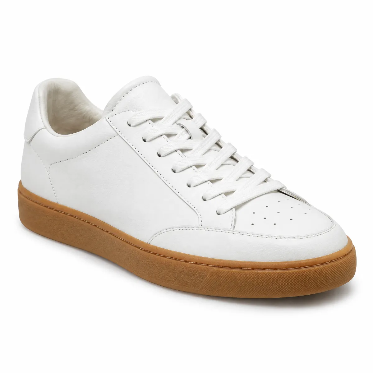
<oc-block-v2><oc-row-v2 variant="image"><img slot="image" src="/previews/imagery/samples/otto-product-still/product-sneaker.webp" alt="" style="display:block;margin:0;width:32px;height:32px;object-fit:cover;border-radius:4px">Sneaker »Court«, Weiß</oc-row-v2></oc-block-v2>
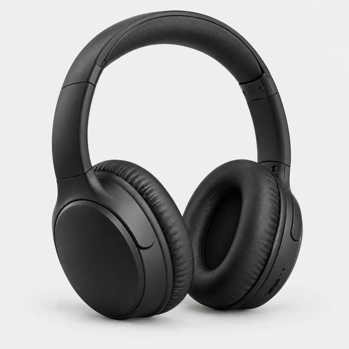
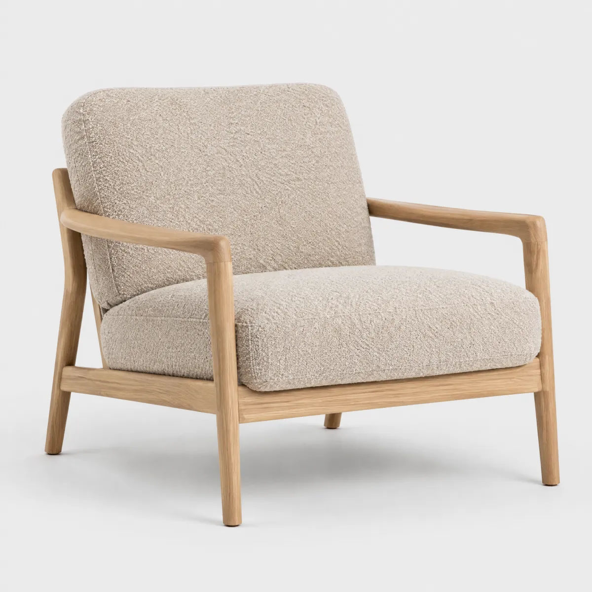
There is also the option to use a two column row.
HTML
<div class="on-frame demo-grid cols-2" style="gap:8px">
<oc-block-v2><oc-row-v2><div style="display:grid;grid-template-columns:1fr 1fr;gap:16px"><img src="/previews/imagery/samples/otto-product-still/product-headphones.webp" alt="" style="display:block;margin:0;width:100%;aspect-ratio:2/1;object-fit:cover;border-radius:8px"><img src="/previews/imagery/samples/otto-product-still/product-armchair.webp" alt="" style="display:block;margin:0;width:100%;aspect-ratio:2/1;object-fit:cover;border-radius:8px"></div></oc-row-v2></oc-block-v2>
<oc-block-v2><oc-row-v2 variant="two-columns"><span slot="column-label">Material</span><span slot="column-text">100 % Baumwolle</span></oc-row-v2></oc-block-v2>
Behavior
States
By default, the row is not interactive and has no states. If you choose to make the row interactive or checkable, the row will have the following states. Note that the checked state of the row only switches the text to be bold.
HTML
<div class="on-frame" style="display:grid;grid-template-columns:auto minmax(0,1fr);gap:8px 32px;align-items:center">
<p class="demo-label" style="text-align:right">default</p>
<oc-block-v2><oc-row-v2 icon-right="arrow-right"><a href="#" slot="primary-action" aria-label="Meine Bestellungen"></a>Meine Bestellungen</oc-row-v2></oc-block-v2>
<p class="demo-label" style="text-align:right">hover</p>
<oc-block-v2><div style="margin:0 -8px;padding:0 8px;border-radius:8px;background:var(--oc-semantic-color-overlay-hover)"><oc-row-v2 icon-right="arrow-right"><a href="#" slot="primary-action" aria-label="Meine Bestellungen"></a>Meine Bestellungen</oc-row-v2></div></oc-block-v2>
<p class="demo-label" style="text-align:right">active (pressed)</p>
<oc-block-v2><div style="margin:0 -8px;padding:0 8px;border-radius:8px;background:var(--oc-semantic-color-overlay-active)"><oc-row-v2 icon-right="arrow-right"><a href="#" slot="primary-action" aria-label="Meine Bestellungen"></a>Meine Bestellungen</oc-row-v2></div></oc-block-v2>
<p class="demo-label" style="text-align:right">focused</p>
<oc-block-v2><div style="margin:0 -8px;padding:0 8px;border-radius:8px;outline:2px solid var(--oc-semantic-focus-outline-color);outline-offset:1px"><oc-row-v2 icon-right="arrow-right"><a href="#" slot="primary-action" aria-label="Meine Bestellungen"></a>Meine Bestellungen</oc-row-v2></div></oc-block-v2>
<p class="demo-label" style="text-align:right">checked</p>
<oc-block-v2><oc-row-v2 icon-right="arrow-right" selected><a href="#" slot="primary-action" aria-label="Meine Bestellungen"></a>Meine Bestellungen</oc-row-v2></oc-block-v2>
Interaction
The hitbox of the interactive or checkable row is 8px wider on each side, to create an optimal hitbox and smooth states. That does not affect the actual width of the row.
HTML
<div class="on-frame demo-stack" style="align-items:center">
<oc-block-v2 style="width:min(100%,360px)"><div style="margin:0 -8px;padding:0 8px;border-radius:8px;outline:1px dashed #e6007e;background:rgb(230 0 126 / 0.2)"><oc-row-v2 icon-left="close" icon-right="arrow-right" hide-divider><a href="#" slot="primary-action" aria-label="Filter zurücksetzen"></a>Filter zurücksetzen</oc-row-v2></div></oc-block-v2>
Fitting
The width of the row uses fill-parent by default. The height of the row fits it content.
HTML
<div class="on-frame demo-stack" style="align-items:center">
<oc-block-v2 style="width:min(100%,360px)"><oc-row-v2 icon-left="close" icon-right="arrow-right"><a href="#" slot="primary-action" aria-label="Filter zurücksetzen"></a>Filter zurücksetzen</oc-row-v2></oc-block-v2>
Placement
Place rows on a block inside the canvas. If you want to place one row below the other do not use any gaps, as they are already divided by the divider, which is part of the default component. Hide the divider for the first row, or if you are placing a row on its own.
HTML
<div class="on-frame demo-stack" style="align-items:center">
<oc-block-v2 style="width:min(100%,360px)">
  <oc-row-v2 icon-left="order" icon-right="arrow-right" hide-divider><a href="#" slot="primary-action" aria-label="Meine Bestellungen"></a>Meine Bestellungen</oc-row-v2>
  <oc-row-v2 icon-left="order-return" icon-right="arrow-right"><a href="#" slot="primary-action" aria-label="Rücksendungen"></a>Rücksendungen</oc-row-v2>
  <oc-row-v2 icon-left="payment-invoice" icon-right="arrow-right"><a href="#" slot="primary-action" aria-label="Rechnungen"></a>Rechnungen</oc-row-v2>
  <oc-row-v2 icon-left="person" icon-right="arrow-right"><a href="#" slot="primary-action" aria-label="Persönliche Daten"></a>Persönliche Daten</oc-row-v2>
</oc-block-v2>
Best practices
 Weiteren Artikel hinzufügen
Content guidelines
Accessibility
For information on accessibility, refer to the technical documentation.
Status
Implementation
Note: For full technical documentation of this component, visitStorybook/row.
Live demo
HTML
<div class="on-frame demo-grid cols-2" style="align-items:start">
  <p class="oc-headline-200" style="margin:0 0 8px">Hallo Anna</p>
  <oc-block-v2>
    <oc-row-v2 variant="headline" headline-level="2">Bestellungen</oc-row-v2>
    <oc-row-v2 icon-left="order" icon-right="arrow-right" hide-divider><a href="#" slot="primary-action" aria-label="Meine Bestellungen"></a>Meine Bestellungen</oc-row-v2>
    <oc-row-v2 icon-left="order-return" icon-right="arrow-right"><a href="#" slot="primary-action" aria-label="Rücksendungen"></a>Rücksendungen</oc-row-v2>
    <oc-row-v2 icon-left="payment-invoice" icon-right="arrow-right"><a href="#" slot="primary-action" aria-label="Rechnungen"></a>Rechnungen</oc-row-v2>
    <oc-row-v2 variant="headline" headline-level="2">Einstellungen</oc-row-v2>
    <oc-row-v2 icon-left="person" icon-right="arrow-right" hide-divider><a href="#" slot="primary-action" aria-label="Persönliche Daten"></a>Persönliche Daten</oc-row-v2>
    <oc-row-v2 icon-left="location" icon-right="arrow-right"><a href="#" slot="primary-action" aria-label="Adressen"></a>Adressen</oc-row-v2>
    <oc-row-v2 icon-left="payment-credit-card" icon-right="arrow-right"><a href="#" slot="primary-action" aria-label="Zahlungsarten"></a>Zahlungsarten</oc-row-v2>
    <oc-row-v2 icon-left="wishlist" icon-right="arrow-right"><a href="#" slot="primary-action" aria-label="Merkzettel"></a>Merkzettel</oc-row-v2>
  </oc-block-v2>
  <p class="oc-headline-200" style="margin:0 0 8px">Bestellung vom 24.09.2026</p>
  <oc-block-v2>
    <oc-row-v2 variant="headline" headline-level="2">Wird heute zugestellt</oc-row-v2>
    <oc-row-v2 variant="image" icon-right="arrow-right" hide-divider><a href="#" slot="primary-action" aria-label="Sessel »Lounge« ansehen"></a><img slot="image" src="/previews/imagery/samples/otto-product-still/product-armchair.webp" alt="" style="display:block;margin:0;width:32px;height:32px;object-fit:cover;border-radius:4px"><span>Sessel »Lounge«, Bouclé, Natur<br><span class="oc-copy-75 oc-text-color-secondary">1 Stück · 449,99 €</span></span></oc-row-v2>
    <oc-row-v2 variant="image" icon-right="arrow-right"><a href="#" slot="primary-action" aria-label="Kopfhörer »Studio« ansehen"></a><img slot="image" src="/previews/imagery/samples/otto-product-still/product-headphones.webp" alt="" style="display:block;margin:0;width:32px;height:32px;object-fit:cover;border-radius:4px"><span>Kopfhörer »Studio«, Schwarz<br><span class="oc-copy-75 oc-text-color-secondary">1 Stück · 98,99 €</span></span></oc-row-v2>
    <oc-row-v2 variant="headline" headline-level="2">Übersicht</oc-row-v2>
    <oc-row-v2 variant="two-columns" hide-divider><span slot="column-label">Bestellnummer</span><span slot="column-text">71 402 385</span></oc-row-v2>
    <oc-row-v2 variant="two-columns"><span slot="column-label">Zahlart</span><span slot="column-text">Rechnung</span></oc-row-v2>
    <oc-row-v2 variant="two-columns"><span slot="column-label">Versand</span><span slot="column-text">kostenlos</span></oc-row-v2>
    <oc-row-v2 variant="two-columns"><span slot="column-label">Gesamt</span><span slot="column-text">548,98 €</span></oc-row-v2>
    <oc-row-v2 icon-left="order-return" icon-right="arrow-right"><a href="#" slot="primary-action" aria-label="Artikel zurücksenden"></a>Artikel zurücksenden</oc-row-v2>
  </oc-block-v2>
Code
| Version | Tag | Status | API |
|---|---|---|---|
| v2 | <oc-row-v2> |
Stable, allowed for generation | RowV2 |
Overview (v2)
Row
The row component provides a flexible row layout with multiple variants, including label, image, headline, and two-columns. It supports interactive features such as clickable rows, selectable states, and customizable icons and images.
Default variation
HTML
<oc-row-v2><oc-placeholder-v1>PLACEHOLDER</oc-placeholder-v1></oc-row-v2>Configuration
The Row component offers a variety of styling variants such as ... This component is highly configurable, allowing you to tailor its features and appearance to your specific needs. To explore all the available options and adjust the component, use the component configurator and see the changes affect the component in real-time.
Usage guidelines
Before integrating the Row component into your project, make sure you have correctly installed the OTTO components package. Look through the variations page for examples of possible component variations. Here, you can discover both common and specific variations that address different use cases.
Info
See the Row UX documentation for detailed user experience guidelines.
Layout considerations
This component has visual overflow in certain states.
When the component is in the hover or active states, it extends beyond its bounding box and is clipped by parent containers with overflow: hidden.
Ensure the parent container has sufficient padding to accommodate the component's full visual area.
Accessibility
The row component comes with a set of built-in accessibility features to ensure a seamless experience for all users.
Use oc-aria-label
To make the row recognizable for screen readers, use the oc-aria-label attribute to provide clear and descriptive context information.
See the general accessibility documentation for guidance on using oc-aria-label, including how it works with link and masked link behavior.
Configuration (v2)
Row configuration
Configure the Row component with the controls below and see the changes live in the preview canvas. Click the Show code button within the preview canvas to see the source code for the current component configuration.
HTML
<oc-row-v2><oc-placeholder-v1>PLACEHOLDER</oc-placeholder-v1></oc-row-v2>Interactive configurator (Storybook controls); every option is listed in the API section of this file.
Migration (v2)
Migration from Row v1 to v2
The oc-row component has been updated from oc-row-v1 to oc-row-v2.
This migration guide provides a step-by-step guide to update your project to the latest version.
The new oc-row-v2 component supports many use cases out of the box, eliminating the need for custom styles that were necessary with the previous version.
Skip to:
What's new
Web component
The row is now a proper web component instead of a CSS-only class, providing:
- Encapsulated styling
- Built-in icon support via
icon-leftandicon-rightattributes - Multiple variants (
default,image,headline,two-columns) - Native support for list views
API changes
Changed structure
| v1 (CSS class) | v2 (Web Component) | Notes |
|---|---|---|
<div class="oc-row-v1"> |
<oc-row-v2> |
Component-based |
oc-row-v1--hide-divider |
hide-divider |
No change |
oc-row-v1--selected |
selected |
No change |
oc-row-v1--interactive |
Not needed | Automatically applied with as-button or href |
How to migrate
Instead of using a div (or a different HTML element) with the oc-row-v1 class, use the
<oc-row-v2> tag.
Here's a table mapping deprecated CSS classes to their corresponding replacement attributes in the new version:
| CSS class (v1) | Attribute (v2) | Notes |
|---|---|---|
oc-row-v1--hide-divider |
hide-divider |
No change |
oc-row-v1--selected |
selected |
No change |
The oc-row-v1--interactive class does not need a corresponding attribute.
Use the as-button or href attributes as you would on any other component, and the row will become interactive automatically.
Refer to the section Migrate an interactive row for more details.
Migrate a basic row
To migrate a basic row, replace the container element <div> using the oc-link-v1 class with the new <oc-row-v2> element.
<!-- From: -->
<div class="oc-row-v1">Row content</div>
<!-- To: -->
<oc-row-v2>Row content</oc-row-v2>
Migrate an interactive row
For interactive rows using an anchor tag <a>, replace the anchor tag with <oc-row-v2>,
remove the deprecated CSS classes, and keep the href attribute.
<!-- From: -->
<a class="oc-row-v1 oc-row-v1--interactive" href="#">Label</a>
<!-- To: -->
<oc-row-v2>
  <a href="#">My Link</a>
  Label
</oc-row-v2>
For interactive rows using a click handler on a button tag <button>, replace the button tag by <oc-row-v2>, remove the deprecated CSS classes, and set the as-button attribute.
<!-- From: -->
<button class="oc-row-v1 oc-row-v1--interactive">Label</button>
<!-- To: -->
<oc-row-v2 as-button>Label</oc-row-v2>
Migrate a row with icons
The new oc-row-v2 component natively supports displaying icons on the left, right, or both sides of the row.
HTML
<oc-row-v2 as-button icon-left="smiley-positive" icon-right="arrow-right">Label</oc-row-v2>Consider migrating to the built-in positioning styles.
As shown below, place the label of the row in the default slot, and use the icon-left and icon-right to set your icons:
HTML
<oc-row-v2 icon-left="smiley-positive" icon-right="arrow-right">
<a href="#">My Link</a>
Label
</oc-row-v2>
Migrate a row with an image
The oc-row-v2 component natively supports displaying an image to the left, optionally with an icon to the right.
HTML
<oc-row-v2 variant="image" as-button icon-right="arrow-right">
<oc-placeholder-v1 slot="image" variant="image" border-radius="4px" width="40" height="40"></oc-placeholder-v1>
Label
</oc-row-v2>
Consider migrating to the built-in positioning styles.
As shown below, set the variant attribute to the value image, place the image in the image slot, and use the icon-right attribute to set the icon:
HTML
<oc-row-v2 variant="image" icon-right="arrow-right">
<img slot="image" src="https://www.example.com" alt="Product image" />
<a href="#">My Link</a>
Label
</oc-row-v2>
Migrate list views
The oc-row-v2 component natively supports list views.
-
Funktionen 3D-Audio
Mikrofon integriert -
Sensoren Magnetometer -
Bedienelemente Stick
Tasten
Touch Plus Controller
HTML
<div class="oc-block-v1">
<oc-row-v2 variant="headline">Details</oc-row-v2>
<ul>
  <li>
    <oc-row-v2 variant="two-columns">
      <span slot="column-label">Funktionen</span>
      <span slot="column-text">3D-Audio<br />Mikrofon integriert</span>
    </oc-row-v2>
  </li>
  <li>
    <oc-row-v2 variant="two-columns">
      <span slot="column-label">Sensoren</span>
      <span slot="column-text">Magnetometer</span>
    </oc-row-v2>
  </li>
  <li>
    <oc-row-v2 variant="two-columns">
      <span slot="column-label">Bedienelemente</span>
      <span slot="column-text">Stick<br />Tasten<br />Touch Plus Controller</span>
    </oc-row-v2>
  </li>
</ul>
For the headline of the list view, use the headline variant:
HTML
<oc-row-v2 variant="headline">Headline</oc-row-v2>For the rows of the list view, use the two-columns variant. Put the label into the column-label slot,
and the text content into the column-text slot.
Important
Do not use
<dl>,<dd>and<dt>elements; they are used internally, and repeating them results in redundancy.
HTML
<oc-row-v2 variant="two-columns">
<span slot="column-label">Label</span>
<span slot="column-text">Text content</span>
</oc-row-v2>
API v2
Row v2 API
API: <oc-row-v2> (RowV2)
The row component provides a flexible row layout with multiple variants, including label, image, headline, and two-columns. It supports interactive features such as clickable rows, selectable states, and customizable icons and images.
Attributes / properties
| Attribute | Type | Default | Required | Description |
|---|---|---|---|---|
variant |
"container" | "image" | "headline" | "two-columns" |
"container" |
no | Specifies which row layout variant to use. Can be one of: container, image, headline, two-columns. |
headline-level |
1 | 2 | 3 | 4 | 5 | 6 |
undefined |
no | If set, renders the headline content inside a heading tag with the specified level. Only applies to variant headline.The heading level has no visual effect but provides semantic structure for screen readers. If not set, renders a div instead of a heading tag. |
icon-left |
icon name (428 values; see Icon list in `storybook/components/icon/README.md`) |
no | Sets an icon that shows on the left side of the row. Only applicable to variant container. |
|
icon-right |
icon name (428 values; see Icon list in `storybook/components/icon/README.md`) |
no | Sets an icon that shows on the right side of the row. Only applicable to variants container and image. |
|
hide-divider |
boolean |
false |
no | When set to true, hides the divider line at the top of the row. |
selected |
boolean |
false |
no | When set to true, displays the row with a blue background, indicating that it is selected. |
href |
string |
undefined |
no | Deprecated: Use an a tag in the default slot instead.Visit SEO optimization techniques for more information. |
base64-href |
string |
undefined |
no | The same as href, except base64-encoded. This is used to mask links in the markup. |
target |
"_blank" | "_self" | "_parent" | "_top" |
undefined |
no | Determines the target of the link when the row is clicked. Note Only applies when href or base64-href is set. |
rel |
string |
undefined |
no | Sets the rel attribute to determine the relationship between the current document and the linked document.Note Only applies when href or base64-href is set. |
as-button |
boolean |
undefined |
no | When set, this row becomes interactive, and clicking it will trigger a listenable event. |
oc-aria-label |
string |
undefined |
no | Sets the ARIA label when the row is interactive. This property should be used when the text content of the row is not enough to deduce its interaction, and should contain a description of that interaction. |
oc-aria-expanded |
boolean |
undefined |
no | Sets the ARIA expanded property for usage as a header in an Accordion for example. This should only be used if the row works as a button and reveals more content on interaction. |
Slots
| Slot | Required | Description |
|---|---|---|
default |
no | Sets the main content of the row. Only applicable to variants container, image, and headline. |
column-label |
no | Sets the content of the label column on the left. Only applicable to variant two-columns.Example: <span slot="column-label">Label</span> |
column-text |
no | Sets the content of the text column on the right. Only applicable to variant two-columns.Example: <span slot="column-text">Label</span> |
image |
no | Sets the image that is shown on the left side of the row. Only applicable to variant image.Example: <img slot="column-text" src="https://example.com" alt="Some image"> |
primary-action |
no | Add an empty tag to change the default behavior of the row component. - empty a tag: the card component behaves as a link (SEO relevant) |
Events
| Event | Detail type | Description |
|---|---|---|
oc-property-change |
OcRowV2Events["oc-property-change"] |
Whenever a property value changes, this event triggers. Use this event to track all property changes within the component. Refer to the Events documentation for more information. |
oc-mount |
{ component: string; } |
Fired when the component is mounted to the DOM. The event is fired when the onMount hook of the component is called by the runtime. |
oc-unmount |
{ component: string; } |
Fired when the component is unmounted from the DOM. The event is fired when the function returned by the onMount hook of the component is called by the runtime. |
CSS custom properties
| Custom property | Default | Description |
|---|---|---|
--custom-spacing-x |
undefined |
Sets the custom horizontal spacing of the row content. |
--custom-spacing-y |
undefined |
Sets the custom vertical spacing of the row content. |
--align-items |
flex-start |
Changes the item alignment in the row. Use center (vertical aligned) or flex-end (aligned to bottom) to overwrite the default |
Variations (v2)
Variations
Listed below are the most common variations of the Row component as well as specific component variations for different use cases.
You can explore all available options using the component configurator, adjust the component to your needs, and see the changes live in a preview canvas.
Default
Story: components-row-variations--default · tags: components, row, v1
The default configuration of the row component.
HTML
<oc-row-v2><oc-placeholder-v1>PLACEHOLDER</oc-placeholder-v1></oc-row-v2>Hidden divider
Story: components-row-variations--hide-divider · tags: components, row, v1
Variation with the hide-divider attribute, hiding the top divider.
Args: hide-divider=true
HTML
<oc-row-v2 hide-divider><oc-placeholder-v1>PLACEHOLDER</oc-placeholder-v1></oc-row-v2>With button behavior
Story: components-row-variations--with-button-behavior · tags: components, row, v1
Variation with the as-button attribute, making it focusable, and giving it hover and active styles.
Args: as-button=true
HTML
<oc-row-v2 as-button><oc-placeholder-v1>PLACEHOLDER</oc-placeholder-v1></oc-row-v2>With link behavior
Story: components-row-variations--with-link-behavior · tags: components, row, v1
The row component with a link as primary action. Search engines will detect the href.
Args: primaryActionSlot=(see snippet)
<oc-row-v2>
  <!--The <a> tag should be placed inside the light DOM to improve SEO.--><a href="#" slot="primary-action" aria-label="placeholder link"></a>
  <oc-placeholder-v1>PLACEHOLDER</oc-placeholder-v1>
</oc-row-v2>
With masked link behavior
Story: components-row-variations--with-masked-link-behavior · tags: components, row, v1
The row component as a masked link. Search engines will not detect the href.
Args: base64-href=Iw==
HTML
<oc-row-v2 base64-href="Iw=="><oc-placeholder-v1>PLACEHOLDER</oc-placeholder-v1></oc-row-v2>With link switch behavior
Story: components-row-variations--with-link-switch-behavior · tags: components, row, v1
The row component as a link with switch behavior. Search engines will detect the href, while users receive the Base64-encoded version.
Args: base64-href=Iz92YXJpYW50PWZvbw==, primaryActionSlot=(see snippet)
<oc-row-v2 base64-href="Iz92YXJpYW50PWZvbw==">
  <!--Search engines will detect the href, while users receive the Base64-encoded version.--><a href='#' slot="primary-action" aria-label='Row'></a>
  <oc-placeholder-v1>PLACEHOLDER</oc-placeholder-v1>
</oc-row-v2>
Selected
Story: components-row-variations--interactive-selected · tags: components, row, v1
An interactive row with the selected attribute, changing the background color to blue.
Args: as-button=true, selected=true
HTML
<oc-row-v2 selected as-button><oc-placeholder-v1>PLACEHOLDER</oc-placeholder-v1></oc-row-v2>Container with icons
Story: components-row-variations--container-icons · tags: components, row, v1
The container variant with icons to the left and right.
Args: as-button=true, defaultSlot=Label, icon-left=smiley-positive, icon-right=arrow-right
HTML
<oc-row-v2 as-button icon-left="smiley-positive" icon-right="arrow-right">Label</oc-row-v2>Image and icon
Story: components-row-variations--image · tags: components, row, v1
The image variant with an image to the left and an icon to the right.
Args: variant=image, as-button=true, defaultSlot=Label, imageSlot=<oc-placeholder-v1 slot="image" variant="image" border-radius="4px" width="40" height="40"></oc-placeholder-v1>, icon-right=arrow-right
HTML
<oc-row-v2 variant="image" as-button icon-right="arrow-right">
<oc-placeholder-v1 slot="image" variant="image" border-radius="4px" width="40" height="40"></oc-placeholder-v1>
Label
</oc-row-v2>
Headline
Story: components-row-variations--headline · tags: components, row, v1
The headline variant is for use at the top of a list of stacked rows.
Args: variant=headline, defaultSlot=Headline
HTML
<oc-row-v2 variant="headline">Headline</oc-row-v2>Two columns
Story: components-row-variations--two-columns · tags: components, row, v1
The two-columns variant displays a label column and a text column.
Args: variant=two-columns, columnLabelSlot=<oc-placeholder-v1 slot="column-label" style="height: 4rem">PLACEHOLDER</oc-placeholder-v1>, columnTextSlot=<oc-placeholder-v1 slot="column-text" style="height: 4rem">PLACEHOLDER</oc-placeholder-v1>
HTML
<oc-row-v2 variant="two-columns">
<oc-placeholder-v1 slot="column-label" style="height: 4rem">PLACEHOLDER</oc-placeholder-v1>
<oc-placeholder-v1 slot="column-text" style="height: 4rem">PLACEHOLDER</oc-placeholder-v1>
<oc-placeholder-v1>PLACEHOLDER</oc-placeholder-v1>
</oc-row-v2>
Navigation demo
Story: components-row-variations--demo-navigation · tags: components, row, v1
A list of interactive rows with arrow icons, one of which is selected.
-
Label -
Label -
Label -
Label -
Label -
Label
HTML
<ul class="oc-block-v1">
<li>
  <oc-row-v2 as-button icon-right="arrow-right" selected>Label</oc-row-v2>
</li>
<li>
  <oc-row-v2 as-button icon-right="arrow-right">Label</oc-row-v2>
</li>
<li>
  <oc-row-v2 as-button icon-right="arrow-right">Label</oc-row-v2>
</li>
<li>
  <oc-row-v2 as-button icon-right="arrow-right">Label</oc-row-v2>
</li>
<li>
  <oc-row-v2 as-button icon-right="arrow-right">Label</oc-row-v2>
</li>
<li>
  <oc-row-v2 as-button icon-right="arrow-right">Label</oc-row-v2>
</li>
</ul>
Story source (TypeScript, verbatim from Storybook)
{
  name: "Navigation demo",
  parameters: {
    controls: {
      disabled: true
    },
    backgrounds: {
      value: "frame"
    }
  },
  render: () => {
    return html`
      <ul class="oc-block-v1">
        <li>
          <oc-row-v2 as-button icon-right="arrow-right" selected>Label</oc-row-v2>
        </li>
        <li>
          <oc-row-v2 as-button icon-right="arrow-right">Label</oc-row-v2>
        </li>
        <li>
          <oc-row-v2 as-button icon-right="arrow-right">Label</oc-row-v2>
        </li>
        <li>
          <oc-row-v2 as-button icon-right="arrow-right">Label</oc-row-v2>
        </li>
        <li>
          <oc-row-v2 as-button icon-right="arrow-right">Label</oc-row-v2>
        </li>
        <li>
          <oc-row-v2 as-button icon-right="arrow-right">Label</oc-row-v2>
        </li>
      </ul>
    `;
  },
  argTypes: hideControlsBadge(Metadata)
}
Interactive list demo
Story: components-row-variations--demo-interactive-list-with-images · tags: components, row, v1
A list of interactive rows with images and arrow icons, one of which is selected.
-
Label -
Label -
Label -
Label -
Label -
Label
HTML
<ul class="oc-block-v1">
<li>
  <oc-row-v2 variant="image" as-button selected>
    <oc-placeholder-v1
      slot="image"
      variant="image"
      border-radius="4px"
      width="40"
      height="40"
    ></oc-placeholder-v1>
    <oc-icon-v1 slot="icon-right" type="arrow-right" size="100"></oc-icon-v1>
    Label
  </oc-row-v2>
</li>
<li>
  <oc-row-v2 variant="image" as-button>
    <oc-placeholder-v1
      slot="image"
      variant="image"
      border-radius="4px"
      width="40"
      height="40"
    ></oc-placeholder-v1>
    <oc-icon-v1 slot="icon-right" type="arrow-right" size="100"></oc-icon-v1>
    Label
  </oc-row-v2>
</li>
<li>
  <oc-row-v2 variant="image" as-button>
    <oc-placeholder-v1
      slot="image"
      variant="image"
      border-radius="4px"
      width="40"
      height="40"
    ></oc-placeholder-v1>
    <oc-icon-v1 slot="icon-right" type="arrow-right" size="100"></oc-icon-v1>
    Label
  </oc-row-v2>
</li>
<li>
  <oc-row-v2 variant="image" as-button>
    <oc-placeholder-v1
      slot="image"
      variant="image"
      border-radius="4px"
      width="40"
      height="40"
    ></oc-placeholder-v1>
    <oc-icon-v1 slot="icon-right" type="arrow-right" size="100"></oc-icon-v1>
    Label
  </oc-row-v2>
</li>
<li>
  <oc-row-v2 variant="image" as-button>
    <oc-placeholder-v1
      slot="image"
      variant="image"
      border-radius="4px"
      width="40"
      height="40"
    ></oc-placeholder-v1>
    <oc-icon-v1 slot="icon-right" type="arrow-right" size="100"></oc-icon-v1>
    Label
  </oc-row-v2>
</li>
<li>
  <oc-row-v2 variant="image" as-button>
    <oc-placeholder-v1
      slot="image"
      variant="image"
      border-radius="4px"
      width="40"
      height="40"
    ></oc-placeholder-v1>
    <oc-icon-v1 slot="icon-right" type="arrow-right" size="100"></oc-icon-v1>
    Label
  </oc-row-v2>
</li>
</ul>
Story source (TypeScript, verbatim from Storybook)
{
  name: "Interactive list demo",
  parameters: {
    controls: {
      disabled: true
    },
    backgrounds: {
      value: "frame"
    }
  },
  render: () => {
    return html`
      <ul class="oc-block-v1">
        <li>
          <oc-row-v2 variant="image" as-button selected>
            <oc-placeholder-v1
              slot="image"
              variant="image"
              border-radius="4px"
              width="40"
              height="40"
            ></oc-placeholder-v1>
            <oc-icon-v1 slot="icon-right" type="arrow-right" size="100"></oc-icon-v1>
            Label
          </oc-row-v2>
        </li>
        <li>
          <oc-row-v2 variant="image" as-button>
            <oc-placeholder-v1
              slot="image"
              variant="image"
              border-radius="4px"
              width="40"
              height="40"
            ></oc-placeholder-v1>
            <oc-icon-v1 slot="icon-right" type="arrow-right" size="100"></oc-icon-v1>
            Label
          </oc-row-v2>
        </li>
        <li>
          <oc-row-v2 variant="image" as-button>
            <oc-placeholder-v1
              slot="image"
              variant="image"
              border-radius="4px"
              width="40"
              height="40"
            ></oc-placeholder-v1>
            <oc-icon-v1 slot="icon-right" type="arrow-right" size="100"></oc-icon-v1>
            Label
          </oc-row-v2>
        </li>
        <li>
          <oc-row-v2 variant="image" as-button>
            <oc-placeholder-v1
              slot="image"
              variant="image"
              border-radius="4px"
              width="40"
              height="40"
            ></oc-placeholder-v1>
            <oc-icon-v1 slot="icon-right" type="arrow-right" size="100"></oc-icon-v1>
            Label
          </oc-row-v2>
        </li>
        <li>
          <oc-row-v2 variant="image" as-button>
            <oc-placeholder-v1
              slot="image"
              variant="image"
              border-radius="4px"
              width="40"
              height="40"
            ></oc-placeholder-v1>
            <oc-icon-v1 slot="icon-right" type="arrow-right" size="100"></oc-icon-v1>
            Label
          </oc-row-v2>
        </li>
        <li>
          <oc-row-v2 variant="image" as-button>
            <oc-placeholder-v1
              slot="image"
              variant="image"
              border-radius="4px"
              width="40"
              height="40"
            ></oc-placeholder-v1>
            <oc-icon-v1 slot="icon-right" type="arrow-right" size="100"></oc-icon-v1>
            Label
          </oc-row-v2>
        </li>
      </ul>
    `;
  },
  argTypes: hideControlsBadge(Metadata)
}
List view demo
Story: components-row-variations--demo-list-view · tags: components, row, v1
A list of basic rows containing a custom layout.
-
Funktionen 3D-Audio
Mikrofon integriert -
Sensoren Magnetometer -
Bedienelemente Stick
Tasten
Touch Plus Controller
HTML
<div class="oc-block-v1">
<oc-row-v2 variant="headline">Details</oc-row-v2>
<ul>
  <li>
    <oc-row-v2 variant="two-columns">
      <span slot="column-label">Funktionen</span>
      <span slot="column-text">3D-Audio<br />Mikrofon integriert</span>
    </oc-row-v2>
  </li>
  <li>
    <oc-row-v2 variant="two-columns">
      <span slot="column-label">Sensoren</span>
      <span slot="column-text">Magnetometer</span>
    </oc-row-v2>
  </li>
  <li>
    <oc-row-v2 variant="two-columns">
      <span slot="column-label">Bedienelemente</span>
      <span slot="column-text">Stick<br />Tasten<br />Touch Plus Controller</span>
    </oc-row-v2>
  </li>
</ul>
Story source (TypeScript, verbatim from Storybook)
{
  name: "List view demo",
  parameters: {
    controls: {
      disabled: true
    },
    backgrounds: {
      value: "frame"
    }
  },
  render: () => {
    return html`
      <div class="oc-block-v1">
        <oc-row-v2 variant="headline">Details</oc-row-v2>
        <ul>
          <li>
            <oc-row-v2 variant="two-columns">
              <span slot="column-label">Funktionen</span>
              <span slot="column-text">3D-Audio<br />Mikrofon integriert</span>
            </oc-row-v2>
          </li>
          <li>
            <oc-row-v2 variant="two-columns">
              <span slot="column-label">Sensoren</span>
              <span slot="column-text">Magnetometer</span>
            </oc-row-v2>
          </li>
          <li>
            <oc-row-v2 variant="two-columns">
              <span slot="column-label">Bedienelemente</span>
              <span slot="column-text">Stick<br />Tasten<br />Touch Plus Controller</span>
            </oc-row-v2>
          </li>
        </ul>
      </div>
    `;
  },
  argTypes: hideControlsBadge(Metadata)
}
Custom spacings demo
Story: components-row-variations--demo-custom-spacings · tags: components, row, v1
A list of basic rows containing a custom layout with adjustable sliders for custom spacings.
<div
  style="display: flex; border: 1px solid var(--oc-base-color-gray-200); border-radius: 8px; width: fit-content; "
>
  <oc-row-v2>
    <oc-placeholder-v1 style="width: 200px">PLACEHOLDER</oc-placeholder-v1>
  </oc-row-v2>
</div>

<div style="display: flex; flex-direction: column; gap: 16px;  margin-top: 32px;">
  <div style="display: flex; gap: 16px; align-items: center;">
    <label for="horizontal-slider">Horizontal Spacing</label>
    <input
      type="range"
      name="horizontal-slider"
      id="horizontal-slider"
      min="0"
      max="64"
      value="0"
    />
    <span id="horizontal-slider-value">0px</span>
  </div>
  <div style="display: flex; gap: 16px; align-items: center;">
    <label for="vertical-slider">Vertical Spacing</label>
    <input
      type="range"
      name="vertical-slider"
      id="vertical-slider"
      min="0"
      max="64"
      value="16"
    />
    <span id="vertical-slider-value">16px</span>
  </div>
</div>

<script>
  (() => {
    const row = document.querySelector("oc-row-v2");
    const horizontalSlider = document.getElementById("horizontal-slider");
    const horizontalSliderValue = document.getElementById("horizontal-slider-value");
    const verticalSlider = document.getElementById("vertical-slider");
    const verticalSliderValue = document.getElementById("vertical-slider-value");

    horizontalSlider.addEventListener("input", (event) => {
      const value = event.target.value + "px";
      row.style.setProperty("--custom-spacing-x", value);
      horizontalSliderValue.textContent = value;
    });

    verticalSlider.addEventListener("input", (event) => {
      const value = event.target.value + "px";
      row.style.setProperty("--custom-spacing-y", value);
      verticalSliderValue.textContent = value;
    });
  })();
</script>
Story source (TypeScript, verbatim from Storybook)
{
  name: "Custom spacings demo",
  parameters: {
    controls: {
      disabled: true
    },
    backgrounds: {
      value: "frame"
    },
    chromatic: {
      hideInChromatic: true
    }
  },
  render: () => {
    return html`
      <div
        style="display: flex; border: 1px solid var(--oc-base-color-gray-200); border-radius: 8px; width: fit-content; "
      >
        <oc-row-v2>
          <oc-placeholder-v1 style="width: 200px">PLACEHOLDER</oc-placeholder-v1>
        </oc-row-v2>
      </div>

      <div style="display: flex; flex-direction: column; gap: 16px;  margin-top: 32px;">
        <div style="display: flex; gap: 16px; align-items: center;">
          <label for="horizontal-slider">Horizontal Spacing</label>
          <input
            type="range"
            name="horizontal-slider"
            id="horizontal-slider"
            min="0"
            max="64"
            value="0"
          />
          <span id="horizontal-slider-value">0px</span>
        </div>
        <div style="display: flex; gap: 16px; align-items: center;">
          <label for="vertical-slider">Vertical Spacing</label>
          <input
            type="range"
            name="vertical-slider"
            id="vertical-slider"
            min="0"
            max="64"
            value="16"
          />
          <span id="vertical-slider-value">16px</span>
        </div>
      </div>

      <script>
        (() => {
          const row = document.querySelector("oc-row-v2");
          const horizontalSlider = document.getElementById("horizontal-slider");
          const horizontalSliderValue = document.getElementById("horizontal-slider-value");
          const verticalSlider = document.getElementById("vertical-slider");
          const verticalSliderValue = document.getElementById("vertical-slider-value");

          horizontalSlider.addEventListener("input", (event) => {
            const value = event.target.value + "px";
            row.style.setProperty("--custom-spacing-x", value);
            horizontalSliderValue.textContent = value;
          });

          verticalSlider.addEventListener("input", (event) => {
            const value = event.target.value + "px";
            row.style.setProperty("--custom-spacing-y", value);
            verticalSliderValue.textContent = value;
          });
        })();
      </script>
    `;
  },
  argTypes: hideControlsBadge(Metadata)
}