Always put the tab bar at the top of the content it controls.
Responsiveness
Breakpoint S (mobile):
By default, the tab items are fill-parent. If the label is too long, it will be abbreviated. If there are too many tab items to fit into the viewport, they will shrink to fit-content. The tab bar then becomes scrollable and the sides fade out to indicate that more tab items are available.
fill-parent: at breakpoint S (phone) long labels are abbreviated
fit-content: too many tabs, the bar scrolls and the sides fade
Liveresponsiveness mobileHTML
<p class="demo-label">fill-parent: at breakpoint S (phone) long labels are abbreviated</p><div style="background:#fff;max-width:340px"><oc-tab-bar-v1><oc-tab-item-v1><button>Produktbeschreibung und Details</button></oc-tab-item-v1><oc-tab-item-v1><button>Bewertungen</button></oc-tab-item-v1></oc-tab-bar-v1></div></div>
<p class="demo-label">fit-content: too many tabs, the bar scrolls and the sides fade</p><div style="background:#fff;max-width:340px"><oc-tab-bar-v1><oc-tab-item-v1><button>Übersicht</button></oc-tab-item-v1><oc-tab-item-v1><button>Details</button></oc-tab-item-v1><oc-tab-item-v1><button>Bewertungen</button></oc-tab-item-v1><oc-tab-item-v1><button>Lieferung</button></oc-tab-item-v1><oc-tab-item-v1><button>Größen</button></oc-tab-item-v1><oc-tab-item-v1><button>Pflege</button></oc-tab-item-v1></oc-tab-bar-v1></div></div>
From breakpoint M (desktop):
Tab items are fit-contentby default. If there are too many tab items to fit into the viewport, the sides also fade. On desktop, icon buttons with arrows appear so you can click to scroll through the tab items.
When you click on a new tab item, the selected indicator moves from the previously selected tab item to the newly selected one. If you select a tab item that is half-hidden off the screen, the tab bar automatically scrolls to put that tab item in the middle of the viewport. The content inside the tab panel slides smoothly in and out when you switch tab items.
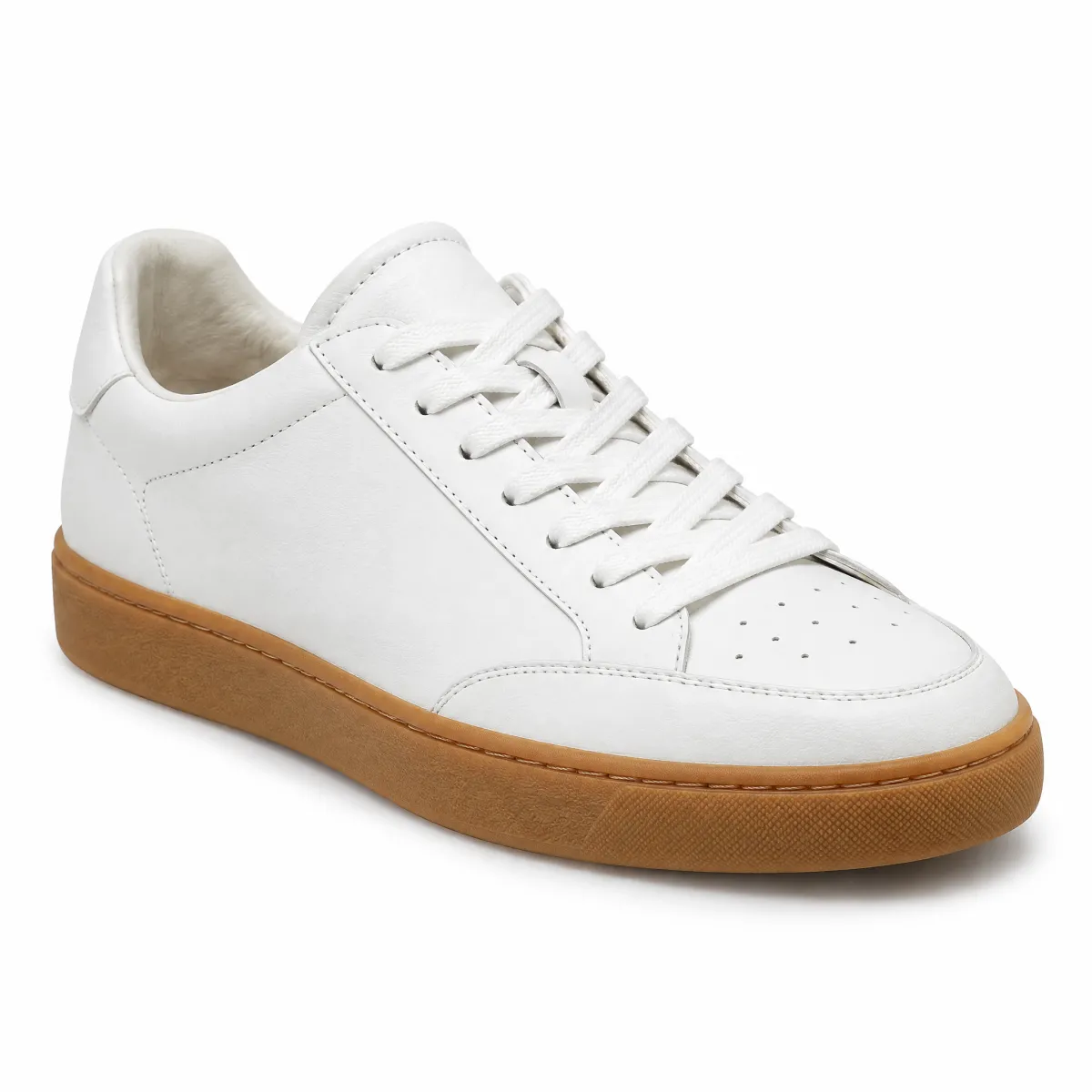
Sneaker aus Glattleder mit gepolstertem Schaftrand und flexibler Gummisohle.
<div style="background:#fff;width:100%;max-width:400px"><oc-tab-bar-v1><oc-tab-item-v1><button>Übersicht</button></oc-tab-item-v1><oc-tab-item-v1><button>Details</button></oc-tab-item-v1><oc-tab-item-v1><button>Bewertungen</button></oc-tab-item-v1><oc-tab-panel-v1 slot="panel"><p class="oc-copy-100" style="padding:16px 0">Sneaker aus Glattleder mit gepolstertem Schaftrand und flexibler Gummisohle.</p></oc-tab-panel-v1><oc-tab-panel-v1 slot="panel"><p class="oc-copy-100" style="padding:16px 0">Obermaterial: Leder. Innenmaterial: Textil. Laufsohle: Gummi.</p></oc-tab-panel-v1><oc-tab-panel-v1 slot="panel"><p class="oc-copy-100" style="padding:16px 0">4,6 von 5 Sternen aus 128 Bewertungen.</p></oc-tab-panel-v1></oc-tab-bar-v1></div>
<p class="demo-label" style="text-align:center">Click a tab: the indicator moves and the panel slides in ↓</p>
<div style="background:#fff;width:100%;max-width:400px"><oc-tab-bar-v1 selected="1"><oc-tab-item-v1><button>Übersicht</button></oc-tab-item-v1><oc-tab-item-v1><button>Details</button></oc-tab-item-v1><oc-tab-item-v1><button>Bewertungen</button></oc-tab-item-v1><oc-tab-panel-v1 slot="panel"><p class="oc-copy-100" style="padding:16px 0">Sneaker aus Glattleder mit gepolstertem Schaftrand und flexibler Gummisohle.</p></oc-tab-panel-v1><oc-tab-panel-v1 slot="panel"><p class="oc-copy-100" style="padding:16px 0">Obermaterial: Leder. Innenmaterial: Textil. Laufsohle: Gummi.</p></oc-tab-panel-v1><oc-tab-panel-v1 slot="panel"><p class="oc-copy-100" style="padding:16px 0">4,6 von 5 Sternen aus 128 Bewertungen.</p></oc-tab-panel-v1></oc-tab-bar-v1></div>
Tab bar vs. chips
The tab bar is used for navigation. Clicking a tab item changes the content of a page or the panel below it. Only one tab item can be selected at a time. Chips are used for filtering. Selecting a chip filters or changes content on the same page (like picking colors or sizes). You can select none, one, or multiple chips at the same time.
DoKeep the labels short so they do not get abbreviated on mobile.DoUse the same type of words for all tab items (e.g. all nouns).
Accessibility
To learn how to use the tab bar with a keyboard (like using the arrow keys) or to see code tags like role="tab", please check the technical documentation.
The Tab Bar component provides an accessible tab navigation pattern following W3C ARIA standards.
It orchestrates tab items and optional panels with full keyboard navigation support.
Note: All three components (oc-tab-bar-v1, oc-tab-item-v1, and oc-tab-panel-v1) are part of the Tab Bar system and live in the same folder.
The tab bar system consists of three tightly-coupled components:
<oc-tab-bar-v1>: The orchestrating wrapper with shadow DOM that manages state, keyboard navigation, and ARIA attributes
<oc-tab-item-v1>: Lightweight cosmetic wrapper for individual tabs (no shadow DOM for better performance)
<oc-tab-panel-v1>: Lightweight cosmetic wrapper for optional content panels (no shadow DOM for better performance)
Performance optimization
The child components (oc-tab-item-v1 and oc-tab-panel-v1) intentionally do not use shadow DOM for optimal performance.
They serve as lightweight wrappers that the parent oc-tab-bar-v1 component orchestrates.
All interactive elements (buttons/links) are direct children in the light DOM, enabling:
Faster rendering without shadow root overhead
Direct DOM access for ARIA attribute management
Simpler styling through global CSS
Reduced JavaScript execution
Configuration
The tab bar component is configurable, allowing you to tailor its features and appearance to your specific needs.
To explore all the available options and adjust the component, use the component configurator and see the changes affect the component in real-time.
Usage guidelines
Before integrating the tab bar component into your project, make sure you have correctly installed the OTTO components package.
Look through the variations page for examples of possible component variations, including tabs with and without panels, tabs with icons, notification badges, and programmatic control.
Implementation requirements
Place tab items first, followed by panels (if used).
The order of tab items and panels determines their association (first tab to first panel, second tab to second panel, etc.).
Each tab item must contain exactly one interactive element (<button> or <a>) as a direct child.
The element must not be nested inside other containers for proper ARIA management.
Use <button> for tabs that control content on the current page.
Use <a> for tabs that navigate to different pages or URLs.
Panels are optional.
Tabs can function as pure navigation elements without associated content panels.
Best practices
Use the disabled attribute on <oc-tab-item-v1> to prevent selection.
Provide meaningful labels on tab buttons for screen readers.
Combine icons with text labels for better recognition and accessibility.
Use notification badges to indicate status or counts on specific tabs.
Tab items and panels are lightweight wrappers without shadow DOM — the parent component manages all ARIA attributes on the interactive elements.
Accessibility
The tab bar component follows the W3C ARIA Tabs Pattern with built-in accessibility features:
Keyboard navigation
Key
Action
Tab
Moves focus into and out of the tab list
Arrow Left/Up
Moves focus to the previous tab (wraps around)
Arrow Right/Down
Moves focus to the next tab (wraps around)
Home
Moves focus to the first tab
End
Moves focus to the last tab
Disabled tabs are automatically skipped during keyboard navigation.
ARIA attributes
The component automatically manages:
role="tablist" on the tab bar
role="tab" on each tab item's interactive element
role="tabpanel" on each panel
aria-controls linking tabs to panels
aria-selected indicating the current tab
aria-labelledby linking panels to tabs
tabindex for roving tab index pattern
Configuration (v1)
Tab Bar V1 configuration
Configure the tab bar component with the controls below and see the changes live in the preview canvas.
Click the Show code button within the preview canvas to see the source code for the current component configuration.
Interactive configurator (Storybook controls); every option is listed in the API section of this file.
API v1
Tab Bar v1 API
API: <oc-tab-bar-v1> (TabBarV1)
The Tab Bar component provides an accessible tab navigation pattern following W3C standards.
It orchestrates tab items and optional panels with keyboard navigation and proper ARIA attributes.
Architecture: The parent oc-tab-bar-v1 uses shadow DOM and manages all state and ARIA
attributes. The child components (oc-tab-item-v1 and oc-tab-panel-v1) are lightweight
wrappers without shadow DOM for optimal performance.
Attributes / properties
Attribute
Type
Default
Required
Description
variant
"default" | "centered"
"default"
no
Specifies which layout variant to use. Can be one of: default, centered.
icon-position
"left" | "top"
"left"
no
Controls the icon position for all tab items. - "left": Icons appear to the left of labels (default) - "top": Icons appear above labels
Important: This setting applies to all tab items in the tab bar. Mixing different icon positions is not supported for visual consistency.
show-divider
boolean
false
no
When set to true, shows the divider line below the tab bar.
selected
number
undefined (first enabled tab)
no
The index of the initially selected tab (0-based).
Important: This prop only sets the initial state when the component mounts. It is not reactive and will not update the selection if changed later.
For programmatic tab selection after mount, use the select(index) method instead: javascript document.querySelector('oc-tab-bar-v1').select(2);
If not provided, the first enabled tab will be selected. If the specified index is disabled, the first enabled tab will be selected instead.
Slots
Slot
Required
Description
default
yes
Contains oc-tab-item-v1 and oc-tab-panel-v1 elements. Tab items should come first, followed by panels (if used). The order determines the tab-to-panel association.
Events
Event
Detail type
Description
oc-tab-change
CustomEvent<{ index: number; tabId: string; }>
Fired when a tab is selected. Detail contains the selected tab index.
oc-property-change
OcTabBarV1Events["oc-property-change"]
Whenever a property value changes, this event triggers. Use this event to track all property changes within the component.
Fired when the component is mounted to the DOM. The event is fired when the onMount hook of the component is called by the runtime.
oc-unmount
{ component: string; }
Fired when the component is unmounted from the DOM. The event is fired when the function returned by the onMount hook of the component is called by the runtime.
Methods
select: (index: number) => void
Programmatically select a tab by its index.
Parameters:
index: number - The 0-based index of the tab to select
Returns: void
Example:
const tabBar = document.querySelector('oc-tab-bar-v1');
tabBar.select(2); // Select the third tab
Variations (v1)
Variations
Listed below are the most common variations of the tab bar component as well as specific component variations for different use cases.
You can explore all available options using the component configurator, adjust the component to your needs, and see the changes live in a preview canvas.
The default tab bar with many tabs.
At mobile sizes (< 448px), tabs use fill-parent mode (expand equally).
At desktop sizes (≥ 448px), tabs use fit-content mode and become scrollable with fade indicators.
Tab bar with three tabs and associated content panels.
Each tab item is linked to a corresponding panel that displays relevant content.
When a tab is selected, its panel becomes visible while others are hidden.
The order of tab items and panels determines their association (first tab to first panel, etc.).
Panel 1
This is the content for the first tab.
Panel 2
This is the content for the second tab.
Panel 3
This is the content for the third tab.
HTML
<oc-tab-bar-v1>
<oc-tab-item-v1>
  <button>Overview</button>
</oc-tab-item-v1>
<oc-tab-item-v1>
  <button>Details</button>
</oc-tab-item-v1>
<oc-tab-item-v1>
  <button>Reviews</button>
</oc-tab-item-v1>
<oc-tab-panel-v1 slot="panel">
  <div class="oc-p-100">
    <h3 class="oc-headline-100 oc-mb-50">Panel 1</h3>
    <p class="oc-copy-100">This is the content for the first tab.</p>
</oc-tab-panel-v1>
<oc-tab-panel-v1 slot="panel">
  <div class="oc-p-100">
    <h3 class="oc-headline-100 oc-mb-50">Panel 2</h3>
    <p class="oc-copy-100">This is the content for the second tab.</p>
</oc-tab-panel-v1>
<oc-tab-panel-v1 slot="panel">
  <div class="oc-p-100">
    <h3 class="oc-headline-100 oc-mb-50">Panel 3</h3>
    <p class="oc-copy-100">This is the content for the third tab.</p>
</oc-tab-panel-v1>
</oc-tab-bar-v1>
Story source (TypeScript, verbatim from Storybook)
{
  name: "With Panels",
  parameters: {
    controls: {
      disabled: true
    }
  },
  argTypes: hideControlsBadge(Metadata),
  render() {
    return html`
      <oc-tab-bar-v1>
        <oc-tab-item-v1>
          <button>Overview</button>
        </oc-tab-item-v1>
        <oc-tab-item-v1>
          <button>Details</button>
        </oc-tab-item-v1>
        <oc-tab-item-v1>
          <button>Reviews</button>
        </oc-tab-item-v1>

        <oc-tab-panel-v1 slot="panel">
          <div class="oc-p-100">
            <h3 class="oc-headline-100 oc-mb-50">Panel 1</h3>
            <p class="oc-copy-100">This is the content for the first tab.</p>
          </div>
        </oc-tab-panel-v1>
        <oc-tab-panel-v1 slot="panel">
          <div class="oc-p-100">
            <h3 class="oc-headline-100 oc-mb-50">Panel 2</h3>
            <p class="oc-copy-100">This is the content for the second tab.</p>
          </div>
        </oc-tab-panel-v1>
        <oc-tab-panel-v1 slot="panel">
          <div class="oc-p-100">
            <h3 class="oc-headline-100 oc-mb-50">Panel 3</h3>
            <p class="oc-copy-100">This is the content for the third tab.</p>
          </div>
        </oc-tab-panel-v1>
      </oc-tab-bar-v1>
    `;
  }
}
Tab bar without content panels.
In this configuration, tabs serve purely as navigation elements without displaying additional content.
Useful when content is managed elsewhere in the application or when tabs navigate to different pages.
<oc-tab-bar-v1>
<oc-tab-item-v1>
  <button>Home</button>
</oc-tab-item-v1>
<oc-tab-item-v1>
  <button>Products</button>
</oc-tab-item-v1>
<oc-tab-item-v1>
  <button>About</button>
</oc-tab-item-v1>
<oc-tab-item-v1>
  <a href="#">Privacy Policy</a>
</oc-tab-item-v1>
<oc-tab-panel-v1 slot="panel">
  <div class="oc-p-100">
    <h3 class="oc-headline-100 oc-mb-50">Panel 1</h3>
    <p class="oc-copy-100">This is the content for the first tab.</p>
</oc-tab-panel-v1>
<oc-tab-panel-v1 slot="panel">
  <div class="oc-p-100">
    <h3 class="oc-headline-100 oc-mb-50">Panel 2</h3>
    <p class="oc-copy-100">This is the content for the second tab.</p>
</oc-tab-panel-v1>
<oc-tab-panel-v1 slot="panel">
  <div class="oc-p-100">
    <h3 class="oc-headline-100 oc-mb-50">Panel 3</h3>
    <p class="oc-copy-100">This is the content for the third tab.</p>
</oc-tab-panel-v1>
</oc-tab-bar-v1>
Story source (TypeScript, verbatim from Storybook)
{
  name: "Mixed - With and Without Panels",
  parameters: {
    controls: {
      disabled: true
    }
  },
  argTypes: hideControlsBadge(Metadata),
  render() {
    return html`
      <oc-tab-bar-v1>
        <oc-tab-item-v1>
          <button>Home</button>
        </oc-tab-item-v1>
        <oc-tab-item-v1>
          <button>Products</button>
        </oc-tab-item-v1>
        <oc-tab-item-v1>
          <button>About</button>
        </oc-tab-item-v1>
        <oc-tab-item-v1>
          <a href="#">Privacy Policy</a>
        </oc-tab-item-v1>

        <oc-tab-panel-v1 slot="panel">
          <div class="oc-p-100">
            <h3 class="oc-headline-100 oc-mb-50">Panel 1</h3>
            <p class="oc-copy-100">This is the content for the first tab.</p>
          </div>
        </oc-tab-panel-v1>
        <oc-tab-panel-v1 slot="panel">
          <div class="oc-p-100">
            <h3 class="oc-headline-100 oc-mb-50">Panel 2</h3>
            <p class="oc-copy-100">This is the content for the second tab.</p>
          </div>
        </oc-tab-panel-v1>
        <oc-tab-panel-v1 slot="panel">
          <div class="oc-p-100">
            <h3 class="oc-headline-100 oc-mb-50">Panel 3</h3>
            <p class="oc-copy-100">This is the content for the third tab.</p>
          </div>
        </oc-tab-panel-v1>
      </oc-tab-bar-v1>
    `;
  }
}
Tabs with icons alongside labels.
Icons appear to the left of the text by default.
Combine icons with text labels for better recognition and accessibility.
Each tab button contains an icon element followed by the label text.
Tabs with notification badges showing counts and status indicators.
Badges can be combined with or without icons to show unread counts, status, or alerts.
Place the badge element after the label text inside the button.
Supports both horizontal (icon left) and vertical (icon top) layouts.
Demo showcasing a "Mein Konto" navigation tab bar with icons.
Each tab is a link representing a different section of the user account area.
<p>
  This demonstrates tab bar with tab panels rendering dynamically loaded extrenal html
  fragments (aka async fragments). Each tab panel fetches its content from a separate URL when
  the tab is selected.
</p>
<p>
  Each Tab Panel can display a loading state while the content is being fetched, which may be
  usefull for devices with slow network connections. In this example, the content is fetched
  from a local server and may take a few seconds to load.
</p>
<p>
  You can test this behavior by ussing developer tools to throttle the network speed to "Slow
  3G" and then clicking on the tabs to see the loading state before the content is displayed.
</p>
<p>
  By default the conten will stay in the dom event when the tab has been deselected. You can
  change this behavior by setting the <code>discard-on-inactive</code> attribute on the tab
  panel which should discard the content when the tab is deselected. The tab panel will then
  restore loading state and repeat the fetch when the tab is selected again.
</p>
<hr />
<oc-tab-bar-v1>
  ${[["person", "Mein Konto"], ["order", "Bestellungen"], ["euro", "Rechnungen"], ["otto-up", "Mein UP"], ["chat", "Nachrichten"], ["settings", "Profil"]].map(([icon, label]) => html`
      <oc-tab-item-v1>
        <button><oc-icon-v1 type="${icon}"></oc-icon-v1>${label}</button>
      </oc-tab-item-v1>
    `)}
  ${[tabBarContent1Url, tabBarContent2Url, tabBarContent3Url, tabBarContent4Url, tabBarContent5Url].map(url => html`
      <oc-tab-panel-v1 slot="panel" url="${url}">
        <div style="display: flex; justify-content: space-between; margin-bottom: 11px;">
          <oc-skeleton-v1 border-radius="8px" width="114px" height="13px"></oc-skeleton-v1>
          <oc-skeleton-v1 border-radius="8px" width="93px" height="13px"></oc-skeleton-v1>
        </div>

        <div style="display: flex; justify-content: space-between; margin-bottom: 24px">
          <oc-skeleton-v1 border-radius="8px" width="64px" height="13px"></oc-skeleton-v1>
          <oc-skeleton-v1 border-radius="8px" width="143px" height="13px"></oc-skeleton-v1>
        </div>
      </oc-tab-panel-v1>
    `)}
</oc-tab-bar-v1>
Story source (TypeScript, verbatim from Storybook)
{
  name: "Demo: Mein Konto with Async Fragments",
  parameters: {
    controls: {
      disabled: true
    },
    chromatic: {
      hideInChromatic: true
    }
  },
  argTypes: hideControlsBadge(Metadata),
  render() {
    return html`
      <p>
        This demonstrates tab bar with tab panels rendering dynamically loaded extrenal html
        fragments (aka async fragments). Each tab panel fetches its content from a separate URL when
        the tab is selected.
      </p>
      <p>
        Each Tab Panel can display a loading state while the content is being fetched, which may be
        usefull for devices with slow network connections. In this example, the content is fetched
        from a local server and may take a few seconds to load.
      </p>
      <p>
        You can test this behavior by ussing developer tools to throttle the network speed to "Slow
        3G" and then clicking on the tabs to see the loading state before the content is displayed.
      </p>
      <p>
        By default the conten will stay in the dom event when the tab has been deselected. You can
        change this behavior by setting the <code>discard-on-inactive</code> attribute on the tab
        panel which should discard the content when the tab is deselected. The tab panel will then
        restore loading state and repeat the fetch when the tab is selected again.
      </p>
      <hr />
      <oc-tab-bar-v1>
        ${[["person", "Mein Konto"], ["order", "Bestellungen"], ["euro", "Rechnungen"], ["otto-up", "Mein UP"], ["chat", "Nachrichten"], ["settings", "Profil"]].map(([icon, label]) => html`
            <oc-tab-item-v1>
              <button><oc-icon-v1 type="${icon}"></oc-icon-v1>${label}</button>
            </oc-tab-item-v1>
          `)}
        ${[tabBarContent1Url, tabBarContent2Url, tabBarContent3Url, tabBarContent4Url, tabBarContent5Url].map(url => html`
            <oc-tab-panel-v1 slot="panel" url="${url}">
              <div style="display: flex; justify-content: space-between; margin-bottom: 11px;">
                <oc-skeleton-v1 border-radius="8px" width="114px" height="13px"></oc-skeleton-v1>
                <oc-skeleton-v1 border-radius="8px" width="93px" height="13px"></oc-skeleton-v1>
              </div>

              <div style="display: flex; justify-content: space-between; margin-bottom: 24px">
                <oc-skeleton-v1 border-radius="8px" width="64px" height="13px"></oc-skeleton-v1>
                <oc-skeleton-v1 border-radius="8px" width="143px" height="13px"></oc-skeleton-v1>
              </div>
            </oc-tab-panel-v1>
          `)}
      </oc-tab-bar-v1>
    `;
  }
}