
Configurator
<oc-tag-v1 variant="sale">-20 % Rabatt</oc-tag-v1>Usage
Anatomy
- Label
- Info icon (optional, makes the tag interactive)
- Container
HTML
<div class="anatomy" style="margin:40px 60px">
<span style="display:inline-block;zoom:2"><oc-tag-v1 variant="sale" size="100" show-info-icon>-20 %</oc-tag-v1></span>
<span class="anatomy-pin" style="left:30%;top:-15%">1</span>
<span class="anatomy-pin" style="left:80%;top:-15%">2</span>
<span class="anatomy-pin" style="left:100%;top:100%">3</span>
<ol class="anatomy-key"><li data-n="1">Label</li><li data-n="2">Info icon (optional, makes the tag interactive)</li><li data-n="3">Container</li></ol>
Variants
The tag is available in the following variants:
- Sale: Use the sale tag for promotions, discounts or rewards.
- Info-primary
- Info-secondary
- Sold-out: Use the sold-out tag if the item is sold out, the sold-out tag is not editable.
It is also available in the following functional colors:
- Success
- Error
- Warning
- Hint
- Service
But you can also use other colors with these two variants:
- custom-color-soft
- custom-color-strong
All variants of the tag are available in the sizes 100, 50 and 25.
Neutral: size 100, 50, 25
Functional: size 100, 50, 25
Custom colour: size 100, 50, 25
HTML
<div class="on-frame" style="margin:0;display:grid;grid-template-columns:repeat(3,minmax(0,1fr));gap:8px">
<p class="demo-label" style="grid-column:1/-1;padding-top:8px">Neutral: size 100, 50, 25</p>
<div style="background:var(--oc-semantic-color-background-canvas, #fff);padding:16px;display:grid;place-items:center"><oc-tag-v1 variant="sale" size="100">-20 %</oc-tag-v1></div>
<div style="background:var(--oc-semantic-color-background-canvas, #fff);padding:16px;display:grid;place-items:center"><oc-tag-v1 variant="sale" size="50">-20 %</oc-tag-v1></div>
<div style="background:var(--oc-semantic-color-background-canvas, #fff);padding:16px;display:grid;place-items:center"><oc-tag-v1 variant="sale" size="25">-20 %</oc-tag-v1></div>
<div style="background:var(--oc-semantic-color-background-canvas, #fff);padding:16px;display:grid;place-items:center"><oc-tag-v1 variant="info-primary" size="100">Neu</oc-tag-v1></div>
<div style="background:var(--oc-semantic-color-background-canvas, #fff);padding:16px;display:grid;place-items:center"><oc-tag-v1 variant="info-primary" size="50">Neu</oc-tag-v1></div>
<div style="background:var(--oc-semantic-color-background-canvas, #fff);padding:16px;display:grid;place-items:center"><oc-tag-v1 variant="info-primary" size="25">Neu</oc-tag-v1></div>
<div style="background:var(--oc-semantic-color-background-canvas, #fff);padding:16px;display:grid;place-items:center"><oc-tag-v1 variant="info-secondary" size="100">Bestseller</oc-tag-v1></div>
<div style="background:var(--oc-semantic-color-background-canvas, #fff);padding:16px;display:grid;place-items:center"><oc-tag-v1 variant="info-secondary" size="50">Bestseller</oc-tag-v1></div>
<div style="background:var(--oc-semantic-color-background-canvas, #fff);padding:16px;display:grid;place-items:center"><oc-tag-v1 variant="info-secondary" size="25">Bestseller</oc-tag-v1></div>
<div style="background:var(--oc-semantic-color-background-canvas, #fff);padding:16px;display:grid;place-items:center"><oc-tag-v1 variant="sold-out" size="100">Ausverkauft</oc-tag-v1></div>
<div style="background:var(--oc-semantic-color-background-canvas, #fff);padding:16px;display:grid;place-items:center"><oc-tag-v1 variant="sold-out" size="50">Ausverkauft</oc-tag-v1></div>
<div style="background:var(--oc-semantic-color-background-canvas, #fff);padding:16px;display:grid;place-items:center"><oc-tag-v1 variant="sold-out" size="25">Ausverkauft</oc-tag-v1></div>
<p class="demo-label" style="grid-column:1/-1;padding-top:8px">Functional: size 100, 50, 25</p>
<div style="background:var(--oc-semantic-color-background-canvas, #fff);padding:16px;display:grid;place-items:center"><oc-tag-v1 variant="success" size="100">Lieferbar</oc-tag-v1></div>
<div style="background:var(--oc-semantic-color-background-canvas, #fff);padding:16px;display:grid;place-items:center"><oc-tag-v1 variant="success" size="50">Lieferbar</oc-tag-v1></div>
<div style="background:var(--oc-semantic-color-background-canvas, #fff);padding:16px;display:grid;place-items:center"><oc-tag-v1 variant="success" size="25">Lieferbar</oc-tag-v1></div>
<div style="background:var(--oc-semantic-color-background-canvas, #fff);padding:16px;display:grid;place-items:center"><oc-tag-v1 variant="error" size="100">Nicht lieferbar</oc-tag-v1></div>
<div style="background:var(--oc-semantic-color-background-canvas, #fff);padding:16px;display:grid;place-items:center"><oc-tag-v1 variant="error" size="50">Nicht lieferbar</oc-tag-v1></div>
<div style="background:var(--oc-semantic-color-background-canvas, #fff);padding:16px;display:grid;place-items:center"><oc-tag-v1 variant="error" size="25">Nicht lieferbar</oc-tag-v1></div>
<div style="background:var(--oc-semantic-color-background-canvas, #fff);padding:16px;display:grid;place-items:center"><oc-tag-v1 variant="warning" size="100">Nur noch 2</oc-tag-v1></div>
<div style="background:var(--oc-semantic-color-background-canvas, #fff);padding:16px;display:grid;place-items:center"><oc-tag-v1 variant="warning" size="50">Nur noch 2</oc-tag-v1></div>
<div style="background:var(--oc-semantic-color-background-canvas, #fff);padding:16px;display:grid;place-items:center"><oc-tag-v1 variant="warning" size="25">Nur noch 2</oc-tag-v1></div>
<div style="background:var(--oc-semantic-color-background-canvas, #fff);padding:16px;display:grid;place-items:center"><oc-tag-v1 variant="hint" size="100">Tipp</oc-tag-v1></div>
<div style="background:var(--oc-semantic-color-background-canvas, #fff);padding:16px;display:grid;place-items:center"><oc-tag-v1 variant="hint" size="50">Tipp</oc-tag-v1></div>
<div style="background:var(--oc-semantic-color-background-canvas, #fff);padding:16px;display:grid;place-items:center"><oc-tag-v1 variant="hint" size="25">Tipp</oc-tag-v1></div>
<div style="background:var(--oc-semantic-color-background-canvas, #fff);padding:16px;display:grid;place-items:center"><oc-tag-v1 variant="service" size="100">Service</oc-tag-v1></div>
<div style="background:var(--oc-semantic-color-background-canvas, #fff);padding:16px;display:grid;place-items:center"><oc-tag-v1 variant="service" size="50">Service</oc-tag-v1></div>
<div style="background:var(--oc-semantic-color-background-canvas, #fff);padding:16px;display:grid;place-items:center"><oc-tag-v1 variant="service" size="25">Service</oc-tag-v1></div>
<p class="demo-label" style="grid-column:1/-1;padding-top:8px">Custom colour: size 100, 50, 25</p>
<div style="background:var(--oc-semantic-color-background-canvas, #fff);padding:16px;display:grid;place-items:center"><oc-tag-v1 variant="custom-color-strong" size="100" style="--background-color: var(--oc-semantic-color-background-strong-mint); --text-color: var(--oc-semantic-color-text-inverted)">Nachhaltig</oc-tag-v1></div>
<div style="background:var(--oc-semantic-color-background-canvas, #fff);padding:16px;display:grid;place-items:center"><oc-tag-v1 variant="custom-color-strong" size="50" style="--background-color: var(--oc-semantic-color-background-strong-mint); --text-color: var(--oc-semantic-color-text-inverted)">Nachhaltig</oc-tag-v1></div>
<div style="background:var(--oc-semantic-color-background-canvas, #fff);padding:16px;display:grid;place-items:center"><oc-tag-v1 variant="custom-color-strong" size="25" style="--background-color: var(--oc-semantic-color-background-strong-mint); --text-color: var(--oc-semantic-color-text-inverted)">Nachhaltig</oc-tag-v1></div>
<div style="background:var(--oc-semantic-color-background-canvas, #fff);padding:16px;display:grid;place-items:center"><oc-tag-v1 variant="custom-color-soft" size="100" style="--background-color: var(--oc-semantic-color-background-soft-mint); --text-color: var(--oc-semantic-color-text-default)">Nachhaltig</oc-tag-v1></div>
<div style="background:var(--oc-semantic-color-background-canvas, #fff);padding:16px;display:grid;place-items:center"><oc-tag-v1 variant="custom-color-soft" size="50" style="--background-color: var(--oc-semantic-color-background-soft-mint); --text-color: var(--oc-semantic-color-text-default)">Nachhaltig</oc-tag-v1></div>
<div style="background:var(--oc-semantic-color-background-canvas, #fff);padding:16px;display:grid;place-items:center"><oc-tag-v1 variant="custom-color-soft" size="25" style="--background-color: var(--oc-semantic-color-background-soft-mint); --text-color: var(--oc-semantic-color-text-default)">Nachhaltig</oc-tag-v1></div>
Behavior
States
Interactive tags have a focused state. The hover and active states are intentionally excluded because the interactivity is mainly included for legal reasons and is not emphasized.
Enabled
Hover and focus it
HTML
<div class="on-frame" style="margin:0;display:grid;grid-template-columns:repeat(2,minmax(0,1fr));gap:8px">
<div style="background:var(--oc-semantic-color-background-canvas, #fff);padding:16px;display:grid;place-items:center"><p class="demo-label" style="margin-bottom:8px">Enabled</p><oc-tag-v1 variant="sale" show-info-icon>-20 %</oc-tag-v1></div>
<div style="background:var(--oc-semantic-color-background-canvas, #fff);padding:16px;display:grid;place-items:center"><p class="demo-label" style="margin-bottom:8px">Hover and focus it</p><oc-tag-v1 variant="sale" show-info-icon>-20 %</oc-tag-v1></div>
Interaction
Although tags can be interactive, they should not be used for important actions. Add an info icon to the right to display legal reasons and clarify that the tag is interactive. Tags with info icons must be interactive.
HTML
<div class="on-frame" style="margin:0;display:grid;grid-template-columns:repeat(3,minmax(0,1fr));gap:8px">
<div style="background:var(--oc-semantic-color-background-canvas, #fff);padding:16px;display:grid;place-items:center"><oc-tag-v1 variant="sale" size="100" show-info-icon>-20 %</oc-tag-v1></div>
<div style="background:var(--oc-semantic-color-background-canvas, #fff);padding:16px;display:grid;place-items:center"><oc-tag-v1 variant="sale" size="50" show-info-icon>-20 %</oc-tag-v1></div>
<div style="background:var(--oc-semantic-color-background-canvas, #fff);padding:16px;display:grid;place-items:center"><oc-tag-v1 variant="sale" size="25" show-info-icon>-20 %</oc-tag-v1></div>
The hitboxes of tags sizes 50 and 25 are enlarged to prevent them from being undersized as per WCAG SC 2.5.8 Target Size.
The whole tag is the hit area, at least 24 px high
HTML
<div class="on-frame" style="margin:0;display:grid;grid-template-columns:repeat(3,minmax(0,1fr));gap:8px">
<div style="background:var(--oc-semantic-color-background-canvas, #fff);padding:16px;display:grid;place-items:center"><span style="outline:1px dashed #f06;outline-offset:0;background:rgba(255,0,102,.15);display:inline-flex;align-items:center;min-height:24px"><oc-tag-v1 variant="sale" size="100" show-info-icon>-20 %</oc-tag-v1></span></div>
<div style="background:var(--oc-semantic-color-background-canvas, #fff);padding:16px;display:grid;place-items:center"><span style="outline:1px dashed #f06;outline-offset:0;background:rgba(255,0,102,.15);display:inline-flex;align-items:center;min-height:24px"><oc-tag-v1 variant="sale" size="50" show-info-icon>-20 %</oc-tag-v1></span></div>
<div style="background:var(--oc-semantic-color-background-canvas, #fff);padding:16px;display:grid;place-items:center"><span style="outline:1px dashed #f06;outline-offset:0;background:rgba(255,0,102,.15);display:inline-flex;align-items:center;min-height:24px"><oc-tag-v1 variant="sale" size="25" show-info-icon>-20 %</oc-tag-v1></span></div>
<p class="demo-label" style="margin-top:12px">The whole tag is the hit area, at least 24 px high</p>
Fitting
The height and width of the tag uses fit-content. However, the tag cannot exceed the width of its container. If the label is too long, it will be abbreviated and truncated since tags cannot span multiple lines.
Width and height fit the content
HTML
<div class="on-frame" style="margin:0;display:grid;grid-template-columns:repeat(3,minmax(0,1fr));gap:8px">
<div style="background:var(--oc-semantic-color-background-canvas, #fff);padding:16px;display:grid;place-items:center"><oc-tag-v1 variant="sale" size="100">Sale</oc-tag-v1></div>
<div style="background:var(--oc-semantic-color-background-canvas, #fff);padding:16px;display:grid;place-items:center"><oc-tag-v1 variant="sale" size="50">Sale</oc-tag-v1></div>
<div style="background:var(--oc-semantic-color-background-canvas, #fff);padding:16px;display:grid;place-items:center"><oc-tag-v1 variant="sale" size="25">Sale</oc-tag-v1></div>
<p class="demo-label" style="margin-top:12px">Width and height fit the content</p>Too long for its container: the label is cut off with an ellipsis
HTML
<div class="on-frame" style="margin:0;display:grid;grid-template-columns:repeat(1,minmax(0,1fr));gap:8px">
<div style="background:var(--oc-semantic-color-background-canvas, #fff);padding:16px;display:grid;place-items:center"><div style="position:relative;background:var(--oc-semantic-color-background-soft-blue, #cfe3f7);border-radius:16px;width:160px;height:140px"><div style="position:absolute;left:12px;right:8px;bottom:8px;display:flex"><oc-tag-v1 variant="sale" style="max-width:100%">super langes Label, das nicht passt</oc-tag-v1></div></div></div>
<p class="demo-label" style="margin-top:12px">Too long for its container: the label is cut off with an ellipsis</p>
Placement
You can place the tag either absolutely or inline. For example, an absolutely positioned tag overlays an image or similar element. An inline tag is included in the layout, such as within a text container.
HTML
<div class="on-frame" style="margin:0;display:grid;grid-template-columns:repeat(2,minmax(0,1fr));gap:8px">
<div style="background:var(--oc-semantic-color-background-canvas, #fff);padding:16px;display:grid;place-items:center"><div style="position:relative;background:var(--oc-semantic-color-background-soft-blue, #cfe3f7);border-radius:16px;width:100%;max-width:360px;height:140px"><oc-tag-v1 variant="sale" style="position:absolute;right:8px;bottom:8px">-20 %</oc-tag-v1></div></div>
<div style="background:var(--oc-semantic-color-background-canvas, #fff);padding:16px;display:grid;place-items:center"><div class="demo-stack gap-8" style="gap:4px"><span class="demo-copy">UVP</span><s class="demo-copy">€ 99,99</s><strong style="color:var(--oc-semantic-color-text-sale, #e20020)">€ 79,99</strong><div style="margin-top:8px"><oc-tag-v1 variant="sale">-20 %</oc-tag-v1></div></div></div>
If you place multiple tags next to each other, ensure a minimum gap of 8px for size 25 and 4px for size 50 to maintain a minimum hitbox of 24px. In general, a gap of at least 8px is recommended.
Size 25: min. 8 px
Size 50: min. 4 px
Size 100: 8 px
HTML
<div class="on-frame" style="margin:0;display:grid;grid-template-columns:repeat(3,minmax(0,1fr));gap:8px">
<div style="background:var(--oc-semantic-color-background-canvas, #fff);padding:16px;display:grid;place-items:center"><p class="demo-label" style="margin-bottom:8px">Size 25: min. 8 px</p><div style="display:grid;grid-template-columns:repeat(3,auto);gap:8px"><oc-tag-v1 variant="sale" size="25">Sale</oc-tag-v1><oc-tag-v1 variant="sale" size="25">Sale</oc-tag-v1><oc-tag-v1 variant="sale" size="25">Sale</oc-tag-v1><oc-tag-v1 variant="sale" size="25">Sale</oc-tag-v1><oc-tag-v1 variant="sale" size="25">Sale</oc-tag-v1><oc-tag-v1 variant="sale" size="25">Sale</oc-tag-v1></div></div>
<div style="background:var(--oc-semantic-color-background-canvas, #fff);padding:16px;display:grid;place-items:center"><p class="demo-label" style="margin-bottom:8px">Size 50: min. 4 px</p><div style="display:grid;grid-template-columns:repeat(3,auto);gap:4px"><oc-tag-v1 variant="sale" size="50">Sale</oc-tag-v1><oc-tag-v1 variant="sale" size="50">Sale</oc-tag-v1><oc-tag-v1 variant="sale" size="50">Sale</oc-tag-v1><oc-tag-v1 variant="sale" size="50">Sale</oc-tag-v1><oc-tag-v1 variant="sale" size="50">Sale</oc-tag-v1><oc-tag-v1 variant="sale" size="50">Sale</oc-tag-v1></div></div>
<div style="background:var(--oc-semantic-color-background-canvas, #fff);padding:16px;display:grid;place-items:center"><p class="demo-label" style="margin-bottom:8px">Size 100: 8 px</p><div style="display:grid;grid-template-columns:repeat(3,auto);gap:8px"><oc-tag-v1 variant="sale" size="100">Sale</oc-tag-v1><oc-tag-v1 variant="sale" size="100">Sale</oc-tag-v1><oc-tag-v1 variant="sale" size="100">Sale</oc-tag-v1><oc-tag-v1 variant="sale" size="100">Sale</oc-tag-v1><oc-tag-v1 variant="sale" size="100">Sale</oc-tag-v1><oc-tag-v1 variant="sale" size="100">Sale</oc-tag-v1></div></div>
Responsiveness
It is possible to use different tag sizes for different breakpoints.
Breakpoint S: size 25
This tag: size 25, size-l 100 (resize the window)
HTML
<div class="on-frame" style="margin:0;display:grid;grid-template-columns:repeat(2,minmax(0,1fr));gap:8px">
<div style="background:var(--oc-semantic-color-background-canvas, #fff);padding:16px;display:grid;place-items:center"><p class="demo-label" style="margin-bottom:8px">Breakpoint S: size 25</p><oc-tag-v1 variant="sale" size="25">Sale</oc-tag-v1></div>
<div style="background:var(--oc-semantic-color-background-canvas, #fff);padding:16px;display:grid;place-items:center"><p class="demo-label" style="margin-bottom:8px">This tag: size 25, size-l 100 (resize the window)</p><oc-tag-v1 variant="sale" size="25" size-l="100">Sale</oc-tag-v1></div>
Best practices
Content guidelines
Do
Don't
Accessibility
For information on accessibility, refer to thetechnical documentation.
Status
Implementation
Note: For full technical documentation of this component, visit Storybook/tag.
Live demo
Unsere Empfehlungen
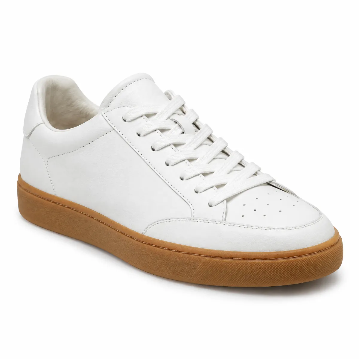
OTTO products
Sneaker aus Glattleder, Weiß
99,99 € 79,99 €
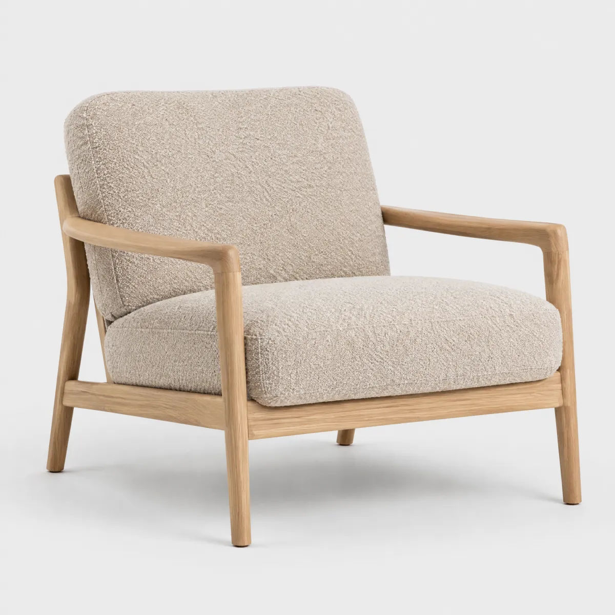
andas
Sessel „Ilvy“ aus Bouclé, Eiche natur
399,99 €
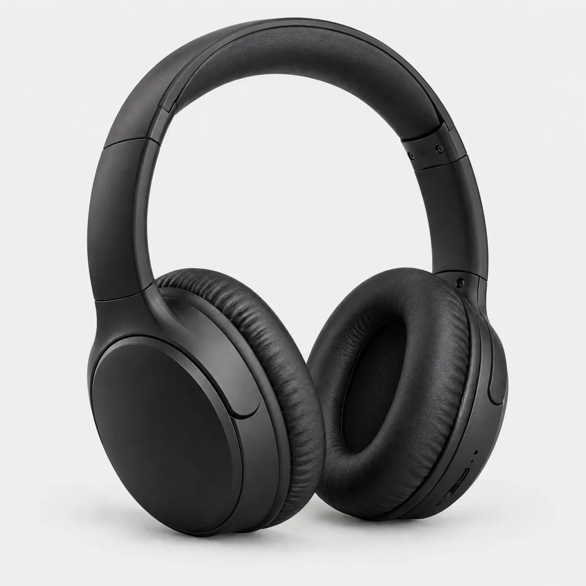
Hanseatic
Over-Ear-Kopfhörer mit Noise Cancelling
59,99 €
HTML
<p class="demo-title" style="font-size:1.25rem">Unsere Empfehlungen</p>
<div style="display:grid;grid-template-columns:repeat(auto-fit,minmax(9.5rem,1fr));gap:24px 16px"><article style="display:flex;flex-direction:column;gap:2px;min-width:0"><div style="position:relative;border-radius:16px;overflow:hidden;background:#f3f3f3"><img src="/previews/imagery/samples/otto-product-still/product-sneaker.webp" alt="Sneaker aus Glattleder, Weiß" width="600" height="600" loading="lazy" style="display:block;width:100%;height:auto;margin:0;mix-blend-mode:multiply"><div style="position:absolute;left:12px;bottom:12px;display:flex;gap:4px;flex-wrap:wrap"><oc-tag-v1 variant="sale" size="50">-20 %</oc-tag-v1><oc-tag-v1 variant="info-secondary" size="50">Bestseller</oc-tag-v1></div></div><p class="demo-copy" style="margin-top:10px;color:var(--oc-semantic-color-text-secondary, #6d6d6d);text-transform:uppercase;font-size:0.75rem;letter-spacing:0.02em">OTTO products</p><p class="demo-copy">Sneaker aus Glattleder, Weiß</p><p class="demo-copy" style="margin-top:6px"><s style="color:var(--oc-semantic-color-text-secondary, #6d6d6d)">99,99 €</s> <strong style="color:var(--oc-semantic-color-text-sale, #e20020);font-size:1rem">79,99 €</strong></p></article><article style="display:flex;flex-direction:column;gap:2px;min-width:0"><div style="position:relative;border-radius:16px;overflow:hidden;background:#f3f3f3"><img src="/previews/imagery/samples/otto-product-still/product-armchair.webp" alt="Sessel „Ilvy“ aus Bouclé, Eiche natur" width="600" height="600" loading="lazy" style="display:block;width:100%;height:auto;margin:0;mix-blend-mode:multiply"><div style="position:absolute;left:12px;bottom:12px;display:flex;gap:4px;flex-wrap:wrap"><oc-tag-v1 variant="info-primary" size="50">Neu</oc-tag-v1></div></div><p class="demo-copy" style="margin-top:10px;color:var(--oc-semantic-color-text-secondary, #6d6d6d);text-transform:uppercase;font-size:0.75rem;letter-spacing:0.02em">andas</p><p class="demo-copy">Sessel „Ilvy“ aus Bouclé, Eiche natur</p><div style="margin-top:6px"><oc-tag-v1 variant="success" size="25">Lieferbar in 2–3 Tagen</oc-tag-v1></div><p class="demo-copy" style="margin-top:6px"><strong style="font-size:1rem">399,99 €</strong></p></article><article style="display:flex;flex-direction:column;gap:2px;min-width:0"><div style="position:relative;border-radius:16px;overflow:hidden;background:#f3f3f3"><img src="/previews/imagery/samples/otto-product-still/product-headphones.webp" alt="Over-Ear-Kopfhörer mit Noise Cancelling" width="600" height="600" loading="lazy" style="display:block;width:100%;height:auto;margin:0;mix-blend-mode:multiply"><div style="position:absolute;left:12px;bottom:12px;display:flex;gap:4px;flex-wrap:wrap"><oc-tag-v1 variant="info-primary" size="50" show-info-icon>sehr beliebt</oc-tag-v1></div></div><p class="demo-copy" style="margin-top:10px;color:var(--oc-semantic-color-text-secondary, #6d6d6d);text-transform:uppercase;font-size:0.75rem;letter-spacing:0.02em">Hanseatic</p><p class="demo-copy">Over-Ear-Kopfhörer mit Noise Cancelling</p><div style="margin-top:6px"><oc-tag-v1 variant="warning" size="25">Nur noch 3 da</oc-tag-v1></div><p class="demo-copy" style="margin-top:6px"><strong style="font-size:1rem">59,99 €</strong></p></article></div>