OTTODesign System

Components

Divider

The divider separates content from one another.

Configurator

LiveDivider: style, orientation and flow
HTML
<div style="height:160px;position:relative"><oc-divider-v1></oc-divider-v1></div>

Usage

Variants

The divider is available in two variants:

  • solid
  • dashed

Solid

Dashed

Livesolid and dashed divider
HTML
<p class="demo-label">Solid</p><oc-divider-v1 in-flow></oc-divider-v1></div>
<p class="demo-label">Dashed</p><oc-divider-v1 variant="dashed" in-flow></oc-divider-v1></div>

Behavior

Interaction

The divider is not interactive.

Fitting

The divider uses fill-parent by default, but you can also adjust the width of the horizontal and the height of the vertical divider. It has a border-width of 1px. To maintain grid spacing, the horizontal divider will not take up any vertical space, and the vertical divider will not take up any horizontal space.

fill-parent

fill-parent

Livefill-parent divider
HTML
<p class="demo-label" style="text-align:center">fill-parent</p><oc-divider-v1 in-flow></oc-divider-v1></div>
<div style="background:#fff;padding:24px 16px;display:flex;justify-content:center;align-items:center;gap:16px;height:112px;box-sizing:border-box"><p class="demo-label">fill-parent</p><div style="height:64px;position:relative"><oc-divider-v1 orientation="vertical"></oc-divider-v1></div><span style="width:64px"></span></div>

When you use the divider to separate content within a group, ensure that the left and right spacing is the same as that of the content. Use fill-parent without left and right spacing to separate different sections. You can also use full-width dividers to imply elevation for native elements, such as the bottom bar.

Meine BestellungenRücksendungen

fill-parent (inset)

Rechnungen

fill-parent (full width)

Livedivider with and without left and right spacing
HTML
<div class="on-frame"><div style="background:#fff;margin:0 auto;padding-top:24px;max-width:540px">
<div style="padding:0 16px"><oc-row-v2 icon-right="arrow-right" hide-divider><a href="#" aria-label="Meine Bestellungen"></a>Meine Bestellungen</oc-row-v2><oc-row-v2 icon-right="arrow-right"><a href="#" aria-label="Rücksendungen"></a>Rücksendungen</oc-row-v2><p class="demo-label" style="text-align:center">fill-parent (inset)</p><oc-row-v2 icon-right="arrow-right"><a href="#" aria-label="Rechnungen"></a>Rechnungen</oc-row-v2></div>
<p class="demo-label" style="text-align:center;padding:16px 0 4px">fill-parent (full width)</p>
<oc-divider-v1 in-flow></oc-divider-v1>
<oc-tab-bar-v1 icon-position="top" variant="centered"><oc-tab-item-v1><button><oc-icon-v1 type="home"></oc-icon-v1>Start</button></oc-tab-item-v1><oc-tab-item-v1><button><oc-icon-v1 type="search-navigation"></oc-icon-v1>Suche</button></oc-tab-item-v1><oc-tab-item-v1><button><oc-icon-v1 type="basket"></oc-icon-v1>Warenkorb<oc-badge-v2 variant="primary">1</oc-badge-v2></button></oc-tab-item-v1><oc-tab-item-v1><button><oc-icon-v1 type="wishlist"></oc-icon-v1>Merkzettel<oc-badge-v2 variant="primary">1</oc-badge-v2></button></oc-tab-item-v1><oc-tab-item-v1><button><oc-icon-v1 type="person"></oc-icon-v1>Konto</button></oc-tab-item-v1></oc-tab-bar-v1>
</div>

Placement

Place the divider horizontally to separate content vertically, or place it vertically to separate content horizontally. Some components, such as the row, accordion, expander, or paper card, already utilize the divider.

Wir liefern in der Regel innerhalb von zwei bis vier Werktagen zu dir nach Hause.

Obermaterial: Leder. Innenmaterial: Textil. Laufsohle: Gummi.

20 % Extra

Extra auf Sneaker

Nur bis 30.09.

Gutscheincode: SNEAKER20

20 % Extra

Extra auf Sneaker

Nur bis 30.09.

Livecomponents with divider
HTML
  <oc-accordion-v1 title="Lieferung"><p class="oc-copy-100">Wir liefern in der Regel innerhalb von zwei bis vier Werktagen zu dir nach Hause.</p></oc-accordion-v1>
  <oc-expander-v1 variant="row-primary" cutoff-height="0" hide-fade oc-aria-label="Weitere Details"><p class="oc-copy-100">Obermaterial: Leder. Innenmaterial: Textil. Laufsohle: Gummi.</p></oc-expander-v1>
  <oc-paper-card-v1 size="100"><oc-tag-v1 variant="sale" size="50">20 % Extra</oc-tag-v1><p class="demo-title">Extra auf Sneaker</p><p class="demo-copy">Nur bis 30.09.</p><p slot="footer" class="demo-copy">Gutscheincode: SNEAKER20</p></oc-paper-card-v1>
  <oc-paper-card-v1 size="50"><oc-tag-v1 variant="sale" size="50">20 % Extra</oc-tag-v1><p class="demo-title">Extra auf Sneaker</p><p class="demo-copy">Nur bis 30.09.</p></oc-paper-card-v1>

Best practices

Lieferung in 2 bis 4 Werktagen

Rücksendung innerhalb von 30 Tagen

DoUse the divider to separate content.

Mojo Drop

Die neue Kollektion ist da.

Don'tUse the divider to highlight content, such as text.

Versand

Rücksendung

Zahlung

Hilfe & Kontakt

DoLeave out the first and last divider in a list.

Versand

Rücksendung

Zahlung

Hilfe & Kontakt

Don'tUse the divider at the start and end of a list.
VersandRücksendungZahlungHilfe & Kontakt
CautionUse full-width dividers sparingly to maintain enclosure.

Accessibility

For information on accessibility, refer to the technical documentation.

Status

Implementation

Note: For full technical documentation of this component, visitStorybook/divider

Live demo
Warenkorb (2 Artikel)

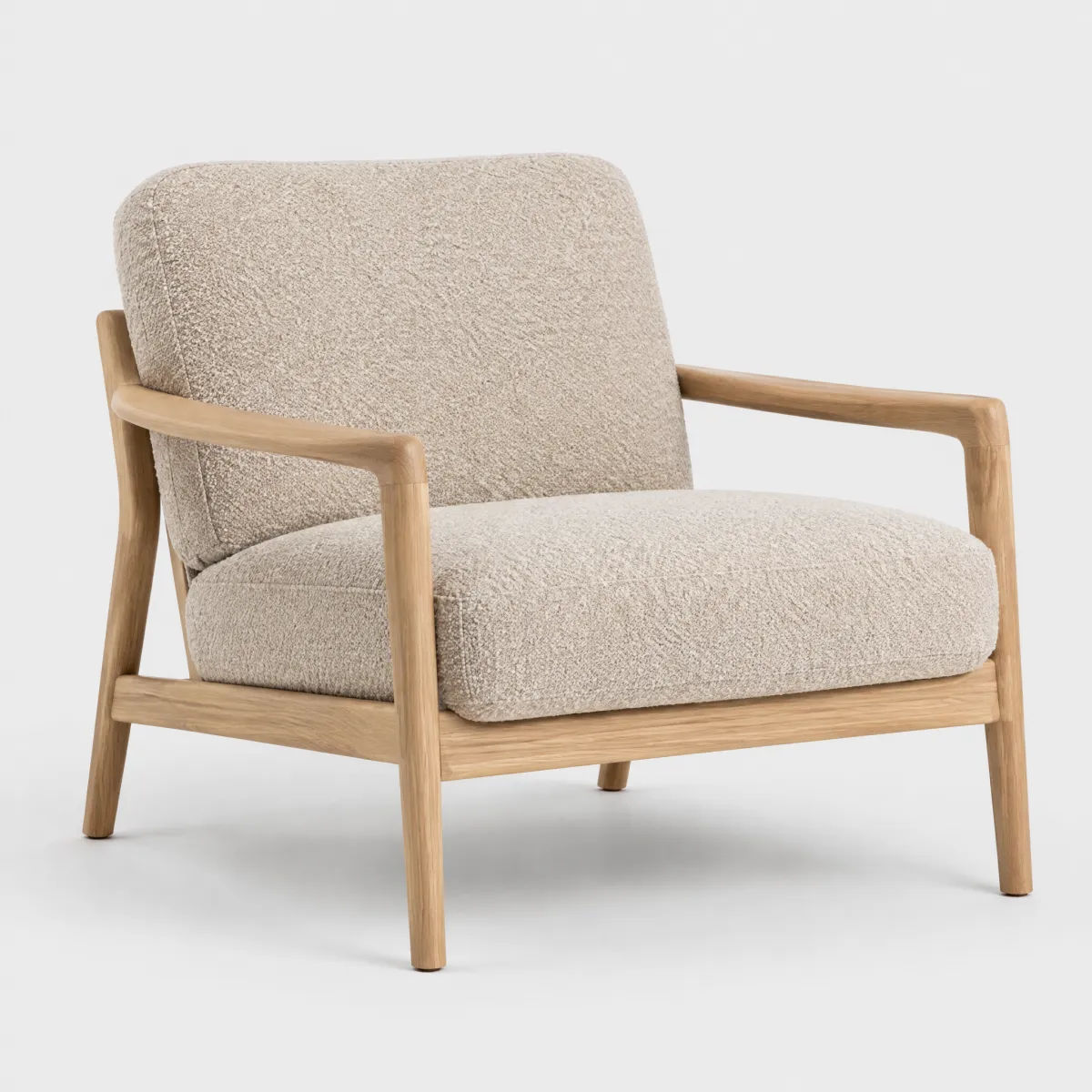
Sessel mit Bouclé-Bezug, CremeMenge: 1349,00 €
Over-Ear-Kopfhörer, SchwarzMenge: 179,99 €
Zwischensumme428,99 €
Versandkostenlos
OTTO UP Punkte−5,00 €
Gesamtsumme423,99 €

inkl. MwSt.

Zur Kasse
LiveReal OTTO components, rendered by the OTTO component runtime
HTML
<div class="on-frame" style="padding:32px 16px">
<div style="width:100%;max-width:390px;margin:0 auto;background:#fff;border-radius:16px;overflow:hidden;box-shadow:0 1px 3px rgba(0,0,0,.08)">
<div style="display:grid;gap:16px;padding:20px 16px 24px">
  <p class="oc-headline-200" style="margin:0">Warenkorb (2 Artikel)</p>
  <div style="display:flex;gap:12px"><img src="/previews/imagery/samples/otto-product-still/product-armchair.webp" alt="" width="72" height="72" style="border-radius:8px;flex:none"><div style="display:grid;gap:2px"><span class="oc-copy-100">Sessel mit Bouclé-Bezug, Creme</span><span class="oc-copy-75" style="color:var(--oc-semantic-color-text-secondary)">Menge: 1</span><span class="oc-copy-100" style="font-weight:700">349,00 €</span></div></div>
  <oc-divider-v1 in-flow></oc-divider-v1>
  <div style="display:flex;gap:12px"><img src="/previews/imagery/samples/otto-product-still/product-headphones.webp" alt="" width="72" height="72" style="border-radius:8px;flex:none"><div style="display:grid;gap:2px"><span class="oc-copy-100">Over-Ear-Kopfhörer, Schwarz</span><span class="oc-copy-75" style="color:var(--oc-semantic-color-text-secondary)">Menge: 1</span><span class="oc-copy-100" style="font-weight:700;color:var(--oc-semantic-color-text-sale)">79,99 €</span></div></div>
  <oc-divider-v1 variant="dashed" in-flow></oc-divider-v1>
  <div style="display:grid;gap:8px"><div style="display:flex;justify-content:space-between;gap:16px"><span class="oc-copy-100">Zwischensumme</span><span class="oc-copy-100">428,99 €</span></div><div style="display:flex;justify-content:space-between;gap:16px"><span class="oc-copy-100">Versand</span><span class="oc-copy-100" style="color:var(--oc-semantic-color-text-success)">kostenlos</span></div><div style="display:flex;justify-content:space-between;gap:16px"><span class="oc-copy-100">OTTO UP Punkte</span><span class="oc-copy-100">−5,00 €</span></div></div>
  <oc-divider-v1 in-flow></oc-divider-v1>
  <div style="display:flex;justify-content:space-between;align-items:baseline"><span class="oc-headline-100">Gesamtsumme</span><span class="oc-headline-200">423,99 €</span></div>
  <p class="oc-copy-75" style="color:var(--oc-semantic-color-text-secondary)" style="margin:-12px 0 0">inkl. MwSt.</p>
  <oc-button-v1 variant="primary">Zur Kasse</oc-button-v1>

Code

Version Tag Status API
v1 <oc-divider-v1> Stable, allowed for generation DividerV1

Overview (v1)

Divider

The divider component is used to provide strict differentiation between two or more components. It is a simple line that can be used to separate content, especially in accordion, expander, paper card or row components, to improve readability and organization.

The divider component is a versatile and essential element in web design, helping to create a clear visual hierarchy and guide users through the content.

Default variation
HTML
<oc-divider-v1></oc-divider-v1>
Configuration

The divider component is available in the main styling variants solid or dashed and can have a horizontal or vertical orientation. The default variant is solid and horizontal, which is the most commonly used configuration.

This component is configurable, allowing you to tailor its features and appearance to your specific needs. To explore all the available options and adjust the component, use the component configurator and see the changes affect the component in real-time.

Usage guidelines

Before integrating the divider component into your project, make sure you have correctly installed the OTTO components package. Look through the variations page for examples of possible component variations. Here, you can discover both common and specific variations that address different use cases.

Info

See the Divider UX documentation for detailed user experience guidelines.

Configuration (v1)

Divider configuration

Configure the divider component with the controls below and see the changes live in the preview canvas. Click the Show code button within the preview canvas to see the source code for the current component configuration.

HTML
<div style="height: 200px">
<oc-divider-v1 ></oc-divider-v1>

Interactive configurator (Storybook controls); every option is listed in the API section of this file.

API v1

Divider v1 API

API: <oc-divider-v1> (DividerV1)

The oc-divider-v1 component is used to provide strict differentiation between two or more components. It is a simple line that can be used to separate content, especially in accordion, expander, paper card, or row components, to improve readability and organization.

Attributes / properties
Attribute Type Default Required Description
variant "solid" | "dashed" "solid" no Sets the visual style of the divider.
orientation "horizontal" | "vertical" "horizontal" no The orientation of the divider.

Note: The vertical orientation will only work if the parent element has a height set.
in-flow boolean false no Determines whether the divider participates in normal document flow. This makes it relatively positioned and achieves a real 1px height.
Events
Event Detail type Description
oc-property-change OcDividerV1Events["oc-property-change"] Whenever a property value changes, this event triggers. Use this event to track all property changes within the component.

Refer to the Events documentation for more information.
oc-mount { component: string; } Fired when the component is mounted to the DOM. The event is fired when the onMount hook of the component is called by the runtime.
oc-unmount { component: string; } Fired when the component is unmounted from the DOM. The event is fired when the function returned by the onMount hook of the component is called by the runtime.

Variations (v1)

Variations

Listed below are the most common variations of the divider component as well as specific component variations for different use cases.

You can explore all available options using the component configurator, adjust the component to your needs, and see the changes live in a preview canvas.

Default

Story: components-divider-variations--default · tags: components, divider, 1, variations

Default Divider

HTML
<oc-divider-v1></oc-divider-v1>
Configurator Only

Story: components-divider-variations--configurator-only · tags: components, divider, 1, variations

Default Divider with custom height, so vertical orientation can be seen on the component configurator

HTML
<div style="height: 200px">
<oc-divider-v1 ></oc-divider-v1>
Story source (TypeScript, verbatim from Storybook)
{
  args: {},
  tags: ["!dev"],
  render: args => {
    return html`
      <div style="height: 200px">
        <oc-divider-v1 ${spread(args)}></oc-divider-v1>
      </div>
    `;
  }
}
Default Vertical

Story: components-divider-variations--default-vertical · tags: components, divider, 1, variations

Solid Divider in vertical orientation

Args: orientation=vertical

HTML
<div style="height: 200px">
<oc-divider-v1 orientation="vertical"></oc-divider-v1>
Story source (TypeScript, verbatim from Storybook)
{
  args: {
    orientation: "vertical"
  },
  render(args) {
    return html`
      <div style="height: 200px">
        <oc-divider-v1 ${spread(args)}></oc-divider-v1>
      </div>
    `;
  }
}
Dashed

Story: components-divider-variations--dashed · tags: components, divider, 1, variations

Dashed Divider

Args: variant=dashed

HTML
<oc-divider-v1 variant="dashed"></oc-divider-v1>
Demo: Divider in several components

Story: components-divider-variations--demo-divider-in-several-components · tags: components, divider, 1, variations

Demo: Divider in several components

<h1>Solid Variant</h1>
<br />
<div style="display: flex; gap: 16px; flex-wrap: wrap">
  <!-- Card w/ Divider -->
  <div style="width: 312px">
    <p>Card with Divider</p>
    <oc-card-v2>
      <div style="padding: 8px">
        <oc-placeholder-v1 variant="text" style="height: 178px; --border-radius: 8px">
          DETACH TO REPLACE CONTENT</oc-placeholder-v1
        >
        <oc-divider-v1 class="oc-my-50"></oc-divider-v1>
        <oc-button-v1 variant="tertiary">Label</oc-button-v1>
      </div>
    </oc-card-v2>
  </div>

  <!-- Block w/ divider (horizontal) -->
  <div>
    <p>Block with Divider (horizontal)</p>
    <div class="oc-block-v1">
      <div style="display: flex; flex-direction: column; gap: 8px">
        <oc-placeholder-v1 variant="text" style="height: 88px;">
          DETACH TO REPLACE CONTENT</oc-placeholder-v1
        >
        <oc-divider-v1></oc-divider-v1>
        <oc-placeholder-v1 variant="text" style="height: 88px;">
          DETACH TO REPLACE CONTENT</oc-placeholder-v1
        >
      </div>
    </div>
  </div>
  <!-- Block w/ divider (vertical) -->
  <div>
    <p>Block with Divider (vertical)</p>
    <div class="oc-block-v1">
      <div style="display: flex; gap: 8px">
        <oc-placeholder-v1 variant="text" style="height: 88px;">
          DETACH TO REPLACE CONTENT</oc-placeholder-v1
        >
        <oc-divider-v1 orientation="vertical"></oc-divider-v1>
        <oc-placeholder-v1 variant="text" style="height: 88px;">
          DETACH TO REPLACE CONTENT</oc-placeholder-v1
        >
      </div>
    </div>
  </div>
</div>
<br />
<br />
<h1>Dashed Variant</h1>
<br />
<div style="display: flex; gap: 16px; flex-wrap: wrap">
  <!-- Card w/ Divider -->
  <div style="width: 312px">
    <p>Card with Divider</p>
    <oc-card-v2>
      <div style="padding: 8px">
        <oc-placeholder-v1 variant="text" style="height: 178px; --border-radius: 8px">
          DETACH TO REPLACE CONTENT</oc-placeholder-v1
        >
        <oc-divider-v1 variant="dashed" class="oc-my-50"></oc-divider-v1>
        <oc-button-v1 variant="tertiary">Label</oc-button-v1>
      </div>
    </oc-card-v2>
  </div>

  <!-- Block w/ divider (horizontal) -->
  <div>
    <p>Block with Divider (horizontal)</p>
    <div class="oc-block-v1">
      <div style="display: flex; flex-direction: column; gap: 8px">
        <oc-placeholder-v1 variant="text" style="height: 88px;">
          DETACH TO REPLACE CONTENT</oc-placeholder-v1
        >
        <oc-divider-v1 variant="dashed"></oc-divider-v1>
        <oc-placeholder-v1 variant="text" style="height: 88px;">
          DETACH TO REPLACE CONTENT</oc-placeholder-v1
        >
      </div>
    </div>
  </div>
  <!-- Block w/ divider (vertical) -->
  <div>
    <p>Block with Divider (vertical)</p>
    <div class="oc-block-v1">
      <div style="display: flex;" class="oc-gap-50">
        <oc-placeholder-v1 variant="text" style="height: 88px;">
          DETACH TO REPLACE CONTENT</oc-placeholder-v1
        >
        <oc-divider-v1 orientation="vertical" variant="dashed"></oc-divider-v1>
        <oc-placeholder-v1 variant="text" style="height: 88px;">
          DETACH TO REPLACE CONTENT</oc-placeholder-v1
        >
      </div>
    </div>
  </div>
</div>
Story source (TypeScript, verbatim from Storybook)
{
  name: "Demo: Divider in several components",
  parameters: {
    backgrounds: {
      value: "frame"
    }
  },
  render() {
    return html`
      <h1>Solid Variant</h1>
      <br />
      <div style="display: flex; gap: 16px; flex-wrap: wrap">
        <!-- Card w/ Divider -->
        <div style="width: 312px">
          <p>Card with Divider</p>
          <oc-card-v2>
            <div style="padding: 8px">
              <oc-placeholder-v1 variant="text" style="height: 178px; --border-radius: 8px">
                DETACH TO REPLACE CONTENT</oc-placeholder-v1
              >
              <oc-divider-v1 class="oc-my-50"></oc-divider-v1>
              <oc-button-v1 variant="tertiary">Label</oc-button-v1>
            </div>
          </oc-card-v2>
        </div>

        <!-- Block w/ divider (horizontal) -->
        <div>
          <p>Block with Divider (horizontal)</p>
          <div class="oc-block-v1">
            <div style="display: flex; flex-direction: column; gap: 8px">
              <oc-placeholder-v1 variant="text" style="height: 88px;">
                DETACH TO REPLACE CONTENT</oc-placeholder-v1
              >
              <oc-divider-v1></oc-divider-v1>
              <oc-placeholder-v1 variant="text" style="height: 88px;">
                DETACH TO REPLACE CONTENT</oc-placeholder-v1
              >
            </div>
          </div>
        </div>
        <!-- Block w/ divider (vertical) -->
        <div>
          <p>Block with Divider (vertical)</p>
          <div class="oc-block-v1">
            <div style="display: flex; gap: 8px">
              <oc-placeholder-v1 variant="text" style="height: 88px;">
                DETACH TO REPLACE CONTENT</oc-placeholder-v1
              >
              <oc-divider-v1 orientation="vertical"></oc-divider-v1>
              <oc-placeholder-v1 variant="text" style="height: 88px;">
                DETACH TO REPLACE CONTENT</oc-placeholder-v1
              >
            </div>
          </div>
        </div>
      </div>
      <br />
      <br />
      <h1>Dashed Variant</h1>
      <br />
      <div style="display: flex; gap: 16px; flex-wrap: wrap">
        <!-- Card w/ Divider -->
        <div style="width: 312px">
          <p>Card with Divider</p>
          <oc-card-v2>
            <div style="padding: 8px">
              <oc-placeholder-v1 variant="text" style="height: 178px; --border-radius: 8px">
                DETACH TO REPLACE CONTENT</oc-placeholder-v1
              >
              <oc-divider-v1 variant="dashed" class="oc-my-50"></oc-divider-v1>
              <oc-button-v1 variant="tertiary">Label</oc-button-v1>
            </div>
          </oc-card-v2>
        </div>

        <!-- Block w/ divider (horizontal) -->
        <div>
          <p>Block with Divider (horizontal)</p>
          <div class="oc-block-v1">
            <div style="display: flex; flex-direction: column; gap: 8px">
              <oc-placeholder-v1 variant="text" style="height: 88px;">
                DETACH TO REPLACE CONTENT</oc-placeholder-v1
              >
              <oc-divider-v1 variant="dashed"></oc-divider-v1>
              <oc-placeholder-v1 variant="text" style="height: 88px;">
                DETACH TO REPLACE CONTENT</oc-placeholder-v1
              >
            </div>
          </div>
        </div>
        <!-- Block w/ divider (vertical) -->
        <div>
          <p>Block with Divider (vertical)</p>
          <div class="oc-block-v1">
            <div style="display: flex;" class="oc-gap-50">
              <oc-placeholder-v1 variant="text" style="height: 88px;">
                DETACH TO REPLACE CONTENT</oc-placeholder-v1
              >
              <oc-divider-v1 orientation="vertical" variant="dashed"></oc-divider-v1>
              <oc-placeholder-v1 variant="text" style="height: 88px;">
                DETACH TO REPLACE CONTENT</oc-placeholder-v1
              >
            </div>
          </div>
        </div>
      </div>
    `;
  }
}