OTTODesign System

Components

Banner

A banner displays general information or user feedback. Banners use different semantic variants (such as info, warning, success or error) to indicate the type of message. They can be static or triggered by user interaction. The colorful design of the banner interrupts the user flow and makes it more prominent than other components. Therefore, use them carefully and sparingly.

Configurator

LiveBanner: variant, size, headline, icon, actions and close button
Wegen der hohen Nachfrage dauert die Lieferung aktuell ein bis zwei Tage länger.Mehr erfahren
HTML
<oc-banner-v1 variant="info" size="200" headline="Längere Lieferzeit">Wegen der hohen Nachfrage dauert die Lieferung aktuell ein bis zwei Tage länger.<oc-link-v2 variant="underlined" href="#" slot="actions">Mehr erfahren</oc-link-v2></oc-banner-v1>

Usage

Anatomy

Deine Zahlung per Kreditkarte konnte leider nicht abgeschlossen werden. Bitte prüfe deine Kartendaten oder wähle eine andere Zahlungsart, damit wir deine Bestellung verschicken können.Mehr erfahrenZahlungsart ändern 1 2 3 4 5 6
  1. Icon (per variant, can be replaced)
  2. Headline (size 200, 300)
  3. Text
  4. Action links (optional, primary bold)
  5. Close button (optional)
  6. Container
LiveAnnotations
HTML
<div class="anatomy" style="width:410px">
<oc-banner-v1 variant="error" size="300" headline="Zahlung fehlgeschlagen">Deine Zahlung per Kreditkarte konnte leider nicht abgeschlossen werden. Bitte prüfe deine Kartendaten oder wähle eine andere Zahlungsart, damit wir deine Bestellung verschicken können.<oc-link-v2 variant="underlined" href="#" slot="actions">Mehr erfahren</oc-link-v2><oc-link-v2 variant="underlined-bold" href="#" slot="actions">Zahlungsart ändern</oc-link-v2></oc-banner-v1>
<span class="anatomy-pin" style="left:36%;top:12%">1</span>
<span class="anatomy-pin" style="left:18%;top:36%">2</span>
<span class="anatomy-pin" style="left:-3%;top:56%">3</span>
<span class="anatomy-pin" style="left:-3%;top:89%">4</span>
<span class="anatomy-pin" style="left:100%;top:10%">5</span>
<span class="anatomy-pin" style="left:100%;top:100%">6</span>
<ol class="anatomy-key"><li data-n="1">Icon (per variant, can be replaced)</li><li data-n="2">Headline (size 200, 300)</li><li data-n="3">Text</li><li data-n="4">Action links (optional, primary bold)</li><li data-n="5">Close button (optional)</li><li data-n="6">Container</li></ol>

Variants

Banner is available in three sizes:

  • 100 is the default size and is meant to be used with short text.
  • 200 has more configuration possibilities with a headline and is meant for medium long text.
  • 300 has a different layout with a larger, centered icon and a centered headline. It is meant to be used for long text.
Deine Bestellung wird heute verschickt.Sendung verfolgen Wegen der hohen Nachfrage dauert die Lieferung aktuell ein bis zwei Tage länger.Mehr erfahrenSendung verfolgen Wegen der hohen Nachfrage dauert die Lieferung aktuell ein bis zwei Tage länger. Wir informieren dich per E-Mail, sobald dein Paket unterwegs ist. Den aktuellen Stand findest du jederzeit in deinem Kundenkonto.Mehr erfahrenSendung verfolgen
Livesize 100, 200 & 300
HTML
<oc-banner-v1 variant="info" size="100">Deine Bestellung wird heute verschickt.<oc-link-v2 variant="underlined" href="#" slot="actions">Sendung verfolgen</oc-link-v2></oc-banner-v1>
<oc-banner-v1 variant="info" size="200" headline="Längere Lieferzeit">Wegen der hohen Nachfrage dauert die Lieferung aktuell ein bis zwei Tage länger.<oc-link-v2 variant="underlined" href="#" slot="actions">Mehr erfahren</oc-link-v2><oc-link-v2 variant="underlined-bold" href="#" slot="actions">Sendung verfolgen</oc-link-v2></oc-banner-v1>
<oc-banner-v1 variant="info" size="300" headline="Längere Lieferzeit">Wegen der hohen Nachfrage dauert die Lieferung aktuell ein bis zwei Tage länger. Wir informieren dich per E-Mail, sobald dein Paket unterwegs ist. Den aktuellen Stand findest du jederzeit in deinem Kundenkonto.<oc-link-v2 variant="underlined" href="#" slot="actions">Mehr erfahren</oc-link-v2><oc-link-v2 variant="underlined-bold" href="#" slot="actions">Sendung verfolgen</oc-link-v2></oc-banner-v1>

There are five semantic variants of the banner:

  • Info: Contains neutral information and is the most subtle.
  • Hint: Contains relevant information and is more prominent.
  • Success: Indicates that it was successful and nothing needs to be changed.
  • Warning: Indicates that something can or should be changed.
  • Error: Indicates that something needs to be changed.

To maximize accessibility, each variant includes a required icon to convey its semantic meaning beyond just color. There is always a default icon for each variant but it can be changed to a custom icon.

Deine Daten werden verschlüsselt übertragen.Mehr erfahren Mit OTTO UP sparst du die Versandkosten.Mehr erfahren Deine Adresse wurde gespeichert.Adresse ansehen Nur noch 2 Artikel auf Lager.Jetzt bestellen Die Zahlung ist fehlgeschlagen.Zahlungsart ändern
Livesemantic variants (info, hint, success, warning and error)
HTML
<oc-banner-v1 variant="info">Deine Daten werden verschlüsselt übertragen.<oc-link-v2 variant="underlined" href="#" slot="actions">Mehr erfahren</oc-link-v2></oc-banner-v1>
<oc-banner-v1 variant="hint">Mit OTTO UP sparst du die Versandkosten.<oc-link-v2 variant="underlined" href="#" slot="actions">Mehr erfahren</oc-link-v2></oc-banner-v1>
<oc-banner-v1 variant="success">Deine Adresse wurde gespeichert.<oc-link-v2 variant="underlined" href="#" slot="actions">Adresse ansehen</oc-link-v2></oc-banner-v1>
<oc-banner-v1 variant="warning">Nur noch 2 Artikel auf Lager.<oc-link-v2 variant="underlined" href="#" slot="actions">Jetzt bestellen</oc-link-v2></oc-banner-v1>
<oc-banner-v1 variant="error">Die Zahlung ist fehlgeschlagen.<oc-link-v2 variant="underlined" href="#" slot="actions">Zahlungsart ändern</oc-link-v2></oc-banner-v1>

Optional action links can be used within a banner. It is possible to use two, primary and secondary, or just one action link. If two action links are used, the primary action is bold and the secondary is regular. If only one action link is used, it is regular.

Optionally the Close Button can be used in case the banner should be dismissible. This might be the case if:

  • it does not contain critical information.
  • it is sufficient for the user to see the information once.
  • it disturbs the user because of the space it occupies.

Behavior

Placement

As a general rule, always place a banner inside a block (canvas) rather than directly on the background (frame), as described in the elevation concept.

The width of the banner uses fill-parent so that it fills the entire width of its parent container. Meanwhile, the height of the banner uses fit-content. Place a banner close to the specific section of content it relates to, or put it at the top of the page if it provides general information or feedback. Allow banners to scroll with the rest of the page content, since they are not sticky.

Wegen der hohen Nachfrage dauert die Lieferung aktuell länger.Mehr erfahrenSendung verfolgen
Livefitting of banner inside a block
HTML
<oc-banner-v1 variant="info" size="200" headline="Längere Lieferzeit">Wegen der hohen Nachfrage dauert die Lieferung aktuell länger.<oc-link-v2 variant="underlined" href="#" slot="actions">Mehr erfahren</oc-link-v2><oc-link-v2 variant="underlined-bold" href="#" slot="actions">Sendung verfolgen</oc-link-v2></oc-banner-v1>

Best practice

Deine Lieferadresse ist unvollständig.Adresse prüfen
DoUse banners sparingly as they are very prominent and may disrupt the users journey.
Neu: Rücksendungen in der App anmelden.Mehr erfahren
Tipp: Speichere deine Größe im Profil.Zum Profil
Du kannst jetzt auch per Rechnung zahlen.Mehr erfahren
Don'tUse banners multiple times on one page for uncritical information.
Neu: Du kannst Rücksendungen jetzt auch in der App anmelden.Mehr erfahren
DoUse closable banners for uncritical information.
Deine Zahlung ist fehlgeschlagen. Ohne neue Zahlungsart können wir nicht liefern.Zahlungsart ändern
Don'tUse closable banners for critical, important information.

Content guidelines

Do1. Use concise, scannable language that communicates the problem.
  1. Indicate the problem directly and offer solutions to fix it (esp. for error or warning)

  2. Action links should be clear and specific, indicating what will happen next.

  3. Write in sentence case and use appropriate punctuation.

  4. Avoid repeating in the headline in the text.

Accessibility

When using a banner consider using role="alert" to make it accessible for screen reader users. Also consider scrolling to a banner if it is displayed outside the viewport after an action.

For further information on accessibility, refer to the technical documentation.

Status

Implementation

Live demo

Lieferadresse

Bitte prüfe die Hausnummer. Ohne sie kann dein Paket nicht zugestellt werden.Adresse bearbeiten

Maria Muster
Werner-Otto-Straße
22179 Hamburg
Weiter zur Zahlung
Wir haben dir eine Bestätigung an maria@beispiel.de geschickt. Voraussichtliche Lieferung: Donnerstag, 2. Oktober.Sendung verfolgen
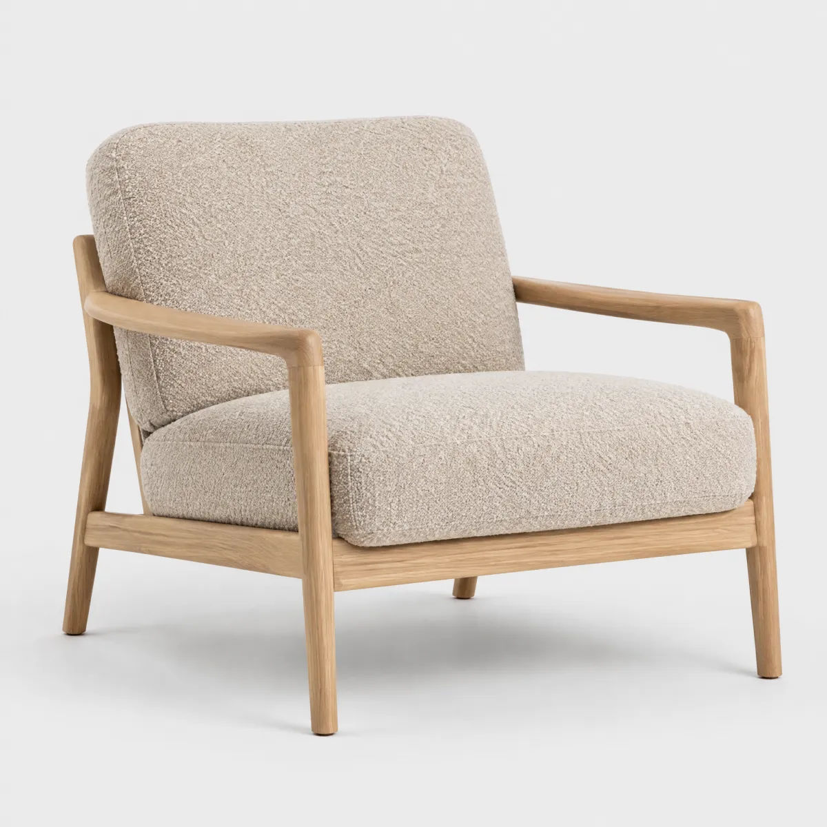
Sessel „Ilvy“

andas

Sessel „Ilvy“ aus Bouclé

399,99 €

LiveReal OTTO components, rendered by the OTTO component runtime
HTML
<div class="on-frame" style="margin:0;padding:24px;display:grid;grid-template-columns:repeat(auto-fit,minmax(16rem,1fr));gap:16px;align-items:start"><div style="background:var(--oc-semantic-color-background-canvas, #fff);border-radius:16px;padding:24px;display:flex;flex-direction:column;gap:16px;box-shadow:0 0 0 1px rgba(0,0,0,.06)"><p class="demo-title" style="font-size:1.125rem">Lieferadresse</p><oc-banner-v1 variant="warning" hide-close-button>Bitte prüfe die Hausnummer. Ohne sie kann dein Paket nicht zugestellt werden.<oc-link-v2 variant="underlined" href="#" slot="actions">Adresse bearbeiten</oc-link-v2></oc-banner-v1><p class="demo-copy">Maria Muster<br>Werner-Otto-Straße<br>22179 Hamburg</p><oc-button-v1 variant="primary">Weiter zur Zahlung</oc-button-v1></div><div style="background:var(--oc-semantic-color-background-canvas, #fff);border-radius:16px;padding:24px;display:flex;flex-direction:column;gap:16px;box-shadow:0 0 0 1px rgba(0,0,0,.06)"><oc-banner-v1 variant="success" size="200" headline="Danke für deine Bestellung!" hide-close-button>Wir haben dir eine Bestätigung an maria@beispiel.de geschickt. Voraussichtliche Lieferung: Donnerstag, 2. Oktober.<oc-link-v2 variant="underlined" href="#" slot="actions">Sendung verfolgen</oc-link-v2></oc-banner-v1><div style="display:flex;gap:12px;align-items:center"><img src="/previews/imagery/samples/otto-product-still/product-armchair.webp" alt="Sessel „Ilvy“" width="72" height="72" style="margin:0;border-radius:12px;background:#f3f3f3"><div><p class="demo-copy" style="color:var(--oc-semantic-color-text-secondary, #6d6d6d);font-size:0.75rem;text-transform:uppercase">andas</p><p class="demo-copy">Sessel „Ilvy“ aus Bouclé</p><p class="demo-copy"><strong>399,99 €</strong></p></div></div></div></div>

Code

Version Tag Status API
v1 <oc-banner-v1> Stable, allowed for generation BannerV1

Overview (v1)

Banner

The banner component displays important messages, supports various styles, provides interactive links, and a custom event triggered on closure.

Default variation
Lorem ipsum dolor sit amet
HTML
<oc-banner-v1 size="100" variant="info">Lorem ipsum dolor sit amet</oc-banner-v1>
Configuration

The banner is available in the main styling variants error, hint, info, success, and warning. This component is configurable, allowing you to tailor its features and appearance to your specific needs. To explore all the available options and adjust the component, use the component configurator and see the changes affect the component in real-time.

Usage guidelines

Before integrating the banner component into your project, make sure you have correctly installed the OTTO components package. Look through the variations section for examples of possible component variations. Here, you can discover both common and specific variations that address different use cases.

Info

See the Banner UX documentation for detailed user experience guidelines.

Accessibility

The banner component comes with a set of built-in accessibility features to ensure a seamless experience for all users.

Icons

Icons in the banner component are purely decorative and do not contain any additional information. Thus, they are hidden from screen readers using the aria-hidden attribute.

Keyboard navigation

The banner component is designed to be accessible via keyboard navigation and allows for the following shortcuts:

Shortcut Description
Tab Focuses the actions and the close button of the banner.
Space / Enter on actions Opens the links set via the actions slots.
Space / Enter on close button Closes the banner.
Tabbing order

The tabbing order is set up to focus the links passed via the actions slot first, followed by the close button.

Configuration (v1)

Banner configuration

Configure the banner component with the controls below and see the changes live in the preview canvas. Click the Show code button within the preview canvas to see the source code for the current component configuration.

Lorem ipsum dolor sit amet
HTML
<oc-banner-v1 size="100" variant="info">Lorem ipsum dolor sit amet</oc-banner-v1>

Interactive configurator (Storybook controls); every option is listed in the API section of this file.

API v1

Banner v1 API

API: <oc-banner-v1> (BannerV1)

The Banner component displays important messages, supports various styles, provides interactive links, and a custom event triggered on closure.

Attributes / properties
Attribute Type Default Required Description
variant "error" | "success" | "warning" | "hint" | "info" "info" no Sets the main styling variant of the banner.
size "100" | "200" | "300" "100" no Sets the size of the banner.
headline string undefined no Sets the text content of the banner headline. This attribute only applies to banners with size="200" and size="300".
headline-level 1 | 2 | 3 | 4 | 5 | 6 undefined no If set, renders the headline content inside a heading tag with the specified level. This attribute only applies to banners with size="200" and size="300".

The heading level has no visual effect but provides semantic structure for screen readers. If not set, renders a div instead of a heading tag.
icon-type icon name (428 values; see Icon list in `storybook/components/icon/README.md`) undefined no Overrides the default icon of the banner.
hide-icon boolean false no Indicates whether the banner icon is hidden.
hide-close-button boolean false no Indicates whether the banner close button is hidden.
hidden boolean false no Indicates whether the banner is hidden.
Slots
Slot Required Description
default yes Sets the main text content of the banner.
actions no Holds the link components that provide interactions to the user.
Example:
<oc-link-v2 variant="underlined" href="#" slot="actions">Action 1</oc-link-v2>
Events
Event Detail type Description
oc-banner-close CustomEvent<Pick<Props, "hideCloseButton">> Closing a banner triggers the oc-banner-close event.
oc-close CustomEvent<Pick<Props, "hideCloseButton">> Closing a banner triggers the oc-close event.
oc-property-change OcBannerV1Events["oc-property-change"] Whenever a property value changes, this event triggers. Use this event to track all property changes within the component.

Refer to the Events documentation for more information.
oc-mount { component: string; } Fired when the component is mounted to the DOM. The event is fired when the onMount hook of the component is called by the runtime.
oc-unmount { component: string; } Fired when the component is unmounted from the DOM. The event is fired when the function returned by the onMount hook of the component is called by the runtime.

Variations (v1)

Variations

Listed below are the most common variations of the banner component as well as specific component variations for different use cases.

To explore all the available options and adjust the component, use the component configurator and see the changes affect the component in real-time.

Default

Story: components-banner-variations--default · tags: components

The default configuration uses the info variant and size=100.

Args: size=100

Lorem ipsum dolor sit amet
HTML
<oc-banner-v1 size="100" variant="info">Lorem ipsum dolor sit amet</oc-banner-v1>

Story: components-banner-variations--banner-100 · tags: components

The info variant with size=100 and passed in action link (by slot).

Args: size=100, actionsSlot=<oc-link-v2 variant="underlined" href="#" slot="actions">Action 1</oc-link-v2>

Action 1 Lorem ipsum dolor sit amet
HTML
<oc-banner-v1 size="100" variant="info">
<oc-link-v2 variant="underlined" href="#" slot="actions">Action 1</oc-link-v2>
Lorem ipsum dolor sit amet
</oc-banner-v1>
Info 200 with headline

Story: components-banner-variations--banner-200 · tags: components

The info variant with size=200 and passed in headline (by attribute).

Args: size=200, headline=Some Headline, actionsSlot=(see snippet)

Action 1 Action 2 Lorem ipsum dolor sit amet
HTML
<oc-banner-v1 size="200" variant="info" headline="Some Headline">
<oc-link-v2 variant="underlined" href="#" slot="actions">Action 1</oc-link-v2>
  <oc-link-v2 variant="underlined-bold" href="#" slot="actions">Action 2</oc-link-v2>
Lorem ipsum dolor sit amet
</oc-banner-v1>
Error 200 with headline as h Tag

Story: components-banner-variations--banner-200-as-h-tag · tags: components

Args: headline=I am an h tag, headline-level=3, size=200, variant=error, actionsSlot=(see snippet)

Action 1 Action 2 Lorem ipsum dolor sit amet
HTML
<oc-banner-v1 size="200" variant="error" headline="I am an h tag" headline-level="3">
<oc-link-v2 variant="underlined" href="#" slot="actions">Action 1</oc-link-v2>
  <oc-link-v2 variant="underlined-bold" href="#" slot="actions">Action 2</oc-link-v2>
Lorem ipsum dolor sit amet
</oc-banner-v1>
Info 300 with headline and multiple actions

Story: components-banner-variations--banner-300 · tags: components

The info variant with size=300 and passed in headline (by attribute) and multiple actions (by slots).

Args: size=300, headline=Some Headline, actionsSlot=(see snippet)

Action 1 Action 2 Lorem ipsum dolor sit amet
HTML
<oc-banner-v1 size="300" variant="info" headline="Some Headline">
<oc-link-v2 variant="underlined" href="#" slot="actions">Action 1</oc-link-v2>
  <oc-link-v2 variant="underlined-bold" href="#" slot="actions">Action 2</oc-link-v2>
Lorem ipsum dolor sit amet
</oc-banner-v1>
Demo: alert pattern

Story: components-banner-variations--demo-alert-pattern · tags: components

Demonstration of how to use role=alert with a banner.

Args: size=100, actionsSlot=<oc-link-v2 variant="underlined" href="#" slot="actions">Action 1</oc-link-v2>, defaultSlot=<strong>Warning:</strong> This is a demo of an accessible banner., variant=warning

<h1 class="oc-headline-200">Demo: alert pattern</h1>
<br />
<p class="oc-copy-100">
  This is a demo for a banner usage with "role=alert". <br />
  To test it, turn on a screen reader and click the "Trigger alert" button. The first
  announcement should be read out loud, followed by the second announcement (banner) that
  interrupts the first.
</p>
<div role="alert" id="alert-space"></div>
<oc-button-v1 variant="secondary" size="50" type="button" id="trigger-button" class="oc-p-100"
  >Trigger alert</oc-button-v1
>
<div aria-live="polite" id="first-announcement-text" class="oc-copy-100"></div>
<script>
  (() => {
    var firstAnnouncement =
      "This is the first announcement that will be interrupted by the second announcement (banner).";
    var firstAnnouncementDiv = document.querySelector("#first-announcement-text");

    const triggerButton = document.getElementById("trigger-button");
    triggerButton.addEventListener("click", handleTriggerAlert);

    function handleTriggerAlert() {
      firstAnnouncementDiv.innerText = firstAnnouncement;
      setTimeout(function () {
        const banner = document.createElement("oc-banner-v1");
        banner.setAttribute("variant", "warning");
        banner.setAttribute("size", "100");
        banner.innerHTML =
          "<strong>Warning:</strong>This is a second announcement and should interrupt the first.";

        const alertSpace = document.getElementById("alert-space");
        alertSpace.appendChild(banner);
      }, 1500);
    }
  })();
</script>
Story source (TypeScript, verbatim from Storybook)
{
  name: "Demo: alert pattern",
  args: {
    size: "100",
    actionsSlot: `<oc-link-v2 variant="underlined" href="#" slot="actions">Action 1</oc-link-v2>`,
    defaultSlot: `<strong>Warning:</strong> This is a demo of an accessible banner.`,
    variant: "warning"
  },
  render() {
    return html`
      <h1 class="oc-headline-200">Demo: alert pattern</h1>
      <br />
      <p class="oc-copy-100">
        This is a demo for a banner usage with "role=alert". <br />
        To test it, turn on a screen reader and click the "Trigger alert" button. The first
        announcement should be read out loud, followed by the second announcement (banner) that
        interrupts the first.
      </p>
      <div role="alert" id="alert-space"></div>
      <oc-button-v1 variant="secondary" size="50" type="button" id="trigger-button" class="oc-p-100"
        >Trigger alert</oc-button-v1
      >
      <div aria-live="polite" id="first-announcement-text" class="oc-copy-100"></div>
      <script>
        (() => {
          var firstAnnouncement =
            "This is the first announcement that will be interrupted by the second announcement (banner).";
          var firstAnnouncementDiv = document.querySelector("#first-announcement-text");

          const triggerButton = document.getElementById("trigger-button");
          triggerButton.addEventListener("click", handleTriggerAlert);

          function handleTriggerAlert() {
            firstAnnouncementDiv.innerText = firstAnnouncement;
            setTimeout(function () {
              const banner = document.createElement("oc-banner-v1");
              banner.setAttribute("variant", "warning");
              banner.setAttribute("size", "100");
              banner.innerHTML =
                "<strong>Warning:</strong>This is a second announcement and should interrupt the first.";

              const alertSpace = document.getElementById("alert-space");
              alertSpace.appendChild(banner);
            }, 1500);
          }
        })();
      </script>
    `;
  }
}

Interaction tests (BannerV1.interactions.stories.ts)

Interaction test stories (automated tests, not usage patterns).

Close Banner

Story: components-banner-interaction-tests--close-banner · tags: play-fn

Args: size=300, headline=Some Headline, defaultSlot=Lorem ipsum dolor sit amet, actionsSlot=<a slot="actions" target="_blank" href="#">Action 1</a>

Story source (TypeScript, verbatim from Storybook)
{
  args: {
    size: "300",
    headline: "Some Headline",
    defaultSlot: "Lorem ipsum dolor sit amet",
    actionsSlot: `<a slot="actions" target="_blank" href="#">Action 1</a>`
  },
  play: async ({
    canvasElement
  }) => {
    const bannerElement = canvasElement.getElementsByTagName("oc-banner-v1")[0]!;
    const closeButton = bannerElement.shadowRoot!.querySelector(".banner__close-button")!;
    await expect(bannerElement).toBeVisible();
    await userEvent.click(closeButton);
    await expect(bannerElement).not.toBeVisible();
  }
}