
Configurator
Gemerkt! Du findest den Artikel jetzt auf deinem Merkzettel.
<div style="width:100%;will-change:transform;min-height:280px;display:flex;flex-direction:column;align-items:center;justify-content:center"><oc-icon-button-v3 variant="secondary" icon="wishlist" oc-aria-label="Merken"></oc-icon-button-v3><oc-popover-v1 anchor="previous-sibling" variant="flyout" position="bottom" visible oc-aria-label="Merkzettel" style="--padding:16px;--arrow-height:initial;--border-radius:initial;--background-color:initial"><p class="oc-copy-100">Gemerkt! Du findest den Artikel jetzt auf deinem Merkzettel.</p></oc-popover-v1></div>Usage
Anatomy
Gemerkt! Du findest den Artikel jetzt auf deinem Merkzettel.
HTML
<div class="oc-background-color-frame" style="will-change:transform;display:flex;flex-direction:column;align-items:center;padding:24px 16px;min-height:200px">
<oc-icon-button-v3 variant="secondary-over-color" icon="wishlist" oc-aria-label="Merken"></oc-icon-button-v3>
<oc-popover-v1 anchor="previous-sibling" position="bottom" visible trigger="none" close-on="none" oc-aria-label="Merkzettel" style="--padding:16px;--min-width:15rem">
  <p class="oc-copy-100">Gemerkt! Du findest den Artikel jetzt auf deinem Merkzettel.</p>
</oc-popover-v1>
Variants
The popover supports several configuration options. It can be shown with or without an arrow. A preferred placement of top or bottom can be defined, while the component still decides the final position. Context gap, viewport spacing, border-radius, background-color and arrow size are configurable. In addition, the popover supports sticky behavior.
Position bottom
Auf deinem Merkzettel
Position top
Auf deinem Merkzettel
Big arrow
Auf deinem Merkzettel
Small arrow
Auf deinem Merkzettel
No arrow
Auf deinem Merkzettel
No context gap
Auf deinem Merkzettel
Adjusted border radius
Auf deinem Merkzettel
Custom background colour
Auf deinem Merkzettel
HTML
<p class="demo-label">Position bottom</p>
<oc-icon-button-v3 variant="secondary-over-color" icon="wishlist" oc-aria-label="Merken"></oc-icon-button-v3>
<oc-popover-v1 anchor="previous-sibling" position="bottom" visible trigger="none" close-on="none" oc-aria-label="Merkzettel" style="--padding:16px"><p class="oc-copy-100">Auf deinem Merkzettel</p></oc-popover-v1>
<p class="demo-label" style="margin-bottom:auto">Position top</p>
<oc-icon-button-v3 variant="secondary-over-color" icon="wishlist" oc-aria-label="Merken"></oc-icon-button-v3>
<oc-popover-v1 anchor="previous-sibling" position="top" visible trigger="none" close-on="none" oc-aria-label="Merkzettel" style="--padding:16px"><p class="oc-copy-100">Auf deinem Merkzettel</p></oc-popover-v1>
<p class="demo-label">Big arrow</p>
<oc-icon-button-v3 variant="secondary-over-color" icon="wishlist" oc-aria-label="Merken"></oc-icon-button-v3>
<oc-popover-v1 anchor="previous-sibling" position="bottom" visible trigger="none" close-on="none" oc-aria-label="Merkzettel" style="--padding:16px;--arrow-height:12px"><p class="oc-copy-100">Auf deinem Merkzettel</p></oc-popover-v1>
<p class="demo-label">Small arrow</p>
<oc-icon-button-v3 variant="secondary-over-color" icon="wishlist" oc-aria-label="Merken"></oc-icon-button-v3>
<oc-popover-v1 anchor="previous-sibling" position="bottom" visible trigger="none" close-on="none" oc-aria-label="Merkzettel" style="--padding:16px;--arrow-height:4px"><p class="oc-copy-100">Auf deinem Merkzettel</p></oc-popover-v1>
<p class="demo-label">No arrow</p>
<oc-icon-button-v3 variant="secondary-over-color" icon="wishlist" oc-aria-label="Merken"></oc-icon-button-v3>
<oc-popover-v1 anchor="previous-sibling" position="bottom" visible trigger="none" close-on="none" oc-aria-label="Merkzettel" style="--padding:16px;--arrow-height:0px"><p class="oc-copy-100">Auf deinem Merkzettel</p></oc-popover-v1>
<p class="demo-label">No context gap</p>
<oc-icon-button-v3 variant="secondary-over-color" icon="wishlist" oc-aria-label="Merken"></oc-icon-button-v3>
<oc-popover-v1 anchor="previous-sibling" position="bottom" visible trigger="none" close-on="none" oc-aria-label="Merkzettel" style="--padding:16px;--arrow-height:0px;--bubble-context-spacing:0px"><p class="oc-copy-100">Auf deinem Merkzettel</p></oc-popover-v1>
<p class="demo-label">Adjusted border radius</p>
<oc-icon-button-v3 variant="secondary-over-color" icon="wishlist" oc-aria-label="Merken"></oc-icon-button-v3>
<oc-popover-v1 anchor="previous-sibling" position="bottom" visible trigger="none" close-on="none" oc-aria-label="Merkzettel" style="--padding:16px;--border-radius:var(--oc-semantic-border-radius-200)"><p class="oc-copy-100">Auf deinem Merkzettel</p></oc-popover-v1>
<p class="demo-label">Custom background colour</p>
<oc-icon-button-v3 variant="secondary-over-color" icon="wishlist" oc-aria-label="Merken"></oc-icon-button-v3>
<oc-popover-v1 anchor="previous-sibling" position="bottom" visible trigger="none" close-on="none" oc-aria-label="Merkzettel" style="--padding:16px;--background-color:var(--oc-semantic-color-background-soft-mint)"><p class="oc-copy-100">Auf deinem Merkzettel</p></oc-popover-v1>
Behaviour
Interaction
The popover interaction depends on the actual use case. Trigger and dismissal can be defined very differently.
Triggering
A popover can be opened by:
- tapping the context
- hovering (desktop only, limited use)
- long-pressing (as a mobile fallback)
- programmatic control
- automatic on page load
Once opened, it positions itself relative to the context and adapts to the available space in the viewport. Vertical flipping ensures that the popover remains visible when space is limited. If an arrow is active, it aligns automatically to the context.
Dismissal
A popover can be closed by:
- tapping outside
- pressing Escape
- selecting an action (menus)
- explicit dismissal (forms, tutorials)
Sticky behavior
When configured as sticky, the popover:
- remains visible when the context scrolls outside the viewport
- detaches visually from the context
- keeps its viewport position
Fitting
The popover adapts its size to the content. Width and height follow the content of the container. The available width is constrained by the viewport, respecting the configured outer spacing to the viewport edge. A maximum width improves readability and typically ranges between 320px and 480px. Inner spacing inside the container follows general layout spacing rules.
fit-content
Gemerkt!
Limited by the viewport (8px to the edge)
Gemerkt! Du findest den Artikel jetzt auf deinem Merkzettel. Dort siehst du auch, wenn der Preis sinkt oder er bald ausverkauft ist.
HTML
<p class="demo-label">fit-content</p>
<oc-icon-button-v3 variant="secondary-over-color" icon="wishlist" oc-aria-label="Merken"></oc-icon-button-v3>
<oc-popover-v1 anchor="previous-sibling" position="bottom" visible trigger="none" close-on="none" oc-aria-label="Merkzettel" style="--padding:16px"><p class="oc-copy-100">Gemerkt!</p></oc-popover-v1>
<p class="demo-label">Limited by the viewport (8px to the edge)</p>
<oc-icon-button-v3 variant="secondary-over-color" icon="wishlist" oc-aria-label="Merken"></oc-icon-button-v3>
<oc-popover-v1 anchor="previous-sibling" position="bottom" visible trigger="none" close-on="none" oc-aria-label="Merkzettel" style="--padding:16px"><p class="oc-copy-100">Gemerkt! Du findest den Artikel jetzt auf deinem Merkzettel. Dort siehst du auch, wenn der Preis sinkt oder er bald ausverkauft ist.</p></oc-popover-v1>
Placement
The popover is positioned relative to its context while respecting the viewport.
The component determines whether the popover appears above or below the trigger. A preferred placement can be defined, but the final position depends on the available space. The popover automatically flips when necessary.
A minimum distance of 8px to the viewport edge prevents clipping. This value is configurable. The component ensures that the popover stays within visible boundaries. The outer spacing between context and popover is 4px by default, but can be overwritten.
If the arrow is enabled, it aligns to the context and adjusts when the popover approaches viewport edges.
Automatic horizontal alignment
Gemerkt! Du findest ihn auf deinem Merkzettel.
Adjusted viewport spacing (24px)
Gemerkt! Du findest ihn auf deinem Merkzettel.
Vertical alignment: no room below, so it shows above
Gemerkt! Du findest ihn auf deinem Merkzettel.
Adjusted context gap (16px)
Gemerkt! Du findest ihn auf deinem Merkzettel.
HTML
<p class="demo-label" style="align-self:flex-start">Automatic horizontal alignment</p>
<oc-icon-button-v3 variant="secondary-over-color" icon="wishlist" oc-aria-label="Merken"></oc-icon-button-v3>
<oc-popover-v1 anchor="previous-sibling" position="bottom" visible trigger="none" close-on="none" oc-aria-label="Merkzettel" style="--min-width:min(17rem, calc(100% - 16px));--padding:16px"><p class="oc-copy-100">Gemerkt! Du findest ihn auf deinem Merkzettel.</p></oc-popover-v1>
<p class="demo-label" style="align-self:flex-start">Adjusted viewport spacing (24px)</p>
<oc-icon-button-v3 variant="secondary-over-color" icon="wishlist" oc-aria-label="Merken"></oc-icon-button-v3>
<oc-popover-v1 anchor="previous-sibling" position="bottom" visible trigger="none" close-on="none" oc-aria-label="Merkzettel" style="--min-width:min(17rem, calc(100% - 16px));--padding:16px;--popover-frame-spacing:24px"><p class="oc-copy-100">Gemerkt! Du findest ihn auf deinem Merkzettel.</p></oc-popover-v1>
<p class="demo-label" style="align-self:flex-start;margin-bottom:auto">Vertical alignment: no room below, so it shows above</p>
<oc-icon-button-v3 variant="secondary-over-color" icon="wishlist" oc-aria-label="Merken"></oc-icon-button-v3>
<oc-popover-v1 anchor="previous-sibling" position="top" visible trigger="none" close-on="none" oc-aria-label="Merkzettel" style="--min-width:min(17rem, calc(100% - 16px));--padding:16px"><p class="oc-copy-100">Gemerkt! Du findest ihn auf deinem Merkzettel.</p></oc-popover-v1>
<p class="demo-label" style="align-self:flex-start;margin-bottom:auto">Adjusted context gap (16px)</p>
<oc-icon-button-v3 variant="secondary-over-color" icon="wishlist" oc-aria-label="Merken"></oc-icon-button-v3>
<oc-popover-v1 anchor="previous-sibling" position="top" visible trigger="none" close-on="none" oc-aria-label="Merkzettel" style="--min-width:min(17rem, calc(100% - 16px));--padding:16px;--bubble-context-spacing:16px"><p class="oc-copy-100">Gemerkt! Du findest ihn auf deinem Merkzettel.</p></oc-popover-v1>
Popover vs. toggletip and tooltip
A popover is a very generic component and provides an interactive container with flexible behavior. A toggletip focuses on additional information on click/tap. A tooltip provides passive hints only on hover.
The key difference lies in interaction complexity and content richness. Popovers enable structured and interactive content, while tooltips and toggletips remain lightweight and informational.
In fact, technically, toggletip and tooltip are both built upon popover and can be chosen as variants.
Popover
Gemerkt! Du findest den Artikel auf deinem Merkzettel.
Toggletip
Merk dir Artikel und behalte Preise im Blick.
Tooltip
HTML
<p class="demo-label">Popover</p>
<oc-icon-button-v3 variant="secondary-over-color" icon="wishlist" oc-aria-label="Merken"></oc-icon-button-v3>
<oc-popover-v1 anchor="previous-sibling" position="bottom" visible trigger="none" close-on="none" oc-aria-label="Merkzettel" style="--padding:16px"><p class="oc-copy-100">Gemerkt! Du findest den Artikel auf deinem Merkzettel.</p></oc-popover-v1>
<p class="demo-label">Toggletip</p>
<oc-icon-button-v3 variant="secondary-over-color" icon="wishlist" oc-aria-label="Merken"></oc-icon-button-v3>
<oc-popover-v1 anchor="previous-sibling" variant="toggletip" close-button position="bottom" visible close-on="none" oc-aria-label="Merkzettel">
  <p>Merk dir Artikel und behalte Preise im Blick.</p>
<oc-link-v2 variant="inverted" as-button>Mehr erfahren</oc-link-v2><oc-link-v2 variant="inverted-bold" as-button>Merken</oc-link-v2></div>
</oc-popover-v1>
<p class="demo-label">Tooltip</p>
<oc-icon-button-v3 variant="secondary-over-color" icon="wishlist" oc-aria-label="Merken"></oc-icon-button-v3>
<oc-popover-v1 anchor="previous-sibling" variant="tooltip" position="bottom" visible trigger="none" close-on="none">Merken</oc-popover-v1>
Content guidelines
Content inside a popover remains concise and action-oriented. Avoid long content as popovers shall always be able to fit into the viewport.
The default inner spacing is 8px. Adjust the inner spacing and border radius of the popover to fit the inner components radiuses. Refer to the border radius nesting guidelines.
Wie gefällt dir dein neuer Sessel?
HTML
<div class="oc-background-color-frame" style="will-change:transform;display:flex;flex-direction:column;align-items:center;padding:24px 16px;min-height:240px">
<oc-icon-button-v3 variant="secondary-over-color" icon="smiley-positive" oc-aria-label="Bewerten"></oc-icon-button-v3>
<oc-popover-v1 anchor="previous-sibling" position="bottom" visible trigger="none" close-on="none" oc-aria-label="Bewertung" style="--padding:16px;--border-radius:var(--oc-semantic-border-radius-200);--max-width:18rem">
  <p class="oc-copy-125 oc-px-100 oc-pb-100">Wie gefällt dir dein neuer Sessel?</p>
  <oc-button-v1 variant="secondary">Jetzt bewerten</oc-button-v1>
</oc-popover-v1>
Best practices
Use a popover when users need to perform focused, contextual tasks without leaving the current view.
A popover works well as an action menu / context menu when users select from a list of actions triggered by a button or icon button. It also fits contextual action lists that are attached to rows or items in tables.
Context gap 0px, no arrow and the usage of row for actions is recommended. Respecting the nesting guidelines, the following spacing values apply:
- 16px horizontal spacing
- 8px vertical spacing
- 16px border-radius
Avoid using popovers for complex multi-step flows, for navigation structures or critical decisions. In these cases, sheets or focused dialogs provide better components.
Wie zufrieden bist du mit deiner Bestellung?
Magst du uns noch mehr dazu sagen?
Accessibility
For information on accessibility, refer to the technical documentation.
Status
Related components
Implementation
Live demo
Mein Konto
Meine Bestellungen
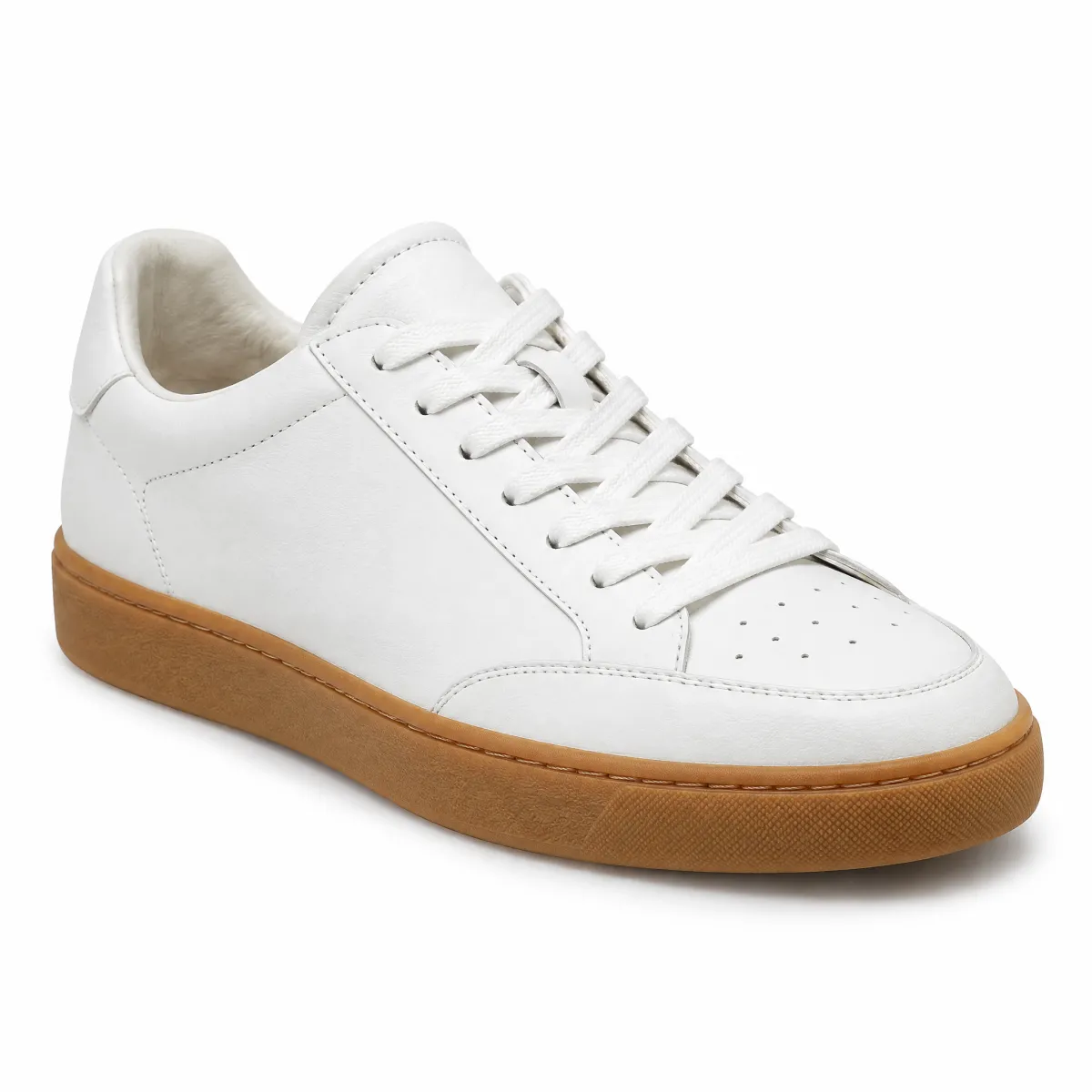
Ledersneaker „Court“, Weiß, EU 42
Bestellt am 22.09.2026 · 89,99 €
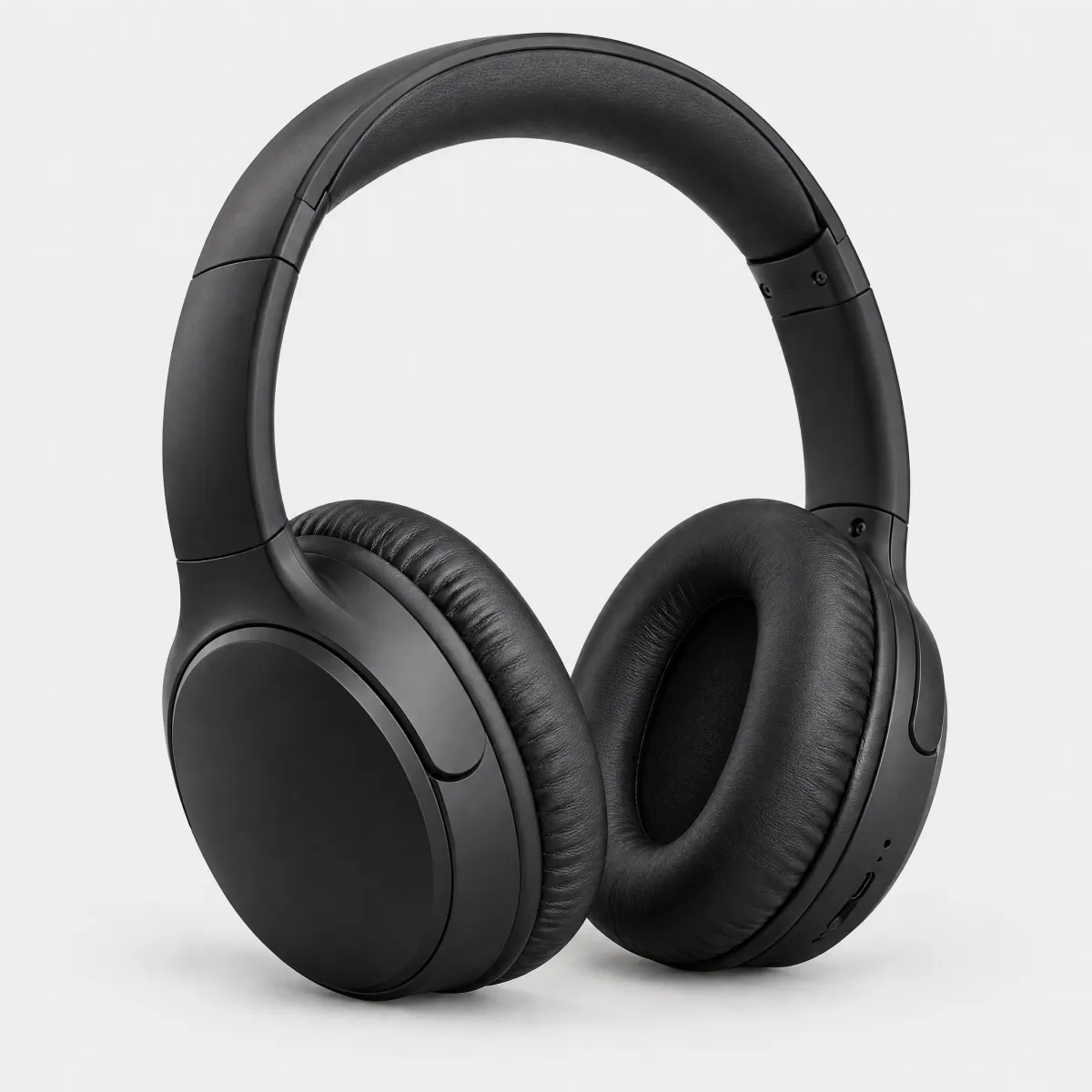
Over-Ear-Kopfhörer, Schwarz
Bestellt am 26.09.2026 · 279,00 €
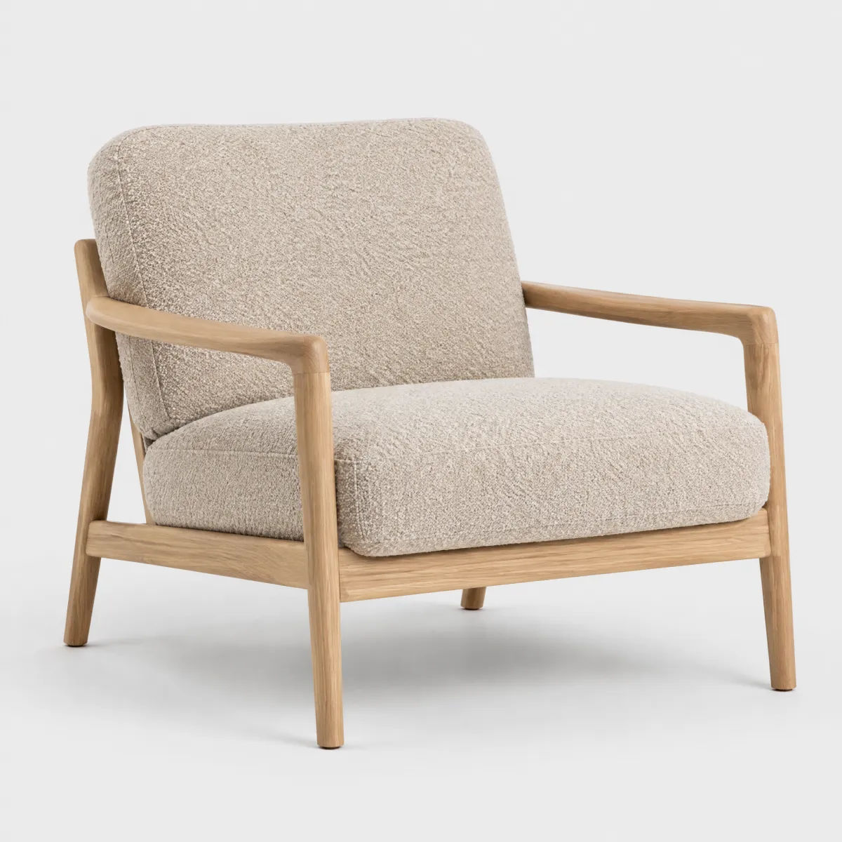
Sessel „Lounge“, Samtoptik
Bestellt am 27.09.2026 · 449,99 €
HTML
<div style="max-width:560px;margin:0 auto">
<p class="oc-copy-75 oc-text-color-secondary">Mein Konto</p>
<p class="oc-headline-200 oc-mb-50">Meine Bestellungen</p>
<div style="display:flex;gap:16px;align-items:center;padding:16px 0">
  <img src="/previews/imagery/samples/otto-product-still/product-sneaker.webp" alt="Ledersneaker Court" style="width:72px;height:72px;object-fit:cover;border-radius:8px;flex:none">
  <div style="flex:1;min-width:0"><p class="oc-copy-100"><b>Ledersneaker „Court“, Weiß, EU 42</b></p><p class="oc-copy-75 oc-text-color-secondary">Bestellt am 22.09.2026 · 89,99 €</p><div style="display:flex;align-items:center;gap:4px;margin-top:4px"><oc-icon-v1 type="order-delivered" style="flex:none"></oc-icon-v1><span class="oc-copy-75">Zugestellt am 24.09.2026</span></div></div>
  <oc-icon-button-v3 variant="secondary" icon="ellipsis" oc-aria-label="Aktionen zu Ledersneaker Court"></oc-icon-button-v3>
  <oc-popover-v1 anchor="previous-sibling" position="bottom" oc-aria-label="Aktionen zu Ledersneaker Court" style="--padding:8px 16px;--border-radius:var(--oc-semantic-border-radius-200);--arrow-height:0px;--bubble-context-spacing:0px;--min-width:15rem">
    <oc-row-v2 as-button icon-left="order-return" hide-divider data-popover-close="click">Rücksendung anmelden</oc-row-v2>
    <oc-row-v2 as-button icon-left="payment-invoice" data-popover-close="click">Rechnung herunterladen</oc-row-v2>
    <oc-row-v2 as-button icon-left="basket" data-popover-close="click">Erneut kaufen</oc-row-v2>
  </oc-popover-v1>
<oc-divider-v1></oc-divider-v1>
<div style="display:flex;gap:16px;align-items:center;padding:16px 0">
  <img src="/previews/imagery/samples/otto-product-still/product-headphones.webp" alt="Over-Ear-Kopfhörer" style="width:72px;height:72px;object-fit:cover;border-radius:8px;flex:none">
  <div style="flex:1;min-width:0"><p class="oc-copy-100"><b>Over-Ear-Kopfhörer, Schwarz</b></p><p class="oc-copy-75 oc-text-color-secondary">Bestellt am 26.09.2026 · 279,00 €</p><div style="display:flex;align-items:center;gap:4px;margin-top:4px"><oc-icon-v1 type="order-shipped" style="flex:none"></oc-icon-v1><span class="oc-copy-75">Unterwegs, Lieferung morgen</span></div></div>
  <oc-icon-button-v3 variant="secondary" icon="ellipsis" oc-aria-label="Aktionen zu Over-Ear-Kopfhörer"></oc-icon-button-v3>
  <oc-popover-v1 anchor="previous-sibling" position="bottom" oc-aria-label="Aktionen zu Over-Ear-Kopfhörer" style="--padding:8px 16px;--border-radius:var(--oc-semantic-border-radius-200);--arrow-height:0px;--bubble-context-spacing:0px;--min-width:15rem">
    <oc-row-v2 as-button icon-left="order-return" hide-divider data-popover-close="click">Rücksendung anmelden</oc-row-v2>
    <oc-row-v2 as-button icon-left="payment-invoice" data-popover-close="click">Rechnung herunterladen</oc-row-v2>
    <oc-row-v2 as-button icon-left="basket" data-popover-close="click">Erneut kaufen</oc-row-v2>
  </oc-popover-v1>
<oc-divider-v1></oc-divider-v1>
<div style="display:flex;gap:16px;align-items:center;padding:16px 0">
  <img src="/previews/imagery/samples/otto-product-still/product-armchair.webp" alt="Sessel Lounge" style="width:72px;height:72px;object-fit:cover;border-radius:8px;flex:none">
  <div style="flex:1;min-width:0"><p class="oc-copy-100"><b>Sessel „Lounge“, Samtoptik</b></p><p class="oc-copy-75 oc-text-color-secondary">Bestellt am 27.09.2026 · 449,99 €</p><div style="display:flex;align-items:center;gap:4px;margin-top:4px"><oc-icon-v1 type="order-packed" style="flex:none"></oc-icon-v1><span class="oc-copy-75">Wird verpackt</span></div></div>
  <oc-icon-button-v3 variant="secondary" icon="ellipsis" oc-aria-label="Aktionen zu Sessel Lounge"></oc-icon-button-v3>
  <oc-popover-v1 anchor="previous-sibling" position="bottom" oc-aria-label="Aktionen zu Sessel Lounge" style="--padding:8px 16px;--border-radius:var(--oc-semantic-border-radius-200);--arrow-height:0px;--bubble-context-spacing:0px;--min-width:15rem">
    <oc-row-v2 as-button icon-left="order-return" hide-divider data-popover-close="click">Rücksendung anmelden</oc-row-v2>
    <oc-row-v2 as-button icon-left="payment-invoice" data-popover-close="click">Rechnung herunterladen</oc-row-v2>
    <oc-row-v2 as-button icon-left="basket" data-popover-close="click">Erneut kaufen</oc-row-v2>
  </oc-popover-v1>