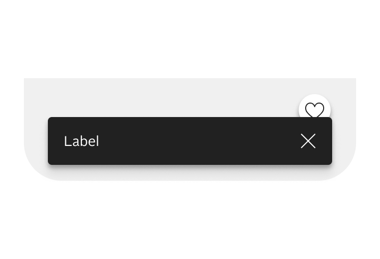
The snackbar is a temporary message that appears at the bottom of a page to provide feedback triggered by a user's action. I should not be used for critical information.
Configurator
LiveSnackbar: message, action, auto-dismiss and background. Press the button to show it at the bottom of the window.
Snackbar zeigenRückgängig machen
HTML
<oc-button-v1 variant="secondary" fit-content data-live-open="#snackbar-cfg">Snackbar zeigen</oc-button-v1>
<oc-snackbar-v1 id="snackbar-cfg" message="Der Artikel wurde von deinem Merkzettel entfernt." auto-dismiss="false"><oc-link-v2 variant="inverted" as-button slot="actions">Rückgängig machen</oc-link-v2></oc-snackbar-v1>
Usage
Anatomy
Variants
The background color of the snackbar can be adjusted. Therefore you should use semantic design tokens with the prefix "$oc-semantic-color-background-strong-". If you want to use other colors please check with the design system team before doing so.
Press a button: the snackbar appears at the bottom of the window
The snackbar is triggered by a user's action on other components. Once triggered, it appears at the bottom of the viewport and automatically disappears after five seconds. However, there is an auto-dismiss restriction:
The snackbar will not disappear as long as the mouse hovers over it, the focus is on it, or it is held by touch.
Make sure the snackbar does not disappear automatically when you place actions inside it to ensure users do not become stressed trying to access them. The snackbar can then be closed manually using the close button.
1. Click the button to trigger the snackbar
In den Warenkorb
2. Close it with the close button, click anywhere else, or wait five seconds
LiveinteractionHTML
<oc-button-v1 variant="secondary" data-live-open="#snackbar-interaction">In den Warenkorb</oc-button-v1>
<oc-snackbar-v1 id="snackbar-interaction" message="Der Artikel liegt jetzt in deinem Warenkorb."></oc-snackbar-v1>
Animation
When the snackbar enters, it moves up and increases its opacity simultaneously. When the snackbar exits, it moves down outside the viewport and decreases its opacity simultaneously. In the case of "prefers-reduced-motion", only the opacity animates.
For breakpoint S the snackbar uses fill-parent with 24px outer spacing on each side. As soon as there is not enough space for the action on the right side it is positioned below the label.
Mobile: width fills the window minus 24 px each side, height fits the content (narrow the window)
Kurzes LabelLanges Label
ActionAction
LiveSnackbar with on line and multiple lines on mobileHTML
For breakpoint M to XL the snackbar uses fit-content. As soon as there is not enough space inside the viewport it switches to fill-parent with 24px outer spacing on each side.
Desktop: fit-content up to the window width minus 24 px each side; long labels move the action below
KurzLangSehr lang
ActionActionAction
LiveSnackbar with on line and multiple lines on desktopHTML
<oc-button-v1 variant="secondary" fit-content data-live-open="#snackbar-fit-d-short">Kurz</oc-button-v1><oc-button-v1 variant="secondary" fit-content data-live-open="#snackbar-fit-d-long">Lang</oc-button-v1><oc-button-v1 variant="secondary" fit-content data-live-open="#snackbar-fit-d-longer">Sehr lang</oc-button-v1></div>
<oc-snackbar-v1 id="snackbar-fit-d-short" message="Label" auto-dismiss="false"><oc-link-v2 variant="inverted" as-button slot="actions">Action</oc-link-v2></oc-snackbar-v1>
<oc-snackbar-v1 id="snackbar-fit-d-long" message="Ein wirklich extrem außergewöhnlich langes Label, das super viel Platz weg nimmt." auto-dismiss="false"><oc-link-v2 variant="inverted" as-button slot="actions">Action</oc-link-v2></oc-snackbar-v1>
<oc-snackbar-v1 id="snackbar-fit-d-longer" message="Ein wirklich extrem außergewöhnlich langes Label, das super mega viel Platz weg nimmt." auto-dismiss="false"><oc-link-v2 variant="inverted" as-button slot="actions">Action</oc-link-v2></oc-snackbar-v1>
Placement
The snackbar appears centered at the bottom of the viewport. It is positioned 16px from the bottom and 24px from the left and right sides. The snackbar is placed sticky (level 3) on top.
Centred at the bottom of the window: 16 px from the bottom, at least 24 px from the sides, elevation level 3
DoShow only one snackbar at a time. Replace the current snackbar when a new one appears.
Snackbar 1Snackbar 2
ActionAction
Don'tAllow multiple snackbars to appear at once or stack snackbars above each other.
1. Aktion: remove the item, 2. Aktion: press “Rückgängig machen” in the snackbar
Artikel entfernen
Rückgängig machen
DoIf a "Rückgänig" or "Wiederholen" action is triggered another snackbar should follow to confirm the action.CautionIf you already use a sticky component in your view be aware that the snackbar might overlap with it.
Content guidelines
DoKeep the label to one line, if possible.Don'tUse stylized text or inline links.DoUse a label that provides feedback on a user's action.Don'tUse a label that has advertising purposes e.g. sale or discounts.Don'tUse an action with the label "Verwerfen" or "Schließen", as the snackbar features it own close affordance.Don'tUse a label that contains critical system messages.
Accessibility
For information on accessibility, refer to thetechnical documentation.
Status
Implementation
Live demo
Neu für dich
-20 %
OTTO products
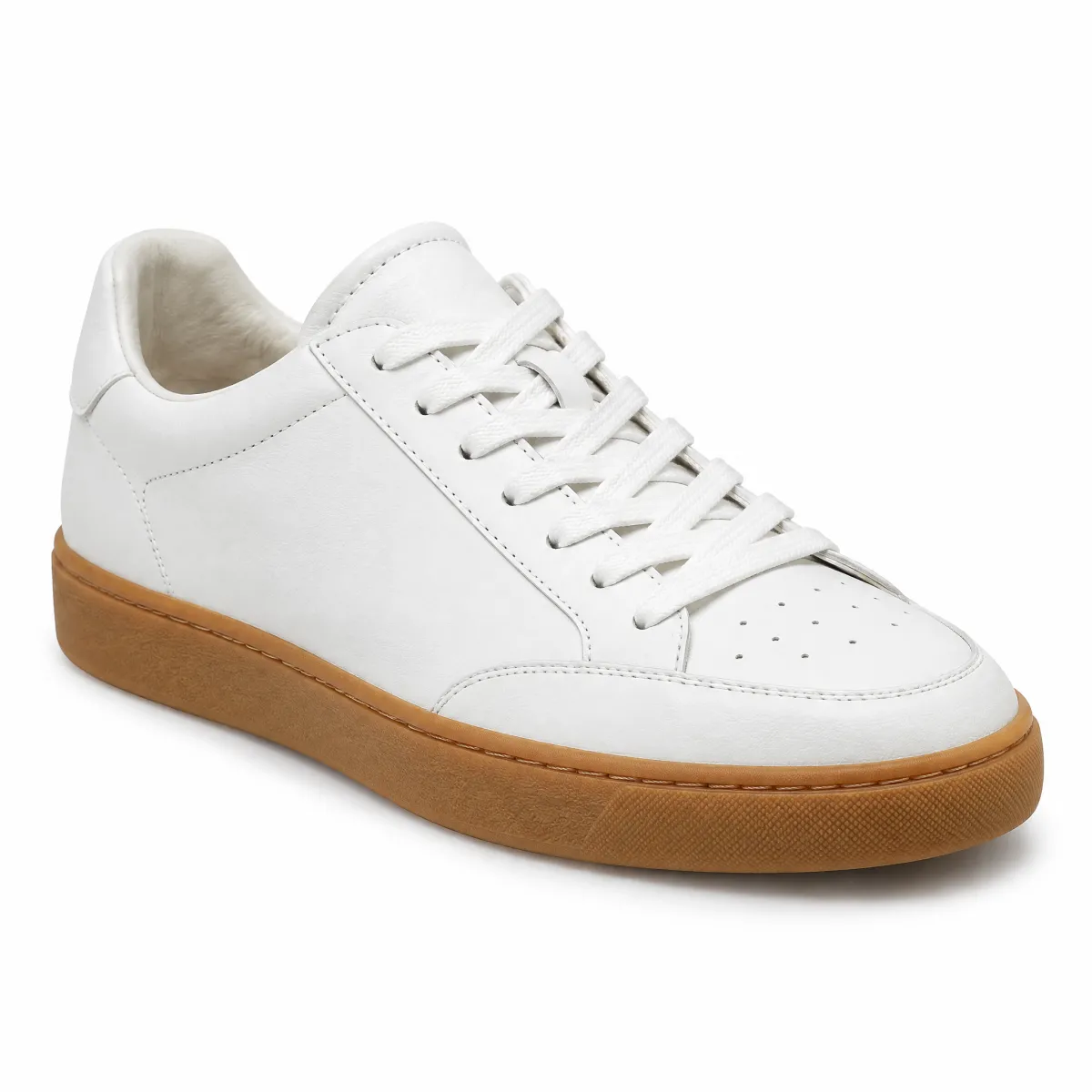
Sneaker aus Glattleder, Weiß
99,99 €79,99 €
Neu
andas
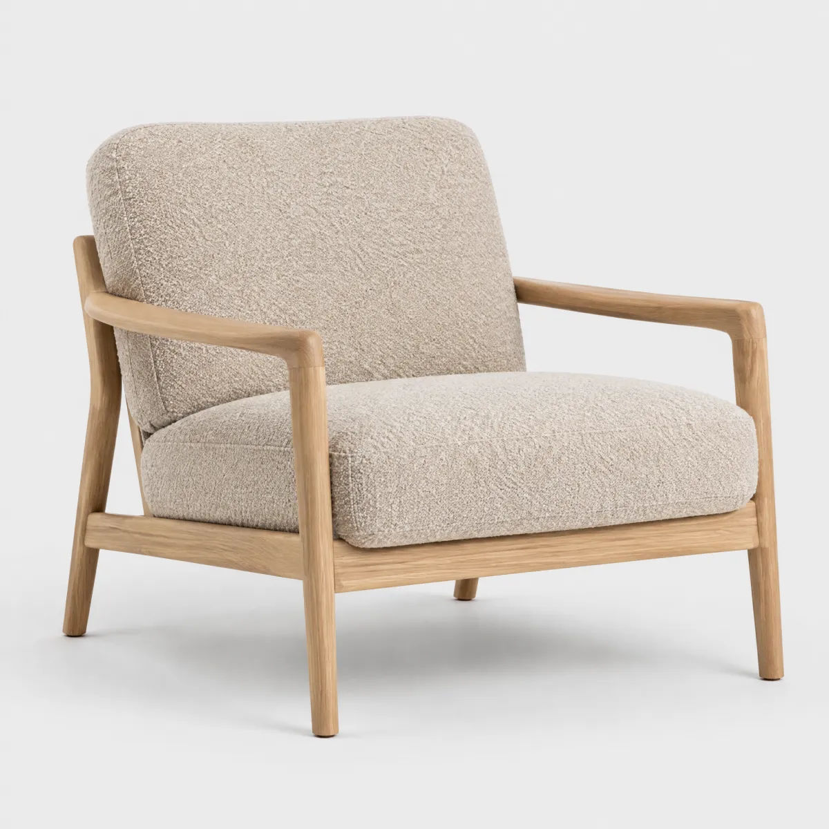
Sessel „Ilvy“ aus Bouclé, Eiche natur
399,99 €
Hanseatic
Over-Ear-Kopfhörer mit Noise Cancelling
59,99 €
Tap a heart: the snackbar confirms the action at the bottom of the window
Merkzettel ansehen
LiveReal OTTO components, rendered by the OTTO component runtimeHTML
The snackbar component offers setting a message text and an optional action.
This component is configurable, allowing you to tailor its features and appearance to your specific needs.
To explore all the available options and adjust the component, use the component configurator and see the changes affect the component in real-time.
Usage guidelines
Before integrating the snackbar component into your project, make sure you have correctly installed the OTTO components package.
Look through the variations page for examples of possible component variations.
Creating snackbars via the Nexus API
The snackbarV1.push Nexus API method creates and displays a snackbar programmatically, without requiring markup in the DOM.
Pass a classNames option (a space-separated string of CSS class names) to apply custom styling to the created oc-snackbar-v1 element, the same way you would set a class attribute on a markup-based snackbar.
Behavior
The snackbar uses an auto dismiss per default. This closes the snackbar after a fixed duration (5000ms). The timer pauses as long as a user hovers the snackbar.
Please make sure that you disable this behavior when you place actions inside the snackbar to ensure that users are not stressed to get there.
Note
When using the keyboard to open the snackbar and then tabbing to the close icon, closing the snackbar will move focus back to the root of the page.
Consider managing focus manually if you want to return focus to the triggering element or another logical position for your use case.
Accessibility
The snackbar is using srSpeak internally (with a assertive setting) so that the message is read to the user immediately.
To avoid putting users under time pressure, the snackbar remains visible until dismissed manually.
This ensures users have enough time to read the message and interact with any available actions.
If you add actions to a snackbar, carefully consider which actions to include.
Only use optional or informational actions — do not place critical actions inside the snackbar.
Focus order
By default, the snackbar is inserted into the DOM at the position where you place it in the code.
Place the snackbar immediately after the triggering element (such as a button) in the DOM so that focus moves to the snackbar right after the trigger.
When creating the snackbar programmatically or interacting with it via the Nexus API, ensure you insert the snackbar at an appropriate place in the DOM to maintain a logical and accessible focus order for your use case.
Configure the snackbar component with the controls below and see the changes live in the preview canvas.
Click the Show code button within the preview canvas to see the source code for the current component configuration.
Interactive configurator (Storybook controls); every option is listed in the API section of this file.
API v1
Snackbar v1 API
API: <oc-snackbar-v1> (SnackbarV1)
The snackbar component allows users to display a dismissable popup message.
Attributes / properties
Attribute
Type
Default
Required
Description
id
string
"computed"
no
Sets the ID of the snackbar instance. The ID must be globally unique. If not provided, a random ID will be generated.
message
string
yes
Sets the text that is displayed in the snackbar. Accepts plain text only.
auto-dismiss
"true" | "false"
true
no
Sets whether the snackbar should be closed automatically after a certain duration.
open
boolean
false
no
Sets the visibility state of the snackbar. Set to true to open the snackbar. Has the same effect as using the open or close method.
force-replace-existing-instance
boolean
false
no
Set to true to perform a DOM query that removes all existing snackbar instances with the same ID. Use in scenarios when a fragment update renders a snackbar instance with the same ID as an existing one, but with different content.
Slots
Slot
Required
Description
actions
no
Holds the link components that provide interactions to the user. Example: <oc-link-v2 variant="underlined" href="#" slot="actions">Action 1</oc-link-v2>
Events
Event
Detail type
Description
oc-snackbar-open
CustomEvent<null>
Dispatched once the snackbar instance is being opened, but before it becomes visible. If not cancelled, then the instance will become visible and start animation.
oc-snackbar-close
CustomEvent<null>
The event will be fired immediately after close is requested, and before any transitions or animations are completed.
oc-open
CustomEvent<null>
Dispatched once the snackbar instance is being opened, but before it becomes visible. If not cancelled, then the instance will become visible and start animation.
oc-close
CustomEvent<null>
The event will be fired immediately after close is requested, and before any transitions or animations are completed.
oc-property-change
OcSnackbarV1Events["oc-property-change"]
Whenever a property value changes, this event triggers. Use this event to track all property changes within the component.
Fired when the component is mounted to the DOM. The event is fired when the onMount hook of the component is called by the runtime.
oc-unmount
{ component: string; }
Fired when the component is unmounted from the DOM. The event is fired when the function returned by the onMount hook of the component is called by the runtime.
Methods
close: () => void
Closes the snackbar. Provides the same effect as setting the attribute open to false.
This method provides the same effect as clicking the close button.
Listed below are the most common variations of the snackbar component as well as specific component variations for different use cases.
You can explore all available options using the component configurator, adjust the component to your needs, and see the changes live in a preview canvas.
<h2>Snackbar with long message</h2>
<br />
<p>
  At breakpoint S, the snackbar has a fixed width with spacing to the side whereas from M
  upwards, it uses as much space as the content needs.
</p>
<p>In either case, the text will be line-wrapped once the outer limits are reached.</p>

<oc-button-v1 id="open" size="50">Open snackbar</oc-button-v1>
<oc-snackbar-v1 id="snackbar-with-long-message" message="Lorem ipsum dolor sit amet, consete sadipscing elitr. Lorem ipsum dolor sit amet, consete sadipscing elitr. Lorem ipsum dolor sit amet, consete sadipscing elitr."> ${unsafeHTML(actionsSlot)} </oc-snackbar-v1>

<script>
  (() => {
    const openButton = document.getElementById("open");
    openButton.addEventListener("click", openSnackbar);

    function openSnackbar() {
      const snackbarElement = document.getElementById("snackbar-with-long-message");
      snackbarElement.open = true;
    }
  })();
</script>
Story source (TypeScript, verbatim from Storybook)
{
  name: "Long message",
  argTypes: hideControlsBadge(Metadata),
  parameters: {
    controls: {
      disabled: true
    }
  },
  args: {
    id: "snackbar-with-long-message",
    message: "Lorem ipsum dolor sit amet, consete sadipscing elitr. Lorem ipsum dolor sit amet, consete sadipscing elitr. Lorem ipsum dolor sit amet, consete sadipscing elitr."
  },
  render({
    actionsSlot,
    ...props
  }) {
    return html`
      <h2>Snackbar with long message</h2>
      <br />
      <p>
        At breakpoint S, the snackbar has a fixed width with spacing to the side whereas from M
        upwards, it uses as much space as the content needs.
      </p>
      <p>In either case, the text will be line-wrapped once the outer limits are reached.</p>

      <oc-button-v1 id="open" size="50">Open snackbar</oc-button-v1>
      <oc-snackbar-v1 ${spread(props)}> ${unsafeHTML(actionsSlot)} </oc-snackbar-v1>

      <script>
        (() => {
          const openButton = document.getElementById("open");
          openButton.addEventListener("click", openSnackbar);

          function openSnackbar() {
            const snackbarElement = document.getElementById("snackbar-with-long-message");
            snackbarElement.open = true;
          }
        })();
      </script>
    `;
  }
}
Args: id=snackbar-with-action, message=Lorem ipsum dolor sit amet, consete sadipscing elitr., actionsSlot=<oc-link-v2 variant="inverted" slot="actions" as-button>Action</oc-link-v2>
<h2>Snackbar with action link</h2>
<br />
<p>
  Provide actions via the actions slot. The slot content is placed next to the text message.
</p>
<p>
  You can use any kind of content as actions but need to take care of the styling yourself.
</p>

<oc-button-v1 id="open" size="50">Open snackbar</oc-button-v1>
<oc-snackbar-v1 id="snackbar-with-action" message="Lorem ipsum dolor sit amet, consete sadipscing elitr."> <oc-link-v2 variant="inverted" slot="actions" as-button>Action</oc-link-v2> </oc-snackbar-v1>

<script>
  (() => {
    const openButton = document.getElementById("open");

    openButton.addEventListener("click", openSnackbar);

    function openSnackbar() {
      const snackbarElement = document.getElementById("snackbar-with-action");
      snackbarElement.open = true;
    }
  })();
</script>
Story source (TypeScript, verbatim from Storybook)
{
  name: "With action",
  argTypes: hideControlsBadge(Metadata),
  parameters: {
    controls: {
      disabled: true
    }
  },
  args: {
    id: "snackbar-with-action",
    message: "Lorem ipsum dolor sit amet, consete sadipscing elitr.",
    actionsSlot: `<oc-link-v2 variant="inverted" slot="actions" as-button>Action</oc-link-v2>`
  },
  render({
    actionsSlot,
    ...props
  }) {
    return html`
      <h2>Snackbar with action link</h2>
      <br />
      <p>
        Provide actions via the actions slot. The slot content is placed next to the text message.
      </p>
      <p>
        You can use any kind of content as actions but need to take care of the styling yourself.
      </p>

      <oc-button-v1 id="open" size="50">Open snackbar</oc-button-v1>
      <oc-snackbar-v1 ${spread(props)}> ${unsafeHTML(actionsSlot)} </oc-snackbar-v1>

      <script>
        (() => {
          const openButton = document.getElementById("open");

          openButton.addEventListener("click", openSnackbar);

          function openSnackbar() {
            const snackbarElement = document.getElementById("snackbar-with-action");
            snackbarElement.open = true;
          }
        })();
      </script>
    `;
  }
}
A demo showcasing how to programmatically push a snackbar via the Nexus API
<br />
<h2>Demo: programmatically pushed snackbar</h2>
<br />
<p>
You can programmatically push a new snackbar element without creating a new element. Useful
for quick notifications that don't require a custom element instance with specific
configuration (e.g. id or actions).
</p>
<p>For example:</p>
<br />
<pre>
function pushSnackbarNexus() {
otto.components.snackbarV1.push("pushed-snackbar", { actions: "<oc-link-v2 slot="actions" variant="inverted" >Action</oc-link-v2>" });
}
</pre>
<oc-button-v1 id="push-nexus" size="50">Push snackbar via Nexus</oc-button-v1>
<script>
(() => {
const openNexusButton = document.getElementById("push-nexus");
openNexusButton.addEventListener("click", openSnackbarNexus);
function openSnackbarNexus() {
otto.components.snackbarV1.push("pushed-snackbar", {
actions: "<oc-link-v2 slot='actions' variant='inverted'>Action</oc-link-v2>",
});
}
})();
</script>
Story source (TypeScript, verbatim from Storybook)
{
name: "Demo: programmatically pushed snackbar",
argTypes: hideControlsBadge(Metadata),
parameters: {
controls: {
disabled: true
},
chromatic: {
hideInChromatic: true
}
},
render() {
return html`
<br />
<h2>Demo: programmatically pushed snackbar</h2>
<br />
<p>
You can programmatically push a new snackbar element without creating a new element. Useful
for quick notifications that don't require a custom element instance with specific
configuration (e.g. id or actions).
</p>
<p>For example:</p>
<br />
<pre>
function pushSnackbarNexus() {
otto.components.snackbarV1.push("pushed-snackbar", { actions: "<oc-link-v2 slot="actions" variant="inverted" >Action</oc-link-v2>" });
}
</pre>
<oc-button-v1 id="push-nexus" size="50">Push snackbar via Nexus</oc-button-v1>
<script>
(() => {
const openNexusButton = document.getElementById("push-nexus");
openNexusButton.addEventListener("click", openSnackbarNexus);
function openSnackbarNexus() {
otto.components.snackbarV1.push("pushed-snackbar", {
actions: "<oc-link-v2 slot='actions' variant='inverted'>Action</oc-link-v2>",
});
}
})();
</script>
`;
}
}
Multiple snackbars stack automatically. Open any combination of them — each
sits above the previous. Oldest at the top, newest at the bottom.
<h2>Demo: Snackbar stack</h2>
<p>
  Click any button to open its snackbar. Open several at once to see them stack automatically.
  No special setup needed — it works for any snackbar.
</p>

<div style="display: flex; gap: 8px; flex-wrap: wrap;">
  <oc-button-v1 id="stack-btn-1" size="50">Item added to wishlist</oc-button-v1>
  <oc-button-v1 id="stack-btn-2" size="50">Order placed</oc-button-v1>
  <oc-button-v1 id="stack-btn-3" size="50">Changes saved</oc-button-v1>
</div>

<oc-snackbar-v1 id="stack-snackbar-1" message="Item added to wishlist."></oc-snackbar-v1>
<oc-snackbar-v1 id="stack-snackbar-2" message="Your order has been placed!"></oc-snackbar-v1>
<oc-snackbar-v1 id="stack-snackbar-3" message="Changes saved successfully."></oc-snackbar-v1>

<script>
  (() => {
    [1, 2, 3].forEach((n) => {
      document.getElementById("stack-btn-" + n).addEventListener("click", () => {
        document.getElementById("stack-snackbar-" + n).open = true;
      });
    });
  })();
</script>
Story source (TypeScript, verbatim from Storybook)
{
  name: "Demo: snackbar stack",
  argTypes: hideControlsBadge(Metadata),
  parameters: {
    controls: {
      disabled: true
    },
    chromatic: {
      hideInChromatic: true
    }
  },
  render() {
    return html`
      <h2>Demo: Snackbar stack</h2>
      <p>
        Click any button to open its snackbar. Open several at once to see them stack automatically.
        No special setup needed — it works for any snackbar.
      </p>

      <div style="display: flex; gap: 8px; flex-wrap: wrap;">
        <oc-button-v1 id="stack-btn-1" size="50">Item added to wishlist</oc-button-v1>
        <oc-button-v1 id="stack-btn-2" size="50">Order placed</oc-button-v1>
        <oc-button-v1 id="stack-btn-3" size="50">Changes saved</oc-button-v1>
      </div>

      <oc-snackbar-v1 id="stack-snackbar-1" message="Item added to wishlist."></oc-snackbar-v1>
      <oc-snackbar-v1 id="stack-snackbar-2" message="Your order has been placed!"></oc-snackbar-v1>
      <oc-snackbar-v1 id="stack-snackbar-3" message="Changes saved successfully."></oc-snackbar-v1>

      <script>
        (() => {
          [1, 2, 3].forEach((n) => {
            document.getElementById("stack-btn-" + n).addEventListener("click", () => {
              document.getElementById("stack-snackbar-" + n).open = true;
            });
          });
        })();
      </script>
    `;
  }
}