OTTODesign System

ComponentsForm

Text field / text area

Text fields are used for inputs that appear in forms, such as registration or changing the delivery address. The text area is used similarly to the text field and is used for longer text inputs, such as the review of a product.

Configurator

LiveText field and text area: type, affixes, texts, validation and state
Vorname
HTML
<oc-text-field-v1 hint="Bitte gib deinen Vornamen so an wie im Personalausweis.">Vorname</oc-text-field-v1>

Usage

Anatomy

Vorname 1 2 3 4 5
  1. Container
  2. Label
  3. Input
  4. Hint
  5. Counter
LiveAnatomy
HTML
<div class="anatomy" style="display:block;max-width:360px;margin:28px auto">
<oc-text-field-v1 value="Lara" hint="Hinweis" maxlength="30">Vorname</oc-text-field-v1>
<span class="anatomy-pin" style="left:-16px;top:35%">1</span>
<span class="anatomy-pin" style="left:6%;top:-18px">2</span>
<span class="anatomy-pin" style="left:18%;top:38%">3</span>
<span class="anatomy-pin" style="left:-16px;top:92%">4</span>
<span class="anatomy-pin" style="left:calc(100% + 16px);top:92%">5</span>
<ol class="anatomy-key"><li data-n="1">Container</li><li data-n="2">Label</li><li data-n="3">Input</li><li data-n="4">Hint</li><li data-n="5">Counter</li></ol>

Variants

Text fields have the following semantic variants:

  • Default
  • Error
  • Success
  • Warning

The error, success, or warning variants can occur after an input from the default state.

Default

Vorname

Error

Vorname

Success

Vorname

Warning

Vorname
Livesemantic variants
HTML
<oc-text-field-v1 hint="Hinweis" maxlength="30">Vorname</oc-text-field-v1>
<oc-text-field-v1 hint="Hinweis" maxlength="30" variant="error">Vorname</oc-text-field-v1>
<oc-text-field-v1 hint="Hinweis" maxlength="30" variant="success">Vorname</oc-text-field-v1>
<oc-text-field-v1 hint="Hinweis" maxlength="30" variant="warning">Vorname</oc-text-field-v1>

Text area

In comparison to the text field, the text area is used for longer inputs. Per default, it has a height of three lines. With the property resizable, users can manually resize it using the native handle in the bottom right corner. Text areas have the same variants as text fields.

Text area

Lieferhinweis

Resizable (drag the corner)

Lieferhinweis
Livedefault text area (left) vs. manually resized height of text area (right)
HTML
<p class="demo-label">Text area</p>
<oc-text-area-v1 hint="Hinweis" maxlength="500" value="Bitte beim Nachbarn im Erdgeschoss abgeben, falls ich nicht zu Hause bin.">Lieferhinweis</oc-text-area-v1>
<p class="demo-label">Resizable (drag the corner)</p>
<oc-text-area-v1 hint="Hinweis" maxlength="500" resizable value="Bitte beim Nachbarn im Erdgeschoss abgeben, falls ich nicht zu Hause bin.">Lieferhinweis</oc-text-area-v1>

Input types

text

Vorname

tel

Telefonnummer

email

E-Mail-Adresse

url

Website

integer

Anzahl

decimal

Betrag
Liveinput types
HTML
<p class="demo-label">text</p>
<oc-text-field-v1 type="text" value="Lara" hint="Hinweis">Vorname</oc-text-field-v1>
<p class="demo-label">tel</p>
<oc-text-field-v1 type="tel" value="04012897096782" hint="Hinweis">Telefonnummer</oc-text-field-v1>
<p class="demo-label">email</p>
<oc-text-field-v1 type="email" value="name@provider.de" hint="Hinweis">E-Mail-Adresse</oc-text-field-v1>
<p class="demo-label">url</p>
<oc-text-field-v1 type="url" value="www.otto.de" hint="Hinweis">Website</oc-text-field-v1>
<p class="demo-label">integer</p>
<oc-text-field-v1 type="integer" value="1" hint="Hinweis">Anzahl</oc-text-field-v1>
<p class="demo-label">decimal</p>
<oc-text-field-v1 type="decimal" value="12.24" hint="Hinweis">Betrag</oc-text-field-v1>

Counter, hint, and error

Text fields can also include a counter which is used for counting the letters and setting minimum or maximum values.

Text Fields come with an optional Hint. The Hint helps the user filling out the text field correctly and provides further context.

The error is shown additionally above the hint if the user made a wrong input. It helps the user understanding the mistake and fixing the input.

Counter (max.)

Titel

Hint and counter (min.)

Spitzname

Hint

Vorname

Error and hint

Vorname
Livecounter (left) and hint/error (right)
HTML
<p class="demo-label">Counter (max.)</p>
<oc-text-field-v1 maxlength="30" value="Mein neuer Lieblingssessel">Titel</oc-text-field-v1>
<p class="demo-label">Hint and counter (min.)</p>
<oc-text-field-v1 minlength="2" value="WildFlora" hint="So nennen wir dich bei der Kommunikation und während des Bestellprozesses.">Spitzname</oc-text-field-v1>
<p class="demo-label">Hint</p>
<oc-text-field-v1 value="Lara" hint="Bitte gib deinen Vornamen an, wie er im Personalausweis angegeben ist.">Vorname</oc-text-field-v1>
<p class="demo-label">Error and hint</p>
<oc-text-field-v1 value="12345" validation-message="Der eingegebene Text ist kein Name. Bitte korrigiere deine Eingabe." hint="Bitte gib deinen Vornamen an, wie er im Personalausweis angegeben ist.">Vorname</oc-text-field-v1>

Placeholder

You can use placeholders to nudge users, which inputs are expected. In comparison to hints, placeholders are very short and mostly example content is provided. It is only visible, when focused but hidden as soon as input is provided.

Click the field: the placeholder appears once it has focus

E-Mail-Adresse
Liveplaceholder
HTML
<p class="demo-label">Click the field: the placeholder appears once it has focus</p>
<oc-text-field-v1 type="email" placeholder="max.mustermann@abc.de">E-Mail-Adresse</oc-text-field-v1>

Pre- and suffix

The prefix and suffix of a text field are optional and can contain icons or text. The prefix is always placed at the left and the suffix on the right inside a text field. Pre- and suffixes are only shown in the focused or filled state.

Prefix and suffix icon

Wunschbetrag

Suffix text

Wunschbetrag
LivePre- and suffix
HTML
<p class="demo-label">Prefix and suffix icon</p>
<oc-text-field-v1 type="decimal" value="50" prefix-icon="money-banknotes" suffix-icon="euro">Wunschbetrag</oc-text-field-v1>
<p class="demo-label">Suffix text</p>
<oc-text-field-v1 type="decimal" value="50" suffix-text="€">Wunschbetrag</oc-text-field-v1>

Behavior

States

All semantic variants have the following states, as shown in the image.

Enabled (hover, focus, type)

Vorname

Filled

Vorname

Disabled

Vorname
LiveStates
HTML
<p class="demo-label">Enabled (hover, focus, type)</p>
<oc-text-field-v1 hint="Hinweis">Vorname</oc-text-field-v1>
<p class="demo-label">Filled</p>
<oc-text-field-v1 value="Lara" hint="Hinweis">Vorname</oc-text-field-v1>
<p class="demo-label">Disabled</p>
<oc-text-field-v1 disabled hint="Hinweis">Vorname</oc-text-field-v1>

Placement

When placing multiple Text Fields next to each other, make sure there is a gap of 8px in-between horizontally and a gap of 24px vertically. Be aware the vertical distance is measured not from the label but from the text field itself.

Side by side, 8px gap

Vorname Nachname
Live8px horizontal gap
HTML
<p class="demo-label">Side by side, 8px gap</p>
<oc-form-group-v1 orientation="horizontal" flex-behavior="grow" gap="var(--oc-base-dimension-8)" oc-aria-label="Name">
<oc-text-field-v1>Vorname</oc-text-field-v1>
<oc-text-field-v1>Nachname</oc-text-field-v1>
</oc-form-group-v1>

Stacked, 24px gap

Straße Hausnummer Postleitzahl
Live24px vertical gap
HTML
<p class="demo-label">Stacked, 24px gap</p>
<oc-form-group-v1 orientation="vertical" gap="var(--oc-base-dimension-24)" oc-aria-label="Adresse">
<oc-text-field-v1 hint="Hinweis">Straße</oc-text-field-v1>
<oc-text-field-v1 value="1">Hausnummer</oc-text-field-v1>
<oc-text-field-v1>Postleitzahl</oc-text-field-v1>
</oc-form-group-v1>

Best practices

Vorname
DoUse a text field for short input e.g. Name or Mail.
Kommentar
Don'tUse a text field for longer inputs like review or comments. Instead, use a text area.
Vorname
DoUse a text field for custom inputs.
Monat
Don'tUse a text field for predictable information. Instead, use a dropdown with suggestions.
Vorname Nachname
DoOnly place related text field on the same line.
Vorname Bestellnummer
Don'tPlace an unrelated text field on the same line.
Vorname Vorname
DoAlways ensure the text field has a visible label to provide context and help the user filling in information.
CautionWhen using a text field without a label, make sure the user has enough context to fill out the text field. Also ensure that there is no accessibility and usability issue.
DoUse a search bar for search requests.
Suche
Don'tUse a text field for search requests.

Content Guidelines

Vorname
DoOnly use short and precise wordings for the label.
In dieses Feld gibst du deinen Vornamen ein
Don'tUse long descriptions or sentences for the label.
Spitzname
DoPut further, longer information which help the user filling out the text field inside the hint.
Spitzname
Don'tPut short information like a title inside the hint. It should only be placed inside the label.
Spitzname
DoProvide clear and useful error that help the user fix the issue.
Spitzname
Don'tUse generic errors, such as "There is an error".

Accessibility

For information on accessibility, refer to the technical documentation.

Status

Implementation

Note: For full technical documentation of this component, visit Storybook/TextField and Storybook/TextArea.

Live demo

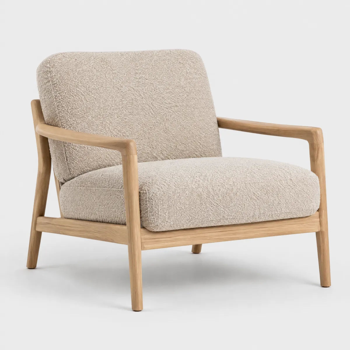
Loungesessel mit Holzgestell

Deine Bestellung vom 12.09.

Loungesessel „Lotta“, Bouclé

Wie gefällt dir dein Sessel?

Deine Bewertung hilft anderen bei der Entscheidung.

Titel deiner Bewertung Deine Erfahrung Spitzname Bewertung abschicken
LiveReal OTTO components, rendered by the OTTO component runtime
HTML
<div style="max-width:720px;margin:0 auto;display:grid;grid-template-columns:repeat(auto-fit,minmax(15rem,1fr));gap:32px;align-items:start">
<div style="display:grid;gap:12px">
  <img src="/previews/imagery/samples/otto-product-still/product-armchair.webp" alt="Loungesessel mit Holzgestell" style="display:block;width:100%;aspect-ratio:1;object-fit:cover;border-radius:12px">
  <p class="oc-copy-75 oc-text-color-secondary">Deine Bestellung vom 12.09.</p>
  <p class="oc-copy-100"><b>Loungesessel „Lotta“, Bouclé</b></p>
<div style="display:grid;gap:20px">
  <div style="display:grid;gap:4px">
    <p class="oc-headline-100">Wie gefällt dir dein Sessel?</p>
    <p class="oc-copy-100 oc-text-color-secondary">Deine Bewertung hilft anderen bei der Entscheidung.</p>
  <oc-text-field-v1 value="Richtig gemütlich" maxlength="50">Titel deiner Bewertung</oc-text-field-v1>
  <oc-text-area-v1 maxlength="1000" hint="Was gefällt dir, was könnte besser sein?" value="Der Bouclé-Stoff fühlt sich toll an, und die Farbe ist genau wie auf den Fotos. Der Aufbau hat keine zehn Minuten gedauert.">Deine Erfahrung</oc-text-area-v1>
  <oc-text-field-v1 value="LaraL" hint="Wird öffentlich neben deiner Bewertung angezeigt." maxlength="20">Spitzname</oc-text-field-v1>
  <oc-button-v1 variant="primary">Bewertung abschicken</oc-button-v1>

Code

Version Tag Status API
v1 <oc-text-field-v1> Stable, allowed for generation TextFieldV1

Overview (v1)

Text field

The text field component provides a configurable single-line input field for user text input. It has attributes for form identification, initial value setting and additional information display. It supports various styling variants, as well as different input types, such as text, email, and more.

Default variation
Label
HTML
<oc-text-field-v1 name="myName" placeholder="this is a placeholder" type="text">Label</oc-text-field-v1>
Configuration

The text field component offers a variety of styling variants such as default, error, success, and warning. This component is configurable, allowing you to tailor its features and appearance to your specific needs. To explore all the available options and adjust the component, use the component configurator and see the changes affect the component in real-time.

Usage guidelines

Before integrating the text field component into your project, make sure you have correctly installed the OTTO components package. Look through the variations page for examples of possible component variations. Here, you can discover both common and specific variations that address different use cases.

Info

See the Text field UX documentation for detailed user experience guidelines.

Layout considerations

This component has visual overflow. It extends beyond its bounding box and is clipped by parent containers with overflow: hidden. Ensure the parent container has sufficient padding to accommodate the component's full visual area.

Accessibility

The text field component comes with a set of built-in accessibility features to ensure a seamless experience for all users.

Important

If the text field component is used in a form, pressing Enter while focused on the text field triggers the submit action immediately (implicit submit) if an oc-button component or a normal HTML button with the type submit is also present in the form.

Use oc-aria-label

To make the text field recognizable for screen readers, use the oc-aria-label attribute to provide a clear and descriptive label when the component does not have content in the default slot. See the general accessibility documentation for guidance on using oc-aria-label, including how it works with link and masked link behavior.

Further reading

Configuration (v1)

Text field configuration

Configure the text field component with the controls below and see the changes live in the preview canvas. Click the Show code button within the preview canvas to see the source code for the current component configuration.

Label
HTML
<oc-text-field-v1 name="myName" placeholder="this is a placeholder" type="text">Label</oc-text-field-v1>

Interactive configurator (Storybook controls); every option is listed in the API section of this file.

API v1

Text Field v1 API

API: <oc-text-field-v1> (TextFieldV1)

The Text Field component provides a single-line input field for user text input. It has attributes for form identification, initial value setting and additional information display. It supports various styling variants, as well as different input types, such as text, email, and more.

Attributes / properties
Attribute Type Default Required Description
variant "default" | "error" | "success" | "warning" "default" no Sets the main styling and behavior of the text field.
type "number" | "text" | "email" | "tel" | "url" | "integer" | "decimal" | "file" | "date" "text" no Defines the type of the input value.

The type integer is a stricter variant of type number and only accepts integer numbers.

The type decimal is a stricter variant of type number and only allows decimal numbers.
value string "" no Sets the initial and reset value of the text field to the provided value for form processing.
placeholder string undefined no Provides additional information related to the desired input value of the text field. Displayed as a faint text in the text field when it's empty.

Note: This does not work when the type is set to date.
hint string undefined no Provides additional information related to the text field below the input element.
validation-message string undefined no Provides a validation message related to the text field below the input element.

Implicitly sets the text field to the error state.
prefix-icon icon name (427 values; see Icon list in `storybook/components/icon/README.md`) undefined no Sets an icon that shows on the left side of the text field and before the prefix-text.
prefix-text string undefined no Sets a text or symbol that is displayed before the input text to provide the user some context, e.g. a unit.
suffix-icon icon name (427 values; see Icon list in `storybook/components/icon/README.md`) undefined no Sets an icon that shows on the right side of the text field and after the suffix-text.
suffix-text string undefined no Sets a text or symbol that is displayed on the right side of the text field to provide the user some context or information.
text-transform uppercase undefined no Defines the text transformation of the input value.

- "uppercase" transforms the input value to uppercase letters.
disabled boolean false no Disables the text field, preventing user interaction and input.
required boolean false no Marks the input as required for screen readers. Doesn't prevent form submission on its own.
hide-counter boolean false no Hides the counter. Maximum number of characters allowed in the text field is still enforced.
name string undefined no Sets the name tag to identify the text field when submitting a form.
autocomplete "" | "off" | "on" | "email" | "tel" | "tel-area-code" | "tel-country-code" | "tel-extension" | "tel-local" | "tel-local-prefix" | "tel-local-suffix" | "tel-national" | "additional-name" | "address-level1" | "address-level2" | "address-level3" | "address-level4" | "address-line1" | "address-line2" | "address-line3" | "bday-day" | "bday-month" | "bday-year" | "cc-csc" | "cc-exp" | "cc-exp-month" | "cc-exp-year" | "cc-family-name" | "cc-given-name" | "cc-name" | "cc-number" | "cc-type" | "country" | "country-name" | "current-password" | "family-name" | "given-name" | "honorific-prefix" | "honorific-suffix" | "name" | "new-password" | "one-time-code" | "organization" | "postal-code" | "street-address" | "transaction-amount" | "transaction-currency" | "username" "off" no Specifies if browsers are permitted to provide assistance in filling out the field value. Set to one of the enum values to enable specific autocomplete.
inputmode "text" | "search" | "none" | "email" | "tel" | "url" | "decimal" | "numeric" undefined no Specifies the input mode for the text field, which hints at the type of data that might be entered by the user.

This can influence the virtual keyboard layout on mobile devices.
min number undefined no Specifies the minimum value allowed in the text field. Note: This only applies when the type is set to number or integer
max number undefined no Specifies the maximum value allowed in the text field. Note: This only applies when the type is set to number or integer
minlength number undefined no Specifies the minimum number of characters required in the text field.
maxlength number undefined no Specifies the maximum number of characters allowed in the text field.
pattern string undefined no Sets a regular expression that defines a required pattern for the input value. The input is considered valid if it matches the pattern.
oc-aria-label string undefined no Sets the ARIA label of the text field.
without-optional-label boolean false no Excludes the automatic "(optional)" label suffix even if the feature toggle is active.
Slots
Slot Required Description
default yes Sets the label of the text field to provide a brief description of the input field.
Events
Event Detail type Description
oc-property-change OcTextFieldV1Events["oc-property-change"] Whenever a property value changes, this event triggers. Use this event to track all property changes within the component.

Refer to the Events documentation for more information.
oc-mount { component: string; } Fired when the component is mounted to the DOM. The event is fired when the onMount hook of the component is called by the runtime.
oc-unmount { component: string; } Fired when the component is unmounted from the DOM. The event is fired when the function returned by the onMount hook of the component is called by the runtime.
Methods
  • selectionStart: number

    Gets or sets the start position of the current text selection in the text field. This is a property with getter/setter access, not a callable method.

  • selectionEnd: number

    Gets or sets the end position of the current text selection in the text field. This is a property with getter/setter access, not a callable method.

Variations (v1)

Variations

Listed below are the most common variations of the text field component as well as specific component variations for different use cases.

You can explore all available options using the component configurator, adjust the component to your needs, and see the changes live in a preview canvas.

Default

Story: components-text-field-variations--default · tags: components

The default configuration uses the default variant and the placeholder attribute to show a placeholder text in the Text Field when clicked.

Label
HTML
<oc-text-field-v1 name="myName" placeholder="this is a placeholder" type="text">Label</oc-text-field-v1>
Error

Story: components-text-field-variations--error · tags: components

The error variant uses a red color to indicate an error state.

Args: validation-message=Invalid input

Label
HTML
<oc-text-field-v1 name="myName" placeholder="this is a placeholder" type="text" validation-message="Invalid input">
Label
</oc-text-field-v1>
Success

Story: components-text-field-variations--success · tags: components

The success variant uses a green color to indicate a success state.

Args: variant=success

Label
HTML
<oc-text-field-v1 name="myName" placeholder="this is a placeholder" type="text" variant="success">
Label
</oc-text-field-v1>
Warning

Story: components-text-field-variations--warning · tags: components

The warning variant uses a yellow color to indicate a warning state.

Args: variant=warning

Label
HTML
<oc-text-field-v1 name="myName" placeholder="this is a placeholder" type="text" variant="warning">
Label
</oc-text-field-v1>
Disabled

Story: components-text-field-variations--disabled · tags: components

Variation with the attribute disabled set to true disables the Text Field, preventing users from interacting with it.

Args: disabled=true

Label
HTML
<oc-text-field-v1 name="myName" placeholder="this is a placeholder" type="text" disabled>Label</oc-text-field-v1>
With hint

Story: components-text-field-variations--with-hint · tags: components

The hint attribute displays a hint below the Text Field.

Args: hint=Hint

Label
HTML
<oc-text-field-v1 name="myName" placeholder="this is a placeholder" type="text" hint="Hint">Label</oc-text-field-v1>
With input mode

Story: components-text-field-variations--with-input-mode · tags: components

The inputmode attribute controls the type of virtual keyboard displayed on mobile devices.

Args: inputmode=tel

Label
HTML
<oc-text-field-v1 name="myName" placeholder="this is a placeholder" type="text" inputmode="tel">
Label
</oc-text-field-v1>
With maxlength and counter and hint

Story: components-text-field-variations--with-maxlength-and-counter-and-hint · tags: components

Variation using the maxlength attribute limits the number of characters that can be entered in the Text Field and displays a counter below the Text Field to show the remaining characters. The hint attribute displays a hint below the Text Field.

Args: maxlength=50, hint=Hint

Label
HTML
<oc-text-field-v1 name="myName" placeholder="this is a placeholder" type="text" maxlength="50" hint="Hint">
Label
</oc-text-field-v1>
With maxlength without counter

Story: components-text-field-variations--with-maxlength-without-counter · tags: components

Variation using the maxlength attribute limits the number of characters that can be entered in the Text Field and displays a counter below the Text Field to show the remaining characters. The hide-counter attribute hides the counter of the Text Field. Maximum number of characters allowed in the text field is still enforced.

Args: maxlength=50, hide-counter=true

Label
HTML
<oc-text-field-v1 name="myName" placeholder="this is a placeholder" type="text" hide-counter maxlength="50">
Label
</oc-text-field-v1>
With prefix text

Story: components-text-field-variations--with-prefix-text · tags: components

Variation with the attribute prefix-text that adds a text label before the input field.

Args: prefix-text=€

Label
HTML
<oc-text-field-v1 name="myName" placeholder="this is a placeholder" type="text" prefix-text="€">
Label
</oc-text-field-v1>
With suffix text

Story: components-text-field-variations--with-suffix-text · tags: components

Variation with the attribute suffix-text that adds a text label after the input field.

Args: suffix-text=cm

Label
HTML
<oc-text-field-v1 name="myName" placeholder="this is a placeholder" type="text" suffix-text="cm">
Label
</oc-text-field-v1>
With prefix icon

Story: components-text-field-variations--with-prefix-icon · tags: components

Variation with the attribute prefix-icon that adds an icon before the input field.

Args: prefix-icon=euro

Label
HTML
<oc-text-field-v1 name="myName" placeholder="this is a placeholder" type="text" prefix-icon="euro">
Label
</oc-text-field-v1>
With suffix icon

Story: components-text-field-variations--with-suffix-icon · tags: components

Variation with the attribute suffix-icon that adds an icon after the input field.

Args: suffix-icon=euro

Label
HTML
<oc-text-field-v1 name="myName" placeholder="this is a placeholder" type="text" suffix-icon="euro">
Label
</oc-text-field-v1>
Demo form

Story: components-text-field-variations--demo-form · tags: components

The demo form showcases various configurations of the Text Area component using the attributes minlength, maxlength, type, placeholder, suffix-icon, suffix-text, and hint.

<h1 style="margin-bottom: 32px">Demo form</h1>

<form id="form1">
  <oc-text-field-v1
    name="first-name"
    placeholder="Max"
    minlength="3"
    value=""
    hint="First part of your name"
    >First Name</oc-text-field-v1
  >

  <oc-text-field-v1
    name="last-name"
    placeholder="Mustermann"
    maxlength="50"
    hint="Last part of your name"
    >Last Name</oc-text-field-v1
  >

  <oc-text-field-v1 name="email" type="email" placeholder="foo@bar.de" required
    >E-Mail</oc-text-field-v1
  >

  <oc-text-field-v1 name="size" type="integer" suffix-text="cm">Size</oc-text-field-v1>

  <oc-text-field-v1 name="money" type="decimal" suffix-icon="euro">Money</oc-text-field-v1>

  <div class="buttons">
    <oc-button-v1 type="reset" variant="secondary">Reset</oc-button-v1>
    <oc-button-v1 type="submit">Submit</oc-button-v1>
  </div>
</form>

<script>
  (() => {
    const [form] = document.getElementsByTagName("form");

    form.addEventListener("submit", (ev) => {
      let formData = new FormData(form);
      let data = "";
      formData.forEach((value, key) => (data += key + "=" + value + "\\n"));
      console.log(data);
      alert("sending:\\n" + data);
      ev.preventDefault();
    });
  })();
</script>

<style>
  form {
    display: flex;
    flex-direction: column;
    gap: 24px;
  }

  .buttons {
    display: flex;
    gap: 16px;
  }
</style>
Story source (TypeScript, verbatim from Storybook)
{
  name: "Demo form",
  parameters: {
    controls: {
      disabled: true
    }
  },
  argTypes: hideControlsBadge(Metadata),
  render() {
    return html`
      <h1 style="margin-bottom: 32px">Demo form</h1>

      <form id="form1">
        <oc-text-field-v1
          name="first-name"
          placeholder="Max"
          minlength="3"
          value=""
          hint="First part of your name"
          >First Name</oc-text-field-v1
        >

        <oc-text-field-v1
          name="last-name"
          placeholder="Mustermann"
          maxlength="50"
          hint="Last part of your name"
          >Last Name</oc-text-field-v1
        >

        <oc-text-field-v1 name="email" type="email" placeholder="foo@bar.de" required
          >E-Mail</oc-text-field-v1
        >

        <oc-text-field-v1 name="size" type="integer" suffix-text="cm">Size</oc-text-field-v1>

        <oc-text-field-v1 name="money" type="decimal" suffix-icon="euro">Money</oc-text-field-v1>

        <div class="buttons">
          <oc-button-v1 type="reset" variant="secondary">Reset</oc-button-v1>
          <oc-button-v1 type="submit">Submit</oc-button-v1>
        </div>
      </form>

      <script>
        (() => {
          const [form] = document.getElementsByTagName("form");

          form.addEventListener("submit", (ev) => {
            let formData = new FormData(form);
            let data = "";
            formData.forEach((value, key) => (data += key + "=" + value + "\\n"));
            console.log(data);
            alert("sending:\\n" + data);
            ev.preventDefault();
          });
        })();
      </script>

      <style>
        form {
          display: flex;
          flex-direction: column;
          gap: 24px;
        }

        .buttons {
          display: flex;
          gap: 16px;
        }
      </style>
    `;
  }
}
Demo autocomplete

Story: components-text-field-variations--autocomplete · tags: components

A Autocomplete demo form showcases various configurations of the Text Area component using the autocomplete attribute to permit browsers to provide assistance in filling out the field value.

Autocomplete

Full Name Last Name First Name E-Mail Phone number Country postal-code street-address address-line1
Reset
HTML
<h1 style="margin-bottom: 32px">Autocomplete</h1>
<form>
<oc-text-field-v1 name="name" placeholder="Max Mustermann" autocomplete="name"
  >Full Name
</oc-text-field-v1>
<oc-text-field-v1 name="last-name" placeholder="Mustermann" autocomplete="family-name"
  >Last Name
</oc-text-field-v1>
<oc-text-field-v1 name="first-name" placeholder="Max" autocomplete="given-name"
  >First Name
</oc-text-field-v1>
<oc-text-field-v1 name="email" type="email" autocomplete="email">E-Mail</oc-text-field-v1>
<oc-text-field-v1 name="tel" type="tel" autocomplete="tel">Phone number</oc-text-field-v1>
<oc-text-field-v1 name="country" autocomplete="country">Country</oc-text-field-v1>
<oc-text-field-v1 name="postal-code" autocomplete="postal-code"
  >postal-code
</oc-text-field-v1>
<oc-text-field-v1 name="street-address" autocomplete="street-address"
  >street-address
</oc-text-field-v1>
<oc-text-field-v1 name="address-line1" autocomplete="address-line1"
  >address-line1
</oc-text-field-v1>
<div class="buttons">
  <oc-button-v1 type="reset" variant="secondary">Reset</oc-button-v1>
</form>
<style>
form {
  display: flex;
  flex-direction: column;
  gap: 24px;
}
.buttons {
  display: flex;
  gap: 16px;
}
</style>
Story source (TypeScript, verbatim from Storybook)
{
  name: "Demo autocomplete",
  parameters: {
    controls: {
      disabled: true
    }
  },
  argTypes: hideControlsBadge(Metadata),
  render() {
    return html`
      <h1 style="margin-bottom: 32px">Autocomplete</h1>

      <form>
        <oc-text-field-v1 name="name" placeholder="Max Mustermann" autocomplete="name"
          >Full Name
        </oc-text-field-v1>

        <oc-text-field-v1 name="last-name" placeholder="Mustermann" autocomplete="family-name"
          >Last Name
        </oc-text-field-v1>

        <oc-text-field-v1 name="first-name" placeholder="Max" autocomplete="given-name"
          >First Name
        </oc-text-field-v1>

        <oc-text-field-v1 name="email" type="email" autocomplete="email">E-Mail</oc-text-field-v1>

        <oc-text-field-v1 name="tel" type="tel" autocomplete="tel">Phone number</oc-text-field-v1>

        <oc-text-field-v1 name="country" autocomplete="country">Country</oc-text-field-v1>

        <oc-text-field-v1 name="postal-code" autocomplete="postal-code"
          >postal-code
        </oc-text-field-v1>

        <oc-text-field-v1 name="street-address" autocomplete="street-address"
          >street-address
        </oc-text-field-v1>

        <oc-text-field-v1 name="address-line1" autocomplete="address-line1"
          >address-line1
        </oc-text-field-v1>

        <div class="buttons">
          <oc-button-v1 type="reset" variant="secondary">Reset</oc-button-v1>
        </div>
      </form>

      <style>
        form {
          display: flex;
          flex-direction: column;
          gap: 24px;
        }

        .buttons {
          display: flex;
          gap: 16px;
        }
      </style>
    `;
  }
}
Demo birthday

Story: components-text-field-variations--demo-birthday · tags: components

A demo showcasing a birthday input using three separate Text Fields for day, month, and year with appropriate attributes for each field. Utilizes the min and max attributes to restrict input values.

Birthday

This story demonstrates a birthday input using three separate Text Fields for day, month, and year with appropriate attributes for each field.

Note that this is just a visual demo. In a real-world application, additional logic would be needed to validate the combined date input.

Values are restricted using the min and max attributes to ensure valid date components.

  • Day: min="1", max="31", maxlength="2"
  • Month: min="1", max="12", maxlength="2"
  • Year: min="1900", max="2025", maxlength="4"
Day Month Year
HTML
<h1 style="margin-bottom: 32px">Birthday</h1>
<p>
This story demonstrates a birthday input using three separate Text Fields for day, month,
and year with appropriate attributes for each field.
</p>
<p>
Note that this is just a visual demo. In a real-world application, additional logic would be
needed to validate the combined date input.
</p>
<p>
Values are restricted using the <code>min</code> and <code>max</code> attributes to ensure
valid date components.
</p>
<div style="margin-bottom: 16px">
<ul class="oc-list--unordered">
  <li><strong>Day:</strong> <code>min="1", max="31", maxlength="2"</code></li>
  <li><strong>Month:</strong> <code>min="1", max="12", maxlength="2"</code></li>
  <li><strong>Year:</strong> <code>min="1900", max="2025", maxlength="4"</code></li>
</ul>
<div style="display: flex; gap: 16px">
<oc-text-field-v1
  name="day"
  placeholder="DD"
  type="integer"
  min="1"
  max="31"
  maxlength="2"
  style="flex-shrink: 0; width: 60px"
  hide-counter
  >Day
</oc-text-field-v1>
<oc-text-field-v1
  name="month"
  placeholder="MM"
  type="integer"
  min="1"
  max="12"
  maxlength="2"
  style="flex-shrink: 0; width: 80px"
  hide-counter
  >Month
</oc-text-field-v1>
<oc-text-field-v1
  name="year"
  placeholder="YYYY"
  type="integer"
  min="1900"
  max="2025"
  maxlength="4"
  style="flex-shrink: 0; width: 80px"
  hide-counter
  >Year
</oc-text-field-v1>
<style>
form {
  display: flex;
  flex-direction: column;
  gap: 24px;
}
.buttons {
  display: flex;
  gap: 16px;
}
</style>
Story source (TypeScript, verbatim from Storybook)
{
  name: "Demo birthday",
  parameters: {
    controls: {
      disabled: true
    },
    chromatic: {
      disableSnapshot: true,
      hideInChromatic: true
    }
  },
  argTypes: hideControlsBadge(Metadata),
  render() {
    return html`
      <h1 style="margin-bottom: 32px">Birthday</h1>
      <p>
        This story demonstrates a birthday input using three separate Text Fields for day, month,
        and year with appropriate attributes for each field.
      </p>

      <p>
        Note that this is just a visual demo. In a real-world application, additional logic would be
        needed to validate the combined date input.
      </p>

      <p>
        Values are restricted using the <code>min</code> and <code>max</code> attributes to ensure
        valid date components.
      </p>

      <div style="margin-bottom: 16px">
        <ul class="oc-list--unordered">
          <li><strong>Day:</strong> <code>min="1", max="31", maxlength="2"</code></li>
          <li><strong>Month:</strong> <code>min="1", max="12", maxlength="2"</code></li>
          <li><strong>Year:</strong> <code>min="1900", max="2025", maxlength="4"</code></li>
        </ul>
      </div>

      <div style="display: flex; gap: 16px">
        <oc-text-field-v1
          name="day"
          placeholder="DD"
          type="integer"
          min="1"
          max="31"
          maxlength="2"
          style="flex-shrink: 0; width: 60px"
          hide-counter
          >Day
        </oc-text-field-v1>
        <oc-text-field-v1
          name="month"
          placeholder="MM"
          type="integer"
          min="1"
          max="12"
          maxlength="2"
          style="flex-shrink: 0; width: 80px"
          hide-counter
          >Month
        </oc-text-field-v1>
        <oc-text-field-v1
          name="year"
          placeholder="YYYY"
          type="integer"
          min="1900"
          max="2025"
          maxlength="4"
          style="flex-shrink: 0; width: 80px"
          hide-counter
          >Year
        </oc-text-field-v1>
      </div>

      <style>
        form {
          display: flex;
          flex-direction: column;
          gap: 24px;
        }

        .buttons {
          display: flex;
          gap: 16px;
        }
      </style>
    `;
  }
}
Demo inputmode

Story: components-text-field-variations--demo-input-mode · tags: components

A demo showcasing all possible inputmodes.

Inputmode

Text Numeric Decimal E-Mail Phone number URL Search
HTML
<h1 style="margin-bottom: 32px">Inputmode</h1>
<form>
<oc-text-field-v1 placeholder="Text" inputmode="text">Text </oc-text-field-v1>
<oc-text-field-v1 placeholder="Numeric" inputmode="numeric">Numeric </oc-text-field-v1>
<oc-text-field-v1 placeholder="Decimal" inputmode="decimal">Decimal </oc-text-field-v1>
<oc-text-field-v1 type="email" inputmode="email">E-Mail</oc-text-field-v1>
<oc-text-field-v1 type="tel" inputmode="tel">Phone number</oc-text-field-v1>
<oc-text-field-v1 type="url" inputmode="url">URL</oc-text-field-v1>
<oc-text-field-v1 type="search" inputmode="search">Search </oc-text-field-v1>
</form>
<style>
form {
  display: flex;
  flex-direction: column;
  gap: 24px;
}
.buttons {
  display: flex;
  gap: 16px;
}
</style>
Story source (TypeScript, verbatim from Storybook)
{
  name: "Demo inputmode",
  parameters: {
    controls: {
      disabled: true
    }
  },
  argTypes: hideControlsBadge(Metadata),
  render() {
    return html`
      <h1 style="margin-bottom: 32px">Inputmode</h1>

      <form>
        <oc-text-field-v1 placeholder="Text" inputmode="text">Text </oc-text-field-v1>

        <oc-text-field-v1 placeholder="Numeric" inputmode="numeric">Numeric </oc-text-field-v1>

        <oc-text-field-v1 placeholder="Decimal" inputmode="decimal">Decimal </oc-text-field-v1>

        <oc-text-field-v1 type="email" inputmode="email">E-Mail</oc-text-field-v1>

        <oc-text-field-v1 type="tel" inputmode="tel">Phone number</oc-text-field-v1>

        <oc-text-field-v1 type="url" inputmode="url">URL</oc-text-field-v1>

        <oc-text-field-v1 type="search" inputmode="search">Search </oc-text-field-v1>
      </form>

      <style>
        form {
          display: flex;
          flex-direction: column;
          gap: 24px;
        }

        .buttons {
          display: flex;
          gap: 16px;
        }
      </style>
    `;
  }
}

Interaction tests (TextFieldV1.form.interactions.stories.ts)

Interaction test stories (automated tests, not usage patterns).

Should Fire Keydown Event

Story: components-text-field-interaction-tests--should-fire-keydown-event · tags: play-fn

{Enter}
HTML
<form>
<oc-text-field-v1 name="name">{Enter}</oc-text-field-v1>
<button type="submit"></button>
</form>
Story source (TypeScript, verbatim from Storybook)
{
  render() {
    return html`
      <form>
        <oc-text-field-v1 name="name">{Enter}</oc-text-field-v1>
        <button type="submit"></button>
      </form>
    `;
  },
  async play({
    canvasElement
  }) {
    canvasElement.getElementsByTagName("form").item(0)!.addEventListener("submit", ev => ev.preventDefault());
    const textField = canvasElement.getElementsByTagName("oc-text-field-v1").item(0)!;
    let fired = 0;
    textField.addEventListener("keydown", () => fired += 1);
    await userEvent.type(textField.shadowRoot!.querySelector("input")!, "{Enter}");
    await expect(fired, "keydown should be fired one time").toBe(1);
  }
}

Should Submit Like Native Inputs

Story: components-text-field-interaction-tests--should-submit-like-native-inputs · tags: play-fn

{Enter}
{Enter}
{Enter} Should submit the form
Should submit the form
{Enter}
{Enter}
{Enter}
{Enter}
{Enter}
HTML
<form id="form1">
<oc-text-field-v1 name="name">{Enter}</oc-text-field-v1>
<button type="submit" data-should-submit></button>
<button type="submit" data-should-not-submit></button>
</form>
<form id="form2">
<oc-text-field-v1 name="name">{Enter}</oc-text-field-v1>
<input type="submit" data-should-submit />
<button type="submit" data-should-not-submit></button>
</form>
<form id="form3">
<oc-text-field-v1 name="name">{Enter}</oc-text-field-v1>
Should submit the form
</form>
<form id="form4">Should submit the form</form>
<oc-text-field-v1 name="name" form="form4">{Enter}</oc-text-field-v1>
<form id="form5">
<button type="submit" data-should-submit></button>
<button type="submit" data-should-not-submit></button>
</form>
<oc-text-field-v1 name="name" form="form5">{Enter}</oc-text-field-v1>
<form id="form6">
<input type="submit" data-should-submit />
<button type="submit" data-should-not-submit></button>
</form>
<oc-text-field-v1 name="name" form="form6">{Enter}</oc-text-field-v1>
<form id="form7">
<oc-text-field-v1 name="name">{Enter}</oc-text-field-v1>
<button type="submit" disabled data-should-not-submit></button>
<button type="submit" data-should-not-submit></button>
</form>
<form id="form8">
<oc-text-field-v1 name="name">{Enter}</oc-text-field-v1>
<input type="submit" disabled data-should-not-submit />
<input type="submit" data-should-not-submit />
</form>
Story source (TypeScript, verbatim from Storybook)
{
  render() {
    return html`
      <form id="form1">
        <oc-text-field-v1 name="name">{Enter}</oc-text-field-v1>
        <button type="submit" data-should-submit></button>
        <button type="submit" data-should-not-submit></button>
      </form>

      <form id="form2">
        <oc-text-field-v1 name="name">{Enter}</oc-text-field-v1>
        <input type="submit" data-should-submit />
        <button type="submit" data-should-not-submit></button>
      </form>

      <form id="form3">
        <oc-text-field-v1 name="name">{Enter}</oc-text-field-v1>
        Should submit the form
      </form>

      <form id="form4">Should submit the form</form>
      <oc-text-field-v1 name="name" form="form4">{Enter}</oc-text-field-v1>

      <form id="form5">
        <button type="submit" data-should-submit></button>
        <button type="submit" data-should-not-submit></button>
      </form>
      <oc-text-field-v1 name="name" form="form5">{Enter}</oc-text-field-v1>

      <form id="form6">
        <input type="submit" data-should-submit />
        <button type="submit" data-should-not-submit></button>
      </form>
      <oc-text-field-v1 name="name" form="form6">{Enter}</oc-text-field-v1>

      <form id="form7">
        <oc-text-field-v1 name="name">{Enter}</oc-text-field-v1>
        <button type="submit" disabled data-should-not-submit></button>
        <button type="submit" data-should-not-submit></button>
      </form>

      <form id="form8">
        <oc-text-field-v1 name="name">{Enter}</oc-text-field-v1>
        <input type="submit" disabled data-should-not-submit />
        <input type="submit" data-should-not-submit />
      </form>
    `;
  },
  async play({
    canvasElement
  }) {
    const submits: {
      form: string;
      submitter: HTMLElement | null;
    }[] = [];
    canvasElement.querySelectorAll("form").forEach(form => form.addEventListener("submit", ev => {
      ev.preventDefault();
      submits.push({
        form: form.id,
        submitter: ev.submitter
      });
    }));
    const textFields = Array.from(canvasElement.querySelectorAll(`oc-text-field-v1[name="name"]`)) as (HTMLOcTextFieldV1Element & {
      internals: ElementInternals;
    })[];
    const shadowInputs = textFields.map(oc => oc.shadowRoot!.querySelector("input")!);
    for (let i = 0; i < textFields.length; i += 1) {
      const textField = textFields[i];
      // eslint-disable-next-line no-await-in-loop
      await expect(textField.internals.form?.id, "text field should have correct associated form").toBe(`form${i + 1}`);
    }

    // eslint-disable-next-line no-restricted-syntax
    for (const input of shadowInputs) {
      // eslint-disable-next-line no-await-in-loop
      await userEvent.type(input, "{Enter}");
    }
    await expect(submits.length, "number of submits").toBe(6);
    await expect(submits[0].form).toBe("form1");
    await expect(submits[0].submitter?.dataset.shouldSubmit).toBeDefined();
    await expect(submits[1].form).toBe("form2");
    await expect(submits[1].submitter?.dataset.shouldSubmit).toBeDefined();
    await expect(submits[2].form).toBe("form3");
    await expect(submits[2].submitter).toBe(null);
    await expect(submits[3].form).toBe("form4");
    await expect(submits[3].submitter).toBe(null);
    await expect(submits[4].form).toBe("form5");
    await expect(submits[4].submitter?.dataset.shouldSubmit).toBeDefined();
    await expect(submits[5].form).toBe("form6");
    await expect(submits[5].submitter?.dataset.shouldSubmit).toBeDefined();
  }
}

Interaction tests (TextFieldV1.interactions.stories.ts)

Interaction test stories (automated tests, not usage patterns).

Should Reset Values With Button

Story: components-text-field-interaction-tests--should-reset-values-with-button · tags: play-fn

label 1 label 2 label 3
HTML
<form>
<oc-text-field-v1 name="key1" value="value 1">label 1</oc-text-field-v1>
<oc-text-field-v1 name="key2" value="value 2">label 2</oc-text-field-v1>
<oc-text-field-v1 name="key3">label 3</oc-text-field-v1>
<button type="reset">Reset</button>
</form>
Story source (TypeScript, verbatim from Storybook)
{
  render() {
    return html` <form>
      <oc-text-field-v1 name="key1" value="value 1">label 1</oc-text-field-v1>
      <oc-text-field-v1 name="key2" value="value 2">label 2</oc-text-field-v1>
      <oc-text-field-v1 name="key3">label 3</oc-text-field-v1>
      <button type="reset">Reset</button>
    </form>`;
  },
  async play({
    canvasElement
  }) {
    const [textField1, textField2, textField3] = Array.from(canvasElement.querySelectorAll("oc-text-field-v1"));
    const [input1, input2, input3] = deepQuerySelectorAll(canvasElement, ".text-field__input");
    await userEvent.type(input1, " foo");
    await userEvent.type(input2, " bar");
    await userEvent.type(input3, "foo bar");
    const button = canvasElement.querySelector("button") as HTMLButtonElement;
    await expect(textField1.value).toBe("value 1 foo");
    await expect(textField2.value).toBe("value 2 bar");
    await expect(textField3.value).toBe("foo bar");
    await fireEvent.click(button);
    await expect(textField1.value).toBe("value 1");
    await expect(textField2.value).toBe("value 2");
    await expect(textField3.value).toBe("");
  }
}

Should Have Correct Form Data

Story: components-text-field-interaction-tests--should-have-correct-form-data · tags: play-fn

label 1 label 2 label 3 label 4
HTML
<form>
<oc-text-field-v1 name="key1">label 1</oc-text-field-v1>
<oc-text-field-v1 name="key2">label 2</oc-text-field-v1>
<oc-text-field-v1 name="key3">label 3</oc-text-field-v1>
<oc-text-field-v1 name="key4" value="I am disabled" disabled>label 4</oc-text-field-v1>
<button type="submit">submit</button>
</form>
Story source (TypeScript, verbatim from Storybook)
{
  render() {
    return html` <form>
      <oc-text-field-v1 name="key1">label 1</oc-text-field-v1>
      <oc-text-field-v1 name="key2">label 2</oc-text-field-v1>
      <oc-text-field-v1 name="key3">label 3</oc-text-field-v1>
      <oc-text-field-v1 name="key4" value="I am disabled" disabled>label 4</oc-text-field-v1>
      <button type="submit">submit</button>
    </form>`;
  },
  async play({
    canvasElement
  }) {
    const [input1, input2, input3] = deepQuerySelectorAll(canvasElement, ".text-field__input");
    await userEvent.type(input1, "foo");
    await userEvent.type(input2, "bar");
    await userEvent.type(input3, "foo bar");
    const form = canvasElement.querySelector("form") as HTMLFormElement;
    let formData = {};
    form.addEventListener("submit", ev => {
      ev.preventDefault();
      // eslint-disable-next-line @typescript-eslint/ban-ts-comment
      // @ts-ignore
      formData = Object.fromEntries(new FormData(form).entries());
    });
    const button = canvasElement.querySelector("button") as HTMLButtonElement;
    await fireEvent.click(button);
    await expect(formData).toStrictEqual({
      key1: "foo",
      key2: "bar",
      key3: "foo bar"
    });
  }
}

Handle Default Value

Story: components-text-field-interaction-tests--handle-default-value · tags: play-fn

no defaults set Test Label
HTML
<oc-text-field-v1>no defaults set</oc-text-field-v1>
<oc-text-field-v1 value="test">Test Label</oc-text-field-v1>
Story source (TypeScript, verbatim from Storybook)
{
  parameters: {
    chromatic: {
      disableSnapshot: true
    }
  },
  render() {
    return html`
      <oc-text-field-v1>no defaults set</oc-text-field-v1>
      <oc-text-field-v1 value="test">Test Label</oc-text-field-v1>
    `;
  },
  async play({
    canvasElement
  }) {
    const [sutWithoutAttributes, sutWithAttributes] = Array.from(canvasElement.getElementsByTagName("oc-text-field-v1")) as (HTMLOcTextFieldV1Element & {
      defaultChecked: boolean;
      defaultValue: string;
    })[];

    // TEST sutWithoutAttributes
    await expect(sutWithoutAttributes.value).toBe("");
    await expect(sutWithoutAttributes.defaultValue).toBe("");
    await expect(sutWithoutAttributes.hasAttribute("value")).toBeFalsy();
    sutWithoutAttributes.value = "new on";
    await expect(sutWithoutAttributes.value).toBe("new on");
    await expect(sutWithoutAttributes.defaultValue).toBe("");
    await expect(sutWithoutAttributes.hasAttribute("value")).toBeFalsy();

    // TEST sutWithAttributes
    await expect(sutWithAttributes.value).toBe("test");
    await expect(sutWithAttributes.defaultValue).toBe("test");
    await expect(sutWithAttributes.getAttribute("value")).toBe("test");
    sutWithAttributes.value = "new test";
    await expect(sutWithAttributes.value).toBe("new test");
    await expect(sutWithAttributes.defaultValue).toBe("test");
    await expect(sutWithAttributes.getAttribute("value")).toBe("test");

    // TEST programmatic created
    const sutCreated = document.createElement("oc-text-field-v1") as HTMLOcTextFieldV1Element & {
      defaultValue: string;
    };
    sutCreated.innerText = "created";
    sutCreated.value = "foo";
    canvasElement.append(sutCreated);
    await expect(sutCreated.value).toBe("foo");
    await expect(sutCreated.defaultValue).toBe("");
    await expect(sutCreated.hasAttribute("value")).toBeFalsy();
    sutCreated.defaultValue = "foo value";
    await expect(sutCreated.value).toBe("foo value");
    await expect(sutCreated.defaultValue).toBe("foo value");
    await expect(sutCreated.getAttribute("value")).toBe("foo value");
  }
}

Interaction tests/Birthday field (TextFieldV1.birthdayfield.interactions.stories.ts)

Interaction test stories (automated tests, not usage patterns).

Birthday: valid inputs

Story: components-text-field-interaction-tests-birthday-field--birthday-valid-inputs · tags: play-fn

Story source (TypeScript, verbatim from Storybook)
{
  name: "Birthday: valid inputs",
  parameters: {
    controls: {
      disabled: true
    }
  },
  render: renderBirthday,
  async play({
    canvasElement
  }) {
    const [day, month, year] = deepQuerySelectorAll(canvasElement, ".text-field__input") as HTMLInputElement[];
    const microtask = () => new Promise(r => setTimeout(r, 0));
    const clearAndType = async (el: HTMLInputElement, text: string) => {
      el.focus();
      await userEvent.keyboard("{Control>}a{/Control}{Backspace}");
      await microtask();
      await userEvent.type(el, text);
    };
    await clearAndType(day, "01");
    await microtask();
    await userEvent.tab();
    await clearAndType(month, "01");
    await microtask();
    await userEvent.tab();
    await clearAndType(year, "2000");
    await microtask();
    await expect(day.value).toBe("01");
    await expect(month.value).toBe("01");
    await expect(year.value).toBe("2000");
    await clearAndType(day, "31");
    await microtask();
    await userEvent.tab();
    await clearAndType(month, "12");
    await microtask();
    await userEvent.tab();
    await clearAndType(year, "1999");
    await microtask();
    await expect(day.value).toBe("31");
    await expect(month.value).toBe("12");
    await expect(year.value).toBe("1999");
  }
}

Birthday: non-digits

Story: components-text-field-interaction-tests-birthday-field--birthday-non-digits · tags: play-fn

Story source (TypeScript, verbatim from Storybook)
{
  name: "Birthday: non-digits",
  parameters: {
    controls: {
      disabled: true
    }
  },
  render: renderBirthday,
  async play({
    canvasElement
  }) {
    const [day, month, year] = deepQuerySelectorAll(canvasElement, ".text-field__input") as HTMLInputElement[];
    const microtask = () => new Promise(r => setTimeout(r, 0));
    const clearAndType = async (el: HTMLInputElement, text: string) => {
      el.focus();
      await userEvent.keyboard("{Control>}a{/Control}{Backspace}");
      await microtask();
      await userEvent.type(el, text);
    };
    await clearAndType(day, "a");
    await microtask();
    await expect(day.value).toBe("");
    await clearAndType(month, "1b");
    await microtask();
    await expect(month.value).toBe("1");
    await clearAndType(year, "19c9");
    await microtask();
    await expect(year.value).toBe("199");
  }
}
Version Tag Status API
v1 <oc-text-area-v1> Stable, allowed for generation TextAreaV1

Overview (v1)

Text area

The text area component provides users with a multi-line input field for text input. It has attributes for form identification, initial value setting, additional information display such as hint and placeholder, styling variants, and form validation.

Default variation
Label
HTML
<oc-text-area-v1 name="myName" placeholder="this is a placeholder">Label</oc-text-area-v1>
Configuration

The text area component offers a variety of styling variants such as default, error, success, and warning. This component is configurable, allowing you to tailor its features and appearance to your specific needs. To explore all the available options and adjust the component, use the component configurator and see the changes affect the component in real-time.

Usage guidelines

Before integrating the text area component into your project, make sure you have correctly installed the OTTO components package. Look through the variations page for examples of possible component variations. Here, you can discover both common and specific variations that address different use cases.

Info

See the Text area UX documentation for detailed user experience guidelines.

Layout considerations

This component has visual overflow. It extends beyond its bounding box and is clipped by parent containers with overflow: hidden. Ensure the parent container has sufficient padding to accommodate the component's full visual area.

Accessibility

The text area component comes with a set of built-in accessibility features to ensure a seamless experience for all users.

Use oc-aria-label

To make the text area recognizable for screen readers, use the default slot to provide a clear and descriptive label. Use the aria-label attribute on the label to provide additional context if the visible label is not sufficient. See the general accessibility documentation for guidance on using oc-aria-label, including how it works with link and masked link behavior.

Further reading

Configuration (v1)

Text area configuration

Configure the text area component with the controls below and see the changes live in the preview canvas. Click the Show code button within the preview canvas to see the source code for the current component configuration.

Label
HTML
<oc-text-area-v1 name="myName" placeholder="this is a placeholder">Label</oc-text-area-v1>

Interactive configurator (Storybook controls); every option is listed in the API section of this file.

API v1

Text Area v1 API

API: <oc-text-area-v1> (TextAreaV1)

The Text Area component provides users with a multi-line input field for text input. It has attributes for form identification, initial value setting, additional information display, styling variants, and form validation.

Attributes / properties
Attribute Type Default Required Description
variant "default" | "error" | "success" | "warning" "default" no Sets the main styling and behavior of the text area.
value string "" no Sets the initial and reset value of the text area to the provided value for form processing.
placeholder string undefined no Provides additional information related to the desired input value of the text area. Displayed as a faint text inside the text area when it's empty.
hint string undefined no Provides additional information related to the text area below the input element.
validation-message string undefined no Provides a validation message related to the text area below the input element.

Implicitly sets the text area to the error state.
disabled boolean false no Disables the text area, preventing user interaction and input.
required boolean false no Marks the input as required for screen readers. Doesn't prevent form submission on its own.
hide-counter boolean false no Hides the counter. Maximum number of characters allowed in the text field is still enforced.
resizable boolean false no Enables the vertical resizing of the text area.
maxlength number undefined no Specifies the maximum number of characters allowed in the textarea.
name string undefined no Sets the name tag to identify the text area when submitting a form.
oc-aria-label string undefined no Sets the ARIA label of the textarea.
without-optional-label boolean false no Excludes the automatic "(optional)" label suffix even if the feature toggle is active.
Slots
Slot Required Description
default yes Sets the label for the text area to provide a brief description of the input field.
Events
Event Detail type Description
oc-property-change OcTextAreaV1Events["oc-property-change"] Whenever a property value changes, this event triggers. Use this event to track all property changes within the component.

Refer to the Events documentation for more information.
oc-mount { component: string; } Fired when the component is mounted to the DOM. The event is fired when the onMount hook of the component is called by the runtime.
oc-unmount { component: string; } Fired when the component is unmounted from the DOM. The event is fired when the function returned by the onMount hook of the component is called by the runtime.
CSS custom properties
Custom property Default Description
--min-height Sets the min-height of the textarea element.

Variations (v1)

Variations

Listed below are the most common variations of the text area component as well as specific component variations for different use cases.

You can explore all available options using the component configurator, adjust the component to your needs, and see the changes live in a preview canvas.

Default

Story: components-text-area-variations--default · tags: components

The default configuration uses the default variant and the placeholder attribute to show a placeholder text in the Text Area when clicked.

Label
HTML
<oc-text-area-v1 name="myName" placeholder="this is a placeholder">Label</oc-text-area-v1>
Error

Story: components-text-area-variations--error · tags: components

The error variant uses a red color to indicate an error state.

Args: validation-message=Invalid input

Label
HTML
<oc-text-area-v1 name="myName" placeholder="this is a placeholder" validation-message="Invalid input">
Label
</oc-text-area-v1>
Success

Story: components-text-area-variations--success · tags: components

The success variant uses a green color to indicate a success state.

Args: variant=success

Label
HTML
<oc-text-area-v1 name="myName" placeholder="this is a placeholder" variant="success">Label</oc-text-area-v1>
Warning

Story: components-text-area-variations--warning · tags: components

The warning variant uses a yellow color to indicate a warning state.

Args: variant=warning

Label
HTML
<oc-text-area-v1 name="myName" placeholder="this is a placeholder" variant="warning">Label</oc-text-area-v1>
Disabled

Story: components-text-area-variations--disabled · tags: components

The disabled attribute set to true disables the Text Area, preventing users from interacting with it.

Args: disabled=true

Label
HTML
<oc-text-area-v1 name="myName" placeholder="this is a placeholder" disabled>Label</oc-text-area-v1>
With hint

Story: components-text-area-variations--with-hint · tags: components

The hint attribute displays a hint below the Text Field.

Args: hint=Hint

Label
HTML
<oc-text-area-v1 name="myName" placeholder="this is a placeholder" hint="Hint">Label</oc-text-area-v1>
With maxlength and counter and hint

Story: components-text-area-variations--with-maxlength-and-counter-and-hint · tags: components

A Text Area using the maxlength attribute limits the number of characters that can be entered in the Text Area and displays a counter below the Text Area to show the remaining characters. The hint attribute displays a hint below the Text Area.

Args: maxlength=50, hint=Hint

Label
HTML
<oc-text-area-v1 name="myName" placeholder="this is a placeholder" maxlength="50" hint="Hint">Label</oc-text-area-v1>
With maxlength without counter

Story: components-text-area-variations--with-maxlength-without-counter · tags: components

Variation using the maxlength attribute limits the number of characters that can be entered in the Text Field and displays a counter below the Text Field to show the remaining characters. The hide-counter attribute hides the counter of the Text Field. Maximum number of characters allowed in the text field is still enforced.

Args: maxlength=50, hide-counter=true

Label
HTML
<oc-text-area-v1 name="myName" placeholder="this is a placeholder" hide-counter maxlength="50">Label</oc-text-area-v1>
Resizable

Story: components-text-area-variations--resizable · tags: components

The resizable attribute allows users to resize the Text Area vertically.

Args: resizable=true

Label
HTML
<oc-text-area-v1 name="myName" placeholder="this is a placeholder" resizable>Label</oc-text-area-v1>
Demo form

Story: components-text-area-variations--demo-form · tags: components

A demo form that showcases the Text Area component using the attributes hint, placeholder, and maxlength.

<h1 style="margin-bottom: 32px">Demo Form</h1>

<form id="form1">
  <oc-text-area-v1
    name="rating"
    placeholder="please be kind :)"
    maxlength="4000"
    hint="Rate the product"
    required
    >Rating</oc-text-area-v1
  >

  <div class="buttons">
    <oc-button-v1 type="reset" variant="secondary">Reset</oc-button-v1>
    <oc-button-v1 type="submit">Submit</oc-button-v1>
  </div>
</form>

<script>
  (() => {
    const form = document.getElementById("form1");

    form.addEventListener("submit", (ev) => {
      let formData = new FormData(form);
      let data = "";
      formData.forEach((value, key) => (data += key + "=" + value + "\\n"));
      console.log(data);
      alert("sending:\\n" + data);
      ev.preventDefault();
    });
  })();
</script>

<style>
  form {
    display: flex;
    flex-direction: column;
    gap: 24px;
  }

  .buttons {
    display: flex;
    gap: 16px;
  }
</style>
Story source (TypeScript, verbatim from Storybook)
{
  name: "Demo form",
  parameters: {
    controls: {
      disabled: true
    }
  },
  argTypes: hideControlsBadge(Metadata),
  render() {
    return html`
      <h1 style="margin-bottom: 32px">Demo Form</h1>

      <form id="form1">
        <oc-text-area-v1
          name="rating"
          placeholder="please be kind :)"
          maxlength="4000"
          hint="Rate the product"
          required
          >Rating</oc-text-area-v1
        >

        <div class="buttons">
          <oc-button-v1 type="reset" variant="secondary">Reset</oc-button-v1>
          <oc-button-v1 type="submit">Submit</oc-button-v1>
        </div>
      </form>

      <script>
        (() => {
          const form = document.getElementById("form1");

          form.addEventListener("submit", (ev) => {
            let formData = new FormData(form);
            let data = "";
            formData.forEach((value, key) => (data += key + "=" + value + "\\n"));
            console.log(data);
            alert("sending:\\n" + data);
            ev.preventDefault();
          });
        })();
      </script>

      <style>
        form {
          display: flex;
          flex-direction: column;
          gap: 24px;
        }

        .buttons {
          display: flex;
          gap: 16px;
        }
      </style>
    `;
  }
}

Interaction tests (TextAreaV1.interactions.stories.ts)

Interaction test stories (automated tests, not usage patterns).

Should Have Correct Form Data

Story: components-text-area-interaction-tests--should-have-correct-form-data · tags: play-fn

label 1 label 2 label 3 label 4 Submit
HTML
<form>
<oc-text-area-v1 name="key1">label 1</oc-text-area-v1>
<oc-text-area-v1 name="key2">label 2</oc-text-area-v1>
<oc-text-area-v1 name="key3">label 3</oc-text-area-v1>
<oc-text-area-v1 name="key4" value="I am disabled" disabled>label 4</oc-text-area-v1>
<oc-button-v1 type="submit">Submit</oc-button-v1>
</form>
Story source (TypeScript, verbatim from Storybook)
{
  render() {
    return html` <form>
      <oc-text-area-v1 name="key1">label 1</oc-text-area-v1>
      <oc-text-area-v1 name="key2">label 2</oc-text-area-v1>
      <oc-text-area-v1 name="key3">label 3</oc-text-area-v1>
      <oc-text-area-v1 name="key4" value="I am disabled" disabled>label 4</oc-text-area-v1>
      <oc-button-v1 type="submit">Submit</oc-button-v1>
    </form>`;
  },
  async play({
    canvasElement
  }) {
    await macrotasks();
    const [input1, input2, input3] = deepQuerySelectorAll(canvasElement, ".text-area__input");
    await userEvent.type(input1, "foo");
    await userEvent.type(input2, "bar");
    await userEvent.type(input3, "foo bar");
    const form = canvasElement.querySelector("form") as HTMLFormElement;
    let formData = undefined;
    form.addEventListener("submit", ev => {
      ev.preventDefault();
      // eslint-disable-next-line @typescript-eslint/ban-ts-comment
      // @ts-ignore
      formData = Object.fromEntries(new FormData(form).entries());
    });
    const [button] = deepQuerySelectorAll(canvasElement, "button");
    await userEvent.click(button);
    await macrotasks();
    await expect(formData).toStrictEqual({
      key1: "foo",
      key2: "bar",
      key3: "foo bar"
    });
  }
}