OTTODesign System

Components

Skeleton

The skeleton provides a placeholder for content while this is loading. It also helps to avoid an unexpected change to the layout, known as cumulative layout shift (CLS).

Configurator

LiveSkeleton: shape, size, corner radius and visibility
HTML
<oc-skeleton-v1 variant="rectangle" width="320px" height="48px"></oc-skeleton-v1>

Usage

Variants

The skeleton can be customized in its shape, dimensions, and border radius to match the associated content. Choose the width and height dimensions and the border radius according to the element it stands for. It has the following shape variants:

  • Rectangle
  • Rounded rectangle
  • Circle

The shapes are freely scalable, whereby the circle has a fixed aspect ratio of 1:1.

Liverectangle and circle skeleton
HTML
<div class="on-frame" style="margin:0;display:grid;grid-template-columns:repeat(3,minmax(0,1fr));gap:8px">
<div style="background:var(--oc-semantic-color-background-canvas, #fff);padding:24px 16px;display:grid;place-items:center;justify-items:stretch"><oc-skeleton-v1 width="100%" height="36px" border-radius="0px"></oc-skeleton-v1></div>
<div style="background:var(--oc-semantic-color-background-canvas, #fff);padding:24px 16px;display:grid;place-items:center;justify-items:stretch"><oc-skeleton-v1 width="100%" height="36px"></oc-skeleton-v1></div>
<div style="background:var(--oc-semantic-color-background-canvas, #fff);padding:24px 16px;display:grid;place-items:center"><oc-skeleton-v1 variant="circle" width="64px"></oc-skeleton-v1></div>

Behavior

States

The skeleton only has a default loading state.

No interactive states: the skeleton only shows that content is loading

Livedefault state
HTML
<oc-skeleton-v1 width="100%" height="36px" border-radius="0px"></oc-skeleton-v1></div>
<p class="demo-label" style="text-align:center">No interactive states: the skeleton only shows that content is loading</p>

Animation

The skeleton has a wave animation that is implemented with a gradient. The gradient moves across the skeleton once for 350ms. It starts on the left and moves linearly to the right. After pausing for 500ms, the animation starts again. Once the content has loaded, the skeleton disappears and the actual content is displayed. This is accompanied by a 50ms linear fade-in.

Loading: the shimmer loops

Loading complete: content fades in

In den Warenkorb
Liveloop and fade in animation
HTML
<div class="on-frame" style="margin:0;display:grid;grid-template-columns:repeat(2,minmax(0,1fr));gap:8px">
<div style="background:var(--oc-semantic-color-background-canvas, #fff);padding:24px 16px;display:grid;place-items:center;justify-items:stretch"><p class="demo-label" style="margin-bottom:8px">Loading: the shimmer loops</p><oc-skeleton-v1 width="100%" height="32px" border-radius="8px"></oc-skeleton-v1></div>
<div style="background:var(--oc-semantic-color-background-canvas, #fff);padding:24px 16px;display:grid;place-items:center"><p class="demo-label" style="margin-bottom:8px">Loading complete: content fades in</p><oc-button-v1 variant="primary">In den Warenkorb</oc-button-v1></div>

Fitting

Make sure the skeleton matches the rough shape of the content it replaces.

Sehr beliebt
OTTO productsBettwäsche aus Bio-Baumwolle€ 39,99
Livefitting
HTML
<div class="on-frame" style="margin:0;display:grid;grid-template-columns:repeat(2,minmax(0,1fr));gap:8px">
<div style="background:var(--oc-semantic-color-background-canvas, #fff);padding:24px 16px;display:grid;place-items:center"><div style="display:flex;flex-direction:column;gap:4px;width:160px"><div style="position:relative;background:var(--oc-semantic-color-background-soft-blue, #cfe3f7);border-radius:24px;width:160px;height:214px"><oc-tag-v1 variant="info-primary" size="50" style="position:absolute;left:16px;bottom:16px">Sehr beliebt</oc-tag-v1></div><span class="demo-copy" style="text-transform:uppercase;margin-top:8px">OTTO products</span><span class="demo-copy">Bettwäsche aus Bio-Baumwolle</span><strong style="color:var(--oc-semantic-color-text-sale, #e20020);margin-top:8px">€ 39,99</strong></div></div>
<div style="background:var(--oc-semantic-color-background-canvas, #fff);padding:24px 16px;display:grid;place-items:center"><div style="display:flex;flex-direction:column;gap:10px;width:160px"><oc-skeleton-v1 width="160px" height="214px" border-radius="24px"></oc-skeleton-v1><oc-skeleton-v1 width="160px" height="48px" border-radius="4px"></oc-skeleton-v1><oc-skeleton-v1 width="160px" height="24px" border-radius="4px"></oc-skeleton-v1></div></div>

Placement

Place the skeleton in the same location as the content it replaces.

MerkenKaufen
Livematch content placement
HTML
<div class="on-frame" style="margin:0;display:grid;grid-template-columns:repeat(2,minmax(0,1fr));gap:8px">
<div style="background:var(--oc-semantic-color-background-canvas, #fff);padding:24px 16px;display:grid;place-items:center"><div style="display:grid;grid-template-columns:1fr 1fr;gap:8px;width:100%"><oc-button-v1 variant="secondary">Merken</oc-button-v1><oc-button-v1 variant="primary">Kaufen</oc-button-v1></div></div>
<div style="background:var(--oc-semantic-color-background-canvas, #fff);padding:24px 16px;display:grid;place-items:center"><div style="display:grid;grid-template-columns:1fr 1fr;gap:8px;width:100%"><oc-skeleton-v1 width="100%" height="48px" border-radius="8px"></oc-skeleton-v1><oc-skeleton-v1 width="100%" height="48px" border-radius="8px"></oc-skeleton-v1></div></div>

Place skeletons on top of the frame (level 0), inside the canvas (level 1) or on top of the canvas (level 1.5).

Liveelevation placement
HTML
<div class="on-frame" style="margin:0;display:grid;grid-template-columns:1fr auto 1fr;gap:24px;align-items:center;padding:24px 16px">
<oc-skeleton-v1 width="100%" height="36px" border-radius="0px"></oc-skeleton-v1>
<div style="background:var(--oc-semantic-color-background-canvas, #fff);padding:24px;width:200px"><oc-skeleton-v1 width="100%" height="36px" border-radius="0px"></oc-skeleton-v1></div>
<oc-skeleton-v1 width="100%" height="36px" border-radius="0px"></oc-skeleton-v1>

Skeleton vs. spinner

Use the skeleton if you want to give a preview of loading content and to avoid unexpected shifts in the layout (CLS). In contrast to this use the spinner if a process is happening asynchronously and no preview is possible, such as submitting a form.

Skeleton: content is loading

Spinner: an action is running

Daten werden übermittelt
Liveskeleton vs. spinner
HTML
<p class="demo-label">Skeleton: content is loading</p><oc-skeleton-v1 width="100%" height="128px" border-radius="0px"></oc-skeleton-v1></div>
<p class="demo-label">Spinner: an action is running</p><oc-auth-field-v1><input type="password" id="skeleton-vs-spinner-pw" value="geheim"><label for="skeleton-vs-spinner-pw">Passwort</label></oc-auth-field-v1><oc-button-v1 variant="secondary" loading>Daten werden übermittelt</oc-button-v1></div>

Best practices

DoUse the possible configuration of the skeleton.
Don'tTurn other elements like icons into skeletons or make your own skeletons.
Sehr beliebt
OTTO productsBettwäsche aus Bio-Baumwolle€ 39,99
DoUse simplified skeleton layouts.
Sehr beliebt
OTTO productsBettwäsche aus Bio-Baumwolle€ 39,99
Don'tDisplay content detail 1:1 with a skeleton.
Merken
DoUse skeletons for common content like images, text, buttons etc.

Hover the button: the tooltip appears only on demand, so it never needs a skeleton

Don'tUse skeletons for tooltips, snackbars or navigation etc.
DoUse skeletons by itself.
Don'tCombine skeleton with a spinner.
DoUse the same shapes, dimensions, and border radiuses as those used in the content.
Don'tDo not use shapes, dimensions or border radiuses that differ from those used in the content.

Accessibility

For information on accessibility, refer to the technical documentation.

Status

Implementation

Live demo

Das könnte dir auch gefallen
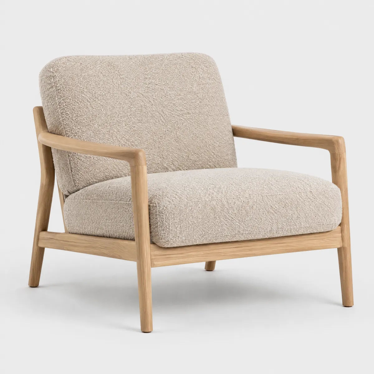
Sessel „Ilvy“ aus Bouclé, Eiche natur
Neu

andas

Sessel „Ilvy“ aus Bouclé, Eiche natur

399,99 €

The first tile has loaded; the other two keep their place with skeletons of the same shape

LiveReal OTTO components, rendered by the OTTO component runtime
HTML
<p class="demo-title" style="font-size:1.25rem">Das könnte dir auch gefallen</p>
<div style="display:grid;grid-template-columns:repeat(auto-fit,minmax(9.5rem,1fr));gap:24px 16px"><article style="display:flex;flex-direction:column;gap:2px;min-width:0"><div style="position:relative;border-radius:16px;overflow:hidden;background:#f3f3f3"><img src="/previews/imagery/samples/otto-product-still/product-armchair.webp" alt="Sessel „Ilvy“ aus Bouclé, Eiche natur" width="600" height="600" loading="lazy" style="display:block;width:100%;height:auto;margin:0;mix-blend-mode:multiply"><div style="position:absolute;left:12px;bottom:12px;display:flex;gap:4px;flex-wrap:wrap"><oc-tag-v1 variant="info-primary" size="50">Neu</oc-tag-v1></div></div><p class="demo-copy" style="margin-top:10px;color:var(--oc-semantic-color-text-secondary, #6d6d6d);text-transform:uppercase;font-size:0.75rem;letter-spacing:0.02em">andas</p><p class="demo-copy">Sessel „Ilvy“ aus Bouclé, Eiche natur</p><p class="demo-copy" style="margin-top:6px"><strong style="font-size:1rem">399,99 €</strong></p></article><article style="display:flex;flex-direction:column;gap:8px;min-width:0"><div style="aspect-ratio:1/1"><oc-skeleton-v1 width="100%" height="100%" border-radius="16px" style="display:block;height:100%"></oc-skeleton-v1></div><oc-skeleton-v1 width="40%" height="12px" border-radius="4px"></oc-skeleton-v1><oc-skeleton-v1 width="100%" height="40px" border-radius="4px"></oc-skeleton-v1><oc-skeleton-v1 width="35%" height="20px" border-radius="4px"></oc-skeleton-v1></article><article style="display:flex;flex-direction:column;gap:8px;min-width:0"><div style="aspect-ratio:1/1"><oc-skeleton-v1 width="100%" height="100%" border-radius="16px" style="display:block;height:100%"></oc-skeleton-v1></div><oc-skeleton-v1 width="40%" height="12px" border-radius="4px"></oc-skeleton-v1><oc-skeleton-v1 width="100%" height="40px" border-radius="4px"></oc-skeleton-v1><oc-skeleton-v1 width="35%" height="20px" border-radius="4px"></oc-skeleton-v1></article></div>

Code

Version Tag Status API
v1 <oc-skeleton-v1> Stable, allowed for generation SkeletonV1

Overview (v1)

Skeleton

The skeleton component provides a placeholder for content while it's loading. It has attributes for setting the shape, width, height, border radius, and visibility state. The skeleton can be a rectangle or a circle, and its dimensions and border radius can be customized. The visibility state can be toggled, with changes applied using a fade-in/out transition.

Default variation
HTML
<oc-skeleton-v1></oc-skeleton-v1>
Configuration

The skeleton component offers a variety of styling variants such as circle and rectangle. This component is configurable, allowing you to tailor its features and appearance to your specific needs. To explore all the available options and adjust the component, use the component configurator and see the changes affect the component in real-time.

Usage guidelines

Before integrating the skeleton component into your project, make sure you have correctly installed the OTTO components package. Look through the variations page for examples of possible component variations. Here, you can discover both common and specific variations that address different use cases.

Accessibility

The skeleton component comes with a set of built-in accessibility features to ensure a seamless experience for all users.

Configuration (v1)

Skeleton configuration

Configure the skeleton component with the controls below and see the changes live in the preview canvas. Click the Show code button within the preview canvas to see the source code for the current component configuration.

HTML
<oc-skeleton-v1></oc-skeleton-v1>

Interactive configurator (Storybook controls); every option is listed in the API section of this file.

API v1

Skeleton v1 API

API: <oc-skeleton-v1> (SkeletonV1)

The {Latest.default.name.toLowerCase()} component provides a placeholder for content while it's loading. It has attributes for setting the shape, width, height, border radius, and visibility state. The skeleton can be a rectangle or a circle, and its dimensions and border radius can be customized. The visibility state can be toggled, with changes applied using a fade-in/out transition.

Attributes / properties
Attribute Type Default Required Description
variant "rectangle" | "circle" "rectangle" no Sets the main shape of the skeleton.
hidden boolean false no Toggles the state of the skeleton between visible and hidden. Set to true to hide the skeleton. State changes will be applied with a fade-in/out transition.
width string undefined no Sets the width of the skeleton.
height string undefined no Sets the height of the skeleton. This attribute only applies to variant="rectangle".
border-radius string "8px" no Sets the border radius of the rectangular skeleton. This attribute only applies to variant="rectangle".
Events
Event Detail type Description
oc-property-change OcSkeletonV1Events["oc-property-change"] Whenever a property value changes, this event triggers. Use this event to track all property changes within the component.

Refer to the Events documentation for more information.
oc-mount { component: string; } Fired when the component is mounted to the DOM. The event is fired when the onMount hook of the component is called by the runtime.
oc-unmount { component: string; } Fired when the component is unmounted from the DOM. The event is fired when the function returned by the onMount hook of the component is called by the runtime.

Variations (v1)

Variations

Listed below are the most common variations of the skeleton component as well as specific component variations for different use cases.

You can explore all available options using the component configurator, adjust the component to your needs, and see the changes live in a preview canvas.

Default

Story: components-skeleton-variations--default · tags: components

The default configuration uses variant=rectangle and an 8px border radius.

HTML
<oc-skeleton-v1></oc-skeleton-v1>
Rectangular skeleton without border radius

Story: components-skeleton-variations--rectangle-without-border-radius · tags: components

The rectangle variant without a border radius.

Args: variant=rectangle, border-radius=0px, width=400px, height=100px

HTML
<oc-skeleton-v1 variant="rectangle" border-radius="0px" width="400px" height="100px"></oc-skeleton-v1>
A circular skeleton

Story: components-skeleton-variations--circle · tags: components

The circle variant with a width of 200px.

Args: variant=circle, width=200px

HTML
<oc-skeleton-v1 variant="circle" width="200px"></oc-skeleton-v1>
Demo: collection of skeletons

Story: components-skeleton-variations--demo-skeleton-collection · tags: components

A collection of skeletons with a custom layout and a button to toggle their visibility using the hidden attribute.

<div class="collection">
  <oc-skeleton-v1
    style="display: block; margin-bottom: 12px;"
    width="100%"
    height="103px"
    border-radius="0px"
  ></oc-skeleton-v1>

  <div style="display: flex; justify-content: space-between; margin-bottom: 11px;">
    <oc-skeleton-v1 border-radius="8px" width="114px" height="13px"></oc-skeleton-v1>
    <oc-skeleton-v1 border-radius="8px" width="93px" height="13px"></oc-skeleton-v1>
  </div>

  <div style="display: flex; justify-content: space-between; margin-bottom: 24px">
    <oc-skeleton-v1 border-radius="8px" width="64px" height="13px"></oc-skeleton-v1>
    <oc-skeleton-v1 border-radius="8px" width="143px" height="13px"></oc-skeleton-v1>
  </div>

  <div style="display: flex; gap: 4px; margin-bottom: 17px">
    <oc-skeleton-v1
      border-radius="16px"
      width="81px"
      height="48px"
      style="flex-shrink: 0;"
    ></oc-skeleton-v1>
    <oc-skeleton-v1
      border-radius="16px"
      width="81px"
      height="48px"
      style="flex-shrink: 0;"
    ></oc-skeleton-v1>
    <oc-skeleton-v1
      border-radius="16px"
      width="81px"
      height="48px"
      style="flex-shrink: 0;"
    ></oc-skeleton-v1>
  </div>

  <div style="align-items: center; display: flex; gap: 17px">
    <oc-skeleton-v1
      style="display: inline-block; flex-shrink: 0;"
      variant="circle"
      width="64px"
    ></oc-skeleton-v1>

    <div style="display: flex; flex-direction: column; gap: 8px; width: 100%;">
      <oc-skeleton-v1 width="100%" height="8px"></oc-skeleton-v1>
      <oc-skeleton-v1 width="100%" height="8px"></oc-skeleton-v1>
    </div>
  </div>
</div>

<p>
  <oc-button-v1 variant="secondary" size="50" type="button" id="toggle-button"
    >Toggle Skeleton
  </oc-button-v1>
</p>

<script>
  (() => {
    const skeletons = document.querySelectorAll(".collection oc-skeleton-v1");
    const button = document.getElementById("toggle-button");
    let hidden = false;

    button.addEventListener("click", () => {
      hidden = !hidden;
      for (let skeleton of skeletons) {
        skeleton.hidden = hidden;
      }
    });
  })();
</script>

<style>
  .collection {
    width: 220px;
    height: 310px;
    overflow-x: hidden;
    display: flex;
    flex-direction: column;
    margin: 46px;
  }
</style>
Story source (TypeScript, verbatim from Storybook)
{
  name: "Demo: collection of skeletons",
  parameters: {
    controls: {
      disabled: true
    },
    chromatic: {
      hideInChromatic: true
    }
  },
  argTypes: hideControlsBadge(Metadata),
  render() {
    return html`
      <div class="collection">
        <oc-skeleton-v1
          style="display: block; margin-bottom: 12px;"
          width="100%"
          height="103px"
          border-radius="0px"
        ></oc-skeleton-v1>

        <div style="display: flex; justify-content: space-between; margin-bottom: 11px;">
          <oc-skeleton-v1 border-radius="8px" width="114px" height="13px"></oc-skeleton-v1>
          <oc-skeleton-v1 border-radius="8px" width="93px" height="13px"></oc-skeleton-v1>
        </div>

        <div style="display: flex; justify-content: space-between; margin-bottom: 24px">
          <oc-skeleton-v1 border-radius="8px" width="64px" height="13px"></oc-skeleton-v1>
          <oc-skeleton-v1 border-radius="8px" width="143px" height="13px"></oc-skeleton-v1>
        </div>

        <div style="display: flex; gap: 4px; margin-bottom: 17px">
          <oc-skeleton-v1
            border-radius="16px"
            width="81px"
            height="48px"
            style="flex-shrink: 0;"
          ></oc-skeleton-v1>
          <oc-skeleton-v1
            border-radius="16px"
            width="81px"
            height="48px"
            style="flex-shrink: 0;"
          ></oc-skeleton-v1>
          <oc-skeleton-v1
            border-radius="16px"
            width="81px"
            height="48px"
            style="flex-shrink: 0;"
          ></oc-skeleton-v1>
        </div>

        <div style="align-items: center; display: flex; gap: 17px">
          <oc-skeleton-v1
            style="display: inline-block; flex-shrink: 0;"
            variant="circle"
            width="64px"
          ></oc-skeleton-v1>

          <div style="display: flex; flex-direction: column; gap: 8px; width: 100%;">
            <oc-skeleton-v1 width="100%" height="8px"></oc-skeleton-v1>
            <oc-skeleton-v1 width="100%" height="8px"></oc-skeleton-v1>
          </div>
        </div>
      </div>

      <p>
        <oc-button-v1 variant="secondary" size="50" type="button" id="toggle-button"
          >Toggle Skeleton
        </oc-button-v1>
      </p>

      <script>
        (() => {
          const skeletons = document.querySelectorAll(".collection oc-skeleton-v1");
          const button = document.getElementById("toggle-button");
          let hidden = false;

          button.addEventListener("click", () => {
            hidden = !hidden;
            for (let skeleton of skeletons) {
              skeleton.hidden = hidden;
            }
          });
        })();
      </script>

      <style>
        .collection {
          width: 220px;
          height: 310px;
          overflow-x: hidden;
          display: flex;
          flex-direction: column;
          margin: 46px;
        }
      </style>
    `;
  }
}
Demo: loading image

Story: components-skeleton-variations--demo-loading-image · tags: components

This demo showcases skeletons that are replaced by an image after it loads.

<div class="layout">
  <div class="container">
    <oc-skeleton-v1
      width="100%"
      height="100%"
      border-radius="0px"
      class="skeleton"
      hidden
    ></oc-skeleton-v1>
  </div>

  <div class="container">
    <oc-skeleton-v1 width="100%" height="100%" class="skeleton" hidden></oc-skeleton-v1>
  </div>

  <div class="container" style="width: 150px; height: 150px;">
    <oc-skeleton-v1
      width="150px"
      height="150px"
      variant="circle"
      class="skeleton"
      hidden
    ></oc-skeleton-v1>
  </div>
</div>

<br />

<p>
  <oc-button-v1 variant="secondary" size="50" type="button" id="loading-button"
    >Load image
  </oc-button-v1>
</p>

<script>
  (() => {
    const button = document.getElementById("loading-button");
    const container = document.querySelectorAll(".container");

    function load() {
      for (let element of container) {
        const prevImage = element.querySelector("img");
        const skeleton = element.querySelector("oc-skeleton-v1");
        skeleton.hidden = false;
        if (prevImage) {
          prevImage.parentNode.removeChild(prevImage);
        }
        const image = document.createElement("img");
        image.onload = () => {
          skeleton.hidden = true;
        };
        element.append(image);

        // simulate slower image loading
        setTimeout(() => {
          image.setAttribute("src", "${placeholderImage}");
        }, 2000);
      }
    }

    button.addEventListener("click", () => {
      load();
    });
  })();
</script>

<style>
  .layout {
    display: flex;
    flex-flow: row wrap;
    gap: 10px;
  }
  .container {
    position: relative;
    width: 200px;
    height: 150px;
    overflow: hidden;
  }

  .container img {
    object-fit: contain;
  }

  .skeleton {
    position: absolute;
  }
</style>
Story source (TypeScript, verbatim from Storybook)
{
  name: "Demo: loading image",
  parameters: {
    controls: {
      disabled: true
    },
    chromatic: {
      hideInChromatic: true
    }
  },
  argTypes: hideControlsBadge(Metadata),
  render() {
    return html`
      <div class="layout">
        <div class="container">
          <oc-skeleton-v1
            width="100%"
            height="100%"
            border-radius="0px"
            class="skeleton"
            hidden
          ></oc-skeleton-v1>
        </div>

        <div class="container">
          <oc-skeleton-v1 width="100%" height="100%" class="skeleton" hidden></oc-skeleton-v1>
        </div>

        <div class="container" style="width: 150px; height: 150px;">
          <oc-skeleton-v1
            width="150px"
            height="150px"
            variant="circle"
            class="skeleton"
            hidden
          ></oc-skeleton-v1>
        </div>
      </div>

      <br />

      <p>
        <oc-button-v1 variant="secondary" size="50" type="button" id="loading-button"
          >Load image
        </oc-button-v1>
      </p>

      <script>
        (() => {
          const button = document.getElementById("loading-button");
          const container = document.querySelectorAll(".container");

          function load() {
            for (let element of container) {
              const prevImage = element.querySelector("img");
              const skeleton = element.querySelector("oc-skeleton-v1");
              skeleton.hidden = false;
              if (prevImage) {
                prevImage.parentNode.removeChild(prevImage);
              }
              const image = document.createElement("img");
              image.onload = () => {
                skeleton.hidden = true;
              };
              element.append(image);

              // simulate slower image loading
              setTimeout(() => {
                image.setAttribute("src", "${placeholderImage}");
              }, 2000);
            }
          }

          button.addEventListener("click", () => {
            load();
          });
        })();
      </script>

      <style>
        .layout {
          display: flex;
          flex-flow: row wrap;
          gap: 10px;
        }
        .container {
          position: relative;
          width: 200px;
          height: 150px;
          overflow: hidden;
        }

        .container img {
          object-fit: contain;
        }

        .skeleton {
          position: absolute;
        }
      </style>
    `;
  }
}