The sheet component is a modular overlay designed to display additional information or interactive elements atop the current context.
Configurator
LiveSheet: alignment, header, close options, height and content background
Sheet öffnen
Wähl deine Größe. Du bist unsicher? In der Größentabelle findest du alle Maße.
ZurücksetzenÜbernehmen
HTML
<div class="demo-row" style="width:100%;justify-content:center;padding:32px 0"><oc-button-v1 variant="secondary" size="50" fit-content data-oc-sheet-v1-open data-oc-sheet-v1-open.id="cfg-sheet">Sheet öffnen</oc-button-v1><oc-sheet-v1 id="cfg-sheet" adaptive-alignment="right" headline="Größe wählen" oc-aria-label="Größe wählen" style="--content-background-color:initial"><p class="oc-copy-100">Wähl deine Größe. Du bist unsicher? In der Größentabelle findest du alle Maße.</p><div slot="actions" style="display:grid;grid-template-columns:1fr 1fr;gap:8px"><oc-button-v1 variant="secondary" data-oc-sheet-v1-close>Zurücksetzen</oc-button-v1><oc-button-v1 variant="primary" data-oc-sheet-v1-close>Übernehmen</oc-button-v1></div></oc-sheet-v1></div>
Usage
Anatomy
Opens a sheet with headline icon, content and action bar. “Größentabelle” opens a second sheet on top, which adds the back button.
Sheet öffnen
Größe wählen
Wähl deine Größe. Du bist unsicher? In der Größentabelle findest du alle Maße.
Nur noch 2 Stück
GrößentabelleÜbernehmen
Größentabelle
Der Sneaker fällt normal aus. Wenn du zwischen zwei Größen liegst, empfehlen wir dir die größere.
Miss deinen Fuß am besten abends, dann ist er am größten. Stell dich dazu auf ein Blatt Papier und markiere Ferse und längsten Zeh.
Passt etwas nicht, schickst du es innerhalb von 30 Tagen kostenlos zurück.
ZurückÜbernehmen
LiveanatomyHTML
<p class="demo-label" style="text-align:center;max-width:32rem">Opens a sheet with headline icon, content and action bar. “Größentabelle” opens a second sheet on top, which adds the back button.</p><div class="demo-row" style="justify-content:center;gap:8px"><oc-button-v1 variant="secondary" size="50" fit-content data-oc-sheet-v1-open data-oc-sheet-v1-open.id="an-1">Sheet öffnen</oc-button-v1></div><oc-sheet-v1 id="an-1"><span slot="headline" style="display:flex;align-items:center;gap:8px"><oc-icon-v1 type="measurement" style="flex:none"></oc-icon-v1>Größe wählen</span><p class="oc-copy-100">Wähl deine Größe. Du bist unsicher? In der Größentabelle findest du alle Maße.</p><div class="oc-mt-100"><oc-form-group-v1 orientation="vertical" gap="var(--oc-base-dimension-16)" oc-aria-label="Größe"><oc-radio-button-v2><input type="radio" name="an" aria-label="oc-auto"><label slot="label">EU 40</label></oc-radio-button-v2><oc-radio-button-v2><input type="radio" name="an" aria-label="oc-auto"><label slot="label">EU 41</label></oc-radio-button-v2><oc-radio-button-v2><input type="radio" name="an" checked aria-label="oc-auto"><label slot="label">EU 42</label></oc-radio-button-v2><oc-radio-button-v2><input type="radio" name="an" aria-label="oc-auto"><label slot="label">EU 43</label></oc-radio-button-v2><oc-radio-button-v2><input type="radio" name="an" aria-label="oc-auto"><label slot="label">EU 44</label><span slot="hint">Nur noch 2 Stück</span></oc-radio-button-v2></oc-form-group-v1></div><div slot="actions" style="display:grid;grid-template-columns:1fr 1fr;gap:8px"><oc-button-v1 variant="secondary" data-oc-sheet-v1-open data-oc-sheet-v1-open.id="an-2">Größentabelle</oc-button-v1><oc-button-v1 variant="primary" data-oc-sheet-v1-close>Übernehmen</oc-button-v1></div></oc-sheet-v1><oc-sheet-v1 id="an-2"><span slot="headline" style="display:flex;align-items:center;gap:8px"><oc-icon-v1 type="measurement" style="flex:none"></oc-icon-v1>Größentabelle</span><p class="oc-copy-100 oc-mb-100">Der Sneaker fällt normal aus. Wenn du zwischen zwei Größen liegst, empfehlen wir dir die größere.</p><p class="oc-copy-100 oc-mb-100">Miss deinen Fuß am besten abends, dann ist er am größten. Stell dich dazu auf ein Blatt Papier und markiere Ferse und längsten Zeh.</p><p class="oc-copy-100 oc-mb-100">Passt etwas nicht, schickst du es innerhalb von 30 Tagen kostenlos zurück.</p><div slot="actions" style="display:grid;grid-template-columns:1fr 1fr;gap:8px"><oc-button-v1 variant="secondary" data-oc-sheet-v1-open data-oc-sheet-v1-open.id="an-1">Zurück</oc-button-v1><oc-button-v1 variant="primary" data-oc-sheet-v1-close>Übernehmen</oc-button-v1></div></oc-sheet-v1></div>
Variants
The sheet is available with the following alignments:
Right: Use from breakpoint M, if it is practical for users to see the original context. Right is the default alignment.
Left: Use from breakpoint M. Left alignment is usually used for navigation or similar purposes.
Center sheet: Use in exceptional cases from breakpointM, if the content is intended for more horizontal space (e.g. videos, tables, PDFs).
Right is the default from breakpoint M, left is for navigation, center for wide content. On breakpoint S every sheet opens from the bottom.
RightLeftCenter
Wähl deine Größe. Du bist unsicher? In der Größentabelle findest du alle Maße.
ZurückÜbernehmen
Wähl deine Größe. Du bist unsicher? In der Größentabelle findest du alle Maße.
ZurückÜbernehmen
Wähl deine Größe. Du bist unsicher? In der Größentabelle findest du alle Maße.
ZurückÜbernehmen
Livebottom, right, left and center sheetHTML
<p class="demo-label" style="text-align:center;max-width:32rem">Right is the default from breakpoint M, left is for navigation, center for wide content. On breakpoint S every sheet opens from the bottom.</p><div class="demo-row" style="justify-content:center;gap:8px"><oc-button-v1 variant="secondary" size="50" fit-content data-oc-sheet-v1-open data-oc-sheet-v1-open.id="va-right">Right</oc-button-v1><oc-button-v1 variant="secondary" size="50" fit-content data-oc-sheet-v1-open data-oc-sheet-v1-open.id="va-left">Left</oc-button-v1><oc-button-v1 variant="secondary" size="50" fit-content data-oc-sheet-v1-open data-oc-sheet-v1-open.id="va-center">Center</oc-button-v1></div><oc-sheet-v1 id="va-right" headline="Größe wählen" adaptive-alignment="right"><p class="oc-copy-100">Wähl deine Größe. Du bist unsicher? In der Größentabelle findest du alle Maße.</p><div slot="actions" style="display:grid;grid-template-columns:1fr 1fr;gap:8px"><oc-button-v1 variant="secondary" data-oc-sheet-v1-close>Zurück</oc-button-v1><oc-button-v1 variant="primary" data-oc-sheet-v1-close>Übernehmen</oc-button-v1></div></oc-sheet-v1><oc-sheet-v1 id="va-left" headline="Größe wählen" adaptive-alignment="left"><p class="oc-copy-100">Wähl deine Größe. Du bist unsicher? In der Größentabelle findest du alle Maße.</p><div slot="actions" style="display:grid;grid-template-columns:1fr 1fr;gap:8px"><oc-button-v1 variant="secondary" data-oc-sheet-v1-close>Zurück</oc-button-v1><oc-button-v1 variant="primary" data-oc-sheet-v1-close>Übernehmen</oc-button-v1></div></oc-sheet-v1><oc-sheet-v1 id="va-center" headline="Größe wählen" adaptive-alignment="center"><p class="oc-copy-100">Wähl deine Größe. Du bist unsicher? In der Größentabelle findest du alle Maße.</p><div slot="actions" style="display:grid;grid-template-columns:1fr 1fr;gap:8px"><oc-button-v1 variant="secondary" data-oc-sheet-v1-close>Zurück</oc-button-v1><oc-button-v1 variant="primary" data-oc-sheet-v1-close>Übernehmen</oc-button-v1></div></oc-sheet-v1></div>
The background color of the content may be adjusted.
Content background canvas or frame
Background canvasBackground frame
Wähl deine Größe. Du bist unsicher? In der Größentabelle findest du alle Maße.
ZurückÜbernehmen
Wähl deine Größe. Du bist unsicher? In der Größentabelle findest du alle Maße.
ZurückÜbernehmen
Livebackground color canvas and frameHTML
<p class="demo-label" style="text-align:center;max-width:32rem">Content background canvas or frame</p><div class="demo-row" style="justify-content:center;gap:8px"><oc-button-v1 variant="secondary" size="50" fit-content data-oc-sheet-v1-open data-oc-sheet-v1-open.id="fr-canvas">Background canvas</oc-button-v1><oc-button-v1 variant="secondary" size="50" fit-content data-oc-sheet-v1-open data-oc-sheet-v1-open.id="fr-frame">Background frame</oc-button-v1></div><oc-sheet-v1 id="fr-canvas" headline="Größe wählen"><p class="oc-copy-100">Wähl deine Größe. Du bist unsicher? In der Größentabelle findest du alle Maße.</p><div slot="actions" style="display:grid;grid-template-columns:1fr 1fr;gap:8px"><oc-button-v1 variant="secondary" data-oc-sheet-v1-close>Zurück</oc-button-v1><oc-button-v1 variant="primary" data-oc-sheet-v1-close>Übernehmen</oc-button-v1></div></oc-sheet-v1><oc-sheet-v1 id="fr-frame" headline="Größe wählen" style="--content-background-color:var(--oc-semantic-color-background-frame)"><p class="oc-copy-100">Wähl deine Größe. Du bist unsicher? In der Größentabelle findest du alle Maße.</p><div slot="actions" style="display:grid;grid-template-columns:1fr 1fr;gap:8px"><oc-button-v1 variant="secondary" data-oc-sheet-v1-close>Zurück</oc-button-v1><oc-button-v1 variant="primary" data-oc-sheet-v1-close>Übernehmen</oc-button-v1></div></oc-sheet-v1></div>
The header may be "hidden", handing over the respective space to the content. The drag indicator, back button and close button are then displayed above the content and made sticky.
Hidden header: the content starts at the very top, the close button floats above it
Sheet ohne Header öffnen
So wirkt „Nordholz“ bei dir
Das Regal aus massiver Eiche ist in einer halben Stunde aufgebaut.
ZurückIn den Warenkorb
Livehidden headerHTML
<p class="demo-label" style="text-align:center;max-width:32rem">Hidden header: the content starts at the very top, the close button floats above it</p><div class="demo-row" style="justify-content:center;gap:8px"><oc-button-v1 variant="secondary" size="50" fit-content data-oc-sheet-v1-open data-oc-sheet-v1-open.id="hh">Sheet ohne Header öffnen</oc-button-v1></div><oc-sheet-v1 id="hh" hide-header no-content-padding oc-aria-label="So wirkt Nordholz bei dir"><img src="/previews/imagery/samples/otto-lifestyle-photo/lifestyle-living-room.webp" alt="Zwei Personen bauen ein Holzregal im Wohnzimmer auf" style="display:block;width:100%;aspect-ratio:4/3;object-fit:cover"><div class="oc-p-100"><p class="oc-headline-100">So wirkt „Nordholz“ bei dir</p><p class="oc-copy-100 oc-mt-50">Das Regal aus massiver Eiche ist in einer halben Stunde aufgebaut.</p></div><div slot="actions" style="display:grid;grid-template-columns:1fr 1fr;gap:8px"><oc-button-v1 variant="secondary" data-oc-sheet-v1-close>Zurück</oc-button-v1><oc-button-v1 variant="primary" data-oc-sheet-v1-close>In den Warenkorb</oc-button-v1></div></oc-sheet-v1></div>
Behavior
Interaction
The sheet functions like a modal. This means that the background elements remain interactive. That is why a scrim is obligatory. Tapping the scrim closes the sheet.
Sheets can be also closed using the close button, using custom actions for example in the action bar or dragging a bottom sheet. The drag indicator only serves as an hint that the whole sheet is draggable when scrolled to the top.
Close it with the close button, a tap on the scrim, dragging the bottom sheet down (S) or an action like “Filtern”
Filter öffnen
ZurücksetzenFiltern
Liveclosing optionsHTML
<p class="demo-label" style="text-align:center;max-width:32rem">Close it with the close button, a tap on the scrim, dragging the bottom sheet down (S) or an action like “Filtern”</p><div class="demo-row" style="justify-content:center;gap:8px"><oc-button-v1 variant="secondary" size="50" fit-content data-oc-sheet-v1-open data-oc-sheet-v1-open.id="co">Filter öffnen</oc-button-v1></div><oc-sheet-v1 id="co" headline="Farbe"><oc-form-group-v1 orientation="vertical" gap="var(--oc-base-dimension-16)" oc-aria-label="Farbe"><oc-checkbox-v2><input type="checkbox" name="co" checked aria-label="oc-auto"><label slot="label">Weiß</label></oc-checkbox-v2><oc-checkbox-v2><input type="checkbox" name="co" aria-label="oc-auto"><label slot="label">Schwarz</label></oc-checkbox-v2><oc-checkbox-v2><input type="checkbox" name="co" aria-label="oc-auto"><label slot="label">Beige</label></oc-checkbox-v2><oc-checkbox-v2><input type="checkbox" name="co" aria-label="oc-auto"><label slot="label">Grün</label></oc-checkbox-v2></oc-form-group-v1><div slot="actions" style="display:grid;grid-template-columns:1fr 1fr;gap:8px"><oc-button-v1 variant="secondary">Zurücksetzen</oc-button-v1><oc-button-v1 variant="primary" data-oc-sheet-v1-close>Filtern</oc-button-v1></div></oc-sheet-v1></div>
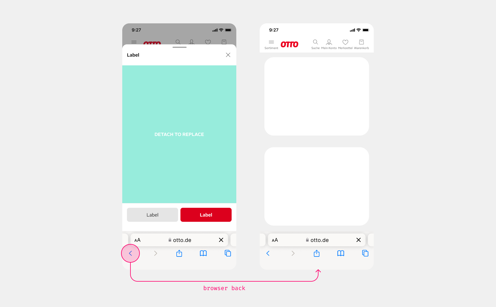
Sheets are part of the browser history. This ensures that a browser-back (using the browser's button, backspace or swipe on phones) closes an open sheet and does not navigate away from the web page opened behind it. Thus effectively removes the sheet from the previous history stack.
browser back
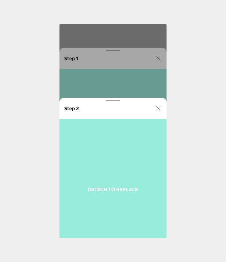
When navigating from a sheet to another sheet, a back button is automatically rendered and the new sheet is also added to the browser history.
“Weiter” opens step 2 on top of step 1; step 2 automatically shows the back button in the header
Schritt 1 öffnen
Wähl deine Größe. Du bist unsicher? In der Größentabelle findest du alle Maße.
Nur noch 2 Stück
ZurückWeiter
Deine Größe: EU 42. Wir legen den Sneaker jetzt in den Warenkorb.
ZurückFertig
Liveback buttonHTML
<p class="demo-label" style="text-align:center;max-width:32rem">“Weiter” opens step 2 on top of step 1; step 2 automatically shows the back button in the header</p><div class="demo-row" style="justify-content:center;gap:8px"><oc-button-v1 variant="secondary" size="50" fit-content data-oc-sheet-v1-open data-oc-sheet-v1-open.id="bb-1">Schritt 1 öffnen</oc-button-v1></div><oc-sheet-v1 id="bb-1" headline="Schritt 1: Größe"><p class="oc-copy-100">Wähl deine Größe. Du bist unsicher? In der Größentabelle findest du alle Maße.</p><div class="oc-mt-100"><oc-form-group-v1 orientation="vertical" gap="var(--oc-base-dimension-16)" oc-aria-label="Größe"><oc-radio-button-v2><input type="radio" name="bb" aria-label="oc-auto"><label slot="label">EU 40</label></oc-radio-button-v2><oc-radio-button-v2><input type="radio" name="bb" aria-label="oc-auto"><label slot="label">EU 41</label></oc-radio-button-v2><oc-radio-button-v2><input type="radio" name="bb" checked aria-label="oc-auto"><label slot="label">EU 42</label></oc-radio-button-v2><oc-radio-button-v2><input type="radio" name="bb" aria-label="oc-auto"><label slot="label">EU 43</label></oc-radio-button-v2><oc-radio-button-v2><input type="radio" name="bb" aria-label="oc-auto"><label slot="label">EU 44</label><span slot="hint">Nur noch 2 Stück</span></oc-radio-button-v2></oc-form-group-v1></div><div slot="actions" style="display:grid;grid-template-columns:1fr 1fr;gap:8px"><oc-button-v1 variant="secondary" data-oc-sheet-v1-close>Zurück</oc-button-v1><oc-button-v1 variant="primary" data-oc-sheet-v1-open data-oc-sheet-v1-open.id="bb-2">Weiter</oc-button-v1></div></oc-sheet-v1><oc-sheet-v1 id="bb-2" headline="Schritt 2: Bestätigen"><p class="oc-copy-100">Deine Größe: EU 42. Wir legen den Sneaker jetzt in den Warenkorb.</p><div slot="actions" style="display:grid;grid-template-columns:1fr 1fr;gap:8px"><oc-button-v1 variant="secondary" data-oc-sheet-v1-open data-oc-sheet-v1-open.id="bb-1">Zurück</oc-button-v1><oc-button-v1 variant="primary" data-oc-sheet-v1-close>Fertig</oc-button-v1></div></oc-sheet-v1></div>
The actions in the action bar are sticky, so they are always visible. The action bar is not limited to one or two buttons, and can be used for all kinds of content. If you do not want the actions to be sticky, you can simply place them at the end of the content.
Actions in the sticky action bar side by side, stacked, or placed at the end of the content
Side by sideStackedIn the content
Der Sneaker fällt normal aus. Wenn du zwischen zwei Größen liegst, empfehlen wir dir die größere.
Miss deinen Fuß am besten abends, dann ist er am größten. Stell dich dazu auf ein Blatt Papier und markiere Ferse und längsten Zeh.
Passt etwas nicht, schickst du es innerhalb von 30 Tagen kostenlos zurück.
ZurückÜbernehmen
Der Sneaker fällt normal aus. Wenn du zwischen zwei Größen liegst, empfehlen wir dir die größere.
Miss deinen Fuß am besten abends, dann ist er am größten. Stell dich dazu auf ein Blatt Papier und markiere Ferse und längsten Zeh.
Passt etwas nicht, schickst du es innerhalb von 30 Tagen kostenlos zurück.
ÜbernehmenZurück
Der Sneaker fällt normal aus. Wenn du zwischen zwei Größen liegst, empfehlen wir dir die größere.
Miss deinen Fuß am besten abends, dann ist er am größten. Stell dich dazu auf ein Blatt Papier und markiere Ferse und längsten Zeh.
Passt etwas nicht, schickst du es innerhalb von 30 Tagen kostenlos zurück.
ÜbernehmenZurück
Liveactions in action bar or in contentHTML
<p class="demo-label" style="text-align:center;max-width:32rem">Actions in the sticky action bar side by side, stacked, or placed at the end of the content</p><div class="demo-row" style="justify-content:center;gap:8px"><oc-button-v1 variant="secondary" size="50" fit-content data-oc-sheet-v1-open data-oc-sheet-v1-open.id="ab-row">Side by side</oc-button-v1><oc-button-v1 variant="secondary" size="50" fit-content data-oc-sheet-v1-open data-oc-sheet-v1-open.id="ab-col">Stacked</oc-button-v1><oc-button-v1 variant="secondary" size="50" fit-content data-oc-sheet-v1-open data-oc-sheet-v1-open.id="ab-in">In the content</oc-button-v1></div><oc-sheet-v1 id="ab-row" headline="Größenberatung"><p class="oc-copy-100 oc-mb-100">Der Sneaker fällt normal aus. Wenn du zwischen zwei Größen liegst, empfehlen wir dir die größere.</p><p class="oc-copy-100 oc-mb-100">Miss deinen Fuß am besten abends, dann ist er am größten. Stell dich dazu auf ein Blatt Papier und markiere Ferse und längsten Zeh.</p><p class="oc-copy-100 oc-mb-100">Passt etwas nicht, schickst du es innerhalb von 30 Tagen kostenlos zurück.</p><div slot="actions" style="display:grid;grid-template-columns:1fr 1fr;gap:8px"><oc-button-v1 variant="secondary" data-oc-sheet-v1-close>Zurück</oc-button-v1><oc-button-v1 variant="primary" data-oc-sheet-v1-close>Übernehmen</oc-button-v1></div></oc-sheet-v1><oc-sheet-v1 id="ab-col" headline="Größenberatung"><p class="oc-copy-100 oc-mb-100">Der Sneaker fällt normal aus. Wenn du zwischen zwei Größen liegst, empfehlen wir dir die größere.</p><p class="oc-copy-100 oc-mb-100">Miss deinen Fuß am besten abends, dann ist er am größten. Stell dich dazu auf ein Blatt Papier und markiere Ferse und längsten Zeh.</p><p class="oc-copy-100 oc-mb-100">Passt etwas nicht, schickst du es innerhalb von 30 Tagen kostenlos zurück.</p><div slot="actions" style="display:grid;gap:8px"><oc-button-v1 variant="primary" data-oc-sheet-v1-close>Übernehmen</oc-button-v1><oc-button-v1 variant="secondary" data-oc-sheet-v1-close>Zurück</oc-button-v1></div></oc-sheet-v1><oc-sheet-v1 id="ab-in" headline="Größenberatung"><p class="oc-copy-100 oc-mb-100">Der Sneaker fällt normal aus. Wenn du zwischen zwei Größen liegst, empfehlen wir dir die größere.</p><p class="oc-copy-100 oc-mb-100">Miss deinen Fuß am besten abends, dann ist er am größten. Stell dich dazu auf ein Blatt Papier und markiere Ferse und längsten Zeh.</p><p class="oc-copy-100 oc-mb-100">Passt etwas nicht, schickst du es innerhalb von 30 Tagen kostenlos zurück.</p><div class="demo-row gap-8"><oc-button-v1 variant="primary" size="50" fit-content data-oc-sheet-v1-close>Übernehmen</oc-button-v1><oc-button-v1 variant="secondary" size="50" fit-content data-oc-sheet-v1-close>Zurück</oc-button-v1></div></oc-sheet-v1></div>
When you open sheets with data that has been fetched and rendered asynchronously, it is good practice to set a loading state on the related button. Even if the content takes a long time to load (e.g. poor internet connection or old device), the user will still see a confirmation that their interaction was successful.
1. Tap
Sheet öffnen
2. Content is loading
Sheet öffnen
3. Sheet opens
Try step 1
Wähl deine Größe. Du bist unsicher? In der Größentabelle findest du alle Maße.
ZurückÜbernehmen
Liveloading state for opening sheetHTML
<div class="group" style="width:12rem"><p class="demo-label">1. Tap</p><oc-button-v1 variant="primary" data-oc-sheet-v1-open data-oc-sheet-v1-open.id="ld">Sheet öffnen</oc-button-v1></div><div class="group" style="width:12rem"><p class="demo-label">2. Content is loading</p><oc-button-v1 variant="primary" loading>Sheet öffnen</oc-button-v1></div><div class="group" style="width:12rem"><p class="demo-label">3. Sheet opens</p><p class="oc-copy-75 oc-text-color-secondary">Try step 1</p></div><oc-sheet-v1 id="ld" headline="Größe wählen"><p class="oc-copy-100">Wähl deine Größe. Du bist unsicher? In der Größentabelle findest du alle Maße.</p><div slot="actions" style="display:grid;grid-template-columns:1fr 1fr;gap:8px"><oc-button-v1 variant="secondary" data-oc-sheet-v1-close>Zurück</oc-button-v1><oc-button-v1 variant="primary" data-oc-sheet-v1-close>Übernehmen</oc-button-v1></div></oc-sheet-v1></div>
For consecutive bottom sheets, you can set full-height - this uses fill-parent for the height to avoid resizing.
The left or right sheet's height always uses fill-parent, regardless of the content's height. The action bar of the left or right sheet is placed directly below the content. Meanwhile, the action bar of the bottom sheet is placed sticky at the bottom of the sheet.
Bottom sheet (S) and center sheet fit their content; left and right sheets fill the height. Full height keeps consecutive bottom sheets the same size.
RightLeftCenterFull height
Wähl deine Größe. Du bist unsicher? In der Größentabelle findest du alle Maße.
ZurückÜbernehmen
Wähl deine Größe. Du bist unsicher? In der Größentabelle findest du alle Maße.
ZurückÜbernehmen
Wähl deine Größe. Du bist unsicher? In der Größentabelle findest du alle Maße.
ZurückÜbernehmen
Wähl deine Größe. Du bist unsicher? In der Größentabelle findest du alle Maße.
ZurückÜbernehmen
LivefittingHTML
<p class="demo-label" style="text-align:center;max-width:32rem">Bottom sheet (S) and center sheet fit their content; left and right sheets fill the height. Full height keeps consecutive bottom sheets the same size.</p><div class="demo-row" style="justify-content:center;gap:8px"><oc-button-v1 variant="secondary" size="50" fit-content data-oc-sheet-v1-open data-oc-sheet-v1-open.id="fi-right">Right</oc-button-v1><oc-button-v1 variant="secondary" size="50" fit-content data-oc-sheet-v1-open data-oc-sheet-v1-open.id="fi-left">Left</oc-button-v1><oc-button-v1 variant="secondary" size="50" fit-content data-oc-sheet-v1-open data-oc-sheet-v1-open.id="fi-center">Center</oc-button-v1><oc-button-v1 variant="secondary" size="50" fit-content data-oc-sheet-v1-open data-oc-sheet-v1-open.id="fi-full">Full height</oc-button-v1></div><oc-sheet-v1 id="fi-right" headline="Größe wählen" adaptive-alignment="right"><p class="oc-copy-100">Wähl deine Größe. Du bist unsicher? In der Größentabelle findest du alle Maße.</p><div slot="actions" style="display:grid;grid-template-columns:1fr 1fr;gap:8px"><oc-button-v1 variant="secondary" data-oc-sheet-v1-close>Zurück</oc-button-v1><oc-button-v1 variant="primary" data-oc-sheet-v1-close>Übernehmen</oc-button-v1></div></oc-sheet-v1><oc-sheet-v1 id="fi-left" headline="Größe wählen" adaptive-alignment="left"><p class="oc-copy-100">Wähl deine Größe. Du bist unsicher? In der Größentabelle findest du alle Maße.</p><div slot="actions" style="display:grid;grid-template-columns:1fr 1fr;gap:8px"><oc-button-v1 variant="secondary" data-oc-sheet-v1-close>Zurück</oc-button-v1><oc-button-v1 variant="primary" data-oc-sheet-v1-close>Übernehmen</oc-button-v1></div></oc-sheet-v1><oc-sheet-v1 id="fi-center" headline="Größe wählen" adaptive-alignment="center"><p class="oc-copy-100">Wähl deine Größe. Du bist unsicher? In der Größentabelle findest du alle Maße.</p><div slot="actions" style="display:grid;grid-template-columns:1fr 1fr;gap:8px"><oc-button-v1 variant="secondary" data-oc-sheet-v1-close>Zurück</oc-button-v1><oc-button-v1 variant="primary" data-oc-sheet-v1-close>Übernehmen</oc-button-v1></div></oc-sheet-v1><oc-sheet-v1 id="fi-full" headline="Größe wählen" full-height><p class="oc-copy-100">Wähl deine Größe. Du bist unsicher? In der Größentabelle findest du alle Maße.</p><div slot="actions" style="display:grid;grid-template-columns:1fr 1fr;gap:8px"><oc-button-v1 variant="secondary" data-oc-sheet-v1-close>Zurück</oc-button-v1><oc-button-v1 variant="primary" data-oc-sheet-v1-close>Übernehmen</oc-button-v1></div></oc-sheet-v1></div>
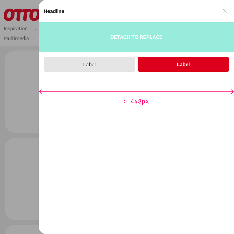
The content follows the same grid principles as every other page. If the left or right sheet is used, the content only needs to be designed for breakpointS, as it never exceeds 28rem.
The center sheet's max-width is 48rem (the same as breakpoint L), but you can modify this if you have the need.
Left and right sheets have a fixed width of 28rem, the center sheet a maximum width of 48rem (or a custom value)
RightLeftCenterCenter, 36rem
Wähl deine Größe. Du bist unsicher? In der Größentabelle findest du alle Maße.
ZurückÜbernehmen
Wähl deine Größe. Du bist unsicher? In der Größentabelle findest du alle Maße.
ZurückÜbernehmen
Wähl deine Größe. Du bist unsicher? In der Größentabelle findest du alle Maße.
ZurückÜbernehmen
Wähl deine Größe. Du bist unsicher? In der Größentabelle findest du alle Maße.
ZurückÜbernehmen
LivegridHTML
<p class="demo-label" style="text-align:center;max-width:32rem">Left and right sheets have a fixed width of 28rem, the center sheet a maximum width of 48rem (or a custom value)</p><div class="demo-row" style="justify-content:center;gap:8px"><oc-button-v1 variant="secondary" size="50" fit-content data-oc-sheet-v1-open data-oc-sheet-v1-open.id="gr-right">Right</oc-button-v1><oc-button-v1 variant="secondary" size="50" fit-content data-oc-sheet-v1-open data-oc-sheet-v1-open.id="gr-left">Left</oc-button-v1><oc-button-v1 variant="secondary" size="50" fit-content data-oc-sheet-v1-open data-oc-sheet-v1-open.id="gr-center">Center</oc-button-v1><oc-button-v1 variant="secondary" size="50" fit-content data-oc-sheet-v1-open data-oc-sheet-v1-open.id="gr-custom">Center, 36rem</oc-button-v1></div><oc-sheet-v1 id="gr-right" headline="Größe wählen" adaptive-alignment="right"><p class="oc-copy-100">Wähl deine Größe. Du bist unsicher? In der Größentabelle findest du alle Maße.</p><div slot="actions" style="display:grid;grid-template-columns:1fr 1fr;gap:8px"><oc-button-v1 variant="secondary" data-oc-sheet-v1-close>Zurück</oc-button-v1><oc-button-v1 variant="primary" data-oc-sheet-v1-close>Übernehmen</oc-button-v1></div></oc-sheet-v1><oc-sheet-v1 id="gr-left" headline="Größe wählen" adaptive-alignment="left"><p class="oc-copy-100">Wähl deine Größe. Du bist unsicher? In der Größentabelle findest du alle Maße.</p><div slot="actions" style="display:grid;grid-template-columns:1fr 1fr;gap:8px"><oc-button-v1 variant="secondary" data-oc-sheet-v1-close>Zurück</oc-button-v1><oc-button-v1 variant="primary" data-oc-sheet-v1-close>Übernehmen</oc-button-v1></div></oc-sheet-v1><oc-sheet-v1 id="gr-center" headline="Größe wählen" adaptive-alignment="center"><p class="oc-copy-100">Wähl deine Größe. Du bist unsicher? In der Größentabelle findest du alle Maße.</p><div slot="actions" style="display:grid;grid-template-columns:1fr 1fr;gap:8px"><oc-button-v1 variant="secondary" data-oc-sheet-v1-close>Zurück</oc-button-v1><oc-button-v1 variant="primary" data-oc-sheet-v1-close>Übernehmen</oc-button-v1></div></oc-sheet-v1><oc-sheet-v1 id="gr-custom" headline="Größe wählen" adaptive-alignment="center" max-width-centered="36rem"><p class="oc-copy-100">Wähl deine Größe. Du bist unsicher? In der Größentabelle findest du alle Maße.</p><div slot="actions" style="display:grid;grid-template-columns:1fr 1fr;gap:8px"><oc-button-v1 variant="secondary" data-oc-sheet-v1-close>Zurück</oc-button-v1><oc-button-v1 variant="primary" data-oc-sheet-v1-close>Übernehmen</oc-button-v1></div></oc-sheet-v1></div>
Best practices
The page stays visible next to the right sheet
Filter
ZurücksetzenFiltern
DoUse left or right sheet, if it is practical for the user to still see the context he came from.
The center sheet gives wide content like pictures or tables room
Raumansicht öffnen
ZurückIn den Warenkorb
DoUse the center sheet if you explicitly need horizontal space.Don'tAdjust the sheets width.
A process across two sheets: “Zurück” and a primary action in each step
Schritt 1 öffnen
Wähl deine Größe. Du bist unsicher? In der Größentabelle findest du alle Maße.
Nur noch 2 Stück
ZurückWeiter
Deine Größe: EU 42. Wir legen den Sneaker jetzt in den Warenkorb.
ZurückFertig
DoUse "Zurück" and a primary action if processes are represented using multiple sheets.Don'tStack Sheets on top of each other.
A secondary action lets people revert the task
Sheet öffnen
Wähl deine Größe. Du bist unsicher? In der Größentabelle findest du alle Maße.
Nur noch 2 Stück
ZurückWeiter
DoIf primary actions are offered for users to fulfill a task, a secondary action may also be offered to revert from the task.
Don't: a lone “Schließen” in the action bar repeats the close button
Sheet öffnen
Der Sneaker fällt normal aus. Wenn du zwischen zwei Größen liegst, empfehlen wir dir die größere.
Miss deinen Fuß am besten abends, dann ist er am größten. Stell dich dazu auf ein Blatt Papier und markiere Ferse und längsten Zeh.
Passt etwas nicht, schickst du es innerhalb von 30 Tagen kostenlos zurück.
Schließen
Don'tUse closing actions like "Schließen" in the action bar by itself. Rely on the different close interactions provided by the sheet instead.
Without close button the sheet still closes by tapping the scrim, pressing Escape or browser back
Sheet öffnen
Wähl deine Größe. Du bist unsicher? In der Größentabelle findest du alle Maße.
ZurückÜbernehmen
CautionHide the close button. It is still possible to close the sheet using other methods like browser-back or tapping the scrim.
Don't: the arrow before the headline looks like a button
Sheet öffnen
Größe wählen
Wähl deine Größe. Du bist unsicher? In der Größentabelle findest du alle Maße.
ZurückWeiter
Don'tUse icons, that could be mistaken as a function.
Accessibility
For information on accessibility, refer to the technical documentation.
Status
Related components
If you want the full attention of users on the task, it may be more suitable to use a focused dialog within the dialog siteframe.
The sheet component is a modular overlay designed to display additional information or interactive elements atop the current context.
It is customizable through various attributes that control its visibility, header display, and content sourcing.
Use the sheet for simple tasks that are connected to the current context.
For more complex tasks, like filling out a long form, the usage of the Focused Dialog is recommended.
To explore all the available options and adjust the component, use the component configurator and see the changes affect the component in real-time.
Usage guidelines
Before integrating the sheet component into your project, make sure you have correctly installed the OTTO components package.
Look through the variations page for examples of possible component variations. Here, you can discover both common and specific variations that address different use cases.
Learn more about how to interact programmatically with a sheet in the Sheet API documentation.
To persist and restore application state when users navigate through browser history, refer to the Restore application context guide.
Tracking
Note that the tracking of the sheet component may not work properly if the content is set via a content string in the default slot.
To ensure proper tracking, use the url or base64-url attribute to load the content from an external source.
The team is aware of the issue and is working to resolve it.
Content Change
On desktops, when a new sheet opens while another is already active, it instantly replaces the previous one, bypassing the open/close animation to indicate the content change to the user.
This behavior allows for the implementation of different contents/pages within the 'same' sheet.
In this scenario, a back button automatically appears in the header, facilitating a return to the previous sheet seamlessly, mirroring the animation-free transition between sheets.
For more information on the visibility and navigation of sheets, see the Sheet presentation and DOM lifecycle documentation.
How the sheet is rendered and positioned in the DOM
When you add the sheet component to your markup, its DOM node is initially rendered exactly where you place it in your code.
However, when the sheet is opened:
The DOM node of the sheet is automatically teleported to the end of the document, right before the closing </body> tag.
At the original DOM node position of the sheet, a placeholder comment is inserted as an anchor, using the id of the sheet.
This ensures the sheet can overlay other content on the page without display issues and always opens at the correct absolute position from the side, regardless of where it was placed in your markup.
When the trigger to open this sheet is clicked, the node is teleported to the end of the <body> and replaced at its original location with a placeholder comment:
<!--auto-uOTGS7VxOhhRTaMnCIcLs-->
This anchor acts as a placeholder, marking where the sheet was originally placed.
When the sheet is closed, the DOM node is teleported back to its original position, replacing the anchor comment.
The sheet component supports keyboard navigation for accessibility purposes.
The following table lists the keyboard shortcuts available for this component:
Shortcut
Description
Tab
Moves focus to next focusable element inside the dialog.
Shift + Tab
Moves focus to previous focusable element inside the dialog.
Escape
Closes the dialog.
Focus handling
The focus is always kept inside an open sheet ("focus trap").
While a sheet is open, it is not possible to move the focus outside of the sheet via keyboard navigation.
Note: This accessibility-friendly behavior of the focus trap is disabled for all previews of the different sheet variations!
It would prevent users from interacting with the menus and toolbars of this component library documentation.
Use oc-aria-label
To make the sheet recognizable for screen readers, use the oc-aria-label attribute to provide a clear and descriptive label when the component does not have a headline attribute.
Note
If your sheet does not have a headline, you must specify its purpose using oc-aria-label to ensure accessibility for screen readers.
Configure the sheet component with the controls below and see the changes live in the preview canvas.
Click the Show code tab within the preview canvas to see the source code for the current component configuration.
Interactive configurator (Storybook controls); every option is listed in the API section of this file.
Migration (v1)
Migration from legacy sheet to Sheet v1
The oc-sheet component is the successor of the deprecated pattern library sheet.
It is implemented as an accessible web component.
data-oc-sheet-v1-create or data-oc-sheet-v1-open attributes
Replaced JavaScript class with declarative attributes
Removed attributes
The following legacy attributes have been removed:
v0 Attribute
v1 Equivalent
Notes
data-sheet-ub64e
data-oc-sheet-v1-create.base64-url
New attribute namespace
data-sheet-content
Use <oc-sheet-v1> element with slotted content
Inline content no longer supported via attributes
data-sheet-title
headline attribute on <oc-sheet-v1> element
Now a component attribute
data-sheet-initial-mobile-height
full-height attribute
Simplified height control
How to migrate
The main change is migrating from the legacy pattern library sheet to a web component-based implementation. The new sheet API simplifies configuration and provides better accessibility.
Migrate a sheet with content from a URL
The deprecated sheet API uses the class js_openInPaliSheet and several data-sheet-* attributes to configure the sheet:
Passing in formatted content through attributes is not supported anymore.
Instead, use a distinct sheet tag <oc-sheet-v1> to define static sheets with formatted and styled content.
You can place the attributes data-oc-sheet-v1-open and data-oc-sheet-v1-open.id="my-sheet-id" for opening the sheets on any other element.
The sheet component offers multiple flexible APIs for programmatic interaction. Choose from DOM manipulation, module imports, or declarative HTML attributes based on your implementation needs.
Each approach is detailed below with examples and configuration options.
You can interact with the sheet component directly through its instance API:
// Create a sheet
const mySheet = document.createElement("oc-sheet-v1");
// Configure the sheet
// The id must begin with a letter ([A-Za-z]).
mySheet.id = "my-sheet";
mySheet.headline = "My sheet headline";
// Open the sheet
mySheet.open = true;
// Close the sheet
mySheet.open = false;
// Listen to open events
mySheet.addEventListener("oc-open", sheetOpenHandlerFn);
Module API
The component provides an alternative api powered by the @otto-ec/global-resources/nexus package.
This API allows you to interact with the sheet component programmatically without directly manipulating the DOM.
Refer to the Nexus documentation for more information about using and creating global OTTO frontend APIs.
For example, you can create and open a sheet instance using the module API as follows:
import { sheetV1 } from "@otto-ec/otto-components/sheet";

// Create a sheet with passed in configuration
// The id must begin with a letter ([A-Za-z]).
sheetV1.create({
  id: "any-sheet-id",
  headline: "My sheet headline",
  url: "/path-to-sheet-content",
});

// Open a sheet with the ID "any-sheet-id"
sheetV1.open("any-sheet-id");
Note
The sheet id is optional. If omitted, a random unique id is generated and added to the trigger element. See the Trigger element configuration section for more details.
Events
You can subscribe to events from all sheet instances using the events object of the module API.
Unlike the DOM event API, the module API broadcasts events for all sheet instances.
Use the id or instance property in the event detail to identify the specific sheet that triggered the event.
import { sheetV1 } from "@otto-ec/otto-components/sheet";

// Subscribe to the oc-open event
sheetV1.events.open.subscribe((event) => {
  console.log("Sheet opened:", event.detail.id, event.detail.instance);
});
Special case: before open
All sheet events have an instance property set to the current sheet instance which is being requested to open.
The before open event however is dispatched immediately on the incoming open request.
The request itself only uses the id of the instance, and therefore the instance may not be created yet.
This gives you the opportunity to create the sheet instance beforehand in case it must be done dynamically.
Signals
For information about working with signals, refer to the Signals and events section in the DOM lifecycle documentation.
Convenience API
The convenience API allows you to interact with the sheet component through data attributes on HTML elements.
This API is useful for creating and opening sheets directly from the HTML without the need for additional JavaScript code.
Create and open a sheet
You can automatically assign a click event listener to any HTML element that supports the click event and use the data-oc-sheet-v1-create attribute to create a new sheet instance and open it.
The underlying mechanism uses the attribute parser to parse the configuration options.
You can pass any configuration option supported by the sheet API either as a specific data attribute, or by using a JSON object to set all required options at once.
<!-- The id must begin with a letter ([A-Za-z]). -->
<button
  data-oc-sheet-v1-create
  data-oc-sheet-v1-create.id="sheet-usk18"
  data-oc-sheet-v1-create.url="/shoppages/usk-18-hinweis"
>
  create and open sheet
</button>
Note
The sheet id is optional. If omitted, a random unique id is generated and added to the trigger element. See the Trigger element configuration section for more details.
Close a sheet
You can close an open sheet by adding the data-oc-sheet-v1-close attribute to any button-like element inside the sheet content.
You can also pass additional info parameter to either default atztribute or as extra parameter attribute like ata-oc-sheet-v1-close.info.
Info can be anything and is simply passed through to all events dispatched by the sheet component during transition.
This may be usefull to identify source of the action triggered the transition of the sheet component.
Use button-like elements to open a sheet
The sheet component responds to click events.
Button-like elements (such as <button>, <oc-button-v1>, or <oc-link-v2 as-button>) trigger click automatically for both mouse and keyboard (Space/Enter) users.
Generic elements like <div> do not trigger click on keyboard activation, even with role="button" or tabindex.
For accessibility and keyboard support, always use button-like elements:
Recommended are elements that have a native click event, for example:
The convenience API allows you to pass through a data set that's added to the instance of the sheet, for example, to set up tracking via the data-tr-v1 attribute.
The following example uses JSON to pass options to the sheet instance and a separate data-set option to setup tracking.
Note
Ensure that inner JSON data is properly escaped.
<!-- The id must begin with a letter ([A-Za-z]). -->
<button
  data-oc-sheet-v1-create='{ "id": "sheet-usk18", "url": "/shoppages/usk-18-hinweis" }'
  data-oc-sheet-v1-create.data-set='{"trV1": "{ \"ot_label\": [\"some\",\"foo\"] }", "trV1.track": "oc-open,oc-close" }'
>
  create and open sheet
</button>
Control target container for the sheet
By default, sheets are appended to the adjacent parent container.
You can override this behavior by specifying a different target container using the container option.
which expects a CSS selector string.
<!-- The id must begin with a letter ([A-Za-z]). -->
<button
  data-oc-sheet-v1-create='{ "id": "sheet-usk18", "url": "/shoppages/usk-18-hinweis", "container": "#my-custom-container" }'
>
  create and open sheet
</button>
<div id="my-custom-container"></div>
<!-- The id must begin with a letter ([A-Za-z]). -->
<button
  data-oc-sheet-v1-create='{ "id": "sheet-usk18", "url": "/shoppages/usk-18-hinweis" }'
  data-oc-sheet-v1-create.container="#my-custom-container"
>
  create and open sheet
</button>
<div id="my-custom-container"></div>
Only open a sheet instance
This API works similar to the create API, but requries a sheet instance that's already created and searchable via the given ID.
It supports the possibility to update the instance configuration, but doesn't support passing through a data-set.
You can omit the sheet ID defined by the data-oc-sheet-v1-create.id attribute.
If omitted, a unique ID is generated and added to the trigger element upon click.
Trigger element before click:
<button data-oc-sheet-v1-create data-oc-sheet-v1-create.url="/shoppages/usk-18-hinweis">
  create and open sheet
</button>
Trigger element after click (with an auto generated ID):
<button
  data-oc-sheet-v1-create
  data-oc-sheet-v1-create.url="/shoppages/usk-18-hinweis"
  data-oc-sheet-v1-create.id="s-62Ffi9UvktbM9tw6JMB"
>
  create and open sheet
</button>
The create sheet method as well create convenience API method are idempotent in regards of creating new sheet instances.
Meaning the instance will only be creatd if there is not exsiting instance with the same ID.
Meaning you don't need to handle this case in your code.
Configuration via JSON object
To avoid creating multiple instances of the same sheet, use the same ID for all trigger elements that should create or open the same sheet.
Instead of using a dedicated data attribute for each configuration detail, pass the entire configuration as a stringified JSON object:
Create and open a sheet with a specific URL and full height:
<button
  data-oc-sheet-v1-create='{"id":"sheet-usk18","url":"/shoppages/usk-18-hinweis","fullHeight":true}'
>
  create and open sheet
</button>
Important
When working with stringified JSON objects, use the camelCase notation for property names.
Hash parameter API
The sheet component can be controlled via the oc-sheet-v1 hash parameter, which supports three different modes of operation:
Open existing sheets
To open an existing sheet instance, pass its ID as the parameter value.
For example, to open a sheet with the ID DISPOSAL_NOTE:
#oc-sheet-v1=DISPOSAL_NOTE
If no sheet with the specified ID exists, the parameter is ignored.
Create sheets dynamically
To create and open a sheet dynamically, pass a URI encoded JSON configuration object.
For example, URI encode {"url": "/foo/bar"} to %7B%22url%22%3A%20%22%2Ffoo%2Fbar%22%7D:
The JSON object supports all sheet configuration attributes.
Note
Only sheets with a url attribute display content. Inline content is not supported for dynamically created sheets.
Use Base64-encoded configuration
To encode complex configurations with special characters, use Base64 encoding for the JSON configuration.
This approach simplifies URL handling by avoiding issues with quotes, spaces, and other special characters in URLs.
All standard sheet configuration attributes remain fully supported when using this Base64 encoding method.
#oc-sheet-v1=eyJ1cmwiOiIvc29tZS9mb28ifQ==
Important
Malformed or incomplete JSON/Base64 strings result in a misconfigured sheet.
Direct sheet navigation
You can open a sheet by navigating directly to a URL that contains the oc-sheet-v1 hash parameter.
This is also known as cross-document navigation or page enter navigation.
For example, sharing or linking to the following URL opens a sheet when the page loads:
The behavior when closing the sheet depends on how the oc-sheet-v1 parameter is set:
Plain sheet ID: When the parameter contains a plain sheet ID (for example DISPOSAL_NOTE), closing the sheet triggers browser back navigation.
This is because the component cannot determine whether the page was reached via a direct link or by in-page navigation.
The browser history API does not provide information about the type of navigation that triggered the current page load.
JSON configuration object: When the parameter contains a JSON configuration object, closing the sheet does not trigger back navigation.
The JSON object acts as both the sheet configuration and as a signal to the component that the page entry was triggered externally (for example, via a direct link or a cross-document navigation).
This allows the component to suppress the back navigation on sheet close.
Suppress back navigation on close
To suppress back navigation when a sheet is opened via direct page navigation, use a JSON configuration object as the parameter value instead of a plain sheet ID.
For an existing sheet instance, pass an object with the id property:
#oc-sheet-v1=%7B%22id%22%3A%22DISPOSAL_NOTE%22%7D
Or using Base64 encoding:
#oc-sheet-v1=eyJpZCI6ICJESVNQT1NBTF9OT1RFIn0=
When a dynamic sheet is created via a JSON configuration object, back navigation is always suppressed by default:
#oc-sheet-v1=%7B%22url%22%3A%22%2Ffoo%2Fbar%22%7D
Error handling
If the resource server returns a response with an error status code when loading remote content, the content is discarded, and the sheet displays the content that is set via the loading-error slot.
This slot shows a static error block that must be configured.
If no error block is defined, the sheet shows nothing in case of an error.
If the response header includes cache-control:no-transform and content-type:text/html, the error content is displayed (even if the status code is not 2xx) and processed as usual, including executing inline scripts.
If error response itself throws an error, then static error block is displayed as last resort.
Use the allowedErrorStatusCodes attribute to define a list of status codes that should be displayed to a user, instead of the static loading-error. If this list is empty, all status codes are considered as user faced error.
Use the oc-content-loading-error event to handle the error programmatically if needed.
External content configuration options
When loading content from a remote server, the content loaded into the sheet is unknown and can vary, even if the URI remains the same.
This can lead to mismatches, such as between the expected and actual headlines.
Because the content can only be adjusted after it is displayed, it can cause flickering or Flash of Unstyled Content (FOUC).
To adress this, teams providing sheet fragments can include an inert script block with sheet configuration options within the content, allowing dynamic adjustments to specific sheet attributes.
Be carefull what props you want to override, it may affect the integration party in a bad manner.
Special note about id property: it may only be overridden, if it starts with auto- prefix, meaning it has been autogenerated.
Special note about extraData: it may only be overridden, if it is not set yet, meaning it has been set by the integration party.
How it works
The sheet searches automatically for a script block of type application/json in the remote content with the data-oc-sheet-v1 attribute.
If found, the included JSON object with the configuration options is parsed by the @otto-ec/global-resources/attribute-parser and the content adjustments are applied to the sheet.
For more details on using the attribute parser for complex use cases, refer to the Attribute parser documentation.
The configuration options are applied in the following way:
Options that are not already defined on the sheet element will be applied.
If an option is already set, the options from the external content will be ignored.
How to provide configuration options
There are two ways to provide options, either as a JSON object or as individual attributes on the script element.
Both methods are equivalent, but attributes always take precedence.
The following example demonstrates how to adjust the headline and fullHeight attributes of a sheet via a JSON object:
The following example demonstrates how to adjust the no-content-padding, headline, and fullHeight attributes via both methods.
Here, the headline attribute takes precedence over the headline property in the JSON object:
<script
  type="application/json"
  data-oc-sheet-v1
  data-oc-sheet-v1.no-content-padding
  data-oc-sheet-v1.headline="Headline via attribute"
>
  {
    "headline": "Headline via JSON object",
    "fullHeight": true
  }
</script>
API v1
Sheet v1 API
API: <oc-sheet-v1> (SheetV1)
A Sheet is a module that shows additional information or interactions on top of the current context.
Attributes / properties
Attribute
Type
Default
Required
Description
id
string
"computed"
no
(Optional) Sets the id of the sheet instance. The id must be globally unique. If not provided, a random id is generated, and a warning is logged.
Important The idmust begin with a letter ([A-Za-z]). Starting the id with a number leads to errors.
adaptive-alignment
"left" | "right" | "center"
"right"
no
Sheet positioning in the viewport. - left : On desktop, it is shown on the left side. On mobile, it is shown from the bottom. - right : On desktop, it is shown on the right side. On mobile, it is shown from the bottom. - center : On desktop, it is shown in the center of the screen with a maximum width. On mobile, it is shown from the bottom.
headline
string
undefined
no
Sets the headline that is displayed in the header. Will be overrridden by the corresponding slot. Accepts plain text or HTML. If HTML is used, it is rendered inside an H1 element, thus only inline elements are allowed.
headline-level
1 | 2 | 3 | 4 | 5 | 6
undefined
no
If set, renders the headline content inside a heading tag with the specified level. Only applies if the headline attribute is set.
The heading level has no visual effect but provides semantic structure for screen readers. If not set, renders a div instead of a heading tag.
hide-back-button
boolean
false
no
Set to true to hide the back button. The back button is only visible if the sheet is opened on top of another sheet. The back button closes the current sheet and shows the previous one. If this prop is set to true, the back button is not shown. However this will not prevent the back navigation via the browser.
hide-close-button
boolean
false
no
Set to `true to hide the close button. The sheet can still be closed by clicking an area outside of it or by swiping down on mobile.
hide-header
boolean
false
no
Set to true to hide the header element. This also hides the header content that is passed via the headline attribute. Has no effect if the header slot is used. The content stretches until the top of sheet and the header buttons are still visible.
disable-tracking
boolean
false
no
If set to true, the sheet will not create a tracking context for the sheet instance. This is useful if the sheet is used in a context where tracking is not desired, such as in a modal or a dialog.
open
boolean
false
no
Sets the visibility state of the sheet. Set to true to open the sheet. Has the same effect as using the open or close method.
disable-close-interactions
boolean
false
no
Set to true to disable all interactions that would lead to closing the sheet, such as clicking outside of the sheet, swiping down on mobile or pressing the escape key. The sheet can only be closed programmatically.
full-height
boolean
false
no
Gives the content all available height. On desktop this pushes the actions slot down to the bottom of the sheet. On mobile, switches are shown without transitions.
max-width-centered
string
48rem
no
max width in any unit for the centered sheet e.g. 500px, 50%, 40rem
extra-data
Record<string, unknown>
null
no
In the sheet history management process it may be necessary to bind additional data to the sheet instance. This data is not used by the sheet itself, but can be used by the consumer to store additional information. The data will also be passed to the sheet events.
allowed-error-status-codes
number[]
[]
no
Defines a list of error status codes that are allowed to be displayed to a user. This only applies to server responses with cache-control: no-transform and content-type: text/html. Find more information in the error handling section.
discard-content-on-inactive
boolean
false
no
If set to true the external content will be discarded when the sheet becomes inactive. This means that the content will be removed from the DOM and will be reloaded when the sheet becomes active again. This applies to close and hide events.
Implies the url or base64Url attribute is in use.
no-content-padding
boolean
false
no
Set to true to remove spacing around the content.
url
string
undefined
no
Sets a URL that points to a resource that is either same as the location or the allowed origin. On opening the sheet, the resource is loaded and displayed. The resource must be a valid HTML document and may contain scripts, for example to a svelte app.
On changing the URL, the sheet reloads the content and replaces the existing one.
base64-url
string
undefined
no
Similar to the {@link url} attribute, but accepts a URL as a base64-encoded string. The string is decoded and processed in same way as the {@link url} prop.
oc-aria-label
string
undefined
no
Sets the ARIA label of the sheet. If not set, the headline attribute is used as the label.
close-history-mode
"pop" | "push" | "replace"
"pop"
no
controlls the way how the browser history is handled when the sheet is closed. The default value is pop, which means that the browser history will be rewound to the previous state. If set to push, a new history entry will be created, and if set to replace, the current history entry will be replaced.
By push and replace will remove sheet scope from the state and commit the history as configured.
This setting can be used in cases where sheet is not as a modal, but rather as a way to manipulate the history state of the application. This is used in the search filters for example.
Slots
Slot
Required
Description
headline
no
Sets the sheet headline that is displayed in the sheet header. Example: <div slot='headline'>My headline</div>
default
no
Sets the main text content of the sheet.
loading-error
no
Sets the error message that is displayed on loading content errors. Example: <div slot='loading-error'>My loading error</div>
actions
no
Holds the link components that provide interactions to the user. Example: <oc-link-v2 variant="underlined" href="#" slot="actions">Action 1</oc-link-v2>
Events
Event
Detail type
Description
oc-sheet-presentation-start
CustomEvent<DetailBase>
Dispatched first time a sheet instance is activated while there is no other sheet instance active. Once a sheet instance activation (show) has been approved. New Presentation stack is created for the current presentation. The instance which is being opened will have this event dispatched.
This event is not cancelable.
oc-sheet-presentation-end
CustomEvent<DetailBase>
Dispatched after all sheet instnaces have been closed and the presentation stack has been cleared. This event will be dispatched for all sheet instances which have participated on the current presentation stack, thus giving the owner of the instance a chance to clean up or perform any other actions that are necessary after the presentation has ended.
This event is not cancelable.
oc-sheet-before-open
CustomEvent<BeforeOpen>
Dispatched immediately after the instance activation has been requested by the integating party. And before the activation process has started. This should give the the owner of the instance to confirm the activation and, for example, make sure that the instance exist in the DOM.
The intergating party may cancel the event, which will prevent the activation process from starting. This may lead to confusion, because the user interaction may end up without any feedback.
oc-sheet-open
CustomEvent<Activation>
Dispatched after the instance activation has completed and the element has been teleported to the end of the body element, and is now visible to DOM. The user agent can now properly draw the sheet element so the upcomming fly-in transition can be applied.
oc-sheet-flyin
CustomEvent<Activation>
Dispatched after the sheet instance has begun its fly-in transition. This event is dispatched after the instance has become visible and the display transition has started.
This event is not cancelable.
oc-sheet-after-open
CustomEvent<Activation>
Dispatched after the sheet instance has been fully opened and the fly-in transition has completed. Also the eventually configured external content has been loaded and applied to the sheet DOM tree. This marks the end of the activation process, and the instance is now ready for user interaction.
This event is not cancelable.
oc-sheet-before-close
CustomEvent<BeforeClose>
Dispatched immediately after the instance deactivation has been requested by the integrating party, Or due to a user interaction, such as clicking the close button or swiping down on mobile. Also triggered by the back / forward browser navigation especially is this causes another sheet to be opened on top of the current one.
The integrating party may cancel the event, which will prevent the deactivation process from starting. This may lead to confusion, because the user interaction may end up with sheet still being opened thus preventing the user from interacting with the web page.
oc-sheet-flyout
CustomEvent<Close>
Dispatched after the sheet instance has begun its fly-out transition. This event is dispatched after the instance has become invisible and the display transition has started.
This event is not cancelable.
oc-sheet-close
CustomEvent<Close>
Dispatched after the sheet instance has been closed and the fly-out transition has completed. The instance has become inactive, and is scheduled to be teleported to its original position in the DOM tree, and set to display: none.
This event is not cancelable.
oc-sheet-after-close
CustomEvent<Close>
Dispatched after the sheet instance has been teleported back to its original position in the DOM tree, and set to display: none. This marks end of the deactivation process, the presentation stack may still be active and presenting other sheet instances. To run processes on presentation end, use the corresponding presentation-end event.
oc-sheet-content-fetch
CustomEvent<ContentFetch>
Dispatched in case the sheet instance has become active and is being opened in the viewport. This event is dispatched after the external content has been fetched from the configured resource URL.
The event will carry the resulting html text and the url used to fetch the content. The integrating party may inspect the raw html text and modify it if needed.
The mutated html text will then be be parsed into DOM and applied to the sheet content. This allows the integrating party to modify the content before it is displayed to the user.
This event is not cancelable
oc-sheet-content-parse
CustomEvent<ContentParsed>
Dispatched after the external content has been fetched and processed into usable DOM Tree. Also the externally provided configuration has been extracted from the response, and will be applied to the sheet instance once applicable.
The integrating party may inspect the processed DOM, and options and modify them if needed. Those modifications will be applied to the sheet DOM tree before the content is displayed.
This event is not cancelable
oc-sheet-content-error
CustomEvent<ContentError>
Dispatched in case the external content could not be fetched or processed. The event will carry the error object that caused the failure, which may be a network error, a parsing error, or any other error that occurred during the content fetching or processing. Also the response object, if available, and eventually the Processed DOM tree that was created out of the errored response.
The integrating party may inspect the error and modify the error contents as needed. The integrating party may provide a fallback content by using the loading-error slot.
This event is not cancelable
oc-sheet-content-apply
CustomEvent<ContentApply>
Dispatched after the external content has been successfully fetched, processed and incerted into the sheet light DOM replacing the potentially existing content.
The DOM has not been activated yet, any scripts that are included in the content have not been executed. The integrating party may inspect the content of the Sheet DOM and modify it if needed.
After this event the content will be activated, scripts will be executed and the sheet fly-in transition will be triggered, thus making the content visible to the user.
This event is not cancelable
oc-sheet-content-discard
CustomEvent<ContentDiscard>
Dispatched when the instance is configured to discard the external content when the sheet becomes inactive. This event is dispatched after the external content has been removed from the intance DOM tree
This event is not cancelable
oc-property-change
OcSheetV1Events["oc-property-change"]
Whenever a property value changes, this event triggers. Use this event to track all property changes within the component.
Fired when the component is mounted to the DOM. The event is fired when the onMount hook of the component is called by the runtime.
oc-unmount
{ component: string; }
Fired when the component is unmounted from the DOM. The event is fired when the function returned by the onMount hook of the component is called by the runtime.
Closes the sheet. Provides the same effect as setting the atrribute open to false.
In contrast to the {@link back} method this method closes alls sheet instances and clears the open sheet history.
This method provides the same effect as clicking the close button.
getHeader: () => HTMLElement | null (deprecated: do not use this method, query from element instead)
Returns the header element if it exists, otherwise returns null.
Returns: HTMLElement | null
getContent: () => HTMLElement | null (deprecated: do not use this method, query from element instead)
Returns the content of the default slot wrapped in a div element, or null if no content elements are present.
Returns: HTMLElement | null
getActions: () => HTMLElement | null (deprecated: do not use this method, query from element instead)
Returns the element assigned to the sheet actions slot, or null if no actions are present.
Returns: HTMLElement | null
isContentApplied: () => boolean
REturns a boolean indicating whether external content has been applied to the sheet DOM.
This will be true if the url or base64Url attribute is set and external content has been loaded
parsed and injected into the DOM of the sheet component successfully.
This will be a falsy value if the sheet is not configured to load external content,
or if the content has not been loaded yet, or if the content has been discarded, or if the content
has been loaded but is errorneous.
Sets the background color of the sheet content area.
--title-spacing
undefined
Controls how much the title should be indented.
DOM lifecycle (v1)
Sheet presentation and DOM lifecycle
This document explains the lifecycle of the oc-sheet-v1 component, including its states, the presentation stack, and how to work with events and signals for advanced integrations.
How the presentation stack manages sheet visibility
The presentation stack of the oc-sheet-v1 component manages how sheets are displayed and navigated within the application.
Opening and stacking sheets
When a sheet is present in the DOM but not opened, it is simply part of the markup and not visible. No presentation stack exists.
When a sheet is opened (e.g., by setting open = true or using the API):
If no stack exists, a new presentation stack is created.
The opened sheet is added to the stack and becomes visible.
If another sheet is opened, it is added to the stack. Only the topmost sheet is visible; others in the stack are hidden.
Navigating back (such as using a back button) removes the topmost sheet from the stack and reveals the previous one.
The stack persists as long as at least one sheet is open. When all sheets are closed, the stack is destroyed.
This stack-based approach allows for complex flows, such as opening a new sheet from within another sheet and returning to the previous sheet without losing context.
Closing sheets
When closing a sheet, consider the following:
When a sheet is opened, the DOM element must stay in the document where it was instantiated.
You can only move a sheet within the DOM while it is closed. Once opened, the stack expects the sheet to exist until it is closed again.
Note
As long as a sheet is opened and part of the presentation stack, it must not be moved within the DOM or removed from the DOM. This can lead to undefined behavior and state.
Remove sheets from the DOM only when there is no active presentation stack, i.e., when all sheets are closed and the stack is empty (isActive is false).
Checking the presentation stack status
You can check the status of the presentation stack using the following command in the browser console:
otto.components.sheetV1.current.get();
Executing this command returns the current presentation stack object, which includes information about the stack and its sheets:
isActive: Indicates whether there is an active presentation stack.
length: Provides the number of sheets currently in the stack.
Sheet state transitions
The lifecycle of a sheet instance includes several distinct states and transitions:
Created (inactive): The sheet instance exists in the DOM but is not visible and is not part of any presentation stack.
Activation request: An activation event, such as oc-sheet-before-open, triggers the opening of the sheet.
Presentation stack created: If no stack exists, a new presentation stack is created and the sheet is added to it.
Activated: The sheet becomes visible and is now the top item in the stack.
External content (optional): If the sheet loads external content, it fetches and processes the content before displaying it.
Deactivation request: A deactivation event, such as oc-sheet-before-close, triggers the closing of the sheet.
Deactivated: The sheet is removed from the stack. If other sheets remain, the previous sheet is shown. If the stack is empty, it is destroyed.
Signals and events
The sheet component supports both events and signals for integration.
Events are stateless; they trigger listeners only when fired.
Signals are stateful; they trigger subscribers whenever the state changes.
Events
Events are stateless notifications dispatched at specific points in the lifecycle of the sheet, such as oc-open, oc-close, oc-sheet-before-open, and oc-sheet-before-close.
Listen for these events to trigger actions. Events do not retain state and listeners are only called when the event is fired.
Signals
Signals, powered by the Nexus signaling API, are stateful and reactive.
Subscribe to signals to react to changes in the sheet's state, not just when a specific event is fired.
The current signal
The sheetV1.current signal provides a reactive way to access the currently opened sheet instance.
Use it to update your UI or perform actions based on the active sheet.
To synchronously access the current sheet instance, use the get method of the signal.
The signal always reflects the current state.
For example:
import { sheetV1 } from "@otto-ec/otto-components/sheet";

// Get the current sheet instance
const currentSheet = sheetV1.current.get().instance;
// Returns null if no sheet is currently opened

// Watch for changes to the current sheet instance
sheetV1.current.subscribe((c) => {
  console.log("Current sheet instance changed:", c.instance);
});
Variations (v1)
Variations
Listed below are the most common variations of the sheet component as well as specific component variations for different use cases.
You can explore all available options using the component configurator, adjust the component to your needs, and see the changes live in a preview canvas.
Variant with a headline and a placeholder in the default slot.
Args: id=basic-sheet, headline=Basic sheet example, defaultSlot=(see snippet)
<oc-sheet-v1 id="basic-sheet" headline="Basic sheet example">
  ${unsafeHTML(headlineSlot)}
      <oc-placeholder-v1 class="oc-headline-100" variant="text" style="height:400px;">
        PLACEHOLDER
      </oc-placeholder-v1>
    ${unsafeHTML(loadingErrorSlot)}${unsafeHTML(actionsSlot)}
</oc-sheet-v1>

<br />
<h2>Basic sheet</h2>
<br />
<p>This option allows the content of the sheet to stretch out to the very top.</p>
<p>The header buttons are still visible and float above the content</p>

<p>
  <oc-button-v1 data-oc-sheet-v1-open data-oc-sheet-v1-open.id=basic-sheet size="50">
    Open sheet
  </oc-button-v1>
</p>
Story source (TypeScript, verbatim from Storybook)
{
  name: "Basic",
  args: {
    id: "basic-sheet",
    headline: "Basic sheet example",
    defaultSlot: `
      <oc-placeholder-v1 class="oc-headline-100" variant="text" style="height:400px;">
        PLACEHOLDER
      </oc-placeholder-v1>
    `
  },
  render({
    defaultSlot,
    loadingErrorSlot,
    actionsSlot,
    headlineSlot,
    ...props
  }) {
    return html`
      <oc-sheet-v1 ${spread(props)}>
        ${unsafeHTML(headlineSlot)}${unsafeHTML(defaultSlot)}${unsafeHTML(loadingErrorSlot)}${unsafeHTML(actionsSlot)}
      </oc-sheet-v1>

      <br />
      <h2>Basic sheet</h2>
      <br />
      <p>This option allows the content of the sheet to stretch out to the very top.</p>
      <p>The header buttons are still visible and float above the content</p>

      <p>
        <oc-button-v1 data-oc-sheet-v1-open data-oc-sheet-v1-open.id=${props.id} size="50">
          Open sheet
        </oc-button-v1>
      </p>
    `;
  }
}
Variant with a headline and a placeholder in the default slot.
Args: id=center-sheet, adaptive-alignment=center, headline=Centered sheet example, defaultSlot=(see snippet)
<oc-sheet-v1 id="center-sheet" adaptive-alignment="center" headline="Centered sheet example">
  ${unsafeHTML(headlineSlot)}
      <oc-placeholder-v1 class="oc-headline-100" variant="text" style="height:400px;">
        PLACEHOLDER
      </oc-placeholder-v1>
    ${unsafeHTML(loadingErrorSlot)}${unsafeHTML(actionsSlot)}
</oc-sheet-v1>

<br />
<h2>Center sheet</h2>
<br />
<p>This option allows the content of the sheet to stretch out to the very top.</p>
<p>The header buttons are still visible and float above the content</p>

<p>
  <oc-button-v1 data-oc-sheet-v1-open data-oc-sheet-v1-open.id=center-sheet size="50">
    Open sheet
  </oc-button-v1>
</p>
Story source (TypeScript, verbatim from Storybook)
{
  name: "Center Sheet",
  args: {
    id: "center-sheet",
    "adaptive-alignment": "center",
    headline: "Centered sheet example",
    defaultSlot: `
      <oc-placeholder-v1 class="oc-headline-100" variant="text" style="height:400px;">
        PLACEHOLDER
      </oc-placeholder-v1>
    `
  },
  render({
    defaultSlot,
    loadingErrorSlot,
    actionsSlot,
    headlineSlot,
    ...props
  }) {
    return html`
      <oc-sheet-v1 ${spread(props)}>
        ${unsafeHTML(headlineSlot)}${unsafeHTML(defaultSlot)}${unsafeHTML(loadingErrorSlot)}${unsafeHTML(actionsSlot)}
      </oc-sheet-v1>

      <br />
      <h2>Center sheet</h2>
      <br />
      <p>This option allows the content of the sheet to stretch out to the very top.</p>
      <p>The header buttons are still visible and float above the content</p>

      <p>
        <oc-button-v1 data-oc-sheet-v1-open data-oc-sheet-v1-open.id=${props.id} size="50">
          Open sheet
        </oc-button-v1>
      </p>
    `;
  }
}
Variation with full-height=true to make the sheet content take all the available space.
SHEET-1 CONTENT
Open Sheet-2
SHEET-2 CONTENT
Two sheets with full-height option
The full-height option gives the sheet content all the available space.
As a consequence on desktop the actions slot content is pushed to the bottom.
In case of a sheet content change (open a sheet while another is already open) no transition
animation is shown on mobile!
Open Sheet-1
Open Sheet-2
HTML
<oc-sheet-v1 id="full-height-1" headline="Sheet with full height" full-height>
<oc-placeholder-v1 class="oc-headline-100" variant="text" style="height:400px;">
  SHEET-1 CONTENT
</oc-placeholder-v1>
<div slot="actions">
  <oc-button-v1 data-oc-sheet-v1-open data-oc-sheet-v1-open.id="full-height-2">
    Open Sheet-2
  </oc-button-v1>
</oc-sheet-v1>
<oc-sheet-v1 id="full-height-2" headline="Sheet No. 2" full-height>
<oc-placeholder-v1 class="oc-headline-100" variant="text" style="height:600px;">
  SHEET-2 CONTENT
</oc-placeholder-v1>
</oc-sheet-v1>
<br />
<h2>Two sheets with full-height option</h2>
<br />
<p>The full-height option gives the sheet content all the available space.</p>
<p>As a consequence on desktop the actions slot content is pushed to the bottom.</p>
<p>
In case of a sheet content change (open a sheet while another is already open) no transition
animation is shown on mobile!
</p>
<br />
<p>
<oc-button-v1 data-oc-sheet-v1-open data-oc-sheet-v1-open.id="full-height-1" size="50">
  Open Sheet-1
</oc-button-v1>
<oc-button-v1 data-oc-sheet-v1-open data-oc-sheet-v1-open.id="full-height-2" size="50">
  Open Sheet-2
</oc-button-v1>
</p>
<p></p>
Story source (TypeScript, verbatim from Storybook)
{
  name: "Full height",
  argTypes: hideControlsBadge(Metadata),
  parameters: {
    controls: {
      disabled: true
    }
  },
  render() {
    return html`
      <oc-sheet-v1 id="full-height-1" headline="Sheet with full height" full-height>
        <oc-placeholder-v1 class="oc-headline-100" variant="text" style="height:400px;">
          SHEET-1 CONTENT
        </oc-placeholder-v1>
        <div slot="actions">
          <oc-button-v1 data-oc-sheet-v1-open data-oc-sheet-v1-open.id="full-height-2">
            Open Sheet-2
          </oc-button-v1>
        </div>
      </oc-sheet-v1>

      <oc-sheet-v1 id="full-height-2" headline="Sheet No. 2" full-height>
        <oc-placeholder-v1 class="oc-headline-100" variant="text" style="height:600px;">
          SHEET-2 CONTENT
        </oc-placeholder-v1>
      </oc-sheet-v1>

      <br />
      <h2>Two sheets with full-height option</h2>
      <br />
      <p>The full-height option gives the sheet content all the available space.</p>
      <p>As a consequence on desktop the actions slot content is pushed to the bottom.</p>
      <p>
        In case of a sheet content change (open a sheet while another is already open) no transition
        animation is shown on mobile!
      </p>
      <br />
      <p>
        <oc-button-v1 data-oc-sheet-v1-open data-oc-sheet-v1-open.id="full-height-1" size="50">
          Open Sheet-1
        </oc-button-v1>
        <oc-button-v1 data-oc-sheet-v1-open data-oc-sheet-v1-open.id="full-height-2" size="50">
          Open Sheet-2
        </oc-button-v1>
      </p>
      <p></p>
    `;
  }
}
Variation with a headline set via the headline attribute, a placeholder in the default slot and action buttons in the actions slot.
Args: id=actions, headline=Sheet with action buttons in footer, defaultSlot=(see snippet), actionsSlot=(see snippet)
<oc-sheet-v1 id="actions" headline="Sheet with action buttons in footer">
  ${unsafeHTML(headlineSlot)}
        <oc-placeholder-v1 class="oc-headline-100" variant="text" style="height:600px;">
          PLACEHOLDER
        </oc-placeholder-v1>${unsafeHTML(loadingErrorSlot)}
        <div slot="actions" style="display: grid; grid-template-columns: 1fr 1fr; gap: 8px;">
          <oc-button-v1 onclick="closest('oc-sheet-v1').open=false" variant="secondary">Close</oc-button-v1>
          <oc-button-v1 variant="primary">Label</oc-button-v1>
        </div>
</oc-sheet-v1>

<br />
<h2>Sheet with action buttons</h2>
<br />
<p>
  Provide actions via the actions slot. The slot content is placed below the default content.
</p>
<p>
  You can use any kind of content as actions but need to take care of the styling yourself.
</p>

<h2>Simple Close behaviour</h2>
<br />
<p>
  The code tab provides an example that showcases how to implement a close button by adding an
  inline onclick event to the button and how to use
  <code>closest('oc-sheet-v1').open=false</code>
  to close the sheet which is a parent of the interactive element.
</p>

<p>
  <oc-button-v1 data-oc-sheet-v1-open data-oc-sheet-v1-open.id=actions size="50">
    Open sheet
  </oc-button-v1>
</p>
Story source (TypeScript, verbatim from Storybook)
{
  name: "With actions in footer",
  args: {
    id: "actions",
    headline: "Sheet with action buttons in footer",
    defaultSlot: `
        <oc-placeholder-v1 class="oc-headline-100" variant="text" style="height:600px;">
          PLACEHOLDER
        </oc-placeholder-v1>`,
    actionsSlot: `
        <div slot="actions" style="display: grid; grid-template-columns: 1fr 1fr; gap: 8px;">
          <oc-button-v1 onclick="closest('oc-sheet-v1').open=false" variant="secondary">Close</oc-button-v1>
          <oc-button-v1 variant="primary">Label</oc-button-v1>
        </div>`
  },
  render({
    defaultSlot,
    loadingErrorSlot,
    actionsSlot,
    headlineSlot,
    ...props
  }) {
    return html`
      <oc-sheet-v1 ${spread(props)}>
        ${unsafeHTML(headlineSlot)}${unsafeHTML(defaultSlot)}${unsafeHTML(loadingErrorSlot)}${unsafeHTML(actionsSlot)}
      </oc-sheet-v1>

      <br />
      <h2>Sheet with action buttons</h2>
      <br />
      <p>
        Provide actions via the actions slot. The slot content is placed below the default content.
      </p>
      <p>
        You can use any kind of content as actions but need to take care of the styling yourself.
      </p>

      <h2>Simple Close behaviour</h2>
      <br />
      <p>
        The code tab provides an example that showcases how to implement a close button by adding an
        inline onclick event to the button and how to use
        <code>closest('oc-sheet-v1').open=false</code>
        to close the sheet which is a parent of the interactive element.
      </p>

      <p>
        <oc-button-v1 data-oc-sheet-v1-open data-oc-sheet-v1-open.id=${props.id} size="50">
          Open sheet
        </oc-button-v1>
      </p>
    `;
  }
}
Variation with a headline set via the headline attribute, a placeholder in the default slot and action buttons in the actions slot.
Args: id=actions, headline=Sheet with action buttons in footer, defaultSlot=(see snippet), actionsSlot=(see snippet), disable-close-interactions=true
<oc-sheet-v1 id="actions" headline="Sheet with action buttons in footer" disable-close-interactions>
  ${unsafeHTML(headlineSlot)}
        <oc-placeholder-v1 class="oc-headline-100" variant="text" style="height:600px;">
          PLACEHOLDER
        </oc-placeholder-v1>${unsafeHTML(loadingErrorSlot)}
        <div slot="actions" style="display: grid; grid-template-columns: 1fr 1fr; gap: 8px;">
          <oc-button-v1 onclick="closest('oc-sheet-v1').open=false" variant="secondary">Close</oc-button-v1>
          <oc-button-v1 variant="primary">Label</oc-button-v1>
        </div>
</oc-sheet-v1>

<p>
  This sheet can only be closed programmatically or by using the close button in the actions
  slot. All other closing interactions like backdrop click, escape key press or drag to close
  are disabled.
</p>

<p>
  <oc-button-v1 data-oc-sheet-v1-open data-oc-sheet-v1-open.id=actions size="50">
    Open sheet
  </oc-button-v1>
</p>
Story source (TypeScript, verbatim from Storybook)
{
  name: "Disabled Close Interactions",
  args: {
    id: "actions",
    headline: "Sheet with action buttons in footer",
    defaultSlot: `
        <oc-placeholder-v1 class="oc-headline-100" variant="text" style="height:600px;">
          PLACEHOLDER
        </oc-placeholder-v1>`,
    actionsSlot: `
        <div slot="actions" style="display: grid; grid-template-columns: 1fr 1fr; gap: 8px;">
          <oc-button-v1 onclick="closest('oc-sheet-v1').open=false" variant="secondary">Close</oc-button-v1>
          <oc-button-v1 variant="primary">Label</oc-button-v1>
        </div>`,
    "disable-close-interactions": true
  },
  render({
    defaultSlot,
    loadingErrorSlot,
    actionsSlot,
    headlineSlot,
    ...props
  }) {
    return html`
      <oc-sheet-v1 ${spread(props)}>
        ${unsafeHTML(headlineSlot)}${unsafeHTML(defaultSlot)}${unsafeHTML(loadingErrorSlot)}${unsafeHTML(actionsSlot)}
      </oc-sheet-v1>

      <p>
        This sheet can only be closed programmatically or by using the close button in the actions
        slot. All other closing interactions like backdrop click, escape key press or drag to close
        are disabled.
      </p>

      <p>
        <oc-button-v1 data-oc-sheet-v1-open data-oc-sheet-v1-open.id=${props.id} size="50">
          Open sheet
        </oc-button-v1>
      </p>
    `;
  }
}
Variation with the headline slot displaying a headline and the default slot showing a placeholder.
Args: id=headline-slot-sheet, headlineSlot=<h3 slot="headline" class="oc-headline-100">Sheet with headline slot</h3>, defaultSlot=(see snippet)
      <oc-sheet-v1 id="headline-slot-sheet">
        <h3 slot="headline" class="oc-headline-100">Sheet with headline slot</h3>
      <oc-placeholder-v1 class="oc-headline-100" variant="text" style="height:400px;">
        PLACEHOLDER
      </oc-placeholder-v1>
    ${unsafeHTML(loadingErrorSlot)}${unsafeHTML(actionsSlot)}
      </oc-sheet-v1>

      <br />
      <h2>Sheet with a headline configured by its slot content</h2>
      <br />
      <p>A sheet´s headline can also be configured through a content slot element.</p>
      <p>
        Keep in mind that for all slot-content it's your responsibility to ensure the correct
        semantic and styling.
      </p>
      <p>
        For the <code>headline</code> slot use a headline element which contains the CSS class
        "oc-headline-100":
      </p>
      <br />
      <p>
        <textarea
          style="width: 100%; resize:none; font-family: Monospace; font-size:10px; border:0;"
          aria-label="example"
          disabled
        >
<h3 slot="headline" class="oc-headline-100">This slot content is used as the sheet header</h3>      </textarea>
      </p>

      <p>
        <oc-button-v1 data-oc-sheet-v1-open data-oc-sheet-v1-open.id=headline-slot-sheet size="50">
          Open sheet
        </oc-button-v1>
      </p>
Story source (TypeScript, verbatim from Storybook)
{
  name: "With headline",
  args: {
    id: "headline-slot-sheet",
    headlineSlot: `<h3 slot="headline" class="oc-headline-100">Sheet with headline slot</h3>`,
    defaultSlot: `
      <oc-placeholder-v1 class="oc-headline-100" variant="text" style="height:400px;">
        PLACEHOLDER
      </oc-placeholder-v1>
    `
  },
  render({
    defaultSlot,
    headlineSlot,
    loadingErrorSlot,
    actionsSlot,
    ...props
  }) {
    return html`
      <oc-sheet-v1 ${spread(props)}>
        ${unsafeHTML(headlineSlot)}${unsafeHTML(defaultSlot)}${unsafeHTML(loadingErrorSlot)}${unsafeHTML(actionsSlot)}
      </oc-sheet-v1>

      <br />
      <h2>Sheet with a headline configured by its slot content</h2>
      <br />
      <p>A sheet´s headline can also be configured through a content slot element.</p>
      <p>
        Keep in mind that for all slot-content it's your responsibility to ensure the correct
        semantic and styling.
      </p>
      <p>
        For the <code>headline</code> slot use a headline element which contains the CSS class
        "oc-headline-100":
      </p>
      <br />
      <p>
        <textarea
          style="width: 100%; resize:none; font-family: Monospace; font-size:10px; border:0;"
          aria-label="example"
          disabled
        >
<h3 slot="headline" class="oc-headline-100">This slot content is used as the sheet header</h3>      </textarea>
      </p>

      <p>
        <oc-button-v1 data-oc-sheet-v1-open data-oc-sheet-v1-open.id=${props.id} size="50">
          Open sheet
        </oc-button-v1>
      </p>
    `;
  }
}
Variation with hide-header=true to hide the headline and shows a placeholder in the default slot.
Args: id=no-header, hide-header=true, oc-aria-label=Aria label for this sheet, defaultSlot=(see snippet)
<oc-sheet-v1 id="no-header" hide-header oc-aria-label="Aria label for this sheet">
  ${unsafeHTML(headlineSlot)}
        <oc-placeholder-v1 class="oc-headline-100" variant="text" style="height:400px;">
          PLACEHOLDER
        </oc-placeholder-v1>${unsafeHTML(loadingErrorSlot)}${unsafeHTML(actionsSlot)}
</oc-sheet-v1>

<br />
<h2>Sheet without header</h2>
<br />
<p>This option allows the content of the sheet to stretch out to the very top.</p>
<p>The header buttons are still visible and float above the content</p>

<p>
  <oc-button-v1 data-oc-sheet-v1-open data-oc-sheet-v1-open.id=no-header size="50">
    Open sheet
  </oc-button-v1>
</p>
Story source (TypeScript, verbatim from Storybook)
{
  name: "Without header",
  args: {
    id: "no-header",
    "hide-header": true,
    "oc-aria-label": "Aria label for this sheet",
    defaultSlot: `
        <oc-placeholder-v1 class="oc-headline-100" variant="text" style="height:400px;">
          PLACEHOLDER
        </oc-placeholder-v1>`
  },
  render({
    defaultSlot,
    loadingErrorSlot,
    actionsSlot,
    headlineSlot,
    ...props
  }) {
    return html`
      <oc-sheet-v1 ${spread(props)}>
        ${unsafeHTML(headlineSlot)}${unsafeHTML(defaultSlot)}${unsafeHTML(loadingErrorSlot)}${unsafeHTML(actionsSlot)}
      </oc-sheet-v1>

      <br />
      <h2>Sheet without header</h2>
      <br />
      <p>This option allows the content of the sheet to stretch out to the very top.</p>
      <p>The header buttons are still visible and float above the content</p>

      <p>
        <oc-button-v1 data-oc-sheet-v1-open data-oc-sheet-v1-open.id=${props.id} size="50">
          Open sheet
        </oc-button-v1>
      </p>
    `;
  }
}
A demo with three sheets showcasing the difference between the open and content change methods.
SHEET-1 CONTENT
Demo text field
Open Sheet-2
SHEET-2 CONTENT
Open Sheet-3
SHEET-3 CONTENT
leave page
Page with three sheets
This story contains three different sheets and three buttons for opening each sheet.
Sheet-1 and Sheet-2 also contain a button inside its content for opening another sheet.
Note the difference in behavior when opening a new sheet while another one is already open.
Window History
The sheet instances push them into the window.history and also restore the open sheet in
case of a refresh or back navigation event which you can see by leaving the page from
sheet-3.
Open Sheet-1
Open Sheet-2
Open Sheet-3
HTML
<oc-sheet-v1 id="three-sheets-1" headline="Sheet No. 1">
<oc-placeholder-v1 class="oc-headline-100 oc-m-0" variant="text" style="height:400px;">
  SHEET-1 CONTENT
</oc-placeholder-v1>
<br />
<br />
<oc-text-field-v1 name="myName" value="" type="text" placeholder="this is a placeholder">
  Demo text field
</oc-text-field-v1>
<div slot="actions">
  <oc-button-v1 data-oc-sheet-v1-open data-oc-sheet-v1-open.id="three-sheets-2">
    Open Sheet-2
  </oc-button-v1>
</oc-sheet-v1>
<oc-sheet-v1 id="three-sheets-2" headline="Sheet No. 2">
<oc-placeholder-v1 class="oc-headline-100" variant="text" style="height:300px;">
  SHEET-2 CONTENT
</oc-placeholder-v1>
<div slot="actions">
  <oc-button-v1 data-oc-sheet-v1-open data-oc-sheet-v1-open.id="three-sheets-3">
    Open Sheet-3
  </oc-button-v1>
</oc-sheet-v1>
<oc-sheet-v1 id="three-sheets-3" headline="Sheet No. 3">
<oc-placeholder-v1 class="oc-headline-100 oc-m-0" variant="text" style="height:600px;">
  SHEET-3 CONTENT
</oc-placeholder-v1>
<div slot="actions">
  <oc-button-v1 href="https://www.otto.de">leave page</oc-button-v1>
</oc-sheet-v1>
<br />
<h2>Page with three sheets</h2>
<br />
<p>This story contains three different sheets and three buttons for opening each sheet.</p>
<p>
Sheet-1 and Sheet-2 also contain a button inside its content for opening another sheet.<br />
Note the difference in behavior when opening a new sheet while another one is already open.
</p>
<h2>Window History</h2>
<br />
<p>
The sheet instances push them into the window.history and also restore the open sheet in
case of a refresh or back navigation event which you can see by leaving the page from
sheet-3.
</p>
<br />
<p>
<oc-button-v1 data-oc-sheet-v1-open data-oc-sheet-v1-open.id="three-sheets-1" size="50">
  Open Sheet-1
</oc-button-v1>
<oc-button-v1 data-oc-sheet-v1-open data-oc-sheet-v1-open.id="three-sheets-2" size="50">
  Open Sheet-2
</oc-button-v1>
<oc-button-v1 data-oc-sheet-v1-open data-oc-sheet-v1-open.id="three-sheets-3" size="50">
  Open Sheet-3
</oc-button-v1>
</p>
Story source (TypeScript, verbatim from Storybook)
{
  name: "Demo: three sheets",
  parameters: {
    controls: {
      disabled: true
    }
  },
  argTypes: hideControlsBadge(Metadata),
  render() {
    const {
      events
    } = otto.components.sheetV1;
    events.beforeOpen.sub(e => console.log("before open", e));
    events.open.sub(e => console.log("open", e));
    events.afterOpen.sub(e => console.log("after open", e));
    events.beforeClose.sub(e => console.log("before close", e));
    events.close.sub(e => console.log("close", e));
    events.afterClose.sub(e => console.log("after close", e));
    const legacyEvents = events as unknown as Record<string, NexusSignal<DetailBase>>;
    legacyEvents.beforeContentChange.sub(e => console.log("before content change", e));
    legacyEvents.contentChangeShow.sub(e => console.log("content change show", e));
    legacyEvents.contentChangeHide.sub(e => console.log("content change hide", e));
    legacyEvents.contentLoaded.sub(e => console.log("content loaded", e));
    legacyEvents.contentLoadingError.sub(e => console.log("content loading error", e));
    return html`
      <oc-sheet-v1 id="three-sheets-1" headline="Sheet No. 1">
        <oc-placeholder-v1 class="oc-headline-100 oc-m-0" variant="text" style="height:400px;">
          SHEET-1 CONTENT
        </oc-placeholder-v1>
        <br />
        <br />
        <oc-text-field-v1 name="myName" value="" type="text" placeholder="this is a placeholder">
          Demo text field
        </oc-text-field-v1>
        <div slot="actions">
          <oc-button-v1 data-oc-sheet-v1-open data-oc-sheet-v1-open.id="three-sheets-2">
            Open Sheet-2
          </oc-button-v1>
        </div>
      </oc-sheet-v1>

      <oc-sheet-v1 id="three-sheets-2" headline="Sheet No. 2">
        <oc-placeholder-v1 class="oc-headline-100" variant="text" style="height:300px;">
          SHEET-2 CONTENT
        </oc-placeholder-v1>
        <div slot="actions">
          <oc-button-v1 data-oc-sheet-v1-open data-oc-sheet-v1-open.id="three-sheets-3">
            Open Sheet-3
          </oc-button-v1>
        </div>
      </oc-sheet-v1>

      <oc-sheet-v1 id="three-sheets-3" headline="Sheet No. 3">
        <oc-placeholder-v1 class="oc-headline-100 oc-m-0" variant="text" style="height:600px;">
          SHEET-3 CONTENT
        </oc-placeholder-v1>
        <div slot="actions">
          <oc-button-v1 href="https://www.otto.de">leave page</oc-button-v1>
        </div>
      </oc-sheet-v1>

      <br />
      <h2>Page with three sheets</h2>
      <br />
      <p>This story contains three different sheets and three buttons for opening each sheet.</p>
      <p>
        Sheet-1 and Sheet-2 also contain a button inside its content for opening another sheet.<br />
        Note the difference in behavior when opening a new sheet while another one is already open.
      </p>
      <h2>Window History</h2>
      <br />
      <p>
        The sheet instances push them into the window.history and also restore the open sheet in
        case of a refresh or back navigation event which you can see by leaving the page from
        sheet-3.
      </p>
      <br />
      <p>
        <oc-button-v1 data-oc-sheet-v1-open data-oc-sheet-v1-open.id="three-sheets-1" size="50">
          Open Sheet-1
        </oc-button-v1>
        <oc-button-v1 data-oc-sheet-v1-open data-oc-sheet-v1-open.id="three-sheets-2" size="50">
          Open Sheet-2
        </oc-button-v1>
        <oc-button-v1 data-oc-sheet-v1-open data-oc-sheet-v1-open.id="three-sheets-3" size="50">
          Open Sheet-3
        </oc-button-v1>
      </p>
    `;
  }
}
A demo showcasing how to programmatically create a sheet and open it.
      <h2>Programatic sheet creation</h2>
      <br />
      <p>
        <oc-text-field-v1
          id="sheet-headline"
          name="sheet-label"
          placeholder="Sheet label"
          value="My programmatically created sheet"
          >Sheet label
        </oc-text-field-v1>
      </p>
      <p>
        <oc-text-area-v1
          id="sheet-content"
          name="sheet-content"
          maxlength="4000"
          placeholder="Sheet content"
          value="<p>This is the content of my programmatically created sheet</p>"
        ></oc-text-area-v1>
      </p>
      <div style="display: flex; gap: 10px;">
        <oc-button-v1 id="create" size="50">Create sheet</oc-button-v1>
        <oc-button-v1 id="open" size="50" disabled="">Open sheet</oc-button-v1>
      </div>
      <br />
      <p>
        You can programmatically create a new sheet element by creating a new sheet element and
        attaching it to the document.
      </p>

      <p>For example:</p>

      <br />

      <pre>
  function createSheet() {
    const sheetElement = document.createElement("oc-sheet-v1");
    sheetElement.id = "prog-sheet";
    sheetElement.open = true;

    // Set sheet content
    sheetElement.headline = "My sheet headline";
    sheetElement.innerHTML = "Any content";

    document.querySelector("body").append(sheetElement);
  }

  function openSheet() {
    const sheetElement = document.getElementById("prog-sheet");
    sheetElement.open = true;
  }
</pre>

      <br />
      <p>
        On page load or when navigating to a page that had an opened sheet, you must handle the
        content of the automatically created sheet instance.
      </p>

      <pre>
  // Once the module is loaded, check if there is an open sheet instance like so:
  otto.components.sheetV1.getOpenSheet().then((sheetElement) => {
    if (sheetElement.id === SHEET_ID) {
      // Set the sheet content on auto created sheet instance.
      sheetElement.headline = "My sheet headline";
      sheetElement.innerHTML = "Any content";
    }
  });

</pre>

      <script>
        (() => {
          const SHEET_ID = "prog-sheet";
          const createButton = document.getElementById("create");
          const openButton = document.getElementById("open");
          const sheetHeadline = document.getElementById("sheet-headline");
          const sheetContent = document.getElementById("sheet-content");

          createButton.addEventListener("click", createSheet);
          openButton.addEventListener("click", openSheet);

          function setSheetProps(sheet) {
            sheet.headline = sheetHeadline.value;
            sheet.innerHTML = sheetContent.value;
            sheet.contentPadding = true;

            createButton.disabled = true;
            openButton.disabled = false;
          }

          function createSheet() {
            const sheetElement = document.createElement("oc-sheet-v1");
            sheetElement.id = SHEET_ID;

            const parentElement = document.querySelector("body");
            const previousSheetElement = document.getElementById(SHEET_ID);
            if (previousSheetElement) {
              previousSheetElement.remove();
            }

            setSheetProps(sheetElement);
            parentElement.append(sheetElement);
          }

          otto.components.sheetV1.getOpenSheet().then((sheetElement) => {
            if (sheetElement?.id === SHEET_ID) {
              setSheetProps(sheetElement);
            }
          });

          function openSheet() {
            const sheetElement = document.getElementById(SHEET_ID);
            sheetElement.open = true;
          }
        })();
      </script>
Story source (TypeScript, verbatim from Storybook)
{
  name: "Demo: programmatically created sheet",
  argTypes: hideControlsBadge(Metadata),
  parameters: {
    controls: {
      disabled: true
    }
  },
  render() {
    return html`
      <h2>Programatic sheet creation</h2>
      <br />
      <p>
        <oc-text-field-v1
          id="sheet-headline"
          name="sheet-label"
          placeholder="Sheet label"
          value="My programmatically created sheet"
          >Sheet label
        </oc-text-field-v1>
      </p>
      <p>
        <oc-text-area-v1
          id="sheet-content"
          name="sheet-content"
          maxlength="4000"
          placeholder="Sheet content"
          value="<p>This is the content of my programmatically created sheet</p>"
        ></oc-text-area-v1>
      </p>
      <div style="display: flex; gap: 10px;">
        <oc-button-v1 id="create" size="50">Create sheet</oc-button-v1>
        <oc-button-v1 id="open" size="50" disabled="">Open sheet</oc-button-v1>
      </div>
      <br />
      <p>
        You can programmatically create a new sheet element by creating a new sheet element and
        attaching it to the document.
      </p>

      <p>For example:</p>

      <br />

      <pre>
  function createSheet() {
    const sheetElement = document.createElement("oc-sheet-v1");
    sheetElement.id = "prog-sheet";
    sheetElement.open = true;

    // Set sheet content
    sheetElement.headline = "My sheet headline";
    sheetElement.innerHTML = "Any content";

    document.querySelector("body").append(sheetElement);
  }

  function openSheet() {
    const sheetElement = document.getElementById("prog-sheet");
    sheetElement.open = true;
  }
</pre>

      <br />
      <p>
        On page load or when navigating to a page that had an opened sheet, you must handle the
        content of the automatically created sheet instance.
      </p>

      <pre>
  // Once the module is loaded, check if there is an open sheet instance like so:
  otto.components.sheetV1.getOpenSheet().then((sheetElement) => {
    if (sheetElement.id === SHEET_ID) {
      // Set the sheet content on auto created sheet instance.
      sheetElement.headline = "My sheet headline";
      sheetElement.innerHTML = "Any content";
    }
  });

</pre>

      <script>
        (() => {
          const SHEET_ID = "prog-sheet";
          const createButton = document.getElementById("create");
          const openButton = document.getElementById("open");
          const sheetHeadline = document.getElementById("sheet-headline");
          const sheetContent = document.getElementById("sheet-content");

          createButton.addEventListener("click", createSheet);
          openButton.addEventListener("click", openSheet);

          function setSheetProps(sheet) {
            sheet.headline = sheetHeadline.value;
            sheet.innerHTML = sheetContent.value;
            sheet.contentPadding = true;

            createButton.disabled = true;
            openButton.disabled = false;
          }

          function createSheet() {
            const sheetElement = document.createElement("oc-sheet-v1");
            sheetElement.id = SHEET_ID;

            const parentElement = document.querySelector("body");
            const previousSheetElement = document.getElementById(SHEET_ID);
            if (previousSheetElement) {
              previousSheetElement.remove();
            }

            setSheetProps(sheetElement);
            parentElement.append(sheetElement);
          }

          otto.components.sheetV1.getOpenSheet().then((sheetElement) => {
            if (sheetElement?.id === SHEET_ID) {
              setSheetProps(sheetElement);
            }
          });

          function openSheet() {
            const sheetElement = document.getElementById(SHEET_ID);
            sheetElement.open = true;
          }
        })();
      </script>
    `;
  }
}
<oc-sheet-v1 id="loading-content-sheet" headline="Sheet with loaded content" url="https://www.otto.de/assets-storybook/assets/sheet-content.rP5OITvp.html">

      <p>
        <oc-spinner-v1 size="100" variant="default" class="spinner"></oc-spinner-v1>loading
        content ...
      </p>
     Loading Error Fallback ${unsafeHTML(actionsSlot)}
</oc-sheet-v1>
<p>
  When loading content, use the <code>default</code> slot to show some loading indication to
  the user.
</p>
<p>
  When a sheet is opened it tries to load content from the URL that is defined via the
  <code>url</code> or <code>base64-url</code> attribute.
</p>
<p>
  While loading, the default content provided via the <code>default</code> slot is shown (if
  available) and then replaced by the loaded content. Use this behavior to display some
  loading information.
</p>

<div style="display: flex; gap: 10px;">
  <oc-button-v1 data-oc-sheet-v1-open data-oc-sheet-v1-open.id=loading-content-sheet size="50">
    Open sheet
  </oc-button-v1>
</div>

<style>
  .spinner {
    float: left;
    margin-right: 12px;
  }
  .loading-error {
    padding: 8px 16px;
    color: red;
    font-weight: bold;
  }
</style>
Story source (TypeScript, verbatim from Storybook)
{
  name: "Demo: load remote content",
  parameters: {
    // Snapshot contains no value
    chromatic: {
      disableSnapshot: true
    }
  },
  args: {
    id: "loading-content-sheet",
    headline: "Sheet with loaded content",
    url: `${externalSheetContentUrl}`,
    defaultSlot: `
      <p>
        <oc-spinner-v1 size="100" variant="default" class="spinner"></oc-spinner-v1>loading
        content ...
      </p>
    `,
    loadingErrorSlot: `Loading Error Fallback`
  },
  render({
    defaultSlot,
    loadingErrorSlot,
    actionsSlot,
    ...props
  }) {
    return html`
      <oc-sheet-v1 ${spread(props)}>
        ${unsafeHTML(defaultSlot)} ${unsafeHTML(loadingErrorSlot)} ${unsafeHTML(actionsSlot)}
      </oc-sheet-v1>
      <p>
        When loading content, use the <code>default</code> slot to show some loading indication to
        the user.
      </p>
      <p>
        When a sheet is opened it tries to load content from the URL that is defined via the
        <code>url</code> or <code>base64-url</code> attribute.
      </p>
      <p>
        While loading, the default content provided via the <code>default</code> slot is shown (if
        available) and then replaced by the loaded content. Use this behavior to display some
        loading information.
      </p>

      <div style="display: flex; gap: 10px;">
        <oc-button-v1 data-oc-sheet-v1-open data-oc-sheet-v1-open.id=${props.id} size="50">
          Open sheet
        </oc-button-v1>
      </div>

      <style>
        .spinner {
          float: left;
          margin-right: 12px;
        }
        .loading-error {
          padding: 8px 16px;
          color: red;
          font-weight: bold;
        }
      </style>
    `;
  }
}
<oc-sheet-v1 id="loading-content-sheet" headline="Sheet with changed URL">

    <p>
      <oc-spinner-v1 size="100" variant="default" class="spinner"></oc-spinner-v1>loading
      content ...
    </p>
   Loading Error Fallback ${unsafeHTML(actionsSlot)}
</oc-sheet-v1>
<p>
  When loading content, use the <code>default</code> slot to show some loading indication
  to the user.
</p>
<p>
  It is possible to change the <code>URL</code> property of the sheet instance. This triggers a reload
  of the content from the new URL the next time the sheet is opened.

  You can enforce a reload of the sheet content by using cache-busting techniques
  like adding a random query parameter to the URL. For example: <code>?v=Math.random()</code>
  or: <code>?v=Date.now()</code>
</p>
<p>
  Do this only while the sheet instance is closed to ensure tracking consistency.
</>

<div style="display: flex; gap: 10px;">
  <oc-button-v1 data-oc-sheet-v1-create='{ "id": "loading-content-sheet", "url": "${externalSheetContentUrl}" }' size="50">
    Open Sheet with first URL
  </oc-button-v1>
  <oc-button-v1 data-oc-sheet-v1-create='{ "id": "loading-content-sheet", "url": "${externalSheetContentExtraUrl}" }' size="50">
    Open Sheet with second URL
  </oc-button-v1>
</div>

<style>
  .spinner { float: left; margin-right: 12px; }
  .loading-error { padding: 8px 16px; color: red; font-weight: bold; }
</style>
Story source (TypeScript, verbatim from Storybook)
{
  name: "Demo: change sheet URL",
  parameters: {
    // Snapshot contains no value
    chromatic: {
      disableSnapshot: true
    }
  },
  args: {
    id: "loading-content-sheet",
    headline: "Sheet with changed URL",
    defaultSlot: `
    <p>
      <oc-spinner-v1 size="100" variant="default" class="spinner"></oc-spinner-v1>loading
      content ...
    </p>
  `,
    loadingErrorSlot: `Loading Error Fallback`
  },
  render({
    defaultSlot,
    loadingErrorSlot,
    actionsSlot,
    ...props
  }) {
    return html`
      <oc-sheet-v1 ${spread(props)}>
        ${unsafeHTML(defaultSlot)} ${unsafeHTML(loadingErrorSlot)} ${unsafeHTML(actionsSlot)}
      </oc-sheet-v1>
      <p>
        When loading content, use the <code>default</code> slot to show some loading indication
        to the user.
      </p>
      <p>
        It is possible to change the <code>URL</code> property of the sheet instance. This triggers a reload
        of the content from the new URL the next time the sheet is opened.

        You can enforce a reload of the sheet content by using cache-busting techniques
        like adding a random query parameter to the URL. For example: <code>?v=Math.random()</code>
        or: <code>?v=Date.now()</code>
      </p>
      <p>
        Do this only while the sheet instance is closed to ensure tracking consistency.
      </>

      <div style="display: flex; gap: 10px;">
        <oc-button-v1 data-oc-sheet-v1-create='{ "id": "${props.id}", "url": "${externalSheetContentUrl}" }' size="50">
          Open Sheet with first URL
        </oc-button-v1>
        <oc-button-v1 data-oc-sheet-v1-create='{ "id": "${props.id}", "url": "${externalSheetContentExtraUrl}" }' size="50">
          Open Sheet with second URL
        </oc-button-v1>
      </div>

      <style>
        .spinner { float: left; margin-right: 12px; }
        .loading-error { padding: 8px 16px; color: red; font-weight: bold; }
      </style>
    `;
  }
}
A demo showcasing a sheet that loads remote content from a URL defined in the url´ or base64-urlattribute with thedefault` slot showing a loading indication.
Here, the remote content contains a script block with options that are applied to the sheet instance.
<oc-sheet-v1 id="loading-content-sheet-with-options" url="https://www.otto.de/assets-storybook/assets/content-with-options.D_Y4gyaQ.html">

      <p>
        <oc-spinner-v1 size="100" variant="default" class="spinner"></oc-spinner-v1>loading
        content ...
      </p>
     ${unsafeHTML(loadingErrorSlot)} ${unsafeHTML(actionsSlot)}
</oc-sheet-v1>
<p>
  When loading content, use the <code>default</code> slot to show some loading indication to
  the user.
</p>
<p>
  After external content is loaded, it may contain a <code>script</code> block with options,
  which can be aplied to the sheet instance from the exernal content.
</p>

<div style="display: flex; gap: 10px;">
  <oc-button-v1 data-oc-sheet-v1-open data-oc-sheet-v1-open.id=loading-content-sheet-with-options size="50">
    Open sheet
  </oc-button-v1>
</div>

<style>
  .spinner {
    float: left;
    margin-right: 12px;
  }
  .loading-error {
    padding: 8px 16px;
    color: red;
    font-weight: bold;
  }
</style>
Story source (TypeScript, verbatim from Storybook)
{
  name: "Demo: load remote content with options",
  parameters: {
    // Snapshot contains no value
    chromatic: {
      disableSnapshot: true
    }
  },
  args: {
    id: "loading-content-sheet-with-options",
    url: `${externalSheetContentWithOptionsUrl}`,
    defaultSlot: `
      <p>
        <oc-spinner-v1 size="100" variant="default" class="spinner"></oc-spinner-v1>loading
        content ...
      </p>
    `
  },
  render({
    defaultSlot,
    loadingErrorSlot,
    actionsSlot,
    ...props
  }) {
    return html`
      <oc-sheet-v1 ${spread(props)}>
        ${unsafeHTML(defaultSlot)} ${unsafeHTML(loadingErrorSlot)} ${unsafeHTML(actionsSlot)}
      </oc-sheet-v1>
      <p>
        When loading content, use the <code>default</code> slot to show some loading indication to
        the user.
      </p>
      <p>
        After external content is loaded, it may contain a <code>script</code> block with options,
        which can be aplied to the sheet instance from the exernal content.
      </p>

      <div style="display: flex; gap: 10px;">
        <oc-button-v1 data-oc-sheet-v1-open data-oc-sheet-v1-open.id=${props.id} size="50">
          Open sheet
        </oc-button-v1>
      </div>

      <style>
        .spinner {
          float: left;
          margin-right: 12px;
        }
        .loading-error {
          padding: 8px 16px;
          color: red;
          font-weight: bold;
        }
      </style>
    `;
  }
}
A demo showcasing the ability of the sheet to deal with legacy content.
A headline embedded via a data-title attribute is transformed to a headline slot element.
<oc-sheet-v1 id="loading-legacy-content-sheet" url="https://www.otto.de/assets-storybook/assets/sheet-content.rP5OITvp.html">
  ${unsafeHTML(defaultSlot)} ${unsafeHTML(loadingErrorSlot)} ${unsafeHTML(actionsSlot)}
</oc-sheet-v1>

<p>
  This demo showcases the ability of the sheet to deal with legacy features in the context of
  loaded content.
</p>
<p>
  Here, the sheet headline is embedded via a data-title attribute in the content and is
  transformed to a headline slot element.
</p>
<div style="display: flex; gap: 10px;">
  <oc-button-v1 data-oc-sheet-v1-open data-oc-sheet-v1-open.id=loading-legacy-content-sheet size="50"
    >Open sheet</oc-button-v1
  >
</div>

<style>
  .spinner {
    float: left;
    margin-right: 12px;
  }
  .loading-error {
    padding: 8px 16px;
    color: red;
    font-weight: bold;
  }
</style>
Story source (TypeScript, verbatim from Storybook)
{
  name: "Demo: load remote legacy content",
  parameters: {
    // Snapshot contains no value
    chromatic: {
      disableSnapshot: true
    }
  },
  args: {
    id: "loading-legacy-content-sheet",
    url: `${externalSheetContentUrl}`
  },
  render({
    defaultSlot,
    loadingErrorSlot,
    actionsSlot,
    ...props
  }) {
    return html`
      <oc-sheet-v1 ${spread(props)}>
        ${unsafeHTML(defaultSlot)} ${unsafeHTML(loadingErrorSlot)} ${unsafeHTML(actionsSlot)}
      </oc-sheet-v1>

      <p>
        This demo showcases the ability of the sheet to deal with legacy features in the context of
        loaded content.
      </p>
      <p>
        Here, the sheet headline is embedded via a data-title attribute in the content and is
        transformed to a headline slot element.
      </p>
      <div style="display: flex; gap: 10px;">
        <oc-button-v1 data-oc-sheet-v1-open data-oc-sheet-v1-open.id=${props.id} size="50"
          >Open sheet</oc-button-v1
        >
      </div>

      <style>
        .spinner {
          float: left;
          margin-right: 12px;
        }
        .loading-error {
          padding: 8px 16px;
          color: red;
          font-weight: bold;
        }
      </style>
    `;
  }
}
<oc-sheet-v1 class="${className}" id="custom-background" headline="Sheet with custom background" full-height no-content-padding style="--content-background-color: var(--oc-semantic-color-frame-background)">

        <div class="oc-copy-100">
          <p>
            Lorem ipsum dolor sit amet, consectetur adipisicing elit. Aliquam amet architecto
            aspernatur assumenda eveniet expedita libero modi odit optio placeat, quae sapiente sed
            sequi tempore vel. Ipsam iure qui quis.
          </p>
          <p>
            Lorem ipsum dolor sit amet, consectetur adipisicing elit. Aliquam amet architecto
            aspernatur assumenda eveniet expedita libero modi odit optio placeat, quae sapiente sed
            sequi tempore vel. Ipsam iure qui quis.
          </p>
        </div> ${unsafeHTML(loadingErrorSlot)}
        <div slot="actions" style="display: grid; grid-template-columns: 1fr 1fr; gap: 8px;">
          <oc-button-v1 variant="secondary">Label</oc-button-v1>
          <oc-button-v1 variant="primary">Label</oc-button-v1>
        </div>
</oc-sheet-v1>

<p>To set a custom background color, apply styles to the sheet content.</p>
<p>
  The <code>full-height</code> option can be applied additionally to make the content take all
  the available space.
</p>

<p>
  <oc-button-v1 data-oc-sheet-v1-open data-oc-sheet-v1-open.id=custom-background size="50"
    >Open sheet</oc-button-v1
  >
</p>

${css}
Story source (TypeScript, verbatim from Storybook)
{
  name: "Demo: custom background color",
  args: {
    id: "custom-background",
    headline: "Sheet with custom background",
    "full-height": true,
    "no-content-padding": true,
    "--content-background-color": "var(--oc-semantic-color-frame-background)",
    defaultSlot: `
        <div class="oc-copy-100">
          <p>
            Lorem ipsum dolor sit amet, consectetur adipisicing elit. Aliquam amet architecto
            aspernatur assumenda eveniet expedita libero modi odit optio placeat, quae sapiente sed
            sequi tempore vel. Ipsam iure qui quis.
          </p>
          <p>
            Lorem ipsum dolor sit amet, consectetur adipisicing elit. Aliquam amet architecto
            aspernatur assumenda eveniet expedita libero modi odit optio placeat, quae sapiente sed
            sequi tempore vel. Ipsam iure qui quis.
          </p>
        </div>`,
    actionsSlot: `
        <div slot="actions" style="display: grid; grid-template-columns: 1fr 1fr; gap: 8px;">
          <oc-button-v1 variant="secondary">Label</oc-button-v1>
          <oc-button-v1 variant="primary">Label</oc-button-v1>
        </div>`
  },
  render({
    defaultSlot,
    loadingErrorSlot,
    actionsSlot,
    ...props
  }) {
    const {
      css,
      className
    } = cssVariablesExample(props);
    return html`
      <oc-sheet-v1 class="${className}" ${spread(props)}>
        ${unsafeHTML(defaultSlot)} ${unsafeHTML(loadingErrorSlot)} ${unsafeHTML(actionsSlot)}
      </oc-sheet-v1>

      <p>To set a custom background color, apply styles to the sheet content.</p>
      <p>
        The <code>full-height</code> option can be applied additionally to make the content take all
        the available space.
      </p>

      <p>
        <oc-button-v1 data-oc-sheet-v1-open data-oc-sheet-v1-open.id=${props.id} size="50"
          >Open sheet</oc-button-v1
        >
      </p>

      ${css}
    `;
  }
}
Multiple demos showcasing how to create sheets on click by using data attributes.
  <p>Trigger the creation of a sheet by putting certain data attributes on any HTML element:</p>
  <br />

  <p>
    <textarea
      style="width: 100%; height: 8rem; resize:none; font-family: Monospace; border:0;"
      aria-label="example"
      disabled
    >
<p
  data-oc-sheet-v1-create
  data-oc-sheet-v1-create.id="sheet-usk18
  data-oc-sheet-v1-create.url="${externalSheetContentUrl}"
  data-oc-sheet-v1-create.full-height
>*** click here ***</p>
    </textarea>
  </p>

  <oc-button-v1
    size="50"
    data-oc-sheet-v1-create
    data-oc-sheet-v1-create.id="sheet-usk18"
    data-oc-sheet-v1-create.url="${externalSheetContentUrl}"
    data-oc-sheet-v1-create.full-height
  >
    *** click here ***
  </oc-button-v1>

  <br />
  <hr />
  <br />

  <p>
    You can also set <code>extra-data</code> containing arbitrary serializable data to be reused
    on sheet activation. This data is persisted, and then passed to various sheets events for
    further usage. The <code>extra-data</code> must be set while the sheet instance is hidden.
  </p>
  <br />
  <p>
    <textarea
      style="width: 100%; height: 8rem; resize:none; font-family: Monospace; border:0;"
      aria-label="example"
      disabled
    >
<p
  data-oc-sheet-v1-create
  data-oc-sheet-v1-create.url="${externalSheetContentUrl}"
  data-oc-sheet-v1-create.full-height
  data-oc-sheet-v1-create.extra-data='{"myData": "myValue"}'
>*** click here ***</p>
    </textarea>
  </p>
  <oc-button-v1
    size="50"
    data-oc-sheet-v1-create
    data-oc-sheet-v1-create.url="${externalSheetContentUrl}"
    data-oc-sheet-v1-create.full-height
    data-oc-sheet-v1-create.extra-data='{"myData": "myValue"}'
  >
    *** click here ***
  </oc-button-v1>

  <br />
  <hr />
  <br />

  <p>You can also pass in the whole configuration as a stringified JSON object.</p>
  <p>
    <b>Note:</b> When working with stringified JSON objects, use the camelCase notation for
    property names!
  </p>
  <br />
  <p>
    <textarea
      style="width: 100%; height: 8rem; resize:none; font-family: Monospace; border:0;"
      aria-label="example"
      disabled
    >
<p
  data-oc-sheet-v1-create='{"url":"${externalSheetContentUrl}","fullHeight":true}'
>*** click here ***</p>
    </textarea>
  </p>

  <oc-button-v1
    size="50"
    data-oc-sheet-v1-create='{"url":"${externalSheetContentUrl}","fullHeight":true}'
    data-oc-sheet-v1-create.headline='<span style="color: cyan">Custom Headline</span>'
  >
    *** click here ***
  </oc-button-v1>
Story source (TypeScript, verbatim from Storybook)
{
  name: "Demo: create sheet on click",
  parameters: {
    chromatic: {
      hideInChromatic: true
    }
  },
  args: {},
  render() {
    otto.components.sheetV1.events.open.sub(console.log);
    otto.components.sheetV1.events.close.sub(console.log);
    return html`
      <p>Trigger the creation of a sheet by putting certain data attributes on any HTML element:</p>
      <br />

      <p>
        <textarea
          style="width: 100%; height: 8rem; resize:none; font-family: Monospace; border:0;"
          aria-label="example"
          disabled
        >
    <p
      data-oc-sheet-v1-create
      data-oc-sheet-v1-create.id="sheet-usk18
      data-oc-sheet-v1-create.url="${externalSheetContentUrl}"
      data-oc-sheet-v1-create.full-height
    >*** click here ***</p>
        </textarea>
      </p>

      <oc-button-v1
        size="50"
        data-oc-sheet-v1-create
        data-oc-sheet-v1-create.id="sheet-usk18"
        data-oc-sheet-v1-create.url="${externalSheetContentUrl}"
        data-oc-sheet-v1-create.full-height
      >
        *** click here ***
      </oc-button-v1>

      <br />
      <hr />
      <br />

      <p>
        You can also set <code>extra-data</code> containing arbitrary serializable data to be reused
        on sheet activation. This data is persisted, and then passed to various sheets events for
        further usage. The <code>extra-data</code> must be set while the sheet instance is hidden.
      </p>
      <br />
      <p>
        <textarea
          style="width: 100%; height: 8rem; resize:none; font-family: Monospace; border:0;"
          aria-label="example"
          disabled
        >
    <p
      data-oc-sheet-v1-create
      data-oc-sheet-v1-create.url="${externalSheetContentUrl}"
      data-oc-sheet-v1-create.full-height
      data-oc-sheet-v1-create.extra-data='{"myData": "myValue"}'
    >*** click here ***</p>
        </textarea>
      </p>
      <oc-button-v1
        size="50"
        data-oc-sheet-v1-create
        data-oc-sheet-v1-create.url="${externalSheetContentUrl}"
        data-oc-sheet-v1-create.full-height
        data-oc-sheet-v1-create.extra-data='{"myData": "myValue"}'
      >
        *** click here ***
      </oc-button-v1>

      <br />
      <hr />
      <br />

      <p>You can also pass in the whole configuration as a stringified JSON object.</p>
      <p>
        <b>Note:</b> When working with stringified JSON objects, use the camelCase notation for
        property names!
      </p>
      <br />
      <p>
        <textarea
          style="width: 100%; height: 8rem; resize:none; font-family: Monospace; border:0;"
          aria-label="example"
          disabled
        >
    <p
      data-oc-sheet-v1-create='{"url":"${externalSheetContentUrl}","fullHeight":true}'
    >*** click here ***</p>
        </textarea>
      </p>

      <oc-button-v1
        size="50"
        data-oc-sheet-v1-create='{"url":"${externalSheetContentUrl}","fullHeight":true}'
        data-oc-sheet-v1-create.headline='<span style="color: cyan">Custom Headline</span>'
      >
        *** click here ***
      </oc-button-v1>
    `;
  }
}
Story source (TypeScript, verbatim from Storybook)
{
  render: StackedInstancesStories.StackedInstances.render,
  play() {
    // skipped because of flakiness in CI environments
    if (StackedInstancesStories.StackedInstances.play) return;
  }
}
Understanding the distinction between these three concepts is essential for implementing state restoration correctly.
Each plays a different role in the restoration flow:
State: Your application's data that forms the foundation for the sheet's content. State and context can contain identical data, but context is not a reference to state.
Context: A serializable snapshot of your application state that is persisted through browser history.
Context is created from application state and can be used to restore application state when the sheet reopens.
Content: The DOM elements rendered inside the sheet component. Your application is responsible for rendering content based on the current state.
The relationship between these terms: Your application state determines what content is rendered in the sheet.
When you persist data as context, you create a serializable snapshot that enables state restoration when users navigate through browser history.
Understanding sheet reusability and state management
The oc-sheet-v1 component is designed as a reusable component that manages its open and closed states through browser history integration.
The sheet component does not control how DOM content is created or rendered—your application is responsible for providing and managing the sheet's content.
When users navigate using browser history (back/forward buttons), the sheet automatically reopens or closes based on its previous state.
However, the sheet cannot restore your application's dynamic content or context because:
The sheet only manages its own open/closed state in browser history
The sheet does not store or restore your application's data or rendered content
Your application must reconstruct the sheet content from the application context when the sheet reopens
When to use state restoration
Use the state restoration pattern when:
Your sheet displays client-side rendered content that changes based on application state
Users use browser back/forward buttons to re-open a reusable sheet from a previously stored context and expect to see their previous content inside the re-opened sheet component.
Your application needs to restore its state from the previously stored context when the sheet automatically reopens
[!NOTE]
If your sheet contains only static content that never changes, you don't need to implement state restoration.
The state restoration pattern
The sheet component provides an event system and extraData mechanism to persist and restore your application context through browser history.
Store serializable context data (a snapshot of your application state) using the sheet's API, and the component manages this data through the browser's history state.
Critical requirement: data serialization
All data stored in extraData must be serializable.
The sheet uses the history API and thus stores this data in the browser's history state.
This requires your data to be compatible with the history state.
Implementation example
The following example demonstrates the state restoration pattern using Svelte, but the pattern applies to any framework.
Use sheetEvents to subscribe to sheet lifecycle events and persist your application context (serializable snapshot of your state).
[!NOTE]
If the sheet instance is available in the DOM when restoration occurs, you can use both sheet events and DOM events on the sheet component.
If the sheet instance is not available in the DOM, use only sheet events.
<script lang="ts">
  import { sheetV1 } from "@otto-ec/otto-components/sheet";
  const { events: sheetEvents } = sheetV1;
  const { data } = $props();
  const id = "my-sheet-id";

  onMount(() => {
    sheetEvents.beforeOpen.subscribe((ev) => {
      if (ev.id === id && ev.extraData) {
        data = ev.extraData; // Restore application state from persisted context (implementation detail, depends on your application logic)
      }
    });

    sheetEvents.open.subscribe((ev) => {
      if (ev.id === id) {
        ev.instance.extraData = $state.snapshot(data); // Store context (snapshot of application state) (implementation detail, depends on your application logic)
      }
    });
  });
</script>

<oc-sheet-v1 {id} {open}>
  {#if data}
    <h1>Content: {data}</h1>
  {/if}
</oc-sheet-v1>
How the pattern works
The sheet component provides two key events for state restoration:
sheetEvents.beforeOpen: Fires before the sheet opens.
The event may contain the extraData property from browser history if the sheet was previously opened and had context data supplied by the application.
Use this event to restore your application state before the sheet becomes visible.
This enables seamless navigation when users use the browser's back/forward buttons.
sheetEvents.open: Fires after the beforeOpen event finishes and the opening of the sheet has been initiated.
Use this event to store your current application context to ev.instance.extraData.
The sheet component persists this data to the browser's history state automatically.
Framework-specific considerations:
The example uses Svelte's $state.snapshot() to create a non-reactive, serializable copy of the state
This prevents storing reactive proxies in browser history, which would cause serialization errors
Other frameworks may require similar transformations to ensure data serializability
Multiple sheets: Always check ev.id to ensure your event handlers process only events from the intended sheet when multiple sheets exist on a page.