
Configurator
<div style="position:relative;height:280px;background:var(--oc-semantic-color-background-soft-mint)">
  <div style="position:absolute;top:24px;left:50%;transform:translateX(-50%)">
    <oc-icon-button-v3 size="100" icon="arrow-long-up" elevation-level="sticky" oc-aria-label="Nach oben"></oc-icon-button-v3>
  </div>
</div>
Usage
Behavior
States
Uses the states of the icon button.
Placement
The back-to-top button is part of the main siteframe per default and does not need to be placed manually. It is sticky and has an outer-spacing of 24px. The position differs between the breakpoints in the following form:
- S - M breakpoint: Button is centered at top.
- L - XL breakpoint: Button is placed at the top right corner.
- XXL breakpoint: Button is placed at the bottom on the right of the content.
Breakpoint S to M: top centre, 24px
Newsletter anmelden & Vorteile sichern
Breakpoint L to XL: top right, 24px from top and side
Newsletter anmelden & Vorteile sichern
HTML
<div class="on-frame" style="margin:0;display:grid;grid-template-columns:minmax(0,1fr) minmax(0,2fr);gap:32px;align-items:start">
<p class="demo-label">Breakpoint S to M: top centre, 24px</p>
<div style="display:grid;gap:8px">
<div style="background:#fff;padding:16px"><div style="position:relative;height:200px;background:var(--oc-semantic-color-background-soft-mint)"><div style="position:absolute;top:24px;left:50%;transform:translateX(-50%)"><oc-icon-button-v3 size="100" icon="arrow-long-up" elevation-level="sticky" oc-aria-label="Nach oben"></oc-icon-button-v3></div></div></div>
<div style="background:#fff;padding:16px;display:grid;gap:12px"><p class="demo-title">Newsletter anmelden & Vorteile sichern</p><oc-text-field-v1>E-Mail-Adresse</oc-text-field-v1><oc-button-v1 variant="secondary" size="50" fill-parent>Anmelden</oc-button-v1></div>
</div>
<p class="demo-label">Breakpoint L to XL: top right, 24px from top and side</p>
<div style="display:grid;gap:8px">
<div style="background:#fff;padding:16px;display:grid;grid-template-columns:1fr 3fr;gap:16px"><div style="height:200px;background:var(--oc-semantic-color-background-soft-mint)"></div><div style="position:relative;height:200px;background:var(--oc-semantic-color-background-soft-mint)"><div style="position:absolute;top:24px;right:24px"><oc-icon-button-v3 size="100" icon="arrow-long-up" elevation-level="sticky" oc-aria-label="Nach oben"></oc-icon-button-v3></div></div></div>
<div style="background:#fff;padding:16px;display:grid;gap:12px"><p class="demo-title">Newsletter anmelden & Vorteile sichern</p><div class="demo-row gap-8" style="flex-wrap:nowrap"><div style="flex:1"><oc-text-field-v1>E-Mail-Adresse</oc-text-field-v1></div><oc-button-v1 variant="secondary" fit-content>Anmelden</oc-button-v1></div></div>
</div>
Breakpoint XXL: bottom right of the content, 24px from bottom and side
Newsletter anmelden & Vorteile sichern
HTML
<div class="on-frame" style="margin:0">
<p class="demo-label" style="margin-bottom:8px">Breakpoint XXL: bottom right of the content, 24px from bottom and side</p>
<div style="position:relative;display:grid;gap:8px;padding-right:72px">
<div style="background:#fff;padding:16px;display:grid;grid-template-columns:1fr 3fr;gap:16px"><div style="height:120px;background:var(--oc-semantic-color-background-soft-mint)"></div><div style="height:120px;background:var(--oc-semantic-color-background-soft-mint)"></div></div>
<div style="background:#fff;padding:16px;display:grid;gap:12px"><p class="demo-title">Newsletter anmelden & Vorteile sichern</p><div class="demo-row gap-8" style="flex-wrap:nowrap"><div style="flex:1"><oc-text-field-v1>E-Mail-Adresse</oc-text-field-v1></div><oc-button-v1 variant="secondary" fit-content>Anmelden</oc-button-v1></div></div>
<div style="background:#fff;padding:16px" class="demo-row"><oc-link-v2 variant="secondary" icon-left="person"><a href="#">Mein Konto</a></oc-link-v2><oc-link-v2 variant="secondary" icon-left="voucher"><a href="#">Geschenkgutschein</a></oc-link-v2><oc-link-v2 variant="secondary" icon-left="feedback"><a href="#">Lob & Kritik</a></oc-link-v2><oc-link-v2 variant="secondary" icon-left="service-info"><a href="#">Service</a></oc-link-v2></div>
<div style="position:absolute;right:12px;bottom:24px"><oc-icon-button-v3 size="100" icon="arrow-long-up" elevation-level="sticky" oc-aria-label="Nach oben"></oc-icon-button-v3></div>
Consider that there is a native search bar inside the app which is sticky at the top. However, since the back-to-top button is part of the web content, it remains sticky underneath it without conflicting with it.
Web: 24px below the top of the viewport
App: sticky below the native search bar
HTML
<p class="demo-label">Web: 24px below the top of the viewport</p>
<div style="background:#fff;border-radius:24px;overflow:hidden;box-shadow:0 0 0 1px #ddd">
<div style="position:relative;height:240px;background:var(--oc-semantic-color-background-soft-mint)"><div style="position:absolute;top:24px;left:50%;transform:translateX(-50%)"><oc-icon-button-v3 size="100" icon="arrow-long-up" elevation-level="sticky" oc-aria-label="Nach oben"></oc-icon-button-v3></div></div>
<oc-link-v2 variant="secondary" size="75"><a href="#">Hilfe & Kontakt</a></oc-link-v2><oc-link-v2 variant="secondary" size="75"><a href="#">Service</a></oc-link-v2><oc-link-v2 variant="secondary" size="75"><a href="#">AGB</a></oc-link-v2><oc-link-v2 variant="secondary" size="75"><a href="#">Datenschutz</a></oc-link-v2></div>
</div>
<p class="demo-label">App: sticky below the native search bar</p>
<div style="background:#fff;border-radius:24px;overflow:hidden;box-shadow:0 0 0 1px #ddd">
<div style="padding:8px 12px;background:#f0f0f0"><oc-search-field-v1><input type="search" placeholder="Wonach suchst du?" spellcheck="false"></oc-search-field-v1></div>
<div style="position:relative;height:190px;background:var(--oc-semantic-color-background-soft-mint)"><div style="position:absolute;top:24px;left:50%;transform:translateX(-50%)"><oc-icon-button-v3 size="100" icon="arrow-long-up" elevation-level="sticky" oc-aria-label="Nach oben"></oc-icon-button-v3></div></div>
<oc-link-v2 variant="secondary" size="75"><a href="#">Hilfe & Kontakt</a></oc-link-v2><oc-link-v2 variant="secondary" size="75"><a href="#">Service</a></oc-link-v2><oc-link-v2 variant="secondary" size="75"><a href="#">AGB</a></oc-link-v2><oc-link-v2 variant="secondary" size="75"><a href="#">Datenschutz</a></oc-link-v2></div>
</div>
Elevation
The back-to-top-button uses the elevation level sticky.
Interaction
Breakpoint S - L: The back-to-top button appears once the user has scrolled down more than one viewport height and then scrolls back up. If the user scrolls down less than one viewport height, the button is not displayed. The button is hidden while scrolling down.
When clicking the back-to-top button, the page scrolls smoothly to the top and the button eases out.
Sneaker
Scrolling down more than one viewport height
Newsletter anmelden
Scrolling up
Newsletter anmelden
HTML
<div class="on-frame" style="margin:0;display:grid;grid-template-columns:1fr 88px 1fr 88px 1fr;gap:12px;align-items:center">
<div style="background:#fff;padding:12px;display:grid;gap:12px"><p class="demo-title">Sneaker</p><div style="height:200px;background:var(--oc-semantic-color-background-soft-mint)"></div></div>
<p class="demo-label">Scrolling down more than one viewport height</p><oc-icon-v1 type="arrow-long-right" style="color:#e5006b"></oc-icon-v1></div>
<div style="background:#fff;padding:12px;display:grid;gap:12px"><div style="height:80px;background:var(--oc-semantic-color-background-soft-mint)"></div><p class="demo-copy" style="font-weight:700">Newsletter anmelden</p><oc-button-v1 variant="secondary" size="50" fill-parent>Anmelden</oc-button-v1></div>
<p class="demo-label">Scrolling up</p><oc-icon-v1 type="arrow-long-right" style="color:#e5006b"></oc-icon-v1></div>
<div style="background:#fff;padding:12px;display:grid;gap:12px"><div style="position:relative;height:120px;background:var(--oc-semantic-color-background-soft-mint)"><div style="position:absolute;top:16px;left:50%;transform:translateX(-50%)"><oc-icon-button-v3 size="100" icon="arrow-long-up" elevation-level="sticky" oc-aria-label="Nach oben"></oc-icon-button-v3></div></div><p class="demo-copy" style="font-weight:700">Newsletter anmelden</p><oc-button-v1 variant="secondary" size="50" fill-parent>Anmelden</oc-button-v1></div>
Newsletter anmelden & Vorteile sichern
Pressing the back-to-top button: the page scrolls to the top, the button eases out

Sneaker
HTML
<div class="on-frame" style="margin:0;display:grid;grid-template-columns:1fr 140px 1fr;gap:16px;align-items:center">
<div style="background:#fff;padding:12px;display:grid;gap:12px"><div style="position:relative;height:160px;background:var(--oc-semantic-color-background-soft-mint)"><div style="position:absolute;top:16px;left:50%;transform:translateX(-50%)"><oc-icon-button-v3 size="100" icon="arrow-long-up" elevation-level="sticky" oc-aria-label="Nach oben"></oc-icon-button-v3></div></div><p class="demo-title">Newsletter anmelden & Vorteile sichern</p><oc-button-v1 variant="secondary" size="50" fill-parent>Anmelden</oc-button-v1></div>
<p class="demo-label">Pressing the back-to-top button: the page scrolls to the top, the button eases out</p><oc-icon-v1 type="arrow-long-right" style="color:#e5006b"></oc-icon-v1></div>
<div style="background:#fff;padding:12px;display:grid;gap:12px"><div class="demo-row" style="justify-content:space-between"><oc-icon-button-v3 variant="transparent" icon="burger" oc-aria-label="Sortiment"></oc-icon-button-v3><div style="width:64px"><img src="/references/logos/otto/otto-de-press-Otto_Logo_rgb.png" alt="OTTO" style="display:block;margin:0;width:100%"></div><oc-icon-button-v3 variant="transparent" icon="basket" oc-aria-label="Warenkorb"></oc-icon-button-v3></div><p class="demo-title">Sneaker</p><div style="height:160px;background:var(--oc-semantic-color-background-soft-mint)"></div></div>
Breakpoint XL – XXL: From breakpoint XL onwards, the back-to-top button is displayed permanently once the user has scrolled down more than one viewport height. If the user scrolls less than one viewport height, the button is not displayed.
Accessibility
The back-to-top button must be rendered as the last focusable element on the page to ensure correct keyboard navigation order. It is hidden from screen readers using the aria-hidden attribute.
Status
Implementation
Live demo
Ratgeber · Wohnen
Möbel aufbauen: So klappt es ohne Stress
Ein neues Regal, ein Schrank oder der Sessel für die Leseecke: Mit etwas Vorbereitung steht dein neues Möbelstück schneller, als du denkst. Wir zeigen dir, worauf du achten solltest.
1. Platz schaffen
Räum die Fläche frei, auf der du arbeiten willst, und leg eine Decke oder den Karton als Unterlage aus. So schonst du Boden und Möbelteile.
2. Teile prüfen
Vergleiche alle Teile und Schrauben mit der Liste in der Anleitung. Fehlt etwas, meld dich bei unserem Kundenservice, wir schicken dir das Ersatzteil kostenlos.
3. Zu zweit geht es leichter
Große Teile wie Rückwände oder Türen lassen sich zu zweit sicherer ausrichten. Zieh die Schrauben erst fest an, wenn alles gerade sitzt.
4. Kippschutz nicht vergessen
Hohe Regale und Schränke gehören an die Wand. Den passenden Kippschutz findest du meist im Lieferumfang.
HTML
<div class="on-frame" style="margin:0;padding:24px">
<div style="max-width:720px;margin:0 auto;height:440px;overflow:auto;background:#fff;border-radius:16px">
<div id="b2t-ratgeber" style="position:sticky;top:24px;height:0;display:flex;justify-content:flex-end;padding-right:24px;z-index:2"><oc-icon-button-v3 size="100" icon="arrow-long-up" elevation-level="sticky" label="Nach oben" oc-aria-label="Nach oben"><a href="#b2t-top"></a></oc-icon-button-v3></div>
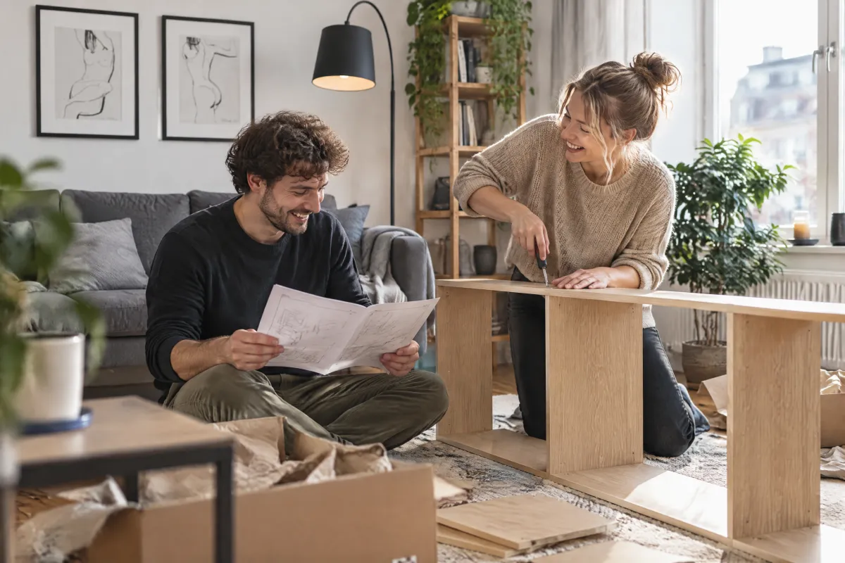
<div id="b2t-top"><img src="/previews/imagery/samples/otto-lifestyle-photo/lifestyle-living-room.webp" alt="Zwei Menschen bauen ein Regal im Wohnzimmer auf" style="display:block;margin:0;width:100%;aspect-ratio:3/1;object-fit:cover"></div>
<div style="display:grid;gap:16px;padding:24px 32px 48px">
  <p class="oc-copy-75 oc-text-color-secondary">Ratgeber · Wohnen</p>
  <p class="oc-headline-200">Möbel aufbauen: So klappt es ohne Stress</p>
  <p class="oc-copy-100">Ein neues Regal, ein Schrank oder der Sessel für die Leseecke: Mit etwas Vorbereitung steht dein neues Möbelstück schneller, als du denkst. Wir zeigen dir, worauf du achten solltest.</p>
  <p class="oc-headline-100">1. Platz schaffen</p>
  <p class="oc-copy-100">Räum die Fläche frei, auf der du arbeiten willst, und leg eine Decke oder den Karton als Unterlage aus. So schonst du Boden und Möbelteile.</p>
  <p class="oc-headline-100">2. Teile prüfen</p>
  <p class="oc-copy-100">Vergleiche alle Teile und Schrauben mit der Liste in der Anleitung. Fehlt etwas, meld dich bei unserem Kundenservice, wir schicken dir das Ersatzteil kostenlos.</p>
  <p class="oc-headline-100">3. Zu zweit geht es leichter</p>
  <p class="oc-copy-100">Große Teile wie Rückwände oder Türen lassen sich zu zweit sicherer ausrichten. Zieh die Schrauben erst fest an, wenn alles gerade sitzt.</p>
  <p class="oc-headline-100">4. Kippschutz nicht vergessen</p>
  <p class="oc-copy-100">Hohe Regale und Schränke gehören an die Wand. Den passenden Kippschutz findest du meist im Lieferumfang.</p>
  <oc-link-v2 icon-right="arrow-right"><a href="#">Aufbauservice buchen</a></oc-link-v2>