
Configurator
<div style="position:relative;transform:translateZ(0);min-height:220px;padding-top:88px">
  <oc-skip-link-v1>
    <oc-button-v1 variant="secondary" size="50" icon-type-left="skip-link">Empfehlungen überspringen</oc-button-v1>
  </oc-skip-link-v1>
  <div style="display:flex;flex-wrap:wrap;gap:8px">
    <oc-button-v1 variant="secondary" size="50">Sneaker</oc-button-v1>
    <oc-button-v1 variant="secondary" size="50">Jeans</oc-button-v1>
    <oc-button-v1 variant="secondary" size="50">Jacken</oc-button-v1>
  </div>
  <p class="demo-label" style="margin-top:16px">After the skipped section</p>
  <oc-link-v2><a href="#">Alle Kategorien</a></oc-link-v2>
</div>
Usage
Anatomy
- Skip link container (appears on keyboard focus)
- Button 50, secondary, with skip-link icon
HTML
<div class="anatomy">
<div style="display:inline-flex;gap:8px;padding:8px;border-radius:var(--oc-component-skip-link-border-radius,16px);background:var(--oc-semantic-color-background-above,#fff);filter:var(--oc-semantic-shadow-above)"><oc-button-v1 variant="secondary" size="50" icon-type-left="skip-link" style="flex:none">Zur Hauptnavigation</oc-button-v1><oc-button-v1 variant="secondary" size="50" icon-type-left="skip-link" style="flex:none">Zur Seitennavigation</oc-button-v1><oc-button-v1 variant="secondary" size="50" icon-type-left="skip-link" style="flex:none">Zum Inhalt</oc-button-v1></div>
<span class="anatomy-pin" style="left:0%;top:0%">1</span>
<span class="anatomy-pin" style="left:18%;top:100%">2</span>
<ol class="anatomy-key"><li data-n="1">Skip link container (appears on keyboard focus)</li><li data-n="2">Button 50, secondary, with skip-link icon</li></ol>
Variants
The header variant consists of several buttons that appear centered at the top of the page. It offers up to four targets, depending on which areas are available on the respective page and currently visible. "Hauptnavigation", "Seitennavigation" and "Filter" are not visible on breakpoints S and M and therefore do not appear as skip‑link options. In the app, „Zum Inhalt“ is also not needed because there is no header.
Breakpoint L: all applicable targets
Breakpoint S and app: only „Zum Inhalt“

Inspiration
HTML
<p class="demo-label">Breakpoint L: all applicable targets</p>
<div style="position:relative;background:#fff;padding:16px;display:grid;gap:16px">
<div style="width:96px"><img src="/references/logos/otto/otto-de-press-Otto_Logo_rgb.png" alt="OTTO" style="display:block;margin:0;width:100%"></div><div class="demo-row gap-8"><oc-icon-button-v3 variant="transparent" icon="wishlist" oc-aria-label="Merkzettel"></oc-icon-button-v3><oc-icon-button-v3 variant="transparent" icon="basket" oc-aria-label="Warenkorb"></oc-icon-button-v3></div></div>
<oc-link-v2 variant="secondary" size="75"><a href="#">Damen-Mode</a></oc-link-v2><oc-link-v2 variant="secondary" size="75"><a href="#">Herren-Mode</a></oc-link-v2><oc-link-v2 variant="secondary" size="75"><a href="#">Baby & Kind</a></oc-link-v2><oc-link-v2 variant="secondary" size="75"><a href="#">Möbel</a></oc-link-v2></div>
<p class="oc-headline-100">Inspiration</p>
<div style="position:absolute;left:50%;top:8px;transform:translateX(-50%);display:flex;gap:8px;padding:8px;white-space:nowrap;border-radius:var(--oc-component-skip-link-border-radius,16px);background:var(--oc-semantic-color-background-above,#fff);filter:var(--oc-semantic-shadow-above)"><oc-button-v1 variant="secondary" size="50" icon-type-left="skip-link" style="flex:none">Zur Hauptnavigation</oc-button-v1><oc-button-v1 variant="secondary" size="50" icon-type-left="skip-link" style="flex:none">Zum Inhalt</oc-button-v1></div>
</div>
<p class="demo-label">Breakpoint S and app: only „Zum Inhalt“</p>
<div style="position:relative;background:#fff;padding:16px;display:grid;gap:16px;max-width:320px">
<oc-icon-button-v3 variant="transparent" icon="burger" oc-aria-label="Sortiment"></oc-icon-button-v3><div style="width:72px"><img src="/references/logos/otto/otto-de-press-Otto_Logo_rgb.png" alt="OTTO" style="display:block;margin:0;width:100%"></div><oc-icon-button-v3 variant="transparent" icon="basket" oc-aria-label="Warenkorb"></oc-icon-button-v3></div>
<p class="oc-headline-100">Inspiration</p>
<div style="position:absolute;left:50%;top:8px;transform:translateX(-50%);display:flex;gap:8px;padding:8px;white-space:nowrap;border-radius:var(--oc-component-skip-link-border-radius,16px);background:var(--oc-semantic-color-background-above,#fff);filter:var(--oc-semantic-shadow-above)"><oc-button-v1 variant="secondary" size="50" icon-type-left="skip-link" style="flex:none">Zum Inhalt</oc-button-v1></div>
</div>
The in‑page variant is used within content to skip sections like recommendations or long navigation blocks. It mostly features a single button. Cinemas use an in‑page skip link as the first focusable element to allow skipping large item lists.
Empfehlungen für dich



HTML
<div class="on-frame" style="margin:0">
<div style="position:relative;background:#fff;padding:16px;display:grid;gap:16px">
  <p class="oc-headline-100">Empfehlungen für dich</p>
  <div style="display:grid;grid-template-columns:repeat(3,1fr);gap:8px"><img src="/references/images/otto/otto-fashion-drop-mojo-01.jpg" alt="" style="display:block;margin:0;width:100%;aspect-ratio:1;object-fit:cover"><img src="/references/images/otto/otto-fashion-drop-mojo-04.jpg" alt="" style="display:block;margin:0;width:100%;aspect-ratio:1;object-fit:cover"><img src="/references/images/otto/otto-fashion-drop-mojo-06.jpg" alt="" style="display:block;margin:0;width:100%;aspect-ratio:1;object-fit:cover"></div>
  <div style="position:absolute;left:24px;top:64px;display:flex;padding:8px;border-radius:var(--oc-component-skip-link-border-radius,16px);background:var(--oc-semantic-color-background-above,#fff);filter:var(--oc-semantic-shadow-above)"><oc-button-v1 variant="secondary" size="50" icon-type-left="skip-link" style="flex:none">Empfehlungen überspringen</oc-button-v1></div>
Behaviour
Interaction
Skip links remain hidden until they receive focus via keyboard. Activating a skip link triggers an immediate focus jump to or after a target; the page scrolls automatically if the target is out of view.
The header variant is positioned absolutely at the top of the page and centered. The in‑page variant appears just above its corresponding section.
States
Skip links use buttons inside, so the states are derived from them.
Fitting
The skip link container fits its content.
fit-content
HTML
<div style="display:inline-flex;gap:8px;padding:8px;outline:1px dashed #e5006b;outline-offset:4px;border-radius:var(--oc-component-skip-link-border-radius,16px);background:var(--oc-semantic-color-background-above,#fff);filter:var(--oc-semantic-shadow-above)"><oc-button-v1 variant="secondary" size="50" icon-type-left="skip-link" style="flex:none">Zur Hauptnavigation</oc-button-v1><oc-button-v1 variant="secondary" size="50" icon-type-left="skip-link" style="flex:none">Zur Seitennavigation</oc-button-v1><oc-button-v1 variant="secondary" size="50" icon-type-left="skip-link" style="flex:none">Zum Inhalt</oc-button-v1></div>
Placement
The header variant is positioned absolutely at the top of the page and centered.
The in‑page variant appears at the start of its corresponding section with a offset of 8px horizontally and vertically.
Inspiration
Empfehlungen für dich
Header variant: centred at the top of the page. In-page variant: 8px from the start of its section.
HTML
<div class="on-frame" style="margin:0">
<div style="position:relative;background:#fff;padding:16px;display:grid;gap:16px;border-top:2px solid #e5006b">
<div style="width:96px"><img src="/references/logos/otto/otto-de-press-Otto_Logo_rgb.png" alt="OTTO" style="display:block;margin:0;width:100%"></div><div class="demo-row gap-8"><oc-icon-button-v3 variant="transparent" icon="wishlist" oc-aria-label="Merkzettel"></oc-icon-button-v3><oc-icon-button-v3 variant="transparent" icon="basket" oc-aria-label="Warenkorb"></oc-icon-button-v3></div></div>
  <p class="oc-headline-100">Inspiration</p>
  <div style="position:relative;display:grid;gap:16px;padding-top:8px;border-top:1px solid #e5006b"><p class="oc-headline-50">Empfehlungen für dich</p>
    <div style="display:grid;grid-template-columns:repeat(3,1fr);gap:8px"><img src="/references/images/otto/otto-fashion-drop-mojo-01.jpg" alt="" style="display:block;margin:0;width:100%;aspect-ratio:4/3;object-fit:cover"><img src="/references/images/otto/otto-fashion-drop-mojo-04.jpg" alt="" style="display:block;margin:0;width:100%;aspect-ratio:4/3;object-fit:cover"><img src="/references/images/otto/otto-fashion-drop-mojo-06.jpg" alt="" style="display:block;margin:0;width:100%;aspect-ratio:4/3;object-fit:cover"></div>
    <div style="position:absolute;left:8px;top:48px;display:flex;padding:8px;border-radius:var(--oc-component-skip-link-border-radius,16px);background:var(--oc-semantic-color-background-above,#fff);filter:var(--oc-semantic-shadow-above)"><oc-button-v1 variant="secondary" size="50" icon-type-left="skip-link" style="flex:none">Empfehlungen überspringen</oc-button-v1></div>
  <div style="position:absolute;left:50%;top:8px;transform:translateX(-50%);display:flex;gap:8px;padding:8px;white-space:nowrap;border-radius:var(--oc-component-skip-link-border-radius,16px);background:var(--oc-semantic-color-background-above,#fff);filter:var(--oc-semantic-shadow-above)"><oc-button-v1 variant="secondary" size="50" icon-type-left="skip-link" style="flex:none">Zur Hauptnavigation</oc-button-v1><oc-button-v1 variant="secondary" size="50" icon-type-left="skip-link" style="flex:none">Zum Inhalt</oc-button-v1></div>
<p class="demo-label" style="margin-top:8px">Header variant: centred at the top of the page. In-page variant: 8px from the start of its section.</p>
Best practices
Use skip links where they help users avoid long or repetitive sections. Keep their usage focused and consistent. They are particularly helpful in areas with large or repeating content and should be offered whenever they significantly reduce keyboard navigation effort.
Sneaker
Adresse ändern
A skip link should never directly lead to another skip link.
Sneaker
HTML
<div style="position:relative;display:grid;gap:12px;padding:12px;background:#fff;box-shadow:0 0 0 8px #f0f0f0;margin:8px auto;max-width:360px">
<oc-icon-button-v3 variant="transparent" icon="burger" oc-aria-label="Sortiment"></oc-icon-button-v3><div style="width:64px"><img src="/references/logos/otto/otto-de-press-Otto_Logo_rgb.png" alt="OTTO" style="display:block;margin:0;width:100%"></div><oc-icon-button-v3 variant="transparent" icon="basket" oc-aria-label="Warenkorb"></oc-icon-button-v3></div>
<p class="demo-title">Sneaker</p><oc-icon-button-v3 variant="primary" size="50" icon="filter" oc-aria-label="Filter"></oc-icon-button-v3></div>
<div style="height:140px;background:var(--oc-semantic-color-background-soft-mint)"></div>
<div style="position:absolute;left:50%;top:6px;transform:translateX(-50%);display:flex;padding:6px;border-radius:var(--oc-component-skip-link-border-radius,16px);background:var(--oc-semantic-color-background-above,#fff);filter:var(--oc-semantic-shadow-above)"><oc-button-v1 variant="secondary" size="50" icon-type-left="skip-link" style="flex:none">Zur Navigation</oc-button-v1></div>
<div style="position:absolute;left:50%;top:62px;transform:translateX(-50%);display:flex;padding:6px;border-radius:var(--oc-component-skip-link-border-radius,16px);background:var(--oc-semantic-color-background-above,#fff);filter:var(--oc-semantic-shadow-above)"><oc-button-v1 variant="secondary" size="50" icon-type-left="skip-link" style="flex:none">Zum Inhalt</oc-button-v1></div>
Users should encounter all consecutive skip link options in a single focus stop, not scattered across separate containers.
HTML
<div style="display:inline-flex;gap:8px;padding:8px;border-radius:var(--oc-component-skip-link-border-radius,16px);background:var(--oc-semantic-color-background-above,#fff);filter:var(--oc-semantic-shadow-above)"><oc-button-v1 variant="secondary" size="50" icon-type-left="skip-link" style="flex:none">Zur Navigation</oc-button-v1><oc-button-v1 variant="secondary" size="50" icon-type-left="skip-link" style="flex:none">Zu den Filtern</oc-button-v1><oc-button-v1 variant="secondary" size="50" icon-type-left="skip-link" style="flex:none">Zum Inhalt</oc-button-v1></div>
Apply them in sections that are long or repetitive.
Sneaker
HTML
<div style="position:relative;display:grid;gap:12px;padding:12px;background:#fff;box-shadow:0 0 0 8px #f0f0f0;margin:8px auto;max-width:360px">
<oc-icon-button-v3 variant="transparent" icon="burger" oc-aria-label="Sortiment"></oc-icon-button-v3><div style="width:64px"><img src="/references/logos/otto/otto-de-press-Otto_Logo_rgb.png" alt="OTTO" style="display:block;margin:0;width:100%"></div><oc-icon-button-v3 variant="transparent" icon="basket" oc-aria-label="Warenkorb"></oc-icon-button-v3></div>
<p class="demo-title">Sneaker</p>
<div style="position:relative;height:140px;background:var(--oc-semantic-color-background-soft-mint)"><div style="position:absolute;left:-4px;top:-8px;display:flex;padding:6px;border-radius:var(--oc-component-skip-link-border-radius,16px);background:var(--oc-semantic-color-background-above,#fff);filter:var(--oc-semantic-shadow-above)"><oc-button-v1 variant="secondary" size="50" icon-type-left="skip-link" style="flex:none">Empfehlungen überspringen</oc-button-v1></div></div>
<div style="height:60px;background:var(--oc-semantic-color-background-soft-mint)"></div>
Only insert them where they add real value; too many skip options create noise rather than accessibility.
Sneaker
HTML
<div style="position:relative;display:grid;gap:12px;padding:12px;background:#fff;box-shadow:0 0 0 8px #f0f0f0;margin:8px auto;max-width:360px">
<oc-icon-button-v3 variant="transparent" icon="burger" oc-aria-label="Sortiment"></oc-icon-button-v3><div style="width:64px"><img src="/references/logos/otto/otto-de-press-Otto_Logo_rgb.png" alt="OTTO" style="display:block;margin:0;width:100%"></div><oc-icon-button-v3 variant="transparent" icon="basket" oc-aria-label="Warenkorb"></oc-icon-button-v3></div>
<p class="demo-title">Sneaker</p>
<div style="position:relative;height:140px;background:var(--oc-semantic-color-background-soft-mint)"><div style="position:absolute;left:-4px;top:-8px;display:flex;padding:6px;border-radius:var(--oc-component-skip-link-border-radius,16px);background:var(--oc-semantic-color-background-above,#fff);filter:var(--oc-semantic-shadow-above)"><oc-button-v1 variant="secondary" size="50" icon-type-left="skip-link" style="flex:none">Empfehlungen überspringen</oc-button-v1></div></div>
<div style="position:relative;height:60px;background:var(--oc-semantic-color-background-soft-mint)"><div style="position:absolute;left:-4px;top:-8px;display:flex;padding:6px;border-radius:var(--oc-component-skip-link-border-radius,16px);background:var(--oc-semantic-color-background-above,#fff);filter:var(--oc-semantic-shadow-above)"><oc-button-v1 variant="secondary" size="50" icon-type-left="skip-link" style="flex:none">Bewertungen überspringen</oc-button-v1></div></div>
Content guidelines
Header skip links always follow the pattern „Zurm [Bereich]“ (e.g., „Zu den Filtern“).
In‑page skip links always follow the pattern „[Bereich] überspringen“ (e.g., „Empfehlungen überspringen“).
Accessibility
Skip links must be reachable early in the tab order to meet WCAG’s bypass‑blocks requirement (2.4.1).
Status
Related components
Implementation
Live demo
Click into this frame, then press Tab: the in-page skip link appears at the start of the recommendations
Das könnte dir auch gefallen
Newsletter anmelden & Vorteile sichern
Die Empfehlungen wurden übersprungen, der Fokus landet hier.
HTML
<div class="on-frame" style="margin:0;padding:24px">
<div style="display:grid;gap:16px;max-width:880px;margin:0 auto">
<div style="position:relative;background:#fff;border-radius:16px;padding:16px;display:grid;gap:16px">
<oc-skip-link-v1><oc-button-v1 variant="secondary" size="50" icon-type-left="skip-link" style="flex:none">Empfehlungen überspringen</oc-button-v1></oc-skip-link-v1>
<p class="oc-headline-100">Das könnte dir auch gefallen</p>
<div style="display:grid;grid-template-columns:repeat(3,minmax(0,1fr));gap:12px">
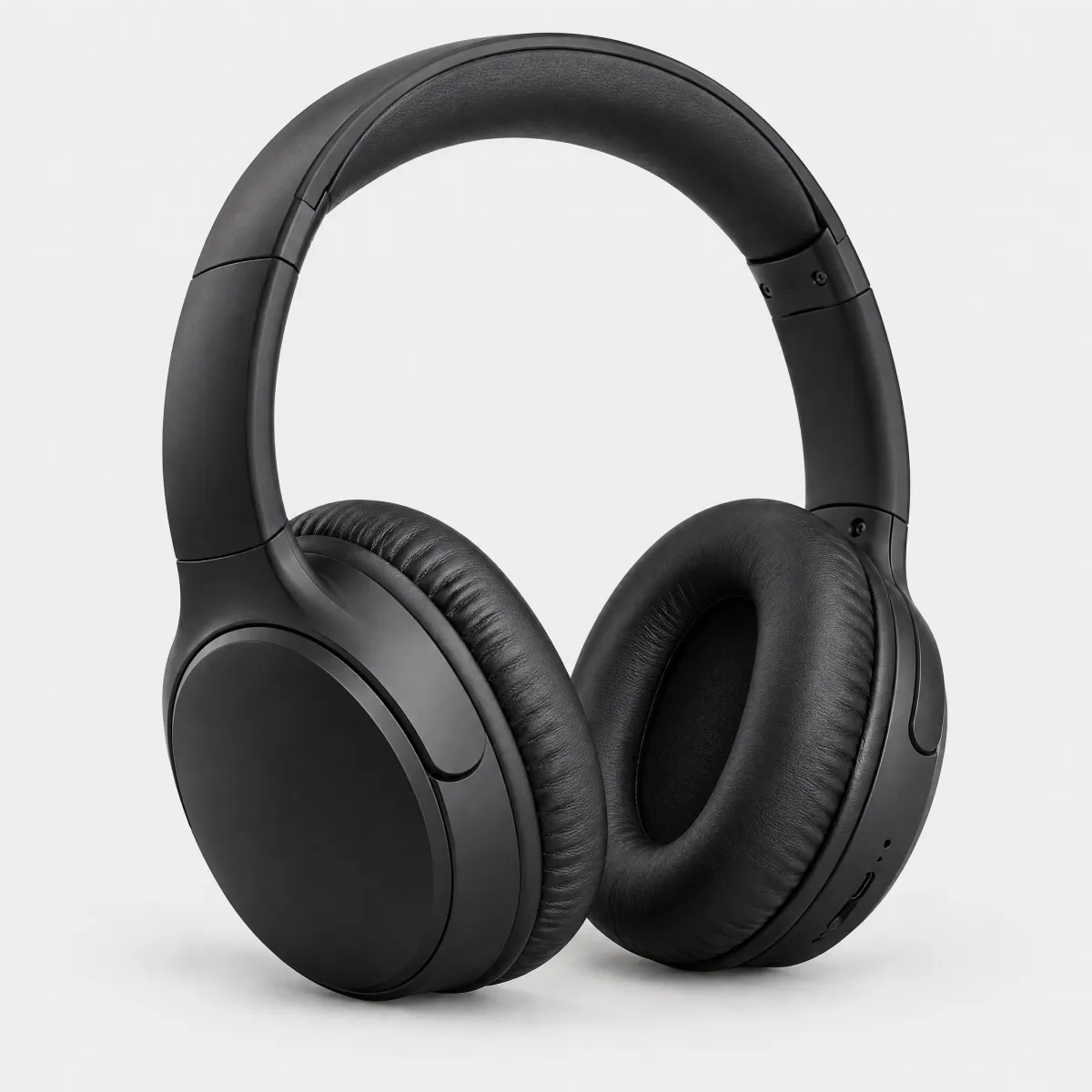
<oc-interactive-overlay-v2 style="--border-radius:12px;width:auto"><a href="#" style="display:grid;gap:4px;text-decoration:none;color:inherit"><img src="/previews/imagery/samples/otto-product-still/product-headphones.webp" alt="" style="display:block;margin:0;width:100%;aspect-ratio:1;object-fit:cover;border-radius:12px"><span class="oc-copy-75">Kopfhörer, Noise Cancelling</span><span class="oc-headline-50">149,99 €</span></a></oc-interactive-overlay-v2>
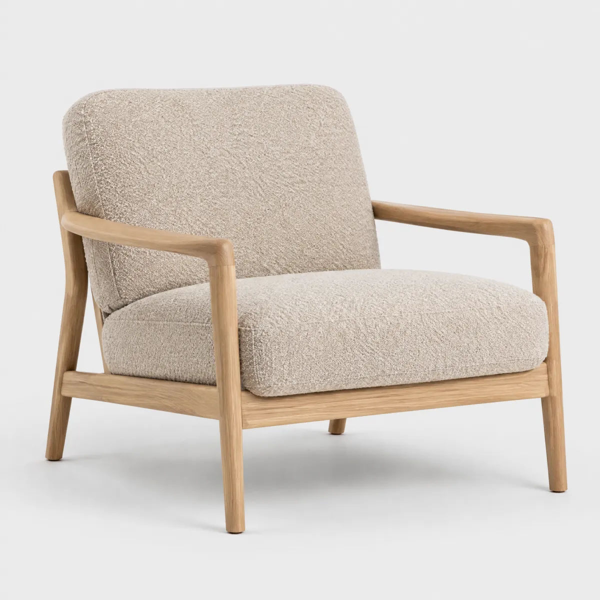
<oc-interactive-overlay-v2 style="--border-radius:12px;width:auto"><a href="#" style="display:grid;gap:4px;text-decoration:none;color:inherit"><img src="/previews/imagery/samples/otto-product-still/product-armchair.webp" alt="" style="display:block;margin:0;width:100%;aspect-ratio:1;object-fit:cover;border-radius:12px"><span class="oc-copy-75">Sessel „Lina“, Bouclé</span><span class="oc-headline-50">399,00 €</span></a></oc-interactive-overlay-v2>
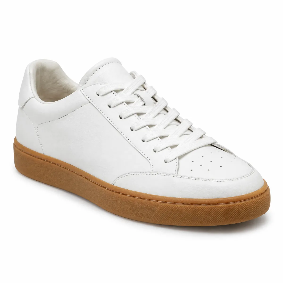
<oc-interactive-overlay-v2 style="--border-radius:12px;width:auto"><a href="#" style="display:grid;gap:4px;text-decoration:none;color:inherit"><img src="/previews/imagery/samples/otto-product-still/product-sneaker.webp" alt="" style="display:block;margin:0;width:100%;aspect-ratio:1;object-fit:cover;border-radius:12px"><span class="oc-copy-75">Ledersneaker „Court“</span><span class="oc-headline-50 oc-text-color-sale">89,99 €</span></a></oc-interactive-overlay-v2>
<oc-block-v2><div style="display:grid;gap:8px"><p class="oc-headline-100">Newsletter anmelden & Vorteile sichern</p><p class="oc-copy-75 oc-text-color-secondary">Die Empfehlungen wurden übersprungen, der Fokus landet hier.</p><div class="demo-row gap-8" style="flex-wrap:nowrap"><div style="flex:1"><oc-text-field-v1>E-Mail-Adresse</oc-text-field-v1></div><oc-button-v1 variant="secondary" fit-content>Anmelden</oc-button-v1></div></div></oc-block-v2>