
Configurator
<oc-progress-bar-v1 min="0" max="5" variant="primary" size="100" value="2" oc-aria-label="Fortschritt deiner Bestellung"></oc-progress-bar-v1>Usage
Anatomy
- Indicator (progress)
- Track
- End point
HTML
<div class="anatomy" style="width:min(400px,80%);margin:40px 24px 28px">
<oc-progress-bar-v1 value="0.55" oc-aria-label="Fortschritt"></oc-progress-bar-v1>
<span class="anatomy-pin" style="left:25%;top:-120%">1</span>
<span class="anatomy-pin" style="left:75%;top:-120%">2</span>
<span class="anatomy-pin" style="left:99%;top:220%">3</span>
<ol class="anatomy-key"><li data-n="1">Indicator (progress)</li><li data-n="2">Track</li><li data-n="3">End point</li></ol>
Variants
The progress bar is available in the sizes 100 and 50. The progress bar has two neutral variants and four functional variants:
- primary
- secondary
- success
- error
- warning
- hint
Size 100
Size 50
Neutral: primary, secondary
Functional: success, error, warning, hint
HTML
<div class="on-frame" style="margin:0;display:grid;grid-template-columns:repeat(2,minmax(0,1fr));gap:8px">
<p class="demo-label" style="padding-top:8px">Size 100</p><p class="demo-label" style="padding-top:8px">Size 50</p>
<p class="demo-label" style="grid-column:1/-1;padding-top:8px">Neutral: primary, secondary</p>
<div style="background:var(--oc-semantic-color-background-canvas, #fff);padding:24px 16px"><oc-progress-bar-v1 value="0.55" variant="primary"></oc-progress-bar-v1></div>
<div style="background:var(--oc-semantic-color-background-canvas, #fff);padding:24px 16px"><oc-progress-bar-v1 value="0.55" variant="primary" size="50"></oc-progress-bar-v1></div>
<div style="background:var(--oc-semantic-color-background-canvas, #fff);padding:24px 16px"><oc-progress-bar-v1 value="0.55" variant="secondary"></oc-progress-bar-v1></div>
<div style="background:var(--oc-semantic-color-background-canvas, #fff);padding:24px 16px"><oc-progress-bar-v1 value="0.55" variant="secondary" size="50"></oc-progress-bar-v1></div>
<p class="demo-label" style="grid-column:1/-1;padding-top:8px">Functional: success, error, warning, hint</p>
<div style="background:var(--oc-semantic-color-background-canvas, #fff);padding:24px 16px"><oc-progress-bar-v1 value="0.55" variant="success"></oc-progress-bar-v1></div>
<div style="background:var(--oc-semantic-color-background-canvas, #fff);padding:24px 16px"><oc-progress-bar-v1 value="0.55" variant="success" size="50"></oc-progress-bar-v1></div>
<div style="background:var(--oc-semantic-color-background-canvas, #fff);padding:24px 16px"><oc-progress-bar-v1 value="0.55" variant="error"></oc-progress-bar-v1></div>
<div style="background:var(--oc-semantic-color-background-canvas, #fff);padding:24px 16px"><oc-progress-bar-v1 value="0.55" variant="error" size="50"></oc-progress-bar-v1></div>
<div style="background:var(--oc-semantic-color-background-canvas, #fff);padding:24px 16px"><oc-progress-bar-v1 value="0.55" variant="warning"></oc-progress-bar-v1></div>
<div style="background:var(--oc-semantic-color-background-canvas, #fff);padding:24px 16px"><oc-progress-bar-v1 value="0.55" variant="warning" size="50"></oc-progress-bar-v1></div>
<div style="background:var(--oc-semantic-color-background-canvas, #fff);padding:24px 16px"><oc-progress-bar-v1 value="0.55" variant="hint"></oc-progress-bar-v1></div>
<div style="background:var(--oc-semantic-color-background-canvas, #fff);padding:24px 16px"><oc-progress-bar-v1 value="0.55" variant="hint" size="50"></oc-progress-bar-v1></div>
All variants can be set to over-color. Make sure to check this option, if you place the progress bar on colored backgrounds.
Neutral, over-color
Functional, over-color
HTML
<div style="display:grid;grid-template-columns:repeat(2,minmax(0,1fr));gap:8px">
<p class="demo-label" style="grid-column:1/-1;padding-top:8px">Neutral, over-color</p>
<div style="background:var(--oc-semantic-color-background-frame, #f0f0f0);padding:24px 16px"><oc-progress-bar-v1 value="0.55" variant="primary" over-color></oc-progress-bar-v1></div>
<div style="background:var(--oc-semantic-color-background-frame, #f0f0f0);padding:24px 16px"><oc-progress-bar-v1 value="0.55" variant="secondary" over-color></oc-progress-bar-v1></div>
<p class="demo-label" style="grid-column:1/-1;padding-top:8px">Functional, over-color</p>
<div style="background:var(--oc-semantic-color-background-frame, #f0f0f0);padding:24px 16px"><oc-progress-bar-v1 value="0.55" variant="success" over-color></oc-progress-bar-v1></div>
<div style="background:var(--oc-semantic-color-background-frame, #f0f0f0);padding:24px 16px"><oc-progress-bar-v1 value="0.55" variant="error" over-color></oc-progress-bar-v1></div>
<div style="background:var(--oc-semantic-color-background-frame, #f0f0f0);padding:24px 16px"><oc-progress-bar-v1 value="0.55" variant="warning" over-color></oc-progress-bar-v1></div>
<div style="background:var(--oc-semantic-color-background-frame, #f0f0f0);padding:24px 16px"><oc-progress-bar-v1 value="0.55" variant="hint" over-color></oc-progress-bar-v1></div>
Behavior
Interaction
The progress bar is not interactive.
Placement
You can place the progress bar according to your needs. Make sure that you place it near its context elements. The progress bar should not be placed standalone.
Dir fehlen noch 40 € zum Mindestbestellwert von 80 €
HTML
<div class="on-frame" style="margin:0;padding:24px"><div class="demo-stack" style="background:var(--oc-semantic-color-background-canvas, #fff);padding:24px 16px;max-width:360px;margin:0 auto;gap:12px;padding:24px">
<oc-progress-bar-v1 value="40" max="80" oc-aria-label="Mindestbestellwert: {{value}} von {{max}} Euro"></oc-progress-bar-v1>
<p class="demo-copy">Dir fehlen noch 40 € zum Mindestbestellwert von 80 €</p>
</div>
Fitting
By default the width of the progress bar is set to fill-parent, but you can adjust the width of the progress bar according to your needs. The height of the progress bar is fixed to 8px at size 100 and 4px at size 50.
fill-parent
HTML
<div class="on-frame" style="margin:0;padding:24px"><div class="demo-stack" style="background:var(--oc-semantic-color-background-canvas, #fff);padding:24px 16px;max-width:360px;margin:0 auto;gap:12px;padding:16px 24px 32px">
<p class="demo-label" style="text-align:center">fill-parent</p>
<oc-progress-bar-v1 value="0.5"></oc-progress-bar-v1>
</div>
Size 100: 8 px
Size 50: 4 px
HTML
<div class="on-frame" style="margin:0;display:grid;gap:8px">
<div style="background:var(--oc-semantic-color-background-canvas, #fff);padding:24px 16px;display:grid;grid-template-columns:auto minmax(0,360px);justify-content:center;align-items:center;gap:16px"><p class="demo-label">Size 100: 8 px</p><oc-progress-bar-v1 value="0.55"></oc-progress-bar-v1></div>
<div style="background:var(--oc-semantic-color-background-canvas, #fff);padding:24px 16px;display:grid;grid-template-columns:auto minmax(0,360px);justify-content:center;align-items:center;gap:16px"><p class="demo-label">Size 50: 4 px</p><oc-progress-bar-v1 value="0.55" size="50"></oc-progress-bar-v1></div>
Stepped
Use the stepped variant of the progress bar to display multiple steps of the task. The stepped progress bar can show how many steps of a task are completed and how many remain, e.g. for collecting OTTO Up points.
Dir fehlen noch 3 Bestellungen für 100 OTTO UP Punkte.
HTML
<div class="on-frame" style="margin:0;padding:24px"><div class="demo-stack" style="background:var(--oc-semantic-color-background-canvas, #fff);padding:24px 16px;gap:12px;padding:24px">
<oc-progress-bar-v1 value="2" min="0" max="5" steps="5" oc-aria-label="OTTO UP Punkte: {{value}} von {{max}} Bestellungen"></oc-progress-bar-v1>
<p class="demo-copy">Dir fehlen noch 3 Bestellungen für 100 OTTO UP Punkte.</p>
</div>
Best Practices
Dir fehlen noch 40 € zum Mindestbestellwert von 80 €
Dir fehlen noch 40 € zum Mindestbestellwert von 80 €
Seite wird geladen.
Vervollständige den letzten Schritt, um dein Konto anzulegen.
Vervollständige den letzten Schritt, um dein Konto anzulegen.
In 40 Schritten hast du es geschafft!
Accessibility
For information on accessibility, refer to the technical documentation.
Status
Implementation
Note: For full technical documentation of this component, visitStorybook/Progress bar.
Live demo
Dein Warenkorb
1 Artikel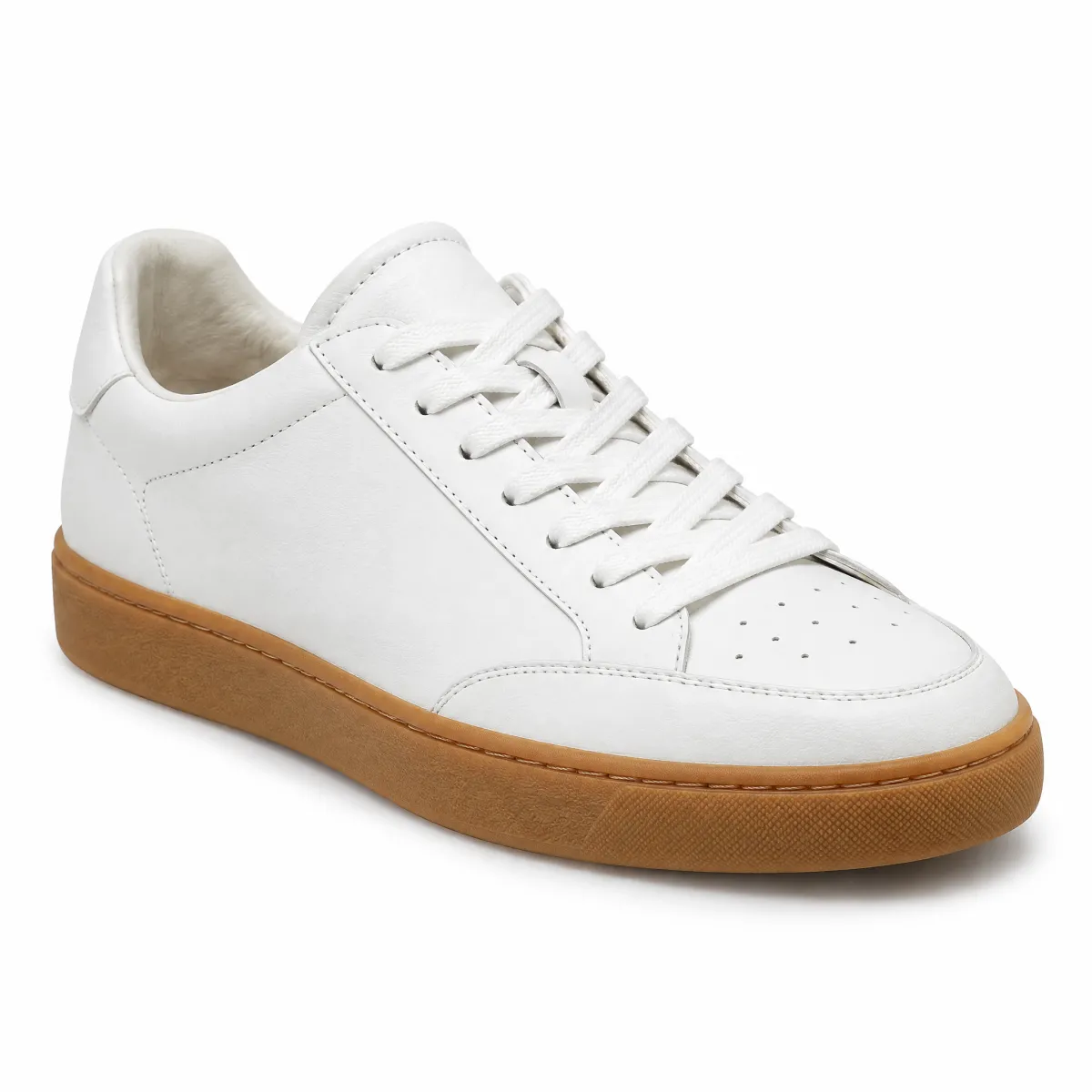
Sneaker aus Glattleder, Weiß
Größe 42
Noch 20,01 € bis zur versandkostenfreien Lieferung.
Mit dieser Bestellung fehlen dir nur noch 2 für 100 OTTO UP Punkte.
HTML
<div class="on-frame" style="margin:0;padding:24px">
<div style="background:var(--oc-semantic-color-background-canvas, #fff);border-radius:16px;padding:24px;display:flex;flex-direction:column;gap:16px;box-shadow:0 0 0 1px rgba(0,0,0,.06);max-width:420px;margin:0 auto"><div style="display:flex;justify-content:space-between;align-items:baseline"><p class="demo-title" style="font-size:1.125rem">Dein Warenkorb</p><span class="demo-copy" style="color:var(--oc-semantic-color-text-secondary, #6d6d6d)">1 Artikel</span></div><div style="display:flex;gap:12px;align-items:center"><img src="/previews/imagery/samples/otto-product-still/product-sneaker.webp" alt="Sneaker aus Glattleder" width="72" height="72" style="margin:0;border-radius:12px;background:#f3f3f3"><div style="flex:1"><p class="demo-copy">Sneaker aus Glattleder, Weiß</p><p class="demo-copy" style="color:var(--oc-semantic-color-text-secondary, #6d6d6d)">Größe 42</p></div><strong style="color:var(--oc-semantic-color-text-sale, #e20020)">79,99 €</strong></div><div class="demo-stack" style="gap:8px"><oc-progress-bar-v1 value="79.99" max="100" variant="success" oc-aria-label="Warenwert {{value}} von {{max}} Euro"></oc-progress-bar-v1><p class="demo-copy">Noch <strong>20,01 €</strong> bis zur versandkostenfreien Lieferung.</p></div><div class="demo-stack" style="gap:8px;border-top:1px solid rgba(0,0,0,.1);padding-top:16px"><oc-progress-bar-v1 value="3" max="5" steps="5" oc-aria-label="OTTO UP: {{value}} von {{max}} Bestellungen"></oc-progress-bar-v1><p class="demo-copy">Mit dieser Bestellung fehlen dir nur noch 2 für 100 OTTO UP Punkte.</p></div><oc-button-v1 variant="primary">Zur Kasse</oc-button-v1></div>