OTTODesign System

Components

Block

A block is a static container that contains content or components that are related to a single topic.

Configurator

LiveBlock: elevation, background colour and content (shown on the frame)

Lieferung

Deine Bestellung ist in 2 bis 4 Werktagen bei dir. Ab 29 € liefern wir kostenlos.

Mehr zur Lieferung
HTML
<div class="oc-background-color-frame" style="padding:24px;width:520px;max-width:100%;box-sizing:border-box"><oc-block-v2><div style="display:grid;gap:8px;justify-items:start"><p class="oc-headline-200">Lieferung</p><p class="oc-copy-100">Deine Bestellung ist in 2 bis 4 Werktagen bei dir. Ab 29 € liefern wir kostenlos.</p><oc-link-v2><a href="#">Mehr zur Lieferung</a></oc-link-v2></div></oc-block-v2></div>

Usage

Blocks vs. cards

Blocks contain content which is part of the current page (onsite content). Cards on the other hand usually lead away from the current page (offsite content). Blocks mostly contain static content (e.g. text) but can also house interactive components. Blocks themselves are never interactive. To emphasize this, they don't have rounded corners like cards or other interactive components. Blocks help to structure and distinguish different topics from each other.

Variants

The block's background uses canvas color by default, but it can also be used with a colored background using the intended color design tokens.

Canvas (default)

Colour token (soft beige)

Livevariants
HTML
<div class="on-frame" style="display:grid;grid-template-columns:1fr 1fr;gap:48px">
<p class="demo-label">Canvas (default)</p><oc-block-v2><img src="/previews/imagery/samples/otto-lifestyle-photo/lifestyle-living-room.webp" alt="" style="display:block;margin:0;width:100%;aspect-ratio:5/2;object-fit:cover"></oc-block-v2></div>
<p class="demo-label">Colour token (soft beige)</p><oc-block-v2 style="--background-color:var(--oc-semantic-color-background-soft-beige)"><img src="/previews/imagery/samples/otto-lifestyle-photo/lifestyle-living-room.webp" alt="" style="display:block;margin:0;width:100%;aspect-ratio:5/2;object-fit:cover"></oc-block-v2></div>

Behavior

Fitting

Blocks have a flexible layout and dimensions based on their content and context (using fill-parent for the width and fit-content for the height). Sometimes it can be useful to use a block with a fixed height or width. Blocks have predefined paddings which can be customized if needed.

Width fill-parent, height fit-content

Livefitting
HTML
<div class="on-frame"><div class="group" style="max-width:460px;margin:0 auto"><p class="demo-label">Width fill-parent, height fit-content</p>
<oc-block-v2><img src="/previews/imagery/samples/otto-lifestyle-photo/lifestyle-living-room.webp" alt="" style="display:block;margin:0;width:100%;aspect-ratio:6/1;object-fit:cover"></oc-block-v2>
</div>

default (24px top and bottom, 16px sides)

example 1 (no horizontal padding)

example 2 (no padding)

Livepaddings
HTML
<div class="on-frame" style="display:grid;grid-template-columns:repeat(3,minmax(0,1fr));gap:24px;align-items:start">
<oc-block-v2><img src="/previews/imagery/samples/otto-lifestyle-photo/lifestyle-living-room.webp" alt="" style="display:block;margin:0;width:100%;aspect-ratio:13/8;object-fit:cover"></oc-block-v2><p class="demo-label">default (24px top and bottom, 16px sides)</p></div>
<oc-block-v2 style="--custom-spacing-x:0px"><img src="/previews/imagery/samples/otto-lifestyle-photo/lifestyle-living-room.webp" alt="" style="display:block;margin:0;width:100%;aspect-ratio:3/2;object-fit:cover"></oc-block-v2><p class="demo-label">example 1 (no horizontal padding)</p></div>
<oc-block-v2 style="--custom-spacing-x:0px;--custom-spacing-y:0px"><img src="/previews/imagery/samples/otto-lifestyle-photo/lifestyle-living-room.webp" alt="" style="display:block;margin:0;width:100%;aspect-ratio:4/3;object-fit:cover"></oc-block-v2><p class="demo-label">example 2 (no padding)</p></div>

Placement

To arrange blocks vertically, it is recommended to use a spacing of 4px. If there are blocks from different topics beneath each other, a larger spacing, such as 40px, can also be used. To arrange blocks horizontally, use a 4px spacing.

Same topic: 4px

Lieferadresse

Erika Mustermann, Werner-Otto-Straße 1–7, 22179 Hamburg

Rechnungsadresse

Wie Lieferadresse

Different topics: 40px

Lieferadresse

Erika Mustermann, Werner-Otto-Straße 1–7, 22179 Hamburg

Zahlungsart

Kauf auf Rechnung

Liveplacement vertical
HTML
<div class="on-frame" style="display:grid;grid-template-columns:1fr 1fr;gap:48px">
<p class="demo-label">Same topic: 4px</p><div style="display:grid;gap:4px">
  <oc-block-v2><div style="display:grid;gap:8px"><p class="oc-headline-100">Lieferadresse</p><p class="oc-copy-100">Erika Mustermann, Werner-Otto-Straße 1–7, 22179 Hamburg</p></div></oc-block-v2>
  <oc-block-v2><div style="display:grid;gap:8px"><p class="oc-headline-100">Rechnungsadresse</p><p class="oc-copy-100">Wie Lieferadresse</p></div></oc-block-v2>
</div>
<p class="demo-label">Different topics: 40px</p><div style="display:grid;gap:40px">
  <oc-block-v2><div style="display:grid;gap:8px"><p class="oc-headline-100">Lieferadresse</p><p class="oc-copy-100">Erika Mustermann, Werner-Otto-Straße 1–7, 22179 Hamburg</p></div></oc-block-v2>
  <oc-block-v2><div style="display:grid;gap:8px"><p class="oc-headline-100">Zahlungsart</p><p class="oc-copy-100">Kauf auf Rechnung</p></div></oc-block-v2>
</div>
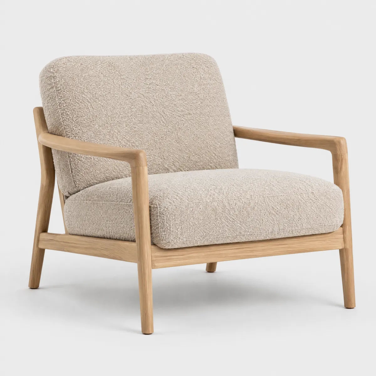
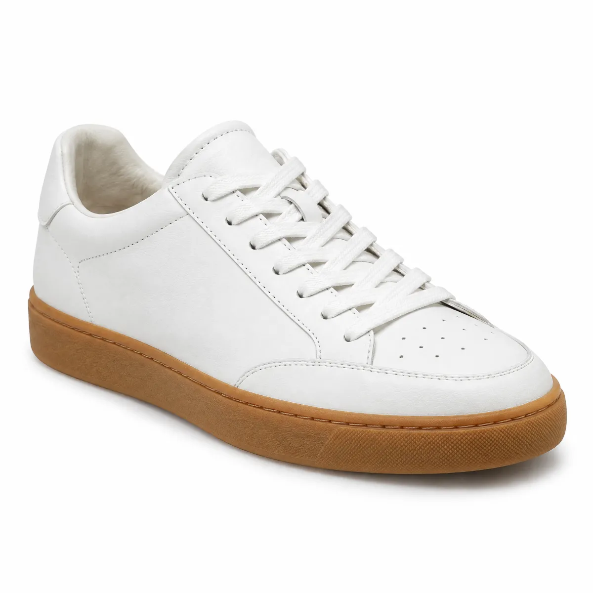
4px horizontal gap

Liveplacement horizontal
HTML
<div class="on-frame"><div style="max-width:460px;margin:0 auto;display:grid;grid-template-columns:1fr 1fr;gap:4px">
<oc-block-v2><img src="/previews/imagery/samples/otto-product-still/product-armchair.webp" alt="" style="display:block;margin:0;width:100%;aspect-ratio:1;object-fit:cover"></oc-block-v2>
<oc-block-v2><img src="/previews/imagery/samples/otto-product-still/product-sneaker.webp" alt="" style="display:block;margin:0;width:100%;aspect-ratio:1;object-fit:cover"></oc-block-v2>
<p class="demo-label" style="text-align:center;margin-top:12px">4px horizontal gap</p></div>
Elevation

Blocks are placed on frame (level 0) as part of canvas (level 1). Blocks can also be placed on top of canvas (inside blocks) as stacked blocks (level 1.5). Therefore, stacked blocks have an outline but no background color. They can only be used inside other blocks. They also have predefined paddings that can be customized if needed. They can also be used inside colored blocks. The content of stacked blocks can be divided with a divider.

Stacked block inside a canvas block

Lieferung

Deine Bestellung ist in 2 bis 4 Werktagen bei dir.

Stacked block inside a coloured block

Lieferung

Deine Bestellung ist in 2 bis 4 Werktagen bei dir.

Stacked block content divided by a divider

Lieferung

Deine Bestellung ist in 2 bis 4 Werktagen bei dir.

Rücksendung

Du hast 30 Tage Zeit, Artikel kostenlos zurückzuschicken.

Liveelevation
HTML
<div class="on-frame"><div style="max-width:420px;margin:0 auto;display:grid;gap:40px">
<p class="demo-label">Stacked block inside a canvas block</p><oc-block-v2><oc-block-v2 elevation-level="stacked"><div style="display:grid;gap:8px"><p class="oc-headline-100">Lieferung</p><p class="oc-copy-100">Deine Bestellung ist in 2 bis 4 Werktagen bei dir.</p></div></oc-block-v2></oc-block-v2></div>
<p class="demo-label">Stacked block inside a coloured block</p><oc-block-v2 style="--background-color:var(--oc-semantic-color-background-soft-beige)"><oc-block-v2 elevation-level="stacked"><div style="display:grid;gap:8px"><p class="oc-headline-100">Lieferung</p><p class="oc-copy-100">Deine Bestellung ist in 2 bis 4 Werktagen bei dir.</p></div></oc-block-v2></oc-block-v2></div>
<p class="demo-label">Stacked block content divided by a divider</p><oc-block-v2><oc-block-v2 elevation-level="stacked"><div style="display:grid;gap:16px"><div style="display:grid;gap:8px"><p class="oc-headline-100">Lieferung</p><p class="oc-copy-100">Deine Bestellung ist in 2 bis 4 Werktagen bei dir.</p></div><oc-divider-v1 in-flow></oc-divider-v1><div style="display:grid;gap:8px"><p class="oc-headline-100">Rücksendung</p><p class="oc-copy-100">Du hast 30 Tage Zeit, Artikel kostenlos zurückzuschicken.</p></div></div></oc-block-v2></oc-block-v2></div>
</div>

Best practices

Lieferung

Deine Bestellung ist in 2 bis 4 Werktagen bei dir. Ab 29 € liefern wir kostenlos.

DoUse static block.
Don'tMake block interactive.

Lieferung

Deine Bestellung ist in 2 bis 4 Werktagen bei dir. Ab 29 € liefern wir kostenlos.

DoUse blocks with default background color.

Lieferung

Deine Bestellung ist in 2 bis 4 Werktagen bei dir.

Rücksendung

30 Tage kostenlos zurückschicken.

Zahlung

Auf Rechnung, per PayPal oder Karte.

CautionOveruse blocks with other background colors than canvas or frame.

Versand und Lieferung

Deine Bestellung ist in der Regel in 2 bis 4 Werktagen bei dir. Ab 29 € Bestellwert liefern wir kostenlos. Große Artikel wie Möbel bringt dir unsere Spedition bis in die Wohnung, den Termin stimmen wir vorher mit dir ab. Du bekommst eine E-Mail, sobald dein Paket unterwegs ist.

DoPlace static content inside a block.

Versand und Lieferung

Deine Bestellung ist in der Regel in 2 bis 4 Werktagen bei dir. Ab 29 € Bestellwert liefern wir kostenlos. Große Artikel wie Möbel bringt dir unsere Spedition bis in die Wohnung, den Termin stimmen wir vorher mit dir ab.

Don'tPlace static content outside of blocks.

Lieferung

Deine Bestellung ist in 2 bis 4 Werktagen bei dir. Ab 29 € liefern wir kostenlos.

DoUse stacked block inside a block.

Lieferung

Deine Bestellung ist in 2 bis 4 Werktagen bei dir. Ab 29 € liefern wir kostenlos.

Don'tUse stacked block outside of a block.

Lieferung: 2 bis 4 Werktage

Versand: kostenlos ab 29 €

Rücksendung: 30 Tage kostenlos

DoUse dividers within or spacing between stacked blocks to structure content, if needed.

Lieferung

Deine Bestellung ist in 2 bis 4 Werktagen bei dir.

Rücksendung: 30 Tage kostenlos

Don'tPlace stacked blocks directly adjacent to other stacked blocks.

Content guidelines

A block's content can be filled with almost any type of content or component. Note that you should not mix content from different topics within a single block.

Versand und Lieferung

Deine Bestellung ist in der Regel in 2 bis 4 Werktagen bei dir. Ab 29 € Bestellwert liefern wir kostenlos. Große Artikel wie Möbel bringt dir unsere Spedition bis in die Wohnung.

Sendung verfolgen

Rücksendung

Du hast 30 Tage Zeit, Artikel kostenlos zurückzuschicken. Melde die Rücksendung in deinem Kundenkonto an und druck das Etikett aus, oder zeig den QR-Code im Paketshop.

Rücksendung anmelden
Liveblock with example content
HTML
<div class="on-frame"><div style="max-width:420px;margin:0 auto;display:grid;gap:4px">
<oc-block-v2><div style="display:grid;gap:12px;justify-items:start"><p class="oc-headline-200">Versand und Lieferung</p><p class="oc-copy-100">Deine Bestellung ist in der Regel in 2 bis 4 Werktagen bei dir. Ab 29 € Bestellwert liefern wir <b>kostenlos</b>. Große Artikel wie Möbel bringt dir unsere Spedition bis in die Wohnung.</p><oc-button-v1 variant="primary" size="50">Sendung verfolgen</oc-button-v1></div></oc-block-v2>
<oc-block-v2><div style="display:grid;gap:12px;justify-items:start"><p class="oc-headline-200">Rücksendung</p><p class="oc-copy-100">Du hast 30 Tage Zeit, Artikel <b>kostenlos zurückzuschicken</b>. Melde die Rücksendung in deinem Kundenkonto an und druck das Etikett aus, oder zeig den QR-Code im Paketshop.</p><oc-link-v2><a href="#">Rücksendung anmelden</a></oc-link-v2></div></oc-block-v2>
</div>

Accessibility

For information on accessibility, refer to the technical documentation.

Status

Implementation

Live demo

Bestellung vom 24.09.2026 · Nr. 8412 3390 17

Deine Bestellung ist unterwegs

Voraussichtliche Lieferung: Dienstag, 30.09.

Sessel »Lounge«, Bouclé, Natur

Menge: 1 · Lieferung per Spedition

349,99 €

Sneaker »Court«, Leder, Weiß

Größe 42 · Menge: 1

89,99 €

Gesamtsumme inkl. MwSt.

439,98 €

Rechnung ansehenSendung verfolgen
LiveReal OTTO components, rendered by the OTTO component runtime
HTML
<div class="on-frame"><div style="max-width:560px;margin:0 auto;display:grid;gap:4px">
<oc-block-v2><div style="display:grid;gap:4px"><p class="oc-copy-75 oc-text-color-secondary">Bestellung vom 24.09.2026 · Nr. 8412 3390 17</p><p class="oc-headline-200">Deine Bestellung ist unterwegs</p><p class="oc-copy-100">Voraussichtliche Lieferung: <b>Dienstag, 30.09.</b></p></div></oc-block-v2>
<oc-block-v2><div style="display:grid;gap:16px">
  <oc-block-v2 elevation-level="stacked"><div style="display:grid;gap:16px">
    <div style="display:grid;grid-template-columns:72px 1fr auto;gap:16px;align-items:center"><img src="/previews/imagery/samples/otto-product-still/product-armchair.webp" alt="" style="display:block;margin:0;width:72px;height:72px;object-fit:cover;border-radius:8px"><div><p class="oc-headline-50">Sessel »Lounge«, Bouclé, Natur</p><p class="oc-copy-75">Menge: 1 · Lieferung per Spedition</p></div><p class="oc-headline-100">349,99 €</p></div>
    <oc-divider-v1 in-flow></oc-divider-v1>
    <div style="display:grid;grid-template-columns:72px 1fr auto;gap:16px;align-items:center"><img src="/previews/imagery/samples/otto-product-still/product-sneaker.webp" alt="" style="display:block;margin:0;width:72px;height:72px;object-fit:cover;border-radius:8px"><div><p class="oc-headline-50">Sneaker »Court«, Leder, Weiß</p><p class="oc-copy-75">Größe 42 · Menge: 1</p></div><p class="oc-headline-100">89,99 €</p></div>
</oc-block-v2>
  <div style="display:flex;justify-content:space-between;align-items:baseline"><p class="oc-copy-100">Gesamtsumme inkl. MwSt.</p><p class="oc-headline-200">439,98 €</p></div>
<oc-button-v1 variant="secondary" size="50">Rechnung ansehen</oc-button-v1><oc-button-v1 variant="primary" size="50">Sendung verfolgen</oc-button-v1></div>
</oc-block-v2>
</div>

Code

Version Tag Status API
v2 <oc-block-v2> Stable, allowed for generation BlockV2

Overview (v2)

Block

The block component provides a container for layout and spacing in your design. Use it to group content and control appearance through its properties.

Default variation
DETACH TO REPLACE CONTENT
HTML
<oc-block-v2><oc-placeholder-v1 style="height: 100px;">DETACH TO REPLACE CONTENT</oc-placeholder-v1></oc-block-v2>
Configuration

Explore all available configuration options in the component configurator and see the changes affect the component in real-time.

Usage guidelines

Visit the variations page for examples of different block configurations and use cases.

Info

See the Block UX documentation for detailed user experience guidelines.

Accessibility

The block component is a presentational container and does not include interactive features. Ensure that any content placed inside the block is accessible and follows best practices for semantic HTML and ARIA attributes.

Visit the accessibility documentation for general guidelines on making your content accessible.

Configuration (v2)

Block configuration

Configure the block component with the controls below and see the changes live in the preview canvas. Click the Show code button within the preview canvas to see the source code for the current component configuration.

DETACH TO REPLACE CONTENT
HTML
<oc-block-v2><oc-placeholder-v1 style="height: 100px;">DETACH TO REPLACE CONTENT</oc-placeholder-v1></oc-block-v2>

Interactive configurator (Storybook controls); every option is listed in the API section of this file.

Migration (v2)

Migration from Block v1 to v2

The oc-block component has been updated from oc-block-v1 to oc-block-v2. This migration guide provides step-by-step instructions to update your project to the latest version.

Skip to:

What's new
Web component

The block is now a proper web component instead of a CSS-only class, providing:

  • Encapsulated styling
  • Consistent behavior across the application
  • Better integration with other Otto Components
API changes
Changed structure
v1 (CSS class) v2 (Web Component) Notes
<div class="oc-block-v1"> <oc-block-v2> Component-based
How to migrate

Instead of using a div with the oc-block-v1 class, use the oc-block-v2 component tag to create a block. The oc-block-v2 component provides a container for layout and spacing in your design. Use it to group content and control appearance through its properties.

Migrate a basic block

Replace the div with the oc-block-v1 class with the oc-block-v2 component tag.

<!-- From: -->
<div class="oc-block-v1">My Block</div>
<!-- To: -->
<oc-block-v2>My Block</oc-block-v2>

API v2

Block v2 API

API: <oc-block-v2> (BlockV2)

The block component provides a container for layout and spacing in your design. Use it to group content and control appearance through its properties.

Attributes / properties
Attribute Type Default Required Description
elevation-level "canvas" | "stacked" "canvas" no Sets the elevation level of the block.
padding "default" | "full-bleed" | "no-padding" "default" no Deprecated: Use CSS variables --custom-spacing-x and --custom-spacing-y instead.

Sets the padding of the block.
Slots
Slot Required Description
default yes Sets the main content of the block.
Events
Event Detail type Description
oc-property-change OcBlockV2Events["oc-property-change"] Whenever a property value changes, this event triggers. Use this event to track all property changes within the component.

Refer to the Events documentation for more information.
oc-mount { component: string; } Fired when the component is mounted to the DOM. The event is fired when the onMount hook of the component is called by the runtime.
oc-unmount { component: string; } Fired when the component is unmounted from the DOM. The event is fired when the function returned by the onMount hook of the component is called by the runtime.
CSS custom properties
Custom property Default Description
--oc-block-background-color undefined Sets a custom background color through a CSS variable.
--background-color undefined Sets a custom background color through a CSS variable. Note: The preferred way of using colors is via design tokens instead of hex values.
--custom-spacing-x undefined Sets the custom horizontal spacing of the block content.
--custom-spacing-y undefined Sets the custom vertical spacing of the block content.

Variations (v2)

Variations

Listed below are the most common variations of the block component as well as specific component variations for different use cases.

You can explore all available options using the component configurator, adjust the component to your needs, and see the changes live in a preview canvas.

Default

Story: components-block-variations--default · tags: components, block, 2, variations

Default Component

Args: defaultSlot=<oc-placeholder-v1 style="height: 100px;">DETACH TO REPLACE CONTENT</oc-placeholder-v1>

DETACH TO REPLACE CONTENT
HTML
<oc-block-v2><oc-placeholder-v1 style="height: 100px;">DETACH TO REPLACE CONTENT</oc-placeholder-v1></oc-block-v2>
Demo: Custom Background Color

Story: components-block-variations--demo-custom-background-color · tags: components, block, 2, variations

Demo: Custom Background Color

Args: defaultSlot=<oc-placeholder-v1 style="height: 100px;">DETACH TO REPLACE CONTENT</oc-placeholder-v1>

<style>
  .block-wrapper {
    display: grid;
    grid-template-columns: repeat(3, 1fr);
    gap: 16px;
    max-width: fit-content;
  }
</style>

<div class="block-wrapper">
  <oc-block-v2 style="--background-color: #B4E1D7">${unsafeHTML(placeholder)}</oc-block-v2>
  <oc-block-v2 style="--background-color: #C5EAFF">${unsafeHTML(placeholder)}</oc-block-v2>
  <oc-block-v2 style="--background-color: #DBFB98">${unsafeHTML(placeholder)}</oc-block-v2>
  <oc-block-v2 style="--background-color: #E5D5FE">${unsafeHTML(placeholder)}</oc-block-v2>
  <oc-block-v2 style="--background-color: #FFD7F5">${unsafeHTML(placeholder)}</oc-block-v2>
  <oc-block-v2 style="--background-color: #FEC5C6">${unsafeHTML(placeholder)}</oc-block-v2>
  <oc-block-v2 style="--background-color: #FFC5A5">${unsafeHTML(placeholder)}</oc-block-v2>
  <oc-block-v2 style="--background-color: #FFFAAF">${unsafeHTML(placeholder)}</oc-block-v2>
  <oc-block-v2 style="--background-color: #E5D5FE">${unsafeHTML(placeholder)}</oc-block-v2>
</div>
Story source (TypeScript, verbatim from Storybook)
{
  name: "Demo: Custom Background Color",
  parameters: {
    controls: {
      disabled: true
    },
    chromatic: {
      hideInChromatic: true
    }
  },
  argTypes: hideControlsBadge(Metadata),
  args: {
    defaultSlot: placeholder
  },
  render() {
    return html`
      <style>
        .block-wrapper {
          display: grid;
          grid-template-columns: repeat(3, 1fr);
          gap: 16px;
          max-width: fit-content;
        }
      </style>

      <div class="block-wrapper">
        <oc-block-v2 style="--background-color: #B4E1D7">${unsafeHTML(placeholder)}</oc-block-v2>
        <oc-block-v2 style="--background-color: #C5EAFF">${unsafeHTML(placeholder)}</oc-block-v2>
        <oc-block-v2 style="--background-color: #DBFB98">${unsafeHTML(placeholder)}</oc-block-v2>
        <oc-block-v2 style="--background-color: #E5D5FE">${unsafeHTML(placeholder)}</oc-block-v2>
        <oc-block-v2 style="--background-color: #FFD7F5">${unsafeHTML(placeholder)}</oc-block-v2>
        <oc-block-v2 style="--background-color: #FEC5C6">${unsafeHTML(placeholder)}</oc-block-v2>
        <oc-block-v2 style="--background-color: #FFC5A5">${unsafeHTML(placeholder)}</oc-block-v2>
        <oc-block-v2 style="--background-color: #FFFAAF">${unsafeHTML(placeholder)}</oc-block-v2>
        <oc-block-v2 style="--background-color: #E5D5FE">${unsafeHTML(placeholder)}</oc-block-v2>
      </div>
    `;
  }
}
Demo: Stacked Block with background color

Story: components-block-variations--demo-stacked-block-with-background-color · tags: components, block, 2, variations

Demo: Stacked Block with background color

Args: defaultSlot=<oc-placeholder-v1 style="height: 100px;">DETACH TO REPLACE CONTENT</oc-placeholder-v1>

<oc-block-v2>
  <oc-block-v2 elevation-level="stacked" style="--background-color: #FFD7F5"
    >${unsafeHTML(placeholder)}</oc-block-v2
  >
</oc-block-v2>
Story source (TypeScript, verbatim from Storybook)
{
  name: "Demo: Stacked Block with background color",
  parameters: {
    controls: {
      disabled: true
    },
    chromatic: {
      hideInChromatic: true
    }
  },
  argTypes: hideControlsBadge(Metadata),
  args: {
    defaultSlot: placeholder
  },
  render() {
    return html`
      <oc-block-v2>
        <oc-block-v2 elevation-level="stacked" style="--background-color: #FFD7F5"
          >${unsafeHTML(placeholder)}</oc-block-v2
        >
      </oc-block-v2>
    `;
  }
}
Demo: Stacked Block in Canvas Block

Story: components-block-variations--demo-stacked-block-in-canvas-block · tags: components, block, 2, variations

Demo: Stacked Block in Canvas Block

Args: defaultSlot=<oc-placeholder-v1 style="height: 100px;">DETACH TO REPLACE CONTENT</oc-placeholder-v1>

<oc-block-v2>
  <oc-block-v2 elevation-level="stacked">${unsafeHTML(placeholder)}</oc-block-v2>
</oc-block-v2>
Story source (TypeScript, verbatim from Storybook)
{
  name: "Demo: Stacked Block in Canvas Block",
  parameters: {
    controls: {
      disabled: true
    },
    chromatic: {
      hideInChromatic: true
    }
  },
  argTypes: hideControlsBadge(Metadata),
  args: {
    defaultSlot: placeholder
  },
  render() {
    return html`
      <oc-block-v2>
        <oc-block-v2 elevation-level="stacked">${unsafeHTML(placeholder)}</oc-block-v2>
      </oc-block-v2>
    `;
  }
}
Demo: Stacked Block in Canvas Block with background color

Story: components-block-variations--demo-stacked-block-in-canvas-block-with-background-color · tags: components, block, 2, variations

Demo: Stacked Block in Canvas Block w/ background color

Args: defaultSlot=<oc-placeholder-v1 style="height: 100px;">DETACH TO REPLACE CONTENT</oc-placeholder-v1>

<oc-block-v2 style="--background-color: #FFD7F5">
  <oc-block-v2 elevation-level="stacked">${unsafeHTML(placeholder)}</oc-block-v2>
</oc-block-v2>
Story source (TypeScript, verbatim from Storybook)
{
  name: "Demo: Stacked Block in Canvas Block with background color",
  parameters: {
    controls: {
      disabled: true
    },
    chromatic: {
      hideInChromatic: true
    }
  },
  argTypes: hideControlsBadge(Metadata),
  args: {
    defaultSlot: placeholder
  },
  render() {
    return html`
      <oc-block-v2 style="--background-color: #FFD7F5">
        <oc-block-v2 elevation-level="stacked">${unsafeHTML(placeholder)}</oc-block-v2>
      </oc-block-v2>
    `;
  }
}
Demo: Stacked Block with divider

Story: components-block-variations--demo-stacked-block-with-divider · tags: components, block, 2, variations

Demo: Stacked Block with divider

Args: defaultSlot=<oc-placeholder-v1 style="height: 100px;">DETACH TO REPLACE CONTENT</oc-placeholder-v1>

<oc-block-v2 style="max-width: 400px;">
  <oc-block-v2
    elevation-level="stacked"
    style="--custom-spacing-y: 16px; --custom-spacing-x: 0;"
  >
    ${unsafeHTML(placeholder)}
    <div style="height: 8px;"></div>
    <oc-divider-v1></oc-divider-v1>
    <div style="height: 8px;"></div>
    ${unsafeHTML(placeholder)}
  </oc-block-v2>
</oc-block-v2>
Story source (TypeScript, verbatim from Storybook)
{
  name: "Demo: Stacked Block with divider",
  parameters: {
    controls: {
      disabled: true
    },
    chromatic: {
      hideInChromatic: true
    }
  },
  argTypes: hideControlsBadge(Metadata),
  args: {
    defaultSlot: placeholder
  },
  render() {
    return html`
      <oc-block-v2 style="max-width: 400px;">
        <oc-block-v2
          elevation-level="stacked"
          style="--custom-spacing-y: 16px; --custom-spacing-x: 0;"
        >
          ${unsafeHTML(placeholder)}
          <div style="height: 8px;"></div>
          <oc-divider-v1></oc-divider-v1>
          <div style="height: 8px;"></div>
          ${unsafeHTML(placeholder)}
        </oc-block-v2>
      </oc-block-v2>
    `;
  }
}
Demo: Custom spacings

Story: components-block-variations--demo-custom-spacings · tags: components, block, 2, variations

Demo of a block component containing a custom layout with adjustable sliders for custom spacings.

<div
  style="display: flex; border: 1px solid var(--oc-base-color-gray-200); width: fit-content; "
>
  <oc-block-v2>
    <ofc-placeholder-v1 variant="image" style="height: 126px"></ofc-placeholder-v1>
    <h1 class="oc-headline-200 oc-mt-100">Some example content</h1>
    <p class="oc-copy-100">
      Text Lorem Ipsum Dolor Sit Amet Bla bla bla. Und so zerbröselt der Keks nunmal.
    </p>
  </oc-block-v2>
</div>

<div style="display: flex; flex-direction: column; gap: 16px;  margin-top: 32px;">
  <div style="display: flex; gap: 16px; align-items: center;">
    <label for="horizontal-slider">Horizontal Spacing</label>
    <input
      type="range"
      name="horizontal-slider"
      id="horizontal-slider"
      min="0"
      max="64"
      value="0"
    />
    <span id="horizontal-slider-value">0px</span>
  </div>
  <div style="display: flex; gap: 16px; align-items: center;">
    <label for="vertical-slider">Vertical Spacing</label>
    <input
      type="range"
      name="vertical-slider"
      id="vertical-slider"
      min="0"
      max="64"
      value="16"
    />
    <span id="vertical-slider-value">16px</span>
  </div>
</div>

<script>
  (() => {
    const row = document.querySelector("oc-block-v2");
    const horizontalSlider = document.getElementById("horizontal-slider");
    const horizontalSliderValue = document.getElementById("horizontal-slider-value");
    const verticalSlider = document.getElementById("vertical-slider");
    const verticalSliderValue = document.getElementById("vertical-slider-value");

    horizontalSlider.addEventListener("input", (event) => {
      const value = event.target.value + "px";
      row.style.setProperty("--custom-spacing-x", value);
      horizontalSliderValue.textContent = value;
    });

    verticalSlider.addEventListener("input", (event) => {
      const value = event.target.value + "px";
      row.style.setProperty("--custom-spacing-y", value);
      verticalSliderValue.textContent = value;
    });
  })();
</script>
Story source (TypeScript, verbatim from Storybook)
{
  name: "Demo: Custom spacings",
  parameters: {
    controls: {
      disabled: true
    },
    backgrounds: {
      value: "frame"
    },
    chromatic: {
      hideInChromatic: true
    }
  },
  render: () => {
    return html`
      <div
        style="display: flex; border: 1px solid var(--oc-base-color-gray-200); width: fit-content; "
      >
        <oc-block-v2>
          <ofc-placeholder-v1 variant="image" style="height: 126px"></ofc-placeholder-v1>
          <h1 class="oc-headline-200 oc-mt-100">Some example content</h1>
          <p class="oc-copy-100">
            Text Lorem Ipsum Dolor Sit Amet Bla bla bla. Und so zerbröselt der Keks nunmal.
          </p>
        </oc-block-v2>
      </div>

      <div style="display: flex; flex-direction: column; gap: 16px;  margin-top: 32px;">
        <div style="display: flex; gap: 16px; align-items: center;">
          <label for="horizontal-slider">Horizontal Spacing</label>
          <input
            type="range"
            name="horizontal-slider"
            id="horizontal-slider"
            min="0"
            max="64"
            value="0"
          />
          <span id="horizontal-slider-value">0px</span>
        </div>
        <div style="display: flex; gap: 16px; align-items: center;">
          <label for="vertical-slider">Vertical Spacing</label>
          <input
            type="range"
            name="vertical-slider"
            id="vertical-slider"
            min="0"
            max="64"
            value="16"
          />
          <span id="vertical-slider-value">16px</span>
        </div>
      </div>

      <script>
        (() => {
          const row = document.querySelector("oc-block-v2");
          const horizontalSlider = document.getElementById("horizontal-slider");
          const horizontalSliderValue = document.getElementById("horizontal-slider-value");
          const verticalSlider = document.getElementById("vertical-slider");
          const verticalSliderValue = document.getElementById("vertical-slider-value");

          horizontalSlider.addEventListener("input", (event) => {
            const value = event.target.value + "px";
            row.style.setProperty("--custom-spacing-x", value);
            horizontalSliderValue.textContent = value;
          });

          verticalSlider.addEventListener("input", (event) => {
            const value = event.target.value + "px";
            row.style.setProperty("--custom-spacing-y", value);
            verticalSliderValue.textContent = value;
          });
        })();
      </script>
    `;
  },
  argTypes: hideControlsBadge(Metadata)
}