
Configurator
<oc-spinner-v1 variant="default" size="100"></oc-spinner-v1>Usage
Anatomy
- Indicator (rotates)
- Track
HTML
<div class="anatomy" style="margin:32px 48px">
<oc-spinner-v1 variant="default" size="200"></oc-spinner-v1>
<span class="anatomy-pin" style="left:-8%;top:10%">1</span>
<span class="anatomy-pin" style="left:108%;top:90%">2</span>
<ol class="anatomy-key"><li data-n="1">Indicator (rotates)</li><li data-n="2">Track</li></ol>
Variants
The spinner is available in sizes 50, 100 and 200. The spinner has following variants:
Size 50, 100, 200; default on light, inverted on dark
HTML
<div class="on-frame" style="margin:0;display:grid;grid-template-columns:repeat(3,minmax(0,1fr));gap:8px">
<div style="background:var(--oc-semantic-color-background-canvas, #fff);padding:40px 16px;display:grid;place-items:center"><oc-spinner-v1 variant="default" size="50"></oc-spinner-v1></div>
<div style="background:var(--oc-semantic-color-background-canvas, #fff);padding:40px 16px;display:grid;place-items:center"><oc-spinner-v1 variant="default" size="100"></oc-spinner-v1></div>
<div style="background:var(--oc-semantic-color-background-canvas, #fff);padding:40px 16px;display:grid;place-items:center"><oc-spinner-v1 variant="default" size="200"></oc-spinner-v1></div>
<div style="background:var(--oc-semantic-color-background-inverted, #212121);padding:40px 16px;display:grid;place-items:center"><oc-spinner-v1 variant="inverted" size="50"></oc-spinner-v1></div>
<div style="background:var(--oc-semantic-color-background-inverted, #212121);padding:40px 16px;display:grid;place-items:center"><oc-spinner-v1 variant="inverted" size="100"></oc-spinner-v1></div>
<div style="background:var(--oc-semantic-color-background-inverted, #212121);padding:40px 16px;display:grid;place-items:center"><oc-spinner-v1 variant="inverted" size="200"></oc-spinner-v1></div>
<p class="demo-label" style="margin-top:12px">Size 50, 100, 200; default on light, inverted on dark</p>
Behavior
Interaction
The spinner is not interactive.
Animation
The track of the spinner turns clockwise in a loop. One turn takes 800ms with a continuous ease.
One full rotation takes 800 ms and loops until loading is done
HTML
<div class="on-frame" style="margin:0;display:grid;grid-template-columns:repeat(1,minmax(0,1fr));gap:8px">
<div style="background:var(--oc-semantic-color-background-canvas, #fff);padding:40px 16px;display:grid;place-items:center"><oc-spinner-v1 variant="default" size="200"></oc-spinner-v1></div>
<p class="demo-label" style="margin-top:12px">One full rotation takes 800 ms and loops until loading is done</p>
Placement
Place the spinner standalone or inside of other components. It is also used within button, icon button or switch. Use the default variant on light backgrounds. Use the inverted variant of the spinner on dark backgrounds. Ensure there is always enough color contrast according to the accessibility guidelines.
On the frame
On the canvas
On dark: inverted
HTML
<div class="on-frame" style="margin:0;display:grid;grid-template-columns:repeat(3,minmax(0,1fr));gap:8px">
<div style="padding:40px 16px;display:grid;place-items:center;gap:12px"><p class="demo-label">On the frame</p><oc-spinner-v1 variant="default" size="200"></oc-spinner-v1></div>
<div style="background:var(--oc-semantic-color-background-canvas, #fff);padding:40px 16px;display:grid;place-items:center;gap:12px"><p class="demo-label">On the canvas</p><oc-spinner-v1 variant="default" size="200"></oc-spinner-v1></div>
<div style="background:var(--oc-semantic-color-background-inverted, #212121);padding:40px 16px;display:grid;place-items:center;gap:12px"><p class="demo-label" style="color:#fff">On dark: inverted</p><oc-spinner-v1 variant="inverted" size="200"></oc-spinner-v1></div>
HTML
<div class="on-frame" style="margin:0;display:grid;grid-template-columns:repeat(3,minmax(0,1fr));gap:8px">
<div style="background:var(--oc-semantic-color-background-canvas, #fff);padding:40px 16px;display:grid;place-items:center"><oc-button-v1 variant="primary" loading fit-content>In den Warenkorb</oc-button-v1></div>
<div style="background:var(--oc-semantic-color-background-canvas, #fff);padding:40px 16px;display:grid;place-items:center"><oc-icon-button-v3 variant="primary" size="100" icon="wishlist" loading oc-aria-label="Merken"></oc-icon-button-v3></div>
<div style="background:var(--oc-semantic-color-background-canvas, #fff);padding:40px 16px;display:grid;place-items:center"><oc-switch-v3 loading><input type="checkbox" aria-label="oc-auto"><label slot="label">Newsletter</label></oc-switch-v3></div>
Spinner vs. skeleton
Use the spinner if a process is happening asynchronously and no preview is possible, such as submitting a form. In contrast to this, use the skeleton if you want to give a preview of loading content and to avoid unexpected changes to the layout (CLS).
HTML
<div class="on-frame" style="margin:0;display:grid;grid-template-columns:repeat(2,minmax(0,1fr));gap:8px">
<div style="background:var(--oc-semantic-color-background-canvas, #fff);padding:40px 16px;display:grid;place-items:center;justify-items:stretch;gap:24px;padding:24px"><oc-auth-field-v1><input type="password" id="spinner-vs-skeleton-pw" value="geheim"><label for="spinner-vs-skeleton-pw">Passwort</label></oc-auth-field-v1><oc-button-v1 variant="secondary" loading>Daten werden übermittelt</oc-button-v1></div>
<div style="background:var(--oc-semantic-color-background-canvas, #fff);padding:40px 16px;display:grid;place-items:center;justify-items:stretch;padding:24px"><oc-skeleton-v1 width="100%" height="128px" border-radius="0px"></oc-skeleton-v1></div>
Best practices
Accessibility
For information on accessibility, refer to the technical documentation.
Status
Related components
Implementation
Live demo
Zusammenfassung
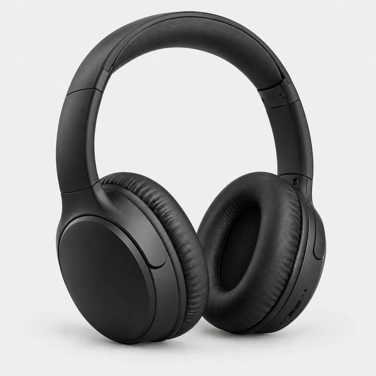
Over-Ear-Kopfhörer mit Noise Cancelling
Menge: 1
Deine Bestellung wird übermittelt …
Suche nach „Sessel“
Wir suchen passende Artikel für dich.
HTML
<div class="on-frame" style="margin:0;padding:24px;display:grid;grid-template-columns:repeat(auto-fit,minmax(16rem,1fr));gap:16px;align-items:start">
<div style="background:var(--oc-semantic-color-background-canvas, #fff);border-radius:16px;padding:24px;display:flex;flex-direction:column;gap:16px;box-shadow:0 0 0 1px rgba(0,0,0,.06)"><p class="demo-title" style="font-size:1.125rem">Zusammenfassung</p><div style="display:flex;gap:12px;align-items:center"><img src="/previews/imagery/samples/otto-product-still/product-headphones.webp" alt="Over-Ear-Kopfhörer" width="64" height="64" style="margin:0;border-radius:12px;background:#f3f3f3"><div><p class="demo-copy">Over-Ear-Kopfhörer mit Noise Cancelling</p><p class="demo-copy" style="color:var(--oc-semantic-color-text-secondary, #6d6d6d)">Menge: 1</p></div></div><div style="display:flex;justify-content:space-between;gap:16px"><span class="demo-copy">Zwischensumme</span><span class="demo-copy">59,99 €</span></div><div style="display:flex;justify-content:space-between;gap:16px"><span class="demo-copy">Versand</span><span class="demo-copy">2,95 €</span></div><div style="display:flex;justify-content:space-between;border-top:1px solid rgba(0,0,0,.1);padding-top:12px"><strong>Gesamtsumme</strong><strong>62,94 €</strong></div><oc-button-v1 variant="primary" loading>Zahlungspflichtig bestellen</oc-button-v1><p class="demo-copy" style="color:var(--oc-semantic-color-text-secondary, #6d6d6d);text-align:center">Deine Bestellung wird übermittelt …</p></div>
<div style="background:var(--oc-semantic-color-background-canvas, #fff);border-radius:16px;padding:24px;display:flex;flex-direction:column;gap:16px;box-shadow:0 0 0 1px rgba(0,0,0,.06)"><p class="demo-title" style="font-size:1.125rem">Suche nach „Sessel“</p><div style="display:grid;place-items:center;gap:12px;padding:32px 0"><oc-spinner-v1 variant="default" size="200"></oc-spinner-v1><p class="demo-copy" style="color:var(--oc-semantic-color-text-secondary, #6d6d6d)">Wir suchen passende Artikel für dich.</p></div></div>