OTTODesign System

Components

Toggletip

The toggletip provides additional context when a user clicks or taps on an element or initially on load. It can contain a headline, icon or action.

Configurator

LiveToggletip: position, background, content and state

Versandkostenfrei

Ab 79 € Bestellwert liefern wir dir versandkostenfrei.

HTML
<div style="width:100%;min-height:260px;display:flex;flex-direction:column;align-items:center;justify-content:center"><oc-toggletip-v1 position="bottom" visible oc-aria-label="Info zu den Versandkosten" style="--background-color:initial"><oc-icon-button-v3 variant="secondary" icon="info" oc-aria-label="Mehr zu den Versandkosten"></oc-icon-button-v3><div slot="toggletip-content" class="demo-stack gap-8"><p class="oc-headline-100" style="color:inherit">Versandkostenfrei</p><p>Ab 79 € Bestellwert liefern wir dir versandkostenfrei.</p></div></oc-toggletip-v1></div>

Usage

Anatomy

Versandkostenfrei

Ab 79 € Bestellwert liefern wir dir versandkostenfrei.

Mehr erfahrenWeiter einkaufen
LiveAnatomy
HTML
<oc-icon-button-v3 variant="secondary" size="100" icon="info" oc-aria-label="Mehr zu den Versandkosten"></oc-icon-button-v3><oc-popover-v1 anchor="previous-sibling" variant="toggletip" close-button visible close-on="none" position="bottom" oc-aria-label="Info" style="--min-width:min(22rem, calc(100% - 16px))"><div style="display:flex;gap:12px;align-items:flex-start"><oc-icon-v1 type="delivery-flat" style="flex:none"></oc-icon-v1><div class="demo-stack gap-8"><p class="oc-headline-100" style="color:inherit">Versandkostenfrei</p><p>Ab 79 € Bestellwert liefern wir dir versandkostenfrei.</p><div class="demo-row" style="gap:16px"><oc-link-v2 variant="inverted" as-button>Mehr erfahren</oc-link-v2><oc-link-v2 variant="inverted-bold" as-button>Weiter einkaufen</oc-link-v2></div></div></div></oc-popover-v1></div>

Variants

You can customise a toggletip by adding, for example, a headline or actions. For the actions, you can add two actions (primary and secondary) or just one, depending on the case. If you want to visualize the content, you can also add an icon. The default toggletip consists of the text and the close button.

Headline

Versandkostenfrei

Ab 79 € liefern wir versandkostenfrei.

Actions

Ab 79 € liefern wir versandkostenfrei.

Mehr erfahrenWeiter einkaufen

Icon

Ab 79 € liefern wir versandkostenfrei.

Combined

Versandkostenfrei

Ab 79 € liefern wir versandkostenfrei.

Mehr erfahrenWeiter einkaufen
Liveheadline, actions, icon and combined
HTML
<p class="demo-label" style="align-self:stretch;text-align:center">Headline</p><oc-icon-button-v3 variant="secondary" size="100" icon="info" oc-aria-label="Mehr zu den Versandkosten"></oc-icon-button-v3><oc-popover-v1 anchor="previous-sibling" variant="toggletip" close-button visible close-on="none" position="bottom" oc-aria-label="Info" style="--min-width:min(17rem, calc(100% - 16px))"><div class="demo-stack gap-8"><p class="oc-headline-100" style="color:inherit">Versandkostenfrei</p><p>Ab 79 € liefern wir versandkostenfrei.</p></div></oc-popover-v1></div>
<p class="demo-label" style="align-self:stretch;text-align:center">Actions</p><oc-icon-button-v3 variant="secondary" size="100" icon="info" oc-aria-label="Mehr zu den Versandkosten"></oc-icon-button-v3><oc-popover-v1 anchor="previous-sibling" variant="toggletip" close-button visible close-on="none" position="bottom" oc-aria-label="Info" style="--min-width:min(17rem, calc(100% - 16px))"><div class="demo-stack gap-8"><p>Ab 79 € liefern wir versandkostenfrei.</p><div class="demo-row" style="gap:16px"><oc-link-v2 variant="inverted" as-button>Mehr erfahren</oc-link-v2><oc-link-v2 variant="inverted-bold" as-button>Weiter einkaufen</oc-link-v2></div></div></oc-popover-v1></div>
<p class="demo-label" style="align-self:stretch;text-align:center">Icon</p><oc-icon-button-v3 variant="secondary" size="100" icon="info" oc-aria-label="Mehr zu den Versandkosten"></oc-icon-button-v3><oc-popover-v1 anchor="previous-sibling" variant="toggletip" close-button visible close-on="none" position="bottom" oc-aria-label="Info" style="--min-width:min(17rem, calc(100% - 16px))"><div style="display:flex;gap:12px;align-items:flex-start"><oc-icon-v1 type="delivery-flat" style="flex:none"></oc-icon-v1><div class="demo-stack gap-8"><p>Ab 79 € liefern wir versandkostenfrei.</p></div></div></oc-popover-v1></div>
<p class="demo-label" style="align-self:stretch;text-align:center">Combined</p><oc-icon-button-v3 variant="secondary" size="100" icon="info" oc-aria-label="Mehr zu den Versandkosten"></oc-icon-button-v3><oc-popover-v1 anchor="previous-sibling" variant="toggletip" close-button visible close-on="none" position="bottom" oc-aria-label="Info" style="--min-width:min(17rem, calc(100% - 16px))"><div style="display:flex;gap:12px;align-items:flex-start"><oc-icon-v1 type="delivery-flat" style="flex:none"></oc-icon-v1><div class="demo-stack gap-8"><p class="oc-headline-100" style="color:inherit">Versandkostenfrei</p><p>Ab 79 € liefern wir versandkostenfrei.</p><div class="demo-row" style="gap:16px"><oc-link-v2 variant="inverted" as-button>Mehr erfahren</oc-link-v2><oc-link-v2 variant="inverted-bold" as-button>Weiter einkaufen</oc-link-v2></div></div></div></oc-popover-v1></div>

The background color of the toggletip can be adjusted. Therefore you should use semantic design tokens with the prefix "$oc-semantic-color-background-strong-". If you want to use other colors please check with the design system team before doing so.

Strong mint

Bestell bis 14 Uhr, dann verschicken wir deine Bestellung noch heute.

Mehr erfahrenZur Kasse

Strong orange

Bestell bis 14 Uhr, dann verschicken wir deine Bestellung noch heute.

Mehr erfahrenZur Kasse

Strong purple

Bestell bis 14 Uhr, dann verschicken wir deine Bestellung noch heute.

Mehr erfahrenZur Kasse

Strong pink

Bestell bis 14 Uhr, dann verschicken wir deine Bestellung noch heute.

Mehr erfahrenZur Kasse
Livecustom background
HTML
<p class="demo-label" style="align-self:stretch;text-align:center">Strong mint</p><oc-icon-button-v3 variant="secondary" size="100" icon="info" oc-aria-label="Mehr zu den Versandkosten"></oc-icon-button-v3><oc-popover-v1 anchor="previous-sibling" variant="toggletip" close-button visible close-on="none" position="bottom" oc-aria-label="Info" style="--background-color:var(--oc-semantic-color-background-strong-mint);--min-width:min(17rem, calc(100% - 16px))"><div class="demo-stack gap-8"><p>Bestell bis 14 Uhr, dann verschicken wir deine Bestellung noch heute.</p><div class="demo-row" style="gap:16px"><oc-link-v2 variant="inverted" as-button>Mehr erfahren</oc-link-v2><oc-link-v2 variant="inverted-bold" as-button>Zur Kasse</oc-link-v2></div></div></oc-popover-v1></div>
<p class="demo-label" style="align-self:stretch;text-align:center">Strong orange</p><oc-icon-button-v3 variant="secondary" size="100" icon="info" oc-aria-label="Mehr zu den Versandkosten"></oc-icon-button-v3><oc-popover-v1 anchor="previous-sibling" variant="toggletip" close-button visible close-on="none" position="bottom" oc-aria-label="Info" style="--background-color:var(--oc-semantic-color-background-strong-orange);--min-width:min(17rem, calc(100% - 16px))"><div class="demo-stack gap-8"><p>Bestell bis 14 Uhr, dann verschicken wir deine Bestellung noch heute.</p><div class="demo-row" style="gap:16px"><oc-link-v2 variant="inverted" as-button>Mehr erfahren</oc-link-v2><oc-link-v2 variant="inverted-bold" as-button>Zur Kasse</oc-link-v2></div></div></oc-popover-v1></div>
<p class="demo-label" style="align-self:stretch;text-align:center">Strong purple</p><oc-icon-button-v3 variant="secondary" size="100" icon="info" oc-aria-label="Mehr zu den Versandkosten"></oc-icon-button-v3><oc-popover-v1 anchor="previous-sibling" variant="toggletip" close-button visible close-on="none" position="bottom" oc-aria-label="Info" style="--background-color:var(--oc-semantic-color-background-strong-purple);--min-width:min(17rem, calc(100% - 16px))"><div class="demo-stack gap-8"><p>Bestell bis 14 Uhr, dann verschicken wir deine Bestellung noch heute.</p><div class="demo-row" style="gap:16px"><oc-link-v2 variant="inverted" as-button>Mehr erfahren</oc-link-v2><oc-link-v2 variant="inverted-bold" as-button>Zur Kasse</oc-link-v2></div></div></oc-popover-v1></div>
<p class="demo-label" style="align-self:stretch;text-align:center">Strong pink</p><oc-icon-button-v3 variant="secondary" size="100" icon="info" oc-aria-label="Mehr zu den Versandkosten"></oc-icon-button-v3><oc-popover-v1 anchor="previous-sibling" variant="toggletip" close-button visible close-on="none" position="bottom" oc-aria-label="Info" style="--background-color:var(--oc-semantic-color-background-strong-pink);--min-width:min(17rem, calc(100% - 16px))"><div class="demo-stack gap-8"><p>Bestell bis 14 Uhr, dann verschicken wir deine Bestellung noch heute.</p><div class="demo-row" style="gap:16px"><oc-link-v2 variant="inverted" as-button>Mehr erfahren</oc-link-v2><oc-link-v2 variant="inverted-bold" as-button>Zur Kasse</oc-link-v2></div></div></oc-popover-v1></div>

Behavior

Interaction

The toggletip can be used to appear initially on page load or on tap on the parent element. It can be closed by tapping the close button or outside the toggletip.

Click or tap the parent element to open the toggletip, click the close button or outside to close it

Versandkostenfrei

Ab 79 € Bestellwert liefern wir dir versandkostenfrei.

Mehr erfahrenWeiter einkaufen

Initially opened toggletip; after closing, a click on the parent element performs its own action

Neu: AR-Ansicht

Platziere dieses Produkt virtuell in deinem Raum, direkt über die Kamera deines Geräts.

Liveopen and close interaction
HTML
<p class="demo-label" style="text-align:center">Click or tap the parent element to open the toggletip, click the close button or outside to close it</p><oc-toggletip-v1 position="bottom" oc-aria-label="Info zu den Versandkosten"><oc-icon-button-v3 variant="secondary" size="100" icon="info" oc-aria-label="Mehr zu den Versandkosten"></oc-icon-button-v3><div slot="toggletip-content"><div style="display:flex;gap:12px;align-items:flex-start"><oc-icon-v1 type="delivery-flat" style="flex:none"></oc-icon-v1><div class="demo-stack gap-8"><p class="oc-headline-100" style="color:inherit">Versandkostenfrei</p><p>Ab 79 € Bestellwert liefern wir dir versandkostenfrei.</p><div class="demo-row" style="gap:16px"><oc-link-v2 variant="inverted" as-button>Mehr erfahren</oc-link-v2><oc-link-v2 variant="inverted-bold" as-button>Weiter einkaufen</oc-link-v2></div></div></div></div></oc-toggletip-v1></div>
<p class="demo-label" style="text-align:center">Initially opened toggletip; after closing, a click on the parent element performs its own action</p><oc-icon-button-v3 variant="secondary" size="100" icon="augmented-reality" oc-aria-label="In deinem Raum ansehen"></oc-icon-button-v3><oc-popover-v1 anchor="previous-sibling" variant="toggletip" close-button visible trigger="none" position="bottom" oc-aria-label="Neu: AR-Ansicht" style="--min-width:min(21rem, calc(100% - 16px))"><div style="display:flex;gap:12px;align-items:flex-start"><oc-icon-v1 type="question-hint" style="flex:none"></oc-icon-v1><div class="demo-stack gap-8"><p class="oc-headline-100" style="color:inherit">Neu: AR-Ansicht</p><p>Platziere dieses Produkt virtuell in deinem Raum, direkt über die Kamera deines Geräts.</p></div></div></oc-popover-v1></div>

The toggletip itself doesn't have own states, but elements within the toggletip, such as links
or icon buttons, can be interactive. You can see the focus order in the following image.

Ab 79 € liefern wir dir versandkostenfrei.

Mehr erfahren1Weiter einkaufen2
3
  1. First action (Tab)
  2. Second action (Tab)
  3. Close button (Tab)
Livefocus order
HTML
<div class="anatomy" style="display:block;margin:0"><div class="demo-grid cols-1">
<oc-icon-button-v3 variant="secondary" size="100" icon="info" oc-aria-label="Mehr zu den Versandkosten"></oc-icon-button-v3><oc-popover-v1 anchor="previous-sibling" variant="toggletip" close-button visible close-on="none" position="bottom" oc-aria-label="Info" style="--min-width:min(20rem, calc(100% - 16px))"><div class="demo-stack gap-8" style="position:relative"><p>Ab 79 € liefern wir dir versandkostenfrei.</p><div class="demo-row" style="gap:16px"><span style="position:relative;display:inline-block"><oc-link-v2 variant="inverted" as-button>Mehr erfahren</oc-link-v2><span class="anatomy-pin" style="left:0;top:-14px">1</span></span><span style="position:relative;display:inline-block"><oc-link-v2 variant="inverted-bold" as-button>Weiter einkaufen</oc-link-v2><span class="anatomy-pin" style="left:0;top:-14px">2</span></span></div><span class="anatomy-pin" style="left:calc(100% + 26px);top:-16px">3</span></div></oc-popover-v1></div>
</div><ol class="anatomy-key"><li data-n="1">First action (Tab)</li><li data-n="2">Second action (Tab)</li><li data-n="3">Close button (Tab)</li></ol>

Fitting

The toggletip uses fit-content as long as there is enough space. If there is no more space, the content breaks and the toggletip has 8px distance to the sides of the viewport. The maximum width of the toggletip is 432px.

fit-content

Versandkostenfrei ab 79 €.

Mehr erfahrenWeiter einkaufen

Breaks at the maximum width of 432px

Ab 79 € Bestellwert liefern wir dir versandkostenfrei. Für Möbel und große Artikel berechnen wir eine Speditionspauschale.

Mehr erfahrenWeiter einkaufen
Livefitting
HTML
<p class="demo-label" style="align-self:stretch;text-align:center">fit-content</p><oc-icon-button-v3 variant="secondary" size="100" icon="info" oc-aria-label="Mehr zu den Versandkosten"></oc-icon-button-v3><oc-popover-v1 anchor="previous-sibling" variant="toggletip" close-button visible close-on="none" position="bottom" oc-aria-label="Info"><div class="demo-stack gap-8"><p>Versandkostenfrei ab 79 €.</p><div class="demo-row" style="gap:16px"><oc-link-v2 variant="inverted" as-button>Mehr erfahren</oc-link-v2><oc-link-v2 variant="inverted-bold" as-button>Weiter einkaufen</oc-link-v2></div></div></oc-popover-v1></div>
<p class="demo-label" style="align-self:stretch;text-align:center">Breaks at the maximum width of 432px</p><oc-icon-button-v3 variant="secondary" size="100" icon="info" oc-aria-label="Mehr zu den Versandkosten"></oc-icon-button-v3><oc-popover-v1 anchor="previous-sibling" variant="toggletip" close-button visible close-on="none" position="bottom" oc-aria-label="Info" style="--min-width:min(27rem, calc(100% - 16px))"><div class="demo-stack gap-8"><p>Ab 79 € Bestellwert liefern wir dir versandkostenfrei. Für Möbel und große Artikel berechnen wir eine Speditionspauschale.</p><div class="demo-row" style="gap:16px"><oc-link-v2 variant="inverted" as-button>Mehr erfahren</oc-link-v2><oc-link-v2 variant="inverted-bold" as-button>Weiter einkaufen</oc-link-v2></div></div></oc-popover-v1></div>

Placement

By default, the toggletip is positioned centered below the parent element. Depending on the available space, it adapts to show above the parent element to always be visible. It also adapt its position, if there is not sufficient space to the left or right. If this fits your case better, you may change the preferred position to above. The toggletip has a spacing of 4px to the parent element.

A toggletip also can be specified as sticky making it always visible even if the context is not within the viewport at the moment. This comes in handy when opening a toggletip on page load.

Bottom (default)

Ab 79 € liefern wir versandkostenfrei.

Mehr erfahrenWeiter einkaufen

Top

Ab 79 € liefern wir versandkostenfrei.

Mehr erfahrenWeiter einkaufen
Livepositioning top or bottom
HTML
<p class="demo-label" style="align-self:stretch;text-align:center">Bottom (default)</p><oc-icon-button-v3 variant="secondary" size="100" icon="info" oc-aria-label="Mehr zu den Versandkosten"></oc-icon-button-v3><oc-popover-v1 anchor="previous-sibling" variant="toggletip" close-button visible close-on="none" position="bottom" oc-aria-label="Info" style="--min-width:min(17rem, calc(100% - 16px))"><div class="demo-stack gap-8"><p>Ab 79 € liefern wir versandkostenfrei.</p><div class="demo-row" style="gap:16px"><oc-link-v2 variant="inverted" as-button>Mehr erfahren</oc-link-v2><oc-link-v2 variant="inverted-bold" as-button>Weiter einkaufen</oc-link-v2></div></div></oc-popover-v1></div>
<p class="demo-label" style="align-self:stretch;text-align:center">Top</p><oc-icon-button-v3 variant="secondary" size="100" icon="info" oc-aria-label="Mehr zu den Versandkosten"></oc-icon-button-v3><oc-popover-v1 anchor="previous-sibling" variant="toggletip" close-button visible close-on="none" position="top" oc-aria-label="Info" style="--min-width:min(17rem, calc(100% - 16px))"><div class="demo-stack gap-8"><p>Ab 79 € liefern wir versandkostenfrei.</p><div class="demo-row" style="gap:16px"><oc-link-v2 variant="inverted" as-button>Mehr erfahren</oc-link-v2><oc-link-v2 variant="inverted-bold" as-button>Weiter einkaufen</oc-link-v2></div></div></oc-popover-v1></div>

Left

Ab 79 € liefern wir versandkostenfrei.

Mehr erfahrenWeiter einkaufen

Center

Ab 79 € liefern wir versandkostenfrei.

Mehr erfahrenWeiter einkaufen

Right

Ab 79 € liefern wir versandkostenfrei.

Mehr erfahrenWeiter einkaufen
Livealignment left, center or right
HTML
<p class="demo-label" style="align-self:stretch;text-align:center">Left</p><oc-icon-button-v3 variant="secondary" size="100" icon="info" oc-aria-label="Mehr zu den Versandkosten"></oc-icon-button-v3><oc-popover-v1 anchor="previous-sibling" variant="toggletip" close-button visible close-on="none" position="bottom" oc-aria-label="Info" style="--min-width:min(17rem, calc(100% - 16px))"><div class="demo-stack gap-8"><p>Ab 79 € liefern wir versandkostenfrei.</p><div class="demo-row" style="gap:16px"><oc-link-v2 variant="inverted" as-button>Mehr erfahren</oc-link-v2><oc-link-v2 variant="inverted-bold" as-button>Weiter einkaufen</oc-link-v2></div></div></oc-popover-v1></div>
<p class="demo-label" style="align-self:stretch;text-align:center">Center</p><oc-icon-button-v3 variant="secondary" size="100" icon="info" oc-aria-label="Mehr zu den Versandkosten"></oc-icon-button-v3><oc-popover-v1 anchor="previous-sibling" variant="toggletip" close-button visible close-on="none" position="bottom" oc-aria-label="Info" style="--min-width:min(17rem, calc(100% - 16px))"><div class="demo-stack gap-8"><p>Ab 79 € liefern wir versandkostenfrei.</p><div class="demo-row" style="gap:16px"><oc-link-v2 variant="inverted" as-button>Mehr erfahren</oc-link-v2><oc-link-v2 variant="inverted-bold" as-button>Weiter einkaufen</oc-link-v2></div></div></oc-popover-v1></div>
<p class="demo-label" style="align-self:stretch;text-align:center">Right</p><oc-icon-button-v3 variant="secondary" size="100" icon="info" oc-aria-label="Mehr zu den Versandkosten"></oc-icon-button-v3><oc-popover-v1 anchor="previous-sibling" variant="toggletip" close-button visible close-on="none" position="bottom" oc-aria-label="Info" style="--min-width:min(17rem, calc(100% - 16px))"><div class="demo-stack gap-8"><p>Ab 79 € liefern wir versandkostenfrei.</p><div class="demo-row" style="gap:16px"><oc-link-v2 variant="inverted" as-button>Mehr erfahren</oc-link-v2><oc-link-v2 variant="inverted-bold" as-button>Weiter einkaufen</oc-link-v2></div></div></oc-popover-v1></div>

Toggletips are placed above the canvas and frame (level 2). Therefore the toggletip uses a shadow200. For further information refer to the elevation documentation.

Toggletip vs. tooltip vs. popover

Toggletips provide more detailed information and must be actively closed while tooltips provide quick and temporary help only visible on hover, focus or long-press. For example, you can use a toggletip to introduce a new feature. On the other hand, a tooltip may be used to describe the context of an icon button.

Popovers hold very generic content and can be used for cases where toggletips are too specific.

Toggletip

Neu: AR-Ansicht

Platziere dieses Produkt virtuell in deinem Raum, direkt über die Kamera deines Geräts.

Mehr erfahrenAusprobieren

Tooltip

AR-Ansicht
Livetoggletip vs tooltip
HTML
<p class="demo-label" style="align-self:stretch;text-align:center">Toggletip</p><oc-icon-button-v3 variant="secondary" size="100" icon="augmented-reality" oc-aria-label="AR-Ansicht"></oc-icon-button-v3><oc-popover-v1 anchor="previous-sibling" variant="toggletip" close-button visible close-on="none" position="bottom" oc-aria-label="Neu: AR-Ansicht" style="--min-width:min(21rem, calc(100% - 16px))"><div style="display:flex;gap:12px;align-items:flex-start"><oc-icon-v1 type="question-hint" style="flex:none"></oc-icon-v1><div class="demo-stack gap-8"><p class="oc-headline-100" style="color:inherit">Neu: AR-Ansicht</p><p>Platziere dieses Produkt virtuell in deinem Raum, direkt über die Kamera deines Geräts.</p><div class="demo-row" style="gap:16px"><oc-link-v2 variant="inverted" as-button>Mehr erfahren</oc-link-v2><oc-link-v2 variant="inverted-bold" as-button>Ausprobieren</oc-link-v2></div></div></div></oc-popover-v1></div>
<p class="demo-label" style="align-self:stretch;text-align:center">Tooltip</p><oc-icon-button-v3 variant="secondary" size="100" icon="augmented-reality" oc-aria-label="AR-Ansicht"></oc-icon-button-v3><oc-popover-v1 anchor="previous-sibling" variant="tooltip" visible trigger="none" close-on="none" position="bottom">AR-Ansicht</oc-popover-v1></div>

Best practices

A common use case is using a toggletip as a tutorial flyout or to advertise a specific feature. Show the toggletip on page load in this case and use the sticky behavior, if the feature appears below the fold.

Neu: AR-Ansicht

Platziere dieses Produkt virtuell in deinem Raum, direkt über die Kamera deines Geräts.

Mehr erfahrenAusprobieren
DoUse short information describing the parent element.

Augmented-Reality-Produktansicht (beta)

Dieses neue Feature, das auf WebXR-Technologie basiert, ermöglicht die Projektion einer dreidimensionalen Darstellung eines Produktes in den physikalischen Raum, vorausgesetzt das Gerät unterstützt ARKit oder ARCore.

Mehr über AR-ProduktansichtAR initialisieren
Don'tDescribe other elements or provide unnecessary information.

Accessibility

For information on accessibility, refer to the technical documentation.

Status

Implementation

Live demo

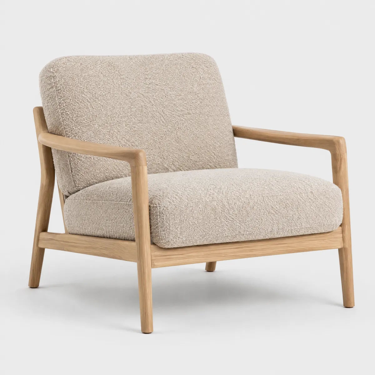
Sessel Lounge in Samtoptik

OTTO products

Sessel „Lounge“ in Samtoptik, Salbei

449,99 €

inkl. MwSt., zzgl. Speditionspauschale

Lieferung bis in die Wohnung in 2–3 Wochen

Lieferung per Spedition

Wir tragen deinen Sessel bis in die Wohnung und nehmen die Verpackung wieder mit. Den Termin stimmen wir vorher mit dir ab.

30 Tage kostenlose Rücksendung

In den Warenkorb
LiveReal OTTO components, rendered by the OTTO component runtime
HTML
<div style="display:grid;grid-template-columns:repeat(auto-fit,minmax(15rem,1fr));gap:32px;align-items:start">
<img src="/previews/imagery/samples/otto-product-still/product-armchair.webp" alt="Sessel Lounge in Samtoptik" style="display:block;width:100%;aspect-ratio:1;object-fit:cover;border-radius:16px">
  <div><p class="oc-copy-75" style="color:#6d6d6d">OTTO products</p><p class="oc-headline-200">Sessel „Lounge“ in Samtoptik, Salbei</p></div>
  <div><p class="oc-headline-300">449,99 €</p><p class="oc-copy-75" style="color:#6d6d6d">inkl. MwSt., zzgl. Speditionspauschale</p></div>
  <oc-divider-v1></oc-divider-v1>
  <div style="display:flex;align-items:center;gap:8px">
    <oc-icon-v1 type="delivery-flat" style="flex:none"></oc-icon-v1>
    <p class="oc-copy-100">Lieferung bis in die Wohnung in 2–3 Wochen</p>
    <oc-toggletip-v1 position="bottom" oc-aria-label="Info zur Speditionslieferung">
      <oc-icon-button-v3 variant="transparent" size="25" icon="info" oc-aria-label="Mehr zur Speditionslieferung"></oc-icon-button-v3>
      <div slot="toggletip-content" class="demo-stack gap-8"><p class="oc-headline-100" style="color:inherit">Lieferung per Spedition</p><p>Wir tragen deinen Sessel bis in die Wohnung und nehmen die Verpackung wieder mit. Den Termin stimmen wir vorher mit dir ab.</p></div>
    </oc-toggletip-v1>
  <div style="display:flex;align-items:center;gap:8px">
    <oc-icon-v1 type="arrow-return" style="flex:none"></oc-icon-v1>
    <p class="oc-copy-100">30 Tage kostenlose Rücksendung</p>
    <oc-button-v1 variant="primary" icon-type-left="basket">In den Warenkorb</oc-button-v1>
    <oc-icon-button-v3 variant="secondary" icon="wishlist" oc-aria-label="Merken"></oc-icon-button-v3>

Code

Version Tag Status API
v1 <oc-toggletip-v1> Stable, allowed for generation ToggletipV1

Overview (v1)

Toggletip

The toggletip component provides a small non-modal dialog box that displays additional contextual information or hints when clicking an interactive element. It supports custom content and offers configuration options for positioning either above or below the triggering element, as well as controlling its initial visibility state.

Default variation
Hier ist der Toggletip! Dieser Text hat einen Toggletip!
HTML
<oc-toggletip-v1 oc-aria-label="Einfacher Toggletip">
<span slot='toggletip-content'>Hier ist der Toggletip!</span>
<oc-button-v1 oc-aria-label="Für mehr Informationen klicken">Dieser Text hat einen Toggletip!</oc-button-v1>
</oc-toggletip-v1>
Configuration

The toggletip is configurable, allowing you to tailor its features and appearance to your specific needs. To explore all the available options and adjust the component, use the component configurator and see how the changes affect the component in real time.

Usage guidelines

Before integrating the toggletip component into your project, make sure you have correctly installed the OTTO components package. Look through the variations page for examples of possible component variations.

The following guidelines apply to the toggletip component:

  • You must make sure that the default slot contains an interactive element. This should preferably be a button, or a component with the as-button attribute.
  • Ensure that the interactive element in the default slot correctly indicates to accessibility tools that it opens a toggletip. If the content itself is not sufficient for this, use the oc-aria-label attribute on it to provide additional information.
  • The interactive element must not have its own click handler or on-click behavior. This might lead to unexpected results.
  • The toggletip-content slot should not contain interactive or block elements.

Info

See the Toggletip UX documentation for detailed user experience guidelines.

Accessibility

The toggletip component comes with a set of built-in accessibility features to ensure a seamless experience for all users.

It follows the interaction model of a non-modal dialog, as defined by the dialog ARIA role.

Labeling

The aria-labelledby attribute on the toggletip references its heading if present, and its content otherwise.

Keyboard navigation

The toggletip supports standard keyboard navigation for interactive elements:

Shortcut Description
Tab Moves focus to the toggletip trigger
Enter/Space Opens the toggletip
Esc Closes the toggletip when open
Keyboard focus management

When the toggletip is opened via the keyboard, the focus moves to the close button. When the toggletip is subsequently closed again, the focus returns to the interactive element that opened it.

Focus handling

The toggletip does not trap the focus, meaning that users can navigate away from it using the Tab key.

Configuration (v1)

Toggletip configuration

Configure the toggletip component with the controls below and see the changes live in the preview canvas. Click the Show code button within the preview canvas to see the source code for the current component configuration.

Hier ist der Toggletip! Dieser Text hat einen Toggletip!
HTML
<oc-toggletip-v1 oc-aria-label="Einfacher Toggletip">
<span slot='toggletip-content'>Hier ist der Toggletip!</span>
<oc-button-v1 oc-aria-label="Für mehr Informationen klicken">Dieser Text hat einen Toggletip!</oc-button-v1>
</oc-toggletip-v1>

Interactive configurator (Storybook controls); every option is listed in the API section of this file.

API v1

Toggletip v1 API

API: <oc-toggletip-v1> (ToggletipV1)

The toggletip component provides a small non-modal dialog box that displays additional contextual information or hints when clicking an interactive element. It supports custom content and offers configuration options for positioning either above or below the triggering element, as well as controlling its initial visibility state.

Attributes / properties
Attribute Type Default Required Description
sticky boolean false no Sets the sticky state of the toggletip. Set to true an opened toggletip always stays in viewport, even if the users scrolls the page. This attribute is automatically unset on closing the toggletip.
visible boolean false no Sets the visibility state of the toggletip. Set to true to show the toggletip. This attribute is automatically unset on closing the toggletip.
position "top" | "bottom" "top" no Sets the preferred position of the toggletip. The position can change depending on the available space.
oc-aria-label string no Sets the aria-label attribute of the toggletip content element. This is used to provide an accessible name for the toggletip content.
Slots
Slot Required Description
default yes Contains the interactive element that opens the toggletip.
Example:

<oc-link-v2>Text with toggletip.</oc-link-v2>
toggletip-content yes Contains the content of the toggletip itself.
Example:

<span slot="toggletip-content">This is the toggletip!</span>
Events
Event Detail type Description
oc-toggletip-open CustomEvent<void> Dispatched when the toggletip is being opened. May be cancelled to prevent the toggletip from opening.
oc-toggletip-close CustomEvent<void> Dispatched when the toggletip is being closed. May be cancelled to prevent the toggletip from closing.
oc-open CustomEvent<void> Dispatched when the toggletip is being opened. May be cancelled to prevent the toggletip from opening.
oc-close CustomEvent<void> Dispatched when the toggletip is being closed. May be cancelled to prevent the toggletip from closing.
oc-property-change OcToggletipV1Events["oc-property-change"] Whenever a property value changes, this event triggers. Use this event to track all property changes within the component.

Refer to the Events documentation for more information.
oc-mount { component: string; } Fired when the component is mounted to the DOM. The event is fired when the onMount hook of the component is called by the runtime.
oc-unmount { component: string; } Fired when the component is unmounted from the DOM. The event is fired when the function returned by the onMount hook of the component is called by the runtime.
Methods
  • recalcPosition: () => void

    Recalculates the position of the toggletip. This can be useful if the content of the toggletip changes dynamically, or if the position of the trigger element changes.

    Returns: void

    Example:

    const toggletip = document.querySelector("oc-toggletip-v1");
    toggletip.recalcPosition();
    
CSS custom properties
Custom property Default Description
--background-color undefined Sets the custom background color

Variations (v1)

Variations

Listed below are the most common variations of the toggletip component as well as specific component variations for different use cases.

You can explore all available options using the component configurator, adjust the component to your needs, and see the changes live in a preview canvas.

Default

Story: components-toggletip-variations--default · tags: components

The default configuration initially hides the toggletip and displays it below the trigger element.

Args: oc-aria-label=Einfacher Toggletip, defaultSlot=<oc-button-v1 oc-aria-label="Für mehr Informationen klicken">Dieser Text hat einen Toggletip!</oc-button-v1>, toggletipContentSlot=<span slot='toggletip-content'>Hier ist der Toggletip!</span>

Hier ist der Toggletip! Dieser Text hat einen Toggletip!
HTML
<oc-toggletip-v1 oc-aria-label="Einfacher Toggletip">
<span slot='toggletip-content'>Hier ist der Toggletip!</span>
<oc-button-v1 oc-aria-label="Für mehr Informationen klicken">Dieser Text hat einen Toggletip!</oc-button-v1>
</oc-toggletip-v1>
Preferred position

Story: components-toggletip-variations--above · tags: components

Variation using the position attribute with the value top to set the preferred position of the toggletip above the trigger element. The toggletip may still be displayed either below or above the trigger element depending on the available space.

Args: oc-aria-label=Oberer Toggletip, defaultSlot=<oc-button-v1>Dieser Text hat einen Toggletip!</oc-button-v1>, toggletipContentSlot=<span slot='toggletip-content'>Hier ist der Toggletip!</span>, position=top, style=margin-top: 100px

Hier ist der Toggletip! Dieser Text hat einen Toggletip!
HTML
<oc-toggletip-v1 oc-aria-label="Oberer Toggletip" position="top">
<span slot='toggletip-content'>Hier ist der Toggletip!</span>
<oc-button-v1>Dieser Text hat einen Toggletip!</oc-button-v1>
</oc-toggletip-v1>
Intially visible

Story: components-toggletip-variations--visible · tags: components

Variation with the visible attribute initially set to true, showing the toggletip without needing to click the trigger element.

Args: oc-aria-label=Sofort sichtbarer Toggletip, defaultSlot=<oc-button-v1>Dieser Text hat einen Toggletip!</oc-button-v1>, toggletipContentSlot=<span slot='toggletip-content'>Hier ist der Toggletip!</span>, visible=true

Hier ist der Toggletip! Dieser Text hat einen Toggletip!
HTML
<oc-toggletip-v1 oc-aria-label="Sofort sichtbarer Toggletip" visible>
<span slot='toggletip-content'>Hier ist der Toggletip!</span>
<oc-button-v1>Dieser Text hat einen Toggletip!</oc-button-v1>
</oc-toggletip-v1>
Long text

Story: components-toggletip-variations--long-text · tags: components

Variation with long text, showcasing the maximum width of the toggletip.

Args: oc-aria-label=Toggletip mit langem Text, defaultSlot=<oc-button-v1>Dieser Text hat einen langen Toggletip!</oc-button-v1>, toggletipContentSlot=(see snippet)

Der Text in diesem Toggletip ist sehr lang. Lorem ipsum dolor sit amet, consetetur sadipscing elitr, sed diam nonumy eirmod tempor invidunt ut labore et dolore magna aliquyam erat, sed diam voluptua. At vero eos et accusam et justo duo dolores et ea rebum. Stet clita kasd gubergren, no sea takimata sanctus est Lorem ipsum dolor sit amet. Lorem ipsum dolor sit amet, consetetur sadipscing elitr, sed diam nonumy eirmod tempor invidunt ut labore et dolore magna aliquyam erat, sed diam voluptua. At vero eos et accusam et justo duo dolores et ea rebum. Dieser Text hat einen langen Toggletip!
HTML
<oc-toggletip-v1 oc-aria-label="Toggletip mit langem Text">
<span slot='toggletip-content'>Der Text in diesem Toggletip ist sehr lang. Lorem ipsum dolor sit amet, consetetur sadipscing elitr, sed diam nonumy eirmod tempor invidunt ut labore et dolore magna aliquyam erat, sed diam voluptua. At vero eos et accusam et justo duo dolores et ea rebum. Stet clita kasd gubergren, no sea takimata sanctus est Lorem ipsum dolor sit amet. Lorem ipsum dolor sit amet, consetetur sadipscing elitr, sed diam nonumy eirmod tempor invidunt ut labore et dolore magna aliquyam erat, sed diam voluptua. At vero eos et accusam et justo duo dolores et ea rebum.</span>
<oc-button-v1>Dieser Text hat einen langen Toggletip!</oc-button-v1>
</oc-toggletip-v1>
Sticky on screen

Story: components-toggletip-variations--sticky-on-screen · tags: components

Variation that sticks on screen, even when achnor is scrolled out of the viewport.

Args: visible=false, sticky=true, oc-aria-label=Toggletip, der im Viewport klebt, defaultSlot=<oc-button-v1>Toggletip, der festklebt.</oc-button-v1>, toggletipContentSlot=<span slot='toggletip-content'>Dieser Toggletip klebt im Viewport!</span>

Dieser Toggletip klebt im Viewport! Toggletip, der festklebt.
HTML
<oc-toggletip-v1 sticky oc-aria-label="Toggletip, der im Viewport klebt">
<span slot='toggletip-content'>Dieser Toggletip klebt im Viewport!</span>
<oc-button-v1>Toggletip, der festklebt.</oc-button-v1>
</oc-toggletip-v1>
Custom Background Color

Story: components-toggletip-variations--custom-background-color · tags: components

Snackbar with action slot & custom background-color

Args: --background-color=var(--oc-semantic-color-background-strong-warm-red)

<div style="height: 150px; display: flex; align-items: center; justify-content: center">
  <!-- to allow space for toggletip -->
  <oc-toggletip-v1
    style="--background-color: var(--oc-semantic-color-background-strong-warm-red)"
    class="${className}"
    position="bottom"
    oc-aria-label="Toggletip auf einem Link"
  >
    <oc-button-v1 oc-aria-label="Für mehr Informationen klicken"
      >Dieser Text hat einen Toggletip!</oc-button-v1
    >
    <span slot="toggletip-content">Hier ist der Toggletip!</span>
  </oc-toggletip-v1>
</div>

${css}
Story source (TypeScript, verbatim from Storybook)
{
  name: "Custom Background Color",
  args: {
    "--background-color": "var(--oc-semantic-color-background-strong-warm-red)"
  },
  render({
    ...props
  }) {
    const {
      css,
      className
    } = cssVariablesExample(props);
    return html`
      <div style="height: 150px; display: flex; align-items: center; justify-content: center">
        <!-- to allow space for toggletip -->
        <oc-toggletip-v1
          ${spread(props)}
          class="${className}"
          position="bottom"
          oc-aria-label="Toggletip auf einem Link"
        >
          <oc-button-v1 oc-aria-label="Für mehr Informationen klicken"
            >Dieser Text hat einen Toggletip!</oc-button-v1
          >
          <span slot="toggletip-content">Hier ist der Toggletip!</span>
        </oc-toggletip-v1>
      </div>

      ${css}
    `;
  }
}
Demo: multiple toggletip configurations

Story: components-toggletip-variations--demo · tags: components

A Demo showcasing multiple toggletip configurations on different elements.

Toggletip on a link This toggletip is on the bottom of the element! Toggletip on a button This toggletip is on the top of the element! This toggletip contains fancy text styles! Button w/o Toggletip

Beispieltext mit eingebettetem Toggletip auf einfachem <span>:

Lorem ipsum dolor sit amet, consectetur adipiscing elit. Vestibulum ante ipsum primis in faucibus orci luctus et ultrices posuere cubilia curae; Integer posuere, nisi non hendrerit laoreet, velit sapien cursus felis, at suscipit nisl metus non justo. Sed efficitur, augue a dictum congue, purus lorem feugiat nibh, a malesuada augue lectus id nibh. Praesent id sem vitae nibh suscipit Löweneckerchen Lerche euismod. Curabitur quis tellus non neque dictum aliquet.

HTML
<div class="container">
<oc-toggletip-v1 position="bottom" oc-aria-label="Toggletip auf einem Link">
  <oc-link-v2 as-button>Toggletip on a link</oc-link-v2>
  <span slot="toggletip-content">This toggletip is on the bottom of the element!</span>
</oc-toggletip-v1>
<oc-toggletip-v1 position="top" oc-aria-label="Toggletip auf einem Button">
  <oc-button-v1>Toggletip on a button</oc-button-v1>
  <span slot="toggletip-content">This toggletip is on the top of the element!</span>
</oc-toggletip-v1>
<oc-toggletip-v1 oc-aria-label="Toggletip auf einem Icon-Button">
  <oc-icon-button-v3
    icon="crab"
    oc-aria-label="Toggletip on an icon button"
  ></oc-icon-button-v3>
  <span slot="toggletip-content"
    >This toggletip contains
    <span style="font-weight: bold; font-style: italic">fancy</span> text styles!</span
  >
</oc-toggletip-v1>
<oc-button-v1>Button w/o Toggletip</oc-button-v1>
<div class="text-container">
<p>Beispieltext mit eingebettetem Toggletip auf einfachem &lt;span&gt;:</p>
<p>
  Lorem ipsum dolor sit amet, consectetur adipiscing elit. Vestibulum ante ipsum primis in
  faucibus orci luctus et ultrices posuere cubilia curae; Integer posuere, nisi non
  hendrerit laoreet, velit sapien cursus felis, at suscipit nisl metus non justo. Sed
  efficitur, augue a dictum congue, purus lorem feugiat nibh, a malesuada augue lectus id
  nibh. Praesent id sem vitae nibh suscipit
  <oc-toggletip-v1 oc-aria-label="Toggletip auf einem Wort">
    <u>Löweneckerchen</u>
    <span slot="toggletip-content">Lerche</span>
  </oc-toggletip-v1>
  euismod. Curabitur quis tellus non neque dictum aliquet.
</p>
<style>
.container {
  padding: 50px 10px;
  width: 100%;
  max-width: 600px;
  display: flex;
  align-items: center;
  flex-wrap: wrap;
  gap: 10px;
}
.text-container {
  margin-top: 20px;
  padding: 20px;
  border: 1px solid #ccc;
  width: 100%;
  max-width: 600px;
}
</style>
Story source (TypeScript, verbatim from Storybook)
{
  name: "Demo: multiple toggletip configurations",
  argTypes: hideControlsBadge(Metadata),
  parameters: {
    controls: {
      disabled: true
    },
    docs: {
      story: {
        inline: false,
        height: "200px"
      }
    }
  },
  render() {
    return html`
      <div class="container">
        <oc-toggletip-v1 position="bottom" oc-aria-label="Toggletip auf einem Link">
          <oc-link-v2 as-button>Toggletip on a link</oc-link-v2>
          <span slot="toggletip-content">This toggletip is on the bottom of the element!</span>
        </oc-toggletip-v1>
        <oc-toggletip-v1 position="top" oc-aria-label="Toggletip auf einem Button">
          <oc-button-v1>Toggletip on a button</oc-button-v1>
          <span slot="toggletip-content">This toggletip is on the top of the element!</span>
        </oc-toggletip-v1>
        <oc-toggletip-v1 oc-aria-label="Toggletip auf einem Icon-Button">
          <oc-icon-button-v3
            icon="crab"
            oc-aria-label="Toggletip on an icon button"
          ></oc-icon-button-v3>
          <span slot="toggletip-content"
            >This toggletip contains
            <span style="font-weight: bold; font-style: italic">fancy</span> text styles!</span
          >
        </oc-toggletip-v1>
        <oc-button-v1>Button w/o Toggletip</oc-button-v1>
      </div>
      <div class="text-container">
        <p>Beispieltext mit eingebettetem Toggletip auf einfachem &lt;span&gt;:</p>
        <p>
          Lorem ipsum dolor sit amet, consectetur adipiscing elit. Vestibulum ante ipsum primis in
          faucibus orci luctus et ultrices posuere cubilia curae; Integer posuere, nisi non
          hendrerit laoreet, velit sapien cursus felis, at suscipit nisl metus non justo. Sed
          efficitur, augue a dictum congue, purus lorem feugiat nibh, a malesuada augue lectus id
          nibh. Praesent id sem vitae nibh suscipit
          <oc-toggletip-v1 oc-aria-label="Toggletip auf einem Wort">
            <u>Löweneckerchen</u>
            <span slot="toggletip-content">Lerche</span>
          </oc-toggletip-v1>
          euismod. Curabitur quis tellus non neque dictum aliquet.
        </p>
      </div>
      <style>
        .container {
          padding: 50px 10px;
          width: 100%;
          max-width: 600px;
          display: flex;
          align-items: center;
          flex-wrap: wrap;
          gap: 10px;
        }
        .text-container {
          margin-top: 20px;
          padding: 20px;
          border: 1px solid #ccc;
          width: 100%;
          max-width: 600px;
        }
      </style>
    `;
  }
}

Interaction tests (ToggletipV1.interactions.stories.ts)

Interaction test stories (automated tests, not usage patterns).

Open and close toggletip with mouse

Story: components-toggletip-interaction-tests--open-and-close-with-mouse · tags: play-fn

Args: defaultSlot=<oc-link-v2 as-button>Link</oc-link-v2>, toggletipContentSlot=<div slot='toggletip-content'>Inhalt des Toggletips</div>

Story source (TypeScript, verbatim from Storybook)
{
  name: "Open and close toggletip with mouse",
  args: {
    defaultSlot: "<oc-link-v2 as-button>Link</oc-link-v2>",
    toggletipContentSlot: "<div slot='toggletip-content'>Inhalt des Toggletips</div>"
  },
  play: async ({
    canvasElement
  }) => {
    const toggletipContainer = canvasElement.getElementsByTagName("oc-toggletip-v1")[0];
    const activator = toggletipContainer.getElementsByTagName("oc-link-v2")[0]!.shadowRoot!.querySelector("span")!;

    // Not yet rendered
    let toggletip = toggletipContainer.shadowRoot?.querySelector("oc-popover-v1")?.shadowRoot?.querySelector(".popover-popover");
    await expect(toggletip).toBeFalsy();
    await userEvent.click(activator);
    waitFor(() => {
      toggletip = toggletipContainer.shadowRoot?.querySelector("oc-popover-v1")?.shadowRoot?.querySelector(".popover-popover");
      return expect(toggletip).not.toBeFalsy();
    });
    waitFor(() => {
      toggletip = toggletipContainer.shadowRoot?.querySelector("oc-popover-v1")?.shadowRoot?.querySelector(".popover-popover");
      return expect(toggletip).toHaveClass("visible");
    });
    const closeButton = toggletipContainer.shadowRoot?.querySelector("oc-popover-v1")?.shadowRoot?.querySelector("oc-icon-button-v3.close-button");
    await userEvent.click(closeButton!);
    await new Promise(res => {
      setTimeout(res, 500);
    });
    waitFor(() => {
      toggletip = toggletipContainer.shadowRoot?.querySelector("oc-popover-v1")?.shadowRoot?.querySelector(".popover-popover");
      // Should be removed from DOM
      return expect(toggletip).toBeFalsy();
    });
  }
}

Open and close toggletip with keyboard

Story: components-toggletip-interaction-tests--open-and-close-with-keyboard · tags: skip-test, play-fn

Args: defaultSlot=<oc-link-v2 as-button>Link</oc-link-v2>, toggletipContentSlot=<div slot='toggletip-content'>Inhalt des Toggletips</div>

Story source (TypeScript, verbatim from Storybook)
{
  name: "Open and close toggletip with keyboard",
  args: {
    defaultSlot: "<oc-link-v2 as-button>Link</oc-link-v2>",
    toggletipContentSlot: "<div slot='toggletip-content'>Inhalt des Toggletips</div>"
  },
  tags: ["skip-test"],
  // Skipped due to flakiness in both CI and local runs
  play: async ({
    canvasElement
  }) => {
    const toggletipContainer = canvasElement.getElementsByTagName("oc-toggletip-v1")[0];
    const activator = toggletipContainer.getElementsByTagName("oc-link-v2")[0];
    // Not yet rendered
    let toggletip = toggletipContainer.shadowRoot?.querySelector(".popover-popover");
    await expect(toggletip).toBeFalsy();
    activator.focus();
    await userEvent.keyboard("{Enter}");
    waitFor(() => {
      toggletip = toggletipContainer.shadowRoot?.querySelector("oc-popover-v1")?.shadowRoot?.querySelector(".popover-popover");
      return expect(toggletip).toHaveClass("visible");
    });
    await waitFor(() => {
      return expect(toggletipContainer.shadowRoot?.activeElement?.tagName).toEqual("OC-POPOVER-V1"); // dialog should be focused
    });
    await userEvent.keyboard("[Escape]");

    // Need longer then a tick, because we have some transitions and state updates before hiding
    await new Promise(res => {
      setTimeout(res, 500);
    });
    toggletip = toggletipContainer.shadowRoot?.querySelector("oc-popover-v1")?.shadowRoot?.querySelector(".popover-popover");
    await expect(toggletip).toBeFalsy();
    await waitFor(async () => [expect(activator?.shadowRoot?.activeElement?.tagName).toEqual("SPAN") // link button should be focused
    ]);
  }
}