
Configurator
<oc-chip-v3><input type="checkbox" aria-label="oc-auto"><label slot="content">Nachhaltig</label></oc-chip-v3>Usage
Anatomy
- Icon or image left (optional)
- Label
- Icon right (optional)
- Container
HTML
<div class="anatomy" style="margin:40px 56px">
<span style="display:inline-block;zoom:1.6"><oc-chip-v3 icon-left="sparkles" icon-right="close"><button aria-label="Neu entfernen">Neu</button></oc-chip-v3></span>
<span class="anatomy-pin" style="left:14%;top:-18%">1</span>
<span class="anatomy-pin" style="left:50%;top:-18%">2</span>
<span class="anatomy-pin" style="left:86%;top:-18%">3</span>
<span class="anatomy-pin" style="left:100%;top:100%">4</span>
<ol class="anatomy-key"><li data-n="1">Icon or image left (optional)</li><li data-n="2">Label</li><li data-n="3">Icon right (optional)</li><li data-n="4">Container</li></ol>
Variants
The chip component can contain different types of content like text, icon or image. On the left side, you can place an icon or image, and on the right side, you can only place icons. The chip is available in two different sizes (chip 100 & chip 200).
The default variant should be used on canvas background. The on-color variant should be used on frame background.
Label only
Icon and label
Image and label

HTML
<div class="on-frame" style="margin:0;display:grid;grid-template-columns:repeat(3,minmax(0,1fr));gap:8px">
<div style="background:var(--oc-semantic-color-background-canvas, #fff);padding:32px 16px;display:flex;flex-wrap:wrap;gap:8px;justify-content:center;align-items:center"><p class="demo-label" style="width:100%;text-align:center">Label only</p><oc-chip-v3><input type="checkbox" aria-label="oc-auto"><label slot="content">Damen</label></oc-chip-v3></div>
<div style="background:var(--oc-semantic-color-background-canvas, #fff);padding:32px 16px;display:flex;flex-wrap:wrap;gap:8px;justify-content:center;align-items:center"><p class="demo-label" style="width:100%;text-align:center">Icon and label</p><oc-chip-v3 icon-left="sparkles"><input type="checkbox" aria-label="oc-auto"><label slot="content">Neu</label></oc-chip-v3></div>
<div style="background:var(--oc-semantic-color-background-canvas, #fff);padding:32px 16px;display:flex;flex-wrap:wrap;gap:8px;justify-content:center;align-items:center"><p class="demo-label" style="width:100%;text-align:center">Image and label</p><oc-chip-v3><img slot="image" src="data:image/svg+xml,%3Csvg xmlns=%27http://www.w3.org/2000/svg%27 viewBox=%270 0 24 24%27%3E%3Ccircle cx=%2712%27 cy=%2712%27 r=%2712%27 fill=%27%232b6cd6%27/%3E%3C/svg%3E" alt="Farbe Blau." style="max-width:none;margin-top:0;margin-bottom:0"><input type="checkbox" aria-label="oc-auto"><label slot="content">Blau</label></oc-chip-v3></div>
On the canvas: size 100 and 200
On a coloured surface: over-color
HTML
<div class="on-frame" style="margin:0;display:grid;grid-template-columns:repeat(2,minmax(0,1fr));gap:8px">
<div style="background:var(--oc-semantic-color-background-canvas, #fff);padding:32px 16px;display:flex;flex-wrap:wrap;gap:8px;justify-content:center;align-items:center"><p class="demo-label" style="width:100%;text-align:center">On the canvas: size 100 and 200</p><oc-chip-v3 size="100" icon-left="sparkles"><input type="checkbox" aria-label="oc-auto"><label slot="content">Neu</label></oc-chip-v3><oc-chip-v3 size="200" icon-left="sparkles"><input type="checkbox" aria-label="oc-auto"><label slot="content">Neu</label></oc-chip-v3></div>
<div style="padding:32px 16px;display:flex;flex-wrap:wrap;gap:8px;justify-content:center;align-items:center"><p class="demo-label" style="width:100%;text-align:center">On a coloured surface: over-color</p><oc-chip-v3 size="100" over-color icon-left="sparkles"><input type="checkbox" aria-label="oc-auto"><label slot="content">Neu</label></oc-chip-v3><oc-chip-v3 size="200" over-color icon-left="sparkles"><input type="checkbox" aria-label="oc-auto"><label slot="content">Neu</label></oc-chip-v3></div>
The chip can have the following additional attributes:
- Removable: Displays a "close" affordance icon on the right and forces the chip to be removed on click/tap.
- Checked: Adds a checked state to the chip that can optionally be extended with the "check" icon as the icon on the left. The "check" icon overrides the current icon or image.
- Disabled: Disables the chip.
Removable
Selected with check mark
Disabled
HTML
<div class="on-frame" style="margin:0;display:grid;grid-template-columns:repeat(3,minmax(0,1fr));gap:8px">
<div style="background:var(--oc-semantic-color-background-canvas, #fff);padding:32px 16px;display:flex;flex-wrap:wrap;gap:8px;justify-content:center;align-items:center"><p class="demo-label" style="width:100%;text-align:center">Removable</p><oc-chip-v3 icon-right="close"><button aria-label="Blau entfernen">Blau</button></oc-chip-v3></div>
<div style="background:var(--oc-semantic-color-background-canvas, #fff);padding:32px 16px;display:flex;flex-wrap:wrap;gap:8px;justify-content:center;align-items:center"><p class="demo-label" style="width:100%;text-align:center">Selected with check mark</p><oc-chip-v3 use-check-state-icon><input type="checkbox" checked aria-label="oc-auto"><label slot="content">Nachhaltig</label></oc-chip-v3></div>
<div style="background:var(--oc-semantic-color-background-canvas, #fff);padding:32px 16px;display:flex;flex-wrap:wrap;gap:8px;justify-content:center;align-items:center"><p class="demo-label" style="width:100%;text-align:center">Disabled</p><oc-chip-v3><input type="checkbox" disabled aria-label="oc-auto"><label slot="content">Ausverkauft</label></oc-chip-v3></div>
Behavior
States
Default: hover, press and tab to it
Over colour: hover, press and tab to it
Selected: hover, press and tab to it
HTML
<div class="on-frame" style="margin:0;display:grid;gap:8px">
<div style="background:var(--oc-semantic-color-background-canvas, #fff);padding:32px 16px;display:flex;flex-wrap:wrap;gap:8px;justify-content:center;align-items:center"><p class="demo-label" style="width:100%;text-align:center">Default: hover, press and tab to it</p><oc-chip-v3 icon-right="close" icon-left="smiley-positive"><button aria-label="Blau entfernen">Blau</button></oc-chip-v3></div>
<div style="padding:32px 16px;display:flex;flex-wrap:wrap;gap:8px;justify-content:center"><p class="demo-label" style="width:100%;text-align:center">Over colour: hover, press and tab to it</p><oc-chip-v3 icon-right="close" over-color icon-left="smiley-positive"><button aria-label="Blau entfernen">Blau</button></oc-chip-v3></div>
<div style="background:var(--oc-semantic-color-background-canvas, #fff);padding:32px 16px;display:flex;flex-wrap:wrap;gap:8px;justify-content:center;align-items:center"><p class="demo-label" style="width:100%;text-align:center">Selected: hover, press and tab to it</p><oc-chip-v3 icon-left="smiley-positive"><input type="checkbox" checked aria-label="oc-auto"><label slot="content">Blau</label></oc-chip-v3></div>
Fitting
The width of the chip fits its content, meanwhile the height of the chip remains fixed. The chip is also available as fill-parent with centered text. The chip also supports multiline text that is left-aligned.
Width fits the content; height 2 rem (size 100) and 3 rem (size 200)
HTML
<div class="on-frame" style="margin:0;display:grid;grid-template-columns:repeat(1,minmax(0,1fr));gap:8px">
<div style="background:var(--oc-semantic-color-background-canvas, #fff);padding:32px 16px;display:flex;flex-wrap:wrap;gap:8px;justify-content:center;align-items:center"><p class="demo-label" style="width:100%;text-align:center">Width fits the content; height 2 rem (size 100) and 3 rem (size 200)</p><oc-chip-v3 icon-right="close" size="100" icon-left="smiley-positive"><button aria-label="Blau entfernen">Blau</button></oc-chip-v3><oc-chip-v3 icon-right="close" size="200" icon-left="smiley-positive"><button aria-label="Blau entfernen">Blau</button></oc-chip-v3></div>
fill-parent
fill-parent, height fits the content
HTML
<div class="on-frame" style="margin:0;display:grid;grid-template-columns:repeat(2,minmax(0,1fr));gap:8px">
<div style="background:var(--oc-semantic-color-background-canvas, #fff);padding:32px 24px;display:flex;flex-direction:column;gap:8px"><p class="demo-label" style="width:100%;text-align:center">fill-parent</p><oc-chip-v3 width-behavior="fill"><input type="checkbox" aria-label="oc-auto"><label slot="content">Das ist ein Standard-Chip</label></oc-chip-v3></div>
<div style="background:var(--oc-semantic-color-background-canvas, #fff);padding:32px 24px;display:flex;flex-direction:column;gap:16px"><p class="demo-label" style="width:100%;text-align:center">fill-parent, height fits the content</p><oc-chip-v3 width-behavior="fill"><input type="checkbox" aria-label="oc-auto"><label slot="content">Das ist ein Standard-Chip<br>mit zwei Zeilen</label></oc-chip-v3><oc-chip-v3 width-behavior="fill" icon-left="smiley-positive" icon-right="close"><button>Das ist ein Chip mit noch mehr Zeilen, genau genommen drei. Rechts ist auch Platz für ein Icon.</button></oc-chip-v3></div>
Placement
When placing multiple chips horizontal or vertical to each other, make sure there is a gap of 8px in-between. Chips can be arranged either horizontally next to each other, extending beyond the viewport in a scrollable cinema, or they can stay within the viewport by wrapping below each other.
Wrapping: 8 px gaps
In a cinema: one scrollable row
HTML
<div class="on-frame" style="margin:0;display:grid;grid-template-columns:repeat(2,minmax(0,1fr));gap:8px">
<div style="background:var(--oc-semantic-color-background-canvas, #fff);padding:32px 16px;display:flex;flex-wrap:wrap;gap:8px;justify-content:center;align-items:center;justify-content:flex-start"><p class="demo-label" style="width:100%;text-align:center">Wrapping: 8 px gaps</p><oc-chip-v3 icon-left="smiley-positive"><input type="checkbox" aria-label="oc-auto"><label slot="content">Damen</label></oc-chip-v3><oc-chip-v3 icon-left="smiley-positive"><input type="checkbox" aria-label="oc-auto"><label slot="content">Herren</label></oc-chip-v3><oc-chip-v3 icon-left="smiley-positive"><input type="checkbox" aria-label="oc-auto"><label slot="content">Kinder</label></oc-chip-v3><oc-chip-v3 icon-left="smiley-positive"><input type="checkbox" aria-label="oc-auto"><label slot="content">Baby</label></oc-chip-v3><oc-chip-v3 icon-left="smiley-positive"><input type="checkbox" aria-label="oc-auto"><label slot="content">Sport</label></oc-chip-v3><oc-chip-v3 icon-left="smiley-positive"><input type="checkbox" aria-label="oc-auto"><label slot="content">Schuhe</label></oc-chip-v3><oc-chip-v3 icon-left="smiley-positive"><input type="checkbox" aria-label="oc-auto"><label slot="content">Wäsche</label></oc-chip-v3></div>
<div style="background:var(--oc-semantic-color-background-canvas, #fff);padding:32px 16px;min-width:0"><p class="demo-label" style="width:100%;text-align:center">In a cinema: one scrollable row</p><oc-cinema-v1 oc-aria-label="Kategorien" resizing="none"><oc-chip-v3 icon-left="smiley-positive"><input type="checkbox" aria-label="oc-auto"><label slot="content">Damen</label></oc-chip-v3><oc-chip-v3 icon-left="smiley-positive"><input type="checkbox" aria-label="oc-auto"><label slot="content">Herren</label></oc-chip-v3><oc-chip-v3 icon-left="smiley-positive"><input type="checkbox" aria-label="oc-auto"><label slot="content">Kinder</label></oc-chip-v3><oc-chip-v3 icon-left="smiley-positive"><input type="checkbox" aria-label="oc-auto"><label slot="content">Baby</label></oc-chip-v3><oc-chip-v3 icon-left="smiley-positive"><input type="checkbox" aria-label="oc-auto"><label slot="content">Sport</label></oc-chip-v3><oc-chip-v3 icon-left="smiley-positive"><input type="checkbox" aria-label="oc-auto"><label slot="content">Schuhe</label></oc-chip-v3><oc-chip-v3 icon-left="smiley-positive"><input type="checkbox" aria-label="oc-auto"><label slot="content">Wäsche</label></oc-chip-v3></oc-cinema-v1></div>
Selection modes
Chips can operate in two different modes: single-selection or multi-selection.
In single-selection mode, choosing one option automatically deselects any previously selected options - serving as radio buttons.
In multi-selection mode, multiple chips can be selected at the same time, allowing users to choose several options without deselecting any of the previously selected ones - serving as checkboxes.
There are no further signifiers to distinguish the two selection modes.
Single select (radio)
Multi select (checkbox) with check mark
HTML
<div class="on-frame" style="margin:0;display:grid;grid-template-columns:repeat(2,minmax(0,1fr));gap:8px">
<div style="background:var(--oc-semantic-color-background-canvas, #fff);padding:32px 16px;display:flex;flex-wrap:wrap;gap:8px;justify-content:center;align-items:center"><p class="demo-label" style="width:100%;text-align:center">Single select (radio)</p><oc-chip-v3 icon-left="smiley-positive"><input type="radio" name="chip-single" aria-label="oc-auto"><label slot="content">Relevanz</label></oc-chip-v3><oc-chip-v3 icon-left="smiley-positive"><input type="radio" name="chip-single" checked aria-label="oc-auto"><label slot="content">Preis</label></oc-chip-v3><oc-chip-v3 icon-left="smiley-positive"><input type="radio" name="chip-single" aria-label="oc-auto"><label slot="content">Neuheiten</label></oc-chip-v3><oc-chip-v3 icon-left="smiley-positive"><input type="radio" name="chip-single" aria-label="oc-auto"><label slot="content">Bewertung</label></oc-chip-v3></div>
<div style="background:var(--oc-semantic-color-background-canvas, #fff);padding:32px 16px;display:flex;flex-wrap:wrap;gap:8px;justify-content:center;align-items:center"><p class="demo-label" style="width:100%;text-align:center">Multi select (checkbox) with check mark</p><oc-chip-v3 icon-left="smiley-positive" use-check-state-icon><input type="checkbox" checked aria-label="oc-auto"><label slot="content">Schwarz</label></oc-chip-v3><oc-chip-v3 icon-left="smiley-positive" use-check-state-icon><input type="checkbox" checked aria-label="oc-auto"><label slot="content">Weiß</label></oc-chip-v3><oc-chip-v3 icon-left="smiley-positive" use-check-state-icon><input type="checkbox" aria-label="oc-auto"><label slot="content">Rot</label></oc-chip-v3><oc-chip-v3 icon-left="smiley-positive" use-check-state-icon><input type="checkbox" checked aria-label="oc-auto"><label slot="content">Blau</label></oc-chip-v3></div>
Chips vs. buttons
Interacting with a chip keeps users in the current step of their journey, for example when filtering or sorting. Meanwhile, interacting with a button takes users to the next or previous step in their journey. Buttons are used to perform actions such as Submit, Delete, or Confirm.
Chips should preferably be used in sets of more than 3. In comparison, buttons should be used as little as possible, ideally no more than 3 within the feature.
Größe wählen
Chips: choose an option
Bestellung
Buttons: trigger an action
HTML
<div class="on-frame" style="margin:0;display:grid;grid-template-columns:repeat(2,minmax(0,1fr));gap:8px">
<div style="background:var(--oc-semantic-color-background-canvas, #fff);padding:24px;display:flex;flex-direction:column;gap:16px;border-radius:24px 24px 0 0"><p class="demo-title">Größe wählen</p><div style="display:flex;flex-wrap:wrap;gap:8px"><oc-chip-v3><input type="radio" name="chip-vs-button" checked aria-label="oc-auto"><label slot="content">36</label></oc-chip-v3><oc-chip-v3><input type="radio" name="chip-vs-button" aria-label="oc-auto"><label slot="content">38</label></oc-chip-v3><oc-chip-v3><input type="radio" name="chip-vs-button" aria-label="oc-auto"><label slot="content">40</label></oc-chip-v3><oc-chip-v3><input type="radio" name="chip-vs-button" aria-label="oc-auto"><label slot="content">42</label></oc-chip-v3><oc-chip-v3><input type="radio" name="chip-vs-button" aria-label="oc-auto"><label slot="content">44</label></oc-chip-v3><oc-chip-v3><input type="radio" name="chip-vs-button" aria-label="oc-auto"><label slot="content">46</label></oc-chip-v3></div><p class="demo-label">Chips: choose an option</p></div>
<div style="background:var(--oc-semantic-color-background-canvas, #fff);padding:24px;display:flex;flex-direction:column;gap:12px"><p class="demo-title">Bestellung</p><oc-button-v1 variant="primary" icon-type-right="arrow-right">Weiter zur Kasse</oc-button-v1><oc-button-v1 variant="secondary" icon-type-right="arrow-right">Zurück zum Warenkorb</oc-button-v1><p class="demo-label">Buttons: trigger an action</p></div>
Best practices
Content guidelines
- Use adjectives or nouns for the label.
- Use verbs for the label.
Accessibility
For information on accessibility, refer to the technical documentation.
Status
Related components
Implementation
Live demo
Neuheiten
3 Artikel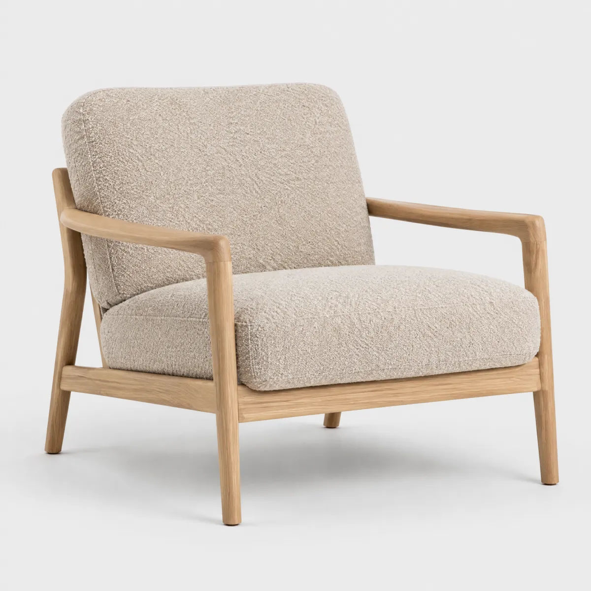
andas
Sessel „Ilvy“ aus Bouclé, Eiche natur
399,99 €
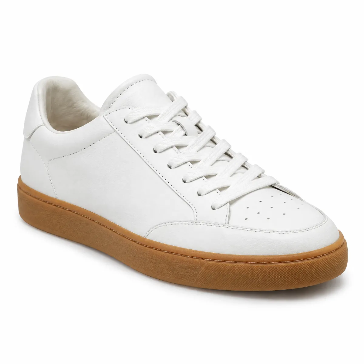
OTTO products
Sneaker aus Glattleder, Weiß
99,99 € 79,99 €
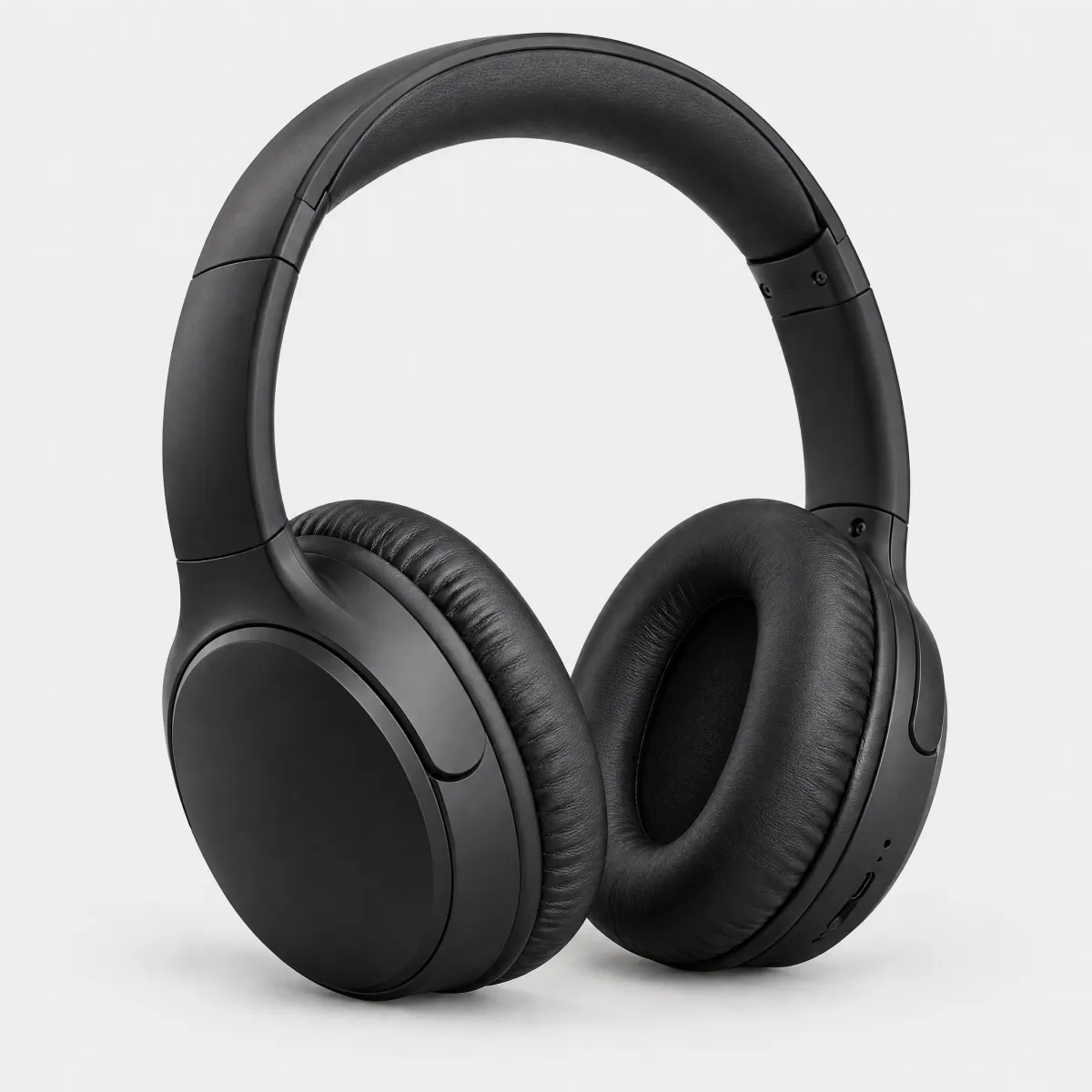
Hanseatic
Over-Ear-Kopfhörer mit Noise Cancelling
59,99 €
HTML
<div style="display:flex;align-items:baseline;gap:8px;flex-wrap:wrap"><p class="demo-title" style="font-size:1.25rem">Neuheiten</p><span class="demo-copy" style="color:var(--oc-semantic-color-text-secondary, #6d6d6d)">3 Artikel</span></div>
<oc-chip-v3><input type="radio" name="chip-demo-cat" checked aria-label="oc-auto"><label slot="content">Alle</label></oc-chip-v3><oc-chip-v3><input type="radio" name="chip-demo-cat" aria-label="oc-auto"><label slot="content">Möbel</label></oc-chip-v3><oc-chip-v3><input type="radio" name="chip-demo-cat" aria-label="oc-auto"><label slot="content">Schuhe</label></oc-chip-v3><oc-chip-v3><input type="radio" name="chip-demo-cat" aria-label="oc-auto"><label slot="content">Elektronik</label></oc-chip-v3><oc-chip-v3><input type="radio" name="chip-demo-cat" aria-label="oc-auto"><label slot="content">Wohnaccessoires</label></oc-chip-v3></div>
<oc-chip-v3 icon-left="filter" size="100"><button>Filter</button></oc-chip-v3><oc-chip-v3 icon-right="close" size="100"><button aria-label="Filter Nachhaltig entfernen">Nachhaltig</button></oc-chip-v3><oc-chip-v3 icon-right="close" size="100"><button aria-label="Filter Bis 400 € entfernen">Bis 400 €</button></oc-chip-v3></div>
<div style="display:grid;grid-template-columns:repeat(auto-fit,minmax(9.5rem,1fr));gap:24px 16px"><article style="display:flex;flex-direction:column;gap:2px;min-width:0"><div style="position:relative;border-radius:16px;overflow:hidden;background:#f3f3f3"><img src="/previews/imagery/samples/otto-product-still/product-armchair.webp" alt="Sessel „Ilvy“ aus Bouclé, Eiche natur" width="600" height="600" loading="lazy" style="display:block;width:100%;height:auto;margin:0;mix-blend-mode:multiply"><div style="position:absolute;left:12px;bottom:12px;display:flex;gap:4px;flex-wrap:wrap"><oc-tag-v1 variant="info-primary" size="50">Neu</oc-tag-v1></div></div><p class="demo-copy" style="margin-top:10px;color:var(--oc-semantic-color-text-secondary, #6d6d6d);text-transform:uppercase;font-size:0.75rem;letter-spacing:0.02em">andas</p><p class="demo-copy">Sessel „Ilvy“ aus Bouclé, Eiche natur</p><p class="demo-copy" style="margin-top:6px"><strong style="font-size:1rem">399,99 €</strong></p></article><article style="display:flex;flex-direction:column;gap:2px;min-width:0"><div style="position:relative;border-radius:16px;overflow:hidden;background:#f3f3f3"><img src="/previews/imagery/samples/otto-product-still/product-sneaker.webp" alt="Sneaker aus Glattleder, Weiß" width="600" height="600" loading="lazy" style="display:block;width:100%;height:auto;margin:0;mix-blend-mode:multiply"><div style="position:absolute;left:12px;bottom:12px;display:flex;gap:4px;flex-wrap:wrap"><oc-tag-v1 variant="sale" size="50">-20 %</oc-tag-v1></div></div><p class="demo-copy" style="margin-top:10px;color:var(--oc-semantic-color-text-secondary, #6d6d6d);text-transform:uppercase;font-size:0.75rem;letter-spacing:0.02em">OTTO products</p><p class="demo-copy">Sneaker aus Glattleder, Weiß</p><p class="demo-copy" style="margin-top:6px"><s style="color:var(--oc-semantic-color-text-secondary, #6d6d6d)">99,99 €</s> <strong style="color:var(--oc-semantic-color-text-sale, #e20020);font-size:1rem">79,99 €</strong></p></article><article style="display:flex;flex-direction:column;gap:2px;min-width:0"><div style="position:relative;border-radius:16px;overflow:hidden;background:#f3f3f3"><img src="/previews/imagery/samples/otto-product-still/product-headphones.webp" alt="Over-Ear-Kopfhörer mit Noise Cancelling" width="600" height="600" loading="lazy" style="display:block;width:100%;height:auto;margin:0;mix-blend-mode:multiply"></div><p class="demo-copy" style="margin-top:10px;color:var(--oc-semantic-color-text-secondary, #6d6d6d);text-transform:uppercase;font-size:0.75rem;letter-spacing:0.02em">Hanseatic</p><p class="demo-copy">Over-Ear-Kopfhörer mit Noise Cancelling</p><p class="demo-copy" style="margin-top:6px"><strong style="font-size:1rem">59,99 €</strong></p></article></div>
Code
| Version | Tag | Status | API |
|---|---|---|---|
| v3 | <oc-chip-v3> |
Stable, allowed for generation | ChipV3 |
| v2 | <oc-chip-v2> |
Deprecated, NOT allowed for generation | ChipV2 |
Only the latest version (v3) is allowed for generation. Older versions are kept for reference and are deprecated.
Overview (v3)
Chip
The chip component represents complex entities in compact form, such as tags or selected options. It offers interactive features like removal and disabling, and allows visual customization with inverted backgrounds, icons, and adjustable sizes.
Default variation
HTML
<oc-chip-v3>
<label slot='content'>Label</label>
<input type='checkbox' aria-label='oc-auto'/>
</oc-chip-v3>
Configuration
This component is configurable, allowing you to tailor its features and appearance to your specific needs. To explore all the available options and adjust the component, use the component configurator and see the changes affect the component in real-time.
Usage guidelines
Before integrating the chip component into your project, make sure you have correctly installed the OTTO components package. Look through the variations page for examples of possible component variations. Here, you can discover both common and specific variations that address different use cases.
Info
See the Chip UX documentation for detailed user experience guidelines.
Layout considerations
Visual Overflow:
This component has visual overflow.
It extends beyond its bounding box and is clipped by parent containers with overflow: hidden.
Ensure the parent container has sufficient padding to accommodate the component's full visual area.
Accessibility
The chip component comes with a set of built-in accessibility features to ensure a seamless experience for all users.
Accessibility for content placed in the slot is the responsibility of the elements used within it.
The chip recognizes the following ARIA attributes on the slotted interactive element to reflect a selected/checked visual state:
| Attribute | Usage |
|---|---|
aria-current |
Use on <a>, <button>, or <div> elements to indicate the current page, step, or item. Any value except "false" is treated as selected. |
aria-pressed="true" |
Use on <button> elements to indicate a toggled-on state (mutually exclusive with aria-checked). |
aria-checked="true" |
Use on custom interactive elements (e.g. role="checkbox" or role="switch") to indicate a checked state. |
Icon-only chips
When using icon-left or icon-right without a text label in the content slot, the chip has no visible text for screen readers.
In this case, provide an aria-label directly on the slotted interactive element:
HTML
<oc-chip-v3 icon-left="like">
<input type="checkbox" aria-label="Like" />
</oc-chip-v3>
Image alt text
When using the image slot, always provide an alt attribute on the image. End the alt text with a period (.) so screen readers insert a natural pause between the image description and the chip label:
<oc-chip-v3>
  <input type="checkbox" aria-label="oc-auto" />
  <img slot="image" src="..." alt="Product thumbnail." />
  <label slot="content">Label</label>
</oc-chip-v3>
Selection state icon
The use-check-state-icon attribute shows a visual checkmark icon when the chip is selected. This icon is decorative — it is not perceived by screen readers. The selected state must always be communicated semantically via the slotted element (e.g. checked on an <input>, or the ARIA attributes listed above). Do not rely on the checkmark icon alone to convey selection.
Deprecated
The
check-if-selectedattribute remains available for compatibility. Useuse-check-state-iconinstead.
Configuration (v3)
Chip V3 configuration
Configure the chip component with the controls below and see the changes live in the preview canvas. Click the Show code button within the preview canvas to see the source code for the current component configuration.
HTML
<oc-chip-v3>
<label slot='content'>Label</label>
<input type='checkbox' aria-label='oc-auto'/>
</oc-chip-v3>
Interactive configurator (Storybook controls); every option is listed in the API section of this file.
Migration (v3)
Migration from Chip v2 to v3
The oc-chip component has been updated from oc-chip-v2 to oc-chip-v3.
This migration guide provides step-by-step instructions to update your project to the latest version.
Skip to:
What's new
- Slot-based interactivity — The chip no longer manages its own interactive element. Any standard HTML interactive element (
<input>,<button>,<a>,<select>, etc.) can be placed in the default slot, giving full control over behavior, form integration, and accessibility. icon-right— Icons can now be placed on both left and right sides simultaneously.- Better radio group support — Since a native
<input type="radio">is used, browser-native radio group behavior (keyboard navigation, form reset, mutual exclusivity) works out of the box without any chip-level configuration. - Full form compatibility — Native
<input>and<button>elements handle form submission, reset, and validation natively without any chip-level wiring.
API changes
Removed
| v2 prop / attribute | Reason |
|---|---|
selection="single|multi" |
Replaced by slotting <input type="radio"> or <input type="checkbox"> |
asButton / as-button |
Replaced by slotting a <button> element |
base64Href / base64-href |
Replaced by slotting a <div data-masked-ref> or <a data-masked-ref> |
checked |
Set checked directly on the slotted <input> |
disabled |
Set disabled directly on the slotted <input> or <button> |
name |
Set name directly on the slotted <input> |
value |
Set value directly on the slotted <input> |
ocAriaLabel / oc-aria-label |
Set aria-label directly on the slotted element |
showRemoveIcon / show-remove-icon |
Use icon-right="clear" on the host instead |
inverted |
Removed without replacement (was already deprecated, use over-color) |
onColor / on-color |
Removed without replacement (was already deprecated, use over-color) |
rel |
Set rel directly on the slotted <a> |
target |
Set target directly on the slotted <a> |
fillParent / fill-parent |
Replaced by width-behavior="fill" |
Changed
| v2 | v3 | Notes |
|---|---|---|
icon |
icon-left |
Renamed for clarity; icon-right is now also available |
show-check-icon |
use-check-state-icon |
Renamed; check-if-selected remains available as a deprecated alias |
| Default slot | slot="content" |
Text content must now be placed in a <label slot="content"> |
size default |
No default | v2 defaulted to "100"; v3 has no default — omit the attribute for the default appearance |
Added
| v3 prop / attribute | Description |
|---|---|
icon-right |
Displays an icon on the right side of the chip |
width-behavior="fill|fit" |
Controls width (replaces fill-parent) |
How to migrate
The fundamental architecture has changed: v2 managed interactivity internally via props (selection, asButton, base64Href). v3 delegates interactivity entirely to a slotted element in the default slot. This makes the chip more flexible and composable.
Selecting the right interactive element for your use case
| Use Case | Slotted Element | Notes |
|---|---|---|
| Multi-select (checkboxes) | <input type="checkbox"> |
Use native form element for automatic form integration |
| Single-select (radio buttons) | <input type="radio"> |
Browser handles mutual exclusivity automatically |
| Toggle state button | <button> with aria-pressed |
For simple toggled states without form submission |
| Navigation (current page) | <a> with aria-current |
Use for navigation links; any value except "false" marks as selected |
| Custom toggle with semantics | <button role="switch"> with aria-checked |
For switch-like behavior with explicit role |
| Simple action button | <button> |
No ARIA state attributes needed |
| Dropdown/select | <select> |
For native dropdown selection |
Migrate a selectable chip (multi-selection / checkbox)
<!-- From: -->
<oc-chip-v2 selection="multi" name="brand" value="otto">Otto</oc-chip-v2>

<!-- To: -->
<oc-chip-v3>
  <input type="checkbox" name="brand" value="otto" aria-label="oc-auto" />
  <label slot="content">Otto</label>
</oc-chip-v3>
Migrate a selectable chip (single-selection / radio)
<!-- From: -->
<oc-chip-v2 selection="single" name="brand" value="otto">Otto</oc-chip-v2>

<!-- To: -->
<oc-chip-v3>
  <input type="radio" name="brand" value="otto" aria-label="oc-auto" />
  <label slot="content">Otto</label>
</oc-chip-v3>
Migrate a button chip
<!-- From: -->
<oc-chip-v2 as-button>Label</oc-chip-v2>

<!-- To (simple action button): -->
<oc-chip-v3>
  <button>Label</button>
</oc-chip-v3>

<!-- To (with toggled-on state via aria-pressed): -->
<oc-chip-v3>
  <button aria-pressed="true">Label</button>
</oc-chip-v3>
Migrate a link chip
No changes needed — slotting an <a> element directly was already supported in v2 and works the same in v3:
HTML
<oc-chip-v3>
<a href="/page">Label</a>
</oc-chip-v3>
Migrate a checked/selected checkbox chip
<!-- From: -->
<oc-chip-v2 selection="multi" name="brand" value="otto" checked>Otto</oc-chip-v2>

<!-- To: -->
<oc-chip-v3>
  <input type="checkbox" name="brand" value="otto" aria-label="oc-auto" checked />
  <label slot="content">Otto</label>
</oc-chip-v3>
Migrate a selected radio button chip
<!-- From: -->
<oc-chip-v2 selection="single" name="brand" value="otto" checked>Otto</oc-chip-v2>

<!-- To: -->
<oc-chip-v3>
  <input type="radio" name="brand" value="otto" aria-label="oc-auto" checked />
  <label slot="content">Otto</label>
</oc-chip-v3>
Migrate a link chip with current page indication
There was no direct v2 equivalent — marking a link as the current page is new in v3. Add aria-current to the slotted <a>. Any value except "false" is treated as selected:
HTML
<oc-chip-v3>
<a href="/current" aria-current="page">Current Page</a>
</oc-chip-v3>
Migrate a removable chip
<!-- From: -->
<oc-chip-v2 show-remove-icon>Label</oc-chip-v2>

<!-- To: -->
<oc-chip-v3 icon-right="clear">
  <button>Label</button>
</oc-chip-v3>
Migrate fill-parent
<!-- From: -->
<oc-chip-v2 fill-parent>Label</oc-chip-v2>

<!-- To: -->
<oc-chip-v3 width-behavior="fill">
  <input type="checkbox" aria-label="oc-auto" />
  <label slot="content">Label</label>
</oc-chip-v3>
API v2 (v2, deprecated, not for generation)
Chip v2 API
API: <oc-chip-v2> (ChipV2)
The chip component represents complex entities in compact form, such as tags or selected options. It offers interactive features like removal and disabling, and allows visual customization with inverted backgrounds, icons, and adjustable sizes.
Attributes / properties
| Attribute | Type | Default | Required | Description |
|---|---|---|---|---|
selection |
"single" | "multi" |
undefined |
no | Specifies if and how the chip should be selectable. |
size |
"100" | "200" |
undefined |
no | Sets the size of the chip. |
value |
string |
"on" |
no | Sets the initial value of the chip for form processing. Mandatory if single-selection is set to true. |
icon |
icon name (428 values; see Icon list in `storybook/components/icon/README.md`) |
undefined |
no | Sets an icon to be displayed on the left side of the chip. Note: When using only an icon without text, it is important to provide an appropriate oc-aria-label for accessibility purposes. |
over-color |
boolean |
false |
no | Changes the background-color of the chip to be placed on a colored surface. |
on-color |
boolean |
false |
no | Deprecated: Use overColor prop instead.Changes the background-color of the chip to be placed on a colored surface. |
inverted |
boolean |
false |
no | Deprecated: Use overColor prop instead.Changes the background-color of the chip to be placed on a colored surface. |
checked |
boolean |
false |
no | Toggles the state of the chip between checked and unchecked. Set to true to initially tick the chip.Accessible in CSS via the custom-state mixin. Only allowed in combination with selection="single" or selection="multi". This is required to ensure proper behavior and accessibility of selectable chips. |
disabled |
boolean |
false |
no | Disables the chip, preventing user interaction and input. |
show-check-icon |
boolean |
false |
no | Displays a checkmark icon on the chip when it is selected. This option only works if the properties showRemoveIcon and disabled are both set to false. |
show-remove-icon |
boolean |
false |
no | Displays an "x" icon on the chip. |
fill-parent |
boolean |
false |
no | Sets the width of the chip to match the width of the parent element. |
name |
string |
undefined |
no | Sets the name tag to identify the chip when submitting a form. Mandatory if single-selection is set to true. |
base64-href |
string |
undefined |
no | Sets the base64 encoded link target of the chip component. Use this attribute to prevent search engines from indexing the link target. |
target |
"_blank" | "_self" | "_parent" | "_top" |
undefined |
no | Sets the target attribute of the interactive component. Note Only applies when base64Href is set. |
rel |
string |
undefined |
no | Sets the rel attribute of the interactive component. Note Only applies when base64Href is set. |
as-button |
boolean |
false |
no | Determines if the chip behaves as a button. Set to true to make the chip behave as a button and trigger an action instead of navigating to a new page. |
oc-aria-label |
string |
undefined |
no | Sets the ARIA label of the chip. |
Slots
| Slot | Required | Description |
|---|---|---|
default |
no | Sets the text content of the chip. |
image |
no | Sets the image content of the chip. When providing an alt text, please end with a dot (.) to separate it from the label when read by screen readers. Example: <img src="" slot='image' alt="Alt text for image."/> |
Events
| Event | Detail type | Description |
|---|---|---|
oc-property-change |
OcChipV2Events["oc-property-change"] |
Whenever a property value changes, this event triggers. Use this event to track all property changes within the component. Refer to the Events documentation for more information. |
oc-mount |
{ component: string; } |
Fired when the component is mounted to the DOM. The event is fired when the onMount hook of the component is called by the runtime. |
oc-unmount |
{ component: string; } |
Fired when the component is unmounted from the DOM. The event is fired when the function returned by the onMount hook of the component is called by the runtime. |
CSS custom properties
| Custom property | Default | Description |
|---|---|---|
--color |
undefined |
Sets the text color and icon color through a CSS variable. Note: The preferred way of using colors is via design tokens instead of hex values. |
--image-width |
Sets the width of the image container through a CSS variable. | |
--image-border-radius |
Sets the radius of the image container through a CSS variable. |
API v3
Chip v3 API
API: <oc-chip-v3> (ChipV3)
The chip component represents complex entities in compact form, such as tags or selected options. It offers interactive features like removal and disabling, and allows visual customization with inverted backgrounds, icons, and adjustable sizes.
Attributes / properties
| Attribute | Type | Default | Required | Description |
|---|---|---|---|---|
size |
"100" | "200" |
undefined |
no | Sets the size of the chip. |
icon-left |
icon name (428 values; see Icon list in `storybook/components/icon/README.md`) |
undefined |
no | Sets an icon to be displayed on the left side of the chip. |
icon-right |
icon name (428 values; see Icon list in `storybook/components/icon/README.md`) |
undefined |
no | Sets an icon to be displayed on the right side of the chip. |
over-color |
boolean |
false |
no | Changes the background-color of the chip to be placed on a colored surface. |
use-check-state-icon |
boolean |
false |
no | Displays a checkmark icon on the chip when it is selected. |
check-if-selected |
boolean |
false |
no | Deprecated: Use useCheckStateIcon instead.Displays a checkmark icon on the chip when it is selected. |
width-behavior |
"fill" | "fit" |
"fit" |
no | Defines the width behavior of the chip component. - "fill": The component expands to fill the available width. - "fit": The component width fits its content. |
Slots
| Slot | Required | Description |
|---|---|---|
default |
yes | Accepts one of the following elements: - <input type="checkbox"> for multi-selection - <input type="radio"> for single-selection - <button role="switch"> for switch behavior - <button> for button behavior - <a href="#"> for link behavior - <div data-masked-ref="..."> for masked link behavior - <a data-masked-ref="..."> for link switching - aria-current on <button> or <a> for current-marked behaviorIf a non-interactive element is used, the chip will not have any interactive styles or behaviors applied to it. If you want the chip to be checked initially, add "checked" to the <input>.For more information on interactive components, refer to the interactive component slots documentation. |
content |
no | The text or HTML content displayed inside the chip. |
image |
no | Sets the image content of the chip. When providing an alt text, please end with a dot (.) to separate it from the label when read by screen readers. Example: <img src="" slot='image' alt="Alt text for image."/> |
Events
| Event | Detail type | Description |
|---|---|---|
oc-property-change |
OcChipV3Events["oc-property-change"] |
Whenever a property value changes, this event triggers. Use this event to track all property changes within the component. Refer to the Events documentation for more information. |
oc-mount |
{ component: string; } |
Fired when the component is mounted to the DOM. The event is fired when the onMount hook of the component is called by the runtime. |
oc-unmount |
{ component: string; } |
Fired when the component is unmounted from the DOM. The event is fired when the function returned by the onMount hook of the component is called by the runtime. |
CSS custom properties
| Custom property | Default | Description |
|---|---|---|
--color |
undefined |
Sets the text color and icon color through a CSS variable. Note The preferred way of using colors is via design tokens instead of hex values. |
--image-width |
Sets the width of the image container through a CSS variable. | |
--image-border-radius |
Sets the radius of the image container through a CSS variable. |
Variations (v3)
Variations
Listed below are the most common variations of the chip component as well as specific component variations for different use cases.
You can explore all available options using the component configurator, adjust the component to your needs, and see the changes live in a preview canvas.
Default
Story: components-chip-variations--default · tags: components, chip, v3, variations
Default Component
Args: defaultSlot=<input type='checkbox' aria-label='oc-auto'/>, contentSlot=<label slot='content'>Label</label>
HTML
<oc-chip-v3>
<label slot='content'>Label</label>
<input type='checkbox' aria-label='oc-auto'/>
</oc-chip-v3>
Icon Left
Story: components-chip-variations--icon-left · tags: components, chip, v3, variations
Variation with an icon on the left side of the chip label.
Args: icon-left=arrow-left, defaultSlot=<input type='checkbox' aria-label='oc-auto'/>, contentSlot=<label slot='content'>Icon and Text</label>
HTML
<oc-chip-v3 icon-left="arrow-left">
<label slot='content'>Icon and Text</label>
<input type='checkbox' aria-label='oc-auto'/>
</oc-chip-v3>
Icon Only
Story: components-chip-variations--icon-only · tags: components, chip, v3, variations
Variation with only an icon and no text label.
Args: icon-left=like, defaultSlot=<input type='checkbox' aria-label='like'/>
HTML
<oc-chip-v3 icon-left="like"><input type='checkbox' aria-label='like'/></oc-chip-v3>Check Icon
Story: components-chip-variations--check-icon · tags: components, chip, v3, variations
Variation with a check icon replacing the left icon when the chip is selected.
Args: icon-left=basket, use-check-state-icon=true, defaultSlot=<input type='checkbox' checked aria-label='oc-auto'/>, contentSlot=<label slot='content'>I am showing a check icon if I am selected</label>
HTML
<oc-chip-v3 icon-left="basket" use-check-state-icon>
<label slot='content'>I am showing a check icon if I am selected</label>
<input type='checkbox' checked aria-label='oc-auto'/>
</oc-chip-v3>
Virtual Assistant
Story: components-chip-variations--virtual-assistant · tags: components, chip, v3, variations
Variation with a virtual assistant style using a sparkles icon and a custom purple color.
Args: icon-left=sparkles, --color=var(--oc-base-color-purple-140), defaultSlot=<button>test</button>
HTML
<oc-chip-v3 icon-left="sparkles" style="--color: var(--oc-base-color-purple-140)">
<button>test</button>
</oc-chip-v3>
Icon Right 200
Story: components-chip-variations--icon-right-200 · tags: components, chip, v3, variations
Variation with an icon on the right side in size 200.
Args: size=200, icon-right=arrow-right, defaultSlot=<input type='checkbox' aria-label='oc-auto'/>, contentSlot=<label slot='content'>Chip 200 with Icon and Text</label>
HTML
<oc-chip-v3 size="200" icon-right="arrow-right">
<label slot='content'>Chip 200 with Icon and Text</label>
<input type='checkbox' aria-label='oc-auto'/>
</oc-chip-v3>
Removable
Story: components-chip-variations--removable · tags: components, chip, v3, variations
Variation with a removable clear icon on the right side. Clicking the icon removes the chip.
Args: size=100, icon-right=clear, defaultSlot=<button>Label</button>
HTML
<oc-chip-v3 size="100" icon-right="clear"><button>Label</button></oc-chip-v3>Disabled
Story: components-chip-variations--disabled · tags: components, chip, v3, variations
Variation with the disabled state, showing icons on both left and right sides.
Args: size=100, icon-left=wishlist, icon-right=wishlist, defaultSlot=<input type='checkbox' disabled aria-label='oc-auto'/>, contentSlot=<label slot='content'>Disabled</label>
HTML
<oc-chip-v3 size="100" icon-left="wishlist" icon-right="wishlist">
<label slot='content'>Disabled</label>
<input type='checkbox' disabled aria-label='oc-auto'/>
</oc-chip-v3>
Image
Story: components-chip-variations--image · tags: components, chip, v3, variations
Variant with Image.
Args: defaultSlot=<input type='checkbox' aria-label='oc-auto'/>, contentSlot=<label slot='content'>Chip with image</label>, imageSlot=(see snippet)

HTML
<oc-chip-v3>
<label slot='content'>Chip with image</label>
<img slot="image" src="https://www.otto.de/assets-storybook/assets/img-placeholder-100.DVwSxVZf.png" alt="Placeholder image." />
<input type='checkbox' aria-label='oc-auto'/>
</oc-chip-v3>
With checked behavior
Story: components-chip-variations--with-checked-behavior · tags: components, chip, v3, variations
The chip can be marked as checked using a checkbox, a radio button, a switch button, or a current-marked link in the default slot. See marking content as checked for guidance on choosing the right pattern.
HTML
<h2>Checkbox</h2>
<div class="row">
<oc-chip-v3 >
  <input type="checkbox" aria-label="oc-auto" />
  <label slot="content">Selectable</label>
</oc-chip-v3>
<oc-chip-v3 >
  <input type="checkbox" aria-label="oc-auto" checked />
  <label slot="content">Selectable</label>
</oc-chip-v3>
<oc-chip-v3 >
  <input type="checkbox" aria-label="oc-auto" />
  <label slot="content">Selectable</label>
</oc-chip-v3>
<h2>Radio button</h2>
<div class="row">
<oc-chip-v3 >
  <input type="radio" name="chip-selection-demo" aria-label="oc-auto" />
  <label slot="content">Selectable</label>
</oc-chip-v3>
<oc-chip-v3 >
  <input type="radio" name="chip-selection-demo" aria-label="oc-auto" checked />
  <label slot="content">Selectable</label>
</oc-chip-v3>
<oc-chip-v3 >
  <input type="radio" name="chip-selection-demo" aria-label="oc-auto" />
  <label slot="content">Selectable</label>
</oc-chip-v3>
<h2>Switch button</h2>
<div class="row">
<oc-chip-v3 >
  <button role="switch" aria-checked="false">Toggleable</button>
</oc-chip-v3>
<oc-chip-v3 >
  <button role="switch" aria-checked="true">Toggleable</button>
</oc-chip-v3>
<oc-chip-v3 >
  <button role="switch" aria-checked="false">Toggleable</button>
</oc-chip-v3>
<h2>Current-marked link</h2>
<div class="row">
<oc-chip-v3 >
  <a href="#">Link</a>
</oc-chip-v3>
<oc-chip-v3 >
  <a href="#" aria-current="page">Link</a>
</oc-chip-v3>
<oc-chip-v3 >
  <a href="#">Link</a>
</oc-chip-v3>
<style>
.row {
  display: flex;
  gap: 16px;
  flex-wrap: wrap;
  margin-bottom: 24px;
}
h2 {
  margin-top: 16px;
}
</style>
Story source (TypeScript, verbatim from Storybook)
{
  name: "With checked behavior",
  // eslint-disable-next-line @typescript-eslint/no-unused-vars -- defaultSlot/contentSlot are not used, this story renders fixed content
  render({
    defaultSlot,
    contentSlot,
    ...props
  }) {
    return html`
      <h2>Checkbox</h2>
      <div class="row">
        <oc-chip-v3 ${spread(props)}>
          <input type="checkbox" aria-label="oc-auto" />
          <label slot="content">Selectable</label>
        </oc-chip-v3>
        <oc-chip-v3 ${spread(props)}>
          <input type="checkbox" aria-label="oc-auto" checked />
          <label slot="content">Selectable</label>
        </oc-chip-v3>
        <oc-chip-v3 ${spread(props)}>
          <input type="checkbox" aria-label="oc-auto" />
          <label slot="content">Selectable</label>
        </oc-chip-v3>
      </div>

      <h2>Radio button</h2>
      <div class="row">
        <oc-chip-v3 ${spread(props)}>
          <input type="radio" name="chip-selection-demo" aria-label="oc-auto" />
          <label slot="content">Selectable</label>
        </oc-chip-v3>
        <oc-chip-v3 ${spread(props)}>
          <input type="radio" name="chip-selection-demo" aria-label="oc-auto" checked />
          <label slot="content">Selectable</label>
        </oc-chip-v3>
        <oc-chip-v3 ${spread(props)}>
          <input type="radio" name="chip-selection-demo" aria-label="oc-auto" />
          <label slot="content">Selectable</label>
        </oc-chip-v3>
      </div>

      <h2>Switch button</h2>
      <div class="row">
        <oc-chip-v3 ${spread(props)}>
          <button role="switch" aria-checked="false">Toggleable</button>
        </oc-chip-v3>
        <oc-chip-v3 ${spread(props)}>
          <button role="switch" aria-checked="true">Toggleable</button>
        </oc-chip-v3>
        <oc-chip-v3 ${spread(props)}>
          <button role="switch" aria-checked="false">Toggleable</button>
        </oc-chip-v3>
      </div>

      <h2>Current-marked link</h2>
      <div class="row">
        <oc-chip-v3 ${spread(props)}>
          <a href="#">Link</a>
        </oc-chip-v3>
        <oc-chip-v3 ${spread(props)}>
          <a href="#" aria-current="page">Link</a>
        </oc-chip-v3>
        <oc-chip-v3 ${spread(props)}>
          <a href="#">Link</a>
        </oc-chip-v3>
      </div>

      <style>
        .row {
          display: flex;
          gap: 16px;
          flex-wrap: wrap;
          margin-bottom: 24px;
        }

        h2 {
          margin-top: 16px;
        }
      </style>
    `;
  }
}
With button behavior
Story: components-chip-variations--with-button-behavior · tags: components, chip, v3, variations
The chip component with a button as primary action.
Args: defaultSlot=<button>Content</button>
HTML
<oc-chip-v3><button>Content</button></oc-chip-v3>With link behavior
Story: components-chip-variations--with-link-behavior · tags: components, chip, v3, variations
The chip component with a link as primary action. Search engines will detect the href.
Args: defaultSlot=<a href='#'>Content</a>
HTML
<oc-chip-v3><a href='#'>Content</a></oc-chip-v3>With masked link behavior
Story: components-chip-variations--with-masked-link-behavior · tags: components, chip, v3, variations
The chip component as a masked link. Search engines will not detect the href.
Args: defaultSlot=<div role="link" tabindex="0" data-masked-ref='Iw=='>Content</div>
HTML
<oc-chip-v3><div role="link" tabindex="0" data-masked-ref='Iw=='>Content</div></oc-chip-v3>With link switch behavior
Story: components-chip-variations--with-link-switch-behavior · tags: components, chip, v3, variations
The chip component as a link with switch behavior. Search engines will detect the href, while users receive the Base64-encoded version.
Args: defaultSlot=<a href='/foo' data-masked-ref='L2Jhcg=='>Content</a>
HTML
<oc-chip-v3><a href='/foo' data-masked-ref='L2Jhcg=='>Content</a></oc-chip-v3>Demo: How to mark select
Story: components-chip-variations--demo-how-to-mark-select · tags: components, chip, v3, variations
Radio Buttons
Buttons with role="switch"
Buttons marked as current
links marked as current
HTML
<h2>Radio Buttons</h2>
<div class="row">
<oc-chip-v3>
  <input type="radio" aria-label="oc-auto" name="foo" value="bar1" />
  <label slot="content">radio button</label>
</oc-chip-v3>
<oc-chip-v3>
  <input type="radio" aria-label="oc-auto" name="foo" value="bar2" checked />
  <label slot="content">radio button</label>
</oc-chip-v3>
<oc-chip-v3>
  <input type="radio" aria-label="oc-auto" name="foo" value="bar3" />
  <label slot="content">radio button</label>
</oc-chip-v3>
<h2>Buttons with role="switch"</h2>
<div class="row">
<oc-chip-v3>
  <button role="switch" aria-checked="false">button</button>
</oc-chip-v3>
<oc-chip-v3>
  <button role="switch" aria-checked="true">button aria-checked="true"</button>
</oc-chip-v3>
<oc-chip-v3>
  <button role="switch" aria-checked="false">button</button>
</oc-chip-v3>
<h2>Buttons marked as current</h2>
<div class="row">
<oc-chip-v3>
  <button aria-current="false">button</button>
</oc-chip-v3>
<oc-chip-v3>
  <button aria-current="true">button with aria-current="true"</button>
</oc-chip-v3>
<oc-chip-v3>
  <button aria-current="false">button</button>
</oc-chip-v3>
<h2>links marked as current</h2>
<div class="row">
<oc-chip-v3>
  <a href="/1">link</a>
</oc-chip-v3>
<oc-chip-v3>
  <a aria-current="page" href="/2">link with aria-current="page"</a>
</oc-chip-v3>
<oc-chip-v3>
  <a href="/3">link</a>
</oc-chip-v3>
<style>
.row {
  display: flex;
}
h2 {
  margin-top: 16px;
}
</style>
Story source (TypeScript, verbatim from Storybook)
{
  name: "Demo: How to mark select",
  parameters: {
    controls: {
      disabled: true
    },
    chromatic: {
      hideInChromatic: true,
      disableSnapshot: true
    }
  },
  argTypes: hideControlsBadge(Metadata),
  render() {
    return html`
      <h2>Radio Buttons</h2>
      <div class="row">
        <oc-chip-v3>
          <input type="radio" aria-label="oc-auto" name="foo" value="bar1" />
          <label slot="content">radio button</label>
        </oc-chip-v3>
        <oc-chip-v3>
          <input type="radio" aria-label="oc-auto" name="foo" value="bar2" checked />
          <label slot="content">radio button</label>
        </oc-chip-v3>
        <oc-chip-v3>
          <input type="radio" aria-label="oc-auto" name="foo" value="bar3" />
          <label slot="content">radio button</label>
        </oc-chip-v3>
      </div>

      <h2>Buttons with role="switch"</h2>
      <div class="row">
        <oc-chip-v3>
          <button role="switch" aria-checked="false">button</button>
        </oc-chip-v3>
        <oc-chip-v3>
          <button role="switch" aria-checked="true">button aria-checked="true"</button>
        </oc-chip-v3>
        <oc-chip-v3>
          <button role="switch" aria-checked="false">button</button>
        </oc-chip-v3>
      </div>

      <h2>Buttons marked as current</h2>
      <div class="row">
        <oc-chip-v3>
          <button aria-current="false">button</button>
        </oc-chip-v3>
        <oc-chip-v3>
          <button aria-current="true">button with aria-current="true"</button>
        </oc-chip-v3>
        <oc-chip-v3>
          <button aria-current="false">button</button>
        </oc-chip-v3>
      </div>

      <h2>links marked as current</h2>
      <div class="row">
        <oc-chip-v3>
          <a href="/1">link</a>
        </oc-chip-v3>
        <oc-chip-v3>
          <a aria-current="page" href="/2">link with aria-current="page"</a>
        </oc-chip-v3>
        <oc-chip-v3>
          <a href="/3">link</a>
        </oc-chip-v3>
      </div>

      <style>
        .row {
          display: flex;
        }

        h2 {
          margin-top: 16px;
        }
      </style>
    `;
  }
}
Demo: Multilines
Story: components-chip-variations--demo-with-multilines · tags: components, chip, v3, variations
Demo with multiline text content at various fixed widths for both size 100 and size 200, including combinations of icons and images.
<oc-chip-v3 style="width: 137px">
  <input type="checkbox" aria-label="oc-auto" />
  <label slot="content">This is a default chip</label>
</oc-chip-v3>
<oc-chip-v3 style="width: 122px">
  <input type="checkbox" aria-label="oc-auto" />
  <label slot="content">This is a chip with two lines</label>
</oc-chip-v3>
<oc-chip-v3 style="width: 247px">
  <input type="checkbox" aria-label="oc-auto" />
  <label slot="content">
    This is a chip that goes as far as possible but when it reaches the container’s limit
    breaks to several lines.
  </label>
</oc-chip-v3>
<oc-chip-v3 style="width: 243px" icon-left="smiley-positive">
  <input type="checkbox" aria-label="oc-auto" />
  <label slot="content">
    This is a chip with even more lines, in fact it’s 3 of them. And we have an icon on the
    left.
  </label>
</oc-chip-v3>
<oc-chip-v3 style="width: 247px">
  <input type="checkbox" aria-label="oc-auto" />
  <label slot="content">
    This is a chip with even more lines, in fact it’s 3 of them. And we have an image on the
    left.
  </label>
  <img slot="image" src="${placeholderImg}" alt="Placeholder image." />
</oc-chip-v3>

<oc-chip-v3 style="width: 247px" icon-left="smiley-positive" icon-right="close">
  <input type="checkbox" aria-label="oc-auto" />
  <label slot="content">
    This is a chip with even more lines, in fact it’s 3 of them. And we have an icon on the
    left.
  </label>
</oc-chip-v3>
<oc-chip-v3 style="width: 251px" icon-right="close">
  <input type="checkbox" aria-label="oc-auto" />
  <label slot="content">
    This is a chip with even more lines, in fact it’s 3 of them. We also support icons on the
    right.
  </label>
  <img slot="image" src="${placeholderImg}" alt="Placeholder image." />
</oc-chip-v3>

<oc-chip-v3 style="width: 231px" icon-right="arrow-down">
  <input type="checkbox" aria-label="oc-auto" />
  <label slot="content">
    This is a chip with even more lines, in fact it’s 4 of them. We also support icons on the
    right. They may even be different ones.
  </label>
</oc-chip-v3>

<br />

<oc-chip-v3 style="width: 156px" size="200">
  <input type="checkbox" aria-label="oc-auto" />
  <label slot="content">This is a default chip</label>
</oc-chip-v3>
<oc-chip-v3 style="width: 145px" size="200">
  <input type="checkbox" aria-label="oc-auto" />
  <label slot="content">This is a chip with two lines</label>
</oc-chip-v3>
<oc-chip-v3 style="width: 276px" size="200">
  <input type="checkbox" aria-label="oc-auto" />
  <label slot="content">
    This is a chip that goes as far as possible but when it reaches the container’s limit
    breaks to several lines.
  </label>
</oc-chip-v3>
<oc-chip-v3 style="width: 280px" size="200" icon-left="smiley-positive">
  <input type="checkbox" aria-label="oc-auto" />
  <label slot="content">
    This is a chip with even more lines, in fact it’s 3 of them. And we have an icon on the
    left.
  </label>
</oc-chip-v3>
<oc-chip-v3 style="width: 280px" size="200">
  <input type="checkbox" aria-label="oc-auto" />
  <label slot="content">
    This is a chip with even more lines, in fact it’s 3 of them. And we have an image on the
    left.
  </label>
  <img slot="image" src="${placeholderImg}" alt="Placeholder image." />
</oc-chip-v3>

<oc-chip-v3 style="width: 300px" size="200" icon-left="smiley-positive" icon-right="close">
  <input type="checkbox" aria-label="oc-auto" />
  <label slot="content">
    This is a chip with even more lines, in fact it’s 3 of them. And we have an icon on the
    left.
  </label>
</oc-chip-v3>
<oc-chip-v3 style="width: 300px" size="200" icon-right="close">
  <input type="checkbox" aria-label="oc-auto" />
  <label slot="content">
    This is a chip with even more lines, in fact it’s 3 of them. We also support icons on the
    right.
  </label>
  <img slot="image" src="${placeholderImg}" alt="Placeholder image." />
</oc-chip-v3>

<oc-chip-v3 style="width: 300px" size="200" icon-right="arrow-down">
  <input type="checkbox" aria-label="oc-auto" />
  <label slot="content">
    This is a chip with even more lines, in fact it’s 4 of them. We also support icons on the
    right. They may even be different ones.
  </label>
</oc-chip-v3>

<style>
  oc-chip-v3 {
    margin: 8px 0;
  }
</style>
Story source (TypeScript, verbatim from Storybook)
{
  name: "Demo: Multilines",
  parameters: {
    controls: {
      disabled: true
    },
    chromatic: {
      hideInChromatic: true,
      disableSnapshot: true
    }
  },
  argTypes: hideControlsBadge(Metadata),
  render() {
    return html`
      <oc-chip-v3 style="width: 137px">
        <input type="checkbox" aria-label="oc-auto" />
        <label slot="content">This is a default chip</label>
      </oc-chip-v3>
      <oc-chip-v3 style="width: 122px">
        <input type="checkbox" aria-label="oc-auto" />
        <label slot="content">This is a chip with two lines</label>
      </oc-chip-v3>
      <oc-chip-v3 style="width: 247px">
        <input type="checkbox" aria-label="oc-auto" />
        <label slot="content">
          This is a chip that goes as far as possible but when it reaches the container’s limit
          breaks to several lines.
        </label>
      </oc-chip-v3>
      <oc-chip-v3 style="width: 243px" icon-left="smiley-positive">
        <input type="checkbox" aria-label="oc-auto" />
        <label slot="content">
          This is a chip with even more lines, in fact it’s 3 of them. And we have an icon on the
          left.
        </label>
      </oc-chip-v3>
      <oc-chip-v3 style="width: 247px">
        <input type="checkbox" aria-label="oc-auto" />
        <label slot="content">
          This is a chip with even more lines, in fact it’s 3 of them. And we have an image on the
          left.
        </label>
        <img slot="image" src="${placeholderImg}" alt="Placeholder image." />
      </oc-chip-v3>

      <oc-chip-v3 style="width: 247px" icon-left="smiley-positive" icon-right="close">
        <input type="checkbox" aria-label="oc-auto" />
        <label slot="content">
          This is a chip with even more lines, in fact it’s 3 of them. And we have an icon on the
          left.
        </label>
      </oc-chip-v3>
      <oc-chip-v3 style="width: 251px" icon-right="close">
        <input type="checkbox" aria-label="oc-auto" />
        <label slot="content">
          This is a chip with even more lines, in fact it’s 3 of them. We also support icons on the
          right.
        </label>
        <img slot="image" src="${placeholderImg}" alt="Placeholder image." />
      </oc-chip-v3>

      <oc-chip-v3 style="width: 231px" icon-right="arrow-down">
        <input type="checkbox" aria-label="oc-auto" />
        <label slot="content">
          This is a chip with even more lines, in fact it’s 4 of them. We also support icons on the
          right. They may even be different ones.
        </label>
      </oc-chip-v3>

      <br />

      <oc-chip-v3 style="width: 156px" size="200">
        <input type="checkbox" aria-label="oc-auto" />
        <label slot="content">This is a default chip</label>
      </oc-chip-v3>
      <oc-chip-v3 style="width: 145px" size="200">
        <input type="checkbox" aria-label="oc-auto" />
        <label slot="content">This is a chip with two lines</label>
      </oc-chip-v3>
      <oc-chip-v3 style="width: 276px" size="200">
        <input type="checkbox" aria-label="oc-auto" />
        <label slot="content">
          This is a chip that goes as far as possible but when it reaches the container’s limit
          breaks to several lines.
        </label>
      </oc-chip-v3>
      <oc-chip-v3 style="width: 280px" size="200" icon-left="smiley-positive">
        <input type="checkbox" aria-label="oc-auto" />
        <label slot="content">
          This is a chip with even more lines, in fact it’s 3 of them. And we have an icon on the
          left.
        </label>
      </oc-chip-v3>
      <oc-chip-v3 style="width: 280px" size="200">
        <input type="checkbox" aria-label="oc-auto" />
        <label slot="content">
          This is a chip with even more lines, in fact it’s 3 of them. And we have an image on the
          left.
        </label>
        <img slot="image" src="${placeholderImg}" alt="Placeholder image." />
      </oc-chip-v3>

      <oc-chip-v3 style="width: 300px" size="200" icon-left="smiley-positive" icon-right="close">
        <input type="checkbox" aria-label="oc-auto" />
        <label slot="content">
          This is a chip with even more lines, in fact it’s 3 of them. And we have an icon on the
          left.
        </label>
      </oc-chip-v3>
      <oc-chip-v3 style="width: 300px" size="200" icon-right="close">
        <input type="checkbox" aria-label="oc-auto" />
        <label slot="content">
          This is a chip with even more lines, in fact it’s 3 of them. We also support icons on the
          right.
        </label>
        <img slot="image" src="${placeholderImg}" alt="Placeholder image." />
      </oc-chip-v3>

      <oc-chip-v3 style="width: 300px" size="200" icon-right="arrow-down">
        <input type="checkbox" aria-label="oc-auto" />
        <label slot="content">
          This is a chip with even more lines, in fact it’s 4 of them. We also support icons on the
          right. They may even be different ones.
        </label>
      </oc-chip-v3>

      <style>
        oc-chip-v3 {
          margin: 8px 0;
        }
      </style>
    `;
  }
}
Demo: Fill Parent
Story: components-chip-variations--demo-with-multilines-and-fill-parent · tags: components, chip, v3, variations
Demo with width-behavior="fill" causing the chip to stretch to its parent container's width,
shown with various icon and image combinations for both size 100 and size 200.
<div style="width: 250px;">
  <oc-chip-v3 width-behavior="fill">
    <input type="checkbox" aria-label="oc-auto" />
    <label slot="content">This is a default chip</label>
  </oc-chip-v3>
  <oc-chip-v3 width-behavior="fill" icon-right="close">
    <input type="checkbox" aria-label="oc-auto" />
    <label slot="content">This is a chip with icon-right</label>
  </oc-chip-v3>
  <oc-chip-v3 width-behavior="fill" icon-left="smiley-positive" icon-right="close">
    <input type="checkbox" aria-label="oc-auto" />
    <label slot="content"> This is with icon-left and -right </label>
  </oc-chip-v3>
  <oc-chip-v3 width-behavior="fill">
    <input type="checkbox" aria-label="oc-auto" />
    <label slot="content">This is a chip with image</label>
    <img slot="image" src="${placeholderImg}" alt="Placeholder image." />
  </oc-chip-v3>
  <oc-chip-v3 width-behavior="fill" icon-right="close">
    <input type="checkbox" aria-label="oc-auto" />
    <label slot="content">This is a chip with image and icon</label>
    <img slot="image" src="${placeholderImg}" alt="Placeholder image." />
  </oc-chip-v3>

  <oc-chip-v3 width-behavior="fill">
    <input type="checkbox" aria-label="oc-auto" />
    <label slot="content">
      This is a chip that goes as far as possible but when it reaches the container’s limit
      breaks to several lines.
    </label>
  </oc-chip-v3>
  <oc-chip-v3 width-behavior="fill" icon-left="smiley-positive">
    <input type="checkbox" aria-label="oc-auto" />
    <label slot="content">
      This is a chip with even more lines, in fact it’s 3 of them. And we have an icon on the
      left.
    </label>
  </oc-chip-v3>
  <oc-chip-v3 width-behavior="fill">
    <input type="checkbox" aria-label="oc-auto" />
    <label slot="content">
      This is a chip with even more lines, in fact it’s 3 of them. And we have an image on the
      left.
    </label>
    <img slot="image" src="${placeholderImg}" alt="Placeholder image." />
  </oc-chip-v3>

  <oc-chip-v3 width-behavior="fill" icon-left="smiley-positive" icon-right="close">
    <input type="checkbox" aria-label="oc-auto" />
    <label slot="content">
      This is a chip with even more lines, in fact it’s 3 of them. We also support icons on
      the right.
    </label>
  </oc-chip-v3>
  <oc-chip-v3 width-behavior="fill" icon-right="close">
    <input type="checkbox" aria-label="oc-auto" />
    <label slot="content">
      This is a chip with even more lines, in fact it’s 3 of them. We also support icons on
      the right.
    </label>
    <img slot="image" src="${placeholderImg}" alt="Placeholder image." />
  </oc-chip-v3>

  <oc-chip-v3 width-behavior="fill" icon-right="arrow-down">
    <input type="checkbox" aria-label="oc-auto" />
    <label slot="content">
      This is a chip with even more lines, in fact it’s 4 of them. We also support icons on
      the right. They may even be different ones.
    </label>
  </oc-chip-v3>
</div>
<br />
<div style="width: 320px;">
  <oc-chip-v3 size="200" width-behavior="fill">
    <input type="checkbox" aria-label="oc-auto" />
    <label slot="content">This is a default chip</label>
  </oc-chip-v3>
  <oc-chip-v3 size="200" width-behavior="fill" icon-right="close">
    <input type="checkbox" aria-label="oc-auto" />
    <label slot="content">This is a chip with icon-right</label>
  </oc-chip-v3>
  <oc-chip-v3 size="200" width-behavior="fill" icon-left="smiley-positive" icon-right="close">
    <input type="checkbox" aria-label="oc-auto" />
    <label slot="content"> This is with icon-left and -right </label>
  </oc-chip-v3>
  <oc-chip-v3 size="200" width-behavior="fill">
    <input type="checkbox" aria-label="oc-auto" />
    <label slot="content">This is a chip with image</label>
    <img slot="image" src="${placeholderImg}" alt="Placeholder image." />
  </oc-chip-v3>
  <oc-chip-v3 size="200" width-behavior="fill" icon-right="close">
    <input type="checkbox" aria-label="oc-auto" />
    <label slot="content">This is a chip with image and icon</label>
    <img slot="image" src="${placeholderImg}" alt="Placeholder image." />
  </oc-chip-v3>

  <oc-chip-v3 size="200" width-behavior="fill">
    <input type="checkbox" aria-label="oc-auto" />
    <label slot="content">
      This is a chip that goes as far as possible but when it reaches the container’s limit
      breaks to several lines.
    </label>
  </oc-chip-v3>
  <oc-chip-v3 size="200" width-behavior="fill" icon-left="smiley-positive">
    <input type="checkbox" aria-label="oc-auto" />
    <label slot="content">
      This is a chip with even more lines, in fact it’s 3 of them. And we have an icon on the
      left.
    </label>
  </oc-chip-v3>
  <oc-chip-v3 size="200" width-behavior="fill">
    <input type="checkbox" aria-label="oc-auto" />
    <label slot="content">
      This is a chip with even more lines, in fact it’s 3 of them. And we have an image on the
      left.
    </label>
    <img slot="image" src="${placeholderImg}" alt="Placeholder image." />
  </oc-chip-v3>

  <oc-chip-v3 size="200" width-behavior="fill" icon-left="smiley-positive" icon-right="close">
    <input type="checkbox" aria-label="oc-auto" />
    <label slot="content">
      This is a chip with even more lines, in fact it’s 3 of them. We also support icons on
      the right.
    </label>
  </oc-chip-v3>
  <oc-chip-v3 size="200" width-behavior="fill" icon-right="close">
    <input type="checkbox" aria-label="oc-auto" />
    <label slot="content">
      This is a chip with even more lines, in fact it’s 3 of them. We also support icons on
      the right.
    </label>
    <img slot="image" src="${placeholderImg}" alt="Placeholder image." />
  </oc-chip-v3>

  <oc-chip-v3 size="200" width-behavior="fill" icon-right="arrow-down">
    <input type="checkbox" aria-label="oc-auto" />
    <label slot="content">
      This is a chip with even more lines, in fact it’s 4 of them. We also support icons on
      the right. They may even be different ones.
    </label>
  </oc-chip-v3>
</div>

<style>
  oc-chip-v3 {
    margin: 8px 0;
  }
</style>
Story source (TypeScript, verbatim from Storybook)
{
  name: "Demo: Fill Parent",
  parameters: {
    controls: {
      disabled: true
    },
    chromatic: {
      hideInChromatic: true
    }
  },
  argTypes: hideControlsBadge(Metadata),
  render() {
    return html`
      <div style="width: 250px;">
        <oc-chip-v3 width-behavior="fill">
          <input type="checkbox" aria-label="oc-auto" />
          <label slot="content">This is a default chip</label>
        </oc-chip-v3>
        <oc-chip-v3 width-behavior="fill" icon-right="close">
          <input type="checkbox" aria-label="oc-auto" />
          <label slot="content">This is a chip with icon-right</label>
        </oc-chip-v3>
        <oc-chip-v3 width-behavior="fill" icon-left="smiley-positive" icon-right="close">
          <input type="checkbox" aria-label="oc-auto" />
          <label slot="content"> This is with icon-left and -right </label>
        </oc-chip-v3>
        <oc-chip-v3 width-behavior="fill">
          <input type="checkbox" aria-label="oc-auto" />
          <label slot="content">This is a chip with image</label>
          <img slot="image" src="${placeholderImg}" alt="Placeholder image." />
        </oc-chip-v3>
        <oc-chip-v3 width-behavior="fill" icon-right="close">
          <input type="checkbox" aria-label="oc-auto" />
          <label slot="content">This is a chip with image and icon</label>
          <img slot="image" src="${placeholderImg}" alt="Placeholder image." />
        </oc-chip-v3>

        <oc-chip-v3 width-behavior="fill">
          <input type="checkbox" aria-label="oc-auto" />
          <label slot="content">
            This is a chip that goes as far as possible but when it reaches the container’s limit
            breaks to several lines.
          </label>
        </oc-chip-v3>
        <oc-chip-v3 width-behavior="fill" icon-left="smiley-positive">
          <input type="checkbox" aria-label="oc-auto" />
          <label slot="content">
            This is a chip with even more lines, in fact it’s 3 of them. And we have an icon on the
            left.
          </label>
        </oc-chip-v3>
        <oc-chip-v3 width-behavior="fill">
          <input type="checkbox" aria-label="oc-auto" />
          <label slot="content">
            This is a chip with even more lines, in fact it’s 3 of them. And we have an image on the
            left.
          </label>
          <img slot="image" src="${placeholderImg}" alt="Placeholder image." />
        </oc-chip-v3>

        <oc-chip-v3 width-behavior="fill" icon-left="smiley-positive" icon-right="close">
          <input type="checkbox" aria-label="oc-auto" />
          <label slot="content">
            This is a chip with even more lines, in fact it’s 3 of them. We also support icons on
            the right.
          </label>
        </oc-chip-v3>
        <oc-chip-v3 width-behavior="fill" icon-right="close">
          <input type="checkbox" aria-label="oc-auto" />
          <label slot="content">
            This is a chip with even more lines, in fact it’s 3 of them. We also support icons on
            the right.
          </label>
          <img slot="image" src="${placeholderImg}" alt="Placeholder image." />
        </oc-chip-v3>

        <oc-chip-v3 width-behavior="fill" icon-right="arrow-down">
          <input type="checkbox" aria-label="oc-auto" />
          <label slot="content">
            This is a chip with even more lines, in fact it’s 4 of them. We also support icons on
            the right. They may even be different ones.
          </label>
        </oc-chip-v3>
      </div>
      <br />
      <div style="width: 320px;">
        <oc-chip-v3 size="200" width-behavior="fill">
          <input type="checkbox" aria-label="oc-auto" />
          <label slot="content">This is a default chip</label>
        </oc-chip-v3>
        <oc-chip-v3 size="200" width-behavior="fill" icon-right="close">
          <input type="checkbox" aria-label="oc-auto" />
          <label slot="content">This is a chip with icon-right</label>
        </oc-chip-v3>
        <oc-chip-v3 size="200" width-behavior="fill" icon-left="smiley-positive" icon-right="close">
          <input type="checkbox" aria-label="oc-auto" />
          <label slot="content"> This is with icon-left and -right </label>
        </oc-chip-v3>
        <oc-chip-v3 size="200" width-behavior="fill">
          <input type="checkbox" aria-label="oc-auto" />
          <label slot="content">This is a chip with image</label>
          <img slot="image" src="${placeholderImg}" alt="Placeholder image." />
        </oc-chip-v3>
        <oc-chip-v3 size="200" width-behavior="fill" icon-right="close">
          <input type="checkbox" aria-label="oc-auto" />
          <label slot="content">This is a chip with image and icon</label>
          <img slot="image" src="${placeholderImg}" alt="Placeholder image." />
        </oc-chip-v3>

        <oc-chip-v3 size="200" width-behavior="fill">
          <input type="checkbox" aria-label="oc-auto" />
          <label slot="content">
            This is a chip that goes as far as possible but when it reaches the container’s limit
            breaks to several lines.
          </label>
        </oc-chip-v3>
        <oc-chip-v3 size="200" width-behavior="fill" icon-left="smiley-positive">
          <input type="checkbox" aria-label="oc-auto" />
          <label slot="content">
            This is a chip with even more lines, in fact it’s 3 of them. And we have an icon on the
            left.
          </label>
        </oc-chip-v3>
        <oc-chip-v3 size="200" width-behavior="fill">
          <input type="checkbox" aria-label="oc-auto" />
          <label slot="content">
            This is a chip with even more lines, in fact it’s 3 of them. And we have an image on the
            left.
          </label>
          <img slot="image" src="${placeholderImg}" alt="Placeholder image." />
        </oc-chip-v3>

        <oc-chip-v3 size="200" width-behavior="fill" icon-left="smiley-positive" icon-right="close">
          <input type="checkbox" aria-label="oc-auto" />
          <label slot="content">
            This is a chip with even more lines, in fact it’s 3 of them. We also support icons on
            the right.
          </label>
        </oc-chip-v3>
        <oc-chip-v3 size="200" width-behavior="fill" icon-right="close">
          <input type="checkbox" aria-label="oc-auto" />
          <label slot="content">
            This is a chip with even more lines, in fact it’s 3 of them. We also support icons on
            the right.
          </label>
          <img slot="image" src="${placeholderImg}" alt="Placeholder image." />
        </oc-chip-v3>

        <oc-chip-v3 size="200" width-behavior="fill" icon-right="arrow-down">
          <input type="checkbox" aria-label="oc-auto" />
          <label slot="content">
            This is a chip with even more lines, in fact it’s 4 of them. We also support icons on
            the right. They may even be different ones.
          </label>
        </oc-chip-v3>
      </div>

      <style>
        oc-chip-v3 {
          margin: 8px 0;
        }
      </style>
    `;
  }
}
Demo: Dropdown
Story: components-chip-variations--demo-with-select-behaviour · tags: components, chip, v3, variations
Demo with a native <select> element as the primary action, displaying the selected value
in the chip label and providing a secondary clear action to remove the chip.
<oc-chip-v3 icon-right="arrow-down">
  <select aria-label="Sort options">
    <option>Value 1</option>
    <option>Value 2</option>
    <option>Value 3</option>
  </select>
  <label slot="content">
    Sort by:
    <span id="select-value">Value 1</span>
    <oc-icon-button-v3
      class="oc-secondary-action"
      icon="clear"
      size="25"
      variant="transparent"
      style="vertical-align: bottom"
    >
      <button aria-label="clear sort chip"></button>
    </oc-icon-button-v3>
  </label>
</oc-chip-v3>
<script>
  (() => {
    const select = document.querySelector("select");
    const clear = document.querySelector("oc-icon-button-v3");
    const span = document.getElementById("select-value");

    select.addEventListener("change", (event) => {
      span.textContent = event.target.value;
    });

    clear.addEventListener("click", () => {
      document.querySelector("oc-chip-v3")?.remove();
    });
  })();
</script>
Story source (TypeScript, verbatim from Storybook)
{
  name: "Demo: Dropdown",
  parameters: {
    controls: {
      disabled: true
    },
    chromatic: {
      hideInChromatic: true,
      disableSnapshot: true
    }
  },
  argTypes: hideControlsBadge(Metadata),
  render() {
    return html`
      <oc-chip-v3 icon-right="arrow-down">
        <select aria-label="Sort options">
          <option>Value 1</option>
          <option>Value 2</option>
          <option>Value 3</option>
        </select>
        <label slot="content">
          Sort by:
          <span id="select-value">Value 1</span>
          <oc-icon-button-v3
            class="oc-secondary-action"
            icon="clear"
            size="25"
            variant="transparent"
            style="vertical-align: bottom"
          >
            <button aria-label="clear sort chip"></button>
          </oc-icon-button-v3>
        </label>
      </oc-chip-v3>
      <script>
        (() => {
          const select = document.querySelector("select");
          const clear = document.querySelector("oc-icon-button-v3");
          const span = document.getElementById("select-value");

          select.addEventListener("change", (event) => {
            span.textContent = event.target.value;
          });

          clear.addEventListener("click", () => {
            document.querySelector("oc-chip-v3")?.remove();
          });
        })();
      </script>
    `;
  }
}
Interaction tests (ChipV3.interactions.stories.ts)
Interaction test stories (automated tests, not usage patterns).
Should Keep Width When Selected
Story: components-chip-interaction-tests--should-keep-width-when-selected · tags: components, chip, 3, interactions, play-fn
HTML
<oc-chip-v3>
<input type="checkbox" aria-label="oc-auto" />
<label slot="content">Label</label>
</oc-chip-v3>
<oc-chip-v3>
<button role="switch" aria-checked="false">
  button with role="switch" and aria-checked
</button>
</oc-chip-v3>
<oc-chip-v3>
<button aria-current="false">button with aria-current</button>
</oc-chip-v3>
<oc-chip-v3>
<a href="/1">link with aria-current</a>
</oc-chip-v3>
Story source (TypeScript, verbatim from Storybook)
{
  render() {
    return html`
      <oc-chip-v3>
        <input type="checkbox" aria-label="oc-auto" />
        <label slot="content">Label</label>
      </oc-chip-v3>

      <oc-chip-v3>
        <button role="switch" aria-checked="false">
          button with role="switch" and aria-checked
        </button>
      </oc-chip-v3>

      <oc-chip-v3>
        <button aria-current="false">button with aria-current</button>
      </oc-chip-v3>

      <oc-chip-v3>
        <a href="/1">link with aria-current</a>
      </oc-chip-v3>
    `;
  },
  play: async ({
    canvasElement
  }) => {
    await waitForShadowTextToReserveSpace(canvasElement);
    const [chip1, chip2, chip3, chip4] = canvasElement.querySelectorAll("oc-chip-v3")!;
    const input = chip1.querySelector("input") as HTMLInputElement;
    await waitForNextAnimationFrame();
    await expect(input.checked).toBeFalsy();
    const chip1WidthUnchecked = chip1.getBoundingClientRect().width;
    const chip2WidthUnchecked = chip2.getBoundingClientRect().width;
    const chip3WidthUnchecked = chip3.getBoundingClientRect().width;
    const chip4WidthUnchecked = chip4.getBoundingClientRect().width;
    await userEvent.click(input);
    chip2.querySelector("button")!.ariaChecked = "true";
    chip3.querySelector("button")!.ariaCurrent = "true";
    chip4.querySelector("a")!.ariaCurrent = "page";
    await waitForNextAnimationFrame();
    await expect(input.checked).toBeTruthy();
    await expect(Math.abs(chip1.getBoundingClientRect().width - chip1WidthUnchecked)).toBeLessThan(1);
    await expect(Math.abs(chip2.getBoundingClientRect().width - chip2WidthUnchecked)).toBeLessThan(4);
    await expect(Math.abs(chip3.getBoundingClientRect().width - chip3WidthUnchecked)).toBeLessThan(6);
    await expect(Math.abs(chip4.getBoundingClientRect().width - chip4WidthUnchecked)).toBeLessThan(5);
  }
}
Should Handle Checkbox Interaction
Story: components-chip-interaction-tests--should-handle-checkbox-interaction · tags: components, chip, 3, interactions, play-fn
HTML
<oc-chip-v3>
<input type="checkbox" aria-label="Select item 1" />
<label slot="content">Checkbox Item</label>
</oc-chip-v3>
Story source (TypeScript, verbatim from Storybook)
{
  render() {
    return html`
      <oc-chip-v3>
        <input type="checkbox" aria-label="Select item 1" />
        <label slot="content">Checkbox Item</label>
      </oc-chip-v3>
    `;
  },
  async play({
    canvasElement
  }) {
    const chip = canvasElement.querySelector("oc-chip-v3")!;
    const input = chip.querySelector("input[type='checkbox']") as HTMLInputElement;
    await waitForNextAnimationFrame();
    await expect(input.checked).toBeFalsy();
    await userEvent.click(input);
    await waitForNextAnimationFrame();
    await expect(input.checked).toBeTruthy();
    await userEvent.click(input);
    await waitForNextAnimationFrame();
    await expect(input.checked).toBeFalsy();
  }
}
Should Handle Button Interaction
Story: components-chip-interaction-tests--should-handle-button-interaction · tags: components, chip, 3, interactions, play-fn
HTML
<oc-chip-v3>
<button aria-label="Action button">Click me</button>
</oc-chip-v3>
Story source (TypeScript, verbatim from Storybook)
{
  render() {
    return html`
      <oc-chip-v3>
        <button aria-label="Action button">Click me</button>
      </oc-chip-v3>
    `;
  },
  async play({
    canvasElement
  }) {
    const chip = canvasElement.querySelector("oc-chip-v3")!;
    const button = chip.querySelector("button") as HTMLButtonElement;
    let clickCount = 0;
    button.addEventListener("click", () => {
      clickCount++;
    });
    await waitForNextAnimationFrame();
    await expect(button).toBeInTheDocument();
    await userEvent.click(button);
    await waitForNextAnimationFrame();
    await expect(clickCount).toBe(1);
  }
}
Should Handle Radio Button Selection
Story: components-chip-interaction-tests--should-handle-radio-button-selection · tags: components, chip, 3, interactions, play-fn
HTML
<oc-chip-v3>
<input type="radio" aria-label="Option 1" name="test-group" value="1" />
<label slot="content">Radio 1</label>
</oc-chip-v3>
<oc-chip-v3>
<input type="radio" aria-label="Option 2" name="test-group" value="2" />
<label slot="content">Radio 2</label>
</oc-chip-v3>
Story source (TypeScript, verbatim from Storybook)
{
  render() {
    return html`
      <oc-chip-v3>
        <input type="radio" aria-label="Option 1" name="test-group" value="1" />
        <label slot="content">Radio 1</label>
      </oc-chip-v3>
      <oc-chip-v3>
        <input type="radio" aria-label="Option 2" name="test-group" value="2" />
        <label slot="content">Radio 2</label>
      </oc-chip-v3>
    `;
  },
  async play({
    canvasElement
  }) {
    const [chip1, chip2] = canvasElement.querySelectorAll("oc-chip-v3")!;
    const input1 = chip1.querySelector("input[type='radio']") as HTMLInputElement;
    const input2 = chip2.querySelector("input[type='radio']") as HTMLInputElement;
    await waitForNextAnimationFrame();
    await expect(input1.checked).toBeFalsy();
    await expect(input2.checked).toBeFalsy();
    await userEvent.click(input1);
    await waitForNextAnimationFrame();
    await expect(input1.checked).toBeTruthy();
    await expect(input2.checked).toBeFalsy();
    await userEvent.click(input2);
    await waitForNextAnimationFrame();
    await expect(input1.checked).toBeFalsy();
    await expect(input2.checked).toBeTruthy();
  }
}
Should Handle Switch Role Interaction
Story: components-chip-interaction-tests--should-handle-switch-role-interaction · tags: components, chip, 3, interactions, play-fn
HTML
<oc-chip-v3>
<button role="switch" aria-checked="false">Toggle me</button>
</oc-chip-v3>
Story source (TypeScript, verbatim from Storybook)
{
  render() {
    return html`
      <oc-chip-v3>
        <button role="switch" aria-checked="false">Toggle me</button>
      </oc-chip-v3>
    `;
  },
  async play({
    canvasElement
  }) {
    const chip = canvasElement.querySelector("oc-chip-v3")!;
    const button = chip.querySelector("button[role='switch']") as HTMLButtonElement;
    await waitForNextAnimationFrame();
    await expect(button.getAttribute("aria-checked")).toBe("false");
    await userEvent.click(button);
    button.setAttribute("aria-checked", "true");
    await waitForNextAnimationFrame();
    await expect(button.getAttribute("aria-checked")).toBe("true");
    await userEvent.click(button);
    button.setAttribute("aria-checked", "false");
    await waitForNextAnimationFrame();
    await expect(button.getAttribute("aria-checked")).toBe("false");
  }
}
Should Handle Aria Current On Button
Story: components-chip-interaction-tests--should-handle-aria-current-on-button · tags: components, chip, 3, interactions, play-fn
HTML
<oc-chip-v3>
<button aria-current="false">Current page</button>
</oc-chip-v3>
Story source (TypeScript, verbatim from Storybook)
{
  render() {
    return html`
      <oc-chip-v3>
        <button aria-current="false">Current page</button>
      </oc-chip-v3>
    `;
  },
  async play({
    canvasElement
  }) {
    const chip = canvasElement.querySelector("oc-chip-v3")!;
    const button = chip.querySelector("button") as HTMLButtonElement;
    await waitForNextAnimationFrame();
    await expect(button.getAttribute("aria-current")).toBe("false");
    button.setAttribute("aria-current", "true");
    await waitForNextAnimationFrame();
    await expect(button.getAttribute("aria-current")).toBe("true");
  }
}
Should Handle Aria Current On Link
Story: components-chip-interaction-tests--should-handle-aria-current-on-link · tags: components, chip, 3, interactions, play-fn
HTML
<oc-chip-v3>
<a href="/page1" aria-current="false">Link 1</a>
</oc-chip-v3>
<oc-chip-v3>
<a href="/page2" aria-current="page">Link 2</a>
</oc-chip-v3>
Story source (TypeScript, verbatim from Storybook)
{
  render() {
    return html`
      <oc-chip-v3>
        <a href="/page1" aria-current="false">Link 1</a>
      </oc-chip-v3>
      <oc-chip-v3>
        <a href="/page2" aria-current="page">Link 2</a>
      </oc-chip-v3>
    `;
  },
  async play({
    canvasElement
  }) {
    const [chip1, chip2] = canvasElement.querySelectorAll("oc-chip-v3")!;
    const link1 = chip1.querySelector("a") as HTMLAnchorElement;
    const link2 = chip2.querySelector("a") as HTMLAnchorElement;
    await waitForNextAnimationFrame();
    await expect(link1.getAttribute("aria-current")).toBe("false");
    await expect(link2.getAttribute("aria-current")).toBe("page");
    link1.setAttribute("aria-current", "page");
    link2.setAttribute("aria-current", "false");
    await waitForNextAnimationFrame();
    await expect(link1.getAttribute("aria-current")).toBe("page");
    await expect(link2.getAttribute("aria-current")).toBe("false");
  }
}
Should Handle Icon Right Click
Story: components-chip-interaction-tests--should-handle-icon-right-click · tags: components, chip, 3, interactions, play-fn
HTML
<oc-chip-v3 icon-right="clear">
<button>Remove me</button>
</oc-chip-v3>
Story source (TypeScript, verbatim from Storybook)
{
  render() {
    return html`
      <oc-chip-v3 icon-right="clear">
        <button>Remove me</button>
      </oc-chip-v3>
    `;
  },
  async play({
    canvasElement
  }) {
    const chip = canvasElement.querySelector("oc-chip-v3")!;
    const button = chip.querySelector("button") as HTMLButtonElement;
    await waitForNextAnimationFrame();
    await expect(chip).toBeInTheDocument();
    await expect(button).toBeInTheDocument();

    // Verify chip is present and has icon-right
    const chipElement = canvasElement.querySelector('oc-chip-v3[icon-right="clear"]');
    await expect(chipElement).toBeInTheDocument();
  }
}
Should Handle Use Check State Icon With Multiple States
Story: components-chip-interaction-tests--should-handle-use-check-state-icon-with-multiple-states · tags: components, chip, 3, interactions, play-fn
HTML
<oc-chip-v3 use-check-state-icon icon-left="basket">
<input type="checkbox" aria-label="Select with check" />
<label slot="content">Show check icon when selected</label>
</oc-chip-v3>
Story source (TypeScript, verbatim from Storybook)
{
  render() {
    return html`
      <oc-chip-v3 use-check-state-icon icon-left="basket">
        <input type="checkbox" aria-label="Select with check" />
        <label slot="content">Show check icon when selected</label>
      </oc-chip-v3>
    `;
  },
  async play({
    canvasElement
  }) {
    await waitForShadowTextToReserveSpace(canvasElement);
    const chip = canvasElement.querySelector("oc-chip-v3")!;
    const input = chip.querySelector("input[type='checkbox']") as HTMLInputElement;
    await waitForNextAnimationFrame();
    await expect(input.checked).toBeFalsy();
    const chipWidthUnchecked = chip.getBoundingClientRect().width;
    await userEvent.click(input);
    await waitForNextAnimationFrame();
    await expect(input.checked).toBeTruthy();
    const chipWidthChecked = chip.getBoundingClientRect().width;

    // Width should remain approximately the same
    await expect(Math.abs(chipWidthChecked - chipWidthUnchecked)).toBeLessThan(2);
  }
}
Should Handle Multiple Chips With Same Name
Story: components-chip-interaction-tests--should-handle-multiple-chips-with-same-name · tags: components, chip, 3, interactions, play-fn
HTML
<oc-chip-v3>
<input type="checkbox" aria-label="oc-auto" />
<label slot="content">Chip 1</label>
</oc-chip-v3>
<oc-chip-v3>
<input type="checkbox" aria-label="oc-auto" />
<label slot="content">Chip 2</label>
</oc-chip-v3>
<oc-chip-v3>
<input type="checkbox" aria-label="oc-auto" />
<label slot="content">Chip 3</label>
</oc-chip-v3>
Story source (TypeScript, verbatim from Storybook)
{
  render() {
    return html`
      <oc-chip-v3>
        <input type="checkbox" aria-label="oc-auto" />
        <label slot="content">Chip 1</label>
      </oc-chip-v3>
      <oc-chip-v3>
        <input type="checkbox" aria-label="oc-auto" />
        <label slot="content">Chip 2</label>
      </oc-chip-v3>
      <oc-chip-v3>
        <input type="checkbox" aria-label="oc-auto" />
        <label slot="content">Chip 3</label>
      </oc-chip-v3>
    `;
  },
  async play({
    canvasElement
  }) {
    const chips = canvasElement.querySelectorAll("oc-chip-v3")!;
    const inputs = Array.from(chips).map(chip => chip.querySelector("input[type='checkbox']") as HTMLInputElement);
    await waitForNextAnimationFrame();
    await expect(inputs[0].checked).toBeFalsy();
    await expect(inputs[1].checked).toBeFalsy();
    await expect(inputs[2].checked).toBeFalsy();
    await userEvent.click(inputs[0]);
    await userEvent.click(inputs[2]);
    await waitForNextAnimationFrame();
    await expect(inputs[0].checked).toBeTruthy();
    await expect(inputs[1].checked).toBeFalsy();
    await expect(inputs[2].checked).toBeTruthy();
    await userEvent.click(inputs[0]);
    await userEvent.click(inputs[1]);
    await waitForNextAnimationFrame();
    await expect(inputs[0].checked).toBeFalsy();
    await expect(inputs[1].checked).toBeTruthy();
    await expect(inputs[2].checked).toBeTruthy();
  }
}
Should Maintain Focus On Interaction
Story: components-chip-interaction-tests--should-maintain-focus-on-interaction · tags: components, chip, 3, interactions, play-fn
HTML
<oc-chip-v3>
<input type="checkbox" aria-label="Focusable checkbox" />
<label slot="content">Focus test</label>
</oc-chip-v3>
Story source (TypeScript, verbatim from Storybook)
{
  render() {
    return html`
      <oc-chip-v3>
        <input type="checkbox" aria-label="Focusable checkbox" />
        <label slot="content">Focus test</label>
      </oc-chip-v3>
    `;
  },
  async play({
    canvasElement
  }) {
    await waitForShadowTextToReserveSpace(canvasElement);
    const chip = canvasElement.querySelector("oc-chip-v3")!;
    const input = chip.querySelector("input[type='checkbox']") as HTMLInputElement;
    await waitForNextAnimationFrame();

    // Focus the checkbox
    input.focus();
    await waitForNextAnimationFrame();

    // Verify it's focused
    await expect(document.activeElement === input).toBeTruthy();

    // Click while focused
    await userEvent.click(input);
    await waitForNextAnimationFrame();
    await expect(input.checked).toBeTruthy();
    await expect(document.activeElement === input).toBeTruthy();
  }
}
V2 (v2, deprecated, not for generation)
Chip
The chip component represents complex entities in compact form, such as tags or selected options. It offers interactive features like removal and disabling, and allows visual customization with inverted backgrounds, icons, and adjustable sizes.
Default variation
<oc-chip-v2>Label</oc-chip-v2>
Configuration
The chip component is configurable, allowing you to tailor its features and appearance to your specific needs. To explore all the available options and adjust the component, use the component configurator and see the changes affect the component in real-time.
Usage guidelines
Before integrating the chip component into your project, make sure you have correctly installed the OTTO components package. Look through the variations page for examples of possible component variations. Here, you can discover both common and specific variations that address different use cases.
Info
See the Chip UX documentation for detailed user experience guidelines.
Accessibility
The chip component comes with a set of built-in accessibility features to ensure a seamless experience for all users.
Use oc-aria-label
To make the chip recognizable for screen readers, use the default slot to provide clear and descriptive label.
Use the aria-label attribute on the label to provide additional context if the visible label is not sufficient.
See the general accessibility documentation for guidance on using oc-aria-label, including how it works with link and masked link behavior.
Note: Removable chips by default have an extended label called "entfernen" that is visually hidden and read by screen readers as "some label entfernen". You can bypass this behavior by using the
oc-aria-labelattribute which overwrites the default label as well as the label extension "entfernen".
Keyboard navigation
The chip component supports keyboard navigation for accessibility purposes. The following table lists the keyboard shortcuts available for this component:
| Shortcut | Description |
|---|---|
| Tab | Focuses the chip. |
| Space | While focused, checks the chip. |
Image alt text
When adding an image with the image slot, ensure to provide meaningful alt text using the alt attribute and please
have in mind that this text will be read right before the label of the chip by screen readers. For best user experience,
add a dot (".") at the end of the alt text to separate it from the label when read by screen readers.
V2/Configuration (v2, deprecated, not for generation)
Chip configuration
Configure the chip component with the controls below and see the changes live in the preview canvas. Click the Show code button within the preview canvas to see the source code for the current component configuration.
<oc-chip-v2>Label</oc-chip-v2>
Interactive configurator (Storybook controls); every option is listed in the API section of this file.
V2/Interaction tests (ChipV2.interactions.stories.ts)
Interaction test stories (automated tests, not usage patterns).
Initial Bold With
Story: components-chip-v2-interaction-tests--initial-bold-with · tags: components, chip, v2, interactions, play-fn
<oc-chip-v2
  ><span>Some</span> <span style="font-weight: bolder">bolder Label</span></oc-chip-v2
>
Story source (TypeScript, verbatim from Storybook)
{
  render() {
    return html` <oc-chip-v2
      ><span>Some</span> <span style="font-weight: bolder">bolder Label</span></oc-chip-v2
    >`;
  },
  play: async ({
    canvasElement
  }) => {
    const [chip] = canvasElement.getElementsByTagName("oc-chip-v2");
    const uncheckedWidth = chip.getBoundingClientRect().width;
    chip.checked = true;
    await tick();
    await waitForNextAnimationFrame();
    const checkedWidth = chip.getBoundingClientRect().width;
    await expect(checkedWidth, "previous width should match with current").toBe(uncheckedWidth);
  }
}
V2/Variations (v2, deprecated, not for generation)
Variations
Listed below are the most common variations of the chip component as well as specific component variations for different use cases.
You can explore all available options using the component configurator, adjust the component to your needs, and see the changes live in a preview canvas.
Default
Story: components-chip-v2-variations--default · tags: components, chip, v2, variations
The default configuration uses size=100 and no icon.
<oc-chip-v2>Label</oc-chip-v2>
Icon left 100
Story: components-chip-v2-variations--chip-100-with-icon · tags: components, chip, v2, variations
Variation with size=100 and an icon.
Args: size=100, icon=arrow-left, selection=multi
<oc-chip-v2 size="100" icon="arrow-left" selection="multi">Label</oc-chip-v2>
Icon only
Story: components-chip-v2-variations--chip-100-icon-only · tags: components, chip, v2, variations
Variation with size=100 and an icon amd no slot content.
Args: defaultSlot=``, size=100, icon=like, oc-aria-label=Like, selection=single
<oc-chip-v2 size="100" icon="like" oc-aria-label="Like" selection="single"></oc-chip-v2>
Alternating icons 100
Story: components-chip-v2-variations--chip-100-check-icon · tags: components, chip, v2, variations
Variation with size=100 and alternating icons when checked and unchecked.
Args: size=100, icon=basket, checked=true, show-check-icon=true, selection=multi
<oc-chip-v2 size="100" icon="basket" checked show-check-icon selection="multi">Label</oc-chip-v2>
Virtual Assistant
Story: components-chip-v2-variations--sparkle-icon · tags: components, chip, v2, variations
Variation with size=100 and a sparkle icon, representing a virtual assistant or similar functionality.
Args: size=100, icon=sparkles, --color=var(--oc-base-color-purple-140)
<oc-chip-v2 size="100" icon="sparkles" style="--color: var(--oc-base-color-purple-140)">Label</oc-chip-v2>
Icon left 200
Story: components-chip-v2-variations--chip-200-with-icon · tags: components, chip, v2, variations
Variation with size=200 and an arrow icon.
Args: size=200, icon=arrow-left, selection=multi
<oc-chip-v2 size="200" icon="arrow-left" selection="multi">Label</oc-chip-v2>
Alternating icons 200
Story: components-chip-v2-variations--chip-200-check-icon · tags: components, chip, v2, variations
Variation with size=200 and alternating icons when checked and unchecked.
Args: size=200, icon=basket, checked=true, show-check-icon=true, selection=multi
<oc-chip-v2 size="200" icon="basket" checked show-check-icon selection="multi">Label</oc-chip-v2>
Removable
Story: components-chip-v2-variations--chip-removable · tags: components, chip, v2, variations
Variation with size=100, a removal icon on the Chip, and behavior that triggers the oc-remove event when clicked.
Args: as-button=true, show-remove-icon=true
<oc-chip-v2 as-button show-remove-icon>Label</oc-chip-v2>
Disabled
Story: components-chip-v2-variations--chip-disabled · tags: components, chip, v2, variations
Variation with size=100 and disabled=true, preventing user interaction.
Args: disabled=true, selection=multi
<oc-chip-v2 disabled selection="multi">Label</oc-chip-v2>
Over Color
Story: components-chip-v2-variations--chip-over-color · tags: components, chip, v2, variations
Variation with size=100 and over-color=true, changing the background color to white.
Args: size=100, over-color=true, icon=arrow-left, selection=multi
<oc-chip-v2 size="100" over-color icon="arrow-left" selection="multi">Label</oc-chip-v2>
Image
Story: components-chip-v2-variations--image · tags: components, chip, v2, variations
Variation with image slot.
When providing an alt attribute for the image, please add a dot (".") at the
end of the alt text to separate it from the label when read by screen readers.
Args: imageSlot=(see snippet), size=100, selection=multi
<oc-chip-v2 size="100" selection="multi">
  <img slot="image" src="https://www.otto.de/assets-storybook/assets/img-placeholder-100.DVwSxVZf.png" alt="Placeholder image." />
  Label
</oc-chip-v2>
Widge image
Story: components-chip-v2-variations--wide-image · tags: components, chip, v2, variations
Variation with image slot containing wide image.
Args: defaultSlot=Label, imageSlot=(see snippet), size=100, selection=multi, --image-border-radius=0.5rem, --image-width=3rem
<oc-chip-v2 class="${className}" size="100" selection="multi" style="--image-border-radius: 0.5rem; --image-width: 3rem"
  >Label<img slot="image" src="https://i.otto.de/i/otto/011e1f45f1da5d6a6308b52f5524b02d?&h=32&upscale=true&sm=clamp&fmt=webp" alt="Prophete logo" style="padding: 2px; background: white;" /></oc-chip-v2
>

${css}
Story source (TypeScript, verbatim from Storybook)
{
  name: "Widge image",
  args: {
    defaultSlot: "Label",
    imageSlot: '<img slot="image" src="https://i.otto.de/i/otto/011e1f45f1da5d6a6308b52f5524b02d?&h=32&upscale=true&sm=clamp&fmt=webp" alt="Prophete logo" style="padding: 2px; background: white;" />',
    size: "100",
    selection: "multi",
    "--image-border-radius": "0.5rem",
    "--image-width": "3rem"
  },
  render(args) {
    const {
      defaultSlot,
      imageSlot,
      ...props
    } = args;
    const {
      css,
      className
    } = cssVariablesExample(props);
    return html`
      <oc-chip-v2 class="${className}" ${spread(props)}
        >${unsafeHTML(defaultSlot)}${unsafeHTML(imageSlot)}</oc-chip-v2
      >

      ${css}
    `;
  }
}
Fill Parent variant
Story: components-chip-v2-variations--fill-parent · tags: components, chip, v2, variations
Variation with the fill-parent attribute, making its width, dependent on the parent's container width.
Args: fill-parent=true
<oc-chip-v2 fill-parent>Label</oc-chip-v2>
With button behavior
Story: components-chip-v2-variations--with-button-behavior · tags: components, chip, v2, variations
Variation with the as-button attribute, making it focusable, and giving it hover and active styles.
Args: as-button=true
<oc-chip-v2 as-button>Label</oc-chip-v2>
With link behavior
Story: components-chip-v2-variations--with-link-behavior · tags: components, chip, v2, variations
The chip component with a link as primary action. Search engines will detect the href.
Args: defaultSlot=<!--The <a> tag should be placed inside the light DOM to improve SEO.--><a href="#">Label</a>
<oc-chip-v2>
  <!--The <a> tag should be placed inside the light DOM to improve SEO.--><a href="#">Label</a>
</oc-chip-v2>
With masked link behavior
Story: components-chip-v2-variations--with-masked-link-behavior · tags: components, chip, v2, variations
The chip component as a masked link. Search engines will not detect the href.
Args: base64-href=Iw==
<oc-chip-v2 base64-href="Iw==">Label</oc-chip-v2>
With masked link with target behavior
Story: components-chip-v2-variations--with-masked-link-with-target-behavior · tags: components, chip, v2, variations
The chip component as a masked link and a _target set. Search engines will not detect the href.
Args: base64-href=Iw==, target=_blank
<oc-chip-v2 base64-href="Iw==" target="_blank">Label</oc-chip-v2>
With link switch behavior
Story: components-chip-v2-variations--with-link-switch-behavior · tags: components, chip, v2, variations
The chip component as a link with switch behavior. Search engines will detect the href, while users receive the Base64-encoded version.
Args: base64-href=Iz92YXJpYW50PWZvbw==, defaultSlot=<!--Search engines will detect the href, while users receive the Base64-encoded version.--><a href='#'>Label</a>
<oc-chip-v2 base64-href="Iz92YXJpYW50PWZvbw==">
  <!--Search engines will detect the href, while users receive the Base64-encoded version.--><a href='#'>Label</a>
</oc-chip-v2>
Demo: single selection
Story: components-chip-v2-variations--demo-single-selection · tags: components, chip, v2, variations
Multiple chips with selection="single" behave like radio buttons.
<h1 class="oc-headline-200">Demo: single selection</h1>
<br />
<form>
  <div style="display: flex; gap: 8px; margin-bottom: 8px">
    <oc-chip-v2 name="brand" value="Samsung" selection="single">Samsung</oc-chip-v2>
    <oc-chip-v2 name="brand" value="LG" selection="single">LG</oc-chip-v2>
    <oc-chip-v2 name="brand" value="Philips" selection="single">Philips</oc-chip-v2>
    <oc-chip-v2 name="brand" value="Sony" selection="single">Sony</oc-chip-v2>
    <oc-chip-v2 name="brand" value="Hisense" selection="single">Hisense</oc-chip-v2>
  </div>
  <div style="display: flex; gap: 8px; margin-bottom: 16px">
    <oc-chip-v2 name="size" value="S" selection="single">S</oc-chip-v2>
    <oc-chip-v2 name="size" value="M" selection="single">M</oc-chip-v2>
    <oc-chip-v2 name="size" value="L" selection="single">L</oc-chip-v2>
    <oc-chip-v2 name="size" value="XL" selection="single">XL</oc-chip-v2>
    <oc-chip-v2 name="size" value="XXL" selection="single">XXL</oc-chip-v2>
  </div>
  <oc-button-v1 type="reset" variant="secondary" fit-content size="100">Reset</oc-button-v1>
  <oc-button-v1 type="submit" fit-content size="100">Submit</oc-button-v1>
</form>

<script>
  (() => {
    const [form] = document.getElementsByTagName("form");
    form.addEventListener("submit", (ev) => {
      ev.preventDefault();
      let formData = new FormData(form);
      let data = JSON.stringify(Array.from(formData.entries()));
      console.log(data);
      alert("sending " + data);
    });
  })();
</script>
Story source (TypeScript, verbatim from Storybook)
{
  name: "Demo: single selection",
  parameters: {
    controls: {
      disabled: true
    },
    chromatic: {
      hideInChromatic: true
    }
  },
  argTypes: hideControlsBadge(Metadata),
  render() {
    return html` <h1 class="oc-headline-200">Demo: single selection</h1>
      <br />
      <form>
        <div style="display: flex; gap: 8px; margin-bottom: 8px">
          <oc-chip-v2 name="brand" value="Samsung" selection="single">Samsung</oc-chip-v2>
          <oc-chip-v2 name="brand" value="LG" selection="single">LG</oc-chip-v2>
          <oc-chip-v2 name="brand" value="Philips" selection="single">Philips</oc-chip-v2>
          <oc-chip-v2 name="brand" value="Sony" selection="single">Sony</oc-chip-v2>
          <oc-chip-v2 name="brand" value="Hisense" selection="single">Hisense</oc-chip-v2>
        </div>
        <div style="display: flex; gap: 8px; margin-bottom: 16px">
          <oc-chip-v2 name="size" value="S" selection="single">S</oc-chip-v2>
          <oc-chip-v2 name="size" value="M" selection="single">M</oc-chip-v2>
          <oc-chip-v2 name="size" value="L" selection="single">L</oc-chip-v2>
          <oc-chip-v2 name="size" value="XL" selection="single">XL</oc-chip-v2>
          <oc-chip-v2 name="size" value="XXL" selection="single">XXL</oc-chip-v2>
        </div>
        <oc-button-v1 type="reset" variant="secondary" fit-content size="100">Reset</oc-button-v1>
        <oc-button-v1 type="submit" fit-content size="100">Submit</oc-button-v1>
      </form>

      <script>
        (() => {
          const [form] = document.getElementsByTagName("form");
          form.addEventListener("submit", (ev) => {
            ev.preventDefault();
            let formData = new FormData(form);
            let data = JSON.stringify(Array.from(formData.entries()));
            console.log(data);
            alert("sending " + data);
          });
        })();
      </script>`;
  }
}
Demo: remove
Story: components-chip-v2-variations--demo-remove-example · tags: components, chip, v2, variations
Multiple removable Chips with a button that removes all Chips.
<div style="display: flex; gap: 8px; margin-bottom: 16px" id="wrapper">
  <oc-chip-v2 show-remove-icon>Schleifer</oc-chip-v2>
  <oc-chip-v2 show-remove-icon>OTTO</oc-chip-v2>
  <oc-chip-v2 show-remove-icon>grün</oc-chip-v2>
  <oc-chip-v2 show-remove-icon>Bosch Home & Garden</oc-chip-v2>
  <oc-chip-v2 show-remove-icon>UP Liefer-Flat</oc-chip-v2>
</div>
<oc-button-v1 id="clear" fit-content size="100">Clear all</oc-button-v1>
<script>
  (() => {
    const wrapper = document.getElementById("wrapper");

    wrapper.addEventListener("click", (ev) => {
      ev?.target?.remove();
    });

    document.getElementById("clear").addEventListener("click", () => {
      document.querySelectorAll("oc-chip-v2").forEach((ele) => ele.remove());
    });
  })();
</script>
Story source (TypeScript, verbatim from Storybook)
{
  name: "Demo: remove",
  parameters: {
    controls: {
      disabled: true
    },
    chromatic: {
      hideInChromatic: true
    }
  },
  argTypes: hideControlsBadge(Metadata),
  render() {
    return html`
      <div style="display: flex; gap: 8px; margin-bottom: 16px" id="wrapper">
        <oc-chip-v2 show-remove-icon>Schleifer</oc-chip-v2>
        <oc-chip-v2 show-remove-icon>OTTO</oc-chip-v2>
        <oc-chip-v2 show-remove-icon>grün</oc-chip-v2>
        <oc-chip-v2 show-remove-icon>Bosch Home & Garden</oc-chip-v2>
        <oc-chip-v2 show-remove-icon>UP Liefer-Flat</oc-chip-v2>
      </div>
      <oc-button-v1 id="clear" fit-content size="100">Clear all</oc-button-v1>
      <script>
        (() => {
          const wrapper = document.getElementById("wrapper");

          wrapper.addEventListener("click", (ev) => {
            ev?.target?.remove();
          });

          document.getElementById("clear").addEventListener("click", () => {
            document.querySelectorAll("oc-chip-v2").forEach((ele) => ele.remove());
          });
        })();
      </script>
    `;
  }
}