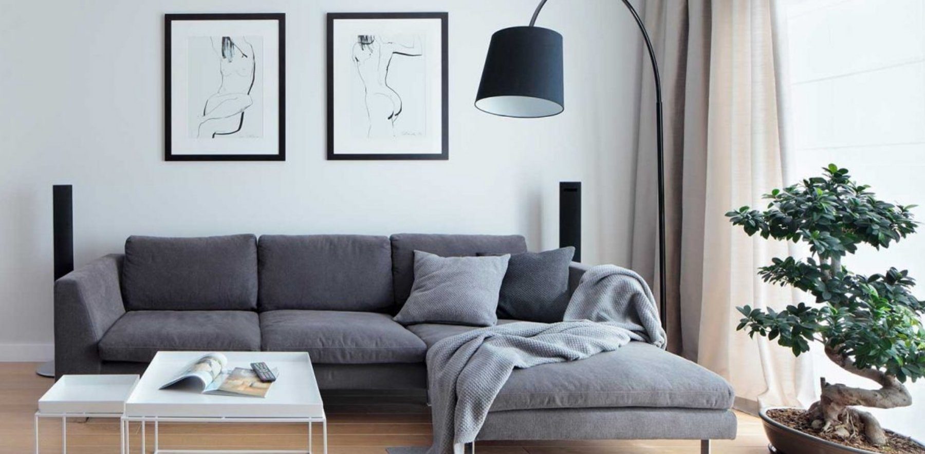
In comparison to blocks, cards contain content, which leads away from the page (offsite content). Mostly the content of a card is different from the content of the page. Cards can serve as entry points into deeper levels of detail or navigation.
Card on the page
Neu im Shop
Wohnzimmer
Leads to its own page
Wohnzimmer
Sofa, Couchtisch, Leuchten: Hier findest du alles, was dein Wohnzimmer gemütlich macht. Lass dich von unseren Ideen inspirieren und bestell bequem nach Hause.
Livecard serving as entry pointHTML
<div class="on-frame" style="display:grid;grid-template-columns:minmax(0,1fr) auto minmax(0,1.1fr);gap:24px;align-items:center">
<p class="demo-label">Card on the page</p>
<oc-card-v3><a href="#" aria-label="oc-auto"></a><div slot="content" class="oc-p-50" style="display:grid;gap:16px"><div class="oc-px-50 oc-pt-50"><p class="oc-copy-100">Neu im Shop</p><p class="oc-headline-100">Wohnzimmer</p></div><img class="oc-br-100" src="/references/images/otto/otto-shop-teaser-wohnzimmer.jpg" alt="" style="display:block;margin:0;width:100%;aspect-ratio:4/3;object-fit:cover"></div></oc-card-v3>
<oc-icon-v1 type="arrow-long-right"></oc-icon-v1>
<p class="demo-label">Leads to its own page</p>
<oc-block-v2><div style="display:grid;gap:16px"><img src="/references/images/otto/otto-shop-teaser-wohnzimmer.jpg" alt="" style="display:block;margin:0;width:100%;aspect-ratio:4/3;object-fit:cover"><p class="oc-headline-200">Wohnzimmer</p><p class="oc-copy-100">Sofa, Couchtisch, Leuchten: Hier findest du alles, was dein Wohnzimmer gemütlich macht. Lass dich von unseren Ideen inspirieren und bestell bequem nach Hause.</p></div></oc-block-v2>
Cards are always interactive. You have two options on how to make a card interactive:
fully interactive: The whole card is interactive and can contain only one link target. You can increase the affordance by adding an action signifier. But remember that the fully interactive card comes with states.
partially interactive: The card itself is static but has to contain at least one interactive component, e.g. button, links or stacked cards. Mostly the interactive components are placed on the bottom of the card. Note that this variant has no states itself.
Note: Interactive cards with interactive components inside are possible, but require a lot of special attention to details because of target sizes, that should be big enough to not interfere with each other.
fully: the whole card is one target
Neu im Shop
Wohnzimmer
partially: only the buttons are targets
Neu im Shop
Wohnzimmer
MerkenAnsehen
Liveinteractive areas of fully vs. partially interactive cardHTML
<p class="demo-label">fully: the whole card is one target</p>
<oc-card-v3><a href="#" aria-label="oc-auto"></a><div slot="content" class="oc-p-50" style="display:grid;gap:16px"><div class="oc-px-50 oc-pt-50"><p class="oc-copy-100">Neu im Shop</p><p class="oc-headline-100">Wohnzimmer</p></div><img class="oc-br-100" src="/references/images/otto/otto-shop-teaser-wohnzimmer.jpg" alt="" style="display:block;margin:0;width:100%;aspect-ratio:4/3;object-fit:cover"></div></oc-card-v3>
<p class="demo-label">partially: only the buttons are targets</p>
<oc-card-v3><div class="oc-p-50" style="display:grid;gap:16px"><div class="oc-px-50 oc-pt-50"><p class="oc-copy-100">Neu im Shop</p><p class="oc-headline-100">Wohnzimmer</p></div><img class="oc-br-100" src="/references/images/otto/otto-shop-teaser-wohnzimmer.jpg" alt="" style="display:block;margin:0;width:100%;aspect-ratio:4/3;object-fit:cover"><div class="demo-row tight gap-8" style="max-width:none"><oc-button-v1 variant="secondary" size="50">Merken</oc-button-v1><oc-button-v1 variant="primary" size="50">Ansehen</oc-button-v1></div></div></oc-card-v3>
Variants
Cards are available in two sizes: 50 and 100. The card sizes differ in their border radius. A larger border radius results in a higher affordance, so card 100 has a higher affordance than card 50. You can use size 50 for smaller cards and size 100 for larger cards. There is also the inverted card, which has a colored background and takes care of its content text being inverted too.
If you want to arrange cards vertically, the recommended spacing is 40px. Some cases, like the module assembly service, generate the recommended spacing results from a bottom spacing (24px) of the upper card and top spacing (16px) of the lower card.
If you want to arrange cards horizontally the recommended spacing is 16px. For smaller cards you can also use smaller distances.
Refer to the elevation guidelines. Cards are placed on a frame (level 0) as an element of the canvas level (level 1). Cards can also be placed on top of the canvas level (cards or blocks) as stacked cards (level 1.5). Therefore, stacked cards have a different background color (stacked background). Stacked cards can also have a custom background color.
The Card component comes without content. All types of content may be included in cards, like these:
image
headline
text
action signifiers (for interactive cards)
actions (for partially interactive cards)
But keep in mind that you should not mix content from different topics within a single card.
Neue Bücher im Sortiment
Krimis, Kochbücher, Kinderbücher: Stöbere durch unsere Neuheiten und lass dir dein nächstes Lieblingsbuch nach Hause liefern.
MerkenEntdecken
LiveCard with example contentHTML
<div class="on-frame"><div style="max-width:340px;margin:0 auto">
<oc-card-v3><div class="oc-p-50" style="display:grid;gap:16px"><img class="oc-br-100" src="/references/images/otto/otto-buecher-sortiment.jpg" alt="" style="display:block;margin:0;width:100%;aspect-ratio:4/3;object-fit:cover"><div class="oc-px-50" style="display:grid;gap:8px"><p class="oc-headline-100">Neue Bücher im Sortiment</p><p class="oc-copy-100">Krimis, Kochbücher, Kinderbücher: Stöbere durch unsere Neuheiten und lass dir dein nächstes Lieblingsbuch nach Hause liefern.</p></div><div class="oc-px-50 oc-pb-50 demo-row tight gap-8" style="max-width:none"><oc-button-v1 variant="secondary" size="50">Merken</oc-button-v1><oc-button-v1 variant="primary" size="50">Entdecken</oc-button-v1></div></div></oc-card-v3>
</div>
Border radiuses
If you place images inside the card, make sure the border matches the border radius of the card. There is a thumb rule that helps you determine the correct nested border radius:
Don'tUse border radiuses that are too sharp or too blunt for content.CautionIf you use a card 100 with padding set to 16 px, the result would be 0 px. However, due to the interactive element rule, the minimum border radius is 4 px. You may still use slightly rounded corners for the content in this case.
DoUse an interactive card with or without action siginifier.
Versand und Lieferung
Deine Bestellung ist in der Regel in 2 bis 4 Werktagen bei dir. Ab 29 € Bestellwert liefern wir kostenlos. Große Artikel wie Möbel bringt dir unsere Spedition bis in die Wohnung, den Termin stimmen wir vorher mit dir ab.
Don'tUse a static card without interactive components.
DoOnly use cards with a filled background.
Don'tUse cards with an Outline.
DoUse same card size inside a feature.
Don'tMix different card dimensions inside a feature.
DoUse the provided semantic tokens "color/background-card" when using the over-color variant.
Don'tUse custom colors.
CautionAvoid placing over-color cards on colored blocks or colored backgrounds.
MOJO
Sweatshirt mit Print
59,99 €
CautionAvoid placing content which belongs to the card outside of the card.
Neu im Shop
Wohnzimmer
target
DoUse cards with a single link target.
Neu im Shop
Wohnzimmer
In den Warenkorb
target 1: the card
target 2: the button
CautionUse cards with overlapping link targets very cautious, expecially if the targets are rather small.
Neu im Shop
Wohnbereiche
Alle Wohnideen
target 1: the stacked cards
target 2: the button
CautionWhen using a card as a interactive cluster, try to clearly separate link targets
Accessibility
For information on accessibility, refer to the technical documentation.
Only the latest version (v3) is allowed for generation. Older versions are kept for reference and are deprecated.
Overview (v3)
Card
The card component is 🔥.
Default variation
Card Content
HTML
<oc-card-v3><div>Card Content</div></oc-card-v3>
Configuration
The card component is available in the main styling variants ..
This component is configurable, allowing you to tailor its features and appearance to your specific needs.
To explore all the available options and adjust the component, use the component configurator and see the changes affect the component in real-time.
Usage guidelines
Before integrating the card component into your project, make sure you have correctly installed the OTTO components package.
Look through the variations page for examples of possible component variations.
Here, you can discover both common and specific variations that address different use cases.
Configure the card component with the controls below and see the changes live in the preview canvas.
Click the Show code button within the preview canvas to see the source code for the current component configuration.
Card Content
HTML
<oc-card-v3><div>Card Content</div></oc-card-v3>
Interactive configurator (Storybook controls); every option is listed in the API section of this file.
Migration (v3)
Migration from Card v2 to v3
The oc-card component has been updated from oc-card-v2 to oc-card-v3.
This migration guide provides step-by-step instructions to update your project to the latest version.
The component now uses native HTML elements (e.g. <a>, <button>, <div>) in the default slot, providing:
Improved accessibility with native semantics
Simpler API with fewer custom attributes
Better form integration
Automatic accessibility labeling
The aria-label="oc-auto" pattern is supported on the slotted element. It is especially useful when the visible label for the card lives in a slot="content" element rather than inside the interactive element itself:
This makes the component's behavior clearer and more maintainable.
API changes
Removed attributes
The following attributes have been removed and their functionality moved to the slotted element:
v2 Attribute
v3 Equivalent
Notes
as-button
Use a <button> tag in the default slot
Button behavior now explicit via native button
background-color
Use --background-color CSS variable
Moved to CSS variable
base64-href
Use data-masked-ref attribute on <a> or <div>
Moved to slotted element
href
Use an <a> tag with href in the default slot
Moved to native anchor element
oc-aria-label
Use aria-label on the slotted element
Renamed to standard attribute
rel
Set rel attribute on the slotted <a> element
Moved to native anchor element
target
Set target attribute on the slotted <a> element
Moved to native anchor element
Removed slots
v2 Slot
v3 Equivalent
Notes
primary-action
Use <a> or <button> in default
Interactive element moved to default slot
default
default or content
Default now contains the interactive element or wrapper
New slots
Slot
Description
default
Contains the interactive element (<a>, <button>, or <div> for masked links)
content
Extra content slot for cards with multiple interactive elements
Unchanged attributes
Attribute
Notes
elevation-level
Works the same in v3
inverted
Works the same in v3
size
Works the same in v3
CSS Variables
Variable
Notes
--background-color
Works the same in v3
How to migrate
The main change in v3 is the simplified API that uses the default slot for the interactive element (link or button) instead of managing it through attributes or named slots.
Migrate a basic non-interactive card
<!-- From: -->
<oc-card-v2>My Card</oc-card-v2>
<!-- To: -->
<oc-card-v3>
  <div>My Card</div>
</oc-card-v3>
Note: v3 requires content to be provided through a slotted element. A non-interactive <div> wrapper is used here — the card will render without hover/active styles or pointer cursors, indicating it is not interactive.
<!-- To: -->
<oc-card-v3>
  <div role="link" tabindex="0" data-masked-ref="Iw==">Card content</div>
</oc-card-v3>
Note: The accessible name for role="link" is computed from the element's text content, so no explicit aria-label is needed when the content is descriptive text. For icon-only or non-descriptive content, add aria-label="…" explicitly on the <div>.
<!-- To: -->
<oc-card-v3>
  <a href="/seo-url" data-masked-ref="Iw==">Card content</a>
</oc-card-v3>
Note: Moving the card content inside the <a> element means the browser computes the accessible name directly from the text content, so the explicit aria-label from v2 is no longer needed. For icon-only or non-descriptive content, add aria-label="…" on the <a> explicitly.
<!-- To: -->
<oc-card-v3>
  <a href="/product" aria-label="oc-auto"></a>
  <div slot="content">
    <h3>Product Title</h3>
    <p>Description</p>
    <oc-button-v2>Add to cart</oc-button-v2>
  </div>
</oc-card-v3>
Note:<div slot="content"> must be a direct child of <oc-card-v3>, not nested inside the interactive element. The default slot (the <a> tag here) and the content slot must be siblings.
API v2 (v2, deprecated, not for generation)
Card v2 API
API: <oc-card-v2> (CardV2)
The Card component provides a container for content with properties for setting base64 encoded URL, ARIA label, and emitting a click event when interacted with. It can also behave as a button and trigger an action instead of navigating to a new page.
Attributes / properties
Attribute
Type
Default
Required
Description
size
"50" | "100"
no
The size of the card.
inverted
boolean
false
no
Indicates whether the card styles should be inverted.
elevation-level
"canvas" | "stacked" | "above" | "sticky"
"canvas"
no
Sets the elevation level of the card. The elevation level determines the shadow and depth of the card.
- "canvas": no shadow, card appears flat, to be used on frame. Note: Has no effect when background-color or inverted has been set. - "stacked": shadow, card appears stacked, to be used on canvas. Note: Has no effect when background-color or inverted has been set. - "above": shadow, card appears above other levels. - "sticky": shadow, card appears above all other levels and is sticky.
background-color
string
undefined
no
Sets the background color of the card.
href
string
undefined
no
Deprecated: Use an a tag in the default slot instead.
Sets the base64 encoded link target of the card. Use this attribute to prevent search engines from indexing the link target.
target
"_blank" | "_self" | "_parent" | "_top"
undefined
no
Sets the target attribute of the card.
Note: Only applies when href or base64Href is set.
rel
string
undefined
no
Sets the rel attribute of the card.
Note: Only applies when href or base64Href is set.
as-button
boolean
false
no
Indicates whether the card behaves as a button or as a link when clicked.
oc-aria-label
string
undefined
no
Sets the ARIA label of the card.
Slots
Slot
Required
Description
default
yes
Sets the content of the card component.
primary-action
no
Add an empty tag to change the default behavior of the card component.
- empty a tag: the card component behaves as a link (SEO relevant) - empty button tag: the card component behaves as a button - empty div tag: for link masking when there are multiple interactive elements
Events
Event
Detail type
Description
click
PointerEvent
Clicking the card or pressing Enter or Space while the card is focused triggers the click event. Use this event in case the as-button attribute is set to true.
oc-property-change
OcCardV2Events["oc-property-change"]
Whenever a property value changes, this event triggers. Use this event to track all property changes within the component.
Fired when the component is mounted to the DOM. The event is fired when the onMount hook of the component is called by the runtime.
oc-unmount
{ component: string; }
Fired when the component is unmounted from the DOM. The event is fired when the function returned by the onMount hook of the component is called by the runtime.
CSS custom properties
Custom property
Default
Description
--background-color
undefined
Sets a custom background color through a CSS variable. Note: The preferred way of using colors is via design tokens instead of hex values.
API v3
Card v3 API
API: <oc-card-v3> (CardV3)
The card component is a versatile container that can be used to display content and actions on a single topic.
Attributes / properties
Attribute
Type
Default
Required
Description
size
"50" | "100"
"100"
no
The size of the card.
inverted
boolean
false
no
Sets the card styles to be inverted.
elevation-level
"canvas" | "stacked" | "above" | "sticky"
"canvas"
no
Sets the elevation level of the card. The elevation level determines the shadow and depth of the card. - canvas: no shadow, card appears flat, to be used on frame.
Note: Has no effect, when background-color or inverted has been set. - stacked: shadow, card appears stacked, to be used on canvas.
Note: Has no effect, when background-color or inverted has been set. - above: shadow, card appears above other levels. - sticky: shadow, card appears above all other levels and is sticky.
Fired when the component is mounted to the DOM. The event is fired when the onMount hook of the component is called by the runtime.
oc-unmount
{ component: string; }
Fired when the component is unmounted from the DOM. The event is fired when the function returned by the onMount hook of the component is called by the runtime.
CSS custom properties
Custom property
Default
Description
--background-color
undefined
Sets the custom background color
Variations (v3)
Variations
Listed below are the most common variations of the card component as well as specific component variations for different use cases.
You can explore all available options using the component configurator, adjust the component to your needs, and see the changes live in a preview canvas.
The card component can be marked as checked using a checkbox, a radio button, a switch button,
or a current-marked link in the default slot. See
marking content as checked
for guidance on choosing the right pattern.
Args: defaultSlot=not used in that story, contentSlot=not used in that story
The image variant using the oc-placeholder-v1 component to provide image content and an a tag in the primary-action slot to provide navigation functionality.
Variation using the new elevation-level property to provide a shadow effect and an a tag in the default slot to provide navigation functionality.
Args: defaultSlot=<a href='#'>Card with shadow</a>, elevation-level=above
<!-- Wrapper to set the width and the height-->
<div style="width: 180px; height: 240px; display: grid">
  <!-- The component-->
  <oc-card-v3 elevation-level="above"
    ><a href='#'>Card with shadow</a>${unsafeHTML(contentSlot)}
  </oc-card-v3>
</div>
Story source (TypeScript, verbatim from Storybook)
{
  name: "Link with elevation",
  args: {
    defaultSlot: `<a href='#'>Card with shadow</a>`,
    "elevation-level": "above"
  },
  render({
    defaultSlot,
    contentSlot,
    ...props
  }) {
    return html`
      <!-- Wrapper to set the width and the height-->
      <div style="width: 180px; height: 240px; display: grid">
        <!-- The component-->
        <oc-card-v3 ${spread(props)}
          >${unsafeHTML(defaultSlot)}${unsafeHTML(contentSlot)}
        </oc-card-v3>
      </div>
    `;
  }
}
<!-- Wrapper to set the width and the height-->
<div style="width: 296px; display: grid;">
  <!-- The component-->
  <oc-card-v3 inverted size="100"
    >
    <a href='#' style="padding: 16px;" >
      <h1 class="oc-headline-100">Headline</h1>
      <p class="oc-copy-100">
        Dies ist ein Typoblindtext. An ihm kann man sehen, ob alle Buchstaben da sind und wie sie
        aussehen. Manchmal benutzt man Worte wie Hamburgefonts, Rafgenduks oder Handgloves
      </p>
    </a>
    ${unsafeHTML(contentSlot)}
  </oc-card-v3>
</div>
Story source (TypeScript, verbatim from Storybook)
{
  name: "Demo: Inverted card",
  args: {
    inverted: true,
    defaultSlot: `
    <a href='#' style="padding: 16px;" >
      <h1 class="oc-headline-100">Headline</h1>
      <p class="oc-copy-100">
        Dies ist ein Typoblindtext. An ihm kann man sehen, ob alle Buchstaben da sind und wie sie
        aussehen. Manchmal benutzt man Worte wie Hamburgefonts, Rafgenduks oder Handgloves
      </p>
    </a>
    `
  },
  render({
    defaultSlot,
    contentSlot,
    ...props
  }) {
    return html`
      <!-- Wrapper to set the width and the height-->
      <div style="width: 296px; display: grid;">
        <!-- The component-->
        <oc-card-v3 ${spread(props)} size="100"
          >${unsafeHTML(defaultSlot)}${unsafeHTML(contentSlot)}
        </oc-card-v3>
      </div>
    `;
  }
}
The card component provides a container for content with properties for setting the link URL, base64 encoded URL, ARIA label, and emitting a click event when interacted with.
It can also behave as a button and trigger an action instead of navigating to a new page.
Default variation
<oc-card-v2></oc-card-v2>
Configuration
The card component is configurable, allowing you to tailor its features and appearance to your specific needs.
To explore all the available options and adjust the component, use the component configurator and see the changes affect the component in real-time.
Usage guidelines
Before integrating the card component into your project, make sure you have correctly installed the OTTO components package.
Look through the variations page for examples of possible component variations.
Here, you can discover both common and specific variations that address different use cases.
The card component can have multiple interactions:
The primary-action is the main action that's triggered when the user clicks on the card.
The secondary-action is an additional action that's triggered when the user clicks on a specific element within the card.
Use the CSS class oc-secondary-action to style the secondary action.
<oc-card-v2>
  <!-- Place the <a> tag in the light DOM to improve SEO.-->
  <!-- Use aria-label if the <a> tag needs to be empty. -->
  <a slot="primary-action" href="#" aria-label="Card"></a>
  <oc-button-v1 class="oc-secondary-action">Secondary action</oc-button-v1>
</oc-card-v2>
Use oc-aria-label
To make the card recognizable for screen readers, use the oc-aria-label attribute to provide clear and descriptive context information.
See the general accessibility documentation for guidance on using oc-aria-label, including how it works with link and masked link behavior.
Button or masked link
See the Link behavior and masked links section in the accessibility documentation for how to apply oc-aria-label in these scenarios.
V2/Configuration (v2, deprecated, not for generation)
Card configuration
Configure the card component with the controls below and see the changes live in the preview canvas.
Click the Show code button within the preview canvas to see the source code for the current component configuration.
<oc-card-v2></oc-card-v2>
Interactive configurator (Storybook controls); every option is listed in the API section of this file.
<!-- Wrapper to set the width and the height-->
<div style="width: 180px; height: 240px; display: grid">
  <!-- The component-->
  <oc-card-v2 base64-href="L2Zvbw==" oc-aria-label="link to test"></oc-card-v2>
</div>
Story source (TypeScript, verbatim from Storybook)
{
  render() {
    return html`<!-- Wrapper to set the width and the height-->
      <div style="width: 180px; height: 240px; display: grid">
        <!-- The component-->
        <oc-card-v2 base64-href="L2Zvbw==" oc-aria-label="link to test"></oc-card-v2>
      </div>`;
  },
  async play({
    canvasElement
  }) {
    const ocCard = canvasElement.getElementsByTagName("oc-card-v2").item(0)!;
    ocCard.focus();
    await tick();

    // instead of the div element there should now be an anchor element
    const linkElement = deepQuerySelector<HTMLAnchorElement>(ocCard, ".card__interactive")!;
    await expect(linkElement.tagName).toBe("A");

    // anchor element inside the shadow root should have the correct href attribute
    await expect(linkElement.getAttribute("href")).toBe(`/foo`);

    // anchor element inside the shadow root should have the same fully href as the host
    await expect(ocCard.href).toBe(`${window.location.origin}/foo`);
    await expect(linkElement.href).toBe(`${window.location.origin}/foo`);
  }
}
V2/Variations (v2, deprecated, not for generation)
Variations
Listed below are the most common variations of the card component as well as specific component variations for different use cases.
You can explore all available options using the component configurator, adjust the component to your needs, and see the changes live in a preview canvas.
The card component with a link as primary action. Search engines will detect the href.
Args: primaryActionSlot=(see snippet)
<oc-card-v2>
  <!--The <a> tag should be placed inside the light DOM to improve SEO.--><a slot="primary-action" href='#' aria-label='Card'></a>
</oc-card-v2>
<oc-card-v2 base64-href="Iz92YXJpYW50PWZvbw==">
  <!--Search engines will detect the href, while users receive the Base64-encoded version.--><a href='#' slot="primary-action" aria-label='Card'></a>
</oc-card-v2>
The image variant using the oc-placeholder-v1 component to provide image content and an a tag in the primary-action slot to provide navigation functionality.
Variation using the new elevation-level property to provide a shadow effect and an a tag in the primary-action slot to provide navigation functionality.
Args: primaryActionSlot=<a slot="primary-action" href='#' aria-label='Card with shadow'></a>, elevation-level=above
<!-- Wrapper to set the width and the height-->
<div style="width: 180px; height: 240px; display: grid">
  <!-- The component-->
  <oc-card-v2 elevation-level="above"
    ><a slot="primary-action" href='#' aria-label='Card with shadow'></a>${unsafeHTML(defaultSlot)}
  </oc-card-v2>
</div>
Story source (TypeScript, verbatim from Storybook)
{
  name: "Link with elevation",
  args: {
    primaryActionSlot: `<a slot="primary-action" href='#' aria-label='Card with shadow'></a>`,
    "elevation-level": "above"
  },
  render({
    defaultSlot,
    primaryActionSlot,
    ...props
  }) {
    return html`
      <!-- Wrapper to set the width and the height-->
      <div style="width: 180px; height: 240px; display: grid">
        <!-- The component-->
        <oc-card-v2 ${spread(props)}
          >${unsafeHTML(primaryActionSlot)}${unsafeHTML(defaultSlot)}
        </oc-card-v2>
      </div>
    `;
  }
}
Args: primaryActionSlot=<a slot="primary-action" href='#' aria-label='Card with shadow'></a>, inverted=true, defaultSlot=(see snippet)
<!-- Wrapper to set the width and the height-->
<div style="width: 296px; height: 126px; display: grid;">
  <!-- The component-->
  <oc-card-v2 inverted size="100"
    ><a slot="primary-action" href='#' aria-label='Card with shadow'></a>
    <div style="padding: 16px;">
      <h1 class="oc-headline-100">Headline</h1>
      <p class="oc-copy-100">
        Dies ist ein Typoblindtext. An ihm kann man sehen, ob alle Buchstaben da sind und wie sie
        aussehen. Manchmal benutzt man Worte wie Hamburgefonts, Rafgenduks oder Handgloves
      </p>
    </div>

  </oc-card-v2>
</div>
Story source (TypeScript, verbatim from Storybook)
{
  name: "Demo: Inverted card",
  args: {
    primaryActionSlot: `<a slot="primary-action" href='#' aria-label='Card with shadow'></a>`,
    inverted: true,
    defaultSlot: `
    <div style="padding: 16px;">
      <h1 class="oc-headline-100">Headline</h1>
      <p class="oc-copy-100">
        Dies ist ein Typoblindtext. An ihm kann man sehen, ob alle Buchstaben da sind und wie sie
        aussehen. Manchmal benutzt man Worte wie Hamburgefonts, Rafgenduks oder Handgloves
      </p>
    </div>
    `
  },
  render({
    defaultSlot,
    primaryActionSlot,
    ...props
  }) {
    return html`
      <!-- Wrapper to set the width and the height-->
      <div style="width: 296px; height: 126px; display: grid;">
        <!-- The component-->
        <oc-card-v2 ${spread(props)} size="100"
          >${unsafeHTML(primaryActionSlot)}${unsafeHTML(defaultSlot)}
        </oc-card-v2>
      </div>
    `;
  }
}